Skip to content

Tag: design

Midweek Miscellany

Book designer and all-round good chap David Pearson on phillumeny at We Made This:

It’s no coincidence that a book designer should be drawn to matchbox labels. Their shape is intrinsically book-like, their method of communication instantaneous and spare, and they provide a dizzying range of illustrative styles. Their uncluttered compositions ensure communication across language barriers, and designs appear cohesive as a result of type and image being rendered by the same hand. But perhaps most alluring of all is their uncompromised clarity of purpose, an attribute that most modern designers can only dream about.

You can see more of David’s ephemera collection on Flickr, there’s another amazing collection of match-box covers here.

An Invisible Rightness — Six graphic designers, including Derek Birdsall and Peter Saville, discuss designers they admire in The Guardian.

A Repurposeful Life — Author William Gibson on cities and fiction in The Scientific American:

Necessity being one of invention’s many mothers, I have a certain faith in our ability to repurpose almost anything, provided it becomes sufficiently necessary. Then again, I suspect we’ve abandoned cities in the past because they were too thoroughly built to do some specific something that’s no longer required.

Let Us Tweet! — An epic-length rant by Jared Lanier, author of You Are Not a Gadget, at Edge:

I’m astonished at how readily a great many people I know, young people, have accepted a reduced economic prospect and limited freedoms in any substantial sense, and basically traded them for being able to screw around online… What that leads to is the world that Wells and Kurt Vonnegut and many others wrote about, where there just is enough virtual bread and circuses, just barely enough to keep the poor in check, and perhaps somehow not breeding, and they just kind of either wither away through attrition or something.

The A.V. Club offer a nice primer on newspaper comics.

Meanwhile… Robot 6 lists six great superhero comics from unlikely sources.

And finally…

An Act of Vengeance Against Former PleasuresThe Comics Journal reviews The League of Extraordinary Gentlemen: Century 1969, neatly summing up my own reservations about the direction of the series:

What’s disconcerting about 1969 is how joyless the exercise has become, and how wan and stretched the story feels. Like its predecessor, 1969 comes off as glum and a bit rancid. It feels like the story of characters who have outlived their time, which may indeed be the point… I don’t need to itemize the various bits of cleverness in 1969, or to point out the screamingly obvious, that 1969 is more intelligent and insinuating than most comic books. It is, after all, a book by Alan Moore and Kevin O’Neill. But the taste of it sits like battery acid on the tongue, and, like 1910 before it, it reads like an act of vengeance against former pleasures.

Comments closed

Just My Type | Weekend Edition

A short interview with Simon Garfield author of Just My Type on NPR’s All in a Weekend:

NPR Weekend Edition: Just My Type, Simon Garfield

I love the story about a man who tried to go a day without Helvetica.

Comments closed

Midweek Miscellany


Nick Hornby on book cover design at We Made This:

[I]ncreasingly the big retailers, Amazon and the supermarkets, have a say in how a book looks before publication, if the book in question has serious commercial prospects. I don’t really know what to say about that, apart from observing that the people who sell books in supermarkets have different tastes from my own. I am at liberty to object to the covers on my novels, if I really hate them, but my publishers would then, I think, be entitled to ask me to take a lower advance, if I care about aesthetics so much. The days of the iconic jacket illustration, the image that forever becomes associated with a much-loved novel, are nearly gone. The stakes are too high now.

(pictured above, the cover for the Penguin Ink edition of High Fidelity by a tattooist Russ Abbott)

George Pelecanos chooses a music playlist for his new book, The Cut, at Largehearted Boy.

Brian Doherty reviews three books on comics history for the LA Review of Books.

And finally…

Longing for the Little Bookstore — Ann Patchett, author of State of Wonder, on bugs, book tours and bookstores, for the New York Times:

With the demise of the Borders chain and the shaky footing of Barnes and Noble, one might be tempted to write off the whole business. But as one who spent her summer on a book tour, I would like to offer this firsthand report from the front lines: Americans are still reading books. Night after night after night I showed up in a different bookstore and people were there with their hardbacks. Sure, I signed a couple of iPad covers, Kindle covers. I’ve got no problem with that. But just because some people like their e-readers doesn’t mean we should sweep all the remaining paperbacks in a pile and strike a match. Maybe bookstores are no longer 30,000 square feet, but they are selling books.

1 Comment

Midweek Miscellany

Superhybridity — Tom Payne reviews Retromania by Simon Reynolds for The New York Times:

It’s not so much the selling-­out that saddens Reynolds. Rather, it’s our ready acceptance that the past is our only future: that after postmodernism, with its weary, overinformed view that there is nothing new to say, comes something called “superhybridity.” Superhybridity, a concept borrowed from an art magazine, exists because the Internet can bring whatever we want into our hard drives, so that we can sample it or mash it up: no culture, from any time or place, can be remote from us.

Anger — In light of the recent riots in Britain, Chris Arnot looks at the legacy of Alan Sillitoe (Saturday Night and Sunday Morning) with the author’s son David:

Something about the sudden switch from menace to charm, coupled with that jack-the-lad swagger, briefly brings to mind Arthur Seaton, the antihero of Saturday Night and Sunday Morning… Arthur had already shrugged off the collectivist values of the postwar years. He was “trying to screw the world … because it’s trying to screw me.”

“Currently my head is empty. I am on holiday.” — Wim Crouwel at Designers & Books.

The Weird Outsider — A long profile of Jared Lanier, author of You Are Not A Gadget, in the New Yorker:

Like an innovative painter who alternately courts and scorns the establishment, Lanier often seems torn between embracing and repudiating his newly influential status. As we drove, he mentioned, with some pride, that he had been “banned” from the TED conferences last year, after publishing an essay about the narcissistic nature of the event in a London magazine. (A spokesperson for TED said that Lanier is welcome at the conferences.) He purported to be similarly unimpressed by Davos, the economic conference, which he has attended “a billion times.” “At one point, I was in an elevator with Newt Gingrich and Hamid Karzai,” he said. “There are really only so many times you want to be in that situation.”

And finally…

Writer Chuck Klosterman interviews Bill James, inventor of sabermetrics — the “ideological engine” behind MoneyballMichael Lewis’ book on baseball — and author of a new book Popular Crime: Reflections on the Celebration of Violence, for Grantland:

This line is fascinating if you’re interested in crime fiction:

The whole idea of Sherlock Holmes is dangerous because it encourages people to think that — if they’re intelligent enough — they could put all the pieces together in absolute terms. But the human mind is not sophisticated enough to do that. People are not that smart. It’s not that Sherlock Holmes would need to be twice as smart as the average person; he’d have to be a billion times as smart as the average person.

But this is just great:

There were so many terrible things done by kings and emperors and everyday normal people that are just incomprehensible today. The historian Suetonius writes about how Nero — beyond the many thousands of people he killed in his official duties— liked to sneak out of the palace at night and murder people in the streets, purely for entertainment. Now, whatever you may think of our recent presidents, it’s pretty safe to say they didn’t do that.

Comments closed

Diana Athill | Michael Salu and Rankin

Designed by the brilliant Michael Salu, the cover for Diana Athill’s forthcoming collection of letters, Instead of a Book, features a stunning portrait of the author by acclaimed British photographer Rankin (co-founder of Dazed & Confused in case you were wondering).

To coincide with the release of the new book in October, Granta are also reissuing paperback editions of Athill’s books Stet, Yesterday Morning and Instead of a Letter with cover designs incorporating Rankin’s photographs.

I don’t think I have made any secret of my love of Stet, Athill’s book about her time as an editor at Andre Deutsch. But I have always been disappointed by the discouraging cover on the tatty copy on my bookshelf, and it makes me incredibly happy to finally see an edition that seems to capture something of Athill’s personality.

Athill’s writing is unflinching and it is remarkable to see that reflected in Rankin’s stark portraits. According to Michael, who art directed series and designed all the covers, “the idea was to not to shy away from age and experience, but to celebrate it and Diana’s distinct personality.” Certainly, it is hard not to be taken by the keenness of Athill’s eyes. One gets the sense she does not suffer fools gladly. There is something of a retired headmistress about her. But I love how in the photograph for Instead of a Letter, Rankin captures Athill’s thumb hooked under her necklace. The author doesn’t appear to be particularly aware that she’s doing it, but it is beautiful and poignant touch.

The type is set in Gill Sans. Of course.

Comments closed

Something for the Weekend

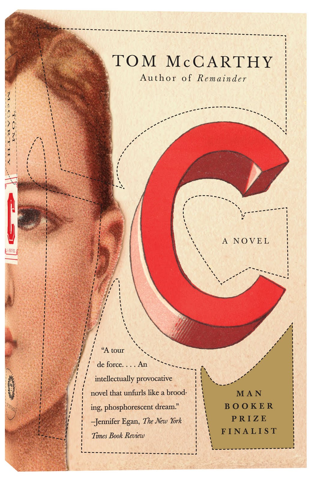
John Gall’s new cover for the paperback edition of C by Tom McCarthy. It can’t have been easy following this monster of cover.

NPR listeners pick their 100 favourite science fiction and fantasy books. On first glance, it looks like a diverse and wide-ranging selection.

Downloadable issues of De Stijl from 1917 to 1920. They’re in Dutch of course, but still! (via Coudal).

And finally…

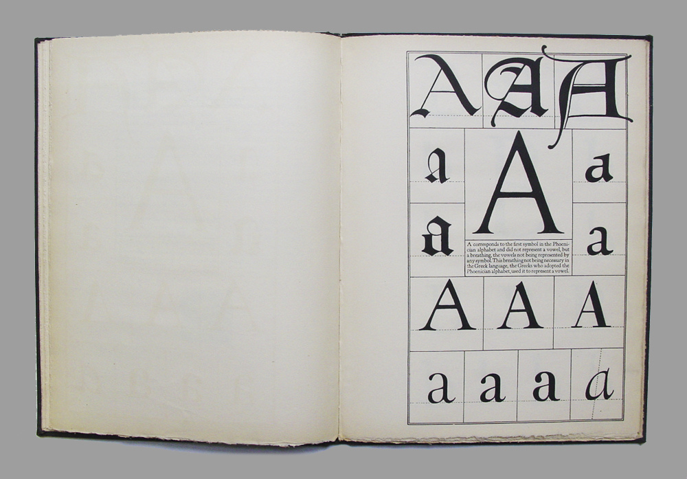
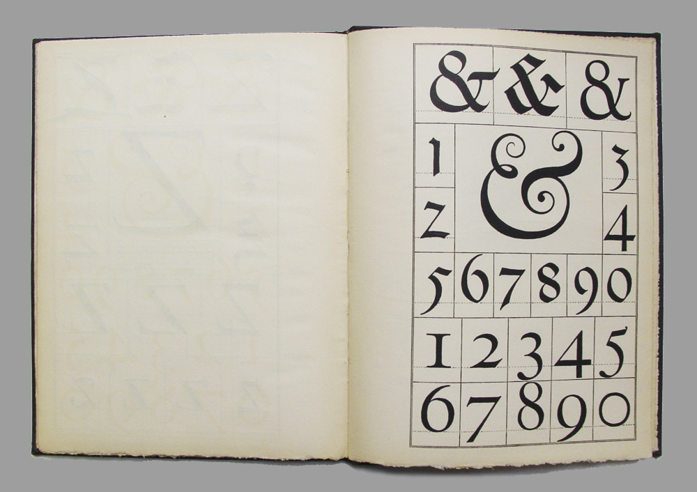
Eye Magazine has a nice feature on Frederic W. Goudy’s 1918 book The Alphabet: Fifteen Interpretative Designs.

Comments closed

Midweek Miscellany

A profile of calligrapher DeAnn Singh at The LA Times:

When the producers of “Mad Men” needed a note in cursive and a signature from Don Draper, they turned to Singh. “Something masculine and from the 1950s” was the request, though they eventually decided that the missive be typed…

Ask her about computers, and she’ll tell the story of Steve Jobs.

Before the founding of Apple and the development of the Macintosh, Jobs dropped out of Reed College and studied calligraphy with artist Lloyd Reynolds. If he hadn’t taken that class, he has said, personal computers might not have come with a variety of fonts.

Fantasy Modernism — Lev Grossman talks to the A.V. Club about The Magician King, the sequel to his 2009 novel The Magicians:

I have this theory about modernism and fantasy, which I’ll do in 30 seconds.

They came into being at the same time, which is very interesting. They were both reactions to the disasters of World War I and the electrification of cities, and urbanization, and the rise of the automobile, the end of that twilight world of the Victorians. They both are reactions to that in different ways. Modernism went very inside and delved into the interior lives of people. Fantasy externalized all that in these fantastical, magical, metaphorical landscapes. I thought, “Well, what if you did both the inside and the outside at once?” I tried to combine those foci of fantasy and modernism into one kind of writing. It sounds like I’m writing a dissertation on my own work, but, you know, you end up thinking about what you’re doing. That’s the kind of thing I thought.

See also: Alexander Chee reviews the book for NPR.

Prussian Pedantry — Susie Harries’ new biography of scholar Nikolaus Pevsner, best known for his 46-volume series The Buildings of England, reviewed by George Walden for The Observer:

For us at least the conflict of national intellectual styles he represented was hugely beneficial. The irony of a “Prussian pedant” lecturing the English on Englishness, for which he was mocked, resolves itself in the fact that, together with Gombrich in art history and Weidenfeld in publishing, Pevsner was one of a golden generation of German/Austrian Jewish refugees who did much to give their adopted country the bottom it prided itself on already possessing.

And for those of you not interested in a county-by-county guide to the wonders of English architecture (what’s wrong with you?), Pevsner also wrote the seminal Pioneers of Modern Design: From William Morris to Walter Gropius. First published in 1936, a revised and expanded edition will be available (in the UK at least) in September.

And finally…

Everyone is an AuteurGuardian correspondent Fiachra Gibbons meets Jean-Luc Godard:

“I am not an auteur, well, not now anyway,” he says as casually, as if it was like giving up smoking. “We once believed we were auteurs but we weren’t. We had no idea, really. Film is over. It’s sad nobody is really exploring it. But what to do? And anyway, with mobile phones and everything, everyone is now an auteur.”

Oh Jean-Luc…

Comments closed

Laurence King on the Future of Design Publishing

In a great interview for Design Observer, UK publisher Laurence King discusses the future of design publishing with Mark Lamster:

Illustrated book publishers, and in particular art publishers, need bookshops to survive, especially the increasingly rare specialist ones where there are discerning buyers who understand art, architecture and design. I think that these need to be treated with a great deal of care by publishers because all too often they serve as shop windows for Amazon. They are more important to us than sales through them indicate. It would be great if they could use their reputations and expert knowledge to become competitive with Amazon on-line. But I dread the day when art publishers have to set up loss-making showrooms to exhibit our books, just because we went on being tough with the specialist booksellers. At the same time, booksellers need to reinvent themselves quite fast, which is obviously difficult.

Laurence King published Bibliographic: 100 Classic Graphic Design Books — one of my favourite visual books from the last couple of years — in 2009, and later this fall, they’re publishing a huge, long-awaited, monograph on designer Saul Bass. Can’t wait.

Full disclosure: Laurence King is distributed in Canada by my employer Raincoast Books. 

Comments closed

Something for the Weekend

Nicholas Carr, author of The Shallows, reviews Retromania by Simon Reynolds for The New Republic:

Who wants yesterday’s papers?” sang Mick Jagger in 1967. “Who wants yesterday’s girl?” The answer, in the Swinging 60s, was obvious: “Nobody in the world.” That was then. Now we seem to want nothing more than to read yesterday’s papers and carry on with yesterday’s girl. Popular culture has become obsessed with the past—with recycling it, rehashing it, replaying it. Though we live in a fast-forward age, we cannot take our finger off the rewind button.

And Mr. Reynolds has been a busy man. Not only is his book also reviewed at the A.V. Club, he is interviewed about it at Pitchfork, The Quietus and The Second Pass.

Shiny and New — Designer Matt Roeser talks about his New Cover project with Ian Shimkoviak at Covered Up:

I love physical books. I have more books than I have space for in my house, but there’s just something about a physical book that is so appealing to me that an e-book will never be able to replicate. Now, whether the rest of the world feels that same way is yet to be seen. I definitely think there is a large population that doesn’t care how they’re experiencing the book; they just want to be able to read it.

And finally…

Drinking, Gambling and Grandma — Lorrie Moore, author of A Gate at the Stairs, on the TV show Friday Night Lights for the NYRB:

The series wants Dillon [Texas] to function as a microcosm of larger working- and middle-class America: it takes its fifty or so hours and opens a window on American family, education, community race relations, athletics, social class and its various brokennesses. But lest you go away, it keeps you involved with the drama of high school—its romantic student soap operas, its tense and dire administrative politics, plus the multigenerational home life that has dads in prison, dads in Iraq, dads gambling and drinking and roaming around the country while Grandma sits in the front room.


Comments closed

Type | PBS Arts Off Book

In this short documentary for a new online series for PBS called Off Book, Jonathan Hoefler and Tobias Frere-Jones, Paula Scher, Eddie Opara, Julia Vakser and Deroy Peraza discuss typography, design, texture, and infographics:

(via The Donut Project)

Comments closed

Midweek Miscellany

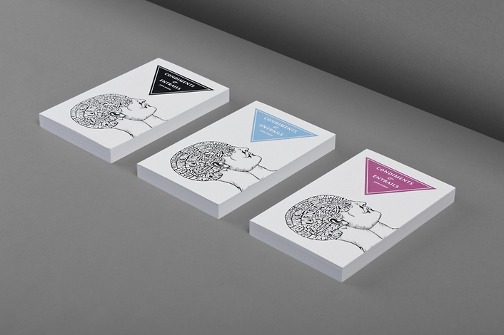
FPO: For Print Only features the fun cover for John Durak’s collection of poetry Condiments and Entrails designed by Bunch

The Oracle of Redirection — James Gleick, author of The Information, reviews four books about Google for the NYRB:

Google defines its mission as “to organize the world’s information,” not to possess it or accumulate it. Then again, a substantial portion of the world’s printed books have now been copied onto the company’s servers, where they share space with millions of hours of video and detailed multilevel imagery of the entire globe, from satellites and from its squadrons of roving street-level cameras. Not to mention the great and growing trove of information Google possesses regarding the interests and behavior of, approximately, everyone.

Glittering Delights  — Simon Schama talks to The Guardian about his recent book of essays Scribble, Scribble, Scribble:

I have this magpie instinct for the next glittering object. There are one or two things I know I can’t write about though: DIY, cricket, automobile repair. I could study it for a lifetime and not produce a word on the carburettor.

And finally…

Power, Corruption and Lies New Yorker critic Alex Ross, author of  The Rest is Noise and Listen To This, on Oscar Wilde, homosexuality, and a new “uncensored” edition of The Picture of Dorian Gray published by Harvard University Press:

[N]o work of mainstream English-language fiction had come so close to spelling out homosexual desire. The opening pages leave little doubt that Basil Hallward, the painter of Dorian’s portrait, is in love with his subject. Once Dorian discovers his godlike powers, he carries out various heinous acts, including murder; but to the Victorian sensibility his most unspeakable deed would have been his corruption of a series of young men… At the Wilde trials of 1895, the opposing attorneys read aloud from “Dorian Gray,” calling it a “sodomitical book.” Wilde went to prison not because he loved young men but because he flaunted that love, and “Dorian Gray” became the chief exhibit of his shamelessness.

Comments closed

Humiliation | Henry Sene Yee

Just too good not to share, here’s an unused comp for Humiliation by Wayne Koestenbaum  designed by Henry Sene Yee for Picador’s Big Ideas // Small Books series. The photograph is by Jon Shireman.

You can see the final cover and read details the design process on his Henry’s blog.

And for the sake of full disclosure, Picador are distributed in Canada by my employer Raincoast Books. 

1 Comment