Book jackets these days, for reasons I won’t unpack, seem to revel, overtly, in wit, conceptual deviousness, unusual clever or droll juxtapositions — we, as a professional community, seem to have elevated the visual bon mot above all other virtues. Again, I won’t delve into the “why” of the matter here for want of space, but suffice it to say that clever work is the work that is celebrated in our community. Not that wit in itself isn’t valuable, and doesn’t have an appropriate place in design — but wit is not the same thing as insightfulness, and often insightfulness is what is called for in a book jacket. Our fetishizing of cleverness has taken a toll I believe, in that (quite often) these clever solutions work at cross-purposes to the (more often than not sincere) narratives they represent. A book in which an author has gone out on a considerable limb in order to write in a genuine and unaffected fashion does not want a cover that winks at the reader. Wit, when it becomes compulsive (as anyone knows who has a friend who puns too often) quickly becomes its opposite- dullness or predictability.
Peter says this is just the first in a series of posts about the process of “jacketing works of fiction”. One can only hope.
(pictured above: a proposed jacket for Nabokov’s Lolita by Emmanuel Polanco)
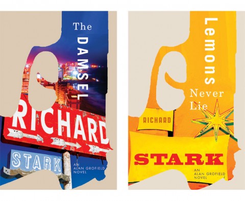
David Drummond designed the covers for the University of Chicago Press recent reissues of Richard Stark’s ‘Parker’ novels. Now David has designed great new covers for the reissues of Stark’s ‘Alan Grofield’ novels as well – The Dame, The Damsel, Blackbird and Lemons Never Lie.
I actually really like these earlier, slightly looser, alternatives as well:
David has written more about the design process on his blog, and you can read my interview with him here.
In the first of a new podcast series from Quill and Quire, web editor Sue Carter Flinn talks with C. S. Richardson, vice-president and creative director at Random House Canada, about his 30-year career in book design:
I had seen the book trailer for The Innovator’s Cookbook by Steven Johnson posted elsewhere and hadn’t paid too much attention to it (elsewhere being wildly more popular than here!) until designer Helen Yentus dropped me a line to say that it showed her process for making the cover’s title letters using a MakerBot 3D printer:
“We really wanted to produce the cover in some way that would fit into the content. The MakerBot guys were nice enough to print the letters for us and they’re a really innovative company. They make the only affordable 3D desktop printer and they run a site where people upload their designs. It’s all pretty cool.”
In the video you can see Helen sketch out and design the letters before they are printed and set up for the cover shoot. It really is pretty cool:
Art or Death — Art Spiegelman on books, comics and technology at Publishers Weekly:
I would say that, in the future, the book will be reserved for things that function best as a book. So, if I need a textbook that’s going to be out of date because of new technological inventions, you’re better off having it where you can download the supplements or the update. If you’re going to read a quick mystery novel to keep you amused while you’re traveling, it’s fine.
None of this is about the business model. It has to do with the boutique nature of a book, the idea that, as McLuhan put it, when a technology is replaced by another technology, the previous technology either becomes art or it dies.
One way to explain the achievement of MetaMaus is to imagine a great architect like Frank Gehry offering a guided tour to one of his classic buildings, opening up the original plans, explaining the solutions he came up with for each problem. Such an act of self-exegesis is immensely rewarding, even if the creator’s genius is as enigmatic as ever.
And, on the subject of comics… A short interview with Alan Moore in Metro:
At the moment I feel an awful lot of my comic career is behind me, particularly all of the superhero stuff – the stuff that’s owned by American corporations. I want to distance myself from that, so the stuff I’m proudest of is what I own: From Hell, Lost Girls, The League Of Extraordinary Gentlemen. I don’t read my earlier work because there are too many unpleasant associations with it. I don’t have a copy of Watchmen in the house. I’m glad the work is out there in the world, having an effect, but it’s like I’ve gone through a messy divorce.
Immersion — Author Neal Stephenson talks about writing and his new novel REAMDEat Full Stop:
I would say that people who like to engage with the details of the historical era or the technical concepts might find [my] books especially rewarding to read. For me it’s a pretty straightforward thing—you know, what readers are paying for, what they’re buying and what I’m selling is a particular kind of experience: essentially one of getting immersed in another world. And it could be a very different world (as in a science fiction book), it could be the history of our world, or it could just be a story that takes place today, like Reamde. And a way to do that — a way to create that feeling of immersion and get the reader feeling like they’re really there — is to supply a lot of details that convey a feeling of immediacy.
See also: REAMDE reviewed by Laura Miller for The Guardian.
And finally…
Filmmaker Gary Hustwit talks about his latest design documentary, Urbanized, with Print Magazine:
I love all the interviews in all the films, that’s why they are in the film. But there are definitely some that people respond to when they watch the film. Most of all Enrique Peñalosa, who is the former mayor of Bogota. He’s got some great lines in the film, like “There’s no constitutional right to parking.” He’s really charismatic and has some really common sense ideas about using the city as a tool to create equality, democracy and social equity. I also got to interview Oscar Niemeyer, the legendary Brazilian modernist architect. He’s about to turn 104 and is the oldest living architect in the world. He’s got his grandchildren working in his office. That was a big honor for sure.
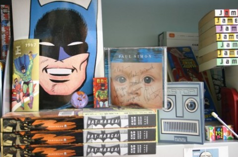
I’ve always been a ‘nester’, I think most designers are. The difference now between my office and my bedroom as a child is the dearth of KISS posters (I mean NOW, not then).
(Frankly I’m surprised the universe didn’t collapse from all that awesomeness contained in a single room)
And on a related note, Mendelsund is one of many designers who work is included in AIGA’s recently announced 50 Books / 50 Covers list (although several covers appear to be attributed to their art directors rather than the designers themselves, no?).
Chance often plays a big part in fiction, but it is generally not chance as this is mathematically understood, which tends to be counter-intuitive. A while back I discovered Edward Tufte’s brilliant books on information design, The Visual Presentation of Quantitative Information, Envisioning Information, and so on. I read Gerd Gigerenzer’s Reckoning with Risk, about why we have trouble calculating probabilities using percentages, even when it’s a matter of life and death (a doctor working out the likelihood that someone is genuinely HIV-positive, based on a positive test result); I read Peter Bernstein’s Against the Gods on the history of risk; I read Michael Lewis’s Moneyball, on the way sabermetrics had transformed professional baseball. It seemed to me that one could use Tufte’s methods to incorporate this tremendously interesting subject into fiction.
The legendary George Lois talks about his covers for Esquire with Gym ClassMagazine. There’s no shortage ego, but I love this anecdote about playing a soft ball game against The New Yorker:
So I go over there with my glove and my sneakers, and I could not believe it. I looked at the team. The third baseman was Gay Talese. The second baseman was Gore Vidal. It was not a team of athletes. I said: ‘Oh my god, they’re all literary geeks.’ He said: ‘No, no, we’re going to have fun.’
Now I’m serious about playing softball or basketball. I don’t screw around, I play with great ballplayers, I’m a good athlete. I said: ‘Harold, this side is terrible.’ He said: ‘No no!’
We went over and played THE NEW YORKER, and I think we lost 18–3, and the only reason we got three runs is because I hit three homers. I don’t remember being there for any other reason.
Peirene Press is small independent publisher in the UK specializing in previously untranslated contemporary European novellas. Their most recent series of books, designed by Sacha Davison Lunt, has been short-listed for the 2011 British Book Design and Production Awards in the Brand/Series Identity category.
Txt — Thomas Jones looks back at the work of author William Gibson at The Guardian:
The most striking feature of cyberspace in Neuromancer, however, the most radical way in which it differs from the modern internet, is its textlessness. Case is, or may as well be, illiterate: his skills as a cyberspace “cowboy” don’t depend on being able to read. He wouldn’t get very far as a hacker these days. The internet, as we now know it, even in the era of YouTube and podcasts, is still heavily text-based and text-dependent. Tweeting not only looks about as low-tech as you can get, it’s also all about language.
When you draw, you don’t have any limits; it kind of transforms our brain. Also, we had not [gone to] any cinema school, so we don’t have these techniques. Like when we started the project they were telling us things like, “Voice-over? Nobody does that any more” and “Cross-dissolve is out.” This notion of “out” and “in,” it depends on what you are saying. You don’t have one way of doing things.
Gotham is almost a nightmare generator, filled with villains that seem to represent an extension of Batman’s greatest fears. A lot of his greatest villains feel like mirrors: the Joker is who Batman would be if he broke his rule and fell into madness; Two Face is a mockery of the duality of his life. But what I love about Bruce in particular, and the reason I’m so excited to be doing Batman, is he’s a superhero that has no powers. He takes it upon himself to go out every night, punish himself, and be the best out there. To me, that is both incredibly heroic and exciting, but also really pathological and obsessive.
Related: Scott Snyder interviewed about the same (but at greater nerdiness) at The Huffington Post.
And finally…
Here’s a short documentary about the making of the Vitsœ shelving system, originally designed by Dieter Rams in 1960 and still going strong:
This is the second time I have tried to write a review of Just My Type. It is a frustrating book—warm and friendly on the surface but obnoxious underneath. The first time, I methodically tore it to pieces in my blue-pencil style, pointing out its deficiencies in niggling detail. When I was done, I felt satisfied but also uncomfortable. Did Simon Garfield really deserve such a bashing? After all, the book is full of fascinating stories and odd trivia about type, and the author has a charming, breezy style that makes each bit of typographic arcana easy to swallow. Is it really that bad? Yes, it is.
Ouch.
“I just call them books” — Robert Birnbaum interviews author John Banville for The Morning News:
I don’t like this ghettoization of books. When I started publishing fiction it is was good, not so good, bad, you know. Now there is a ghetto for crime fiction. I would like to have books listed alphabetically—no distinction.
There’s been an explosion of writers employing strategies of copying and appropriation over the past few years, with the computer encouraging writers to mimic its workings. When cutting and pasting are integral to the writing process, it would be mad to imagine that writers wouldn’t exploit these functions in extreme ways that weren’t intended by their creators… The previous forms of borrowing in literature, collage, and pastiche—taking a word from here, a sentence from there—were developed based on the amount of labor involved. Having to manually retype or hand-copy an entire book on a typewriter is one thing; cutting and pasting an entire book with three keystrokes—select all / copy / paste—is another.
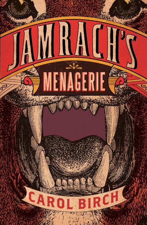
Creative Review takes a look at the cover designs for the books shortlisted for the Booker Prize, including this beauty by the mighty Jon Gray for Jamrach’s Menagerie by Carol Birch.
Let’s Get Critical — Long-form cultural criticism, essays and reviews, curated by architecture and design critic Alexandra Lange.
“I thought that lots of these middle-aged men had bought suits 10 or 15 years ago and stuck with them,” she says. “I would look at a character and try to work out where they had bought their suit.”
She decided that everything in the film could have been bought from shops within half a mile of Piccadilly in London: “Things from Savile Row, Jermyn Street, Fortnum & Mason, Burlington Arcade – one of those upper-middle-class shops that are never fashionable but always do a certain kind of clothing.”
Whereas art history in Germany was a creditable discipline of long standing, in England it was a new subject – class-ridden, based on connoisseurship and, he thought, “at its worst, an activity a bit like stamp collecting”. It was this fustian world that Pevsner and other émigrés such as Ernst Gombrich, Rudolf Wittkower and Edgar Wind were to transform.
Pevsner had a hard time fitting in, not least because he was a modernist, something the British found temperamentally uncongenial. For Pevsner, though, it represented an antidote to art for art’s sake and he saw it as an appropriate expression of the spirit of the age. Art, he believed, should be functional and of service, and architecture was the most important of the arts because it was the most closely connected with human life.
London has always had the reputation of being a city of contrast, where pathos and pantomime meet. That is true in the work of Charles Dickens and Charlie Chaplin, for example. And it is certainly true in the work of [William] Blake. So you can see patterns of the London imagination at work. It is a world of theatre. The grand theatre of the human spirit which London most readily represents, and there is scenic detail and movement and passion and the action of crowds. It is quite different from other cities.