
Mike Dempsey interviews renowned British designer Michael Wolff, co-founder of the Wolff Olins Agency, for the RSA’s RDinsights series:
RSA Insights: Michael Wolff Interview mp3
Comments closedBooks, Design and Culture
Mike Dempsey interviews renowned British designer Michael Wolff, co-founder of the Wolff Olins Agency, for the RSA’s RDinsights series:
RSA Insights: Michael Wolff Interview mp3
Comments closed
It’s been a stupidly busy December, but before I take a break from the blog for a couple of weeks, I want to thank everyone for supporting The Casual Optimist this year — it means a lot. Really.
Happy Holidays.
The amazing book cover above is from Maraid Design’s incredible, incredible Flickr photostream. Go take a look.
Comments closedAfter posting my long overdue picks for 2010 last week, here are my selections for my favourite book covers of 2011.
I’m currently reading Where The Stress Falls a collection of writing by Susan Sontag published in 2001. In an essay about art she quotes Paul Valéry on the painter Corot. “One must always apologize for talking about painting” he says. I know just what he means. I feel the same way about book design. Perhaps even more than a painting, what you see is what you get with a book jacket. If you have to explain why it works, it probably doesn’t. Or you’re talking to the wrong crowd. But there’s something else too. I also feel like I need to apologize for not knowing more; for producing reductive lists like this one; for being, well, so presumptuous…
The 2011 list has changed a few times in the last few days and would likely be different again if you asked me tomorrow — not for lack of quality you understand, but simply because narrowing the list down to a manageable number and deciding which should be in the final ‘top 10’ was just plain hard. This isn’t a definitive survey of book covers in 2011 by any means (sorry!) it’s simply a list of the book jackets that caught my eye this year — designs I thought that were beautiful, a bit different, audacious, a bit out of the ordinary, a bit worthwhile… I’m grateful to all the designers who created these covers, who gave me suggestions and helped me source the images. Once again, I’ve been struck by their generosity. Nevertheless I have surely I’ve missed some great covers. Tell me what they are in the comments.
10 Comments
An interview with designer Suzanne Dean, creative director at Random House UK, in The Daily Telegraph:
For this year’s Man Booker winner, Dean tried out, in her own estimation, about 20 different jackets. Working with the book’s themes of time and memory, she ordered vintage watches from eBay, and even smashed them up in her garden. She tried period photographs of schoolboys, and an image of a couple. Each version tilted one’s reading of the novel quite distinctly. Julian Barnes took about seven covers home and thought about them. Just as he was about to settle on one that featured old rulers and a watch, Dean had second thoughts. “I asked him to give me two more weeks.”
See also: ‘A year of beautiful books’ in The Guardian, and ‘How designers are helping to keep the old format alive’ in The Independent.
Virtual Comics Emporium — Michel Faber reviews 1001 Comics You Must Read Before You Die by Paul Gravett:
I know what you’re thinking, those of you who’d like to get to grips with this medium but are dutifully consuming Julian Barnes’ Booker-winning chef-d’oeuvre instead. How can you be seen reading a tome with Judge Dredd on the cover and Hellboy punching demons inside? Well, look at it this way: studying 1001 Comics You Must Read Before You Die is like visiting the world’s most fabulously well-stocked comics shop. This virtual emporium may be far superior to Forbidden Planet, but it can’t afford to ignore its regular customers. If superheroes, homicidal maniacs and feisty animals are not your thing, you’ll just have to tolerate them as you discover a wealth of other delights. Eventually, the realisation may even sneak up on you that a good superhero comic is better than a bad literary novel.
And the on subject of comics…. Neal Adams on Batman cartoonist Jerry Robinson, co-creator of Robin and The Joker, who died aged 89 on Wednesday, in The LA Times:
Neal Adams, the comic book artist who became a fan-favorite in the 1960s and a champion for creator rights, said that young Robinson brought an energy and intuitive understanding of his audience to the Batman comics. Nothing showed that more, Adams said, than the addition of Robin, the plucky daredevil sidekick who provided an entry point for every kid who spent their nickels on Detective Comics, or characters such as Two-Face, which showed Robinson’s affection for Chester Gould’s Dick Tracy… “As I grew up and fell into this stuff, I realized that everything I liked about Batman ending up being the stuff that Jerry Robinson created. ‘Who is this guy? He did all that? Yes he did all that.’”
And finally…
The Individual Soul — Adam Kirsch reviews Life and Fate by Vasily Grossman for The New Republic:
Comments closed[Grossman] was a former engineer turned writer who became famous as a journalist covering World War II for the Red Star newspaper; his dispatches were immensely popular and made him one of the Soviet Union’s leading writers. That’s why it came as such a shock to the authorities when, in 1960, he submitted the manuscript of Life and Fate for publication. It is, on the one hand, a paean to Soviet heroism in World War II, especially at the crucial battle of Stalingrad, which forms the backdrop to the novel. Yet at the same time, it is a brilliantly honest account of the horrors of Stalinism, and its running theme is that Communism and Nazism were two sides of the same coin.
This is doing the rounds today, but it’s simply too good not to post…
Ice Cube, who apparently studied architectural drafting before joining NWA, on the architecture of Los Angeles and the design of Charles and Ray Eames:
The New York Times has an interview with Ice Cube about the video:
I had learned about them when I was studying architectural drafting. Back then, I didn’t know I was going to make money. So being that they put together a house in two days and used discarded materials — something about their style caught on.
As I got older, I could equate it to sampling. I see that’s what we were doing, taking discarded records from the ’60s and ’70s and revamping them.
Awesome.
Comments closedAt the end of last year, Joseph Sullivan, curator of the late lamented The Book Design Review, asked me to write about my favourite covers of 2010. I’d always stayed away from such posts in the past because it was Joseph’s thing (his 2009 list is here). But since it was Joe who was doing the asking and The BDR was on “indefinite hiatus,” how could I not?
For various reasons, the list I compiled didn’t get used in the end, and it has sat in my drafts folder for about year now. I now have a list of my favourite covers of 2011, but before I post it I thought I would share that original list from 2010, if only for a bit of context.
I’ve made a few minor alterations to the list I sent to Joe — mostly to better accommodate the series designs and to fully utilise 12 months of regret and hindsight — but it is more or less intact, in spirit at least.
I’ve included the short introduction I wrote for the original piece to explain my process (or lack thereof…).
(Hindsight = 20/20: Apparently I like negative space. A LOT).
The Top 10 Book Covers of 2010
Selecting an annual top 10 of anything — film, music, books — is fraught with difficulty. Not only do you have to sift through all things you have seen, heard, and read over the course of a year (assuming you can remember them all), you must somehow take into account all the things you meant to get to and didn’t (where does one even start?). Worse, you are haunted by the awful, inevitable realization that there were any number of incredible things so outside your usual cultural range that they didn’t even register on your consciousness — the “unknown unknowns,” to borrow Donald Rumsfeld’s immortal phrase. Fate usually decides that you will discover at least one previously unknown work of brilliance exactly 24-hours after you publicly declare your favourites…
Then, having grappled with (ignored) all those thorny issues (and plunged on regardless), there is further problem of what actually constitutes good (let alone “great”) book cover design. Part science, part art (part pleasing interested parties), good book cover design is slippery and alchemical. How does one judge? Using what criteria? Ask 10 designers and you will surely get 10 differently nuanced answers.
I have not read all the books on this list, so I cannot claim authority on appropriateness of every cover to its subject (surely an significant consideration, and yet who would want to limit their list only to the books they had read?), so my criteria, such as they were, included the quality of the overall design — the composition, image selection and typography — as well as originality, swagger and the indefinable je ne sais quoi essential in my opinion to really great covers.
And with that complete abdication from any claim to comprehensiveness or authority, I introduce my picks for the top 10 book covers of the last year with apologies to all the designers — particularly outside of North America and the UK — whose amazing work I have missed, forgotten, or otherwise neglected.
The covers are presented in alphabetically by title.
3 CommentsIn this fascinating interview, Gestalten.tv talks to Ken Barber, lead letterer at the amazing House Industries, about lettering, typography, and font design:
1 Comment
And The Moral Is Don’t Fuck William Faulkner… A really great post by Glen David Gold, author of Sunnyside and Carter Beats the Devil, at the LA Review Books:
The world after publication is — beyond its many joys — an evaporating and ruinous goldfish bowl of thwarted ambition. If you write long enough, you will know editors and agents. You will have dinner with people who give interesting fellowships to weeklong retreats in the south of France. You will teach at good programs and you might know when a publisher’s child is having a birthday and what his favorite Transformer is, and these facts more than the quality of your humanity might be what makes you a chess piece when another writer slaps you on the back and asks you if you might read something he wrote.
Very Long, Very Tricky, Very Strange — Adam Gopnik in The New Yorker on the appeal of Tolkien and fantasy novels:
Of all the unexpected things in contemporary literature, this is among the oddest: that kids have an inordinate appetite for very long, very tricky, very strange books about places that don’t exist, fights that never happened, all set against the sort of medieval background that Mark Twain thought he had discredited with “A Connecticut Yankee in King Arthur’s Court.”
Against Bigness — Mark Edmundson on the movies of Robert Altman and Woody Allen at The American Scholar:
Altman was against bigness. He always wanted to turn the carpet over. He wanted you to see the signs of strain and stress that went into the making of what looked like a serene, well-balanced thing. But he didn’t want to debunk the whole construction; he simply wanted to marvel at the quirky congestion of threads. It was probably tough for the players who acted prominently in his movies to redeem their Hollywood standing. He turned stars into hand-held sparklers. He waved them around. But he did it without resentment, without meanness: he simply liked them better that way.
Meanwhile in the comics corner…
Alan Moore talks to Fast Company about a Kickstarter project to build a memorial to the late Harvey Pekar in Cleveland Heights public library, and to The Guardian about the Occupy Movement wearing V for Vendetta masks at protests.
And at The Daily Telegraph, Kasia Boddy reviews MetaMaus by Art Spiegelman:
The effect of this great assemblage is complicated. On the one hand, it consolidates Maus’s status as a canonical work, about which we need to know everything, and emphasises its claim to historical testimony (Spiegelman complained to The New York Times when Maus was included on the fiction bestseller list.) On the other hand, however, the almost overwhelming presence of all this stuff emphasises that history is far from a straightforward retrieval of “facts”, but rather involves a complex process of accumulation, sifting and construction.
And finally…
Martin Filler reviews the documentary Eames: The Architect and the Painter for NYRB:
Comments closedThe last time I saw Ray Eames, a few months before her death, I mentioned the high prices that the couple’s original furniture was fetching in New York galleries. “Oh, no,” she cried, and held her hands to her ears in genuine dismay. “We wanted our things be available to everyone, not just rich people.” Yet although the Eameses’ molded plywood LCW chair of 1946 at first retailed for $20.95, their rosewood-and-leather lounge and ottoman of 1956 cost a not-inconsiderable $578 when first introduced, and now, still in production by Herman Miller, sells for $4,499. This luxurious seating became a familiar component of upscale psychiatrists’ consultation rooms, as much an emblem of mid-century professional attainment as pairs of Ludwig Mies van der Rohe’e chrome-and-leather Barcelona chairs were in the reception areas of Fortune 500 companies.

Knopf designer Peter Mendelsund has just posted the second of his meditations on designing book covers for fiction:
When setting out to design a book jacket for a work of fiction, whether we are aware of it or not, we designers are picking our subject matter from a limited set of bins. Though the choices we can make as designers are unlimited, the categories that define most of the choices we make when we pluck these ideas from their native fictions, are, on the face of it, quite easy to list.
Well worth reading all the way through, including the extensive footnotes.
Comments closedIn this 10-minute film by Johnny Daukes for Microsoft UK, typographer Erik Spiekermann talks type with Elliot Jay Stocks, founder of 8 Faces magazine:
(via I Love Typography)
Comments closedBook Sniffing — Six writers on their book collecting habits, including Gary Shteyngart:
I’m big on sniffing books. The old Soviet ones really have this strong smell, reminding me, for some reason, of tomato soup in a cheap Soviet cafeteria.
Fear of a Blank Canvas — Book designer Chip Kidd interviewed at Azure Magazine:
If I’m designing a book for myself, that’s a very different thing than if I’m designing a book for Murakami – he’s ultimately the boss. For 1Q84, what I’m really trying to do, as pretentious as it sounds, is to create a work of art that services a greater work of art. It’s him. It’s not about me. But at the same time, I want to make something great for him. If I’m designing something for myself, it can be liberating and potentially stifling at the same time. It’s the literary equivalent of being given a blank canvas. And I’m not a great blank canvas kind of guy. I want the canvas filled in, in terms of content, by Murakami, and then I can make it look like something.
See also: Book designers Lauren Duffy, Kimberly Glyder, Henry Sene Yee and David Drummond on the ins-outs of book design at The Book Deal.
The Incommunicability of Difference — David Bellos discusses translation and his new book Is That A Fish In Your Ear? on Talk of the Nation:
For translation to exist, you have to accept the fact that languages are all different and they don’t describe the world in quite the same way. You also have to accept that languages are all the same in that anything you can say in one language can be said in any other. And it seems to me [that the] tension between the incommunicability of difference and … the sharing of a common set of messages and meanings is … human. I mean, we all live in that state, that I am not like you. My experience is not directly commensurable with yours, and yet, for us to get on and to be human and to be in a society, we have to also make the assumption that in another dimension, we’re all the same. We have the same needs, the same fears, the same desires.”
And finally…
James Parker on George Smiley, John le Carré’s literary spy, and why he is the antithesis of James Bond at The Atlantic:
Comments closedBureaucratically dowdy, rarely spotted in the field, a dull fucker by both instinct and training, Smiley drops no one-liners, romances no tarot-card readers, roars no speedboats through the Bayou… When John le Carré dies, there will be no pseudo–le Carrés, rotating the clichés of Smileydom through their potboilers. Not only is le Carré more or less inimitable—less imitable, certainly, than Ian Fleming, whose style was essentially that of a school bully with a typewriter—but Smiley himself is too elusive a creature to be captured by any pen other than that of his creator.
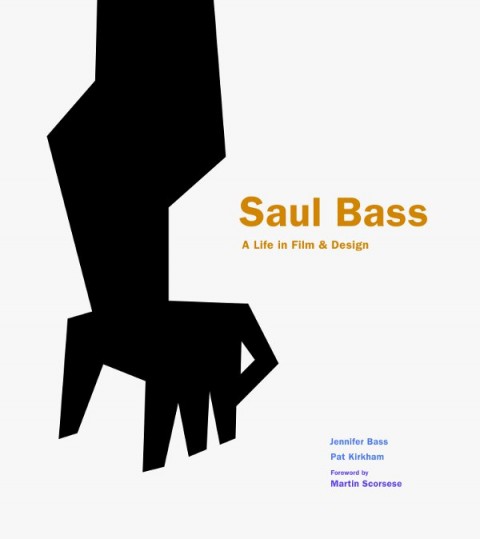
I’ve been waiting for a book about Saul Bass since I was bookseller. Now Saul Bass: A Life In Film & Design is finally in bookstores, Ian Albinson of the brilliant Art of the Title has put together a brief visual history of some of Bass’s most celebrated work:
(For the record: Saul Bass: A Life in Film & Design is published by Laurence King and distributed in Canada by my employer Raincoast Books)
Comments closed