Skip to content

Tag: design

Midweek Miscellany

Elegant Simplicity — A nice profile of book designer David Pearson at Spitalfields Life:

On the basis of “Penguin By Design,” David was given the job to design the covers for Penguin Great Ideas, an experimental series of low-budget books with two-colour covers. “I’m not an illustrator and I can’t take photographs, so I decided to do all the covers with type,” explained David, almost apologetically. Yet David’s famous landmark designs for these books, derived from his knowledge of the history of Penguin covers, were a model of elegant simplicity that stood out in bookshops and sold over three million copies. “I saw people picking them up and they didn’t want to put them down!” he confided to me, rolling his eyes in delight, “They were a phenomenon.” Then he placed a hand affectionately upon a stack of copies of this series for which he has now designed one hundred covers.

My interview with David is here.

Books MatteredDavid L. Ulin on the late Barney Rosset for The LA Times:

For Rosset, the mission was simple: Books mattered, they could be dangerous, they could change your life. Writers were heroes, “cosmonauts of inner space,” to borrow a phrase from “Cain’s Book” author Alexander Trocchi, their function less to reassure than to destabilize, to challenge the assumptions by which society was made.

This could happen in all sorts of ways — Beckett’s unflinching absurdism (“Ever tried. Ever failed. No matter. Try Again. Fail again. Fail better”), Burroughs’ scabrous cynicism (“A functioning police state needs no police”), Miller’s sense of living at the end of history, when all the so-called verities had collapsed beneath their own sanctimonious lies.

See also: Barney Rosset obituary in The Guardian.

Sprawling Tentacles — Alexandra Manglis reviews Alan Moore: Storyteller by Gary Spencer Millidge for the Oxonian:

The work and the man have morphed together resulting in a giant Moore myth that fans and comic creators alike have difficulty surmounting, its tentacles sprawled out far beyond his small Northamptonshire home. The infamous Guy Fawkes mask, for one, created in Moore’s anarchist comic V for Vendetta, has been worn by protesters from Tahrir Square to Occupy Wall Street, and Moore is indubitably proud of the anarchist symbol’s use in real civil unrest. Yet the symbol’s popularisation is largely due to the comic’s adaptation into a Hollywood blockbuster, from which Moore removed his name and refused to take royalties. Moore’s stories have become bigger than the man himself; the images he has authored have grown beyond him and often, as in the case of V for Vendetta, in spite of him.

See also: Paul Gravett’s review for The IndependentThe Guardian celebrates 35 years of British comic 2000AD

And finally…

Geoff Dyer, author of Zona, interviewed at Bookforum:

Failure is quite interesting, and it’s something I have a certain amount of experience with. I wasn’t a failure in the way lots of people are failures—I could always get published, that was pretty straightforward. Literary failure is funny because it’s not like you get this massive slap in the face and become a figure of ridicule. It’s more that you do this thing, you write this book, and then this big thing is poised to happen on publication. And nothing happens. It’s just a weird non-event. The literary Richter scale doesn’t register any kind of tremor. That was happening to me for a very long while, and then I managed to persuade myself that these serial failures were perhaps a kind of liberation in that it meant I was free from any kind of pressure from publishers. The stakes were so low that it didn’t really make any kind of difference to anybody that I went from writing a novel to writing a book about the First World War. So I’ve certainly known what it’s like for a book to simply, well, disappear.

Comments closed

TED Talks: Neil MacGregor

Neil MacGregor, Director of the British Museum and author of A History of the World in 100 Objects, traces 2600 years of Middle Eastern history through a single object:

Comments closed

Midweek Miscellany

Publisher, film distributor and rebel Barney Rosset has died aged 89. The Associated Press obituary is here:

As publisher of Grove Press, Rosset was a First Amendment crusader who helped overthrow 20th century censorship laws in the United States and profoundly expanded the American reading experience. Rosset had an FBI file that lasted for decades and he would seek out fellow rebels for much of his life.

Between Grove and the magazine Evergreen Review, which lasted from 1957 to 1973, Rosset published Samuel Beckett, Malcolm X, Che Guevara, Jean-Paul Sartre, Allen Ginsberg, Henry Miller, D.H. Lawrence and William Burroughs. He was equally daring as a film distributor, his credits including the groundbreaking erotic film “I Am Curious (Yellow),” and art-house releases by Jean-Luc Godard, Marguerite Duras and others.

Music and American History — Simon Reymolds profiles author and music critic Greil Marcus for The Guardian:

For Marcus, listening rapt at the cusp of the 60s and 70s, rock was growing up in the richest and most unexpected way. What’s more, his two great passions, music and American history, had converged. “Their music sounded like a new way to understand who you were, the fact that you weren’t just a product of your own willfulness but also a product of the past,” he says of the Band, the subject of Mystery Train‘s most compelling section (although the chapters on Sly Stone and Elvis Presley aren’t far behind). “There was this sense that they were opening a door to your own country and your own history.”

A Bunch of People in a Room — An interview with Chip Kidd at Smashing Magazine:

I very much try to downplay the jacket as a sales tool, because I think that publishers invest too much intellectually in this concept, and they can actually make my work much, much harder than it needs to be. And certainly with the advent of buying books on the Web, you’re not going to buy a book from Amazon because of the way it looks. It’s just not the nature of how that works. The problem arises when you get a bunch of people in a room looking at a jacket and determining the fate of the design based on preconceptions of how the book will sell, about how this design will help the book to sell.

And finally…

Flawed Monster Heroes — Legendary comic book artist Neal Adams on Marvel superhero Spider-Man:

A weakling kid is bitten by a radioactive spider and decides to become…a circus performer? Yes, that’s right, Peter Parker is more interested in using his “gift” to find a paycheck, not a damsel in distress. Until, with all his power, his weaknesses cause him to fail to save his Uncle Ben. Soft monsters as superheroes. Not sparkly-toothed-born heroes…but flawed monster heroes. Then came the incredible Steve Ditko… Marvel had found a… creator who got it, who totally understood the concept: Flawed monster heroes. It was a new idea, born out of a touch of coincidence, a touch of history, a massive amount of brilliance

Comments closed

Something for the Weekend

James Victore shares his workspace with From The Desk Of.

Burn Unit — At the New York Times ‘Bits’ blog, David Streitfeld writes on Amazon’s recent image problems:

[Take] the cover of Bloomberg Businessweek two weeks ago. It shows a book in flames with the headline, “Amazon wants to burn the book business.” What was remarkable was not just the overt Nazi iconography but the fact that it did not cause any particular uproar. In the struggle over the future of intellectual commerce in the United States, apparently even evocations of Joseph Goebbels and the Brown Shirts are considered fair game.

Witheringly Obscure — Wired Magazine talks to William Gibson about Distrust That Particular Flavor and collecting antique watches:

[It] was really about pursuing a totally unnecessary and gratuitous body of really, really esoteric knowledge. It wasn’t about accumulating a bunch of objects. It was about getting into something utterly, witheringly obscure, but getting into it at the level of, like, an extreme sport. I met some extraordinarily weird people. I met guys who could say, “Well, I’ve got this really rare watch, and it’s missing this little piece. Where might I find one?” Then the guy would kind of stare into space for a while, and then he’d say this address in Cairo, and he’d say, “It’s in the back room. The guy’s name is Alif, and he won’t sell, but he would trade it to you if you had this or this.” And it wasn’t bullshit. It was kind of like a magical universe. It was very interesting. But once I’d gotten that far … I got to a certain point, and there was just nowhere else to go with it. The journey was complete.

Magic Journalism — Writer Geoff Dyer chooses five unusual histories for The Browser:

[T]ypically, I guess, you read history books for the content – that sounds an unbelievably stupid comment – and you’re drawn to certain works of history rather than others because you’re interested in the period. You read Stalingrad by Antony Beevor because you’re interested in the Second World War, or Russia or whatever. Whereas it seemed to me that the thing about these books was that you might be interested in the subject, but it’s the way that the subject is dealt with that is the distinguishing feature of each one.

And finally…

A long article for Intelligent Life  on ceramicist Edmund de Waal and the double-edged success of his memoir The Hare with Amber Eyes:

In the 18 months since the book came out, de Waal has completed six overseas book tours, given dozens of talks, answered hundreds if not thousands of questions. He has also kept his porcelain-making studio busy and has plans for a subsequent book, about the history of porcelain around the world, which will take him from 18th-century Plymouth to the hillsides outside Jingdezhen where porcelain was first made in China, via Dresden, Marco Polo’s Venice, Istanbul and Yemen. “Porcelain”, he says, “is light when most things are heavy. It rings clear when you tap it. You can see the sunlight shine through. It is in the category of materials that turn objects into something else. It is alchemy. Porcelain starts elsewhere, takes you elsewhere. Who could not be obsessed?”

Comments closed

Midweek Miscellany

Beautiful children’s book and magazine covers from Korea in the 1950’s and 1960’s at the amazing 50 Watts.

Not a Pretty Scene — Tess Thackara on design and the future of printed books at Guernica magazine:

Amy Martin’s illustrations for Symphony City [published by McSweeney’s McMullens imprint 2011] create a layered multidimensional and richly textural world, which often appears like original paper collages. In some places the visual environment of an urban landscape full of music she creates is so absorbing that I wondered what an e-book or iPad app could offer that print couldn’t… McSweeney’s art director and editor Brian McMullen, who developed and gave his name to the imprint, offered a more practical reason for keeping to printed matter for kids: “Those of us who are parents aren’t convinced that kids need to be encouraged to spend more time than they already do in front of screens… Have you ever tried to tell a three-year-old it’s time to stop looking at one of these devices and hand it back to Daddy? It’s not a pretty scene. These devices are just not compatible with bedtime, in my experience, whereas a printed picture book, for whatever reason, is.”

See also: Designers on Book Covers of the Future at Publishing Perspectives.

Publishing’s Ecosystem on the Brink — An interesting summary by the Author’s Guild of recent articles in Bloomberg Business Week, The New York Times and Harpers about the perilous state of the  book industry.

And finally…

Attention Deficit — Lars Mensel interviews Nicholas Carr, author of The Shallows, for The European:

There’s no question that the internet offers all sorts of benefits – that is the reason why we use it so much. It is an incredibly powerful and useful technology that makes all sorts of information immediately available to us. Things that used to be impossible, hard or expensive to find are now right there. And we all know how to improve our ability to make decisions with it. But accompanying that, incredibly, is the fact that we become so intent on gathering information that we never slow down and think deeply about the information we find. We gain the ability to harvest huge amounts of data but we lose the ability to engage in contemplation, reflexion and other modes of thinking that require a large amount of attentiveness and the ability to filter out distractions and disruptions.


Comments closed

Truman Capote Designs by Megan Wilson

Megan Wilson has designed a striking new set of covers for the Vintage paperback editions of Truman Capote with some lovely bold type and photographs by Leombruno-Bodi, William Eggleston, Richard Rutledge and Olivia Parker.


Photo credits:
Music for Chameleons / Leombruno-Bodi
In Cold Blood / William Eggleston
Answered Prayers / Richard Richard Rutledge
Other Voices, Other Rooms / Olivia Parker

2 Comments

Paris Versus New York

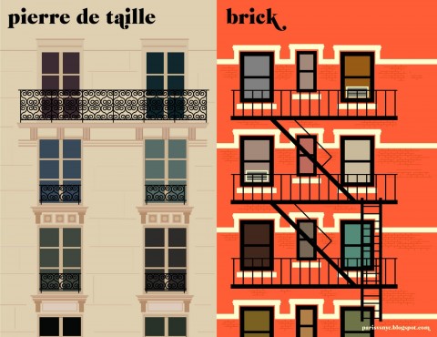
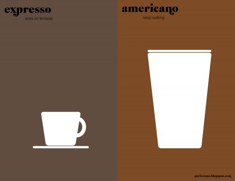
Vahram Muratyan’s playful illustrations comparing Paris and New York are now available in a beautiful new pocket-sized hardcover from Penguin.

Prints are available to buy from the Paris versus New York blog.

Comments closed

Animated Futura Specimen

A lovely animated short featuring Paul Renner’s geometrically elegant sans-serif typeface Futura:

(via Nice Type)

1 Comment

Hand und Werk

Some lovely letterpress action to ease you through your day:

(via Coudal)

1 Comment

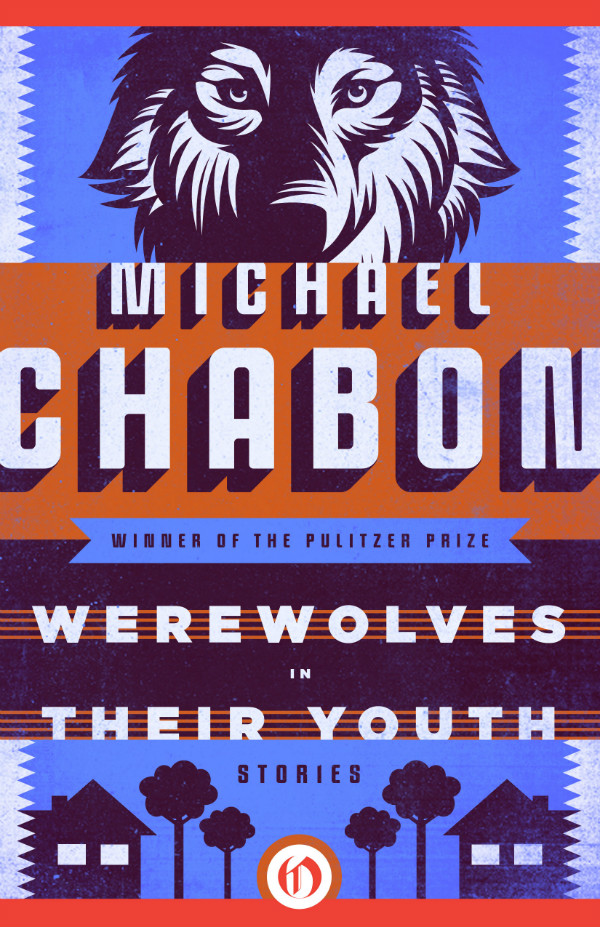
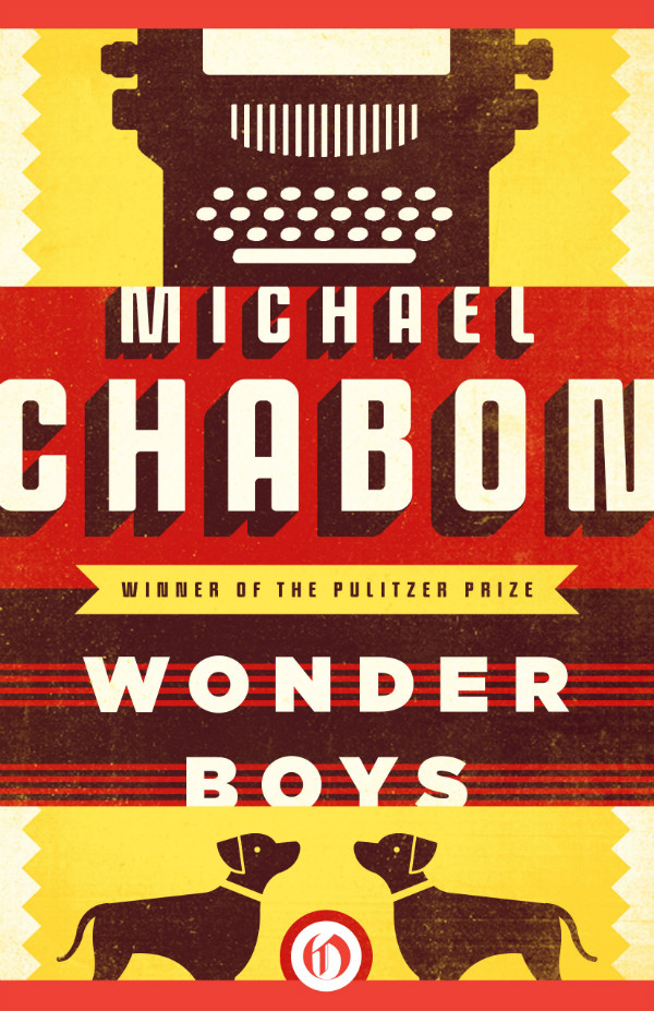
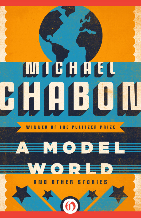
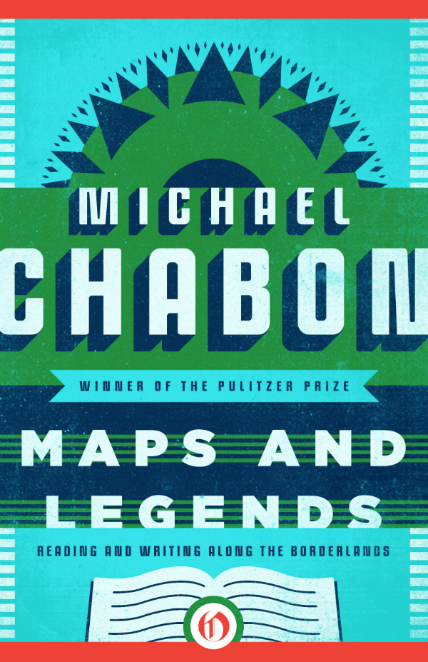
Chabon by Connie Gabbert

These stunning Michael Chabon covers are the work of Oregon-based designer Connie Gabbert. Although evocative in some way of faded ink, old-time letterpress, silkscreened posters and linocuts illustrations, interestingly these designs will never see actually see print themselves.

Connie knew from the start that they would be e-books and would not go to press, but apparently the design process was not that different, at least not to begin with. “It’s when the covers are approved that the process feels different,” she says. “There is no spine to build, no back cover copy, no print files to prepare. It is a bit sad to know that I won’t see the finals printed, but it’s also interesting to be a part of the e-book industry and to see the packaging exist only online.”

According to Connie, the challenge was actually making the approved cover direction work for the other four titles in the series. “The first approved cover was for Wonder Boys, and from there, I had to come up with new color palettes and new imagery for the rest of the series,” she says. “The goal was to make them look unified but individually unique. I really liked how Richard Bravery achieved this with his Chabon series, keeping the type in a fixed location, while the imagery changed from cover to cover… [T]he first stab at these covers was hand-lettered. While I love working illustrated type into cover designs, the final type feels very fitting for Chabon and the covers that he already has. I’m not often asked to create masculine covers, so it was a fun change of pace.”

You can read more about Connie’s type choices for these covers at Fonts in Use, and see more of her work on her website and design:related.

Comments closed

Something for the Weekend

Fabulous Fury — Evie Nagy reviews Tarpé Mills & Miss Fury: Sensational Sundays 1944–1949 for The LA Review of Books:

Though Mills ostensibly hid her gender and wrote a high-adventure comic rife with guy stuff like smuggling, espionage, mad science, and gruesome murders, Miss Fury has much in it that seems designed to appeal to women as well. For one thing, the outfits are fabulous. As Robbins suggests, Mills clearly took great pleasure in dressing Marla, scheming villainess Erica Von Kampf, and other characters in elaborate gowns, lingerie, and smart but finely detailed sportswear. Modern superhero comics tend to focus on the intricacies of high-tech costumes at the expense of civilian clothes; Miss Fury, by contrast, is midcentury clothes porn.

Fucking Great — British film director Beeban Kidron remembers Magnum photographer Eve Arnold who died recently aged 99:

She was an early adopter of colour – favouring a thick negative with rich hues and simple compositions – and she ruthlessly edited her own work with a wicked sense of humour. “It’s not that we’re so great, it’s that the others are so fucking mediocre.”

See also:

A slide show of Eve Arnold’s work at The Guardian.

Eve Arnold remembered in The Guardian, The Telegraph, The Financial Times, The New York Times and The Economist.

The best Typefaces of 2011 from FontShop and the most popular fonts of the year from MyFonts.

Forward! — Stephen Page, chief executive of Faber & Faber, writing for The Guardian on the way ahead in publishing:

[T]he men and women engaged in publishing need to be bold and exuberant. This is an extraordinary age for writing and reading, and it seems to me that this endeavour will go better if it’s done with a sense of purpose and pleasure, rather than defensively. It won’t turn out well for everyone currently in the business, but so what? If publishing is useful and creates value then it will be of value, whoever is doing it.

And finally…

A lovely profile of  Peter Hardwicke, one of the last traditional signwriters in London’s East End, in Spitalfields Life:

I am an old school signwriter that likes to talk directly to the client to select the fonts and the colours. I’ve found it a rewarding way to work, dealing with independent shopkeepers. I like to look at the built environment and choose fonts that are sympathetic to the architecture and the surrounding cityscape. I look at the other shops and I do research…I think people are bored with computer generated artwork…even my younger clients, they’d rather have it  done professionally than use stick on letters – it shows they’ve got taste.

You can find an earlier profile of Peter here and see an archive of his work on Flickr. (Thx Monique)


Comments closed

PressPausePlay

The full-length documentary PressPausePlay is now available to watch on Vimeo. The film, which somehow manages to be simultaneously both inspiring and melancholic, looks at the effects of digital technology and the Internet on the creative economy. Worth watching if you have a spare hour (although depending on your attitude to these things it might make you smile in joyful validation or retreat to your bed for about a week to weep quietly to yourself:

PressPausePlay was made by creative agency House of Radon.

Comments closed