Skip to content

A stunning new cover for James Joyce’s The Dubliners by German designer Apfel Zet (which reminds me — in a good way — of Tony Meeuwissen’s Woodbine-inspired cover for Billy Liar published by Penguin in the 1970’s).
Consistent Forms of Hostility — With an exhibition opening in May at the Barbican in London, Rowan Moore looks at the enduring influence the Bauhaus school at The Guardian:
Not much united Walter Ulbricht, the Stalinist dictator of East Germany for two decades, and Tom Wolfe, celebrant of the splendours and follies of American capitalist excess. Not much, except a loathing of the Bauhaus and the style of design it inspired. Ulbricht called it “an expression of cosmopolitan building” that was “hostile to the people” and to “the national architectural heritage”. Wolfe called it “an architecture whose tenets prohibit every manifestation of exuberance, power, empire, grandeur or even high spirits and playfulness”.
For Ulbricht it was alien to Germany, for Wolfe it was alien to America. Both agreed that it was placeless, soulless and indifferent to ordinary people’s needs. And if the Bauhaus attracted such consistent forms of hostility, that is due to the power and coherence of the image it presented to the world, of disciplined and monochrome modernist simplicity, usually involving steel and glass.
Translators Jay Rubin and J. Philip Gabriel talk about translating Haruki Murakami into English at the SF Bay Guardian.
And finally…
A Very American Critic — Elaine Showalter on film critic Pauline Kael at the TLS:
Cosmopolitan in her reading, sophisticated about international cinema, and au courant with theories of the auteur, Kael was nonetheless a very American critic. She was forty-seven before she ever travelled to Europe, and from the very beginning, she used her reviews and essays to explore what it meant to write film criticism in the United States, where the movies were always a compromise between art and commerce. “The film critic in the United States”, she wrote in “Movies, the Desperate Art” (1959), “is in a curious position; the greater his interest in the film medium, the more enraged and negative he can sound”. American film critics risked the temptations of selling out to Hollywood, or expressing contempt for mass market films. Kael prided herself on both her knowledge of the film medium and her deep love for the movies, trashy and avant-garde alike. Movies, she wrote in “The Function of a Critic” (1966), “are one of the few arts (along with jazz and popular music) Americans can respond to without cultural anxieties”. She did not intend to condescend to her readers or tell them that their tastes were wrong.
 Jennifer Heuer is a book designer based in Brooklyn. Formerly a designer at HarperCollins and Simon & Schuster, she now runs her own studio out of the Pencil Factory. Jen’s striking inkblot design for 1000 Black Umbrellas by Daniel McGinn, published by Californian small press Write Bloody, was one of my favourite covers of last year. As Jen was in a list with many of the usual suspects — several of whom have already been interviewed here — it only seemed appropriate to feature more her excellent work on The Casual Optimist and interview her as well.
Jen and I corresponded by email earlier this year.
When did you become interested in book design? Where did you start your career?
In college I always thought that I wanted to design either album covers or book covers. I didn’t really know how to get into either field after I graduated, but I was fortunate to have Dave Caplan hire me over at HarperCollins. It was a great place to start and Dave was an awesome boss. I was in the children’s department there, and worked on a wide range of covers as well as interiors. It was boot camp in learning how to package an entire manuscript — all the way down to the binding specs and headbands. It was a great way to start thinking beyond the cover and the spine.
I spent about 4 years there learning the ins and outs of book design with a great team. My next goal was to move over to adult book cover design. Simon and Schuster became my new home where I was able to have a blast creating fiction and nonfiction covers for five super talented art directors.
Why did you decide to go freelance?
It’s funny, I’d always dreamed of taking the freelance plunge, but had planned on staying in-house for a few years more before doing so. Thankfully, my husband, Jed, and I shook up our lives a bit and moved to Portland, Oregon for a year. He was joining the experimental team of WK12 at Wieden+Kennedy and I figured I’d be miserable if I sat around Brooklyn without him. So we packed up, and took a few weeks to drive across the country and try something new. The best and scariest decision I’ve made in a long time.
I set up a studio in town and biked to work most days. I worked on building up clients and challenging myself with new projects and classes in and around the area. I even learned how to letterpress! In the end, I’m so glad I took the freelance jump when I did.

Who are some of the publishers you work with?
Just over a year out on my own I’m so thankful to say I’ve worked with HarperCollins, Random House, Little Brown, Grand Central, Penguin, Thomas Nelson, Simon & Schuster, Scribner, Freepress, Ecco, Columbia University Press, Write Bloody, Harvard Business Review Press, and W.W. Norton & Co.


Could you describe you book cover design process?
Each book is different, so the process can vary. But ideally, this is how I hope I’m working:
Naturally, I read the manuscript if there is one. While I’m reading I keep a running list of keywords, signifiers, and themes in my notebook. From there I create some free-association lists of words, trying to decide on a general direction for the look. Then I head to the Pratt library. As an alumni, I have access to the remarkably eclectic collection. The library is where I tend to sketch out ideas. I made these simple worksheets, basically 6 book shaped rectangles on a sheet of paper to knock around some layouts before using the computer. When I’m back in the studio I set up a moodboard on imgspark.com to organize the artwork I’ve created and keep track of art I’ve collected. That’s kinda the whole shebang. I do a lot of prep work before starting the actual design, although you need to be wary of overthinking a project. Sometimes it’s nice to have almost no time at all and just go with my gut. I recently got to do that with the 30 Books in 30 Days project and the Lolita Project.


What are your favorite books to work on? The most challenging?
Well, this may sound super obvious, but I really don’t care what the subject matter is — from brain eating aliens to a medical history, or a memoir on life abroad, to a beautiful love story — as long as it’s a smart, well-written book that I want to pass along to friends and family. Those are the best books to work on. The ones where you don’t feel like you’re doing work while reading the manuscript. The most rewarding projects present a conceptual design challenge, similar to editorial illustration.
Do you see any current trends in book design?
I feel like I’m hearing more and more about making the book an object of desire — something that will be coveted and gift-worthy. And I love seeing smart special effects on covers these days. While this may be the knee-jerk reaction to e-books, I hope it will be something that holds on long enough to make everyone appreciate the object of the book. There also seems to be more attention paid to detail throughout the entire book — from the cover to the end paper to the title page. It’s a great thing to see these days, and solidifies the purpose of the designer.


Where do you look for inspiration and who are some of your design heroes?
Inspiration honestly comes from everywhere. The important part is to pay attention. I try to to get away from my desk and go to the library, museums, read fashion magazines, the newspaper, listen to the radio, watch documentaries and observe closely. I tend to find that when I’m not consciously searching for a design solution, I’m inspired by things happening around me. These things are often times closely related to the project at hand. Perhaps its all synchronicity, but either way, paying attention to what’s around me seems to work well.
As far as heroes go, it’s the people around me that inspire me the most. Friends I’ve known over the years who keep me on my creative toes are an incredible source of inspiration. Of course there are greats throughout the history of art and design, but I feel like I look up to a different person or group of people depending on what I’m working on.
OK, that’s annoyingly vague. Here are some examples: I just watched Senna, and loved the Formula One graphics and footage from the 80’s; the silk screen posters from Slavs and Tatars in the Print/Out show at MoMA were wonderfully fresh and fun to read; found this amazing book of South African block prints while searching for artwork at the library; was settling into the new studio and read an interesting article about brainstorming and the chance creative interactions that were coming out of MIT’s make-shift Building 20.


Who else do you think is doing interesting work right now?
I mentioned earlier that my husband and I spent some time living in Portland last year, and the WK12 group was a big influence. Not necessarily in how I work visually, but in thinking beyond the assignment. While I love spending hours in bookstores oohing and aahhing over the beautiful covers, I’ve been trying to look elsewhere when it comes to interesting work.
It spans from the gorgeous Alexander McQueen textiles, to the beautifully clever industrial design of Joey Roth (I love these speakers!). I’ve been looking at the photography of Todd Hido, and love the eye of Jason Fulford. But I try to pull inspiration from the world outside of design and art. Shows like The Moth, Radiolab, and TED are obvious ones, but incredible resources. The people who are doing the most interesting work are those promoting solid ideas and telling those stories in brand new ways.

What books have you read recently?
Non-work related reading? I’ve been really into Aravind Adiga’s novels. I randomly picked up Between the Assassinations from the free book shelf when I used to work at S&S a couple of years ago and loved it. Right now I’m in the middle of his latest. I’m also in the middle of Chronic City which is a blast to read. I tend to be in the middle of a lot of books when it’s not work related, and always seem to lose track of what I was last reading.
Work related, I enjoyed reading Alexi Zentner’s Touch—lovely story! And a soon-to-be-released collection of short stories by Lucia Perillo was a truly good read (got to use a photo by Todd Hido!).
Do you have a favorite book?
That’s a tough one… It used to be A Farewell to Arms, but it’s been so long since I’ve read that. I did a piece for a gallery show based on Leaves of Grass and found it to be amazingly relaxing to read. And a recent favorite (before any hint of a movie, which I think I’ll skip) is Extremely Loud and Incredibly Close. I loved the combination of visual narrative and traditional narrative to tell a story.


What does the future hold for book cover design?
Oh, I’m sure it’s adorable puppies on every cover. I think my mom would be happy with that! Who wouldn’t?!
Thanks Jen!
You can read more about Jen’s design process in this interview for Faceout Books.

Another beautiful Truman Capote cover by Megan Wilson (photograph by Louise Rosskam).
Have a great long weekend.

Ways of Designing — Steven Heller chats with British graphic designer Richard Hollis, who designed the original cover for the classic Ways of Seeing by John Berger (among other things), at Imprint:
My generation went from hot-metal to photosetting to digital. Computers have changed everything, bringing total control to the designer. But they haven’t changed the way I design. Perhaps they should have. But the way people read hasn’t changed, the sequence, letter –words–sentences–paragraphs– columns of text. Fifty years ago the printer made the corrections and changes were expensive. Now clients know that changes can be made, and designers pay with their time. The alphabet hasn’t changed, while the range of type designs available is astonishingly increased. Two or three are plenty for me.
Fringe Behaviour — Richard King, author of How Soon is Now?, on the indie record labels that changed the British music industry at The Guardian:
The improvisatory space in which the indies thrived has shrunk for several reasons. One is the ever-prevalent and finely tuned ability for corporate culture to absorb fringe behaviour and repackage it and market it as cutting edge. Another is the formalising of Britain’s creative industries, a process that has seen the development of college degrees in music business, music journalism and, indeed, being in a band, lead to industry standardisation. The independent sector’s greatest attributes – its ability to ad-lib, to trust its instincts and to hang the consequences are both impracticable and unteachable in such rigid frameworks. The sort of behaviour that allowed Wilson, McGee, Watts-Russell and their contemporaries to conceive some of their more extreme and fanciful ideas would also be something of a stretch for a human resources department to manage.
Also in The Guardian, a profile of author of author Peter Carey.
Value the Medium — Mark Thwaite interviews Benjamin Eastham and Jacques Testard, editors of literary journal The White Review, at ReadySteadyBook:
[We] believe in the value of the book as a physical object. Neither do we consider this to be an old-fashioned attitude. Publishing will go down two different routes: there’s no point knocking out a cheap, poorly bound paperback on crap paper any more because you’re as well to read the content on an electronic reader. The book as a medium has to justify itself now, it’s no longer the default option, and this is to its benefit. We’ve witnessed an upsurge in beautifully produced books, with enormous amounts of time and creativity invested in them – check out Visual Editions, for just one example, and the work of artists and independent galleries exploring the possibilities offered by the book form. The design of The White Review is important to us – the quality of the images we reproduce, the balance of the colours, the alignment and legibility of the text. We value the content, so we value the medium in which it is reproduced.
The White Review is beautifully designed by Ray O’Meara in case you were wondering.
And finally…
Robert Lane Greene on the origins of the term “dude” for More Intelligent Life:
Though the term seems distinctly American, it had an interesting birth: one of its first written appearances came in 1883, in the American magazine, which referred to “the social ‘dude’ who affects English dress and the English drawl”. The teenage American republic was already a growing power, with the economy booming and the conquest of the West well under way. But Americans in cities often aped the dress and ways of Europe, especially Britain. Hence dude as a dismissive term: a dandy, someone so insecure in his Americanness that he felt the need to act British. It’s not clear where the word’s origins lay. Perhaps its mouth-feel was enough to make it sound dismissive.

I first came across the London-based (and wonderfully-named) design studio We Made This by way of founder Alistair Hall’s prodigious collections of ephemera and found type on Flickr. The chances are I found these either via Ace Jet 170, a fellow designer and collector (and cyclist) who I interviewed last week, or Alistair’s page on Ffffound. It wasn’t until later than I discovered that We Made This also designed book covers and had actually worked with David Pearson on several covers for Penguin’s Great Ideas series.
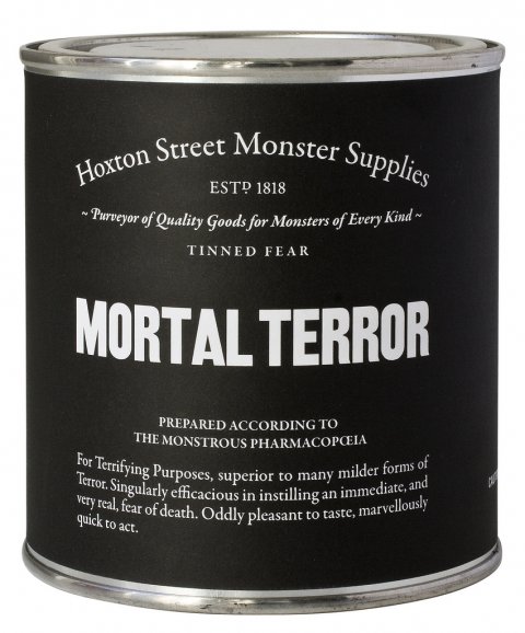
More recently, We Made This has come to the attention of the literary community for the stylish and witty designs for the Ministry of Stories, and its fantastical shop front Hoxton Street Monster Supplies. The bold, flat typographic designs for the Hoxton Street Monster Supplies store are, of course, characteristic of the work produced by We Made This — taking inspiration from the best of British post-war design and Alistair’s love of printed vintage ephemera to produce something sharp, modern and irreverent but also, somehow, local and warm.
Alistair and I chatted by email.
When did you first become interested in design?
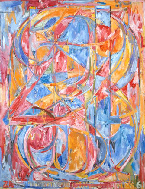
I did art at A-level, and loved it, and the artists I gravitated towards tended to have a fairly graphic sensibility – Jasper Johns, Richard Long, Jenny Holzer, David Hockney. Anything with a bit of typography caught my eye. But I didn’t realise that graphic design existed as a separate discipline, and certainly not as a career. It was never really talked about. So I studied Art History and English at Leeds University, then worked as a production assistant on TV commercials for a year or so. While I was working out what to do next, I was vaguely thinking about moving into films, so I read the BFI book Inside Stories: Diaries of British Film-makers at Work. In the book, the producer Julie Baines talks about going to see the proofs of the poster for her film. It was like a lightbulb went on in my head – “Ah, that’s what I want to do. Make posters.” So in 1999 I went to Central Saint Martins to do the BA Graphics course, and adored it – particularly when it came to the physical making of stuff – screenprinting, letterpress, etching, bookbinding, and photography (this was before digital cameras had really got going).
Is the joy of actually making things yourself integral to what you do?
Hell yes. It’s like therapy. In fact, it’s something I’ve been thinking about a lot lately. Running a blog, as I’m sure you know, is hugely satisfying – it generates fascinating conversations with people from across the design spectrum, and from across the planet. But crikey it eats up a lot of time! And having run the We Made This blog for coming up on six years, I think this year I’m going focus on it less, and use some of the time I was spending on the blog to make some actual physical stuff.
Why did you decide to start your own agency? What were you doing before?
When I left college I was lucky enough to get a place at the design studio CDT, which was then being run by the lovely Mike Dempsey (the D of CDT). The studio did a fine mix of branding, print, editorial and environmental work – I spent a year and a half there, and learnt a vast amount. My favourite job there was the work we did for the Royal College of Art’s Summer Shows in 2003, for which I wrote and set a chunk of copy that we used on invitations, leaflets, signage and the catalogue. It was fairly tongue in cheek, but a lot of the students hated it. At around that time NESTA launched a short residential course that helped young creatives to set up businesses, and I got a place on that (as did a few of the students who’d been at the Royal College – there was a distincly uncomfortable silence once I owned up to that bit of work). The course was brilliant, and as soon as it finished, I handed in my resignation and set up We Made This.

What interests you about ephemera?
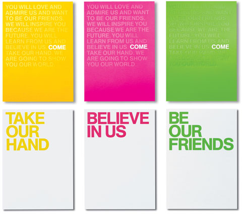
Well, I guess there’s a few things. There’s that feeling that you’re discovering something that no-one else necessarily knows about – these things aren’t design classics by big name designers, they’re little bits and bobs created by anonymous designers. I suppose I must feel some affinity with that… They’re enormously evocative of different periods, so there’s something there about the joy of wallowing in the past – that can be as much about the language used on them as on the design itself. Then there’s the fact that a lot of it is quite utilitarian, almost un-designed, with function dictating form, which always has an inherent beauty and honesty. Mainly though, I think all designers are just visual magpies – it’s in our DNA to get woefully overexcited about old bits of paper and old signs, and to want to take them home to feather our nests.
Do you collect specific kinds of things?
No, I’m way too undisciplined for that. I guess I do loosely focus on design from around the 1890s through to the 1950s. I tend to find most of my stuff at the regular Ephemera Society fairs in London – they’re brilliant sales that happen every few months, where ephemera traders get together and sell their wares: old luggage labels, theatre playbills, invoices, maps, all that kind of thing.
Where else do you look for inspiration?
Well, I think the most important part of the design process is research, and you never really know where that might lead you. If I was being unecessarily fanciful, I’d say it’s a bit like being a private detective – the brief is the case, and the solution to the case is out there somewhere. You just have to know where to look, who to interrogate. But you don’t have to wear a trenchcoat.
I might start with some online research but I try to move to something physical as quickly as possible. Living in London we’re blessed with a vast wealth of fantastic libraries, museums and galleries, and I often find myself heading to them to find specific visual references. The City of London Libraries’ online catalogue is often one of my first points of call – of the libraries it covers, the St Bride Library is particularly lovely, though at the time of writing, it’s open by appointment only.
I have a Ffffound page too, which is useful as an online scrapbook for keeping track of any visual bits online that catch my eye. Though we were discussing in the studio the other day whether one of the dangers of the web is that we’re all looking at the same stuff at the same time. A particular style can become omnipresent very quickly – it’s called the world wide web for a good reason – and it’s possible that regional design styles are rather fading away as a result, and everything is becoming a tad homogeneous. The web is great, but you know, approach with caution.

What was it like working with David Pearson on the Great Ideas series?
Hideous. A really unpleasant experience. Although he comes across as one of the loveliest people you could hope to meet, what a lot of people don’t realise about Dave is that he has borderline psychopathic tendencies that often manifest themselves in verbal, and occasionally physical, abuse.
Actually, it was annoyingly pleasurable. I think he was very skilled at knowing which covers each of us (the series was designed by David himself, Phil Baines, Catherine Dixon and me) would work well on. He pretty much let us get on with it, providing just a few gentle nudges here and there. He has a very thoughtful approach to design – in fact, I think he’d make an incredible art director. (If he can get a grip on the psychopathy, obviously.) Of course, the brief was just a gift. And after the books started selling by the bucketload, I think Penguin were happy to let most of the cover designs sail through.

Do you often get asked to design book covers?
Not as often as I’d like. Designing books is generally a real pleasure, particularly as you have such a concrete thing at the end of it. (Well, you have done historically… more on that below.) But I’m very lucky that I get to work on such a breadth of different types of work – though I do sometimes worry that I’m a jack of all trades, master of none. Maybe I should start focusing a bit more…
How did you get involved in the Ministry of Stories?
That all came about after I saw the film of Dave Eggers’ inspiring TED talk about his brilliant 826 literacy project. I posted the film on our blog, and asked if anyone was going to be setting up something similar in London. On the back of that post, a few of us got together and chatted loosely about how a London version of 826 might work. Things pootled along gently for a while, until Lucy Macnab and Ben Payne (the brilliant project directors) secured some funding, at the same time as Nick Hornby, who had been thinking about setting up something similar himself, joined the gang.
The Ministry follows the model of the 826 centres: a writing centre where kids aged 8-18 can get one-to-one tuition with professional writers and other volunteers; with the centres being housed behind fantastical shop fronts designed to fire the kids’ imaginations (and generate income for the writing centres). In our case, the shop is Hoxton Street Monster Supplies – Purveyor of Quality Goods for Monsters of Every Kind.


The identity for the Ministry itself grew out of an extensive series of branding workshops where hundreds of names for the project were mulled over. Lots of Post-It notes later, we eventually gravitated towards a group of names that had a slightly tongue-in-cheek air of authority about them. While that was going on, I happened to stumble upon my grandmother’s old post-war ration book, featuring the Ministry of Food logo, which seemed like the right sort of name and look for the project. There was also a fantastic exhibition about the Ministry of Food on at the Imperial War Museum, which was great for visual research.
 What was the design process like for the Hoxton Street Monster Supplies project?
Well, it was just a real pleasure really. A stupid amount of work, far more than I’d anticipated, but a real pleasure.
The story is that the shop was established in 1818, and ever since then has served the daily needs of London’s extensive monster community. It stocks a whole range of essential products for monsters. You can pick from a whole range of Tinned Fears (each of which comes with a short story from authors including Nick Hornby and Zadie Smith), a selection of Human Preserves, bars of impacted earwax, jars of daylight for vampires with S.A.D.; and a variety of other really rather fine goods.
I was given a fairly free rein by Lucy and Ben, which made things much easier, and right from the start I had a really clear idea of how it was all going to look. Of course, we had the brilliant work of the various 826 stores to use as inspiration, particularly the gorgeous Brooklyn Superhero Supply Co., designed by Sam Potts.
It was quite a full-on process though. For example, for the products: it meant coming up with the initial ideas for what they might be, working out how to produce them, naming them, writing the copy for the packaging, designing the packaging, and then actually putting the products together in the days before we opened. Fortunately we had a fantastic team of incredibly talented volunteers working on that whole process.
Have you read any interesting books lately?
I’ve just finished George Orwell’s 1984, which rather ridiculously I’d not read before, and which I loved. I’ve been going through a stage of reading some classic literature, so I’ve also recently read Dracula, Treasure Island and Huckleberry Finn. From a more contemporary point of view, I’ve also just read Alan Hollinghurst’s The Stranger’s Child, which was great – not quite up there with some of his other stuff, but still great. I definitely lean toward fiction when it comes to reading.
Do you have a favourite book?
The Day I Swapped My Dad for Two Goldfish, which is a kid’s book written by Neil Gaiman, and illustrated by Dave McKean, (who also did the brilliant Batman graphic novel, Arkham Asylum). It’s hilarious and beautiful.
As far as Really Serious Grown Up Fiction goes, The Master and Margarita blew me away when I read it. In fact, I think it might be about time to read it again.
On the more populist side, I love Iain M Banks’ science fiction novels, particularly the Culture novels, such as Consider Phlebas.
What does the future hold for books and print design?
Hmm. Just let me get this crystal ball powered up…
Ah, heck, I’m no expert. I’m not sure what’s going to happen next, but as someone who designs covers now and again, I have been having a think about what’s going on right now with books and print. (And it is perhaps useful here to make the distinction between literature, which is the content, and books, which are the containers of that content.) I think for literature, it’s an amazing time, with a whole raft of new ways for readers to experience the written (or typed) word. For books, obviously things are looking a bit more rocky. But I don’t think it’s all gloom and doom.
(I should point out up front that I don’t own a Kindle, nor an iPad, so I’m still effectively a luddite. I don’t have anything against either of those devices really. I already own a Mac, a Macbook Pro, and an iPhone, so I just couldn’t bring myself to rush out and grab another bit of Apple’s admittedly lovely kit.)
I think the two fundamental recent changes are: where you get your literature from, and what form that literature takes.
To set the scene, if we look just a few years back, it used to be that where you bought literature from was bookshops; or you’d borrow it from a library, or from friends and family. It would come in either hardback or paperback form – you could get audio books too, but mainly your literature came in the form of printed ink on paper pages, bound between two covers and a spine, and with some sort of hopefully appealing cover design.
So, to look at where you now buy your literature. More than likely you might go to one of the big three: Amazon, Apple, or Google; or possibly directly to a publisher’s site. You might still go along to a bookshop, where you can browse books on tables and shelves, picking them up, feeling them, touching them, even smelling them. But that’s going to become more and more unlikely.
So, you’re going to buy your chunk of literature. You might still choose to buy it in the form of a printed book. But you’re looking increasingly likely to download it, perhaps to your e-reader, with its monochrome e-ink screen and reflowable text; or perhaps to a shiny tablet, where it might be enhanced with moving images and audio. Or perhaps you’ll download it to your smartphone, either as an e-book, or as a dedicated app.
So if that’s where we’re at, how’s it working for us right now?
If we look at the first bit, the where, then I think the big problem is that no-one has really come up with anything online that beats the experience of browsing books in a shop. Obviously Amazon has all the bells and whistles of recommendations, similar items, suggestions based on your browsing history and so on, but good lord, it’s so cluttered! Apple’s iTunes is cleaner, but is still hardly an enjoyable experience. And publishers’ websites are almost universally hideous. (Canongate are perhaps the exception there, with their canongate.tv site, which at least feels like it’s heading in the right direction.)
Online retail of literature seems to still be stuck at the stage of apologetically showing you little thumbnails of book covers, as if admitting that these rectangles of pixels are just substitutes, and that the actual physical book cover will make up for it. But hey, we might never get that actual physical book cover now! So why not show us big beautiful images for the literature we’re thinking of buying. Maybe if you thought of these images as the equivalent of film posters, then you’d start to think in a different way? This should all be done so much better.
Looking at the second bit, the form our literature takes, how’s that doing?
It seems that the days of the paperback are numbered. E-readers and tablets and smartphones have dug its grave, and they’re just standing around waiting for the coffin to arrive.
The book cover, which as well as a sales tool, used to be a visual catalyst for our memories of a piece of literature, well, that’s been sidelined on e-books. As I’ve already mentioned, when you’re buying online, you’re limited to a small thumbnail. Once downloaded, sometimes you glimpse it on your device as the story first begins, but often you don’t. That seems like a lost opportunity. Surely we can do better? I saw that John Gall recently posted a possible triptych cover for an iPad edition of a book, which is an interesting new idea (unfortunately, it got rejected).
Meanwhile, the outside of your device always stays the same – after all, the device is more a library than it is a book. So the pleasure of seeing what book someone was reading, perhaps on the beach or on the tube, that’s gone. (Of course, if you want to surreptitiously read porn in public, these are happy times for you!)
Also, now that literature has become partially disconnected from its package, it starts to exist more in your head. In some ways, that could be a good thing – more pure somehow, your experience of literature no longer so influenced by the marketing team and the cover designer. But equally, an additional texture (literally and metaphorically) has been removed.
I think e-readers are pretty good, but not yet brilliant, particularly when it comes to page transitions, which are still a grimly disruptive moment in your reading, far more disruptive than turning a physical page. And you’d be more upset if you lost one than if you lost an actual book; and as everyone likes to point out, you can’t really read them in the bath. (But how many people exactly are still taking baths? And of those, how many are reading in their baths? Have they tried reading in bed? It’s far better.)
Tablets like the iPad or the Kindle Fire are great for enhanced experiences, like Faber and Touch Press’s version of T.S. Eliot’s poem The Wasetland, but less good for reading lengthy texts. Just too damn bright. Apps like Enhanced Editions’ version of Nick Cave’s The Death of Bunny Munro are interesting too, bringing lots of extra mulitmedia stuff to the party. But apparently rather costly to develop.
(If I may digress slightly, Apple’s new iBooks Author app looks quite exciting as a cheap way for designers to self-publish work. Yes it means you’re tied to the iPad rather than any other device, but still… shiny!)
From a more philosophical point of view, as Jonathan Franzen recently pointed out, there’s something distinctly unsettling about the the fact that screen based text lacks permanence. If it’s not printed, it may well change – just as in Orwell’s Ministry of Truth in 1984, where historical documents were constantly revised to suit the Party’s needs. Of course, that’s an issue for all digital media. Similarly, you can’t really lend an e-book to a friend. And can you pass on your library of e-books to your children? What will happen to all that digital content in the future?
So, overall it feels like there’s yet some work to be done with e-books before they really live up to their potential. And obviously it means that the satisfaction of producing a concrete ‘thing’ is no longer there, which is a shame. But they’re here to stay, so it’s pointless for us as designers to stick our heads in the sand while lamenting the death of the book. Better to look to the exciting new possibilities.
And, anyway, while e-books are doing their thing, they’ve also thrown fresh light on physical books – we’ve started re-examining why we love their physical form, we’ve started to treasure them again. It’s not a new area (the Folio Society has been creating beautiful high-end editions of books for years), but it’s obviously now an expanding area. You can see this with Penguin’s hardback F.Scott Fitzgeralds, and their Clothbound Classics series, as well as the gorgeous Fine Editions from White’s Books. For book designers, that opens up lots of exciting possibilities.
Gosh, I rather rambled on there. I’m sure far wiser and more people than me will have a much clearer idea of where the industry might be going.

Thanks Alistair!
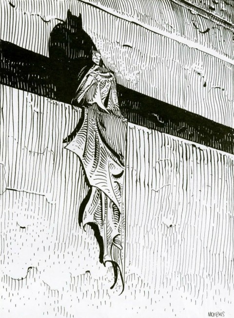 Obituary for artist Jean Giraud, AKA Moebius, in The Guardian:
Giraud… had an impact on the visual arts that went beyond comics. He was seen as a figurehead linking bandes dessinées with modernism and nouveau réalisme. As the co-creator of Métal Hurlant magazine, he took comics to an older, more literate audience. In cinema, his fans ranged from Federico Fellini to Hayao Miyazaki and his style influenced dozens of others, including Ridley Scott, George Lucas, James Cameron and Luc Besson.
Tom Spurgeon also has an in-depth obituary at The Comics Reporter:
Giraud would… describe the revolution driven by his work and others as one of creative choice rather than content, that the feeling of the artist inhabiting the work was more important than the kind of work being done. He drew a connection to the undergrounds and cartoonists like Robert Crumb, although he felt that the work of he and his peers existed in an entirely different cultural context.
See also: The comics industry remembers Moebius at Robot 6.
(I remember being very disappointed when I discovered that the drawing above was a standalone piece, and not a panel from a complete Batman story illustrated by Moebius. Heartbreak.)
Material Conversations — An interview with Jonathan Ive, Apple’s Senior Vice President of Industrial Design, in The Evening Standard:
What I love about the creative process, and this may sound naive, but it is this idea that one day there is no idea, and no solution, but then the next day there is an idea. I find that incredibly exciting and conceptually actually remarkable. The nature of having ideas and creativity is incredibly inspiring. There is an idea which is solitary, fragile and tentative and doesn’t have form. What we’ve found here is that it then becomes a conversation, although remains very fragile. When you see the most dramatic shift is when you transition from an abstract idea to a slightly more material conversation. But when you made a 3D model, however crude, you bring form to a nebulous idea, and everything changes – the entire process shifts. It galvanises and brings focus from a broad group of people. It’s a remarkable process.
And finally…
Boredom — Geoff Dyer, author Zona: A Book About a Film About a Journey to a Room, in conversation with Ethan Nosowsky at The Believer:
Boredom is often a side effect of something else. The apparent boredom inflicted by Stalker is actually the friction between the pace of the film and one’s expectations of how a film should proceed, so you just need to give yourself over to it. But then I think some so-called art films are irredeemably and inherently boring. As soon as I say that, though, I realize that the most boring films are the big, moronic action-blockbusters. They really bore the crap out of me. There’s an essential relationship between boring art films and moronic blockbusters because, as Ernst Fischer pointed out, any art form that glories in being understood only by a few—that worships at the altar of its own tedium, as it were—opens the floodgates for trash for the masses. At a certain point, as filmmakers got serious, they willingly took on a slowness that could easily become boring. But there was a long period before that when boredom was just inconceivable, not part of the equation.

I don’t know exactly when I first discovered Ace Jet 170. It was a few years ago — at least four because I was reading it before I started The Casual Optimist. And it must have been recommended by someone (I Like? Noisy Decent Graphics?) because I don’t think I can have stumbled across it. But perhaps I did. Certainly, there was little reason for me to be interested in the blog of designer/writer living in Belfast at the time. And yet I started t0 follow Ace Jet 170 religiously. I still do, even as I’ve lost interest in many other well-known design blogs who ‘curate’ stuff.
Admittedly, I share some common interests with Richard Weston, the man behind Ace Jet 170 — Penguin paperbacks, printed ephemera, maps, found type and fatherhood, to name a few — but really it is the tone of the blog as much as anything that keeps me coming back. “Unassuming” is probably the word for it, but somehow that undersells it. It’s personal, funny, idiosyncratic and occasionally little eccentric. It looks like it comes easily, although I expect it probably doesn’t.
Like Anne Ward at I Like, Richard seems to find everything interesting and yet never really tries to sell you anything. There is little shameless promotion. Just interesting things. And like I Like, Ace Jet 170 was one of the early inspirations for this blog — one of the few I hoped it would be like when it grew up. (It isn’t of course, but how could it be?)
Richard and I are now friends, but in a very modern way. We’ve never met or even spoken to each other (I still don’t know what he looks like), but we stay in what seems like a very ambling dialogue via Twitter, Instagram and Path. I do actually feel quite honoured to finally him on the blog talking at length. We chatted by email.

When did you start Ace Jet 170?
The middle of 2006.
How has the blog developed since then? Is it different from when you started?
I think it is different. At first, I was just trying to catalogue stuff I had stashed away all over the place. In retrospect, it’s not the best way to do that. But as time went by it became somewhere to write as well. It’s a little wordier than it used to be. Of course, it also gained interest from others and has helped me make surprising connections.

What’s your interest in ‘found type’?
Loads of typographers and graphic designers love ephemeral typography. And have done for decades. If you look through old copies of Typographica, there’s Fletcher/Forbes/Gill [Alan Fletcher, Colin Forbes and Bob Gill], or Herbert Spencer or Robert Brownjohn with photos of found type.
If you have a love of letter forms, you’re drawn to them aren’t you? My blog, again, was just a useful place to put things. Quite quickly, other people started sending stuff in. That was probably the first kind of feedback I got. It was exciting to find out other people wanted to contribute. So it became an irregular slot on Fridays. Not every Friday. And then of course, I realised Flickr collates “crowd sourced” found type much better. And Flickr pools started springing up. Nothing to do with me. But they show how common the urge is.

In your personal photography you often seem to be looking for the beautiful in the mundane. Is that a conscious thing?
Like the found type thing, it is a compulsion. Something that’s been with me for years – long before I started recording it. I have pretty modest tastes and expectations. I guess I have a fairly humble background. So the little things mean a lot. But it’s an interesting world isn’t it? I mean visually. I reckon you could work down any street and take ten photos of interesting, everyday things. Instagram, of course, monopolises on that. It takes it to the next, natural level where we can all share stuff.

When did you start collecting vintage Penguin paperbacks?
When we lived in England, I found this Penguin Education book, in a box of junk outside a second-hand bookshop. The cover was designed by Derek Birdsall at Omnific. It’s so simple and perfect. He was already a bit of a hero of mine.
A little later, I picked up a Pelican also by Birdsall. It wasn’t in the common style, which was odd. It was less of a big idea like Juniors but beautiful. I was hooked. I soon got to know the Marber Grid that Pelican and Penguin books used through the 60s and into the 70s. It coincided with a glut of covers from emerging talents so you’d find covers by Fletcher, Forbes and Gill; loads by Germano Facetti and then Romek Marber himself; but also Milton Glaser, Massimo Vignelli, Alan Aldridge – all these guys who went on to become the leading lights of their generation. Finding covers credited to names you knew became pretty exciting. You could pick up a design by Abram Games for 50p. That’s amazing. But I also admired the system. The Marber Grid was beautifully constructed and it’s a testament to it that it was used so extensively. It just worked so damn well. And then there’s the whole Penguin business, Allen Lane’s brilliant idea. Inspiring. Oh and I like sets. Penguin do a great set. Always have done. Still do.

Do you look for certain designers or illustrators?
I generally prefer to pick up covers I like. If they’re by designers I recognise, all the better but it’s not essential. You get to know them after a while and that’s fun. You see a cover and you think, hey that looks like a Facetti. And you’re right!
With the Pelicans, I really like the ones that successfully represent the idea behind the book. Some do that more successfully than others. Occasionally the good ones aren’t the aesthetically pleasing ones, but they make a point really well.
With Penguins I can pass them by if I don’t like the illustration on the cover then go into a cold sweat if I find one with a Paul Hogarth cover.
David Gentleman’s covers for the Penguin Shakespeare series are amazing. And the Stephen Russ covers for The Penguin Poets; beautiful and clever within a very restricted format. Great design.


Are there any editions you particularly covet?
There’s a little booklet called Penguin Books, The Pictorial Cover, 1960-1980 by Evelyne Green that was published by Manchester Polytechnic in 1981. I really want a copy. Saw one on Amazon recently but it’s out of my price range. It’s a really low-key publication – typewritten text. It’s hardly a “book” but it’s unique. I harbour a fantasy that one day I’ll find one in the surplus box at a charity book shop and pick it up for 50p.


What else do you collect?
Blimey. So many things. Sometimes I think I collect collections. I have a stamp collection that I love but I’m not a proper stamp collector. A proper one would be horrified with how I store them. I have them on file cards in little Moleskine wallets. And they’re judged purely on looks. I don’t care about their value or country of origin. Actually, the cheaper the better and I think every country produces brilliant and bloody awful stamps designs.
I’ve got tons of books of course, stationery products (staplers, bulldog clips, typewriters), coffee pots, branded espresso cups, vintage light meters, you know, all sorts of nonsense. Some are really small collections.
What have you read recently?
I’m well into the Saul Bass book. Karen, my wife, keeps laughing at me. She says designers aren’t really supposed to read these books. We’re supposed to leave them lying around and look at the pictures every now and then but I love a monograph. It’s an amazing, if slightly cumbersome book. And it’s been a long time coming – I remember the Bass exhibition at the Design Museum in London, must have been around ten years ago. There was talk of a book after that.
By sharp contrast, we read 101 Things I learned in Architecture School, in the UX Belfast Book Club I go to. It’s short, snappy and really good. Interesting glimpse into the life of an architect and great to see universal principles that apply across disciplines.
And then I read From Those Wonderful Folks Who Gave You Pearl Harbor. Have you read it? Has everyone? It’s brilliant. Really captures a less politically correct time.
Haven’t read much fiction for a good while. Lots of work related stuff. David Weinberger’s Everything is Miscellaneous was brilliant too.

What are a few of your favourite books?
Favourites are hard; so much to choose from. I have books that have had a major effect on me and my work. Ruari McLean’s first book on Tschichold and the ancient tomb by Vincent Steer, Printing Design and Layout really pushed me on as a young designer. And John R Biggs’ modestly titled Basic Typography.
Monographs! Like I said before: I love a monograph: Games, Sutnar, Huber, Aicher, Lustig, Schleger, Rand – amazing stuff. Then I like a marketing book too: anything by John Grant. Fiction-wise: trickier still. I’ve read lots by classics like Chandler and Deighton. Graham Greene.
What is the day job?
I work at a multidisciplinary design company called Thought Collective. It’s pretty new, although born out of two companies that came together, officially, at the beginning of 2011. One a “traditional” design studio and the other a web developer. So the company is evenly split now between cross media designers and those concerned with coded matters.
I claimed the rather grand job title of Head of Strategic Design. I write and design. Work out strategies and how to do stuff I’ve never done before. It’s really good.
Is there a thriving design community in Northern Ireland?
Yes. It’s a microcosm. Belfast in particular is an intensely populated, compact area. I think the Irish connection fuels the creativity of the region. So there’s some great things going on. There’s a significant web design/development community and loads of design companies. The degrees of separation seem fewer so it’s fairly easy to get to know other designers.
Are you still interested in print design?
Definitely, although I don’t do much. From where I’m sitting print feels more treasured than it was, say, ten years ago. There are loads of great books being published and things like letterpress are way more accessible than they used to be. I feel there’s a great focus on craft.

How do traditional ways of thinking about design apply to digital design?
For a spell, while I was acclimatising to working on more digital projects, I thought it was a major shift. But then it dawned on me that much of what I’d learned to date was still extremely relevant. There are universal design principals that transcend medium. And the parallels between the development of intelligent marketing activities offline and user experience focus online are striking.
I don’t know if you know the Claude C Hopkins book Scientific Advertising? He wrote it just after he retired. Around 1923. Hopkins has been described as the ‘Father of Modern Advertising’ and [David] Ogilvy said something like, “you shouldn’t work in advertising until you’ve read this book seven times” – like he would. It’s antiquated in many ways. But also, with a little imagination you can discern from it techniques and approaches that are still very active today. Especially online. I’m talking about strategic marketing scenarios. If nothing else, it illustrates how principals cross over mediums. And can be timeless.
And then there’s all that fundamental human stuff (hierarchy of needs etc) that has nothing to do with the specific channels by which messages are delivered.
So, “traditional ways of thinking” apply well. What’s new is some of the language used and the complex mechanical ways in which ideas are expressed and realised.

What does the future hold for books?
I think the near future is looking pretty healthy. It feels like we’re in some kind of print renaissance for crafted, tactile print-based experiences. There’s some great stuff being made.
But I do think that one day, once we’ve all got used to reading on devices and the experience has become much more rich and fulfilling, that print may well vanish. If it does, it’ll be when we’re happy for it to die; when other forms provide what we want and need. Perhaps in the future we’ll think of digital files as artifacts when their content delivers a sensory experience we can currently only guess at.
Or perhaps we’ll stop caring about the artifact like we care less about the Album or CD sleeve; when we treasure the content more that the object. I’d be very happy if that doesn’t happen in my life time.
Is that a bit of a depressing point to finish on? It’s not meant to be. Rich digital experiences are exciting. Who knows what the book of the future will be like. You can be pretty sure it’ll exceed expectations.
Thanks Richard!

Imprint talks to John Bertram about his Recovering Lolita project:
For obvious reasons, of course, [Lolita] remains as controversial a novel as it was a half century ago, if not more so. And, probably helped along by Kubrick’s breezy film, and many very terrible covers, the term “Lolita” has come to popularly mean something quite the opposite of the novel’s namesake, so a designer has that to contend with as well. On the one hand, then, designers face the very real challenge of communicating some of that complexity in a cover, which can easily become overwhelming… On the other hand, I think there are also important ethical considerations that require careful negotiation since, whatever people may think, we are talking about a novel which has child rape at its core.
There is more about the project here (pictured above: Lolita designed by Rachel Berger).
The Bare Specificities — A really lovely profile of Portland-based book-scout Wayne Pernu at The New Yorker:
On the job, Pernu keeps a few principles in mind—first and foremost, the importance of condition. For example, with its original dust jacket, the value of a first-edition “The Great Gatsby” can multiply from two thousand five hundred dollars to more than two hundred thousand. “That little piece of paper on the book is often worth thousands and thousands of dollars, much more than the book itself,” Pernu says. “Specificity is really crucial as well. A book called ‘World History’ isn’t going to do well, but a book called ‘Peruvian Shovel Makers in the Seventeenth Century,’ that’s going to be worth a lot of money to someone. You always get excited when you see something that specific, no matter what it is.”
Also really nice: An interview with English letter carver Fergus Wessel for I Love Typography:
Eric Gill is my hero! His lettering, in my opinion, remains unsurpassed, partly because of its honesty. We are all striving for perfection, but there really is no such thing of course. If we try to control it and attempt to be too artistic, we are in danger of losing that honesty. One has to let the letters flow a little.
There are certainly strict rules of good layout and lettering, but rules are there to be broken. But in order to bend the rules, one has to know them in the first place, and attain that initial discipline. This requires years of experience and practice; it is something that evolves and it is during this evolution that you develop your own individual style and form.
And finally…

Alexandra Harris, author of Romantic Moderns, on Modernism at The Browser:
To an extent, yes. But take [Nikolaus] Pevsner for example, who was one of the great exponents of the Bauhaus version of modernism in England. Because there’s such a strong German tradition of minimal, pared down, internationalist architecture, for him it was a kind of nostalgia. It wasn’t our English tradition but a German tradition, so it seemed to us very brutal and modernist. But to him it was laden with associations and emotions, as it was for the other émigré artists like [Laszlo] Maholy-Nagy and Naum Gabo.
Again, what seems very new is actually attached to a tradition, and is so much more interesting that an absolute break with the past. A lot of these buildings that seem very modern are deeply entangled with a tradition of classical architecture using the same classical symmetries and the sense of elegance and refinement that comes straight down from Greece and Rome, and it doesn’t get more traditional than that. So there’s always a traditionalism in the modern.
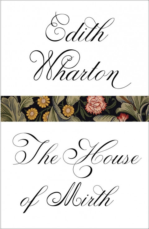
Two more beautiful cover designs for Vintage by Megan Wilson: The House of Mirth and Ethan Frome by Edith Wharton.
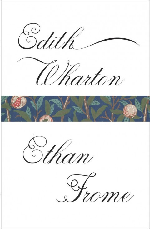
The William Morris wallpaper is a lovely touch.

Creative director Paul Buckley has posted the covers for the latest Penguin Graphic Classics to his Flickr. The new covers include Heart of Darkness by Hellboy creator (and Optimist hero) Mike Mignola (pictured above) and an absolute belter by Stuart Kolakovic for The Death of King Arthur:


You can read my interviews with Paul Buckley here and here.