Skip to content

Tag: design

Midweek Miscellany

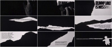
The excellent Art of the Title looks at the opening sequences to Anatomy of a Murder and Bunny Lake is Missing by Saul Bass.

Just Getting Started — Bill Moran on the Hamilton Wood Type and Printing Museum in Two Rivers, Wisconsin, for Design Observer:

When you hold a piece of wood type in your hands this deceptively simple piece of mass communication rewards you with its grace but also surprises with its weight. End grain maple is cut from the cross section of a tree yielding a harder and heavier piece of wood. Using the end grain of the wood improves durability with most wood type that was made in the nineteenth century still fully functional a century after its date of manufacture.

Leading the Blind — Nick Harkaway, author of The Blind Giant: Being Human in a Digital World, on book publishers and technology at The Guardian:

There’s a willingness to think: we’ll let everyone else figure out how the market should work, and then we’ll just supply books in the same way that we did to bookshops to electronic sellers like Amazon, Apple and Google. But booksellers are tied to publishing – they need conventional publishing models to continue – but for those companies that’s not the case. Amazon is an infrastructure company; Apple sells hardware; Google is really an advertising company. You can’t afford as a publisher to have those companies control your route to market.

Creative Paralysis — Michelle Dean on the future of ‘serious’ publishing at The Rumpus:

I don’t think there is anyone out there who has recently looked at the state of book publishing, I mean really looked, and not tightened her grip on her wineglass… I don’t work inside or report on publishing, but what limited exposure I do have suggests that there is indeed a crisis on the horizon. Anyone who’s ever wanted to see their name in print on the cover of a book — biography or novel, chapbook or memoir — ought to be thinking about that, about how to sustain the world of books. But the focus on the internet as the death of culture, which drones on in tired refrain on certain book sites, strikes me as bizarre, and overstated, not to mention creatively paralyzing.

And finally…

Eleanor Wachtel interviews composer Philip Glass for CBC Radio:

CBC Radio Ideas: Wachtel on the Arts with Philip Glass mp3

Comments closed

Typesetting

Typesetting is a new documentary series that explores the relationship between designers, their work, and the cities in which they live. In the first episode designer Elisabeth Kopf talks about living in Vienna and how it inspires her untraditional approach to design. I had never seen Kopf’s highly original work before, but her beautiful Little Orchestra CD packaging is wondrous. Watch:

(via Coudal)

Comments closed

Midweek Miscellany

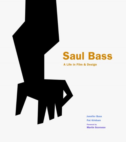
Lyra Kilston reviews Saul Bass: A Life in Film and Design for the LA Review of Books.

The Well-Made Book — An interesting article by Michael Agresta on how printed books, and their design, are changing in the digital age:

Now, as we move into the digital age, the well-made copy has come to occupy a familiar, almost nostalgic middle ground between the aura of an original and the ghostly quality of a computer file. A mass-produced paper book, though bulkier and more expensive, may continue to be more desirable because it carries with it this material presence. And presence means something—or it can, at least, in the hands of a good book designer.

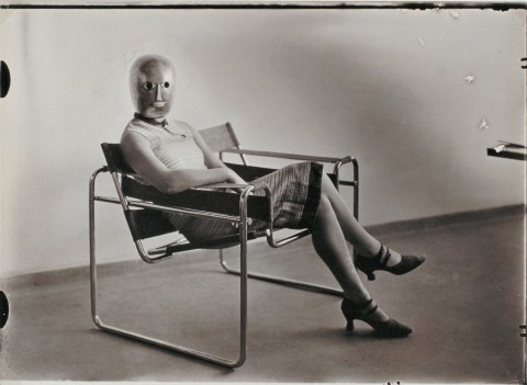
Innards and Interiors — The Bauhaus: Art as Life exhibition at the Barbican reviewed at The Financial Times:

Paul Klee favoured risotto with steamed calf’s heart, sour liver and lung ragout: in the kitchen, as in his paintings, he was obsessed with innards, interiors, reconfiguring essential forms. Wassily Kandinsky lived in a streamlined white apartment but, incongruously, cooked on a “kamin” – a Russian wood-burning stove made from heavily ornamented black iron. Josef Albers claimed “I paint the way I spread butter on pumpernickel” – robustly and straightforwardly; he called the colour mixes in his “Homage to the Square” series his “recipes”. And Swiss painter and vegetarian zealot Johannes Itten was driven out of Weimar because he hijacked the Bauhaus kitchen and alienated director Walter Gropius by producing only “uncooked mush smothered in garlic”. The Barbican’s new exhibition… gives a whole new flavour to the story of the art school long seen to embody sober, purist German modernism.

Weird Comics — Local small press publisher Annie Koyama profiled in the Quill & Quire:

Koyama says her strategy for the year ahead is “to throw everything against the wall and see what sticks,” but she acknowledges her biggest business challenge is twofold: increasing print runs to improve margins and lining up reliable distribution for the fledgling firm. After working around the clock for nearly four years… she says her goal now is to create a sustainable enterprise that can continue to fulfill its artist-centric mandate… She’s also considering expanding into children’s books. But not in the way you’d expect. “While there are a million good kids’ books out there, there aren’t a million good kids’ comics I can see – especially not weird ones,” she says.

And finally…

Maurice Sendak, “author of splendid nightmares” has passed away aged 83. The New Yorker has made a short Art Spiegelman comic about meeting Sendak available online. And here is a wonderful interview with author from December last year:

Comments closed

Signature Shakespeare Illustrated by Kevin Stanton

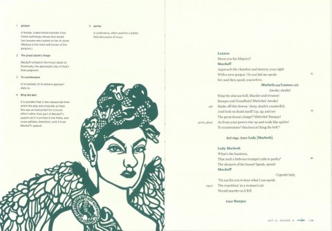
Freelance illustrator and paper artist Kevin Stanton recently contacted me about his book illustrations for the new Signature Shakespeare editions of Romeo and Juliet and Macbeth.

Art directed by Ashley Prine at Sterling Publishing, and with additional typography by the immensely talented Chin-Yee Lai, both books have laser-cut covers, as well as five laser-cut interior illustrations per book, and more than 30 other illustrations.

The results are beautiful and the project sounded like fascinating undertaking, so I thought I would ask Kevin a little more about it.

We corresponded by email.

How did the project come about?

Two years ago, at the very beginning of my foray into freelancing and just a month after graduating from Pratt, I received an unsolicited email from Pamela Horn, a Editorial Director at Sterling Signature. It turns out that a higher-up in the company had seen my work at Pratt’s Annual Pratt Show and passed my portfolio on to her!

After we met a few times, she mentioned that she’d been looking to do a project with a paper artist, and that when the right one came along she would let me know. Initially this had meant a series of Classics book covers, but that fell through. Nine months after our first interview, I got the call — Pam wanted to do a series of Shakespeare plays, starting with Romeo and Juliet and Macbeth, each with a cover and fifteen plates! And that was a dream job right there! And after some discussion with my Art Director, Ashley Prine, it got even better, even more unreal: today it is a hardcover book with a laser-cut cover, five interior two-layer laser-cut illustrations, and almost forty printed spots, spreads, act openers and motifs. And my name on the cover to boot!

How did you approach such a big project? 

The process was interesting to figure out. After hand-cutting a great deal of the book, we realized that scans of the pieces didn’t look good and there was no quick-fix for turning them into vectors. Enter my friend and assistant, Victoriya Baskin. Since my sketches before I cut are like maps of everything (I don’t freehand anything), she was able to vector it all together so that we had a product that could be printed on the pages and sent to the laser-cutter with clean, expert lines! And the work can be edited, which was our primary concern with paper.

How you feel about the final results?

It’s been an absolute dream. As a young illustrator, and one that works in paper, I couldn’t have hoped for a better display of my work than these books. I am so happy with them, although seeing them on the shelves in a book store is the most surreal experience for me. It’s a privilege to work with my entire team, and an honor to have been a part of such a phenomenal production! Much Ado about Nothing and Hamlet are next in line to be published in November!

Thanks Kevin!

You can see more of Kevin’s work on these books on his blog.

7 Comments

More Matt Taylor le Carré

Under Paul Buckley’s art direction at Penguin US, UK-based illustrator Matt Taylor has produced two more stunning John le Carré covers. The type and design is by Gregg Kulick.

You can see the previous covers in the series here, and, according to Matt, there are a couple more on the way. Happy day.

Comments closed

Something for the Weekend

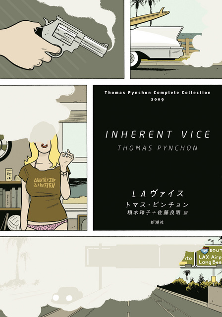
Cover illustration by Adrian Tomine for the Japanese edition of Inherent Vice by Thomas Pynchon, published by Shinchosha Publishing.

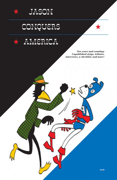
The Darkness — Norwegian cartoonist Jason profiled in The National Post:

“A comedy that has some darkness, like The Apartment, is more appealing than if it’s just fluff. Ingmar Bergman’s best film, to me, is Fanny and Alexander, that is dark, like many of his early films, but there is a joy also, an affirmation of life,” he continues. “Darkness just for being dark doesn’t interest me that much. … I prefer the vitality of something that isn’t perfect.”

Jason will be at the Toronto Comic Arts Festival this weekend, and you can read my Q & A with him here.

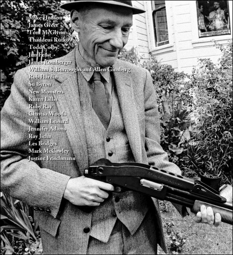
Bam… Bam… Bam… David L. Ulin, writing at the LA Times, on interviewing William S. Burroughs:

“Life is a cutup,” Burroughs says about halfway through his conversation with Ginsberg, referring to his technique of bisecting pieces of text and reconfiguring them as collages, letting the juxtapositions create a meaning that transcends traditional narrative. “And to pretend that you write or paint in a timeless vacuum is just simply … not … true, not in accord with the facts of human perception.”

Yes, yes, I found myself thinking, not least because four years later, Burroughs had said virtually the same thing to me. “Life is a goddamn cutup,” is how he put it. “Every time you look out the window, or answer the phone, your consciousness is being cut by random factors. Walk down the street — bam, bam, bam…. And it’s closer to the facts of your own perception, that’s the point.”

Ulin is referring to a conversation between Allen Ginsburg and Burroughs recently published in Sensitive Skin magazine.

And finally…

A Deadman’s Masterpiece — Gabriel Winslow-Yost on Tarkovovsky’s movie Stalker, the Chernobyl disaster, and the S.T.A.L.K.E.R. series of video games, for the NYRB:

The Zone in the video games is a beautifully dangerous place, bigger and grimmer than Tarkovsky’s, but somehow still appropriate. There are plenty of long, tense walks through damp weather or empty, creaking tunnels. Packs of dogs wander the landscape, ruined farmhouses give shelter from the rain; here and there the ground ripples strangely. Stalkers gather around campfires, bandits take potshots at passersby, and a man lies wounded in a ditch, begging for help. Watching Stalker, one is occasionally brought up short by remembering that it was not filmed in Chernobyl, so perfect an analogue does that event seem for the film’s images of technology and nature, beauty and danger in strange alliance. The games, at their best, can seem like a sort of miracle: a dead man’s masterpiece, come home at last.

Comments closed

Midweek Miscellany

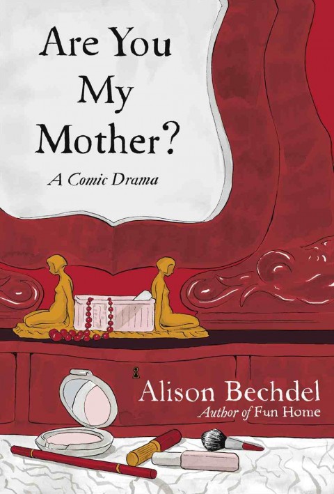
This Precarious Balancing Act — Maud Newton talks to Alison Bechdel, author of (the astonishingly good) Fun Home, about her new graphic novel Are You My Mother?. Fascinating stuff:

I feel like cartooning for me has been like a way to be a crypto-writer. I couldn’t ever say I wanted to be a writer because my mother was a writer, and even now I’ve had to find this alternative way of expressing myself as a writer. I don’t want to diminish the drawing. I think it’s integral to what I do. But I’m kind of a secret writer… I’m very wordy for a cartoonist. I’m always struggling against that, because the more space your words take up the less room you have for pictures. So it’s always this precarious balancing act.

School Disco — Mark Medley’s latest National Post piece on House of Anansi Press follows the publisher to the London Book Fair:

The London Book Fair, now in its 41st year, is one of the biggest, and most important, in the world — though it is dwarfed by Frankfurt, which takes place in October. This year, the fair hosted more than 1,500 exhibitors from 57 countries and expected more than 25,000 attendees, almost half from overseas. During the festival’s three days, MacLachlan describes it variously as “a meeting of the tribe,” “highly social,” and “like [a] school dance. The cool kids are in one corner, the nerds are somewhere else.”

Confused By the eBook Lawsuit? So Is Everyone else” — Peter Osnos, founder of Public Affairs Books, writing at The Atlantic.

And finally…

With the Bauhaus: Art as Life exhibition opening at the Barbican tomorrow, author Fiona MacCarthy (William Morris: A Life for Our Time)  looks back at the revolutionary design school at The Guardian:

Gropius’s idea for the Bauhaus emerged from his experience of the first world war in which he served as a cavalry officer on the western front for almost the whole four years. His response to the devastating scenes he lived through was a stark determination to “start again from zero”. Only a new outlook on design and architecture could provide the means for a shattered civilisation literally to rebuild itself… Gropius’s vision was for the “unification of the arts under the wings of great architecture”. It was a democratic concept of art for the people, art for social betterment in which everyone would share. The Bauhaus aesthetic replaced bourgeois furbelows with a geometry of clarity, sharp angles and straight lines.

The Guardian’s art critic Adrian Searle reviews the show here.

2 Comments

St. Aubyn Redesigns by Stuart Wilson

A few weeks ago, I mentioned Stuart Wilson’s unsettling redesigns for the Picador (UK) editions of the Patrick Melrose novels by Edward St. Aubyn. Here’s the full the set:

3 Comments

The Penguin English Library

Award-winning director Woof Wan-Bau has created a wonderfully weird animated short for the launch of the  Penguin English Library:

(via Ace Jet 170)

1 Comment

Something for the Weekend

A busy week for John Gall, Art Director at Anchor/Vintage: he unveiled a beautiful new website, and his design for the paperback boxed set of 1Q84 by Haruki Murakami (pictured above). My Q & A with John is here.

Los Angeles Review of Books also has a swanky new website.

Let’s Not Get Carried Away — Harvard professor Ann Blair, author of Too Much To Know, on the history of information at The Browser:

“Reading” covers a wide range of practices. Medieval scholasticism, for example, favoured a ponderous kind of reading of difficult Latin texts done by a few qualified scholars with pen in hand to comment on them. This kind of reading typically took place in a library or study with access to many other learned books. Novel reading was very different when it developed, especially in the 18th century – novels were viewed as engrossing and escapist entertainment, which was typically enjoyed in a nice comfy chair. Interestingly, this kind of reading, which we try to encourage in our children today, worried people in the 18th century. Wouldn’t girls especially get carried away by flights of fancy? People thought it important to control reading. For instance, it was considered better to have girls read in a circulating library since a public setting imposed limits on how far they could get carried away. So some of the fears parents have today about kids playing video games used to apply to reading.

And finally…

Howard Jacobson on Wisden’s Cricketer’s Almanack for the Independent:

What a wonderful thing is Wisden, that lovely, lozengy, yellow-jacketed, Bible-shaped and Bible-weighted cricketers’ almanack, 1,500 pages deep, in which the averages of batsmen and bowlers and wicketkeepers, English and not-English, male and female, living and dead, are collated with a mystic punctiliousness that proves beyond argument the existence of God. You want to see the Divine Watchmaker at work on the mathematics of life? Then read Wisden.

Comments closed

The Art of Film & TV Title Design | Off Book

The new episode of PBS Arts documentary series Off Book takes a look at the art of the title sequence. The designers of the titles for Blue Valentine, Mad Men, The Pacific, Se7en, and Zombieland discuss their work, and there’s a lovely bit at the end when they all talk about the influence of the mighty Saul Bass:

Comments closed

Q & A with Nigel Peake

I first saw the work of Nigel Peake in his book In The Wilds, published by Princeton Architectural Press in 2011. Collecting Nigel’s beautiful and meditative drawings and watercolours of rural landscapes and buildings, the book reminded me of both of the work of Paul Klee (Highways and Byways, for example) and Rings of Saturn, W. G. Sebald’s discursive record of ambling through East Anglia.

I subsequently discovered, of course, that Nigel had already produced a significant body of work prior to In the Wilds, including illustrations for Ninja Tune, Hermes, the Royal Horticultural Society, Habitat, The Believer and Dwell magazine, as well as several books.

And in this shiny digital age, there is undoubtedly something wonderful in Nigel’s meticulous hand-drawn maps and tumbledown sheds. We corresponded by email.

Do you remember when you first become interested in art and illustration?

I feel like I have always drawn. Some of my earliest memories are associated with painting and the things that surround it, the plastic containers that held the primary colours and the smell from the cheap paint. When I was growing up I did not really think in terms of design or illustration I just had a wish to draw all the time. And that is still true now, I type this surrounded my paints, pens and paper… so maybe not much has changed. Drawing for me, is essentially a way of thinking through a thought or an idea, to document and try to understand what is around me.

What was your first job as illustrator?

When I was still studying and finishing my architecutural thesis I designed a snowboard graphic for a company in California. After that I worked on a project with Ninja Tune

And how did the project for Ninja Tune come about?

In truth I am not too sure, I remember leaving a zine for DJ Food when he was djing at Edinburgh, I was not even thinking of it in terms of work , I just wanted to share my work with those that I admired. One way or another I ended up drawing the artwork for the Coldcut ‘Sound Mirror’ LP and singles. They were really nice people to work with and I have made a few other things for them since.

You’re also an architect as well as an artist. How does that inform your work?

I am not a ‘complete’ architect – in that I have yet to finish it professionally. I did study it for 6 years. Studying architecture did not directly affect how I draw, but it did introduce me to a lot of different ways of thinking. I read a lot of interesting books and listened to some wonderful conversations. It was hard work, and the studio ethic of working all day is still engrained in me. I am interested in architecture and how it holds all these moments that occur every day. I recently made a book about the bridges of London, these fantastical structures that essentially have become invisible to those who live there. It is amazing to be in a city and look around, and you have all these forms and shapes that where designed and made by us. It is the combination of our efforts.

Why did you decide to move away from the city?

It was not intentional, it just happened. I was tutoring and drawing projects and then I seem to end up in the country, I probably got tired of being in a city. I had been living in Edinburgh for 8 years. At the moment I travel a lot with my work so it is nice to live somewhere that is quiet and simple, and a place that I want to return to.
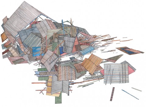
What is it about the details of vernacular architecture that particularly interest you?

I am not sure, it is probably because it is what I have grown up around. I enjoy how things are put together, and vernacular architecture is very honest in that respect – you can see what holds what up.

Also a lot of things fall apart because of the wind and the rain and old age, and I find this equally beautiful because when this happens you see all the parts that where previously hidden to the world.

It is an architecture determined by what is close to hand and so the materials and colours used are more interesting. Blue twine holds it together and plastic bags and old gates bridge the gaps.

Is there a tension between your love of the countryside and your fascination with built structures?

Not particulary, probably because I look at them with the same interest, when I look at a leaf I am still amazed by the detail and the wonder of it and then when I look at a skyscraper I can not believe that we can make such incredible structures. The only tension is that if I spend too long in a city I want to go to the places where there are no buildings, I particularly miss the sea if I have not seen it for a while.

Do you take a lot of photographs or do you rely more on sketchbooks?

I do take photographs, but not to draw from, but just to remember things that I see along the way. I also like how a camera allows you to frame what is around you – by taking a photo of something you edit everything else around you and that one moment is held. I keep sketchbooks and draw in them every day not because I think it is fashionable or because I think I should but because I will forget things – so I use them to hold those things that might turn into something someday. I think this idea of keeping a book comes from school because for years we sat at tables with books marked maths, geography, chemistry… so it seems normal to keep writing and drawing things into a book.

Apart from nature and buildings, where do you look for inspiration?

Nearly everything I see has an affect upon me, one of my favourite things is to sit and just look, not as a form of procrastination but as a way of observing what is around me. There is so much to see and hear in everything.

Beyond what I see, I know that music is probably my biggest influence. In the same way that I have early memories of drawing – these are entangled with memories of music. My mother played Gracelands on repeat in the house or the car. And my father always had Pet Sounds. On a Friday night we would have record night and each of us would get to choose one to play. I always listen to music when I am drawing or making things. It is such a beautiful thing to close your door for a while, sit at your table and put on a record and simply draw.

You publish some of your work with Analogue Books in Edinburgh. How did that come about?

I studied architecture in Edinburgh and Analogue opened a few years after I had arrived. I remember going in and liking the books they had and more importantly the people who owned it seemed kind. And so I started to bring some work in and got to know Russell and Julie through that. Since then we have published zines and books and exhibitions and probably eaten a lot of McVities biscuits. They are some of the best people I have met through my work. Hopefully in the next few months we are going to make some new things.

Your work does seem particularly well suited to the books. Are you interested in the juxtaposition of word and pictures?

Books are wonderful objects. There were a lot of books around me when I was growing up.

The possibilities are endless, in terms of what words and pictures can do. Making a book is as close as I will get to making an album. With this form, you can tell a story or not, but with each page you can explore an idea, knowing that it will be seen after what went before, so for me there is a beautiful rhythm to a book. The flicking of a page has great joy in it. For now I like making work as a series ( maps, sheds, bridges, birds, billboards, cameras…) and so books are perfect for this exploration.


Who are a few of your favourite writers?

To name a few who I can always return to, in no order.

John Steinbeck, Earnest Hemmingway, F Scott Fitzgerald, Seasmus Heaney, George Simenon, Maj Sjowall and Per Wahloo, Francis Ponge, Jorge luis Borges, Gaston Bacherlard, Walter Benjamin, Arthur Conan Doyle and John Cheever.

What are you reading currently?

At the moment I am living in Austria and have read all the books I packed so for now I am reading the newspaper.

Thanks Nigel!

Full Disclosure: In the Wilds by Nigel Peake is published by Princeton Architectural Press, and distributed in Canada by my employer Raincoast Books.

7 Comments