Skip to content

Tag: design

Something for the Weekend

Somehow I missed that the second volume of Baltimore came out in June. It will soon be on the ‘to read’ pile along with the new Darwyn Cooke ‘Parker’ book The Score.

And just so you have ample advance warning: The Golden Age of DC Comics: 1935-1956 by Paul Levitz will be published by Taschen early next year:

See also: Sean T. Collins list of the 15 Essential Batman Graphic Novels at Rolling Stone.

Changing tack completely…

How it Felt to be There — Neal Ascherson reviews Ryszard Kapuściński: A Life by Artur Domosławski  (translated by Antonia Lloyd-Jones), for the LRB:

Domosławski has written a book which is three sorts of cautionary tale: about journalism engaged or disengaged, about the political maze through which intelligent Poles made their way in the later 20th century, about the endless capacity of human beings to believe their own fictions and keep secrets from themselves. He ends up still confident about Kapuściński’s stature as a writer, still attracted to the memory of him as a friend, but amazed at what he has found out. As one of Kapuściński’s former lovers said, ‘he was a complex man living in tangled times, in several eras, in various worlds.’

The brilliant Isaac Tobin, senior designer at University of Chicago Press, interviewed at From the Desk of…

Almost all book covers I design are secretly collaborations with Lauren [Nassef], especially the successful ones. She’s often both the source of the initial idea, and an invaluable editor and critic — she always sees the dozens of variations I go through before settling on a final design, and tells me what’s working and what isn’t.

My 2009 interview with Isaac is here.

The folks behind Designers and Books have announced Designers & Books Fair 2012 to be held  Saturday October 27, and Sunday October 28 at the F.I.T Conference Center in New York.

See also: nominations for the new 50 Books / 50 Covers, co-sponsored by Designers and Books, Design Observer and AIGA. There are some astonishingly good entries. My list for 2011 looks meagre by comparison.

Have a great weekend.

Comments closed

Midweek Miscellany

City Air Sets You Free — Mark Lamster interviews P.D. Smith about his new book City: A Guidebook for the Urban Age, for Design Observer:

It was never my intention to write an architectural history. Cities are much more than the sum of their architecture or infrastructure. A city is made great by its people. Nevertheless, you cannot ignore the structures and spaces of a city. Winston Churchill once famously said: “We shape our buildings and afterwards our buildings shape us.” Our urban environments undoubtedly shape us as people. That’s why between each of the eight sections in the book there are essays on more concrete features of the urban landscape, such as the Central Station, the City Wall, the Skyscraper or even the Ruins. But I hope that even here I don’t lose sight of the people who use these architectural spaces. After all, they are the life-blood of the city.

Pop Detritus — Peter Paphides reviews When Ziggy Played Guitar by Dylan Jones, for The Observer:

For many critics, Ziggy was the last desperate act of a craven opportunist. A New Yorker writer flown to see the Ziggy shows fretted that “Bowie doesn’t seem quite real”. But, as long as music journalism has existed, performers – be it Bowie in 1972 or Lana Del Rey in 2012 – have been docked points for their apparent lack of authenticity.

And, besides, it was those very notions of authenticity with which Bowie was playing when he created Ziggy. After several hapless reinventions, the only hit he had to show for his efforts was Space Oddity, but, as Jones points out, Ziggy Stardust was the result of a decade spent sifting through pop cultural detritus and working out which bits he could use to turn him into a pop star.

Don’t Believe the Type — Estimable Jon Gray on the recently revealed cover design for J.K. Rowling’s new novel:

JD Salinger famously had a clause written into his contract stating that no imagery could appear on his covers. Günter Grass will only allow his own drawings. The classic orange Penguins, the poetry covers of Faber: they tell us nothing other than this is a book of note, a book of importance. JK Rowling’s name is the important piece of information, the quality assurance mark, and it is stated very simply and boldly in the brightest and clearest way possible.

(Needless to say, Jon’s thoughts are more interesting that the cover itself).

Material World — An interview with mighty Coralie Bickford-Smith:

I always start by asking myself ‘what is the most effective set of book covers I can produce using just standard materials which are simple but incredibly effective to be within the usual budget constraints?’ To marry design with materials in the most considered and best way possible. So in a way it always starts with the materials so I can make my design suit that method of printing. With the cloth classics its was all about creating a book that would be loved and cherished and not throw away. The materials were the starting point. The foiling was a real struggle at first, the detail of the design cant be too intricate. So the patterns were all designed with this in mind so that the printers could reproduce the design easily. Every material has its limits and its all about getting to grips with those limits to produce an end product that looks effortless and deceptively simple.

My interview with Coralie is here.

And finally…

The Long History of the Espresso Machine

In the 19th century, coffee was a huge business in Europe with cafes flourishing across the continent. But coffee brewing was a slow process and, as is still the case today, customers often had to wait for their brew. Seeing an opportunity, inventors across Europe began to explore ways of using steam machines to reduce brewing time – this was, after all, the age of steam. Though there were surely innumerable patents and prototypes, the invention of the machine and the method that would lead to espresso is usually attributed to Angelo Moriondo of Turin, Italy, who was granted a patent in 1884 for “new steam machinery for the economic and instantaneous confection of coffee beverage.”

Great stuff… (see also: The Once and Future Coffeehouses of Vienna)

Comments closed

Midweek Miscellany

An interview with award-winning Toronto-based illustrator Gary Taxali at GrainEdit.

How Disappointing — Book designer Peter Mendelsund on what we picture in our minds when we read literary works:

“Call me Ishmael.” What happens when you read this line? You are being addressed, but by whom? Chances are you hear the line (in your mind’s ear) before you picture the speaker. I can hear Ishmael’s words more clearly than I can see his face. (Audition requires different neurological processes than vision, or smell. And I would submit that we hear more when we read than we see). Picturing Ishmael requires a strong resolve.

But if you indeed took the trouble to summon an image of Ishmael what did you come up with? A sea-faring man of some sort? Is this a picture or a category? Do you picture Richard Basehart, the actor in the John Huston adaptation? How disappointing.

(All I can say is that the follow-up essay had better be about comic books, Peter!)

The Secret Detectives — An interview with Patti Smith in The Telegraph:

“When I was young I knew William Burroughs really well. And William’s secret desire, which he never quite did, was to write a straightforward detective novel. How good would that have been! And I used to say, ‘you have to do it William!’ And he’d say” – Smith gives a passable impersonation of the Burroughsian growl – “‘Oh, I don’t know, one of these days.’ William was like the embodiment of a detective, I just loved him so much.”

Our Greatest Creation — Jonathan Glancey, The Guardian‘s former architecture and design correspondent, reviews City: A Guidebook for the Urban Age by P.D. Smith:

The stuff of lofty intentions and grubby backstreet life, the city represents much of our restless and contradictory natures. “In this dynamic, cosmopolitan space,” Smith writes, “lies the wellspring of our creativity as a species. The greatest cities nurture and stimulate ideas in science and the arts that are the very heart of human civilisation. For this reason, sustainable, humane and well-governed cities are our best hope for the future.”

Amen.

Hiding in Plain Sight — Type designer Ramiro Espinoza on ‘Amsterdamse Krulletter’, the curly lettering painted on the windows of traditional pubs in Amsterdam, and his only typographic revival Krul:

The fact that such gorgeous and original letters have largely been ignored in a country with such a rich type- and letter-making tradition reminds me of the plot of Edgar Allan Poe’s famous story “The Purloined Letter”. In the story, an important document cannot be found because it is lying in plain sight. Sometimes things can become invisible to us because of their very familiarity.

Avant Garde — Adrian Shaughnessy on life and work of designer Herb Lubalin at Imprint:

I have a pet theory about why Lubalin is currently popular: In the eyes of many designers, he offers a way of designing—and of communicating—that doesn’t require expensive art direction, over-manicured photography, or grandiose presentation. Lubalin proved that to be effective, all you need is a typeface and a good idea. In other words, he is a designer for the age of austerity.

Unit Editions’ forthcoming limited edition monograph, Herb Lubalin: American Graphic Designer, 1918–81, will be available in August.

And finally (and also at Imprint)…

An interview with designer and collage artist Graham Moore, who incorporates mid-century modern ephemera and fragments from billboard posters into his work.

Comments closed

Q & A with Barbara deWilde

It would be hard to overstate the impact of Barbara deWilde on contemporary book cover design. Along side Carol Devine Carson, Chip Kidd and Archie Ferguson, Barbara’s designs not only defined the bold, visual aesthetic now commonly associated with Knopf, but helped reinvent American book cover design in the 1990’s.

Barbara left book publishing in 2000 to become the design director of Martha Stewart Living — where she successfully implemented a redesign of the magazine (which gave the world the Hoefler Frere-Jones font Archer, thank you very much) — but returned to Knopf  seven years later and created more characteristically distinctive book cover designs, including the jacket for the Pulitzer Prize winning novel A Visit From the Goon Squad by Jennifer Egan. And yet, not resting on her laurels, Barbara recently changed direction once more. Now studying interaction design full-time at the School of Visual Arts, it seemed the perfect time to look back at Barbara’s work as a book cover designer and to talk to her about what’s next…

Barbara and I corresponded by email.

Do you remember when did you first become interested in design?

I wanted to be an artist, but my parents forbid me to pursue art as a major. My act of defiance was to be an Education major, but to take as many art classes as my schedule could hold. I was taking a Ceramics class and the work area was in an open yard beneath the Graphic Design studio. As I worked into the night, I saw that the lights were always on, in fact, they were never turned off, even long into the night. I had to find out what they were doing up there…

You’re an established designer; why did you decide to go back to school?

I was a bit embarrassed to make this move back to school, but now I can honestly say it was the best thing that I could have done for myself as a designer. In fact, I can’t tell you the number of people who have been enquiring about how to make a similar move. Two years ago I wanted to make the move to working digitally, but there was a barrier to doing this professionally. I’m at too high a level in my design to be be paid to learn. I could have approached the shift by taking on an interactive project and figuring out the digital component like most autodidacts, but I found that I didn’t even know the language of software creation. There is no singular programming language, there’s no silver bullet…learn this software and you’ll understand all. The landscape is changing all the time. I spoke to a lot of people in the digital publishing world and made a list of skills that I would have to acquire. I found that some of the skills could be acquired through continuing education, and some were available online, but most were not available unless you entered a program. There are only a handful of Interaction Design programs in the U.S. and 2 are in New York. I thought if I took off for 2 years and got the degree I would have everything in one place and also get that piece of paper (like in the Wizard of Oz) that attests that I know this field. I’ve never had a graduate degree, so I jumped.

What interests you about Interaction Design?

I find it very humbling. You are designing with the medium of human behavior. As an interaction designer one needs to be more observant and less dictatorial, but most importantly it requires a methodical approach to design. I am extremely intuitive. In the past I have found my way to a design solution by feeling it. The intuitive approach is fine if you work primarily with yourself or with one other person. When you work on building a service, a website, let’s say, or an interactive mobile product, you are working with a team of people. You need a common language, models, and writing skills. The collaborative nature of the work and the relentlessness of content and tasks makes an intuitive approach, if not obsolete, at least secondary.

Are you still designing book covers?

Yes, I love them. I hope I can still work on a few every year. Now, they are my guilty pleasure.

Could you describe how you approach a new design project?

I read whatever I’m given. I try to understand what the usual expectation for a book in the genre is and ditch it…or try my best to stay miles away from it. I don’t start working at my desk until I have some model in my head of what the book is going to look like. I usually make a thumbnail sketch which is totally unrecognizable to anyone but me.

What are your favourite projects to work on?

I like anything that’s well written. I can tell you what I don’t like to work on…anything in the category of “chick lit.” I’m not great at thrillers, but I like working on them occasionally.

How is your approach to art direction different from your own design process?

I art direct projects that I understand, but that I don’t have an aptitude to design. I’m not an illustrator or a photographer, but I do both sometimes. When a book requires a real skill set, I love to hire people. I think an art director is most helpful when they have a vision, can communicate it, and give feedback. Otherwise, they’re useless in the role.

What do you look for in a designer’s portfolio?

Life is boring, make my day… show me something that I wish that I had created. I’d rather see three drop dead great pieces than a couple of great ones and then fifteen mediocre things. It makes me question which designer I’m going to get when I hire you, the great one or the middle-of-the-road one.

Do you see any prevalent trends in contemporary book design?

There’s a lot of illustration now, a lot of charm. I don’t see much ugly stuff, it’s all very masterful. I like ugly, raw work.

What challenges do book designers face currently?

Publishing execs are always grumbling about not making enough money, but lately I think they really believe it. The economics of the publishing model are being challenged by the internet and that turns publishers from idealists to technocrats. That downward pressure always hurts production and design. In addition, whenever a publishing house becomes risk averse, their designers’ choices are limited.

Do women designers have the same creative opportunities as their male colleagues?

Absolutely not…nor do their female writing counterparts. Titles are assigned by the vision of the art director. Usually there is a gender mapping… girl book: girl designer. The publicity budgets are smaller for female writers as are the print runs and the reviews. Meg Wolitzer called it “The Second Shelf.”

What advice would you give a designer starting their career?

At this point, a design student has software and the world has problems…go! There has to be a pretty compelling reason to work for someone else. I would encourage designers to be entrepreneurial.

Where do you look for inspiration, and who are some of your design heroes?

I have print design heroes, like Peter Saville, Francesco Franchi, and Yomar Augusto, and interaction design heroes like Nick Felton and the guys who started Kickstarter: Perry Chen, Yancey Strickler, and Charles Adler.

What books have you read recently?

I just finished Bring Up the Bodies by Hilary Mantel (which I loved) and now I’m reading a book published in 1883 on making candy. It’s called the Frye’s Practical Candy Maker. The stack near my bed has the Steve Jobs biography, Colum McCann, Let the Great World Spin, the new Richard Ford, and Katherine Boo’s Behind the Beautiful Forevers.

Do you have a favourite book?

My last favourite book always changes. Right now it’s a three way tie between Wolf Hall; Blood, Bones, and Butter; and Olive Kitteridge. My favourite book of all times is Suttree by Cormac McCarthy.

What is ‘What the Book’?

WhattheBook.org is a website that was made in conjunction with the last exhibition at the AIGA of 50 Books/50 Covers. The show had been an annual destination for the best of book and book jacket design but has ended. The AIGA reasoned that the show was no longer relevent, that book design is easily curated and shared on the internet through various blogs, and that it only served the New York elite not the wider national membership.

Within the AIGA gallery I created a 12 foot wide book shelf that allowed visitors to shelve a book, essentially “vote,” for how they feel about the shift in books from physical objects to digital. A red book meant that you agreed and a black book meant that you disagreed. An example of one of the statements is “I silently judge people by their bookshelves.” Agree or disagree. The website runs through the same list of statements and you can vote online. The last part asks the visitor to define what “book” means now that the physical constraints don’t always apply.

We’ve collected nearly 1700 definitions and I’m in the midst of trying to make a visualization of them… and a part 2 to the website. It was the perfect transition project from my old world of book jacket design to interaction design.

What does the future hold for book cover design?

I’m a pragmatist. James Bridle describes the book not in its physical model (pages or no pages) but in its temporal model. What that means is that a book functions first as an advertisement , second as a reading experience, and third as a souvenir. Now eBooks make lousy advertisements, so-so readings experiences, and lousy souvenirs. But some publishers are now selling nearly 60% of each title in eBook form.

So, despite the flaws, people are opting for price and convenience. As a designer, I would ask how my work functions within this model and if it doesn’t how could it in the future? I answered the question by leaving print to learn digital design. I felt there were more creative opportunities elsewhere. (I know I didn’t answer the question.)

Thank you, Barbara!

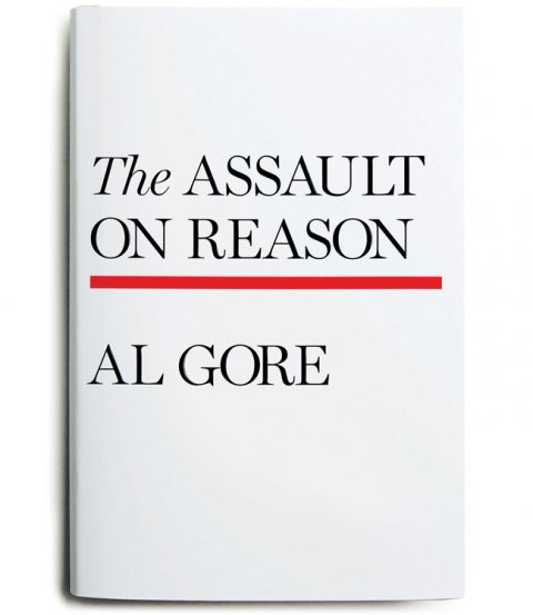
The Assault on Reason

Image 1 of 12

3 Comments

Fully Booked – Interview with David Pearson and Jim Stoddart

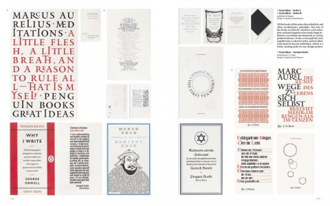
GestaltenTV have been reposting some of their past videos, and I just came across this interview with designer David Pearson and Penguin art director Jim Stoddart from 2008 for the Gestalten title Fully Booked: Cover Art and Design for Books (currently unavailable sadly):

Comments closed

New Ways To Kill Your Mother

New Ways to Kill Your Mother: not only a great title, the UK edition of Colm Tóibín’s most recent book  sports  a wonderful jacket design by talented Scottish designer, illustrator and letterer Steven Bonner. The typography and decorative lettering is beautiful, but the noose is just such an elegant black twist.

Steven’s lettering was included in Letter Cult’s massive list of the best custom lettering of 2011 (linked to previously here), and you can see more of his design work on his website.

New Ways to Kill Your Mother has just been released in the US. You can read the New York Times review here.

1 Comment

Something for the Weekend

A stunning jacket design by the great Isaac Tobin for After Freud Left, published by University of Chicago Press.

You can read my interview with Isaac from 2009 here.

Bauhütte to Bauhaus — A fascinating overview of the Bauhaus by Frank Whitford, author of the Thames & Hudson ‘World of Art’ book Bauhaus,  for the TLS:

The structure of the Bauhaus… followed, as Gropius thought, medieval principles. He coined the school’s name so as to echo the word Bauhütte, in the Middle Ages the German for a guild of masons, builders and decorators. And the teaching was based on specialist workshops where you learned your trade by carrying out actual projects, graduating from apprentice to journeyman and master. The teachers were at first called Masters and not Professors, a revolution in a country where academic snobbery was the norm.

Calligraphica — A new tumblr devoted to calligraphy and hand drawn type (pictured above: ‘One Hope One Quest’, by Greg Papagrigoriou).

Persuasion — Michael Bierut talks to Designers & Books about his collection 79 Short Essays on Design:

Even the best designers have to persuade people all the time. They have to persuade people to hire them; then they have to persuade people to go with the recommended solution; then they have to persuade people to realize that solution in the best possible way. Simply showing someone a nice design is almost never enough. This constant effort—and all the rejection that inevitably ensues—obviously requires healthy confidence and nerves of steel, if not a strong ego.

And finally…

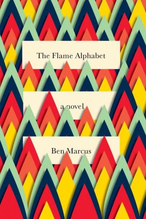
Critic James Lasdun reviews The Flame Alphabet by Ben Marcus for The Guardian:

Language, the debasement, banality and ultimate toxicity thereof, is his subject. It’s a staple topic of avant garde literature, from the Prenzlauer Berg writers of the former East Germany to the Language poets of the American academy. All proceed, more or less, on the basis that verbal communication has been fatally corrupted by political or literary abuse and can be rescued only by a total dismantling and reassembly. Results vary (I’ve yet to read a Language poem that didn’t make me want to dissolve it in acid), but Marcus’s own, especially in The Age of Wire and String, have been haunting and inventive.

Comments closed

Midweek Miscellany

I really enjoyed Naïve: Modernism and Folklore in Contemporary Graphic Design, so I really think I have to pick up  Echoes of the Future: Rational Graphic Design and Illustration, also published by Gestalten. A “compilation of recent graphic design and illustration that is inspired by our collective visual memory”,  the book includes work by Gianmarco Magnani, AKA Silence Television, who (calling all enterprising art directors) ought to be doing book covers (if he isn’t already):

But moving on…

“The only thing left on the high street that doesn’t want either your soul or your wallet” — Zadie Smith on libraries at the NYRB:

What kind of a problem is a library? It’s clear that for many people it is not a problem at all, only a kind of obsolescence. At the extreme pole of this view is the technocrat’s total faith: with every book in the world online, what need could there be for the physical reality? This kind of argument thinks of the library as a function rather than a plurality of individual spaces. But each library is a different kind of problem and “the Internet” is no more a solution for all of them than it is their universal death knell.

And on a sort of related note…

The Disease-Carrying Book — John Sutherland reviews How To Do Things With Books in Victorian Britain by Leah Price for the Literary Review:

The public library, introduced in Manchester with much municipal self-congratulation in the early 1850s, was ‘free’, unlike ‘leviathan’ circulating libraries such as Mudie’s and W H Smith’s that catered to the middle classes. The lower classes lick their index fingers to turn the page. A quaint ‘fumigator’ in which Victorian public libraries could decontaminate their stock is illustrated in Leah Price’s discussion of the disease-carrying book. Victorians were wedded to the ‘miasmic’ theory of disease. Yet it wasn’t air but spittle that was the vector of the dreaded consumption.

Reality is Elsewhere — Steve Wasserman on Amazon at The Nation:

For many of us, the notion that bricks-and-mortar bookstores might one day disappear was unthinkable. Jason Epstein put it best in Book Business, his incisive 2001 book on publishing’s past, present and future, when he offered what now looks to be, given his characteristic unsentimental sobriety, an atypical dollop of unwarranted optimism: “A civilization without retail bookstores is unimaginable. Like shrines and other sacred meeting places, bookstores are essential artifacts of human nature. The feel of a book taken from the shelf and held in the hand is a magical experience, linking writer to reader.” That sentiment is likely to strike today’s younger readers as nostalgia bordering on fetish. Reality is elsewhere.

Also at The Nation Michael Naumann on Germany’s bookstores and literary culture:

Since the late 1840s in Germany, the ambiguous character of books—simultaneously a commodity and a cultural work—has defined internal discussions in the publishing business. Putting aside the implicit hubris of German nationalism, the country’s self-aggrandizement as a veritable Kulturnation, the fact remains that in Germany the cultural definition of the “book” as a major source of intellectual, scientific, economic and aesthetic self-improvement has carried the day over the capitalist notion that a book is a commodity and therefore deserving of no special considerations. The book as such is sacred. One does not throw books away.

And finally…

The Graphic Modern: USA, Italy and Switzerland 1934–66 exhibition curated by Patricia Belen and Greg D’Onofrio of Kind Co. is on display at Fordham University at Lincoln Center, should you happen to be in New York between now and July 26th.

Comments closed

Something for the Weekend

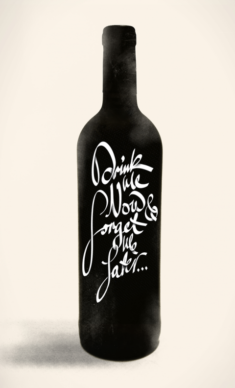
Letter Cult’s epic selection of the best custom lettering of 2011 (don’t click on the link if you have things to do today — and this is only part one!). Pictured above ‘Drink Me Now, Forget Me Later…’ by Michael Spitz.

Rank Amateurs — Design critic Justin McGuirk reviews Home-Made Europe: Contemporary Folk Artifacts for The Guardian:

The makers’ motives are not always need or thrift; sometimes it’s pleasure or obstinacy, or serendipity – a road sign that happens to make a perfect tabletop. This kind of uncelebrated creativity brings to mind artist Jeremy Deller’s Folk Archive, which catalogues everything from protest banners to pizza kiosks. Deller has written a short foreword here, in which he makes a distinction between these objects and DIY, “a hobby that seems so pleased with itself”. The difference is that the DIYer seeks to emulate the professional, whereas these objects all share the nonchalance of the amateur.

Also in The Guardian, Anthony Quinn on cricket and the novel:

Sport in novels is seldom just sport. It’s a way of talking about something else – fellowship, ambition, jealousy, honour. With cricket it’s clearly a way of writing about failure. Lately we’ve been hearing a lot about players who, at the end of their careers, succumb to insecurity and depression; some cannot handle the post-career blues and choose to end it all. As David Frith’s excellent book Silence of the Heart (2001) made clear, cricket has the highest proportion of suicides in any sport. Why? It might be because it is, of all sports, the loneliest.

Repressed Energy — An interview with Daniel Clowes about The Art of Daniel Clowes: Modern Cartoonist at the A.V. Club:

I can look at my early work and see what a pained struggle it was to draw what I was drawing. I was trying so hard to get this specific look that was in my head, and always falling short. I could see the frustration in the lines, and I remember my hand being tensed and redrawing things a thousand times until I finally inked it, and just having this general tense anxiety about every drawing. I think that comes through in the artwork, and gives it this certain kind of manic energy, this kind of repressed energy, so you feel like it’s sort of bursting at the seams or something.

And finally…

Sara Goldsmith on the history of the paper clip at Slate magazine:

The paper clip we think of most readily is an elegant loop within a loop of springy steel wire. In 1899, a patent was issued to William Middlebrook for the design, not of the clip, but of the machinery that made it. He sold the patent to the American office-supply manufacturer Cushman & Denison, who trademarked it as the Gem clip, in 1904. Middlebrook’s rather beautiful patent drawing shows the clip not as an invention but as the outcome of an invention: the best solution to an old problem, using a new material and new manufacturing processes. Coiled in this form, the steel wire was pliant enough to open, allowing papers to nestle between its loops, but springy enough to press those papers back together. When the loops part too far from each other and the steel reaches its elastic limit, the clip breaks.


Comments closed

Something for the Weekend

You’re All Just Jealous of My Jetpack — Tom Gauld has a Tumblr (The title is a reference to this of course).

Legacy Issues — Stephen Page, chief executive of Faber & Faber, writing at The Guardian:

Let’s deal with technological obsolescence. Media businesses are not technology businesses, but they can be particularly affected by technology shifts. I run a so-called legacy publishing house, Faber & Faber. Most of our business is based on licensing copyrights from writers and pursuing every avenue to find readers and create value for those writers. We are agnostic about how we do this. For our first 80 years, we could only do it through print formats (books); now we can do it through books, ebooks, online learning (through our Academy courses), digital publishing (such as the Waste Land app) and the web. Technology shifts have tended to result in greater opportunity, not less.

Bibliophiles in London — The Economist on The London International Antiquarian Book Fair:

Most interesting, perhaps, is the air of optimism—there is not the slightest whiff of gloom at the state of the book world. The internet, paradoxically, has made books “à la mode”, says Claude Blaizot of the Librarie August Blaizot in Paris, purveyor of first editions of “Tintin” and fantastically bound livres d’artiste. “It has brought people to books, and shown them booksellers they never would have known existed before,” he says. Clive Farahar, the Antiques Roadshow’s book specialist, agrees that technology has opened up the book trade, and made the world of books much more accessible to all. “It’s not just the dim little shop on the high street anymore,” he said. “We can learn so much now we never would have known before.”

Simplicity — A two-part interview with Apple designer Jonathan Ive at The Telegraph:

“Simplicity is not the absence of clutter, that’s a consequence of simplicity. Simplicity is somehow essentially describing the purpose and place of an object and product. The absence of clutter is just a clutter-free product. That’s not simple.”

(part two)

And finally…

Daniel Clowes at wired.com:

“Digital seems like such a step back from a printed book… For me, the whole process involves envisioning this book in my head as I’m working. That is what I’m trying to create. That’s the work of art. That’s the sculpture I’m chipping away at, and when I’m finally done, I will arrive at that perfect 3-D object. The iPad version would be like a picture of the book, which doesn’t hold any interest at all for me. Even if I only had 10 readers, I’d rather do the book for them than for a million readers online.”

Comments closed

Radiolab: Colors

On the latest episode of Radiolab, Jad Abumrad and Robert Krulwich explore the science of colour (in their own inimitable and meandering style):

Radiolab: Colors mp3 

(pictured above: Interaction of Color by Josef Albers. Not mentioned in the show, but somewhat appropriate…? Any excuse for a bit Albers really…)

Comments closed

Something for the Weekend

Chris Ware’s astonishing cover for Crockett Johnson and Ruth Krauss: How an Unlikely Couple Found Love, Dodged the FBI, and Transformed Children’s Literature by Philip Nel. See the full thing in detail here.

A free interactive e-book about British artist Francis Bacon created by the estate of the artist and Katharina Günther is available from iTunes (via A Piece of Monologue).

Page 1: Great Expectations, the first book by GraphicDesign&, “collects the responses of 70 international graphic designers when posed with the same brief – to design and lay out the first page of Great Expectations by Charles Dickens.” The Creative Review and We Made This have more on the project.

And finally…

Jon Contino’s beautiful cover  illustration for The Marlowe Papers by Ros Barber. You can’t really tell from the image above, but the apple is actually brown foil, the grub and stalk in are in gold on finished book. You can see better in these pictures Contino posted to Instagram:

Comments closed