Skip to content

Tag: design

Lip Service

The most recent cover of Playboy is, as some have been quick to point out, reminiscent of John Gall’s original cover design for the Vintage edition of Lolita by Vladimir Nabokov, reissued in 2005. John’s design is more subtle than the Playboy cover and more effective for it (but then Lolita is not Playboy after all):

Were Playboy inspired by the book cover? It seems unlikely. The image in John’s design was actually rotated for the final cover and looks quite different:

If I remember correctly the change was made because original orientation was too suggestive. For Lolita. (Just think about that for a minute.)

Is it also seems unlikely that they were inspired by Georgia O’Keeffe (Black Iris III pictured above) although there are some obvious similarities. Has anyone used O’Keeffe for the cover of Lolita?

Interestingly, the cover for the current Penguin edition of Lolita uses a similar colour palette to the Vintage edition and (to a lesser extent Playboy). The head is upright in this version as well. The vertical line of the nose is broken the horizontal features of the eyes and mouth, as well as by the title. Disconcertingly, the photograph and the round sans-serif font are suggestive of a YA novel. Perhaps that unsettling thought is the desired effect?

John’s design for Vintage replaced an earlier photographic cover by Megan Wilson which took an altogether different approach,  placing the book firmly in a historical context. It’s interesting, however, that John’s unused design echoes the crooked vertical line created by the legs in Wilson’s image:

While maintaining a vertical line, David Gee’s unpublished cover cuts to the chase in a far more clinical fashion…*

Inadvertently referencing spatialist painter Lucio Fontana

And one cannot talk about vertical lines and vaginas without mentioning Barnett Newman and his infamous “zip”. Or at least I can’t. But surely Mr Newman wasn’t thinking smutty thoughts was he?

Somehow I doubt Playboy was influenced by either Fontana or Newman. However, here is a 2003 poster for the Vagina Monologues designed by Chermayeff & Geismar that pre-dates both Playboy and Gall. The message is different, I think, but the photograph is clearly being used in a similar way. I’m sorry I don’t have a better image:

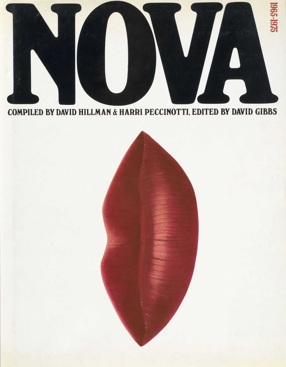
And finally, here is the cover of Nova 1965-1975, which utilizes an original cover from the innovative women’s magazine where Harry Peccinotti was art director. Is this the design that started it all?

*You can see many (many) more Lolita book covers here, and read Print magazine’s article ‘Recovering Lolita’ about John Bertram’s cover competition, here. The mighty Peter Mendelsund also weighs in on covering Nabokov here.

Comments closed

Midweek Miscellany

Designer Jon Gray (AKA Gray318) has launched a new website.

Jon has also been interviewed by We Love This Book:

A book cover only becomes iconic because the book that it covers becomes iconic. The cover is just a face for the content. I have been lucky to work on some really great books and have benefitted from their success. People often assume that by copying the cover of a successful book it will help their book sell, and are always surprised when it doesn’t work. It always has to start with the content.

The Browser — Author Anthony Daniels on the digital challenges faced by books, at The New Criterion:

An intellectual might be defined as someone who elaborates justifications for his own tastes and preferences, as metaphysics was once defined as the finding of bad reasons for what we all believe on instinct. And so the reader of books soon finds reasons for the supposed superiority of the printed page over the screen of the electronic device: for nothing stimulates the brain quite like the need for rationalization. The dullest of minds, I have found, works at the speed of light when a rationalization is needed…

Whether the book survives or not, I am firmly of the opinion that it ought to survive, and nothing will convince me otherwise. The heart has its beliefs that evidence knows not of. For me, to browse in a bookshop, especially a second-hand one, will forever be superior to browsing on the internet precisely because chance plays a much larger part in it. There are few greater delights than entirely by chance to come across something not only fascinating in itself, but that establishes a quite unexpected connection with something else. The imagination is stimulated in a way that the more logical connections of the Internet cannot match; the Internet will make people literal-minded.

And finally…

As am I, as am I — Edward Docx on the Sherlock Holmes ‘pilgrims’ and a re-enactment of The Final Problem organised by The Sherlock Holmes Society of London:

I have come to like the pilgrims a good deal. They’re warm-hearted, engaging and amusing people, which is more than can be said for the moped brethren. There are many from the legal profession—Moriarty is a practising barrister; Cardinal Tosca and Queen Victoria (who are married) are retired from the bar. Sherlock Holmes, I learn, is an ex-head teacher—and is (disconcertingly) married to Mrs Hudson. Watson works for Lloyd’s of London. The strangest and most impressive folk are those who have come the furthest—not least the two ladies from the aforementioned Japan Sherlock Holmes Club (founded in 1977; about 1000 members), who do not, I think, speak English and who are posing as “Baritsu Assistants”—this being some kind of martial art that Holmes knew and that saved  him in his struggle with Moriarty on the falls. There are also policemen, toxicologists, bookmakers, engineers, historians, and many who—nobly—refuse to admit to any other existence save that of their character. If these people have anything in common, beyond the obvious, it is that they are all comfortable with a very elastic sense of reality… As am I, as am I.

Comments closed

Something for the Weekend

A rather brilliant cover for The Yellow World by Albert Espinosa, reminiscent of a Matisse cut-out or a Paul Rand illustration, designed by Jon Gray.

The Sickly Glow — John Banville, author most recently of Ancient Light, reviews The Big Screen by David Thomson, for The Guardian:

Thomson worries that something happened to the cinema around the time of Jaws, something cynical, sinister and perhaps even fatal. Part of the fun of Jaws and the other mindless thrills-and-spills imitations that it spawned, he says, “is that the commotion meant nothing. The sensation eclipsed sensibility”. This is the contentious heart of The Big Screen. The deadening process that, according to Thomson, set in the 1970s has now spread across the billions of tiny screens that infest the world, the combined sickly glow of which must be visible from outer space. Watching has become mere gaping, open-mouthed and slow-breathing. “Facebook already takes our earnest admissions about ourselves and trades them for advertising.”

You can read a short interview with Thomson about the book at The Arts Desk:

I went through a stage, particularly when I was teaching, of saying, “Well, these are the great filmmakers, let us explore them as if they were Charles Dickens or Van Gogh or someone like that.” The auteur theory. And now I’ve got to a stage where I sort of feel that every film is more like other films than anything else. Films are all alike, because the technology is more important. The director is fading away – you don’t think to ask who directs television, and yet television today in America is at a very good stage. So I’ve become increasingly interested in the technology, and what that has done to shape the format.

And on a somewhat glummer note… David Denby, movie critic at The New Yorker and author of Do the Movies Have a Future?, on the economics of Hollywood, at The New Republic:

Most of the great directors of the past—Griffith, Chaplin, Murnau, Renoir, Lang, Ford, Hawks, Hitchcock, Welles, Rossellini, De Sica, Mizoguchi, Kurosawa, Bergman, the young Coppola, Scorsese, and Altman, and many others—did not imagine that they were making films for a tiny audience, and they did not imagine they were making “art” movies, even though they worked with a high degree of conscious artistry. (The truculent John Ford would have glared at you with his unpatched eye if you used the word “art” in his presence.) They thought that they were making films for everyone, or at least everyone with spirit, which is a lot of people. But over the past twenty-five years, if you step back and look at the American movie scene, you see the mass-culture juggernauts, increasingly triumphs of heavy-duty digital craft, tempered by self-mockery and filling up every available corner of public space; and the tiny, morally inquiring “relationship” movies, making their modest way to a limited audience. The ironic cinema, and the earnest cinema; the mall cinema, and the art house cinema.

Viva Hate — Keith Gessen, founding editor of n+1, on Kingsley Amis and Philip Larkin, at The New Statesman:

They had been brought together by their mutual hatred of the universe, which for a while did a fine job of confirming their feelings about it by rejecting and ignoring them. As they began to find their way in the world it became a little harder to hate it, at least with the same intensity. And so their letters to each other dwindled: What was there to say?

They were rescued by the 1960s. Amis and Larkin managed to greet the transformations, disturbances and new thinking with shared hostility. It brought them a whole gamut of things to hate.

And finally…

Lunch with painter Frank Auerbach, at the Financial Times:

It’s funny, this business of a vocation. One starts from a motive one hardly comprehends. In the school holidays I was an office boy – I found the idea of going into an office horrifying. As a painter, I thought there would be bohemianism, freedom, and there was, but gradually the practice of art took over. As Auden says, in any crisis, the break-up of a relationship, the response is to flee to the arms of the muse. At art school you know at least as many talented students as those who became painters, but they get off the train at some point. I met Stephen Spender once, I expected a poet with a vocation but I found a civilised man, gregarious, leading a varied, entertaining, virtuous life – for whom poetry was only one of the facets. He said one of his dreams was to be a poet, the other to have a lovely life, go to France, know lots of people.

Comments closed

Building Stories

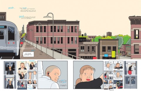
Cartoonist Chris Ware has rightly been garnering a lot of attention for his new ‘graphic novel’ Building Stories14 books, booklets, magazines, newspapers and pamphlets that collect a decade of comics from The New Yorker, The New York Times and McSweeney’s, as well as previously unpublished work.

Douglas Wolk, author of Reading Comics, reviews the book for The New York Times:

You will never be able to read “Building Stories” on a digital tablet, by design. It is a physical object, printed on wood pulp, darn it. It’s a big, sturdy box, containing 14 different “easily misplaced elements” — a hard-bound volume or two, pamphlets and leaflets of various dimensions, a monstrously huge tabloid à la century-old Sunday newspaper comics sections and a folded board of the sort that might once have come with a fancy game. In which order should one read them? Whatever, Ware shrugs, uncharacteristically relinquishing his customary absolute control. In the world of “Building Stories,” linearity leads only to decay and death.

Comics historian Jeet Heer is as insightful as always for a somewhat undeserving Globe and Mail:

This marriage of comics and architecture might sound surprising, but it has a long history, which Ware, deeply knowledgeable about the past, knows well. The modern skyscraper emerged at the same time as modern narrative cartooning, in the middle of the 19th century, although both forms had prehistories that extend further into the past. The classic Sunday newspaper comic strip, with many panels on the page laid out on a grid, has obvious parallels with tall many-windowed office buildings, a fact that pioneering cartoonists like Winsor McCay played with when they drew stories that used the New York skyline not just as a backdrop but as a virtual character. The drawing board of a cartoonist is not unlike the drafting table of an architect. And in both drawing comics and imagining homes, you work with grids, rectangles and cubes and need to have mastered perspective.

And Rick Moody, author of The Ice Storm, gets terribly excited at Salon:

Building Stories is a masterpiece, above all, because it cares about human beings, many of them women. It cares enough to observe human beings closely, both when they are behaving themselves, and when they are engaging in their manifold selfishnesses. It cares enough about them to depict them when they are attractive and when they are singularly unattractive. The contemporary novel, it bears mentioning, does not care this much, because the contemporary novel is so preoccupied with affirmation that it will not risk what Ware is willing to risk.

Other reviews include David L. Ulin for The LA Times, Glen Weldon for NPR, Ian McGillis for the Montreal Gazette, and Rachel Cooke in The Guardian.

The Guardian and New York Magazine also have short interviews with Ware, but there also several excellent longer ones.

At Publishers Weekly, Ware speaks to Calvin Reid:

the idea behind the book is to try to get at the way we remember things, the way we put our lives together in our memories and kind of rewrite our own memories sometimes to suit ourselves. Also to get at a sense of how when you are remembering something that’s happened to you, sometimes you can almost lose yourself in that memory to the point where you lose the sense of the world around you, maybe just for a few seconds or something like that. I had hoped that with this book, that if say you start reading one story and interpret it as the present and then move on to another part of the book and realize that it wasn’t actually the present you were reading about, it was actually the character’s past, that that that might get at a little tiny bit of that feeling. I mean, every book is about a story happening from beginning to end and somebody changing as the story goes on but I wanted to try to create something that is maybe a little more analogous to the way that it feels in my brain, which is maybe a little more three dimensional and uncertain than that…

At the The LA Review of Books, Casey Burchby:

I don’t draft or script; the drawings and stories form themselves out of the images and what they suggest as I draw them, along with the memories they might dredge up. There’s really no way I could plan these things; the connections and coincidences that occur have to happen on the page. I’ve noticed that there’s a sort of nervousness on the part of the reader as to when exactly it is that the writer or artist starts winging it, as if that information has to be taken into account when assessing whether a story is believable or not, but it seems to me that writing an outline or a script on typing paper is just as much winging it as drawing directly on the page, and the latter approach allows the composition and scale to structure and shape the story, as well – which only taking notes or making thumbnails does not do. I do erase. I also have general ideas, themes, notions — whatever you want to call them, but I think that scripts come too perilously close to turning the process into illustrating words, which overlooks the inherent power of what cartooning — essentially a key to visual memory via the structure of language — can be.
And at The New Statesman, Alex Hearn:

I’m simply trying to present life as I’ve experienced it, though admittedly in my own very shielded, first-world way. My characters suffer very little compared to someone who might’ve seen their parents killed in a genocide, or endured starvation or disaster. I don’t know why some readers or viewers don’t find it more depressing that most popular books and movies and television programs can’t seem to not be about murderers or rapists or psychopaths — as if a story simply isn’t interesting unless someone is brutally threatened or killed. Violence is always the cheapest shortcut to emotional involvement.

And finally, Debbie Millman chats with Ware for the design podcast Design Matters:

Design Matters: Chris Ware mp3

Comments closed

50 Memorable Covers From the Last Four Years

The Casual Optimist turned 4 years old at the end of last week. While not exactly a historic achievement, the blog has lasted the length of a presidency and exactly 3 years, 11 months longer than I thought it would. In order to celebrate this minor triumph, I thought I would post some memorable book covers from the last 4 years. It was going to be 10 covers, then it was 20… It quickly became 25, then it was 30… by 30 I figured I might as well do 40… I missed 40 and had to cap it at 50. It was just for fun and not meant to be a definitive survey — it’s just 50 covers that have stuck in my mind. Let me know what you would’ve included in the comments. Leave a comment or send me an email if I am missing details or have incorrectly attributed something.

The keen-eyed among you will also notice that there are no covers from 2012. I’m keeping my powder dry. You can expect a post of my favourite covers of the year in the not too distant future. You can let me know your picks for 2012 in the comments as well. In the meantime, I’m going on vacation so this will be my last post for a while.

So here you go — 50 great covers with some occasional notes. Enjoy…

13 Comments

Midweek Miscellany

A design collaboration between Paul Buckley and Jessica Hische, Penguin Drop Caps is  a 26-book series of hardcover classics. The first six books go on sale November 27th. See the covers at Imprint.

Plumbing — An interview with book designer John Gall at The Believer:

A cover is a structural part of the book. It protects the pages. It provide the first impression of the content. It’s an eye-catching device – maybe the book’s only means of advertising. It can even add to the editorial content of the book; you can kill bugs with it.  Then, after you buy the book, the cover takes on another function. It’s your visual connection to the book as you develop a relationship with the material. It can also communicate to others who you are. I’m one of those people, who when I visit someone, I snoop around and see what’s on their bookshelves. I’m not doing this to judge them, but to find some common interest, a connection to that person.

There is also this great anecdote about Tom McCarthy and the cover for Remainder:

We did a photo shoot for his cover so it appeared that the book was being slowly immersed into blue liquid. We had to create a somewhat elaborate setup to get it just right. We sent the author a photo of the studio setup as a souvenir, showing the tripods and lights and water tanks. A year later he wrote back saying he had an argument with some artist friends of his over dinner. They were looking at the studio-set photo and were insisting that it was all a fake setup and that the cover was executed in Photoshop; that the photo shoot was all staged to provide “proof,” like a fake moon landing!

My Q & A with John is here.

Graveyard Stillness — Andrew Beckett reviews Unknown Pleasures by Joy Division bassist Peter Hook for The Guardian:

Joy Division, for all the graveyard stillness of their record sleeves, were participants in a frenetic golden age for British pop, which had begun with punk in 1976 and would peak, commercially at least, with the British dominance of the American charts in 1983. Groups grew up fast and seized their moment, or disappeared. Yet Joy Division did not earn enough from their feverish touring and recording to give up their day jobs. Hook worked in the offices of the Manchester Ship Canal Company, Curtis at an employment exchange, and Sumner for a film company where his “job was to colour in Danger Mouse”.

And finally…

The Fight Against Loss — A lovely essay by Simon Schama on why he writes:

Orwell’s four motives for writing still seem to me the most honest account of why long-form non-fiction writers do what they do, with “sheer egoism” at the top; next, “aesthetic enthusiasm” – the pleasure principle or sheer relish of sonority (“pleasure in the impact of one sound on another”); third, the “historical impulse” (the “desire to see things as they are”), and, finally, “political purpose”: the urge to persuade, a communiqué from our convictions.

To that list I would add that writing has always seemed to me a fight against loss, an instinct for replay; a resistance to the attrition of memory.


Comments closed

Something for the Weekend

Saw this in person for the first time at a bookstore  last night… Gray318’s cover really is outstanding.

Natives on the Boat — Teju Cole, author of Open City, on his stay in the Roi des Belges in London, and an encounter with V.S. Naipaul:

This boat of which I am temporary captain is named the Roi des Belges. In 1890, Joseph Conrad piloted a steamship down the Congo on a boat with the same name. That journey became his inspiration for “Heart of Darkness,” a puzzling novella with nested narrators who unfolded a shadowed, strangled, brutal tale. He wrote it in the last year of the nineteenth century and published it at the beginning of the twentieth. So, this perch on which I sit above the Thames—the sky is blue now, the hundred-and-eighty-degree view of it full of long stratus clouds—this perch in which the city is exposed to me but I am not to it, is an homage to Conrad’s bitter vision. What might it mean when the native pilots the ship? What happens when the ones on the shore, numerous, unindividuated, are white?

See also: Teju Cole’s diary in the Financial Times and an interview with Cole at 3:AM Magazine. (Thanks Peter)

SciFi Now picks 10 of the best Judge Dredd story arcs.

Wood For Our Coffins — Adam Kirsch on the modern rival of fairy tales for Prospect magazine:

fairy tales have a double relationship to poverty. They are poor themselves—in motivation, imagery, description, ambiguity, complexity, everything that makes for literary interest—and they are the products of poverty. This is clear enough from their social and economic premises: they are frequently  tales of hunger and neglect and child abuse. What we remember about Hansel and Gretel is the gingerbread house and the witch in the oven, but it starts out as a portrait of starvation and infanticide: “If we don’t get rid of them, all four of us will starve,” the children’s mother says to their father. “You may as well start planing the wood for our coffins.”

And finally…

Imprint reviews The Lustigs: A Cover Story, 1933-1961, an exhibition of covers designed and illustrated by Alvin and Elaine Lustig opening at the CVA in Saint Paul, Minnesota, next week.

You can see more of the Lustig’s astonishing body of work at the Alvin and Elaine Lustig Flickr Pool

Comments closed

Something for the Weekend

For the launch of his new book Building Stories, Chris Ware has two exhibitions opening this weekend. The first opens tonight at the Carl Hammer Gallery in Chicago. The second opens on Saturday at the Adam Baumgold Gallery in New York. Both shows will display original art from the new book.

The Snail — The ‘accidental’ history of the @ symbol at the Smithsonian Magazine:

Called the “snail” by Italians and the “monkey tail” by the Dutch, @ is the sine qua non of electronic communication, thanks to e-mail addresses and Twitter handles. @ has even been inducted into the permanent collection of the Museum of Modern Art, which cited its modern use as an example of “elegance, economy, intellectual transparency, and a sense of the possible future directions that are embedded in the arts of our time.”

A short profile of artist and designer Ray Eames at Dwell:

According to Beatriz Colomina, in her essay “With, or Without You: The Ghosts of Modern Architecture,” even though Charles and Ray Eames were revolutionary by including her name in the brand as an equal partner, Ray didn’t always receive her fair share of credit. An editor from the New York Times once erased Ray’s name from an article on the Eameses, despite protests from the writer, Esther McCoy. McCoy was outraged, and wrote Ray an apology letter outlining her frustrations over the omission (and the editor’s insistence on calling the Eames lounge a casting couch), “This is sheer nonsense; the broad audience isn’t titillated by the phrase casting couch nor does it object to a woman being credited for work,” she wrote.

And finally…

ShortList on Mary Harron’s movie adaptation of American Pyscho:

If there’s one moment in American Psycho that sums up the film’s utter greatness, it’s the business card scene. On the one hand, parodying the narcissism of Eighties yuppies, on the other, lending an insight into the warped psyche of the film’s protagonist… And 10 years after the film was first released, it’s certainly one of the reasons why this darkly hilarious Wall Street satire, based on the Bret Easton Ellis novel, is considered a cult classic and one of the greatest films of the past decade.

Comments closed

Midweek Miscellany

Steven Heller shares a few pages from Effective Type-use for Advertising, self-published by Benjamin Sherbow in 1922, at Imprint.

Lost in the Shuffle — Brian Appleyard profiles the writer and critic Clive James:

James’s television work, brilliant as it was, has tended to blur his identity as one of the most influential writers of his time. At one level every newspaper is still packed with James wannabes, his prose tricks and tropes are imitated everywhere; at another level, the whole 1980s wave of new British fiction, especially Martin Amis, showed signs of having learnt from James. Most important was his invention of a way of writing seriously about popular culture.

Listed — Phil Patton on the age of the list, for the New York Times:

We’re living in the era of the list, maybe even its golden age. The Web click has led to the wholesale repackaging of information into lists, which can be complex and wonderful pieces of information architecture. Our technology has imperceptibly infected us with “list thinking.”

Lists are the simplest way to organize information. They are also a symptom of our short attention spans.

And finally…

Swallowing Up the Past — John Gray on J. G. Ballard and memory, for BBC Magazine:

Through a kind of inner alchemy, the Shanghai of his childhood became the London of his first major novel The Drowned World, also published in 1962.

Irreversibly altered by climate change so that it has become a region of tropical lagoons and advancing jungle, the city is almost unrecognisable, though the weed-choked streets remain intact in the depths of the lagoons and the upper floors of a few crumbling hotels continue to be habitable.

Like many of Ballard’s characters, the novel’s central protagonist – a biologist who shares many of Ballard’s own preoccupations with time and memory – doesn’t regret the passing of the old world. At the end of the novel he finds fulfilment in the sun-filled wilderness that is swallowing up the past.

Comments closed

Something for the Weekend

The brilliant Jon Gray and Jamie Keenan reveal the 20 irrefutable theories of book cover design. All of them are great.

Also at The Guardian: Ahdaf Soueif, author most recently of Cairo: My City, Our Revolution, on fiction and the revolution in Egypt:

Attempts at fiction right now would be too simple. The immediate truth is too glaring to allow a more subtle truth to take form. For reality has to take time to be processed, to transform into fiction. So it’s no use a story presenting itself, tempting, asking to be written, because another story will – in the next minute – come roaring over it, making the same demand. And you, the novelist, can’t grab one of them and run away and lock yourself up with it and surrender to it and wait and work for the transformation to happen – because you, the citizen, need to be present, there, on the ground, marching, supporting, talking, instigating, articulating.

The Last Book Sale — A charming piece for the NYRB by Larry McMurty, book dealer and author of The Last Picture Show, on an auction of his books in Archer City:

Everything sold but the fiction. Everyone who deals in fiction has plenty, and more is spilling onto the market from the sale of the Serendipity Bookshop stock now being dispersed on the West Coast. Many people asked me if I was sad to see so many books go. I wasn’t—mainly I was irritated to discover that I still had 30,000 novels to sell.

And finally…

 Put A Bird On It — The New York Times on the city’s boutique art bookstores:

perhaps because the physical book is coming to seem more like an object than ever before, the current landscape of shops blurs the line between bookstore and gallery in rollicking, unpredictable fashion. And because the shops are not nearly as tethered to high-end economics as art galleries, the mélange of stuff that results, some for sale and some not, can be strange and wonderful, like highly personalized cross sections cut from the culture at large.

1 Comment

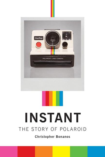
Instant: The Story of Polaroid

Led by the visionary Edwin Land, Polaroid grew from a 1937 garage start-up into a billion-dollar pop-culture phenomenon. Instant by New York magazine editor Christopher Bonanos tells the story of Land’s unique invention, Polaroid’s first instant camera, its meteoric rise in popularity and adoption by artists such as Andy Warhol, and the company’s eventual decline into bankruptcy and its unlikely resurrection in the digital age:

(I should, of course, make clear that as much as I am fascinated by Polaroid cameras, Instant is published by Princeton Architectural Press, who are also distributed in Canada by my employer Raincoast Books. But while I am on the shill, I might as well mention Balthazar Korab: Architect of Photography another P A Press titlewhich was published this earlier month. Korab was Eero Saarinen’s on-staff photographer. Fast Company has a slideshow of some of the stunning images from the book. You should take a look).

Comments closed

Chip Kidd on the Future of Book Covers

Billy Batson Chip Kidd, associate art director at publisher Alfred A. Knopf (as if you didn’t know), talks to NPR’s Weekend Edition about the future of book cover design:

NPR WEEKEND EDITION: In the E-Book World, Are Book Covers a Dying Art?

2 Comments