Skip to content

Tag: design

Q & A with Misha Beletsky, Art Director Abbeville Press, Part One

Misha Beletsky is the art director of New York’s Abbeville Press, an independent publisher of fine art and illustrated books.

Towards the end of last year, Misha was kind enough to send me a copy of his recent book, The Book Jackets of Ismar David, published by RIT Press.

A German-born graphic artist, David worked in Germany and then Jerusalem before moving permanently to the United States to become part of a group of accomplished calligraphers who also worked as book jacket designers in New York in the 1950s. David’s bold and expressive style was informed by a mastery of the typographic tradition (he designed a calligraphic Hebrew typeface called David Hebrew), and he worked for many of leading publishers of the day including Alfred A. Knopf, Harper and Row, Houghton Mifflin, Random House and others.

In this post, the first of a two-part interview, Misha discusses the book and his interest in the work of Ismar David.

When did you first come across the work of Ismar David?

Anyone who reads Hebrew is familiar with David’s work, whether they are aware of it or not: David Hebrew, a font he designed happens to be one of the most ubiquitous Hebrew typefaces for text setting. I was first exposed to his work outside of type design as I researched my article on the history of Hebrew typography around twelve years ago.

What interested you about him?

David’s work is powerful and beautiful, yet little known. He had a rare ability of using traditional skills and historical knowledge to arrive at strikingly contemporary results.

Did David’s work change when he moved to the US?

His work matured and became more diverse, as he grew in his craftsmanship and absorbed many exciting influences of 1950s’ New York design scene. He was working alongside other accomplished calligrapher jacket designers like George Salter, Warren Chappell, Arnold Bank, Phil Grushkin, Charles Skaggs, Oscar Ogg, Jeanyee Wong, and Lili Wronker, among others. They all knew each other and learned from each other’s work.

Do you consider David to be primarily a book designer or a calligrapher?

He was a graphic artist who used calligraphy as a primary means of expression. He was equally comfortable designing book jackets, architectural interiors, logos, advertisements, and monumental inscriptions, depending on the project at hand.

What was special about his Hebrew typeface ‘David’?

It was the first 20th c. Hebrew text type, whose letterforms were not based on an existing typographic model, but found inspiration in historic calligraphic hands. David distilled the idea of the Hebrew letter to its purest form.

How did David’s work differ from his contemporaries Paul Rand and Alvin Lustig?

His work could not be called clever or conceptual. He relied on the sheer power of the letter, shape, and color to create stunning jackets that told the book’s story through a primary visual vocabulary.

Is David’s work still relevant today?

I believe it is. Twenty years into the “conceptual revolution” in our book cover design, the Modernist idiom is getting a bit tired. We are ready for something different. There is a renewed interest in traditional typography and design craftsmanship, and it is here that we could learn a thing or two from David.

Do you think we’re seeing a revival of calligraphy, lettering and hand-drawn type?

Somewhat: if Pinterest stats are any indication, lettering compositions are trending along with pictures of fashionable outfits, cute puppies, and expensive home interiors. It’s not a complete comeback, though. On one hand, a few talented designers like Marian Bantjes and Jessica Hische are enjoying a tremendous degree of success with their decorative lettering work. On the other hand, the work of traditionally trained calligraphers is still in relatively low demand. What seems encouraging, though, is a renewed interest in, and appreciation of, calligraphy as a craft. I would attribute the interest in this and other handicrafts to the backlash against the proliferation of the computer that has left the hand out of the creative process. At the same token, the plethora of visual resources now available on the Internet provides unprecedented access to the rare historical calligraphic books and manuscripts. In this case the same computer is actually helping to make the handicraft popular again.

Thanks Misha.

You can find more images from The Book Jackets of Ismar David on Facebook. Part two of my converation with Misha will be available tomorrow.

Comments closed

Midweek Miscellany

Toy Monkeys — Steven Heller interviews Canadian artist and illustrator Gary Taxali for Imprint:

Illustration is in rapid flux. How pictures are being used defies what we traditionally knew about illustration. Many artists are empowered by new digital media. Yet I sense a fear about the continued life of a still picture. People were talking about how illustrations needed to “move” two years ago. That’s not illustration, that’s animation. Most illustrators can’t animate. The timeless power of a still image will never leave the human psyche despite what new gadgets can accomplish.

(pictured above: I Love You, OK? by Gary Taxali, published by teNeues)

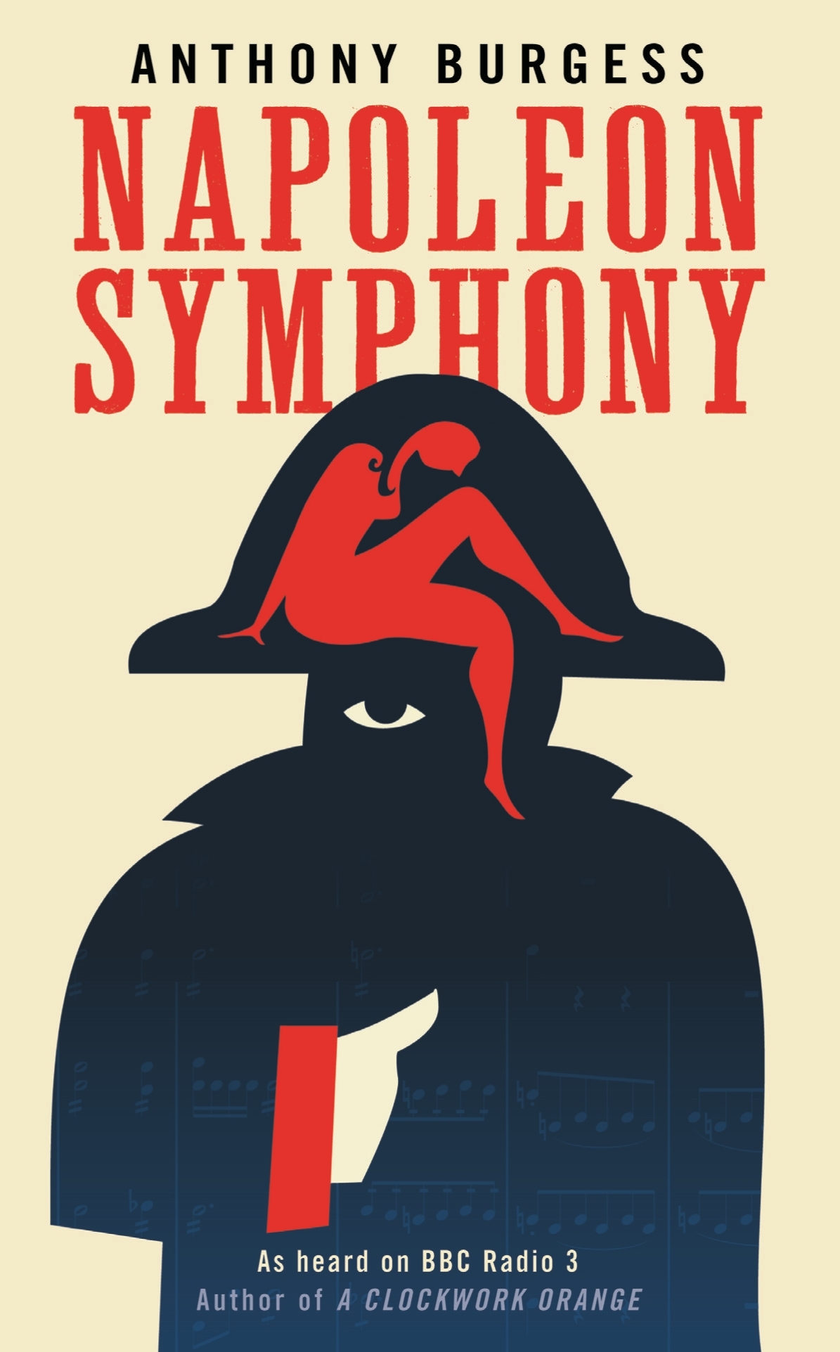
Stanley Kubrick’s 1972 rejection letter to Anthony Burgess, at Letters of Note:

I earnestly hope that our all too brief friendship will survive me telling you that the MS is not a work that can help me make a film about the life of Napoleon. Despite its considerable accomplishments, it does not, in my view, help solve either of the two major problems: that of considerably editing the events (and possibly restructuring the time sequence) so as to make a good story, without trivializing history or character, nor does it provide much realistic dialogue, unburdened with easily noticeable exposition or historical fact.

As Shaun Usher, editor of Letters of Note, points out: “Burgess was undeterred, and Napoleon Symphony was published as a novel in 1974. Kubrick’s movie, however, failed to materialise.”

Strange Places — Owen Hatherley reviews Museum without Walls by Jonathan Meades, for the London Review of Books:

What Meades does most often is praise things, especially things that are habitually ignored: he is surely our greatest exponent of what the Russian Formalists called ostranenie, ‘making-strange’. Architecture, as an art form, isn’t quite mundane enough to be made strange, and for that reason Meades would seldom recognise his writing as being about ‘architecture’ as such. Rather, it is about Place, somewhere architecture happens, at times in a very dramatic way, but doesn’t necessarily have the leading role. Architects take non-art, ‘the rich oddness of what we take for granted’, the mutability, detritus and accident that define truly worthwhile Place, and replace them with something static and unchangeable. However, unlike Iain Sinclair or the London ‘psychogeographers’… Meades does not fetishise the spaces between. ‘I have to admit to a fondness for pitted former rolling stock dumped in fields and for abandoned filling stations,’ he writes. ‘But man cannot live by oxidisation alone. It’s not a question of either atmospheric scrappiness or gleaming newbuild. It’s a question of both/and. It’s a question of the quality of the atmospheric scrappiness, the quality of the newbuild.’

And finally…

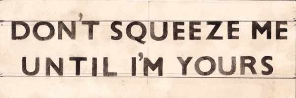
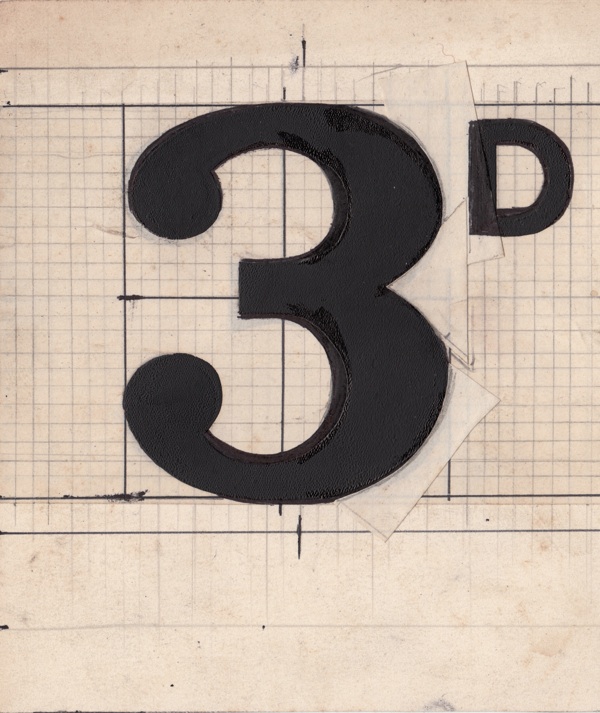
The best thing I’ve seen in ages… Roy Gardner’s designs for the sales tickets in his store Gardners’ Market Sundriesmen on Commercial St in Spitalfields, London:

No doubt knocking up these sales tickets was all in day’s work to Roy Gardner – just one of the myriad skills required by a Market Sundriesman – yet a close examination of his elegant graphic designs reveals he was also a discriminating and creative typographer.

Comments closed

Typographic Dreams

French duo Cauboyz have created a wonderful new type-orientated music video for Husbands ‘Dreams’:

It’s all the more impressive when you realise that it was created with light boxes and switches rather than digitially. Watch the ‘making of’ video:

And this isn’t the first time Cauboyz have created a deceptively simple looking typographic music video. They also created this beauty for The Black Keys ‘Make You Free’:

You can watch the ‘making of’ video here.

Comments closed

You’ll Never Get Anywhere Like That

Or a Few Thoughts on the Cover Design of The Bell Jar (An Illustrated Essay of Sorts)

In his recent essay ‘Graphic Design Criticism as a Spectator Sport’ designer Michael Bierut (author of 79 Short Essays on Design) suggested that “at a time where more people than ever are engaged with design,” design criticism has been reduced to a “seemingly endless series of drive-by shootings punctuated by the occasional lynch mob, conducted by anonymous people with the depth of barroom philosophers and the attention span of fruit flies.”

Unsurprisingly, I thought of Mr. Bierut during the recent furore about the cover design of The Bell Jar.

When Faber and Faber published a 50th anniversary edition of Sylvia Plath’s novel last month with a brightly coloured new cover, they can hardly have expected a controversy. But the design, which features a photograph of a woman holding a compact and touching up her make-up, was, it turned out, nothing less than “a ‘fuck you’ to women everywhere.” It was so truly hideous, that if “Sylvia Plath hadn’t already killed herself, she probably would’ve” when she first saw it. It was “THE BELL JAR as chick lit” — “1990s chick lit“!

It wasn’t much better when the designers weighed in. If the diplomatic Jamie Keenan thought Faber hadn’t “got it quite right,” Barbara DeWilde was less equivocal: “it’s a travesty… I’m still almost speechless that it was published in this form.”

We are, of course, morbidly fascinated by Plath, who died tragically young — there are at least 3 new books about her life being published this year alone. That The Bell Jar is both semi-autobiographical and her only novel makes our opinions about it even more intense.

But just how much of the criticism was actually fair?

On the face of it, the image isn’t entirely inappropriate. Mirrors (and photographs) are a recurrent motif in the book (one of its working titles was The Girl in the Mirror). The novel even begins with Esther working for a fashion magazine in New York. She talks about her looks, her clothes and her make-up. She carries a compact in her bag. Esther is fixated with appearances even as she struggles against being defined by hers.

Nor is the new design some kind of “chick lit makeover” — that just seemed like a convenient, if inaccurate, headline. While defining what qualifies a ‘chick lit’ is notoriously difficult, the cover has none of whimsy usually associated with the genre. Furthermore the new design wasn’t a sudden attempt to make the book look more feminine. The beautiful Faber Firsts cover from 2009 designed by Mark Swan also uses a glamorous retro image (albeit a disturbingly cropped one).

In fact, the new cover, also designed by Swan, is much more jarring than the Faber Firsts’ almost romantic image. There’s an angular sickliness to it — an awkward, unpleasant toxicity. The bright colours are unnaturally heightened, the pose mannered, the jerky lettering like “loops of string lying on the paper” blown askew.

As Faber themselves would later would confirm, it was meant to unsettle. The intent “was that the image of the expressionless woman ‘putting on her mask’ and the discordant colour palette would suggest ambivalence and unease.”

Certainly the new cover, is harder to like. It is indisputably ugly, especially compared to Swan’s earlier design or the original Faber cover from 1967 (pictured above) designed by Shirley Tucker (if not more so than this Warholian shocker from 1998). But tasteful covers rarely stand out on the shelves and from a marketing perspective there isn’t anything necessarily wrong with something being dissonant. It can be startling effective as Peter Mendelsund’s covers for Simone de Beauvoir demonstrate. Disruptive designs can also provoke interest in new readers and there is even some anecdotal evidence this is precisely what has happened with The Bell Jar — it is, apparently, “doing the business.”

Still, the design of The Bell Jar fails, at least as an accurate representation of the book. The mirror’s reflection does nothing to imply the introspection or detachment of the novel — only a coquettish vanity and narcissism. The woman in the photograph is just too put-together, too worldly. The mannered glamour is reminiscent of the stifling fashion photography of the 1950’s. This isn’t a 19 year-old’s face, “bruised and puffy and all the wrong colours.” There is no ennui or anxiety on display. No hint of poverty or isolation. Nothing of the suicidal depression aor a person coming apart. There is none of the disappointment. It is just an icily cool model posing for a photograph — an image Esther herself denies:

The magazine photograph showed a girl in a strapless evening dress of fuzzy white stuff, grinning fit to split, with a whole lot of boys bending in around her. The girl was holding a glass full of a transparent drink and seemed to have her eyes fixed over my left shoulder on something that stood behind me, a little to my left. A faint breath fanned the back of my neck. I wheeled around.

The night nurse had come in, unnoticed, on her soft rubber soles.

“No kidding,” she said, “is that really you?”

“No, it’s not me. Joan’s quite mistaken. It’s somebody else.”

To make matters worse for Faber, they also revealed the new cover shortly after Penguin Classics reissued new editions of George Orwell with cover designs by David Pearson. The contrast is unfavourably stark. Where Pearson deftly combines wit and originality with respect for material (not to mention Penguin’s design heritage), the stock photography, anachronistic type and bright colours of The Bell Jar seem crass and gaudy.

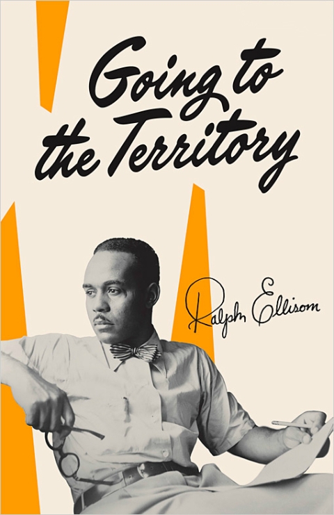
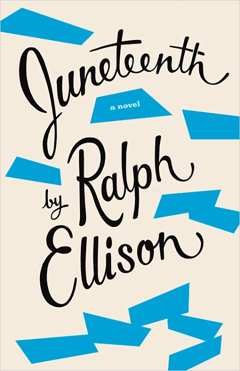
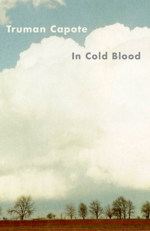
Comparisons with similarly stylish new editions of Kafka and Joyce designed Peter Mendelsund, Truman Capote designed by Megan Wilson, and Ralph Ellison designed by Cardon Webb, are unequally unflattering. It’s not hard to see that Plath, like so many other women writers, has been decidedly short-changed.

As Fatema Ahmed, noted in her post ‘Silly Covers for Lady Novelists‘ for the London Review Books blog, “the anniversary edition fits into the depressing trend for treating fiction by women as a genre, which no man could be expected to read and which women will only know is meant for them if they can see a woman on the cover.”

In recent years, contemporary writers as diverse as Francine Prose, Jodi Picoult, Jennifer Weiner, Meg Wolitzer, Fay Weldon, and Lionel Shriver have all noted how fiction by women is marginalized. No matter that women buy the most books, women writers are less well-reviewed, win fewer literary awards, and all too often the covers of their books don’t accurately reflect nature of the work itself.

If books by Jonathan Franzen, Chad Harbach and Ben Marcus are designed to look different and stand out on the shelves, contemporary literary fiction written by women tends to look the same regardless of the book’s subject matter. All too often there is a photograph of woman on the cover — pretty, domesticated, inoffensive and wistful. The assumption is that women only want to read certain kinds of stories, and that men don’t want to read books by women at all. In discussing the treatment of her own work, Shriver dryly pointed out, “publishing’s notion of ‘what women want’ is dated and condescending.”

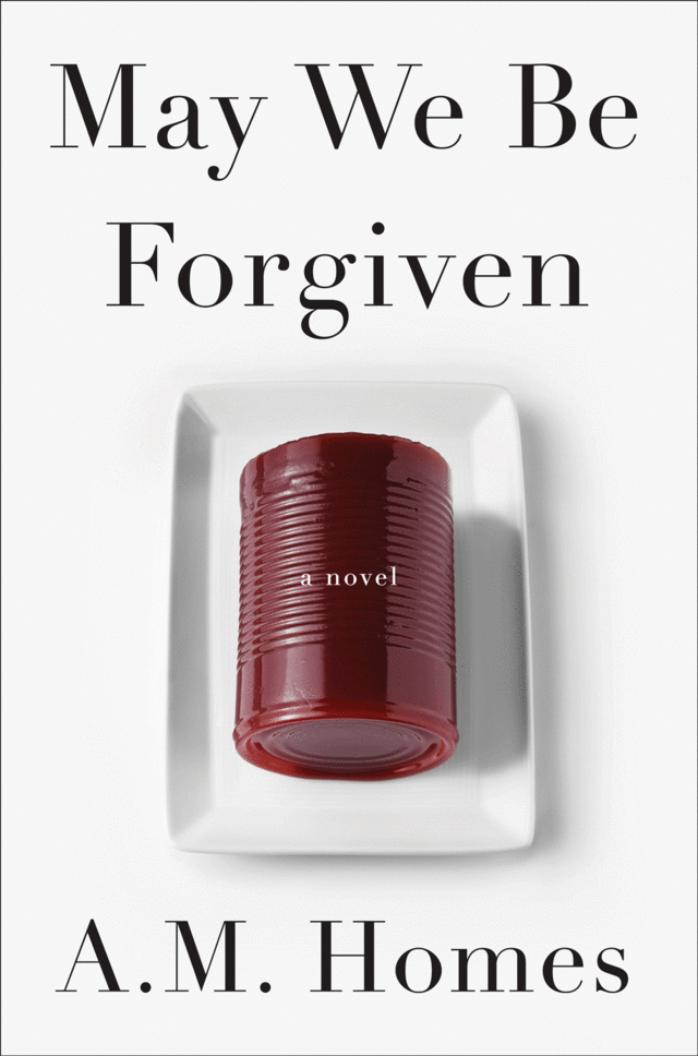
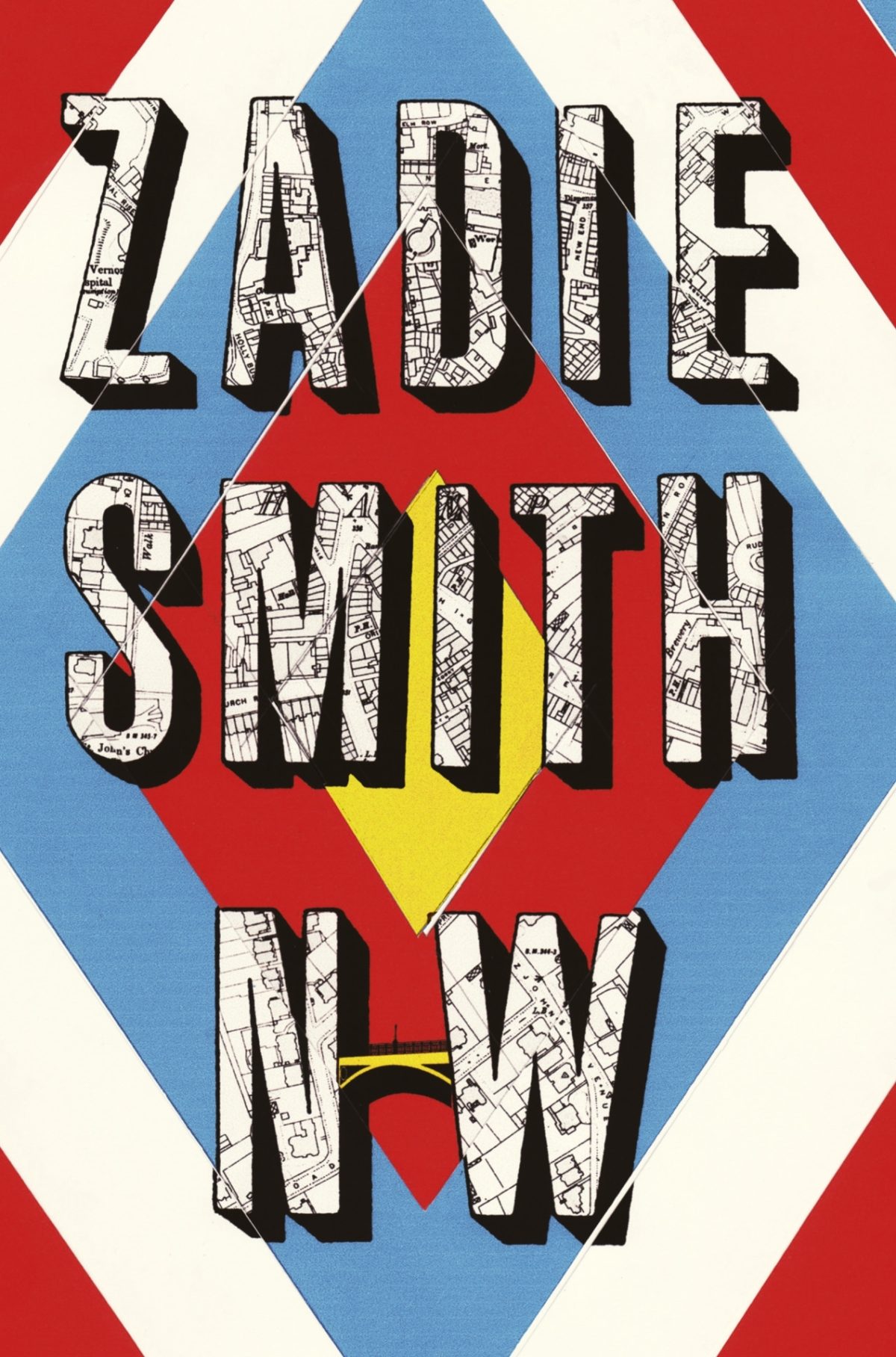
This isn’t always true, of course. Hilary Mantel’s Thomas Cromwell novels defy all expectations. See Now Then, Jamaica Kincaid’s first novel in 10 years, has a type-only cover. The Casual Vacancy by J. K. Rowling is notable for its hand-drawn lettering and calculated, corporate blandness. Both the American and the British editions of Zadie Smith’s NW — designed by Darren Haggar/Tal Goretsky and Gray318 respectively — are stunning. Alison Forner’s sinister canned cranberries for May We Be Forgiven by A. M. Homes is a neat inversion of domesticated happiness. The Penguin Modern Classics reissues of Carson McCullers designed by Jim Stoddart — with images selected by Penguin Press picture editor Samantha Johnson — also demonstrate that 20th century classics by women do not have to suffer from poor design or gender stereotypes.

There are surely other isolated examples too. But one can’t help thinking they are exceptions that prove the rule, and it is a particularly bitter irony that Plath’s novel about a young woman struggling with society’s expectations of her should, 50 years later, expose that woman writers are still stereotyped and treated poorly in comparison to their male counterparts. My sense is, however, that this latest controversy is a sign that the tide is turning. Women, both writers and readers, are being more outspoken about what is wrong with the way their books are handled by publishers and the media. They expect more and they expect better. This is the upside of design as a spectator sport. White middle-aged men are no longer the only voices being heard. Thankfully.


I was recently asked for my opinion on the new cover of The Bell Jar for an article in the Chicago Tribune. This an edited and expanded version of my comments to journalist Nara Schoenberg for that article. Thanks to everyone who gave feedback on an earlier draft of these remarks.


9 Comments

Something for the Weekend

Deciphered — Designer Peter Saville on his designs for New Order, particularly Blue Monday and Power Corruption and Lies, at Upon Paper:

To me a record cover is part of the everyday, the now. And regularly there were phases of reference and quotation that – for whatever reason – I found relevant or pertinent. There were things going on in fashion or architecture that I would be aware of… things that I would take a reading from. I was interested in how the arts in general, but in particular the applied arts, were in some way evoking the mood, the appetite or the direction, the direction of the now. I always had a sense of what direction ‘the now’ was, it started with my own senses and then I would double-check and double-check to determine that what I was thinking was not merely insular. Around ’82 to ’83, I began to feel confident in my own sensibility.

Txtng teh Apclyps — The Guardian rock critic Alexis Petridis talks to  Nick Cave about this new album:

“Texting is apocalyptic on some level,” he muses, when the title of Push The Sky Away’s first single, We No Who U R is mentioned. “It’s a reduction of things. Maybe the last book, the last thing that ever gets written is just a bye, you know, goodbye in text speak.”

And finally…

Teju Cole on literature, Barak Obama,  dirty wars and drone strikes, at The New Yorker:

The plain fact is that our leaders have been killing at will.

How on earth did this happen to the reader in chief? What became of literature’s vaunted power to inspire empathy? Why was the candidate Obama, in word and in deed, so radically different from the President he became? In Andrei Tarkovsky’s eerie 1979 masterpiece, “Stalker,” the landscape called the Zona has the power to grant people’s deepest wishes, but it can also derange those who traverse it. I wonder if the Presidency is like that: a psychoactive landscape that can madden whomever walks into it, be he inarticulate and incurious, or literary and cosmopolitan.

Comments closed

Something for the Weekend

Snowstorm…something, something… Snowstorm… Hmm, what? Oh right. Here we go…

Pick Up a Pearson — A profile of book designer David Pearson in the New York Times:

 The chillingly eloquent jacket of “Nineteen Eighty-Four” is the work of the British graphic designer David Pearson He is responsible for the design of four more books that have been reissued by Penguin in the Great Orwell series of paperbacks. From the horror movie typography on “Animal Farm” to the Vorticist-inspired illustration that Mr. Pearson commissioned from Paul Catherall for “Down and Out in Paris and London,” each of the covers exhibits the wit, thoughtfulness and ingenuity that have come to distinguish his work.
“David manages to combine respect for tradition with playfulness and a light touch,” said the graphic design historian Emily King. “He also has a brilliant understanding of the book as a physical object.”

Kvelling — Gerald Howard on the 50th anniversary of the New York Review of Books, at Salon:

Last week, my colleague at Doubleday came by my office with an austere-looking 11-by-15-inch broadsheet. Good God! It was a facsimile edition of the first issue of the New York Review of Books, Feb. 1, 1963. The advertising director and I sat there kvelling over this wondrously manifested printed object from another universe, with its Murderers Row of reviewers weighing in on many books that all these years later still matter, its old-school book ads with their quaint frontal appeals to the reader’s higher cultural aspirations…

The Literaries — A great essay Eddie Campbell about comics criticism at The Comics Journal:

Moving sideways at this point takes me to another recurring argument that falls within the jurisdiction of the present rant. I refer to the incessant debate over who authored Marvel Comics, was it Stan Lee or was it Jack Kirby?… The literaries are inclined to debate whether the furnishing of a plot is enough of a claim to authorship, or whether the real writer in this case was the artist. Once the argument gets started it can go in any direction, and is just as likely to deny that a plot was ever given in the first place, because it is obligatory that everybody who wasn’t there have an opinion and take sides. None of that has ever mattered, as far as I’m concerned, though I acknowledge that the ownership of successful movie franchises could make a difference to this party or that. But the movies do not interest me and I do not care. None of them have ever captured the thing that made Marvel comics exciting to me in 1965 when I discovered them for myself.
And finally…

Amazon Unpacked — A long, must-read piece at the FT on Amazon’s warehouse in the former mining -town of Rugeley, Staffordshire:

As online shopping explodes in Britain, helping to push traditional retailers such as HMV out of business, more and more jobs are moving from high-street shops into warehouses like this one. Under pressure from politicians and the public over its tax arrangements, Amazon has tried to stress how many jobs it is creating across the country at a time of economic malaise. The undisputed behemoth of the online retail world has invested more than £1bn in its UK operations and announced last year that it would open another three warehouses over the next two years and create 2,000 more permanent jobs. Amazon even had a quote from David Cameron, the prime minister, in its September press release. “This is great news, not only for those individuals who will find work, but for the UK economy,” he said.

People in Rugeley, Staffordshire, felt exactly the same way in the summer of 2011 when they heard Amazon was going to occupy the empty blue warehouse on the site of the old coal mine. It seemed like this was the town’s chance to reinvent itself after decades of economic decline. But as they have had a taste of its “jobs of the future”, their excitement has died down…

You can probably guess where it goes from there (but you should still read it)…

Comments closed

Midweek Miscellany

A bit late in the day on this, but the British edition of HHhH by Laurent Binet, designed James Paul Jones Senior Designer at Vintage Books, is quite something. The book was recently released in paperback in the UK.

And, if you’re curious, the North American edition designed by Rodrigo Corral looks like this:

The Language Policy — Further thoughts from Tim Parks on the role of editors, at the NYRB Blog:

As readers, it seems, we love to feel we are in direct, unmediated contact with an especially creative, possibly subversive mind and that we are getting all of its quirks and qualities unmediated and unmitigated by the obtusity of lesser folks perversely eager to return everything to the expected and mundane. This is no doubt why so little is said about editing even in the more learned papers, while nothing at all appears in the popular press, let alone at a promotional level. One cannot imagine, for example, a publisher launching an advertising campaign to boast that it has the most attentive copy editors in the business and can guarantee that everything you may read from its list has been properly purged of anything grammatically iffy, or foreign, or idiosyncratic.

Numbers — Rick Poyner on The Book of Numbers created by Herbert Spencer Spencer  in collaboration with his daughter, Mafalda:

The concept is simple enough. “We live in a world full of numbers: on houses and shops, on buses and motor cars, on magazines and packages, on stamps and labels, in fairgrounds and markets, on boats and aeroplanes, on road signs and posters,” write the Spencers. A series of photographs documents the occurrence of the numbers 1 to 100 going about their business somewhere out there in the world. Most numbers — seen on a showcard, a trash can, a hanging sign, a ceramic tile, a bus stop — receive their own images. In a few cases, such as house numbers and a set of maps, several consecutive numbers form a photogenic group within the same picture.

(It sounds fantastic).

And finally…

Colin Dickey on the haunted hotels of Los Angeles, at the Virginia Quarterly Review:

All hotels are haunted. It doesn’t matter which hotel; it’s already played host to a murder, an overdose, an accidental death with a story. You’re kidding yourself if you don’t see this, if you don’t recognize you sleep with ghosts. Every hotel staff has its stories, any cleaning woman or bellhop knows the score. In Wilkie Collins’ 1878 gothic novel The Haunted Hotel, an Italian villa is converted to a hotel shortly after it houses an unexplained, horrific tragedy. On opening night, a guest (“not a superstitious man”) takes Suite 14, and leaves hurriedly the following morning. The next night another couple take the suite; throughout the night the woman has horrifying dreams—awake, “afraid to trust herself again in bed,” she too makes excuses and leaves.

Assume, then, that every nightmare you’ve ever had in a hotel was a cry for help, some violence from the past reaching out to you.

Comments closed

Shirley Tucker on Book Design

The Bell Jar by Sylvia Plath was first published in 1963 under the pseudonym Victoria Lucas. To mark the book’s 50th anniversary, Faber & Faber have posted a series of fascinating video interviews with Shirley Tucker, who designed the cover of their original 1966 edition.

After studying graphic art at the Royal College, Tucker spent several years working in Penguin’s design department, then headed by the distinguished German designer Hans Schmoller. She joined Faber in 1959 and worked alongside another great German emigre typographer, Berthold Wolpe (who created the Albertus typeface used on many of Faber’s typographic covers). Tucker worked in Faber production department until her retirement in 1987.

Shirley Tucker on Designing Book Covers:

Shirley Tucker on her Favourite Faber Covers:

Shirley Tucker on Berthold Wolpe:

1 Comment

Midweek Miscellany

A great post on designer Josef Müller-Brockmann at I Love Typography:

A student from the back of the room shouted out a wish to see JMB’s business card. As JMB casually pulled the business card out of his coat pocket, there was a frenzy like fish at a pond when the morsels are tossed in. He was taken aback as we scurried around to take a peak at the card revealed; novice typographers eager to see his miniature piece of art. I still remember the card clearly. It was on light gray paper stock printed with a solitary color of cool gray ink. All content was in a singular sans serif face, all lowercase, and no punctuation to speak of other than the umlaut and hyphen in his distinguished name. No commas, no periods, no colons. All the elements on the card were restricted to the purest of necessary elements. In that small space he proved the mastery of minimalism; communication clearly achieved without the use of a period or a comma.

Thumbnails — An interview with book cover designer Isaac Tobin at the University of Chicago Magazine:

His approach to cover designs… hasn’t changed even as Kindles have sparked an ink and paper bonfire. Book covers always have had to work at reduced size, to be appealing from afar on a bookshelf or to make attractive catalog displays. “Things like color and shape,” Tobin says, “can do a lot to work from a distance or in a thumbnail.”

My 2009 interview with Isaac is here.

Tom Waits and Anton Corbijn are going to publish a limited edition book of their photographs.

And finally…

Holy Offset Press, Batman! — My favourite thing on the internet this week so far…  Marvel and DC superheroes printing comics (with art by Joe Kubert):


(thx Jacob!)

Comments closed

Something for the Weekend

Flavorwire asked a number of prominent designers — including Coralie Bickford-Smith, John Gall, Peter Mendelsund and Barbara deWilde —  to choose their favourite book covers designs from the previous year. I feel a slight tinge of regret that the cover for R.J. Palacio’s Wonder designed by Tad Carpenter didn’t make it on to my list

Mind-Boggling — Tom Spurgeon interviews Sean Howe, author of Marvel Comics: The Untold Story, at The Comics Reporter:

I worried that it would seem like the world’s longest wikipedia entry. There were so many things I wanted to include. I had a very good sense of what the narrative arc was. There’s a rise and fall, rise and fall, rise and fall structure here. If I were writing a play, I’d be failing miserably. But you can’t allay that stuff, you can’t recraft the narrative, without fictionalizing it. Having to get into everything that was going on as Marvel was commercially ascending, like in the early 1980s, I guess that I felt a responsibility to not over-summarize. I constantly worried that I was reciting too many facts as I went. Then I hear from people who are like, “Wow, that was a quick read. I wish you’d done more descriptions.”… Which boggles my mind.

From Psychopaths Lairs to Superhero Mansions — Charlotte Neilson on modern architecture in film, at ArchDaily:

We all know that psychopaths prefer contemporary design. Hollywood has told us so for decades. From the minimal lairs of Bond adversaries to the cold homes of dysfunctional families, modernist interiors scream emotional detachment and warped perspectives.The classic film connection between modern buildings and subversive values is well documented and, for the architectural community, quite regrettable. The modernist philosophy of getting to the essence of a building was intended to be liberating and enriching for the lives of occupants. Hardly fair then that these buildings are routinely portrayed with villainous associations.

And finally…

A (very) long review of Ryszard Kapuściński: A Life by Artur Domosławski at Dissent magazine:

Kapuściński’s genius was his dissection of comportments, his insight into politics that derived from conversations and observations of regular people. Clearly, his books were something other than traditional journalism, and he never claimed otherwise. Indeed, he was acclaimed in both Poland and the West precisely for offering a new kind of journalism. Domosławski relates the various criticisms, but suggests that the Catalan critic Luis Albert Chillón probably had it best when he wrote of Kapuściński creating a “formerly unknown symbiosis” combining “the information-gathering techniques that belong to investigative journalism, the art of observation that is typical of reportage, and a quest for a kind of poetic truth, which through a narrative mode that is closer to myths, legends and folk tales than to realistic novels, transcends the boundaries inherent in simple documentary truth.”


Comments closed

Favourite Covers of 2012

For the past couple of years now (since Joseph Sullivan put the Book Design Review on ice in fact), I’ve been posting a short list of my favourite covers for books for the year. Now that thing for the New York Times is out of the way, I’m free to post my list for 2012.

To make a couple of very general observations about book design this year, the cover that probably made the greatest impact was Fifty Shades of Gray. It was a design that made it OK to read erotica in public, something which surely contributed to the book’s breakout success — a point not lost on other publishers who rushed to re-package their own erotica titles in a similar fashion. The results inevitably lacked the finesse of the original, but imitation is the sincerest form of flattery, as they say…

But while the cover of Fifty Shades of Gray smartly defied the conventions of its genre, it wasn’t an exciting cover and some publishers seemed to be more conservative in their design choices, playing it safe or relying on formulas. The jacket for The Casual Vacancy could hardly have been more forgettable, and it was not alone. A bland sameness crept in. Perhaps that could be said every year. I suspect, however, that smaller budgets, tighter deadlines, and readers browsing thumbnails rather than shelves had an effect.

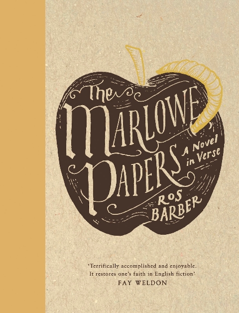
Nevertheless, some publishers were willing to trust their art directors and designers, and publish interesting and challenging covers. If I was to identify a common theme to my choices this year, it would be hand-drawn lettering and illustrated designs. With the ubiquity of stock photos and uninspired type-choices, that seems to be where the interesting things are happening, at least to my mind. Perhaps photographs will make a come back next year?

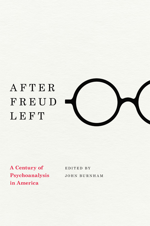
After Freud Left edited by John Burnham; designed by Isaac Tobin
University of Chicago Press

All Men Are Liars by Alberto Manguel; design by Jason Booher
Riverhead

El asenino hipocondríaco by Juan Jacinto Muñoz Rengel; design by Ferran López, illustration Santiago Caruso
Plaza & Janés


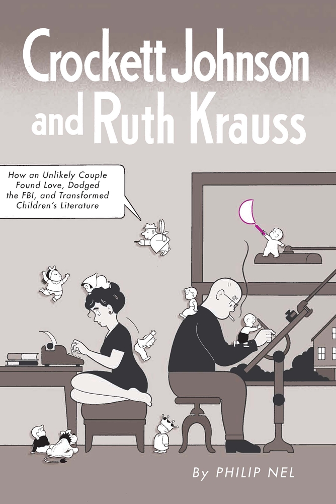
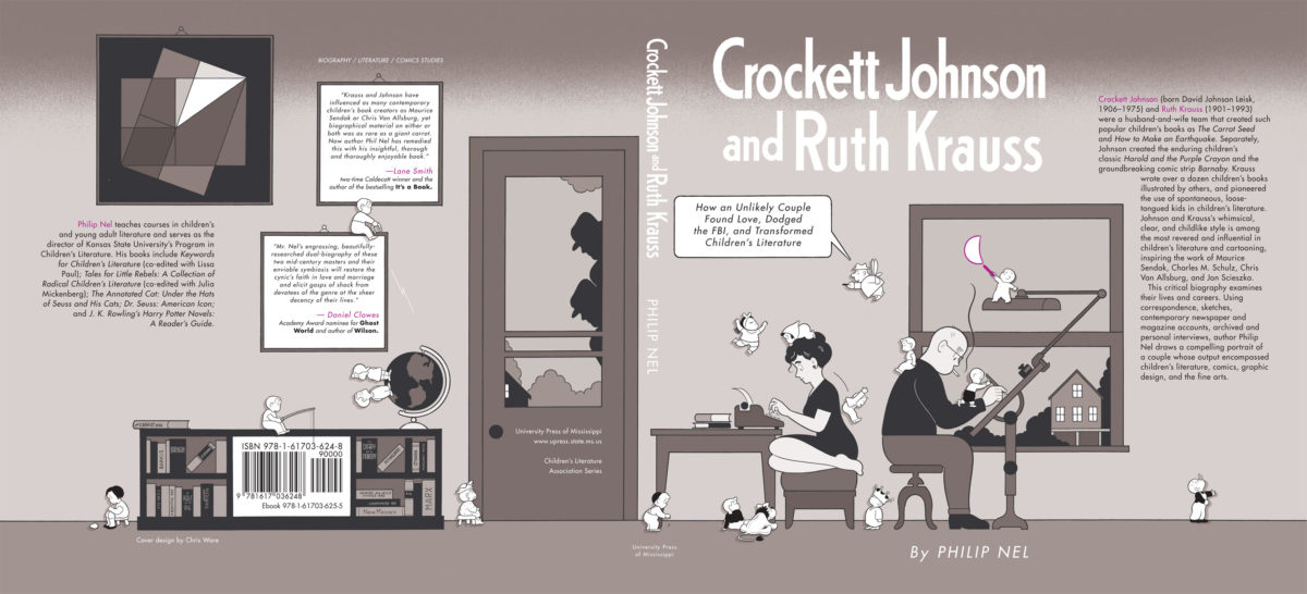
Crockett Johnson and Ruth Krauss by Philip Nel; design by Chris Ware
University Press of Mississippi

Cruel Britannia by Ian Cobain; design by FUEL
Portobello Books

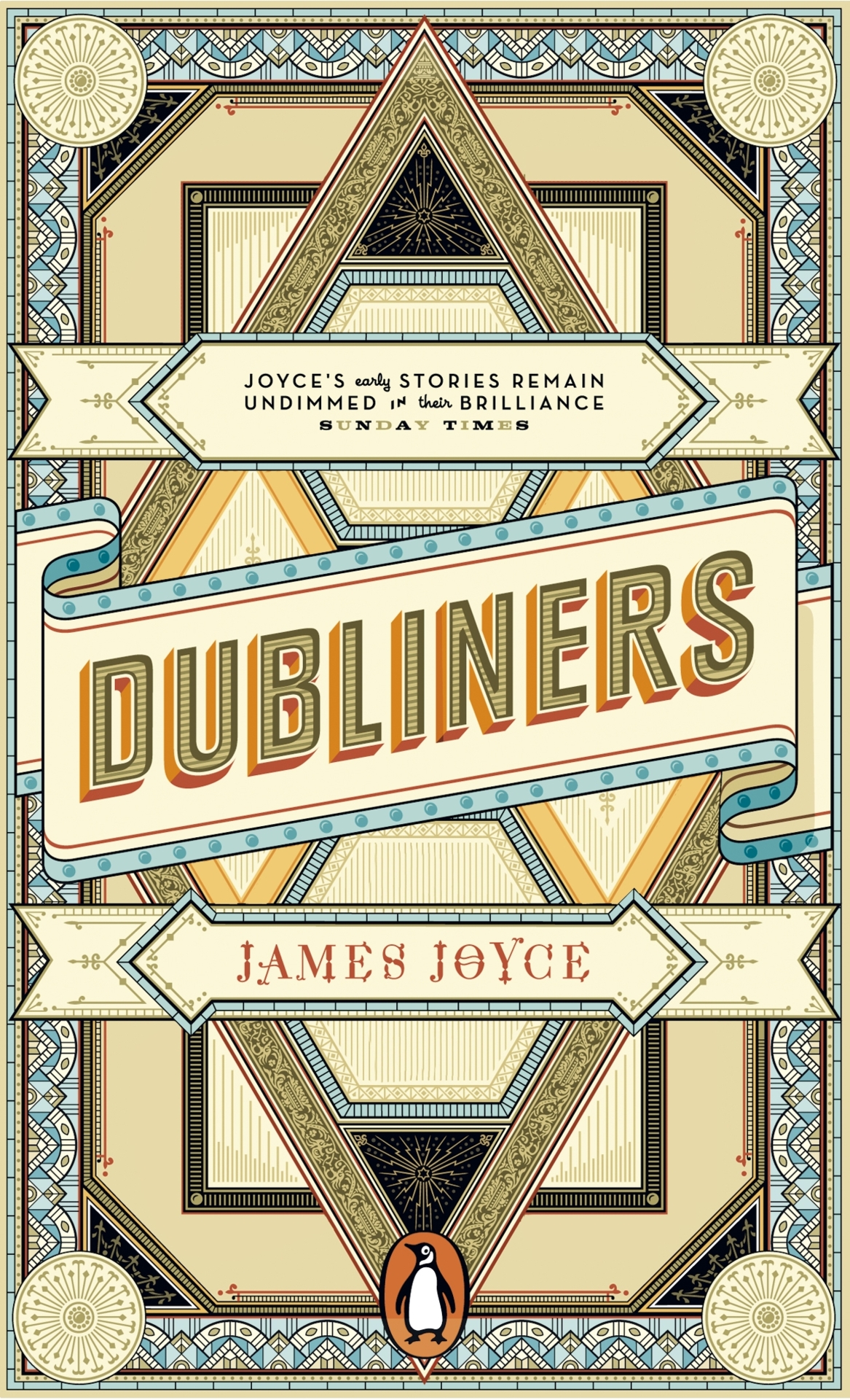
The Dubliners by James Joyce; design by Apfel Zet / Richard Bravery
Penguin Essentials, Penguin (UK)

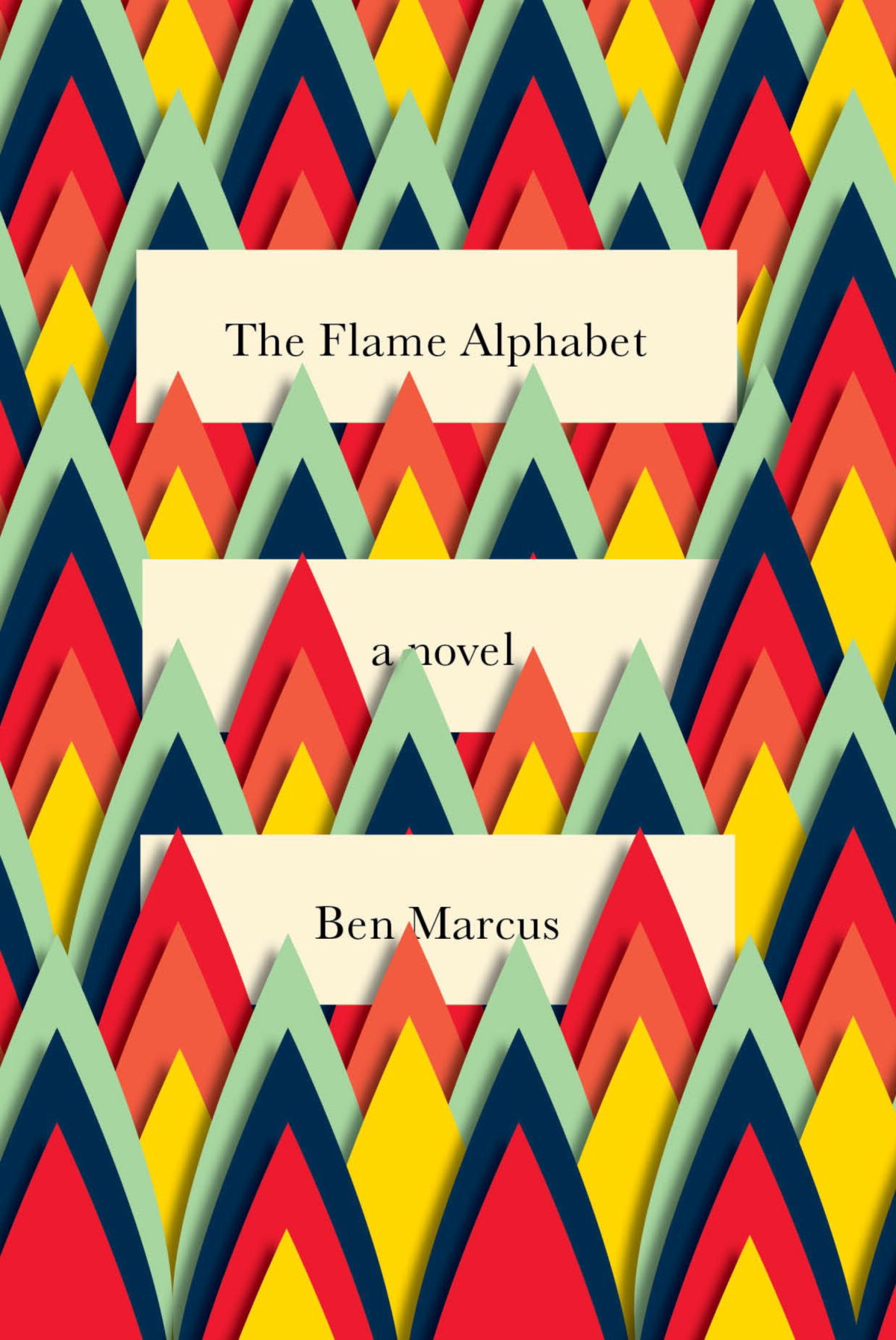
The Flame Alphabet by Ben Marcus; design by Peter Mendelsund
Knopf

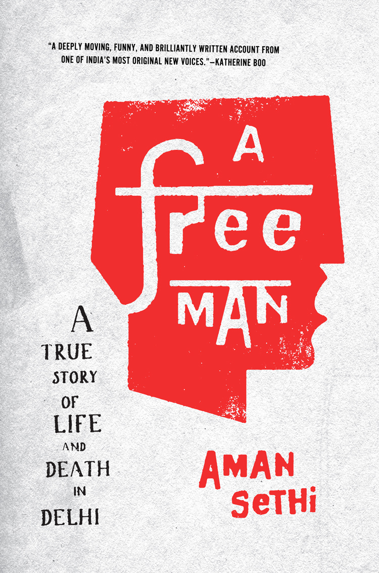
A Free Man by Aman Sethi; design by Ben Wiseman
W.W. Norton

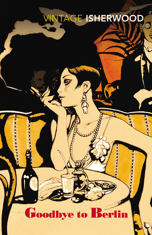
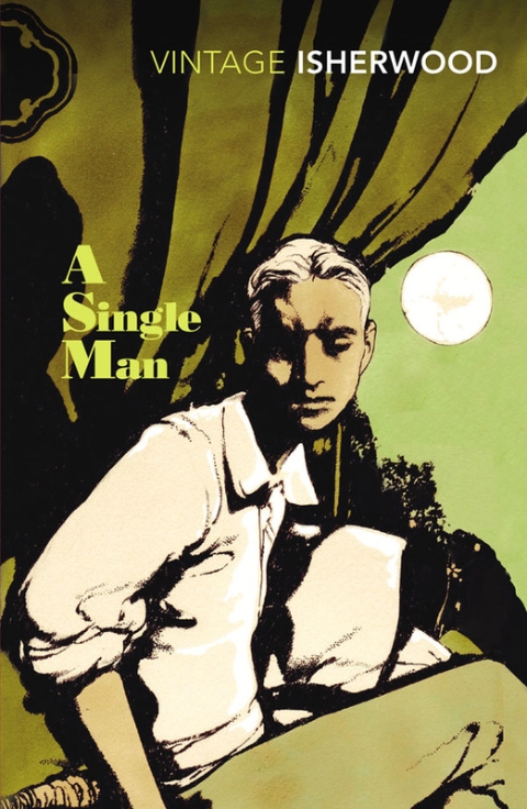
Goodbye to Berlin by Christopher Isherwood; illustration by Vania Zouravliov

Vintage Isherwood, Vintage (UK)

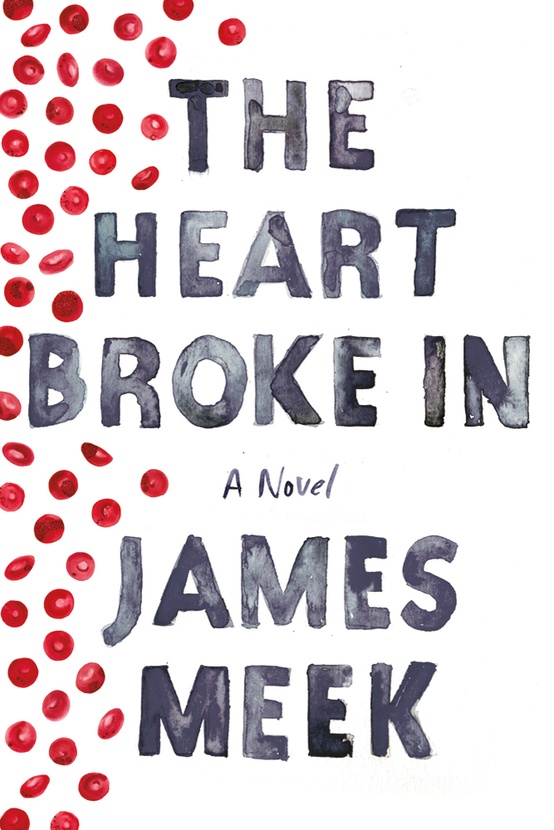
The Heart Broke In by James Meek; design by Jennifer Carrow; illustration by Michele Banks
Farrar, Straus & Giroux

Hope: A Tragedy: A Novel by Shalom Auslander; design by John Gall
Riverhead

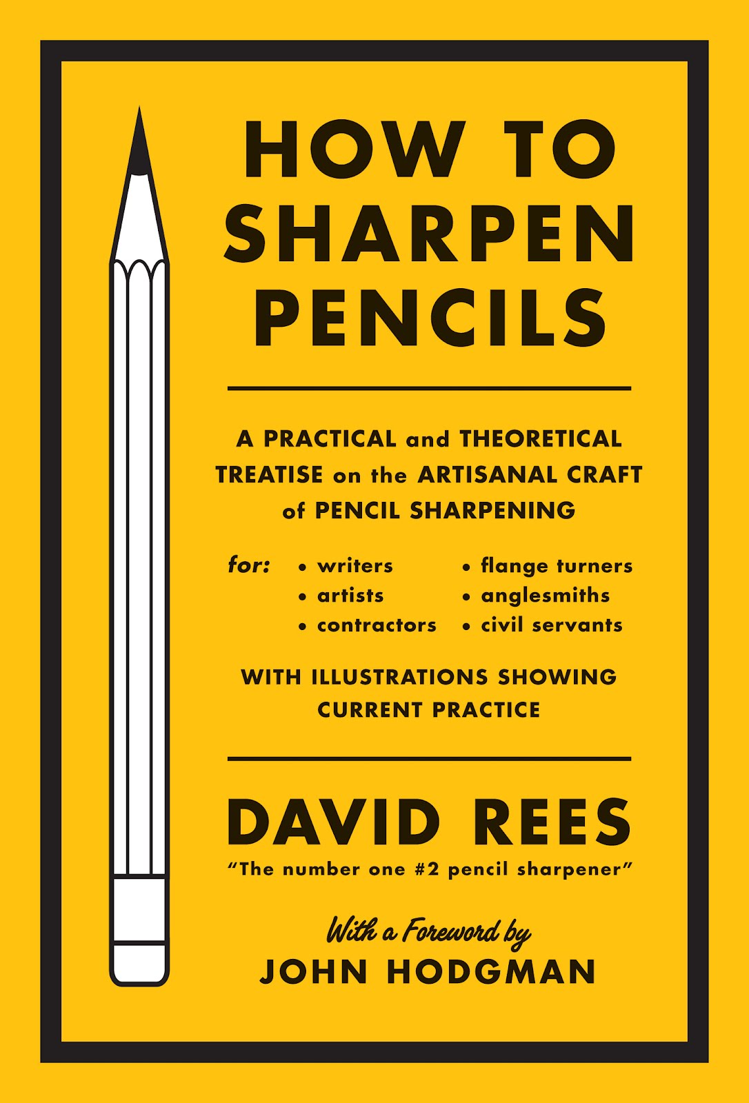
How to Sharpen Pencils by David Rees; design by Christopher Brian King
Melville House

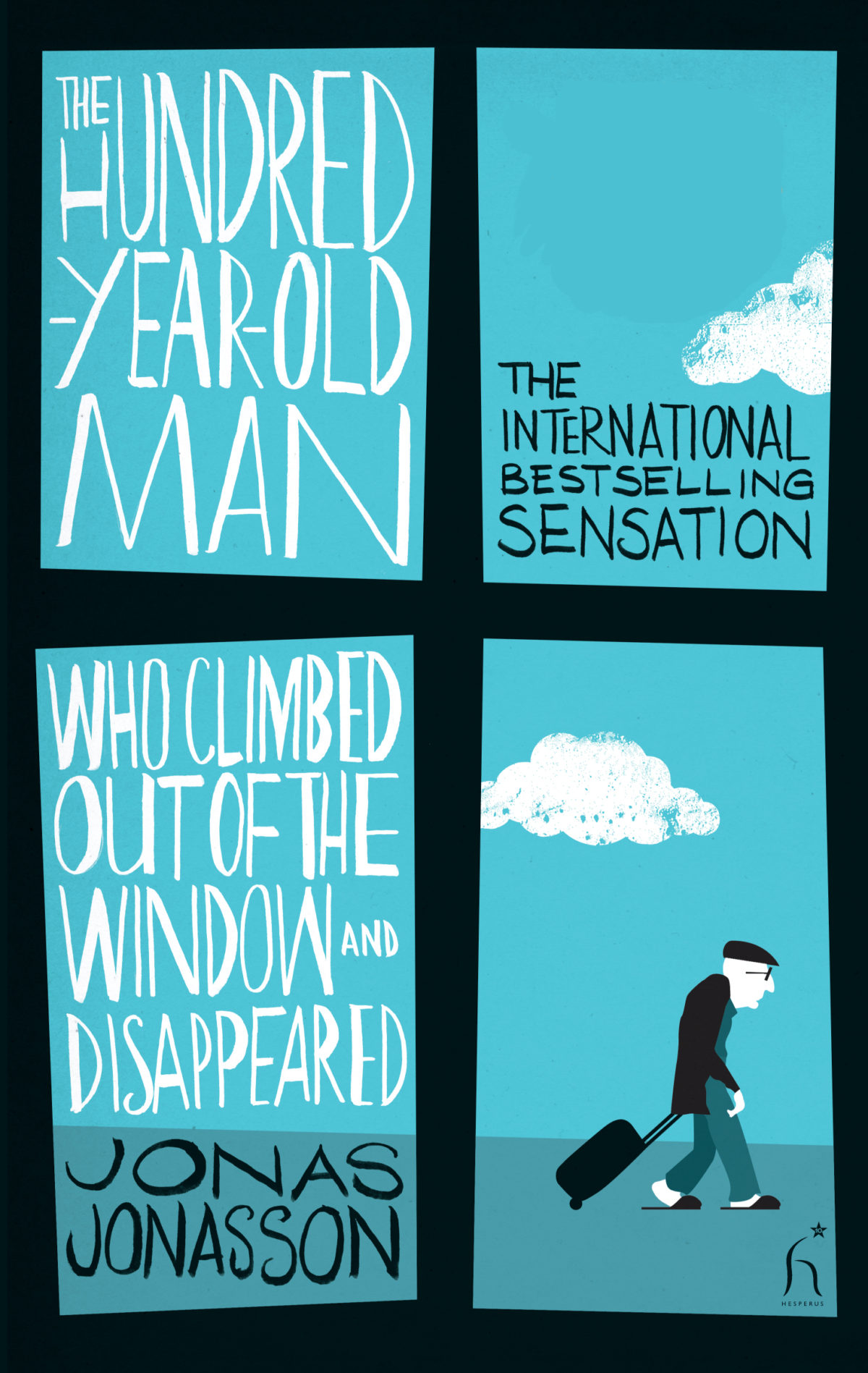
The Hundred-Year-Old Man Who Climbed Out of the Window and Disappeared by Jonas Jonasson; design by Jonny Pelham
Hesperus Press

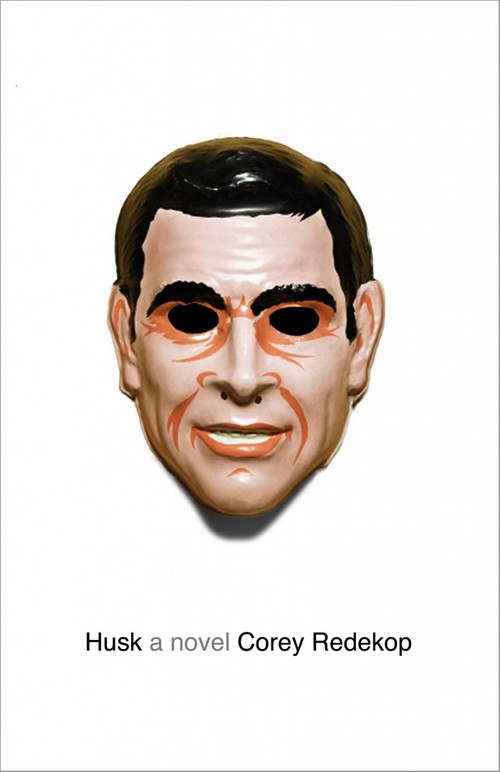
Husk: A Novel by Corey Redekop; design by David A. Gee

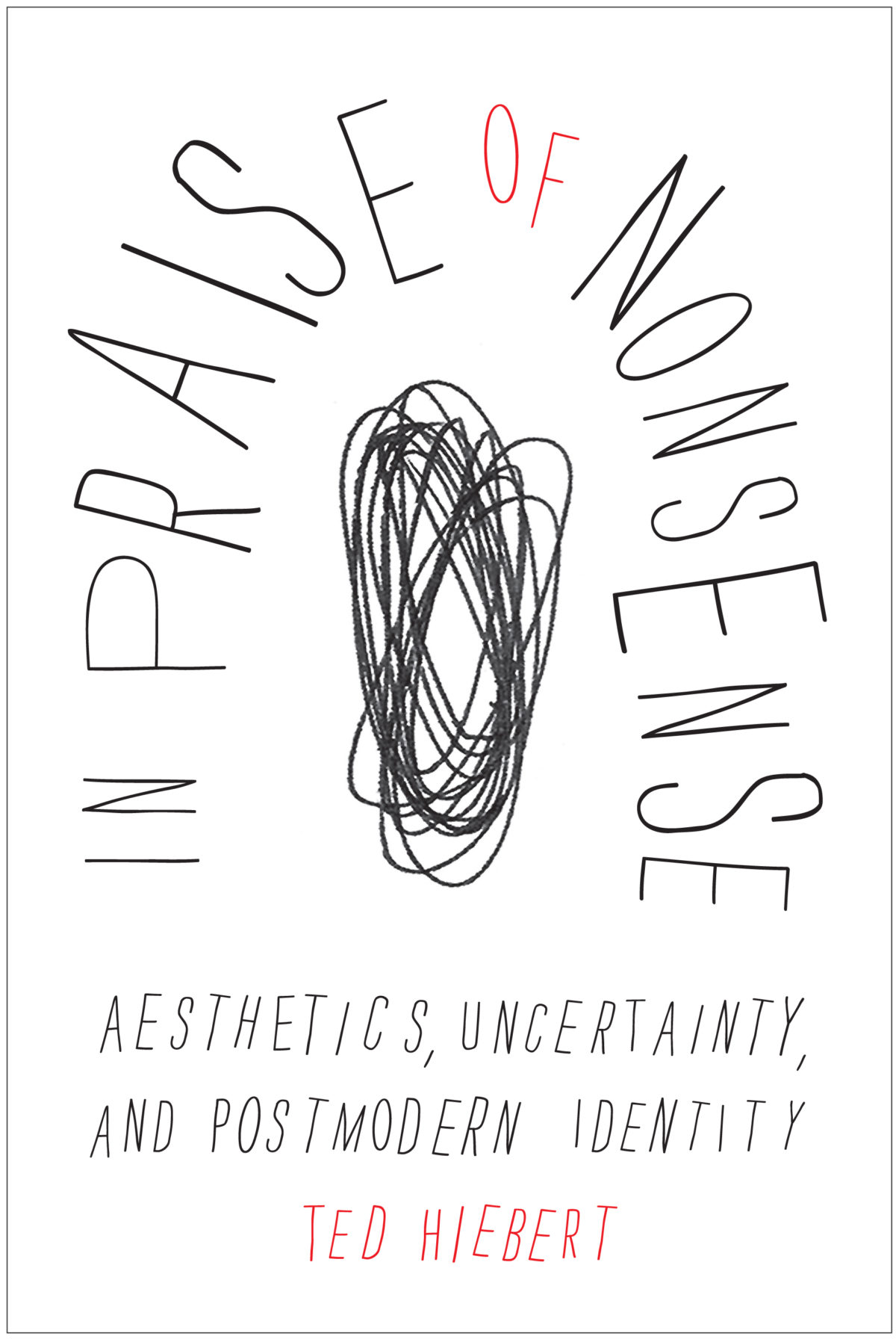
In Praise of Nonsense by Ted Hiebert; design by David Drummond
McGill-Queens University Press

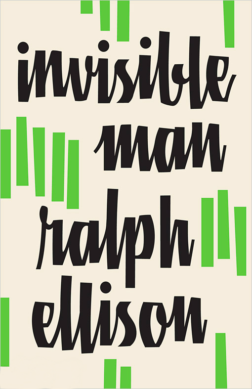
Invisible Man by Ralph Ellison; design by Cardon Webb

Vintage (US)

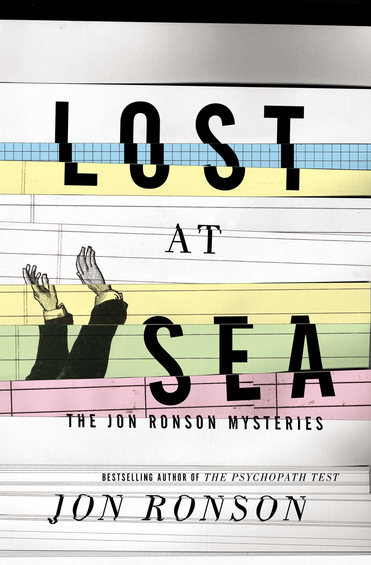
Lost at Sea by Jon Ronson; design by Matt Dorfman
Riverhead

May We Be Forgiven by A. M. Homes; designed by Alison Forner
Viking

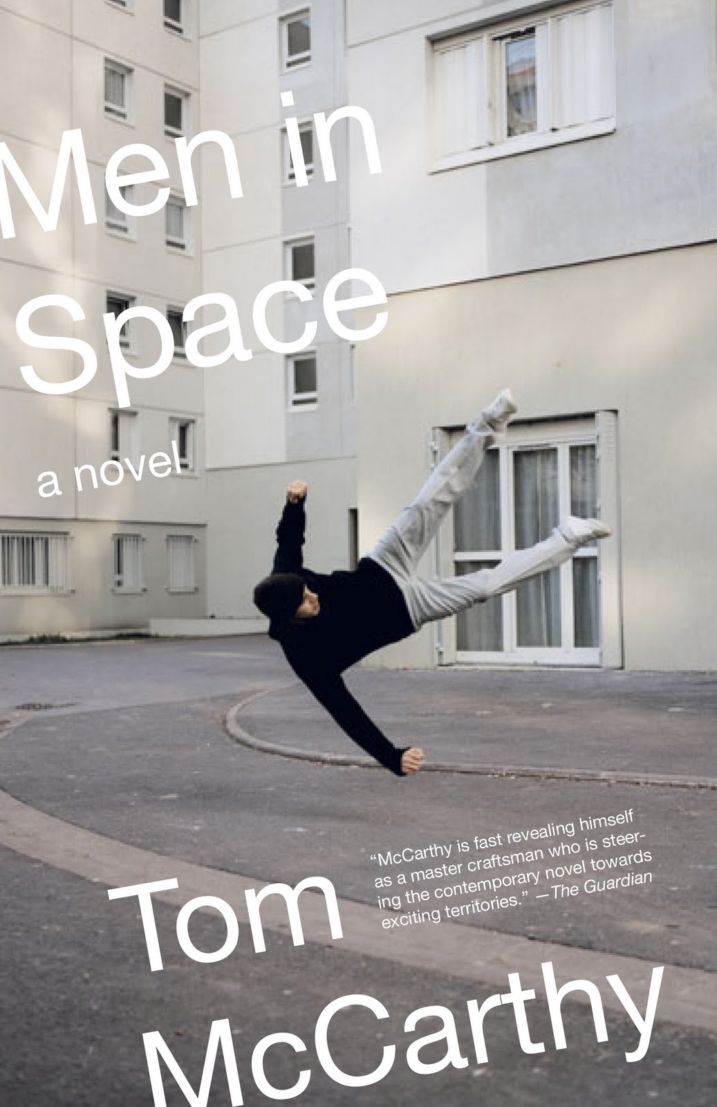
Men in Space by Tom McCarthy; design by John Gall
Vintage (US)

NW by Zadie Smith; designed by Gray318
Hamish Hamilton

Office Girl by Joe Meno; design by Cody Hudson, photograph by Todd Baxter
Akashic

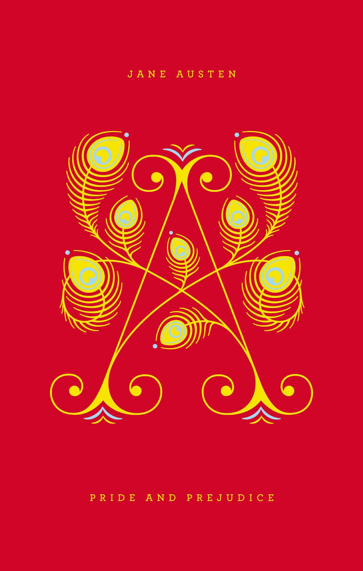
Pride and Prejudice by Jane Austen; design by Jessica Hische / Paul Buckley

Penguin Drop Cap, Penguin (US)

Swimming Studies by Leanne Shapton; design Leanne Shapton / Matthew Young
Particular Books

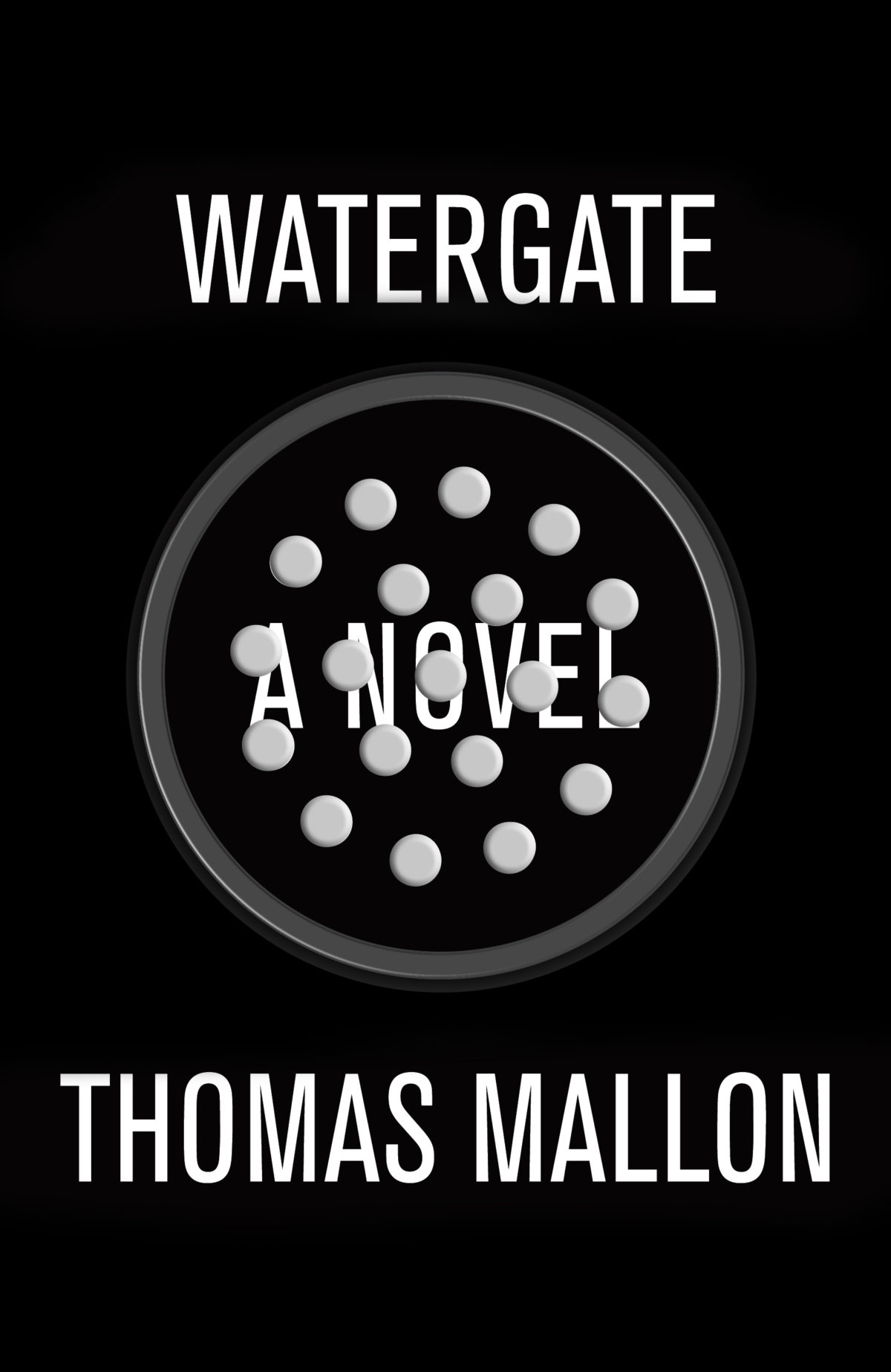
Watergate: A Novel by Thomas Mallon; design by Paul Sahre

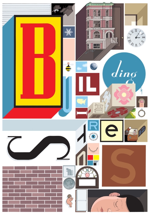
Why We Build by Rowan Moore; illustration by Diane Berg
Picador (UK)

Honourable Mentions:

;

You can find my lists for 2010 and 2011 here and here, and if you haven’t seen my 50 covers post from earlier this year, you can find that here. Happy Holidays!

16 Comments

Something for the Weekend

Down the River — An interview with Sean Howe, author of Marvel Comics: The Untold Story, at The Phoenix:

Marvel is this narrative tapestry that all of these people have worked on and passed on. It’s sort of like television soap operas, but there’s something about that creative ownership that somebody has that’s not lasting, and the proprietary feeling that they have when something that they are a collaborator on doesn’t belong to them at all. It’s due to the way that Marvel ’s storytelling worked — Marvel Comics was this river that rushed by all these people, and they would throw their ideas into this river, and the river would just keep going on without them, it was bigger than any of them. And I think that Marvel is just an extreme example of that kind of thing which exists in the comic book industry.

See also: Sean Howe interviewed at Publishers Weekly; a review of the book at the A.V. Club; and for the (even) nerdier among you, a more critical review at The Hooded Utilitarian.

And on a semi-related note… Chris Ware interviewed by Tavi Gevinson for Rookie Magazine. It’s a little different from all the other interviews I’ve read with Ware recently:

Our memories are all we have, and even those we think of as “real” are made up. Art can condense experience into something greater than reality, and it can also give us permission to do or think certain things that otherwise we’ve avoided or felt ashamed of. The imagination is where reality lives; it’s the instant lie of backwash from the prow of that boat that we think of as cutting the present moment, everything following it becoming less and less “factual” but no less real than what we think of as having actually occurred.

Dead Comrades — D. J. Taylor on the writer Julian Mclaren-Ross, for The Guardian:

In strict category terms, the author of Bitten by the Tarantula (Maclaren-Ross’s titles nearly always leap up at you from the library catalogue) is a classic English literary bohemian in a tradition that goes back at least as far as Marlowe: one of those people who really do live their lives out of suitcases, whose books are ground out in a procession of rented rooms with the landlord’s boots resounding on the carpetless stair and whose best work appears in a brief window of opportunity before the milieu in which they operate rises up and drowns them. Certainly the form of Maclaren-Ross’s fiction seems intimately connected to the circumstances in which it was composed: written at night, Benzedrine tablets (“My pills”) to hand, in seedy west London hotels after a day spent bar-propping in the Soho drinking dens.

And finally…

Little SunJon Gray on his cover design for The Yellow World by Albert Espinosa, at Design Week:

The brief was: ‘read this amazing book and please give it an interesting cover’. I’m really lucky in that Jim Stoddart, the art director, gave me pretty much free-reign.
.. I thought that there was something appealing in the big yellow ball. Rather like Olafur Eliasson’s giant sun at Tate Modern a few years back. It’s warming and comforting on the eye. I also thought it would stand out against other books and without type would make you want to pick it up and find out more.

(via Theo Inglis)

Comments closed