Skip to content

Tag: design

A Ballardian Obsession with Materials


In what is presumably an excerpt from his new book Stuff Matters, materials scientist and engineer Mark Miodownik describes how his obsession with materials began with being attacked on the London Underground:

I was right about one thing: he didn’t have a knife. His weapon was a razor blade wrapped in tape. This tiny piece of steel, not much bigger than a postage stamp, had easily cut through five layers of my clothes, and then through the epidermis and dermis of my back in one swipe. When I saw the weapon in the police station later, I was mesmerised. As the police quizzed me, the table between us wobbled and the blade sitting on it wobbled too. In doing so it glinted in the fluorescent lights, and I saw that its steel edge was still perfect, unaffected by its afternoon’s work.

This was the birth of my obsession with materials – starting with steel. I became sensitive to its presence everywhere. I saw it in the tip of the ballpoint pen I was using to fill out the police form; it jangled on my dad’s key ring while he waited, fidgeting; later that day it sheltered and took me home, covering the outside of our car in a layer no thicker than a postcard. When we got home I sat down next to my parents at the kitchen table, and we ate soup together in silence. I even had a piece of steel in my mouth. Why didn’t it taste of anything?

There is something almost Ballardian about the connections Miodownik draws between materials and violence (car accidents, improvised weapons) and, of course, culture:

The fundamental importance of materials is apparent from the names we have used for stages of civilisation – the Stone Age, Bronze Age and Iron Age. Steel was the defining material of the Victorian era, allowing engineers to create suspension bridges, railways, steam engines and passenger liners. The 20th century is often hailed as the Age of Silicon, after the breakthrough in materials science that ushered in the silicon chip and the information revolution. Yet this is to overlook the array of other new materials that revolutionised modern living.

Architects took mass-produced sheet glass and combined it with structural steel to produce skyscrapers that invented a new city life. Product and fashion designers adopted plastics and transformed our homes and dress. Polymers were used to produce celluloid and brought about the biggest change in visual culture for 1,000 years, the cinema. The development of aluminium alloys and nickel superalloys enabled us to build jet engines and fly cheaply, thus accelerating the collision of cultures. Medical and dental ceramics allowed us to rebuild ourselves and redefine disability and ageing.

The Guardian

Comments closed

Massimo Vignelli Makes Books

Massimo Vignelli discusses his approach to book design:

[vimeo http://vimeo.com/64811872 w=500]

The video was produced by Pentagram’s Michael Bierut and Aron Fay for Mohawk’s “What Will You Make Today?” campaign, and is accompanied by a limited edition journal that reproduces Vignelli’s grid from the film.

Comments closed

Something for the Weekend

Excitingly Wrong — An interview with Peter Mendelsund at Porter Square Books:

I am always interested by anything graphical that strikes me as (this is difficult to put into words) excitingly wrong. There is a cool-factor to certain images that lie just on this side of disagreeable…pictorial effects that make me think “this will bother a lot of unimaginative people.” Whenever I see something like that, a piece of art or graphic design that has that special kind of wrongness about it, I think “I need to do something like this myself.” Attendant to this is always the feeling of “in the future, this will be done a lot.” In other words, today’s ugly is tomorrow’s beautiful.

Lurking Menace — Ostensibly reviewing David Bowie Is, the catalogue for the current V & A exhibition, and Bowie’s new album, The Next Day, Ian Buruma looks back at the performer’s career at the NYRB:

[Bowie] drew his inspiration from anything that happened to catch his fancy: Christopher Isherwood’s Berlin of the 1930s, Hollywood divas of the 1940s, Kabuki theater, William Burroughs, English mummers, Jean Cocteau, Andy Warhol, French chansons, Buñuel’s surrealism, and Stanley Kubrick’s movies, especially A Clockwork Orange, whose mixture of high culture, science fiction, and lurking menace suited Bowie to the ground. Artists and filmmakers have often created interesting results by refining popular culture into high art. Bowie did the opposite: he would, as he once explained in an interview, plunder high art and take it down to the street; that was his brand of rock-and-roll theater.

This Movie is About Hope — Film Comment has a transcript of Steven Soderbergh’s San Francisco International Film Festival ‘State of Cinema Address’:

 The simplest way that I can describe it is that a movie is something you see, and cinema is something that’s made. It has nothing to do with the captured medium, it doesn’t have anything to do with where the screen is, if it’s in your bedroom, your iPad, it doesn’t even really have to be a movie. It could be a commercial, it could be something on YouTube. Cinema is a specificity of vision. It’s an approach in which everything matters. It’s the polar opposite of generic or arbitrary and the result is as unique as a signature or a fingerprint. It isn’t made by a committee, and it isn’t made by a company, and it isn’t made by the audience. It means that if this filmmaker didn’t do it, it either wouldn’t exist at all, or it wouldn’t exist in anything like this form.

Read the whole thing. It reminded me of William Goldman’s famous comment about Hollywood in Adventures in the Screen Trade: “nobody knows anything.”

See also: At the New York Times film critic A. O. Scott looks at Soderbergh’s ‘Twitter narrativeGlue.

And finally…

Just to the Right of Karl Marx — At the Financial Times, Julia Hobsbawn remembers her father, the historian Eric Hobsbawn:

The cemetery plot, situated as my husband Alaric wryly pointed out later “just to the right of Karl Marx”, had been freshly dug…  My mum Marlene had bought the plot in an expensive and expansive act of love several years earlier. She is 81 and was my father’s unsung muse for 50 years, dealing constantly with demands on his time from students, publishers, editors and broadcasters while acting as his general reader…

My dad was pleased knowing that he would end up there. Highgate Cemetery’s east wing is full of iconoclasts from the intelligentsia. I can picture him, glasses pushed up over his high forehead, peering longsightedly at the guide produced by the Friends of Highgate Cemetery Trust about its history, hoovering up the text and filleting it for us in an exact and pithy way. “Ah yes,” he might say, energised like a freshly charged battery by what he had just read, “you see what is really interesting about this is…”

Comments closed

Tom Gauld Book Covers

The esteemed Tom Gauld recently posted a delightfully bonkers new cover illustration for Stevyn Colgan’s book Constable Colgan’s Connect-O-Scopeand I thought it was about time we had a retrospective of Tom’s book covers around here:

The Three Musketeers by Alexandre Dumas (2007)

The Tribes of Britain by David Miles (2006)

Strange Eventful Histories by Shiamin Kwa (2012)

Stories by Neil Gaiman and Al Sarrantonio (2011)

Shadow Show edited by Sam Weller and Mort Castle (2012)

Family Fang by Kevin Wilson (2011)

The Damned Busters by Matthew Hughes (2011)

Costume Not Included by Matthew Hughes (2012)

Hell To Pay by Matthew Hughes (2013)

Nobrow #6 by various (2012)

Goliath by Tom Gauld (2012)

And finally, Tom’s new book You’re All Just Jealous of My Jetpack has just been published:

You can read my Q & A with Tom here.

(full disclosure etc., Tom’s two most recent books, Goliath and You’re Just Jealous of My Jetpack, are published in North America by Drawn & Quarterly and distributed in Canada by my employer Raincoast Books)

Comments closed

AIGA Bright Lights Video: Hoefler and Frere-Jones

In this charmingly nerdy 5-minute video profile,  type designers Jonathan Hoefler and Tobias Frere-Jones talk about their careers,  designing typefaces, and why each project takes about a decade.

Hoefler and Frere-Jones were recently awarded a AIGA Medal for their “contributions to the typographic landscape through impeccable craftsmanship, skilled historical reference and insightful vernacular considerations.”

Just look at those bookshelves…

The video was created by dress code, and was supported in part by an award from the National Endowment for the Arts.

Comments closed

Something for the Weekend

Making Bird Noises — Dwight Garner profiles novelist John Le Carré, for the New York Times:

In his lesser books, le Carré’s prose can thin out perilously, but at his best, he’s among the finest writers alive. There’s a reason Philip Roth has called “A Perfect Spy,” le Carré’s 1986 autobiographical work of fiction, “the best English novel since the war.” The Times of London ranked him 22nd on a list of the 50 greatest writers since 1945. His books are less about espionage than they are about human frailty and desire; they’re about how we are, all of us, spies of a sort.

See also: Mark Lawson reviews Le Carré’s latest, A Delicate Truth, for The Guardian.

(Pictured above: the cover to the US edition, illustrated by Matt Taylor)

And while we’re at it… James Campbell reviews Kurt Vonnegut: Letters edited by Dan Wakefield, which has just been released in the UK:

[Anatole] Broyard was scarcely wrong to say that Vonnegut’s reputation suffered a blow with each new book; he is a classic example of a writer whose renown endures through the success of a single novel. Yet the tone was ever recognisable, and even lesser-known books – SlapstickDeadeye DickHocus Pocus – sold well. In response to a question from a reader in 1991 about the relationship of his style to “jazz and comedians”, he replied: “I don’t think about it much, but now that you’ve asked, it seems right to say that my writing is of a piece with nightclub exhibitionism … lower class, intuitive, moody, and anxious to hold the attention of a potentially hostile audience.”

New England — Alan Moore talks to Pádraig Ó Méalóid about League of Extraordinary Gentlemen, Nemo: Heart of Ice, his unfinished novel Jerusalem, and his Lovecraftian work-in-progress Providence:

with Providence, what I am doing is, I’m looking as much at American society in 1919 as I am looking at Lovecraft, in terms of my research, and I am connecting up Lovecraft’s themes, and Lovecraft’s personality, to a certain degree, with the tensions that were then incredibly evident in American society… It’s starting from – if Lovecraft’s characters, if Lovecraft’s monsters, if Lovecraft’s locales actually existed in A Real World, then what would they really be like, and what would the world be like?

In part two of the interview, Moore discusses his recent film projects and other work.

Who? — Steven Heller talks to Unit Editions Adrian Shaugnessy about Jurriaan Schrofer (1926-90): Restless Typographer at Imprint. It’s a rather short interview, but there are some lovely illustrations!

Any finally…

Still my favourite thing on the internet this week:

Phillip Marsden’s one-page comic strip ‘Hipster Hairdo’ for Off Life #4 (PDF).


Comments closed

Midweek Miscellany

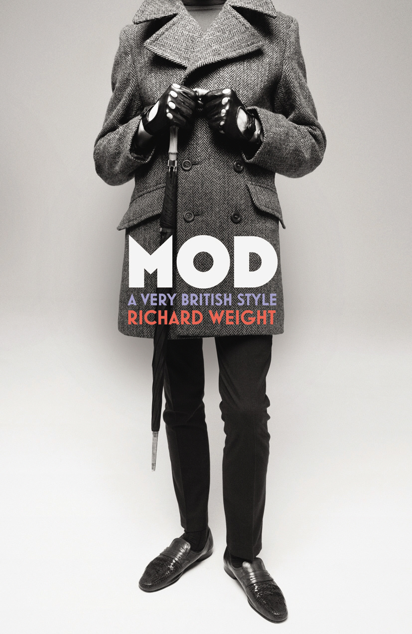
Ian Thompson reviews Mod: A Very British Style by Richard Weight for The Observer:

Mod’s first choice of music was jazz, Richard Weight reminds us. Miles Davis in particular became a fashion icon for blue-eyed soul brothers everywhere in Britain. The photograph of Davis on the cover of his celebrated 1958 Milestones album – Sta-Prest trousers, button-down Ivy League shirt – became a sort of mod pin-up. Mods (“modernists”) were among the first white Britons to embrace west-coast jazz, which had been galvanized by the Birth of the Cool sessions led by Davis in New York from 1949-50.

See also: Gavin James Bower’s review for The Independent.

It is What it is  — Five designers, Craig Mod, Rodrigo Corral, Michael Fusco, John Gall, and Jon Gray, on the books that inspire them, at the Virginia Quarterly Review.

Here’s Mr. Gall:

The clearest explanation of a good cover that I have ever heard came from Michael Beirut. I was a guest invited to critique a book-cover project he had given to his Yale students. As I was struggling to express some notion about why a particular concept may or may not be working, he got right to the point: “It has to look like what it is.” Indeed.


The Darkness — Sarah Weinman profiles Canadian author and illustrator Jon Klassen (I Want My Hat Back, This is Not My Hat, and The Dark) for Maclean’s:

Klassen’s style shies away from sentimentality. Instead it shows young children the consequences of bad behaviour through the prism of humour, a technique that hearkens back to books for children by the likes of Shel Silverstein and Roald Dahl.

And finally…

On the Exaggerated Reports of a Decline in British Fiction at the White Review:

Our peculiar creed is mortally suspicious of untrammelled aestheticism, endlessly asserting the primacy of content over form. In accounts of British writing, even now – long after such a thing could be anything other than a rather quaint anachronism of an old culture war – the avant-garde features as a kind of bogeyman. One whose dandified aestheticism belies a questionable politics, a moral compass gone awry; who must be beaten back by decency and common sense. Literary experiment still tends to be perceived as a pernicious form of French ‘flu: of course we should still be bloody grateful for the English Channel, separating, as it does, steady, dependable old Blighty from that kind of thing.

1 Comment

Midweek Miscellany

Work / Life — An interview with the brilliant Louise Fili, designer and former art director of Pantheon Books, at The Great Discontent:

Everybody wanted to use standard fonts, but I just wasn’t satisfied doing that. I didn’t realize this until years later, but what I was really doing was developing type treatments for the title of the book and approaching it more like a logo. I wanted each book to have its own personality and that couldn’t be achieved with standard fonts. Again, I was lucky because it was appropriate to do that for the types of books I was working on. The other thing to note is that I was collaborating with a lot of really talented illustrators and made a concerted effort to combine the type and image together. I also tried to encourage illustrators to create their own type. I would sketch it out for them and then ask them to actually draw it so it would become part of the illustration, which makes for a stronger design, whether it’s a book cover or logo.

Colour and Intention — Claire Cameron interviews Sam Garrett about his translation of The Dinner by Herman Koch, for the LA Review of Books:

The words a writer uses not only have a dictionary definition, but also a color and an intention. To pin those down, the translator has to sniff around. From the first to the final word of a translation, you’re leading the reader along a path to a destination. The color is what keeps the reader hopping; the intention is the scent that keeps the translator on the right path.


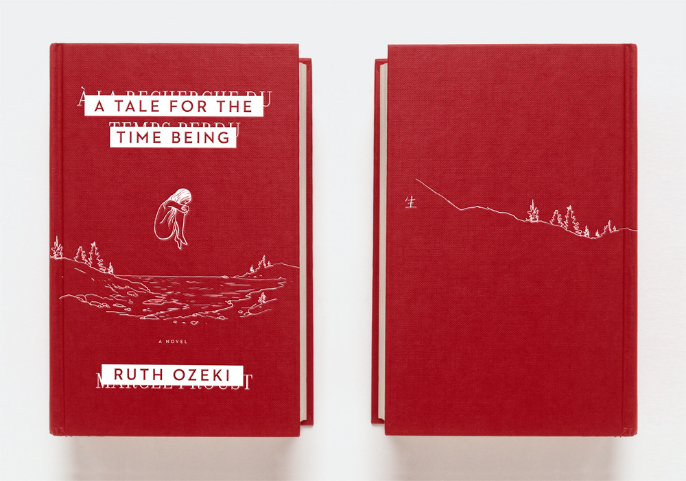
Negotiations — Jim Tierney explains his design process for the cover of Ruth Ozeki’s A Tale for the Time Being:

I decided to run with the first concept that popped into my head: a very simple and tactile facsimile of the red Proust notebook, embossed with an illustration of Nao, floating spectrally above the rocky coast of British Columbia. I think this design is all about questions: How did this book get here? Was it lost intentionally, or by accident? Is Nao alive or dead? Is she even real?

Minimal designs like this is always a hard sell in cover meetings, and it was immediately rejected as too quiet and precious-looking. Loud, colorful, and commercial are popular adjectives in modern book marketing, but it’s always fun to start off negotiations with something a little more obscure.

And finally…

Welcome back from near-death Dan Mogford. Please don’t do that again.

Comments closed

Midweek Miscellany

The Creative Review interviews Richard Littler, the man behind the absolutely bloody terrifying Scarfolk:

For me, the desired effect can only be achieved if the images are visually authentic. The seriousness of presentation and form is absolutely crucial. It lulls the viewer into a false sense of security so that the gap between expectation and reality – the juxtaposition of staidness and absurdity – is as wide as it can be.

The fictional authors, designers and archivists of Scarfolk’s public information material must sincerely believe in the gravity of the message that the subject matter wants to convey and deserves, such as rabies. In addition, the whole concept of Scarfolk has to be internally consistent. There has to be a credible, believable identity.

Greatly Exaggerated — Salon’s Laura Miller on technology, self-publishing, and why publishers and bookstores are still matter:

If print could talk, it would surely be telling the world, Mark Twain-style, that reports of its demise have been greatly exaggerated… New self-publishing enterprises are a godsend for traditional publishers because they can take much of the uncertainty out of signing a new author. By the time a self-published author has made a success of his or her book, all the hard stuff is done, not just writing the manuscript but editing and the all-important marketing. Instead of investing their money in unknown authors, then collaborating to make their books better and find them an audience, publishers can swoop in and pluck the juiciest fruits at the moment of maximum ripeness…. [That’s] exactly what happened with erotica blockbuster E.L. James.

Epitaph — A smart take on the end of Google Reader by Paul Ford for The Financial Times:

This is the downside to apps: when everything is online your ability to labour along in familiar ways is contingent upon money coming to the app provider. This works when we remain consumers, for example of media objects such as paywalled newspapers, Netflix and Spotify. We lease access to the databases, own nothing, and the access makes it worthwhile. But when we work inside these systems we increase our levels of risk. When Google Reader goes away, it will not be like a television show being cancelled – much work is lost, and the ability to access that work is also lost.

The Exploded Mind — A big interview with artist, illustrator and picture book maker Oliver Jeffers at The Great Discontent:

Balancing integrity versus income is tricky; when I make decisions, sometimes I know that I might not be as well off the next year, but I’ll certainly be making the best work. I figured out early on that there are certain things I don’t want to do when it comes to how I’m perceived. I try to stay away from advertising, even though that’s where the big money is. In the visual arts, you are often only as good as your reputation and associations, so you have to think ahead and be smart. As far as commercial commissions, I’m not just a gun for hire; I actually have something I’m trying to accomplish and a way of making work that I want to continue and be known for. Although some lucrative offers came in for illustration work, I realized that taking them would be shortsighted and could possibly stunt other aspects of my practice.

See also: ‘Maurice Sendak’s Jumper and Me‘ by Jeffers at The Guardian:

Sendak was trying to satisfy himself. He was telling these stories, as much a way to make sense of the world around him as anything else. He was using them as a poet uses poetry and a painter uses paint. He was making art that ultimately transcended himself and neat classification. Perhaps as a result he was one of the first contemporary picture-book makers to discover the power of picture book as a way of storytelling for everyone. Perhaps this might go some way to explain why his books have won over so many, regardless of geography or decade – because he is putting himself, and the way he views the world on paper, darkness and all.

And finally…

Dr. Jazz — James Hughes on Stanley Kubrick’s unmade film about jazz in the Third Reich, at The Atlantic:

Kubrick’s interest in jazz-loving Nazis… represents his most fascinating unrealized war film. The book that Kubrick was handed, and one he considered adapting soon after wrapping Full Metal Jacket, was Swing Under the Nazis, published in 1985 and written by Mike Zwerin, a trombonist from Queens who had performed with Miles Davis and Eric Dolphy before turning to journalism. The officer in that Strangelovian snapshot was Dietrich Schulz-Koehn, a fanatic for “hot swing” and other variations of jazz outlawed as “jungle music” by his superiors. Schulz-Koehn published an illegal underground newsletter, euphemistically referred to as “travel letters,” which flaunted his unique ability to jaunt across Western Europe and report back on the jazz scenes in cities conquered by the Fatherland. Kubrick’s title for the project was derived from the pen name Schulz-Koehn published under: Dr. Jazz.

Comments closed

The Film Before The Film

The Film Before The Film is a documentary short by the Berliner Technische Kunsthochschule about the history of opening titles. Although the narration is a little flat, the film itself is a visual treat:

Comments closed

Something for the Weekend

Typgraphica’s favourite typefaces of 2012. There’s a lot to love about Balkan Sans by Nikola Djurek and Marija Juza. But check out the ligatures on Levato by Felix Bonge:


Chasing the White Rabbit — Francine Prose on dreams and literature, at the New York Review of Books blog:

Literature is full of dreams that we remember more clearly than our own. Jacob’s ladder of angels. Joseph saving Egypt and himself by interpreting the Pharoah’s vision of the seven fat and lean cows. The dreams in Shakespeare’s plays range as widely as our own, and the evil are often punished in their sleep before they pay for their crimes in life. Kafka never tells us what Gregor Samsa was dreaming when he awakens as a giant insect, except that the dreams were “uneasy.” Likely they were not as uneasy as the morning he wakes into. By the end of the first paragraph of “The Metamorphosis,” Gregor has noticed his arched, dome-like brown belly, his numerous waving legs. “What has happened to me? he thought. It was no dream.”

Krautrock on the Underground — An excerpt from Earthbound by Paul Morley, part of the Penguin Lines series for the 50th anniversary of the London Underground, at The New Statesman:

“Krautrock” was the convenient collective name given in a slightly jokey, slightly wary and affectionately patronising way to an eclectic collection of radicalised German groups from very different parts of the country that contained musicians who were born in the few years before, during or just after the Second World War. Another collective name for these groups, still frivolous but more descriptive of their mission to create sound never heard before on our planet and invent music that could make you feel you were leaving the earth behind, was “kosmische”. As well as Can, these groups included Kraftwerk, Tangerine Dream, Amon Düül II, Cluster, Popol Vuh, Harmonia, Neu! and Faust, and they were looking for ways to repair their traumatic recent history, remove the crippling infection of fascism, break free of totalitarian artistic repression, negotiate turbulent social and emotional currents, and radically, romantically reinstate the positive, progressive elements of their mortified national psyche.

See also: Jonathan Gibbs looks at the design of the Penguin Lines series at The Independent.

And finally…

Fact-Checking at the New Yorker, an excerpt from a new book called The Art of Making Magazines:

When the new, remade The New Yorker of the last decade was gearing up and we started getting all these late-breaking stories, issues such as logic and fairness and balance—which previously had been the responsibility of the editors—began to fall on the checkers. This wasn’t by anybody’s design. It was because the editors were really busy putting these stories together and they wanted us to look at things from the outside and see how they were framed, and look at them from the inside and look at the logic and the way they were reported and the way quotes were used and many other such things.

That responsibility came to us not in the way of anybody saying suddenly, “You’re doing that.” It just became that when a problem arose, they would come to us and say, “Why didn’t you warn us?” And so it just became clear that there was this gap between editing and checking that had opened up under the pressure of later-breaking stories, and it just seemed logical that we should fill it. It made our job more challenging, and more fun.

(via Kottke)

1 Comment

Q & A with Misha Beletsky, Part Two

In part one of our conversationMisha Beletsky, art director at Abbeville Press, discussed his interest in the work of German-born designer and calligrapher Ismar David, the subject his recent book The Book Jackets of Ismar David, published by RIT Press. In this second and final part of our interview, Misha and talks about his own work as a designer and an art director:

How did you become interested in design?

The father of a boyhood friend in Russia was a book designer. He had a photo lab set up in his closet, took pictures of letters, and pasted them up with rubber cement. Having access to creation of the book, that holy of the holies of the bookish world I grew up in seemed like magic. I thought it was the coolest thing in the world. One day I tagged along with this friend to take night classes at the Moscow Printing Institute. Suddenly, I felt it was no longer a world I could enjoy as a guest, but a world I could be a part of. I felt it was not only something I liked doing, but an area where I could make a real difference. When I arrived in the US, one particular image from a RISD catalog influenced my decision to choose this school over others: a photograph of a calligraphy class. The unassuming black-and-white image spoke to me more than all lavish and clever full-color catalogs of other schools not because I wanted to become a calligrapher, but because I knew this was a place that based its design education on a solid ground. The essential training in typography I received at RISD laid the ground for my summer internship with David R. Godine, Publisher in Boston. This small press started out as a letterpress printing shop in a barn and over the years has been responsible for more important books on book design and typography than any single publisher in this country. There I caught the bug of fine printing. I began appreciating printer’s ink, impression, and paper, and there I was indoctrinated about the proper use of old style figures and small caps. I learned to consider all elements of the book as a part of one system where the whole is more than a sum of its parts and each part is integrally related to each other. Empowered by my discovery of the letterpress, I went back to school to spend my Senior year hand-setting metal type, carving woodcuts, and printing my own limited-edition books. My first job after school designing book interiors for Alfred A. Knopf was the best way to apply the ideals of fine printing to real-life trade publishing. Knopf house style had changed little since the heady days of W.A. Dwiggins, George Salter, and Warren Chappell. I explored every nook in the corporate library, taking in every book designed by the best designers of the 30s, 40s, and 50s. Their lessons are still with me today.

Could you describe your book cover design process?

Most of the books I design are art books, which usually implies I am responsible for both the cover and the interior design. This means I have a rare privilege of making sure the cover and the interior design agree. I usually start from the inside out: I decide on the interior typography first, and then move on to the jacket. Unlike most trade books, where cover designers are only limited by their imagination and their budget in the choice of the artwork, the cover image for illustrated books usually comes from within the book. I select an image, crop it, and design the typography. This limitation made me keenly aware of how much you can do with type alone and sympathetic to the designers of the past who were able to achieve great results with limited tools.

What do you look for in a designer’s portfolio?

I look for understanding of and an eye for traditional book typography. Only a handful of portfolios out of hundreds I reviewed had it.

Do you see any prevalent trends in contemporary book design?

There is a relatively new trend of purely decorative covers and bindings by Coralie Bickford-Smith and others that seems to be a reaction to the overwhelming number of clever designs. As far as interiors go, by and large, I see a lot of unexciting work of decent quality and very little great work. I keep waiting for a resurgence of good typography, but it has not arrived yet.

What advice would you give a designer starting their career?

Read Ben Shahn’s The Shape of Content. Learn calligraphy, drawing, and printmaking. Learn letterpress printing from metal type. Manual skills cannot be emphasized enough.

Who are some of your design heroes?

Bruce Rogers, the subject of my new book. He had an almost unfathomable sensitivity to typography. In his lifetime he was famous to a point of embarrassment. Today he is hardly ever talked about. Yet, to me he remains the most versatile and the most accomplished practitioner of our craft.

Another name is Vladimir Favorsky, a towering genius of Russian graphic arts, completely forgotten outside of Russia. For many years he taught at VKhuTeMas, the Russian sister-school of the Bauhaus (which evolved into the design department of Moscow Printing Institute where I briefly studied), yet he was in opposition to the Constructivist ideas espoused by most professors there. He developed an original design philosophy of his own that integrated Avant-garde ideas with the traditional craft of wood engraving. Ironically, his fusion of the old and the new may prove more relevant today than the radical rejection of the old by his famous modernist colleagues.

What does the future hold for book cover design?

Who knows? What does the future hold for visual art or for our culture at large? It seems we’ve been living in a cultural twilight zone. We’ve tried Modernism and we came to a logical dead end, we’ve tried revolting against Modernism, and we’ve become tired of that, too. What’s next? I hope we can learn to build on top of what the previous generations learned instead of rejecting whatever the last fashion was and trying to outdo it. In the words of Goethe that Ismar David loved to quote, “What you inherited from your fathers, acquire it to make it your own.”
Thanks Misha! (And I couldn’t resist including this…)

Read part one.

Comments closed