Skip to content

Tag: design

Herbert Bayer’s Book of Maps

Nate Burgos of Design Feast takes an appreciative look at the World Geo-Graphic Atlas (1953) designed by Herbert Bayer with Martin Rosenzweig, Henry Gardiner and Masato Nakagawa. Published in 1953, the book contains 2,200 diagrams, graphs, charts, and symbols about the planet:

The video is part of a new series called ‘Rare Book Feast’ about “the timeless character of books.”

Comments closed

Something for the Weekend

A lovely new cover design by Dan Mogford for All Over the Map by Michael Sorkin (Verso Books).

In an epic two part interview for Bomb Magazine, George Saunders, author of Pastoralia, talks about writing with Patrick Dacey.

From part one:

[O]ne of the challenges of the writing life is to find new things to say and/or new ways to say them. And this is a paradox, because when you write your first book, you actually carve out a great deal of what you’ll end up working with for the rest of your life… [T]hat’s genuinely exciting. But then there’s the next 60 years to get through (!).

From part two:

Sometimes when I read new fiction, I feel that the writers of it, myself included, have a somewhat dysfunctional relationship with our own culture. I don’t mean we disapprove of it. I mean that we have absorbed so much habitual disapproval of it that we are no longer able to see it, and therefore are unable to disapprove of it properly. How can you disapprove (or approve) of something you no longer see? If your palette of possible modes of representation has been habitually narrowed and restricted (to the edgy, the snarky, the hip, etc., etc.), if that palette has been shorn of, say, the spiritual, the ineffable, the earnest, the mysterious—of awe, wonder, humility, the truly unanswerable questions—then there isn’t much hope of any real newness there.

Just as an aside, I love this cover for Pastoralia (I’m not sure who the designer is though. Anyone?):

Mom — A short interview with Gene Hackman in GQ. I’ve always been a fan of Hackman’s acting, what I didn’t realise is that he is also a novelist:

Yeah, they tell you not to write about your mom in books, but I don’t know how you keep from doing that.

Fantastic. Hackman’s most recent novel is Payback at Morning Creek.

And finally…

A gallery of vintage Irish book covers from the 1920’s to 1970’s curated by Niall McCormack, a graphic designer based in Dublin. Pictured above: Cuir Síos Air, Fallons. Cover design by Cor Klaasen. (Via The Donut Project).

Comments closed

Midweek Miscellany

A little late on this, but 50 Watts has posted the winners of  Polish Book Cover contest. Will Schofield’s co-judges were Aleksandra and Daniel Mizieliński, editors of 1000 Polish Book Covers, and Peter Mendelsund. All the amazing entries are here. Pictured above: A Clockwork Orange by Chris Taylor.

Fragments of Experience The Guardian reviews Modernist America by Richard Pells:

Film editing, he tells us, owes debts to cubism, futurism and surrealism. Cutting from one shot to another enables the cinema to “create a feeling of movement as well as a sometimes fractured sense of time and reality. The fragments of experience, captured in a single shot and then juxtaposed with other shots to produce a multiplicity of perspectives, are the cornerstones of the cinema, and they are also central to the modernist view of the world.”

Music from Nowhere — Rob Young, author of Electric Eden, interviewed in the LA Times:

[P]art of my argument is that the British folk revival did actually begin much earlier than… the 1950s — you have to look back at the late 19th century and the Victorian folk collectors… [William] Morris is important because what you find in the 1880s and ’90s is a surge of conservation and preservation projects starting up, mainly by people who were horrified at the destructive effects of industrial progress on the landscape, the environment and the labor conditions of the working class. Morris was at the forefront of this, and his time-travel novel “News from Nowhere” sets out the utopian conditions of a better world in which the future is actually like a medieval golden age.

Gestalt-Ingenieur — Dieter Rams on design, Jonathan Ives and Apple for The Daily Telegraph:

I am troubled by the devaluing of the word ‘design’. I find myself now being somewhat embarrassed to be called a designer. In fact I prefer the German term, Gestalt-Ingenieur. Apple and Vitsoe are relatively lone voices treating the discipline of design seriously in all corners of their businesses. They understand that design is not simply an adjective to place in front of a product’s name to somehow artificially enhance its value. Ever fewer people appear to understand that design is a serious profession; and for our future welfare we need more companies to take that profession seriously.

And finally…

Music for Dieter Rams — a mini-album by Jon Brooks (via The Donut Project):

“Every sound on this record, from the melodic sounds to the percussion, the atmospheric effects to the bass lines originates from the Braun AB-30 alarm clock.”

Awesome.

Comments closed

Incognito

I love this cover for the Canongate edition of Incognito by David Eagleman. It looks like something from the brilliant Fontana Modern Masters series by way of Bridget Riley and Wallpaper* magazine. Stunning.

Can anyone tell me who the designer is?

Thanks

(via This Isn’t Happiness)

Comments closed

Midweek Miscellany

Line o’ Type — John Hendel celebrates 125 years of Linotype at The Atlantic:

A German immigrant named Ottmar Mergenthaler invented [Linotype] in the 1880s and continued to promote and expand its use until dying in Baltimore in 1899. The Linotype’s power involved transferring a line of text (typed with meticulous care by a Linotypist onto a special 90-key keyboard) to a sheet, creating a “line o’ type” that could be rapidly printed onto many subsequent pages, thanks to the genius of matrices and hot metal.

A Good English ButlerDwell Magazine spends 30 minutes with designer Dieter Rams:

Never forget that a good product should be like a good English butler. They’re there for you when you need them, but in the background at all other times. Besides a few millionaires in London, most of us don’t have butlers.

The butlers of today are our products and our furniture.

And on a related note… Erik Spiekermann talks about typography and crowd-sourcing a logo for human rights with Deutsche Welle:

Typography is the famous crystal goblet – you drink the wine, you don’t think about the glass. I can make things a little bit warmer or colder, or squarer or rounder, but I am a servant to the words… I like to say, typography is like air – you only talk about it when it’s bad. It’s taken for granted, but we would certainly miss it if it wasn’t there.

Lying LiarsIan Leslie, author of Born Liars: Why We Can’t Live Without Deceit, on the connection between lying and storytelling:

[T]here is a gushing river of verbal creativity in the normal human mind, from which both artistic invention and lying are drawn. We are born storytellers, spinning narrative out of our experience and imagination, straining against the leash that keeps us tethered to reality. This is a wonderful thing; it is what gives us our ability to conceive of alternative futures and different worlds. And it helps us to understand our own lives through the entertaining stories of others. But it can lead us into trouble, particularly when we try to persuade others that our inventions are real. Most of the time, as our stories bubble up to consciousness, we exercise our cerebral censors, controlling which stories we tell, and to whom. Yet people lie for all sorts of reasons, including the fact that confabulating can be dangerously fun.

See also: Cynthia Crossen on the allure of unreliable narrators for the WSJ:

Today, unreliable narration does seem to be in vogue. Could that be because so many people are chronicling their lives online now, and we can see how unreliable most personal narratives are? As David Fromkin wrote in his history of civilization, “The Way of the World,” “Life is a story that each of us tells to his or her self; and it therefore is a tale told by an unreliable narrator.”

And finally…

Author Umberto Eco on the books we haven’t read for The Guardian:

There are more books in the world than hours in which to read them. We are thus deeply influenced by books we haven’t read, that we haven’t had the time to read… And yet I’ve a fairly accurate notion of what I haven’t read. I have to admit that I only read War and Peace when I was 40. But I knew the basics before then. The Mahabharata – I’ve never read that, despite owning three editions in different languages. Who has actually read the Kama Sutra? And yet everyone talks about it, and some practise it too. So we can see that the world is full of books that we haven’t read, but that we know pretty well.

Comments closed

Midweek Miscellany

Juggling — The multi-tasking Charlotte Strick,  art editor of The Paris Review, art director at Faber & Faber and Farrar, Straus & Giroux, and book designer,  interviewed at From The Desk Of…

Genre — China Miéville, on his new book Embassytown and genre fiction in The Guardian:

“I love genres; I think they are fascinating. My issue with litfic is not that it is a genre but that (a) it doesn’t think it is and (b) it thinks it’s ipso facto better than all the ones that are genres. Literary fiction of that ilk – insular, socially and psychologically hermetic, neurotically backslapping and self-congratulatory about a certain milieu, disaggregated from any estrangement or rubbing of aesthetics against the grain – is in poor shape.”

Invasion by the Virtual — Iain Sinclair discusses London and five novels that capture the spirit and history of city:

When the railways were first put in, there was devastation, because there were so many competing companies who just ripped up houses right, left, and centre. In the name of catching the spirit of the age and indulging in this technological process (and the idea of progress through science), London was savagely remade. It took a long time to absorb, recover and discover itself through that. At the moment, we’re in this sort of management age — an age of the virtual — in which you can change reality by looking at digitised, computer-generated images and projecting a fantastic city of the future, like a science fiction. People have come to believe that this is reality, even though they are contradicted by observation, which shows you devastated fields, radioactive materials buried in the ground that have been ripped up fast, and absolute destruction… So it is a devastating moment for the city, which I don’t think has ever been under such a prolonged form of invasion by the virtual.

Franzen’s Ugly Americans — Tim Parks on reading Jonathan Franzen’s Freedom in Europe (and, incidentally, the work Swiss novelist Peter Stamm, author of Seven Years, which sounds great) (via Bookslut):

Freedom’s failings are interesting in so far as they deepen the mystery of the book’s international success. It’s one thing for the Americans to hype and canonize one of their favorite authors, but why do the Europeans buy into it? Ever anxious that they need to understand America, fascinated by its glamor and power, Europeans are perhaps attracted to those American novels that explain everything: Roth’s American Pastoral, DeLillo’s Underworld. More than a novel by an American they want The Great American Novel. But of course Europeans also resent American world hegemony and feel (still and no doubt wrongly) superior culturally.

And finally…

20 Books Every Graphic Designer Should Read and an interview with Rick Poynor, founding editor of Eye and a co-founder of Design Observer, who compiled the list, at Designers and Books:

Books always point to other books. A bookshop, like a library, is a fantastic, spatially organized, easily navigable source of vast quantities of interconnected information about what exists for you to discover and know. If someone devised an online virtual space that allowed you to do this kind of rapid, effortless, multifocal, visual, and spatial browsing—perhaps someone has, though it certainly isn’t Amazon or the iPad App Store—we’d applaud them for a brilliant new concept. But these marvelous spaces already exist, at least for the time being, right there in your local shopping street.

art editor of The Paris Review and an award-winning designer known for creating the jackets for books by Roberto Bolaño, Lydia Davis, and Jonathan Franzen, among many others. She is also art director of Faber & Faber, Inc. and of the paperback line at Farrar, Straus and Giroux.art editor of The Paris Review, art director of Faber & Faber and at Farrar, Straus & Giroux,
Comments closed

Killed

Last Thursday The New York Times hosted an exhibition of rejected book jacket designs called ‘Killed Covers’. Fortunately for those of us who don’t live in New York they’ve also posted a gallery of 20 covers from the show.

(Pictured above left: design by Roberto de Vicq, Wetlands. Right: design by John Gall and Leanne Shapton, Autograph Man)

(thx Henry / Alan)

1 Comment

Something for the Weekend

Canadian book designer Bill Douglas annotates one of his favourite covers for the newly launched Toronto weekly The Grid.

Tools of the TradeJonathon Green, author of the three volume Green’s Dictionary of Slang and the somewhat more compact and affordable Chambers Slang Dictionary, on the life of a lexicographer:

What I do is to sit alone in a room with a screen in front of me, a book more than likely to my left, held open by the weight of a discarded piece of chain, and within reach walls full of more books which are not just books but also tools and at the same time both extensions of and bastions for my existence. Some of them I have even made myself. With this screen and books and book-shaped tools I chase down words. And by placing these words in alphabetical order and by naming and defining and providing a word-based background for their existence and more words that illustrate examples of their use I create yet another book which is designated more than any other type to be a tool in its turn.

A Nostalgic Baseline — Harvard English Professor Leah Price, author of The Anthology and the Rise of the Novel and the forthcoming Unpacking My Library: Writers and Their Books, on books as objects:

“In thinking about new media, we measure what we do now against a nostalgic baseline. We compare the way we really do use digital media to the way we imagine we once used printed media, so that we take the reading of printed books to stand for all sorts of values we think we used to have, like sustained attention, linear thinking, noninstrumental appreciation,” Price said. “But if you just count how many pages came off of the printing press at any moment, never in any historical period have books, let alone literary works, been the majority of printed production.”

What Are You? — A wonderful essay by Alexander Chee, author of the novel Edinburgh, on comics, identity and American culture at The Morning News:

At the supermarket when people asked my white mom, “Whose little boy is this?” sometimes I would defiantly insist I was hers, sometimes say nothing, but I’d glare each time as if I had eyebeams that could vaporize them… No one else was like me, except my sister and brother… In the bathroom I sometimes imagined myself as I would have been with either a white face or an Asian one, looking into the hazel part of my eye and seeing the green extend across all the way, or watch it shrink back, covered by brown. The freckles would blanch away or extend until they met and my face turned darker.

It would have been easier to be a mutant, I decided. I sometimes told myself I was one, that it was the only explanation for the reason so many people asked me “What are you?”

The Ludovico Treatment — Steve Rose on Stanley Kubrick’s film adaptation of A Clockwork Orange, released 40 years ago, for The Guardian:

Beyond the UK, the movie has never been out of currency, particularly in the US, and particularly among the young. Its sci-fi stylings have aged remarkably well, and its almost abstract portrayal of out-of-control youth and paternalistic society have made it something of a teenage rite of passage, the movie equivalent of The Catcher in the Rye. Remarkably, it has been a style guide for pretty much every subsequent musical genre… On the big screen, meanwhile, every time you see a gang walking along in slow-motion, a speeded-up party scene, a slow pan out from a closeup of a face, a torture scene set to cheerful music, the chances are it was plundered from Kubrick’s original.

There Are Enough Chairs — A short interview with designer Dieter Rams in the New York Times:

Most of the things are done already — you can’t make it better. Look at chairs: there are enough chairs. There are bad chairs, some good ones, mostly bad ones. But there are, even with a chair, possibilities to make it more comfortable or, from the economic point, you can make it cheaper, save some material or you can try new materials.

And finally…

Because it’s Friday, and because I can, The Velvet Underground Oh! Sweet Nuthin’:

You can thank me later.

Comments closed

Midweek Miscellany

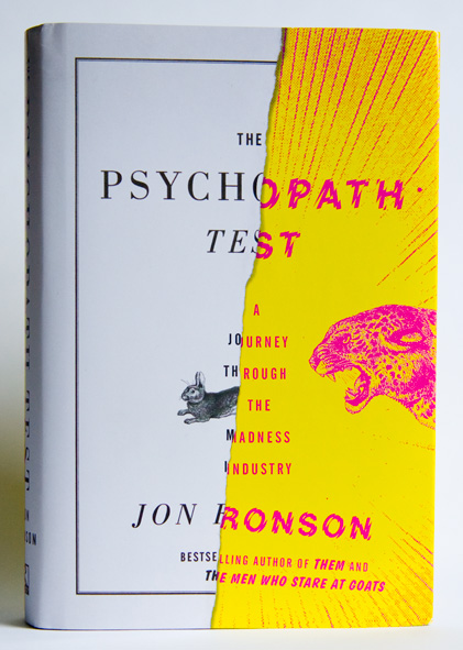
Half Crazy — Matt Dorfman on his great book cover design for The Psychopath Test by Jon Ronson, published by Riverhead Books:

Riverhead did not skimp on the production touches for this one. They sprung for a combination gritty matte finish (which covers the white paper portions of the jacket) and a shiny gloss for the yellow/magenta “crazy” half, thereby giving your sense of touch a noticeable edge if you find yourself blindly scanning your shelf for this book in a dark room (which I have done).

The Intimate Orwell — Simon Leys reviews Diaries by George Orwell, edited by Peter Davison, and George Orwell: A Life in Letters also edited and annotated by Davison, for the NYRB:

From the very start, literature was always Orwell’s first concern. This is constantly reflected in his correspondence: since early childhood “I always knew I wanted to write.” This statement is repeated in various forms, all through the years, till the end. But it took him a long time (and incredibly hard work) to discover what to write and how to write it. (His first literary attempt was a long poem, eventually discarded.) Writing novels became his dominant passion—and an accursed ordeal: “writing a novel is agony.” He finally concluded (some would say accurately), “I am not a real novelist.” And yet shortly before he died he was still excitedly announcing to his friend and publisher Fredric Warburg, “I have a stunning idea for a very short novel.”

Investigative Self-Repair — Author James Lasdun (It’s Beginning to Hurt) reviews Edward St. Aubyn’s latest semi-autobiographical Patrick Melrose novel At Last for The Guardian:

This act of investigative self-repair has all along been the underlying project of these extraordinary novels. It is the source of their urgent emotional intensity, and the determining principle of their construction. Not much gets into these books that doesn’t bear directly on Patrick’s predicament. Exposition is kept to a minimum; there are few descriptive passages, no digressions. For all their brilliant social satire, they are closer to the tight, ritualistic poetic drama of another era than the expansive comic fiction of our own.

And finally…

The General Specialist — Designer, illustrator, and letterer Jessica Hische talks to Method & Craft:

I love learning about new things whether or not they directly connect to how I earn a living and I think that this desire to pay attention to related industries is one of the reasons why I’m a figure in the design community. It’s by learning about many things that you’re able to understand specialization—that design is broken into countless micro-industries. If you don’t understand the differences between them (or acknowledge that they exist), there is no way for you to find your own specialized niche with in it.

Comments closed

Chip Kidd at The Comic Archive

Last week I linked to a short video of Chip Kidd talking about growing up with comics. Now, The Comic Archive have posted a few more segments from that interview in which Chip discusses his book design and work in comics.

In this first clip, Chip talks about his decision to pursue graphic design in college and the influence of comic books on his work:

In this longer segment, he discusses coming to New York, being hired by Knopf as a cover designer, and returning to comics through DC Comics and Pantheon:

And this may just be for the fan-boys, but in this final clip Chip shows off his specially commissioned one-of-a-kind collections of original artwork:

#Envy

Comments closed

Something for the Weekend

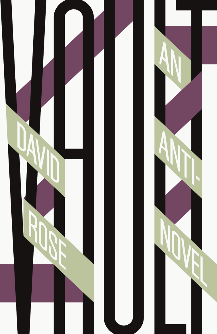
A distinctively typographic cover by David Pearson for Vault by David Rose, new from Salt Publishing.

Giving Up Irony — John Self reviews Edward St. Aubyn’s At Last:

The author’s background, like Patrick’s, is of inherited wealth; perhaps it is this which enables him to treat his characters mockingly and sympathetically at the same time. His brittle, witty prose evokes comparisons with Evelyn Waugh, whose snobbish attraction to the upper classes, looking in on them from without, contrasts with St Aubyn’s cool-eyed appraisal. The phrase “a handful of dust”, quietly slipped into At Last, could be an acknowledgement of the similarities and contrasts.

Patrick is like his creator, not just in his background, but in his stylistic weaknesses:

“It’s the hardest addiction of all. Forget heroin. Just try giving up irony, that deep down need to mean two things at once, to be in two places at once, not to be there for the catastrophe of a fixed meaning.”

The Architecture of the Secret Lair — Mark Lamster for Design Observer:

The Bin Laden compound makes an interesting contrast with the secret modern lairs created for Bond villains by the legendary production designer Ken Adam. These have routinely been described as unrealistic, insofar as they could never be built without drawing attention. It’s curious now, in retrospect, to think that it was fear that kept the local population from Dr. No’s island hideaway (which was just off British and American territory). Though Bond films make us think of visual extravagance, the most visually arresting set from the film was the rather raw interrogation room, with its cross-beam, ocular ceiling. What was in Osama’s basement?

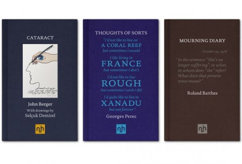
Notting Hill Editions, a new publishing imprint devoted to the essay, launches this month with books by from John Berger, Georges Perec and Roland Barthes among others. The typographic covers were designed by Garvin Hirst at Berlin-based design consultancy Flok.

And finally…

The Burden of Entertainment — Woody Allen discusses five books that still resonate with him:

The Catcher in the Rye has always had special meaning for me because I read it when I was young – eighteen or so. It resonated with my fantasies about Manhattan, the Upper East Side and New York City in general.

It was such a relief from the other books I was reading at the time, which all had a quality of homework to them. For me, reading Middlemarch or Sentimental Education was work, whereas reading The Catcher in the Rye was pure pleasure. The burden of entertainment is on the author. Salinger fulfils that obligation from the first sentence on.

Reading and pleasure didn’t go together for me when I was younger. Reading was something you did for school, something you did for obligation, something you did if you wanted to take out a certain kind of woman. It wasn’t something I did for fun. But Catcher in the Rye was different. It was amusing, it was in my vernacular, and the atmosphere held great emotional resonance for me. I reread it on a few occasions and I always get a kick out of it.

new publishing imprint launching in May, which is dedicated to revitalising and celebrating the essay.
1 Comment

Making Businessweek

Here’s a neat (if slightly irreverent) time-lapse video showing Businessweek magazine being put together over the course of a week:

And Bonus points to the @bizweeksgraphics team for using French Disko by Stereolab as the soundtrack.

(via Kottke)

Comments closed