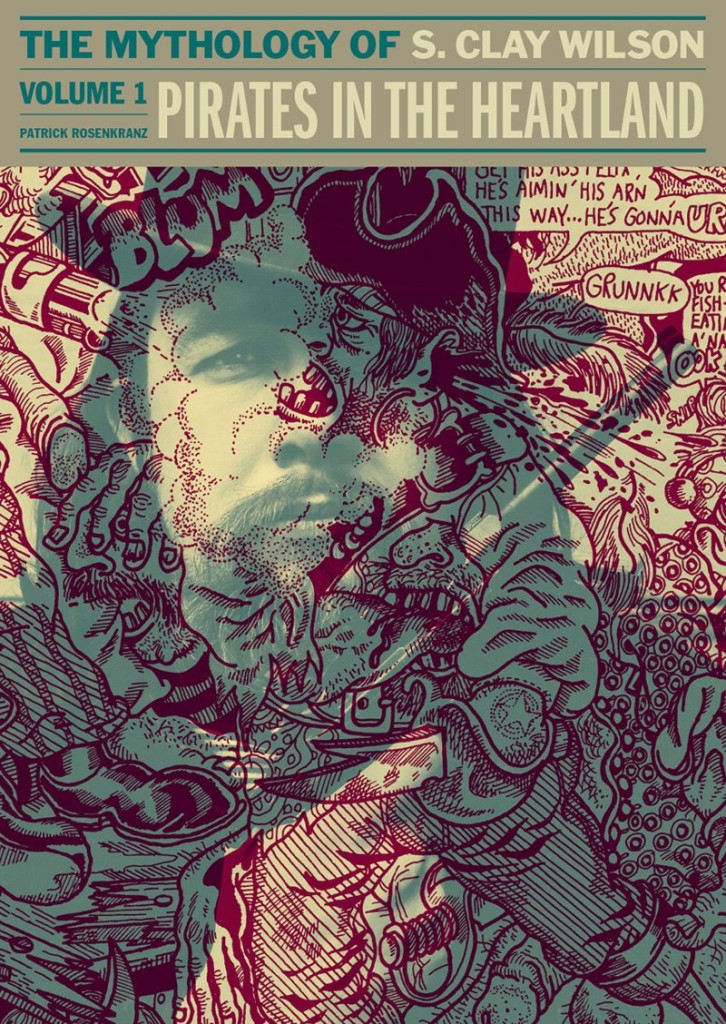
Designer Jacob Covey recently posted a short essay on his personal Facebook page about his cover design for Pirates in the Heartland, the first volume of Patrick Rosenkranz’s biography of underground cartoonist S. Clay Wilson. I asked Jacob if I could repost it in its entirety here, but the book’s publisher Fantagraphics had beaten me to it. While you can read the whole piece on their blog, here’s a short excerpt:
In publishing, one has to approach a cover with the information of an expert and the ignorance of a browser. In biographies, a photo of the subject is generally employed for good reason: The viewer immediately knows this is a book about a person. (Hence the trend in fiction of generally cropping off the heads of models or having them looking away — this is not about THEM.) But Wilson is recognizable only by his artwork, so a photo alone isn’t enough information. Ultimately, my solution is a kind of psychedelia but a practical one: Pirate art (a favorite theme of Wilson) overlaying a mythic portrait of young Wilson. Creation and creator in color overlays that force your eye to try to unhook one from the other.
I generally consider it a failure when cover design requires a band of color upon which to set the type. In this case, it allowed for the art to be the primary feature, to be a bit uncontrolled, while the type treatment is an anchor that harkens classic album design. This kind of visual messaging is trying to align Wilson with rebels and rockstars without making false promises. The trickiest part was simply finding Wilson art that had ANY white space so his portrait could connect with the viewer. The dual function of his artwork blowing the brains out, simultaneously, of Wilson and another of Wilson’s creation was too wonderful to pass up but I’m going to leave the symbology of such things to the viewer.
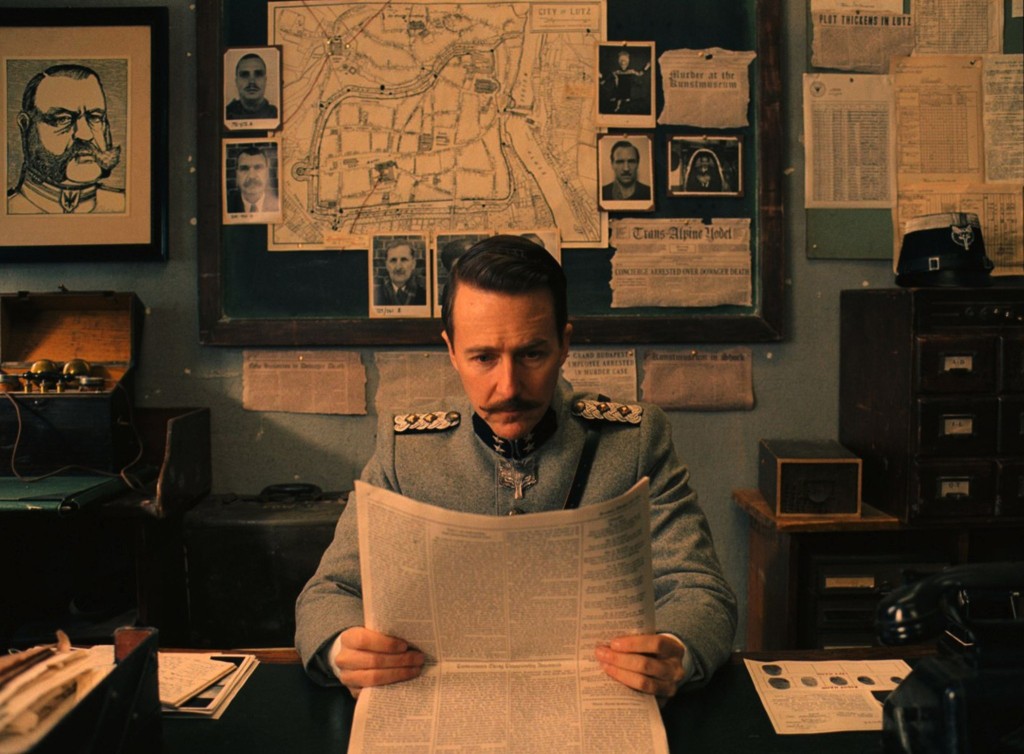
Just to quickly follow up my post about Wes Anderson and The Grand Budapest Hotelearlier this week, there is an interesting interview with art director Adam Stockhausen about working with on the film at The Dissolve:
[The references] come from all over the place. They’re very specific, but they can come from any place. They can come from a story, they can come from a painting, they can come from a movie. In this movie, there’s a Bergman film called The Silence, with the boy wandering around the hallways, we modeled our hallways on that. If you look at the hotel doors in that film, ours are a carbon copy. There’s a sequence in a Hitchcock movie called Torn Curtain where he comes out of his hotel and he gets on the bus and he goes to the museum; we have a bit of an homage to that sequence when Deputy Kovacs goes from his office to the art museum and he’s being chased by Willem Dafoe’s character. For the palm court we looked at Rousseau paintings. For the command tent in Moonrise Kingdom, we looked at Churchill’s war room. The references can be very wide, but they’re all pretty different.
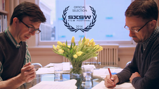
Dress Code‘s documentary short about typographers Jonathan Hoefler and Tobias Frere-Jones, Font Men, “gives a peek behind the curtain into the world of Jonathan and Tobias. Tracking the history of their personal trajectories, sharing the forces that brought them together and giving an exclusive look at the successful empire they built together.” The film is a SXSW 2014 Official Selection:
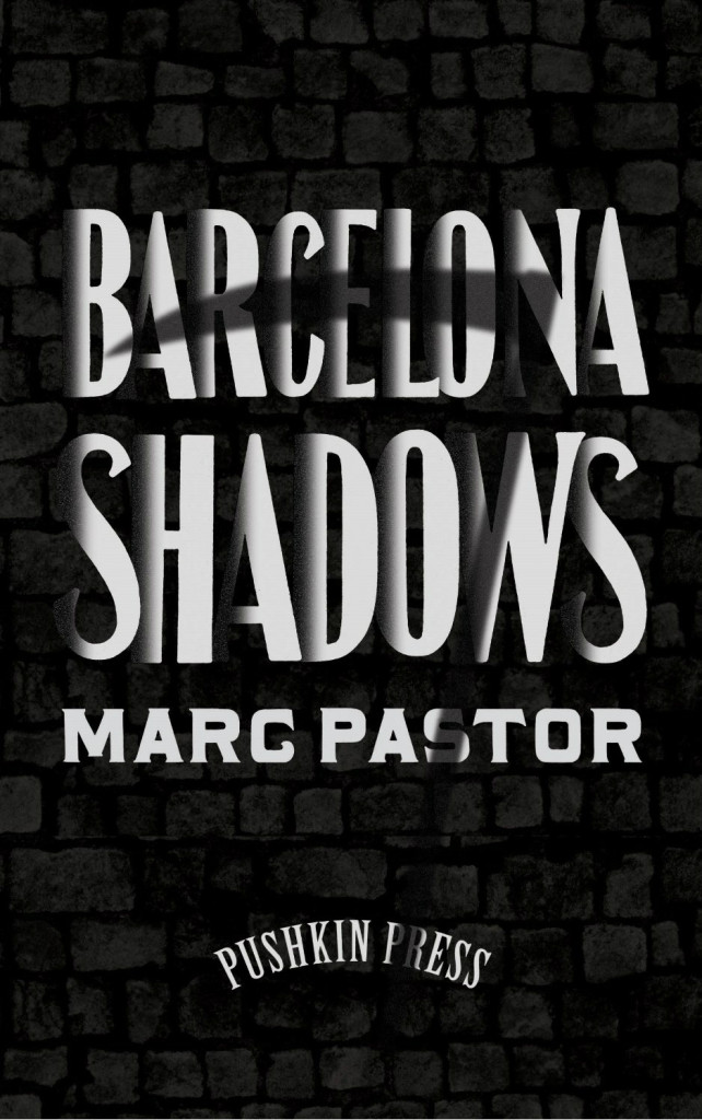
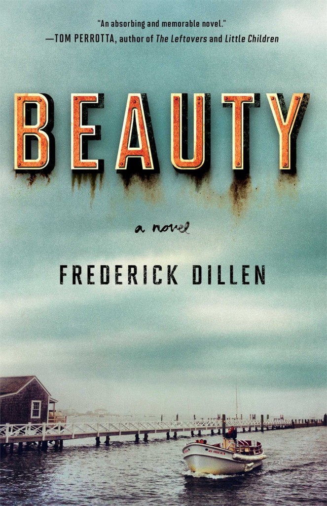
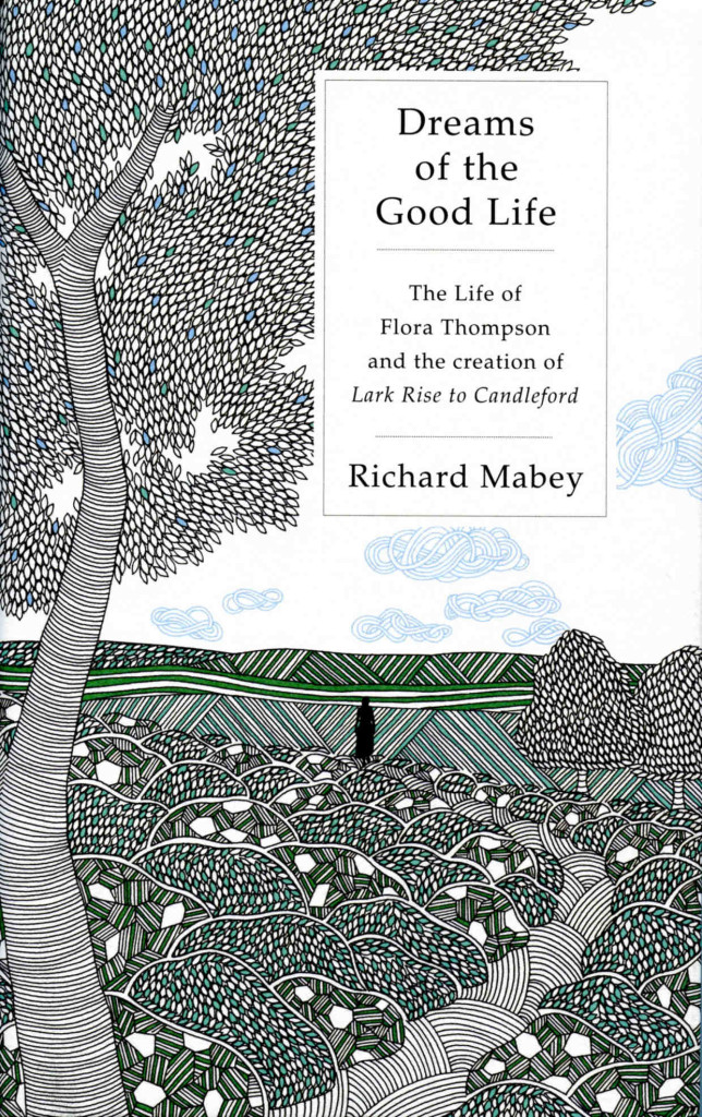
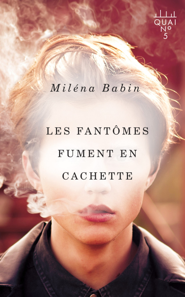
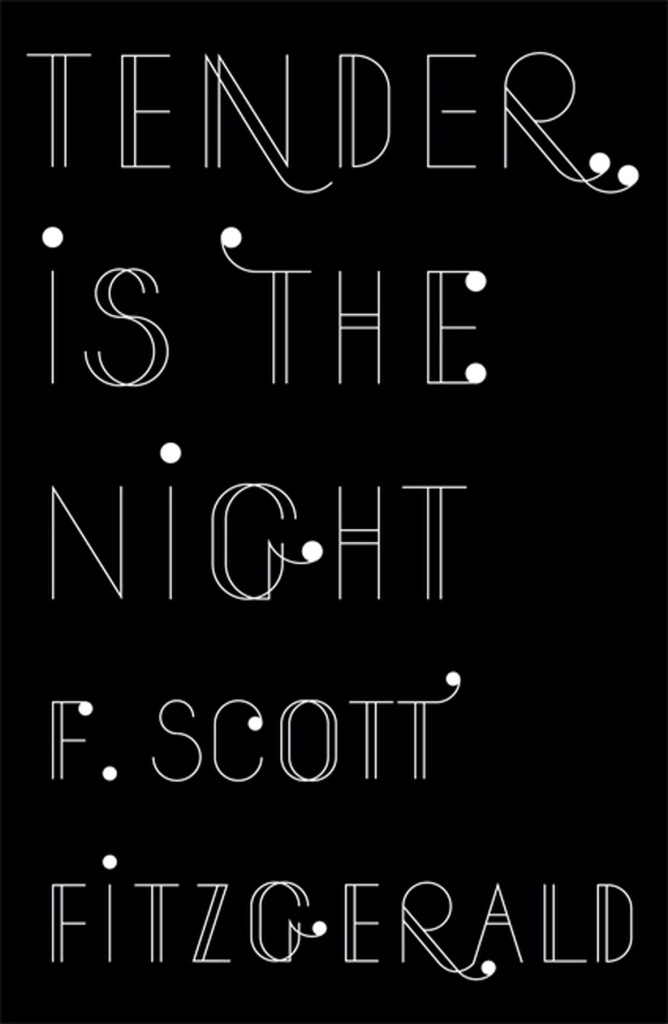
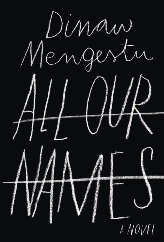
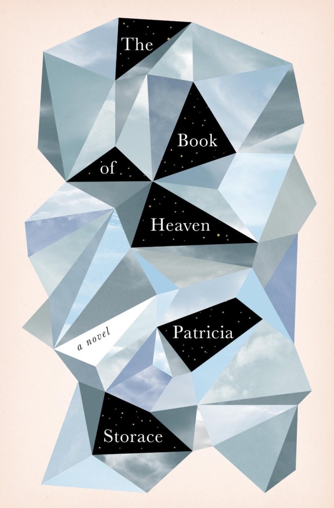
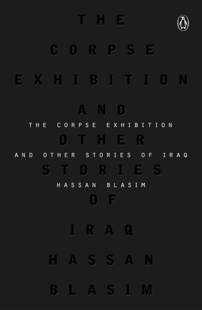
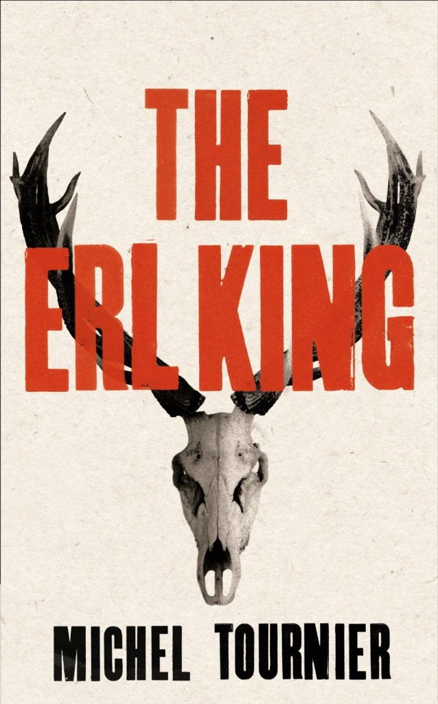
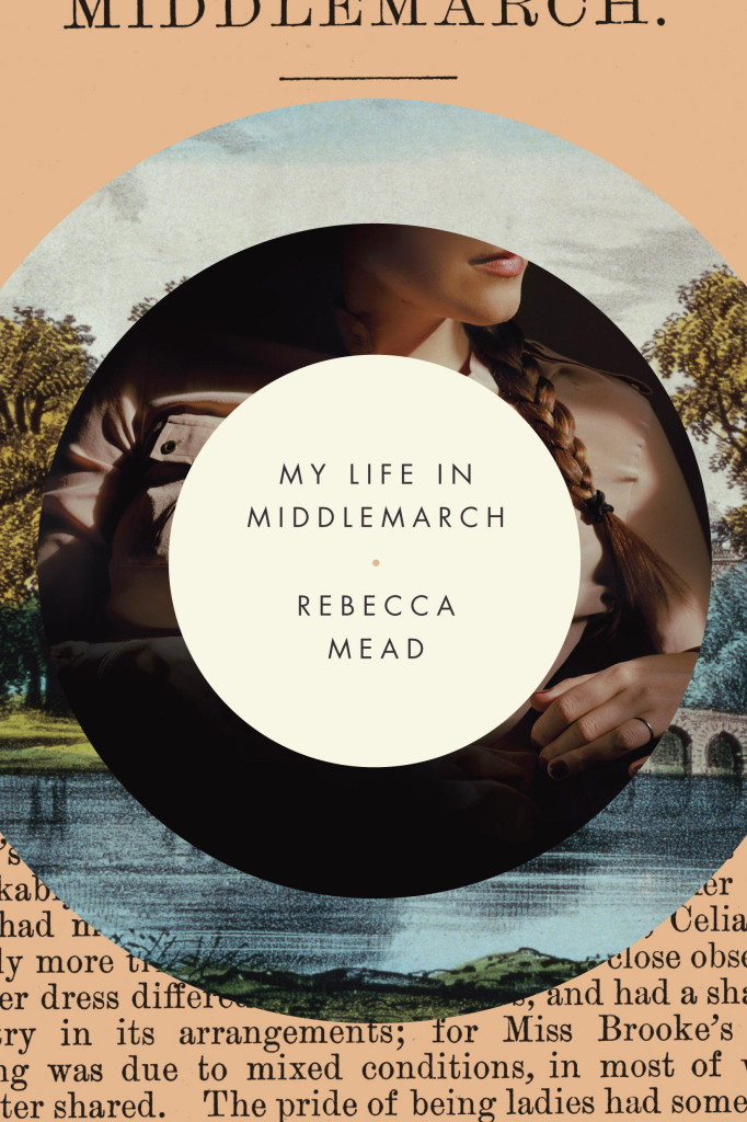
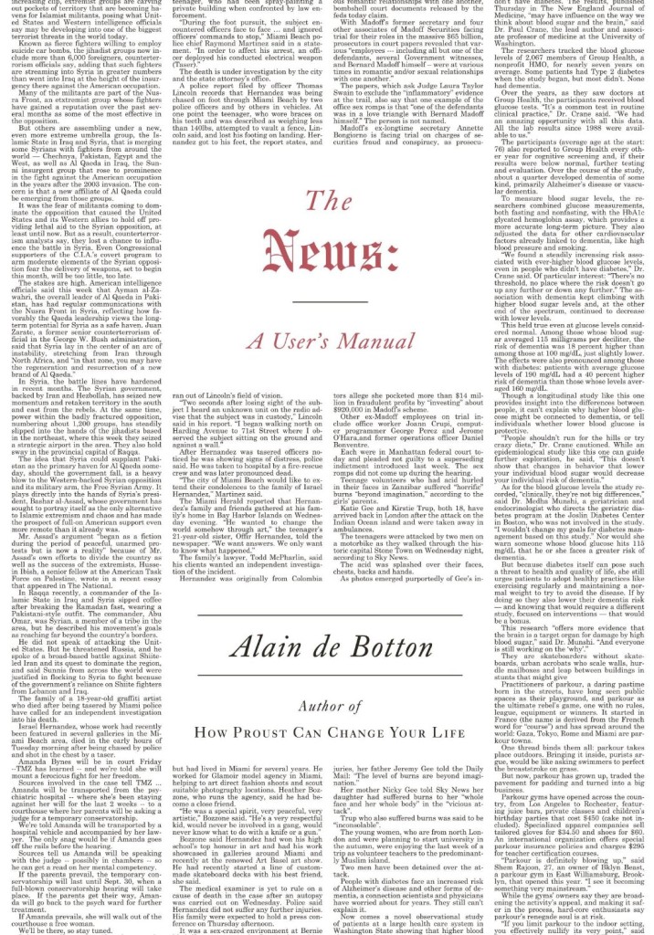
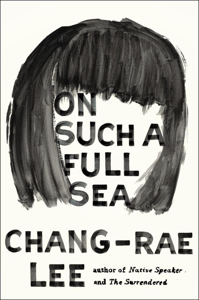
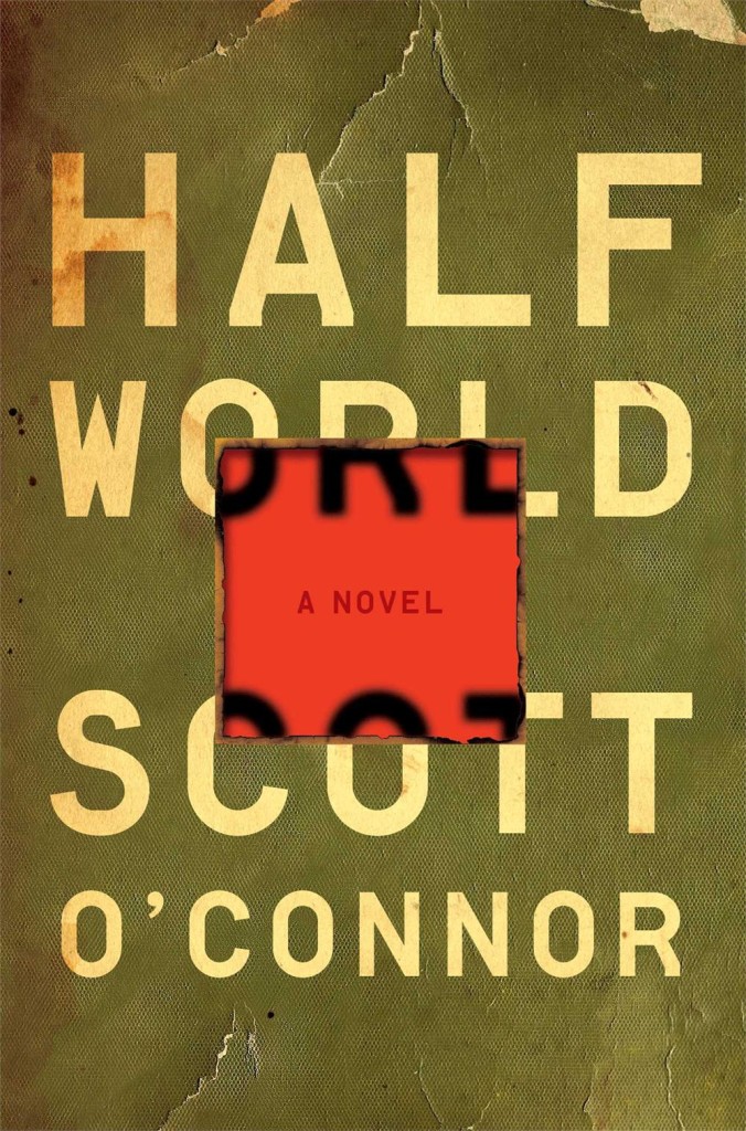
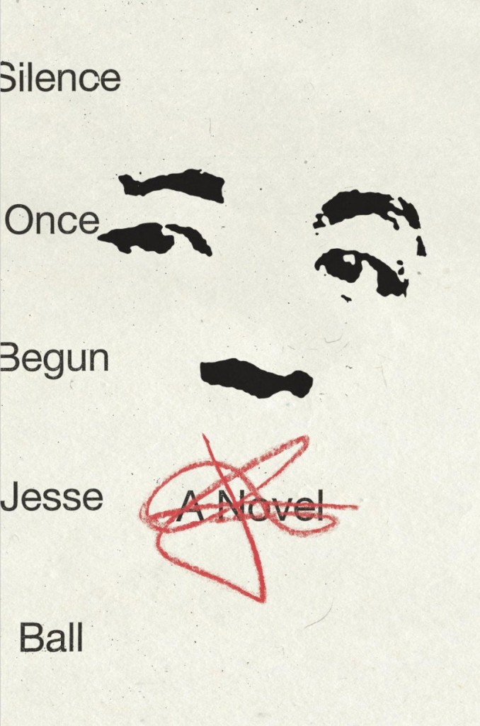
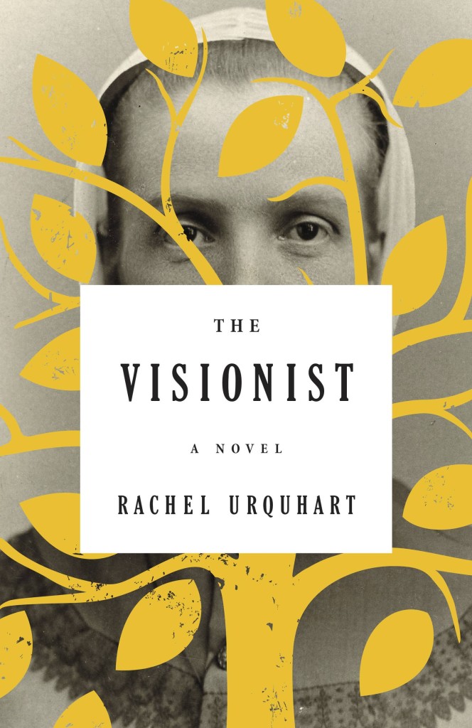
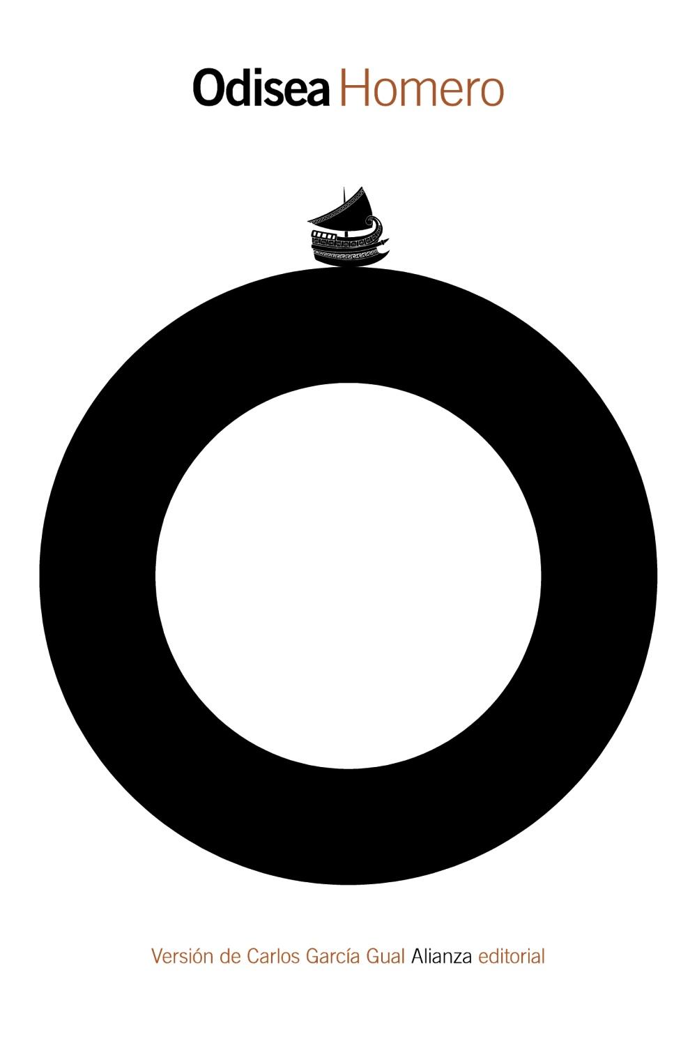
The Academy of British Cover Design held its inaugural awards ceremony last night. The competition was open to any cover produced for a book published between January 1 and December 31 2013 by a designers based in the UK. Here are the winning cover designs in each of the 10 categories:
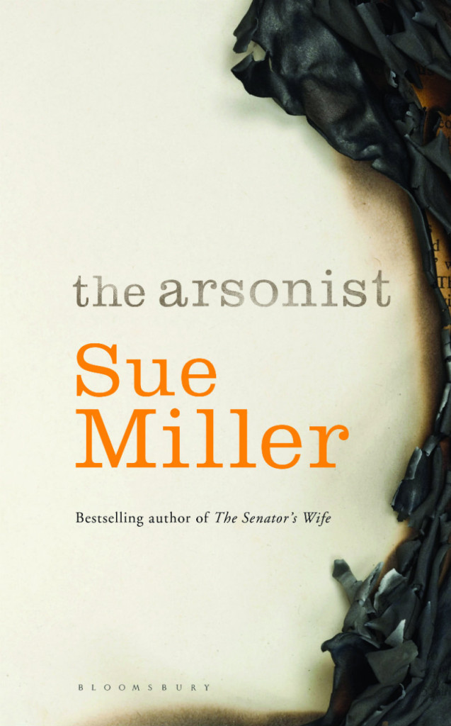
It’s almost March and I’ve just realised that I haven’t posted very many book covers this year. To make up for this lapse, here are ten of my favourite covers from the last few months:
It’s just been announced that Haruki Murakami’s next novel, Colorless Tsukuru Tazaki and His Years of Pilgrimage, will be published on August 12th in the UK and US by Harvill Secker and A. A. Knopf respectively. The cover of the US edition is above, the UK edition below.
US Edition
UK Edition
I would assume that the US cover is designed by Chip Kidd (correct me if I’m wrong); please let me know if you know who Suzanne Dean designed the UK cover (thank you @BookCovrs).
Sara Wood kindly let me know that fellow designer Steve Attardo has not only started his own freelance studio NinetyNorth Design, but also delivered this rather fine jacket design for Laline Paull’s forthcoming novel The Bees.
The book’s publisher Ecco has put together a rather nice trailer based on Steve’s cover design. It was conceptualized by Ecco’s art director Allison Saltzman and animated by Justin Cassano:
Author Rachel Kushner discusses her novel The Flamethrowers(now out in paperback), and the importance of images to her work, with The Quietus:
I’m inspired by visual art and film… Whether or not I’m writing about those mediums directly, as I sometimes do in Flamethrowers, I’m always thinking about images… I always wanted to have images in a book, and with [The Flamethrowers], after I got to have my choice of the image on the North American cover, I got a little bold, and asked about putting images inside. My editor said yes, so I quickly put together a short list of ideal visual passages. I didn’t want anything that would illustrate the narrative. I wanted, instead, images as kind of pauses, or counterpoints, but that would complicate, function in a relation, but not an obvious one. There’s a Richard Prince image, and he’s a shadow presence over the course of the book (one of the characters is also the name of Prince’s alter-ego, John Dogg). There’s a photograph by Aldo Bonasia, of a riot and police tear-gassing the rioters, in Italy. There’s a still from the movie Wanda, which figures in the book…
Funnily enough, I have feeling that Scribner have actually stuck closer to the hardcover for the front of the US paperback edition and slapped needless award stickers all over it, but I prefer the restraint of the version above left. The cover on the right is the UK paperback — a vast improvement on that mystifying hardcover).
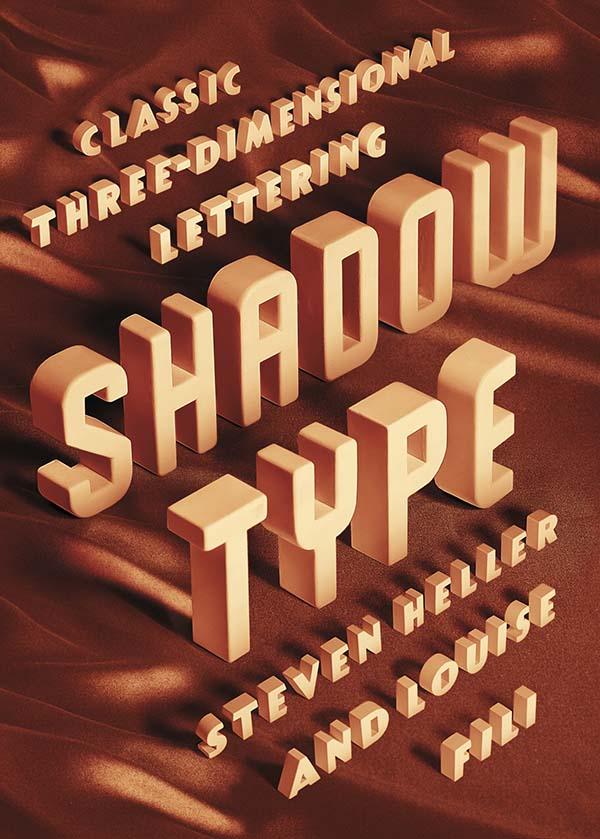
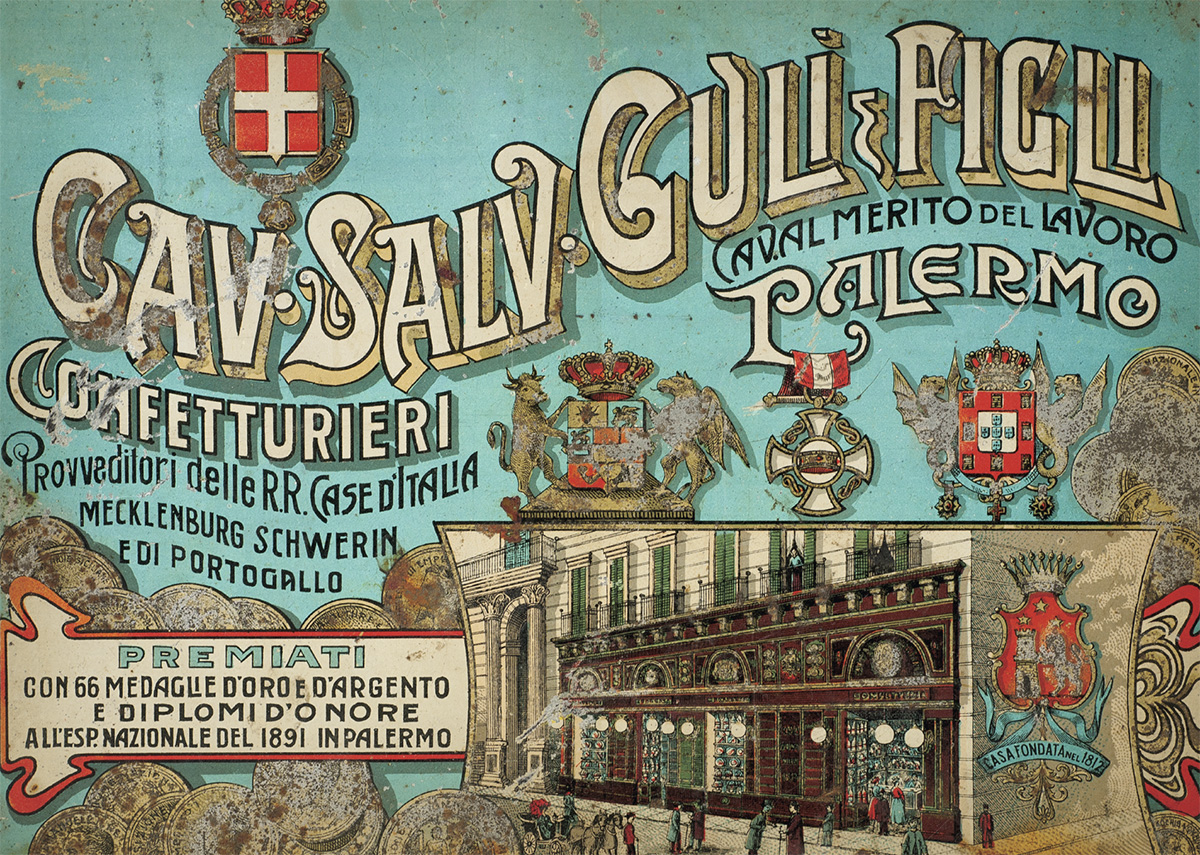
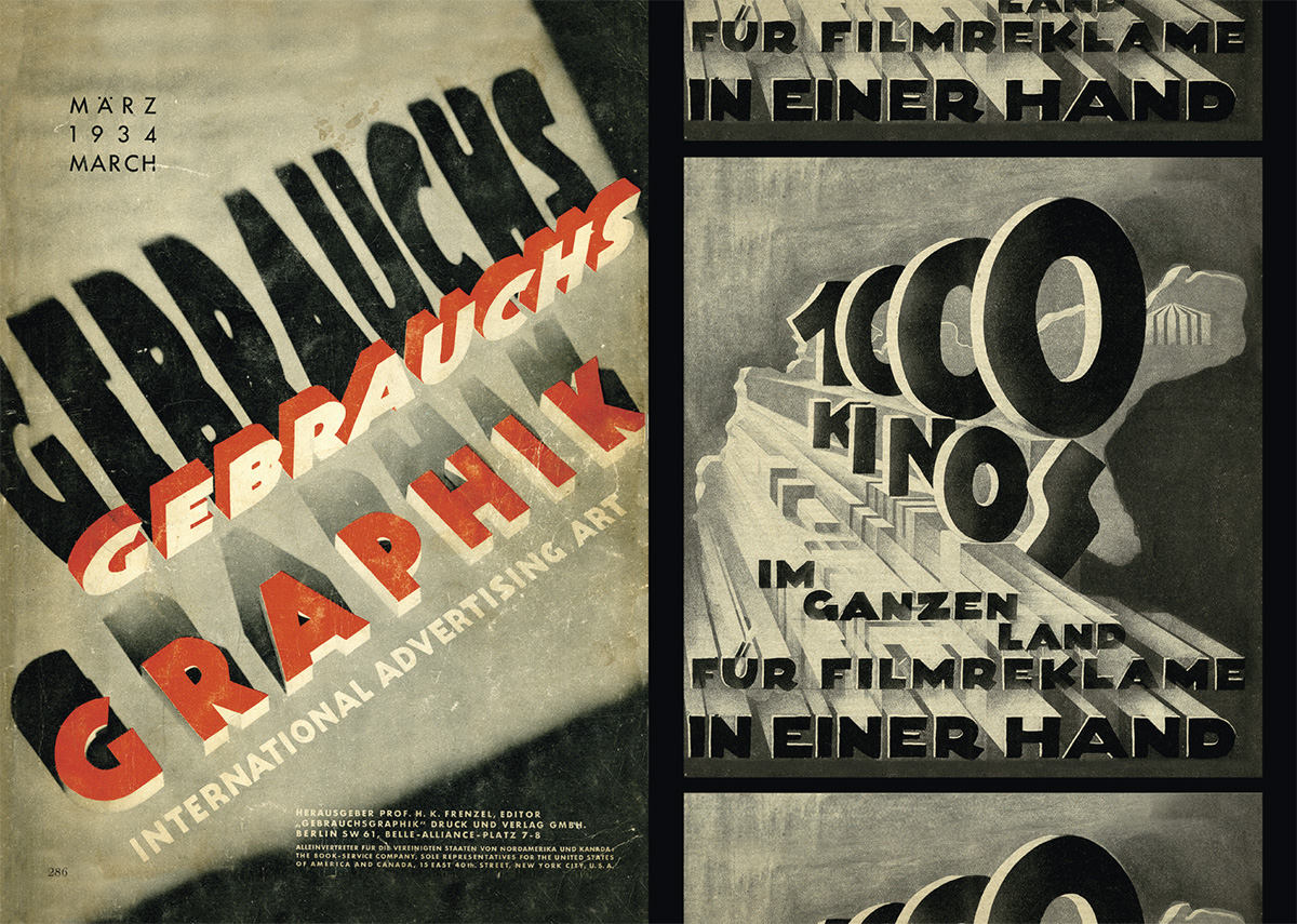
“Dimensional typefaces toy with human perception, challenging the limits of cognition. Whether framed by a subtle tint or a bold silhouette, in color or in black and white, a shadow adds bulk, enabling the words to rise voluminously from otherwise flat and unmonumental surfaces. Shadow faces are typographic trompes l’œil, fascimiles of real three-dimensional letters and inscriptions in sculpture and architecture… This sculptural essence of shadow type adds not only to the letters’ visibility, but also to their continuing allure.”
Just thinking about how much Steven Heller writes makes me a little giddy. The renowned art director, educator, design historian, and critic provides a steady stream of design commentary in newspaper, magazine and journal articles (not to mention his blog for Print magazine, The Daily Heller). He has authored, co-authored, or edited over 100 books on design, illustration and typography, including the recent Shadow Type: Classic Three-Dimensional Lettering, co-authored with his partner Louise Fili.
Shadow letters started to make an appearance on merchants’ signs in the 18th-century, and were introduced as metal typefaces as early as 1815, but they did not become common in printed text until later in the 19th-century. After a surge in popularity among printers and their clients, type foundries began to provide a wide selection of styles and sizes, and by the late 19th-century shadow wood type was also in demand, coming in extra-large sizes so it could be used outdoors. “Whether custom drawn, or as metal or wood type, shadow letters animated newspaper and magazine mastheads, product labels, and, indeed, all kinds of signs and posters.”
Published in September last year by Princeton Architectural Press, and distributed in Canada by Raincoast Books, I had the opportunity to ask Steven about Shadow Type, his interest in design ephemera, and how he finds time to write.
Do you remember when you first became interested in design?
I was interested in pictures at an early age. I wanted to be like Jules Feiffer, a comics artist. Design came later. I was studying the work of some German satirists, who were also designers.
Did you grow up in a creative household? Not especially.
Where did you begin your design career? At 14 I worked for an ad agency doing RussssTogs. Didn’t go well. It took another 3 years before I was hired by an underground paper to do layouts.
When did you first start writing about design history?
When I was at the NY Times as OpEd art director, I did a little bit of writing on those Germans I mentioned. Then it accelerated to writing about publications and other historical themes.
How do you find the time write?
There’s always time.
Do you still get excited when you hold one of your own books in your hands for the first time? Yes, the thrill is still there. But the high lasts shorter. An addict gets used to the fix and needs another and another. These days, I don’t rip the envelope right open. I let it sit for hours, so I have something to look forward to. Weird, I guess.
Why did you and Louise decide to write a book on classic three-dimensional lettering?
We did the first one on Scripts. We’ve done series before, they didn’t start out that way, but evolved. This evolved into Shadow Type. I have long loved the dimensional, colourful, sculptural letters.
When was the heyday of ‘shadow type’? 19th, 20th and 21st centuries. Its never gone out of style. But the golden age was late 1880s to 1940s.
Why did it become popular? Dimensionality on flat surface. Our eyes love to be fooled.
Why do you think there is a renewed interest in ornate typography and lettering? It comes and goes. I see a shift away again. But it has to do with the joy we get from ornament and I think it parallels what goes on in clothing.
Has Louise’s work contributed the revival of decorative type? Possibly. But she’s not decorative per se. Her type choices are elegant. She’s about precision and aesthetic pleasure.
Do all the examples in the book come from your own collection?
For Scripts and Shadow yes. And for the next one too, that’s Stencil Type.
Why does design ephemera hold such a fascination for you? I’ve come up with all sorts of reasons, but the all seem bogus. I feel the stuff somehow represents who I am. But I also love being a repository of history. More than that, I cannot say.
Your son, Nicolas Heller, recently made a film about your den called “The Cave.” What was that experience like? He’s a great talent. I just set him loose. And he made his film. The stuff in that place should be interpreted by others. The juxtapositions of objects and books are at times wonderful.
What’s Nicolas working on now? He’s doing a series of documentaries on eccentric New Yorkers called NO YOUR CITY, he’s also filming designers for documentaries produced by Brian Collins.
Do you have a favourite book? Of my own? I’ve done over 165, but I love Iron Fists. Of other people? There are too many to say.
What books are in your ‘to read’ pile? I just finished Deborah Solomon’s biography of Norman Rockwell – smartly done. And I finished Year Zero by Ian Buruma about the year 1945, makes the blood chill and boil. On the pile is a thick book about the Beatles. Not sure I’ll get to that.
Is there one book you think all designers should read?
I love Ben Shahn’s The Shape of Content. I also love The Hare with Amber Eyes, but for me, nothing is so essential that I’d stand on the mount and scream that they should read the tablets.