Skip to content

Tag: design

Q & A with Jessica Sullivan

If you saw my post on Canadian book covers last year, then you’ve already seen the work of Vancouver-based designer and art director Jessica Sullivan.

I first came across Jessica’s name in 2009. I was trying to convince Peter Cocking, then art director at Douglas & McIntyre, to agree to an interview. Peter, in his way, was having absolutely none of it (and still isn’t, really), but he did suggest that I talk to his senior designer Jessica Sullivan, “the best book designer in the country.” Nothing came of it then, but I did start to pay attention to Jessica’s work — to be honest, it was hard to miss her distinctive style, impeccable typography, and quite how many Alcuin Awards she was winning!

Now, five years after that original conversation with Peter, Jess is now working as a freelance designer and part-time art director for Greystone Books, and still delivering some of the best book covers in the country. In this interview she discusses her work, her career, and offers some advice for designers starting out today.

Jess and I corresponded by email.

When did you first become interested in design?

I took an art class for the very first time in grade ten. My teacher was a graphic designer and one of his clients was A & W. My 15-year-old self thought that was just about the coolest job I could have imagined.

From that day forward any time anyone asked me what I wanted to be when I grew up, I said Graphic Designer. Even though I didn’t really know what that meant.

Did you study design at school?

My determination to be a designer was thwarted by a scholarship to UBC, so after a bit of a detour, I rerouted and attended the Emily Carr Institute of Art + Design and received a BA in Communication Design.

Where did you start your career?

I think I started my career at school. I had this perception that landing a design job on my own was going to be impossible (I’m not sure why). I had it in my head that my first job would materialize through one of my instructors. I treated school like a very long job interview, only not so well-dressed. By fourth year an offer came by way of my typography instructor Peter Cocking, then Art Director at Douglas & McIntyre. A position was created for me and the two of us became the new in-house design department. And a book designer was born.

How long were you at Douglas & McIntyre?

9.5 years. During my tenure I married, had babies, designed hundreds of books and experienced a bankruptcy—theirs, not mine.

Has working freelance been very different from working in-house?

In almost every way. I’ve always enjoyed my job, but now I enjoy so many more aspects of it. There is a lot that’s rewarding outside of the work itself. You’re fairly invisible in an in-house scenario. There’s little you can change about process and there is an historical nucleus to the way things are done. It’s a lot simpler to affect change when it’s just me I’m dealing with. I’m pretty easy to work with.

Are you still designing books and book covers?

Yes, absolutely. I just design more than books now.

What have you worked on recently?

I’ve recently designed a book series for MOA [Museum of Anthropology] at UBC, I’m currently working on a visual identity for an editing and writing services company which I’m having a lot of fun with, and I just wrapped up a project for an exhibition of Japanese woodblock prints from the 1800s. I also continue my work with Greystone Books as their art director. A position which adds balance and bit of chaos to my work flow and ensures I leave the house at least once a week. It also guarantees a few good laughs—it’s a great office to work in.

What are your favourite kinds of projects?

I love it when after your first meeting you’ve not only fallen for the project itself (you have a vision for it, you can’t wait to get started, you can SEE how you’re going to make a difference and bring something to this thing) but you’ve also fallen for the people, the client. Every time this happens, and I’ve been very fortunate over the past 14 months as it’s happened quite frequently, I walk away from those meetings like there are tiny, little clouds under my feet.

What kind of books present the greatest creative challenges?

Fiction covers. I don’t know if I hate them or love them. It’s such a hard market, competitive and over saturated, so the cover becomes of utmost importance. It’s usually the most painful genre when designs are rejected, and I’m generally unfazed by rejections at this point in my career, it’s just part of the job. But I’m fairly opinionated regarding fiction and powerless in terms of persuasion, so it can make for a tortured process. And I might be over exaggerating a bit here.

Can you describe your process for designing a book cover?

If it’s fiction, I read the book, otherwise I read the synopsis and familiarize myself with the content and tone. Then I think. That’s probably the most important stage. Generate as many ideas and concepts from all that thinking. Source imagery or create imagery or have imagery created. Add type. Explore, test, judge, select, refine. Judge, select, refine. Judge, select, refine. Sleep. Wake up and see if I still agree with myself. Submit.

What advice would you give a designer starting their career?

1. Be professional at school. Be on time, hand things in by deadline. Design communities are often small. You will encounter your instructors out in the world. They will remember you if you pissed them off with your laziness. They will not hire you.

2. You only get out of school what you put into it. They can’t teach you to be a good designer; that comes from work and practice. Ensure that every instructor you encounter enriches your education—you are paying for it.

3. Continue to grow. If your job becomes boring—challenge yourself. Give yourself personal goals within your projects. Ensure that everything you create is adding to your own personal archive. When you’ve amassed what you need don’t be scared to leave and move on to the next challenge.

Is there a supportive design community in Vancouver?

I’m not really sure. I do feel I am part of a supportive community—although it’s not actually composed entirely (or much at all) of fellow designers. I’ve been told one exists in Toronto, and I have to admit, I am very curious about it all.

Where do you look for inspiration, and who are some of your design heroes?

I try to be aware of my surroundings, to makes connections of all kinds, not just in design. I like old things and new things and mixing the two together. I’m always looking at stuff. Printed stuff: books, magazines, wallpaper, packaging. Moving stuff: movies, documentaries, TV, birds. Invented stuff: art, architecture, interior design, music, fashion. Stuff that just exists: fish—which have the most amazing colour palettes, snow affirms the beauty of white space.

I am a fan of Barbara deWilde, Gabriele Wilson, John Gall, Paul Rand, Charles and Ray Eames, Charley Harper, B. C. Binning, Rex Ray. I’m not sure if any of them ever rescued anyone though.

What books have you read recently?

That’s a hard one. I’ve been so busy lately that I honestly haven’t had time to read anything besides work related matter. I used to read in transit and at night, so I consumed a lot of books on a monthly basis. Now I write proposals and tend to email on the bus rides and research in the evenings and fall asleep before I can finish a page of the book that’s sitting next to my bed, Ingenious Pain. The last book I read that I really devoured was Million Little Pieces which is strange because I almost exclusively read novels.

Do you have a favourite book?

That’s not possible. I can’t even say I have a favourite author. There’s just too many, too much to choose from. And I read all kinds of fiction, some of my favourites: A Spot of Bother Mark Haddon, Tom Bedlam George Hagen, On Beauty Zadie Smith, As I Lay Dying William Faulkner, The House of Mirth Edith Wharton, The Collector John Fowles, The Chimney Sweeper’s Boy Barbara Vine, The Mysteries of Pittsburgh Michael Chabon.

What does the future hold for book cover design?

I don’t really see that much changing, to be honest. Unless we’re no longer allowed to use paper, and we go back to the time where stories are housed in people’s memories. And then I’ll be useless for a number of reasons. I have a terrible memory for that kind of detail.

Thanks Jess! 

4 Comments

Helen Yentus 3D Slipcase


Helen Yentus, the art director of Riverhead Books, designed two covers for the recently published On Such a Full Sea by Chang-rae Lee. The regular hardcover — which is beautiful in itself (see below) — has a hand-lettered jacket. The second, for a limited edition of the novel, comes in a white slipcase made on a 3D printer. In this video, Helen talks about the 3D printed slipcase, designed in collaboration with the MakerBot Studio:


This isn’t the first time Helen’s worked with MakerBot. In 2011 she used the 3D printer to create the letters on the cover of The Innovator’s Cookbook by Steven Johnson:

1 Comment

Favourite Covers of 2013: A Postscript

I didn’t exactly know what to call this post, but ‘postscript’ seems appropriate.

Every time I post my annual list of favourite covers I immediately see (or remember) a dozen designs that would have been on the list (or would’ve been close) if I did it all over again. This is an attempt to collect a few of those covers from last year in one place. I guess you could call it a list of ‘honourable mentions,’ but that doesn’t seem quite right. Truthfully, it’s a collection of some of the covers that I saw for the the first time, or was gently reminded of, immediately after I posted my original list. It is, as much as anything else, an excuse to post more fantastic work from 2013.

I have been completely overwhelmed by the incredible response to this year’s covers post, and although I could probably do lists like this for the rest of 2014, I won’t. I will save my energy for next December. Happy New Year!


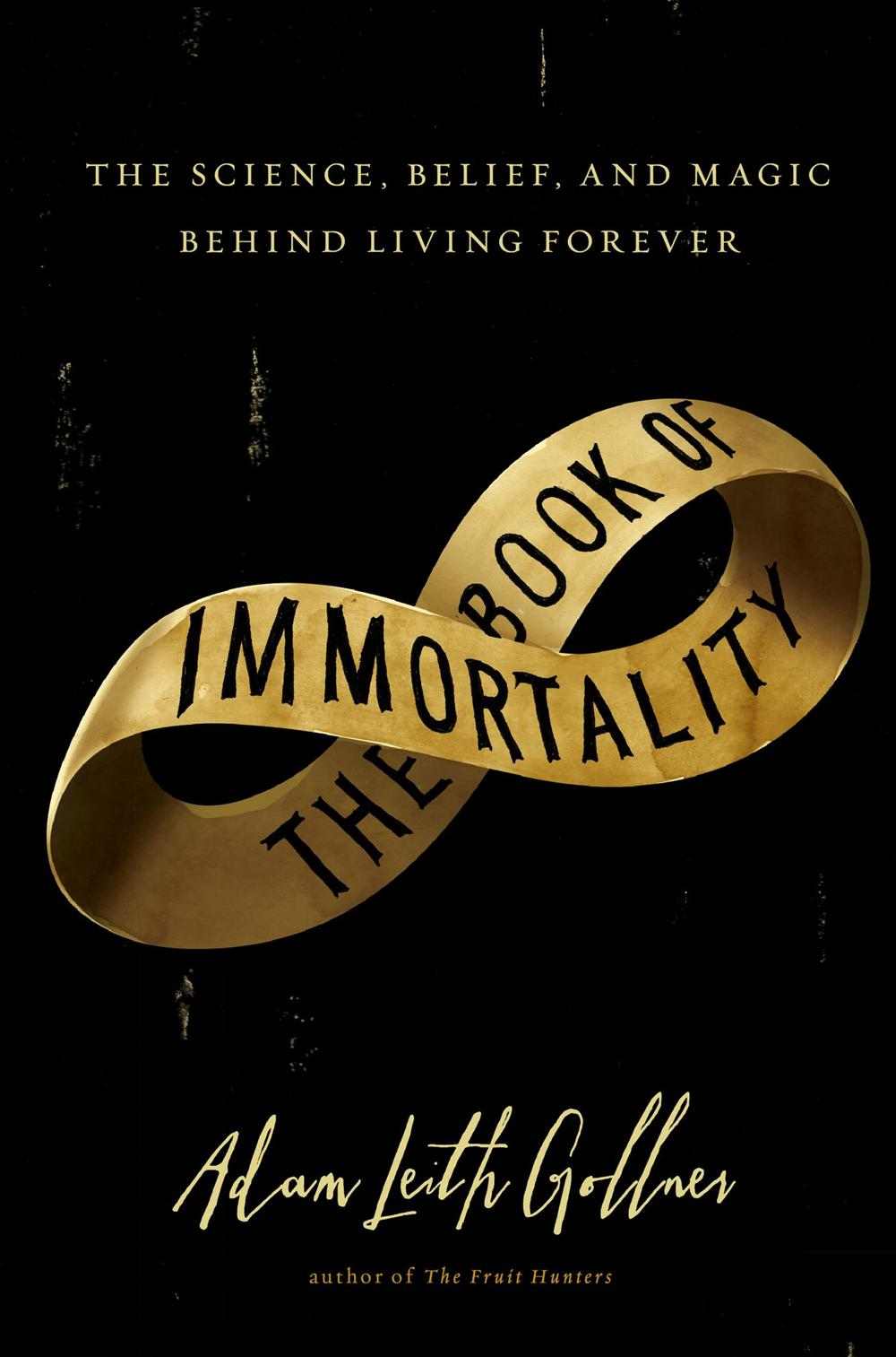
The Book of Immortality by Adam Leith Gollner; design by Tal Goretsky and Janet Hansen

The cover for Doctor Sleep by Stephen King, designed by Tal Goretsky and illustrated by Sean Freeman was also a cracker.


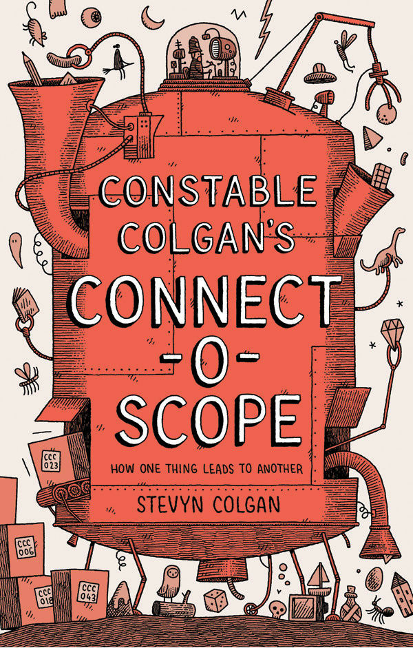
Constable Colgan’s Connect-O-Scope by Stevyn Colgan; illustration by Tom Gauld


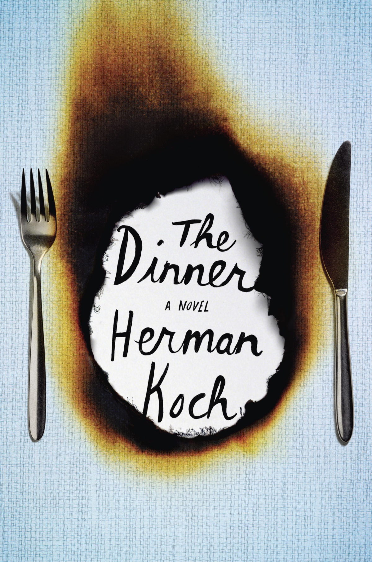
The Dinner by Herman Koch; design by Christopher Brand

Christopher Brand did some great covers this year, especially for Crown. I like this one too.


The Divine Comedy by Dante Alighieri, translated by Clive James; design by Rodrigo Corral


Down and Out in Paris and London by George Orwell; design by David Pearson, illustration Paul Catherall

Yes, it was the year of David Pearson.


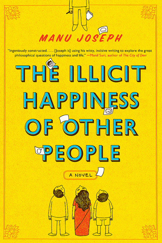
The Illicit Happiness of Other People by Manu Joseph; design by Jarrod Taylor


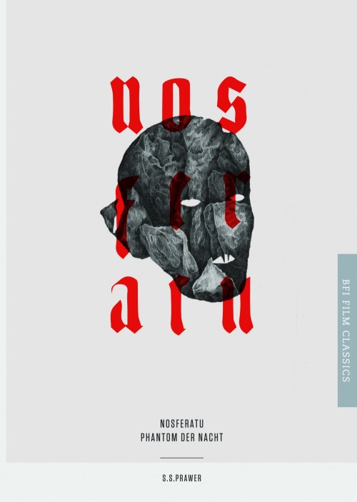
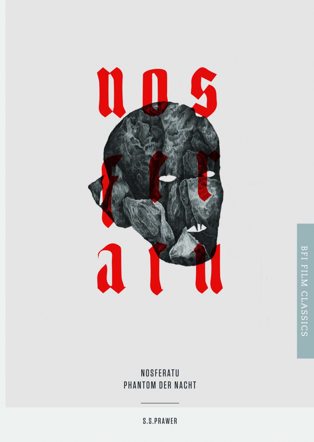
Nosferatu: Phantom der Nacht by S. S. Prawer; design by Matt Brand

I also really like Julia Soboleva‘s design for Nosferatu: Eine Symphonie des Grauens and Ben Goodman‘s cover for Das Cabinet des Dr. Caligari.


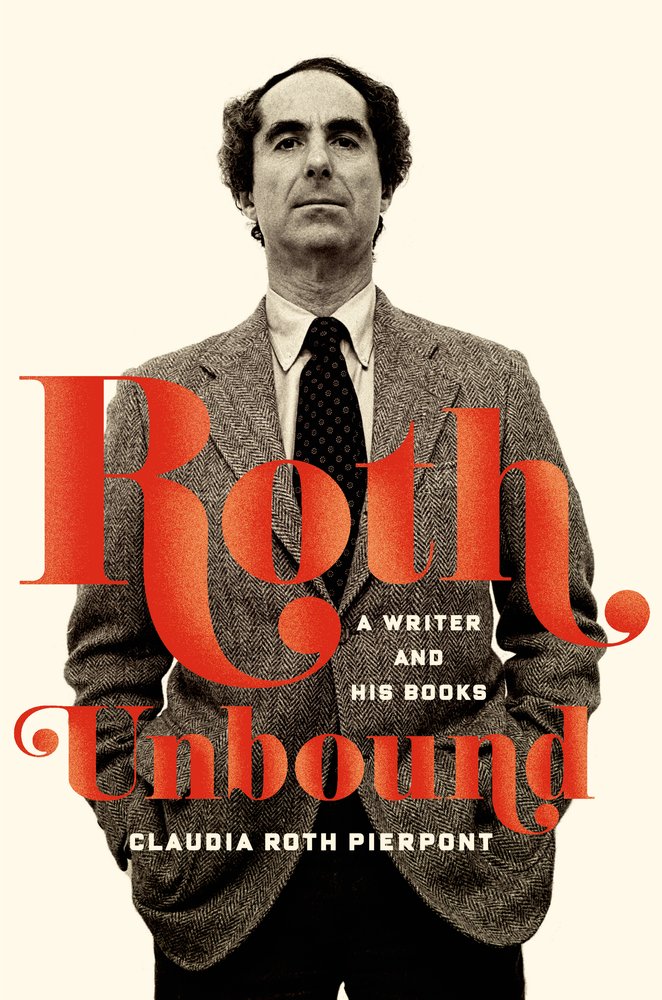
Roth Unbound by Claudia Roth Pierpont; design by Charlotte Strick, photograph Ken Sharp

Great photo. Great type. Charlotte produced some really lovely work for FSG in 2013.


The Shining by Roger Luckhurst; design by Mark Swan

I liked a lot of the BFI covers (obviously!), but Mark’s design for The Shining struck me as particularly clever. You can read about the design process for all the recent BFI Film Classics here.


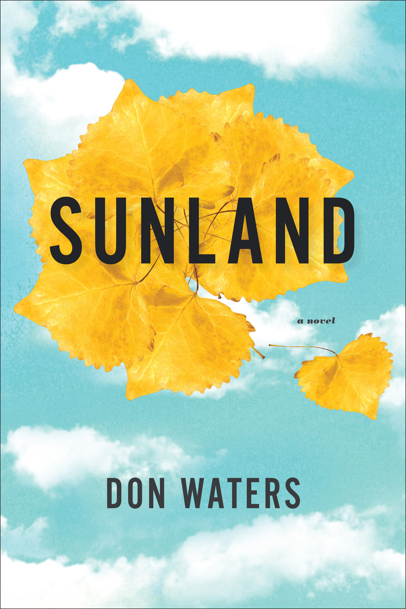
Sunland by Don Waters; design by Kimberly Glyder


That Smell and Notes from Prison by Sonallah Ibrahim; design by Paul Sahre

Nicholas Blechman’s cover design list for the New York Times alerted me to this one.


Ulysses by James Joyce; design by Peter Mendelsund

Ok. I had seen this cover and didn’t forget about it either. It was on my list from the start and it got cut at the last minute. I’ve agonised about it since. Sorry Peter.

Comments closed
Spanish Book Covers of 2013

One of the enduring shortcomings of my end of year covers list is its failure to represent designers from the non-English-speaking world. Having interviewed Spanish designer Ferran López Creative Director for Editorial Planeta (and previously a designer at Random House Mondadori) a few years ago, I’m particularly aware of how much amazing work is being done in Spain and how little of it gets featured here. Fortunately at Unpopular Culture, the blog of Madrid-based independent publisher Pop Editions,  Óscar Palmer has selected his 12 favourite book covers of the year. It’s a good-looking list!

See all of Óscar’s selections

Pictured above (from top to bottom): DIARIO DE 1926, design by Eduardo Jiwnani; LA BANDA QUE ESCRIBÍA TORCIDO, design by Carlos Úbeda; EL ARTE DE LA COCINA FRANCESA, design by Nora Grosse; ROBINSON, design by Juan Pablo Cambariere; LA SOMBRA FUERA DEL TIEMPO, design by Zuri Negrín.

Comments closed

ABCD and 50/50 Design Contests 2013

Design Observer has announced that they are now accepting entries for this year’s 50 Books/50 Covers competition. The submission deadline is February 20th 2014.

Design Observer, in partnership with AIGA and Designers & Books, began hosting the competition in 2011, and you can see the winners from the previous two years here.

Meanwhile, if you are a designer based in the UK, The Academy of British Cover Design (ABCD) has also announced the opening of its new annual cover design competition.

The competition is open to any cover produced for a book published between January 1 and December 31 2013. Entries must be received by January 31st, 2014.

Comments closed

Nicholas Blechman’s Best Book Covers of 2013

The great book designer George Salter once said that a good jacket “must be in perfect accord with the literary quality of the book. It must be even more if it is to function as an important sales factor, if it is to ‘stop’ the eye of the person passing by.” Of the thousands of books that come through the offices of the Book Review each year, these are the covers and jackets that caught my eye, that compelled me to flip them over to check the back flap to see who designed them.

If you weren’t satisfied with my 2013 covers list (and why would you be?), then the infinitely more qualified Nicholas Blechman, art director at New York Times Book Review, has selected his best book covers of the year.

Ulysses, redesigned by Peter Mendelsund for Vintage, is on Nicholas’s list,  and I also liked Paul Sahre‘s design for the cover of That Smell and Notes From Prison by Sonallah Ibrahim, and the cover of Without Their Permission by Alex Ohanian designed by Oliver Munday:

We agreed on Gabriele Wilson‘s beautiful cover for Middle C by William Gass, but I think I should compile a list of all the great covers from 2013 that I’ve seen since I posted my list on Tuesday. (I’m kidding. Sort of).

Comments closed

Beyond a Man’s Machines: The Art of Rube Goldberg

All else aside, though, it’s his Rube Goldberg inventions that made him a lasting cultural presence. Goldberg once said his machines — which he drafted with strict but rollicking precision — were a “symbol of man’s capacity for exerting maximum effort to achieve minimal results.” It sometimes took him as long as 30 hours to execute one single-panel piece.


The New York Times takes a look at The Art of Rube Goldberg by Jennifer George:

1 Comment

Design is Fine


Design is Fine. History is Mine, an eclectic design history blog compiled by Rea Riegel, a copy writer and lecturer from Germany, is one of my favourite new Tumblrs. Go take a look.

(Pictured above: Pierre Reverdy and Pablo Picasso Le chants des morts, 1948)

2 Comments

Shadow Type and The Designers & Books Online Book Fair


Steven Heller and Louise Fili talk about their beautiful new book Shadow Type in a new video for Designers & Books:

The video is part of the Designers & Books Online Book Fair, a wonderful directory of design books that you can browse in all sorts of interesting ways.

(Shadow Type is published by Princeton Architectural Press in the United States, and distributed by my employer Raincoast Books in Canada)

1 Comment

The Absent Column

I was just in Chicago this past weekend, so I was really interested in this short documentary about the battle to preserve the former Prentice Women’s Hospital in the city. Designed by modern architect Bertrand Goldberg, the building — composed of a nine-story concrete cloverleaf tower cantilevered over a rectangular five-story podium — is owned by Northwestern University, which is in the process of demolishing it. The film is directed by journalist and Northwestern alumnus Nathan Eddy:

Comments closed

Michael Bierut: Use Curiosity as a Route into Work


Interviewed at the AGI Open London 2013, Michael Bierut discusses his work, living in New York, and shares some advice for aspiring designers:

3 Comments

The Great Discontent: Paula Scher

The Great Discontent interview designer Paula Scher:

I think graphic design is an important profession because it’s part of what we put out into the world, and it’s what people see and perceive. It’s not just about doing design for the “public good.” The design community currently thinks that if you design something to help the victims of Hurricane Sandy, then that’s good, but if you design something for a bank, then that’s bad. I disagree. I think all design matters and all design deserves to be intelligent.

Obviously, we don’t want to advertise products that are horrible for people because that’s immoral. But if we can raise the expectation of what something can be, then we’ve done a huge service for our community. For example, consider the way most strip malls and shopping centers think they have to appear and behave: it’s horrible. Why can’t there be a different kind of experience? Why can’t we see them as something potentially terrific? There’s an architect named James Wines, whose Structure In the Environment architecture firm designed facades for a chain of BEST stores in the 1970s. He took big box stores and turned them into fantastic outdoor sculptures. He raised the expectation of what those experiences could be.

To me, that’s the most responsible design there is: taking something “bad” and making it terrific by raising the expectation. That’s what we do.

Comments closed