Skip to content

Tag: design

Q & A with Erin Fitzsimmons

House of Ivy and Sorrow

In recent years, I doubt there’s been a greater publishing success story than Young Adult — or ‘YA’ —  fiction.

Sometimes mistakenly described as a genre, YA is actually an age-category roughly ascribed to books across a range of subjects and genres that are suitable for teenagers. Yet, confusingly,  YA is not quite synonymous with ‘Teen Fiction.’ While Teen Fiction is assigned books appropriate for ages 12-17, YA is increasingly used to describe (albeit loosely) fiction intended specifically for older teens and even readers in their 20s and beyond.

In 2012, Publishers Weekly reported that “55% of buyers of works that publishers designate for kids aged 12 to 17… are 18 or older, with the largest segment aged 30 to 44, a group that alone accounted for 28% of YA sales.” If it wasn’t exactly news that grown-ups read books for teens, their willingness to do so openly, and the development of a passionate fan culture driven as much by these adults as teens, has seen a change in the way publishers think about YA and how they package it.

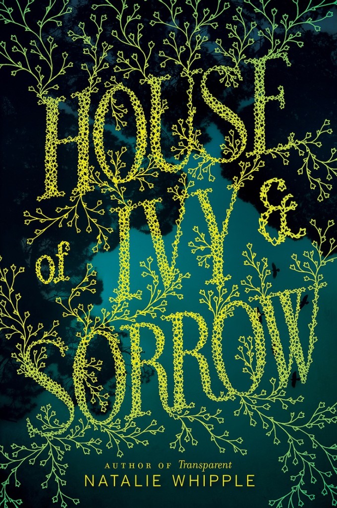
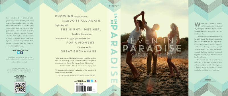
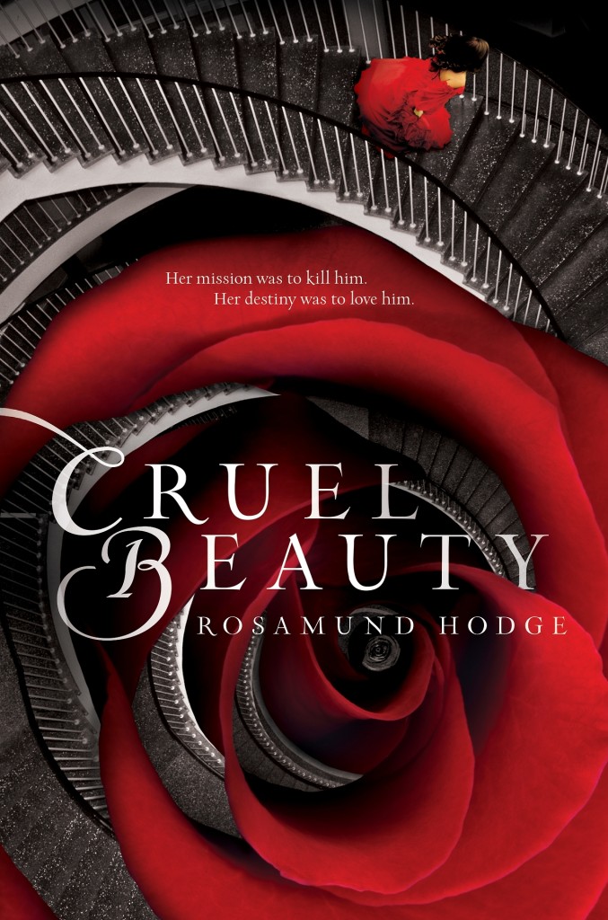
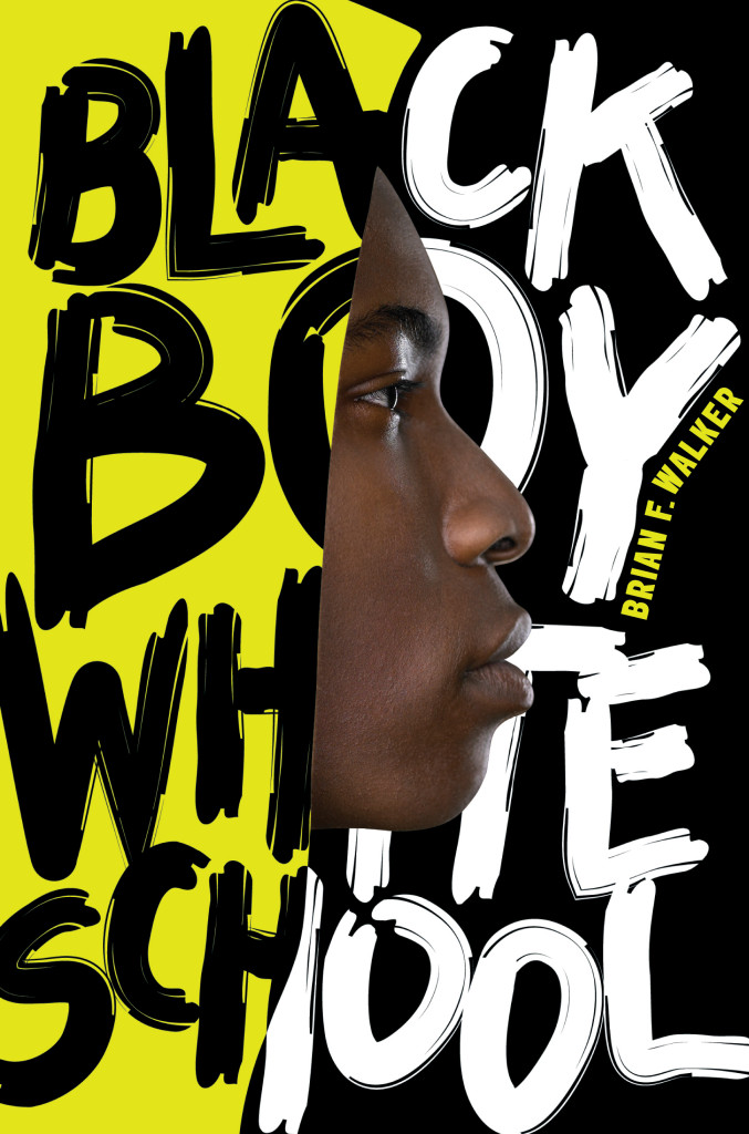
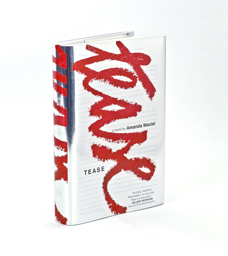
The growing sophistication of YA cover design can be seen in the work of Erin Fitzsimmons, associate art director for HarperTeen in New York. The attention to lettering and typography throughout Erin’s work, notably on the cover of House of Ivy and Sorrow by Natalie Whipple and Tease by Amanda Maciel (see below), convinced me that YA design is something that should be featured here and happily Erin agreed to talk about her work. We corresponded by email.
EveninParadise_jacket

Did you read a lot of books growing up?

When I was very young, I memorized my favorite children’s book, We’re Going on a Bear Hunt, so I could “read” it to my little sister. When I was older, I was into all the big chapter and middle-grade series: Goosebumps, Boxcar Children, Sweet Valley High. I must’ve just missed the Harry Potter era. I’m reading them now and they’re incredible.

Do you remember your favourite book as a teenager?

It’s funny—I’ve read far more teen books now than I ever read growing up. As a high school student, you have to do so much required reading for school, I don’t remember reading many books for fun. The book I remember reading most vividly as a teen was Jurassic Park. I went through a Michael Crichton phase, and then skipped straight to John Grisham. I read pretty much his entire library in mass market paperbacks over the course of a few summers.

When did you first become interested in design?

About 7 years ago, I started working in publishing as a photo editor. I went to school for photojournalism, but it wasn’t for me. I was convinced that since I couldn’t hack it as a photographer, I was meant to be a photo editor. Indeed, I was much better at editing, but after a year or so, my Art Director offered me the chance to design a book cover. It was love at first design, and I haven’t looked back since.
cruel-beauty

Is anyone else in your family creative?

Fortunately, my entire immediate family is creative. Both of my parents went to art school, and are supremely more talented than I will ever be. My dad owns an art gallery and frame shop, and my mom is a floral designer. My little sisters are also involved in creative fields: one is an art therapist and the other works at a youth theater when not in college. Thanks to them, I feel very supported in what I do. Even better, I don’t ever have to explain what a book designer does to them! A slightly unfortunate side effect is that simple things like Easter egg dyeing and pumpkin carving can get very competitive in my house.

Did you study design at school?

I desperately wanted to go to art school for photography, but my sage parents suggested I broaden my studies. I was lucky enough to find the Gallatin School at NYU. Gallatin allows you to take classes in all of the undergrad schools at NYU, and there are no traditional majors. So while my concentration was photojournalism, I was able to study communication and jazz history and documentary filmmaking and so forth. The challenge of this type of education was to find the way it all related to storytelling, and I’ve continued that practice in my professional career. I see design as a logical extension of storytelling, as it’s often the method and means through which stories are told. Without my Gallatin education, I might not have been so open to recognizing those relationships and trying new fields. Still to this day I find myself wanting to constantly learn new things. At the moment, it is type design, lettering, and calligraphy, but who knows what’s next.
BlackBoyWhiteSchool

Have you always specialized in young adult books?

My first experience designing books was at Fairchild Books, a small publisher of fashion and interior design textbooks. Even though we published educational books, their designs had to be a bit more stylish than your average textbook. My experience there was very much trial by fire, as I learned everything I could about design and publishing. A few years later I transitioned to HarperCollins, where I started designing mostly Young Adult and Middle Grade/Tween titles.

Can you describe your process for designing a book cover?

It differs from project to project. The basic step-by-step is usually the same: read the book > take notes > sketch/comp ideas > find artists > present > refine > present > (repeat some more…) > finalize! But within there are so many variables. There are a ton of people to please when it comes to a book cover, so that can certainly affect the flow.

Sometimes you’ll have an idea at the very start of the process, and sometimes it won’t come until much later. I tend to work up too many ideas in the early stages, and truth be told, many of my best ideas develop by mistake (or at least from different intentions) so it’s important for me to explore even the crazy/weird/bad ones.

I often find if your concept is good enough from the start, it should survive the rounds and rounds and come out all polished and shiny at the end. I am just finishing up an incredible project where the image I had in my head while reading became a pencil sketch and is now a striking piece of artwork. They can’t all be like that, but it certainly makes up for the rest.

SeptemberGirls

What are your favourite kinds of projects to work on?

I especially like working on stories that are out there and different. In the YA world, there tends to be a lot of repetition: Well, that worked, so let’s do it again, and again… So it’s truly exciting when you read something fresh. As a designer, you can really latch onto what makes the book unique, and focus on those differences to set the cover design apart.

What kinds of books present the greatest creative challenges?

There are a few genres in teen (Dystopian and Sci-Fi/Fantasy, for example) that have been tread upon so heavily that it can be difficult to come up with new and original ideas. Similarly, anything that can be considered trendy at the moment will be more of a challenge to break the mold of what’s been working for other publishers. We can try to resist the trend all we want, but too often in the end, commercial appeal will win out for the teen market. But we will still keep trying to push those boundaries.
Blackout_series

Do you approach series differently from individual cover designs?

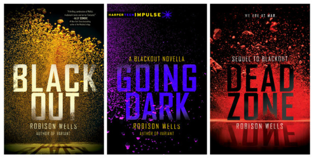
Absolutely. We live in the land of trilogies, so if your idea won’t work three times, it won’t work at all. We often are asked to concept more than one book in a series at once, just to prevent the inevitable frustration if your idea doesn’t carry through. For the upcoming Snow Like Ashes, we designed the entire series from the start. The third book in that series won’t publish until 2016, so it’s a bit crazy to think that far ahead. Blackout was another instance where I found a series of photographs I loved, but I had to be sure from the outset that we could make each cover feel special across a series. Lately they’ve been adding last minute “interstitial” e-novellas to our release in between hardcovers in our bigger series. It might as well be the book design equivalent of a knuckleball.

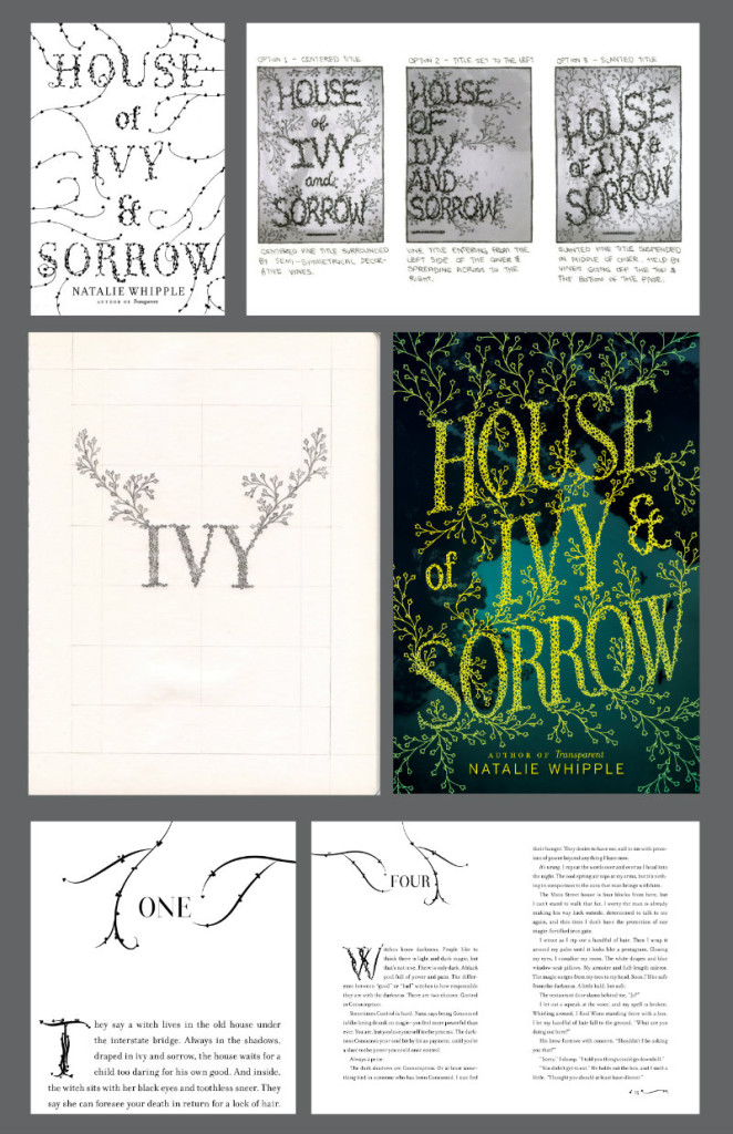
For the cover of House of Ivy and Sorrow by Natalie Whipple you used a custom typeface called Ivy Type. Do you like to experiment with type design and lettering in your work?

I do, and House of Ivy & Sorrow is one of my all-time favorite projects for this reason! I had been sketching ideas for the cover design for weeks, and it just wasn’t working (my lettering skills are still very much in development). Luckily, I was able to hire fellow CooperType grad Sasha Prood to letter and illustrate the final cover. She took it so much further than I ever could have on my own. I am so grateful to get to work with incredible artists like her that make my ideas better.

The upside was that since we design both the book covers and interiors, I was able to digitize my lettering and create a character set to use for the interior design drop caps, so all was not lost in the end. I’ve created a couple of custom faces for book interiors I’ve worked on, and lately I’ve been doing a lot more hand-lettering for covers. It’s definitely something I want to keep exploring and improving upon.
HouseofIvy&Sorrow_process

Is the popularity of teen fiction among adults allowing you to create more sophisticated designs? Or is there just more pressure now on designers to produce commercial covers? 

It might be a bit of both, actually! I started in teen right as the Twilight phase was ending and Dystopian era was beginning, and so began the rise (and return) of more sophisticated subject matters. Realistic fiction has always been a staple of teen fiction, but the sheer popularity of authors like John Green and Rainbow Rowell has pushed it to the extreme in recent years. More adults are reading teen books, and therefore the covers have begun to mature along with their readers. There was also a time where sophisticated did not equal commercial. It’s wild how much that has shifted in just a few years. The lines are starting to blur and overlap, and I see it even in the adult section. It’s so fascinating to be a part of.

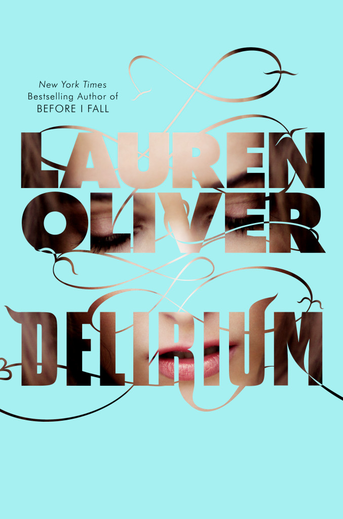
Cover designs are obviously important to YA readers, and ‘cover reveals’ have become common for big releases. But are YA covers still an under-appreciated art in the industry?

The cover reveal has taken on a life of its own. The popularity of Goodreads and the plethora of YA blogs has created the need for most authors to reveal their covers in advance of the catalog posting. It used to be only the lead titles were revealed, but now almost every cover ends up with the same fanfare. And with that fanfare comes scrutiny. There are entire blog posts dedicated to covers they like or don’t like. But between the reveals and the rising popularity of the teen genre, we’ve all been pushed to make better covers, and the results have been fantastic. YA covers used to be automatically looked down upon, but that is changing (slowly, but surely). And hopefully it continues to shift. I’d love to hire more adult designers to get their perspective on our genre. I also think a lot of people would be surprised at how much work goes into these covers. There are an ever growing number of talented folks working in teen design.
Delirium

Who are some of your design heroes?

Paula Scher, Peter Mendelsund, Louise Fili, Marian Bantjes, Chip Kidd, John Gall, Barbara deWilde.

Who do you think is doing interesting work right now?

Book design: Ray Shappell, Jen Heuer, Lucy Ruth Cummins, Jaya Miceli, Helen Yentus, Jon Gray, Theresa Evangelista, Olga Grlic, Elena Giavaldi, Oliver Munday.

Type/lettering/design: Dan Cassaro, Sasha Prood, Sean Freeman, Craig Ward, Isabel Urbina, I Love Dust, Kellerhouse.
InvisibleCities

Is there a particular author or a book you’d like to design (or redesign!) a cover for?

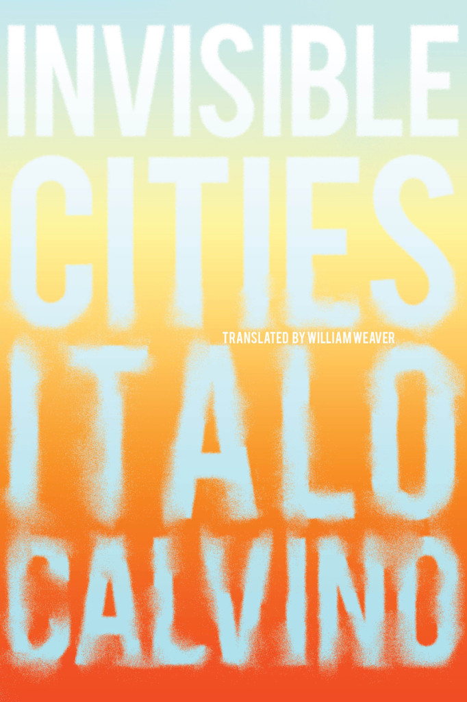
Italo Calvino would be a dream, though I fear Peter Mendelsund might have dibs! Maybe the next repackage?

I designed a cover for Invisible Cities for an SVA Continuing Ed typography class that I still really like, but I’d love to take another swing at it, along with the rest of his work.

What‘s in your ‘to read’ pile?

I am halfway through two epic series: Harry Potter and Game of Thrones, Italo Calvino’s Letters, Wildwood by Colin Meloy and Carson Ellis, The Luminaries, Claire DeWitt and the Bohemian Highway.

Do you have system for organizing your books?

Most of our design and photography books are in the living room, but the rest of our (far too many) books are in the bedroom. We have a large white bookcase in there, and most of our décor is gray and white, so I spent way too long arranging the books in a rainbow spectrum. It’s not the most functional way, but it sure looks pretty and it’s forced me to pay a lot more attention to spine design.

Do you have a favourite book?

Invisible Cities. I read it first in college and have read it countless times since. There’s always something new to discover.
Tease_3D_rev

What does the future hold for book cover design?

Innovative and interactive packaging, a focus on book as object, and (hopefully) a continual blurring of the lines between adult and teen design.

Thank you, Erin!

1 Comment

The Story of Pelican Books

domesticated-brain

Penguin UK is relaunching its nonfiction line Pelican in May with a redesigned logo and design. This short new video from the publisher takes a flying look at the imprint’s history and some of its more memorable covers:

Comments closed

Paula Scher: A Woman of Identities

paula-scher

In a new video for Gestalten.tv designer Paula Scher discusses her creative process and her vision of branding and identity design:

Comments closed

Matthew Carter: My life in typefaces

matthew-carter-TED
Type designer Matthew Carter, creator of typefaces such as Verdana, Georgia and Bell Centennial, talks about his career, working within constraints, and the connection between technology and type for TED Talks:

1 Comment
Penguin Books Wallpapers

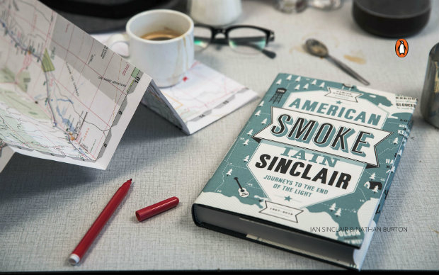
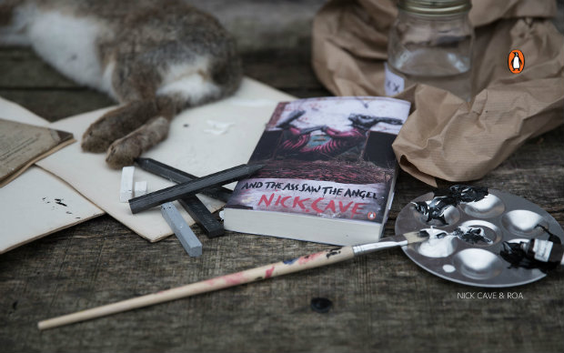
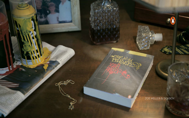
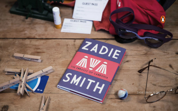
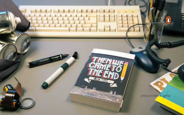
In a partnership with file-transfer service WeTransfer, Penguin Books (UK) has made a series of rather nice desktop wallpapers available. The photographs feature book covers from their Street Art series, as well as recent designs by Jon Gray and Nathan Burton. Click on the images for the hi-res versions:

iansinclair_co
Iain Sinclair, American Smoke (Cover: Nathan Burton)

nickcave_co
Nick Cave, And the Ass Saw the Angel (Cover: ROA)

zoeheller_co
Zoë Heller, The Believers (Cover: Sickboy)

zadiesmith_co
Zadie Smith, Embassy of Cambodia (Cover: gray318)

joshferris_co
Joshua Ferris, Then We Came to the End (Cover: 45RPM)

You can read more about Penguin’s collaboration with WeTransfer here.

1 Comment
Book Cover Design on Tumblr

the-quick

There is a Casual Optimist Tumblr as you know, but I don’t post a lot of new book covers there. Fortunately there are other Tumblrs that do focus on book cover design if that’s your thing. Here are a few that I follow:


trying-not-to-try

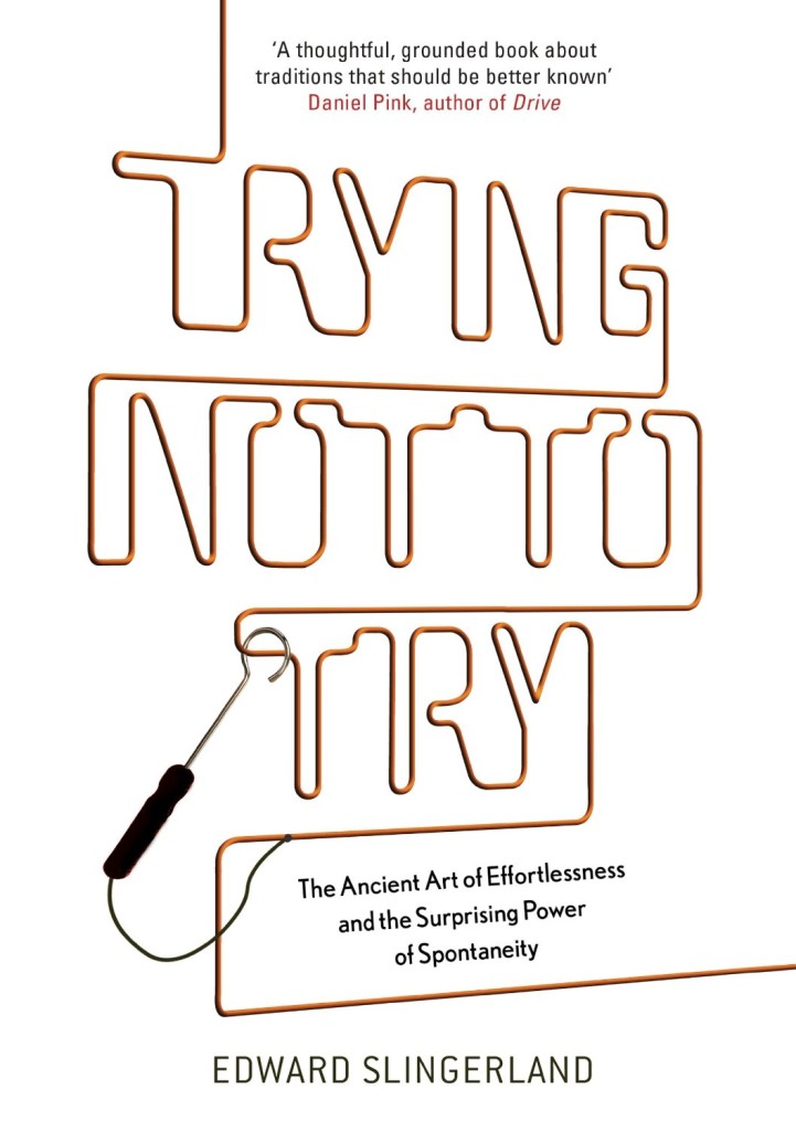
Book Covrs (pictured above: Trying Not To Try by Edward Slingerland; design by Gray318)

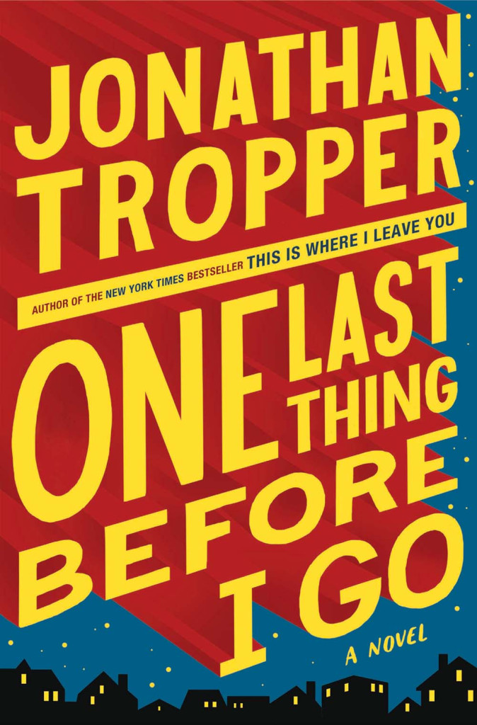
one-last-thing-before-i-go-book

Booketing (pictured above: One Last Thing Before I Go by Jonathan Tropper; design by Jim Tierney)

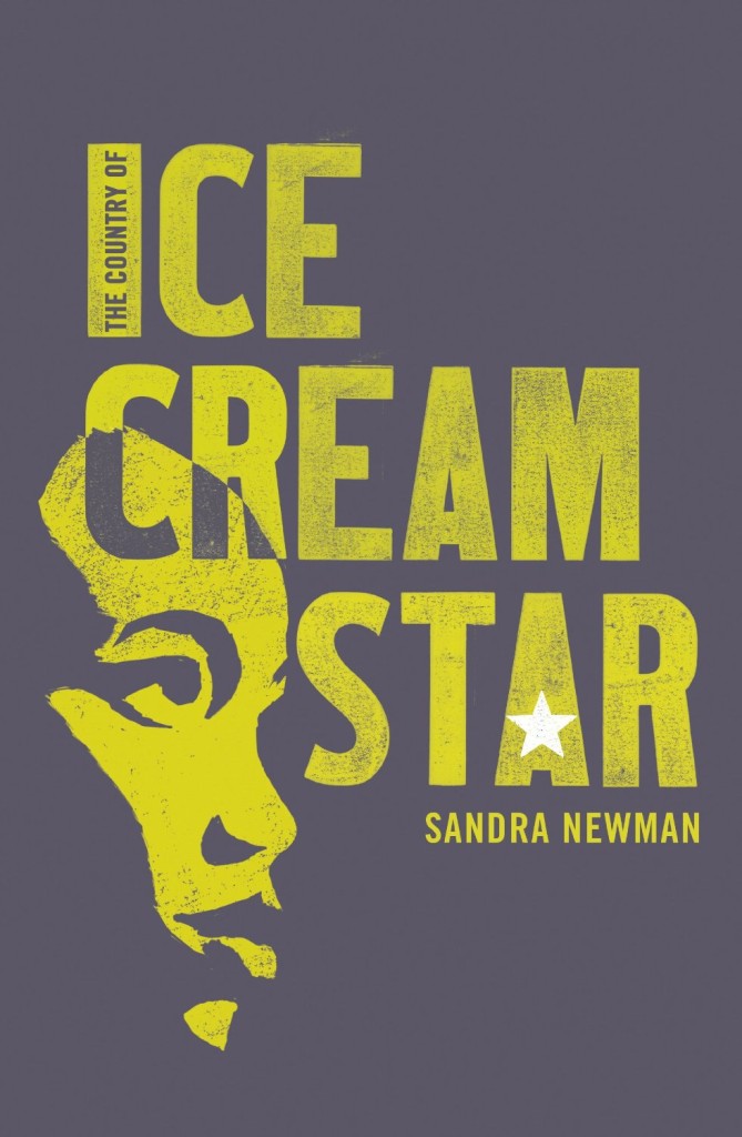
ice-cream-star

CMYK  / Vintage Books (pictured above: The Country of Ice Cream Star by Sandra Newman; design by Julia Connolly)

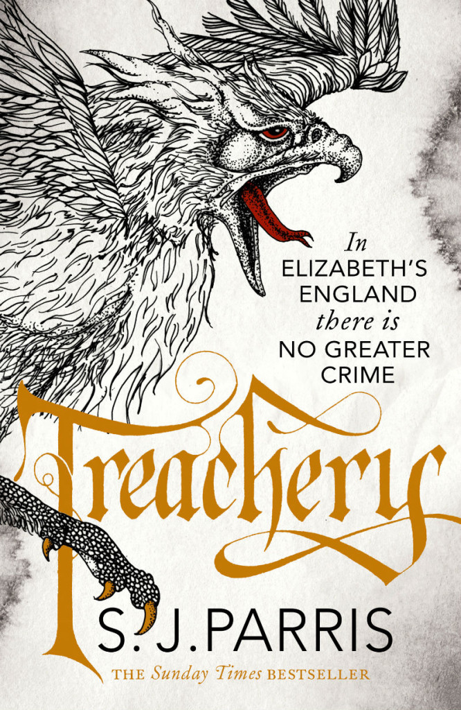
treachery

HarperCollins Design (pictured above: Treachery by S. J. Parris; design by Alexandra Allden, illustration by Daren Newman)

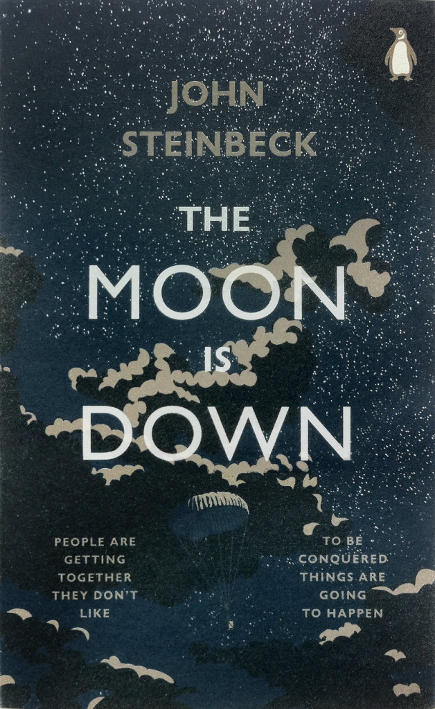
Moon-Is-Down

Penguin Design (Pictured above: The Moon is Down by John Steinbeck; design by Jim Stoddart)

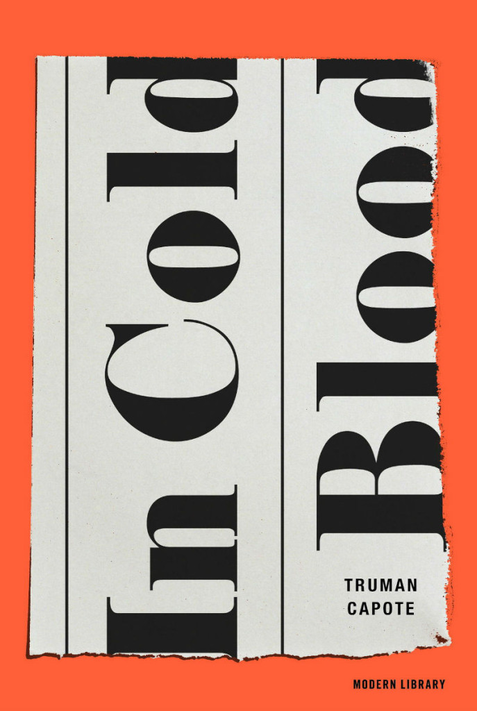
in-cold-blood

Random House Art Department (pictured above: In Cold Blood by Truman Capote; design by Eric White)

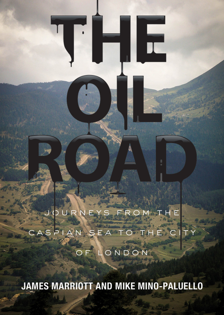
oil-road

Verso Covers (pictured above: The Oil Road by James Marriott and Mike Mino-Paluello; design by Alex Merto)

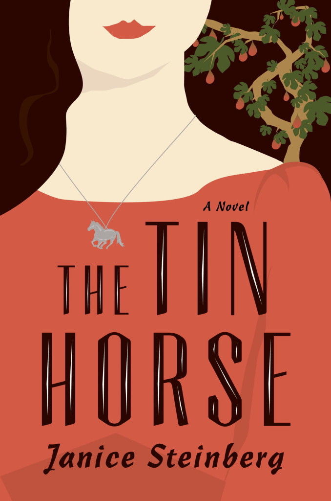
the-tin-horse

There are also several book designers who are on Tumblr in their own right. Here are some that use it showcase their work: Robin Bilardello, David Gee, Kimberly Glyder, Greg Heinimann, James Paul Jones, Oliver Munday, and Stephanie Ross. (Pictured above: The Tin Horse by Janice Steinberg; design by Kimberly Glyder)

Who am I missing? Let me know what book design Tumblrs you follow!

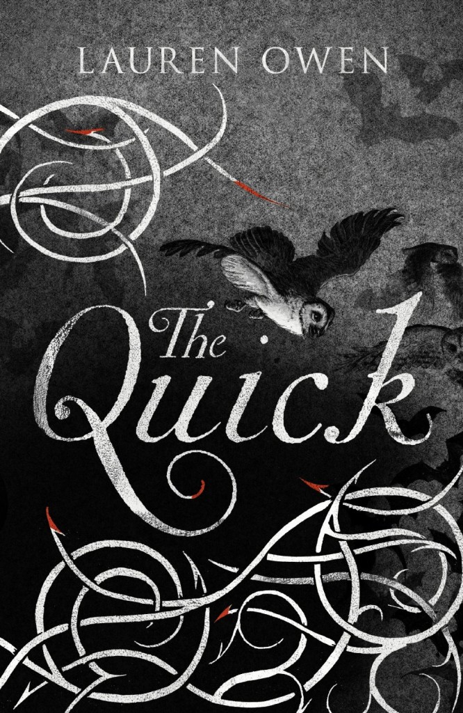
(Pictured top: The Quick by Lauren Owen, illustration by Jim Kay, taken from Vintage UK’s CMYK Tumblr)

Update:

Two I missed…

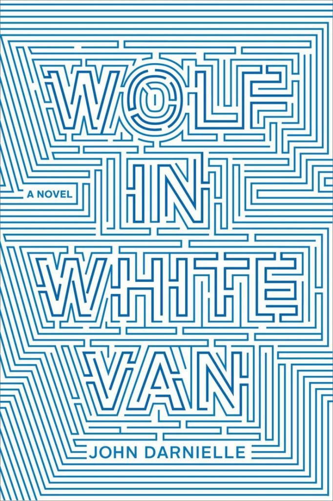
wolf-in-white-van
Hey, Good Bookin’ (pictured above: Wolf in White Van by John Darnielle; design by Timothy Goodman)

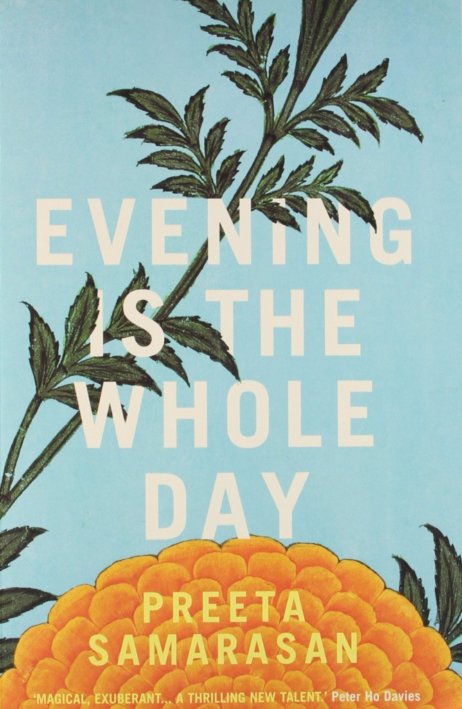
evening-is-the-whole-day
Lovely Bookcovers (pictured above: Evening is the Whole Day by Preeta Samarasan; design by Leo Nickolls)

Comments closed

Recent Book Covers of Note April 2014

accidental-universe
The Accidental Universe by Alan Lightman; design by Pablo Delcán (Pantheon January 2014)

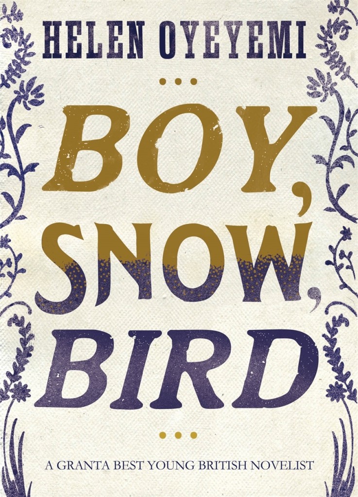
9781447254225
Boy, Snow, Bird by Helen Oyeyemi; design by Jo Thomson (Picador March 2014)

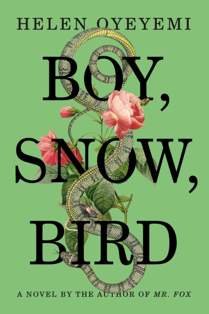
9781594631399B
Boy, Snow, Bird by Helen Oyeyemi; design by Helen Yentus (Riverhead March 2014)

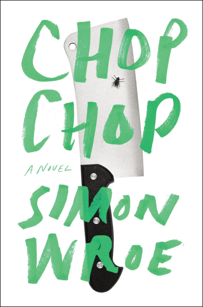
9781594205798

Chop Chop by Simon Wroe; design by Ben Wiseman (Penguin April 2014)

danish-dynamite-steve-leard
Danish Dynamite: The Story of Football’s Greatest Cult Team by Rob Smyth, Lars Eriksen & Mike Gibbons; design by Steve Leard (Bloomsbury April 2014)

dept-of-speculation-gray-318
Dept. of Speculation by Jenny Offill; design by Gray318 (Granta March 2014)

9781555976712
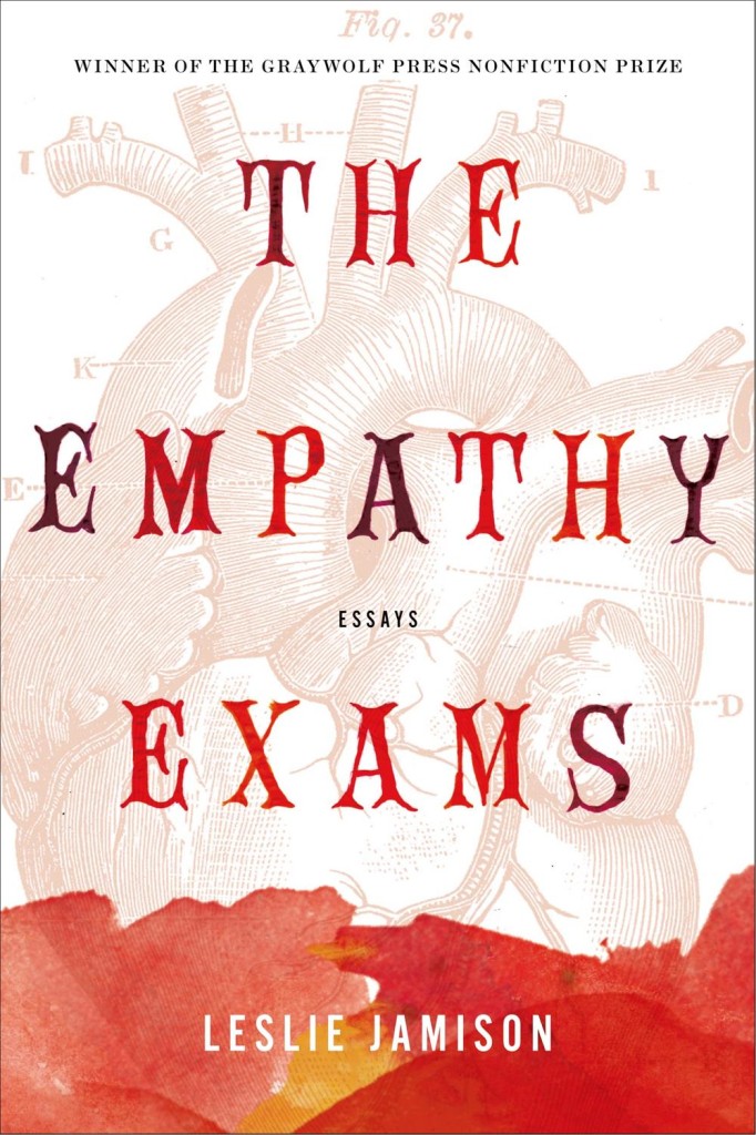
The Empathy Exams: Essays by Leslie Jamison; design by Kimberly Glyder (Graywolf April 2014)

exception

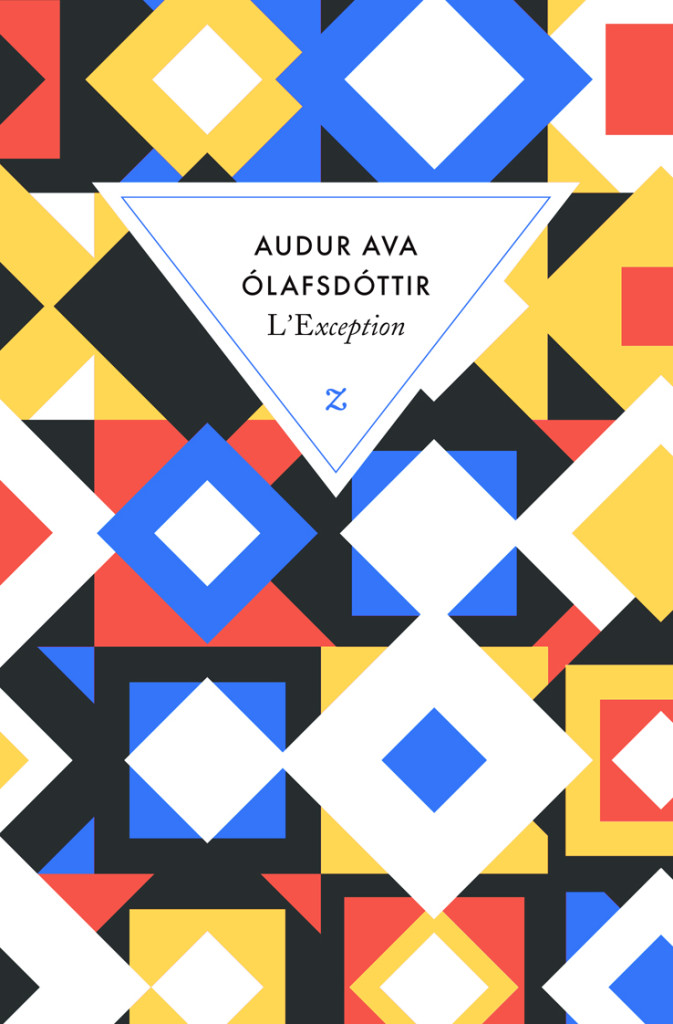
L’Exception by Auður Ava Ólafsdóttir; design by David Pearson (Éditions Zulma April 2014)

David’s cover design for Rosa Candida by Auður Ava Ólafsdóttir (Éditions Zulma March 2011) is also stunning.

mistakes-i-made-at-work
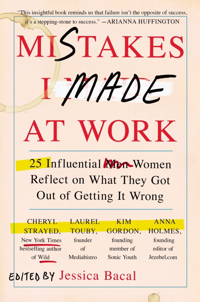
Mistakes I Made at Work edited by Jessica Bacal; design by Jaya Miceli (Plume April 2014)

quand-pépin
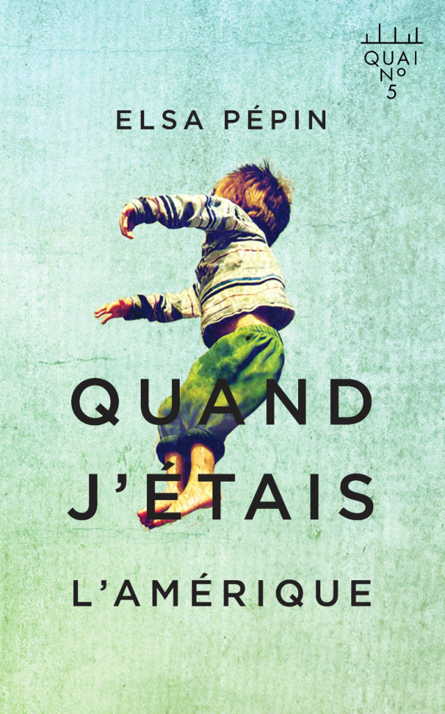
Quand j’étais l’Amérique by Elsa Pépin; design by David Drummond (Les Éditions XYZ April 2014)

Resurrection
Resurrection by Wolf Haas; design by Christopher Brian King (Melville House January 2014)

The cover for next book in the series, Come, Sweet Death! (Melville House July 2014), is great too.

there-goes-gravity-alex-merto
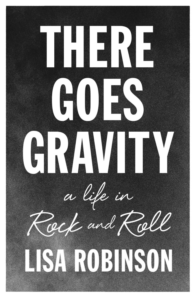
There Goes Gravity: A Life in Rock and Roll by Lisa Robinson; design by Alex Merto (Riverhead April 2014)

This slideshow requires JavaScript.

Comments closed

Centred Concentric Circles — It’s a Thing

kino

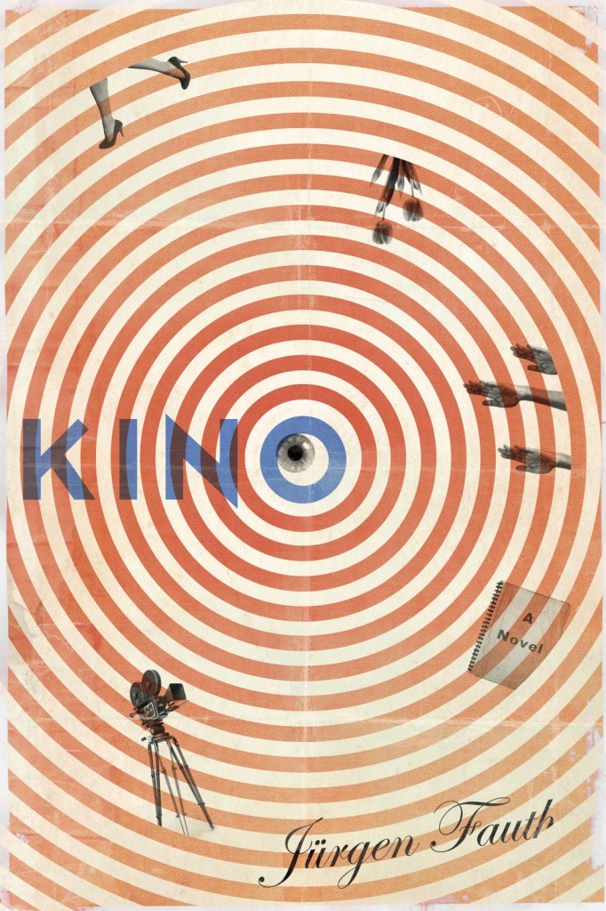
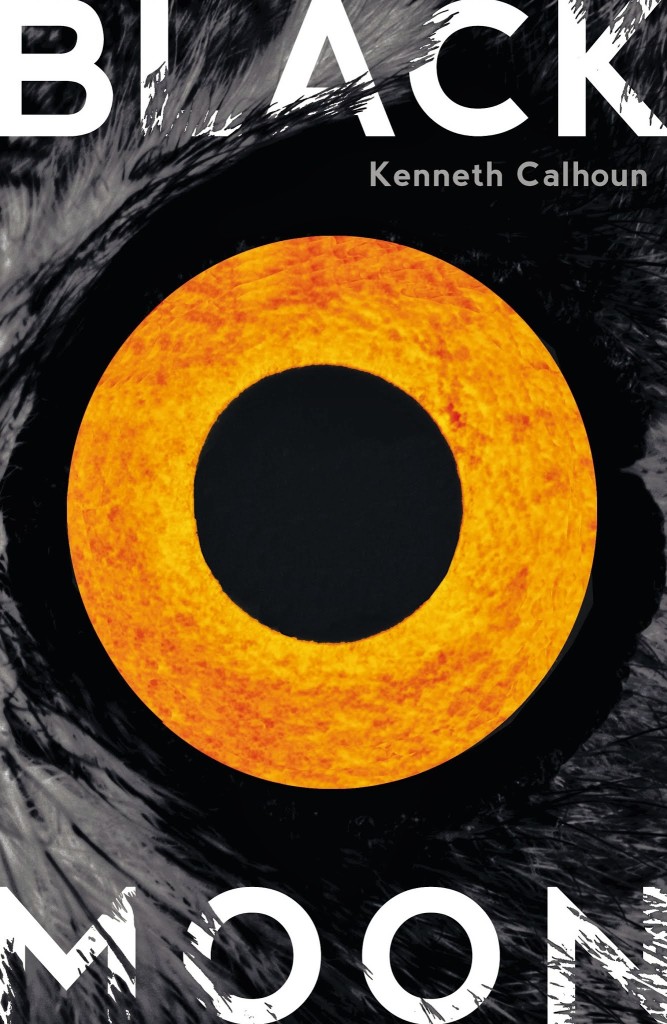
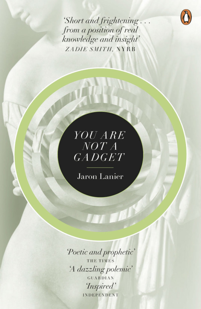
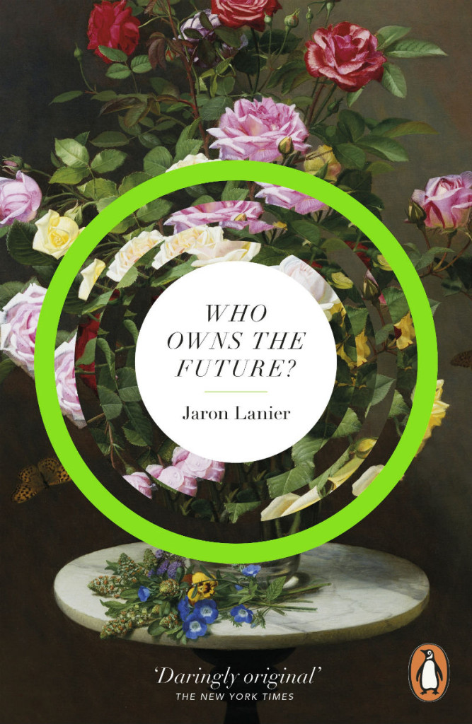
This post actually started life on (one of) my other blog(s). I noticed a couple of rather similar looking covers that used a circle motif, but at the time I was sure I was missing at least one other cover. As it turned out, I was thinking of the cover of Who Owns the Future by Jaron Lanier which is out in paperback this month. I hadn’t realised that it was a riff on an earlier Jaron Lanier cover. Then I was reminded of James Paul Jones‘s cover design for Black Moon by Kenneth Calhoun, published last month. AND then I remembered Jamie Keenan’s cover design for Kino by Jürgen Fauth from a couple of years ago (Atticus Books April 2012), which is a bit different but still uses concentric circles.

Anyway, here is an updated version of that post. I know the cover of My Life in Middlemarch was designed by Elena Giavaldi. I don’t know who designed the others. Sorry. Please leave a comment if you can help with attribution, or you can think of any other covers that fit the pattern…
you-are-not-a-gadget
You are Not a Gadget by Jaron Lanier; design Stefanie Posavec (Penguin February 2011)

who-owns-the-future
Who Owns the Future by Jaron Lanier (Penguin April 2014)


The River of No Return by Bee Ridgway; design by Nick Misani (Plume March 2014)


My Life in Middlemarch by Rebecca Mead; design by Elena Giavaldi (Crown January 2014)

9781620403112
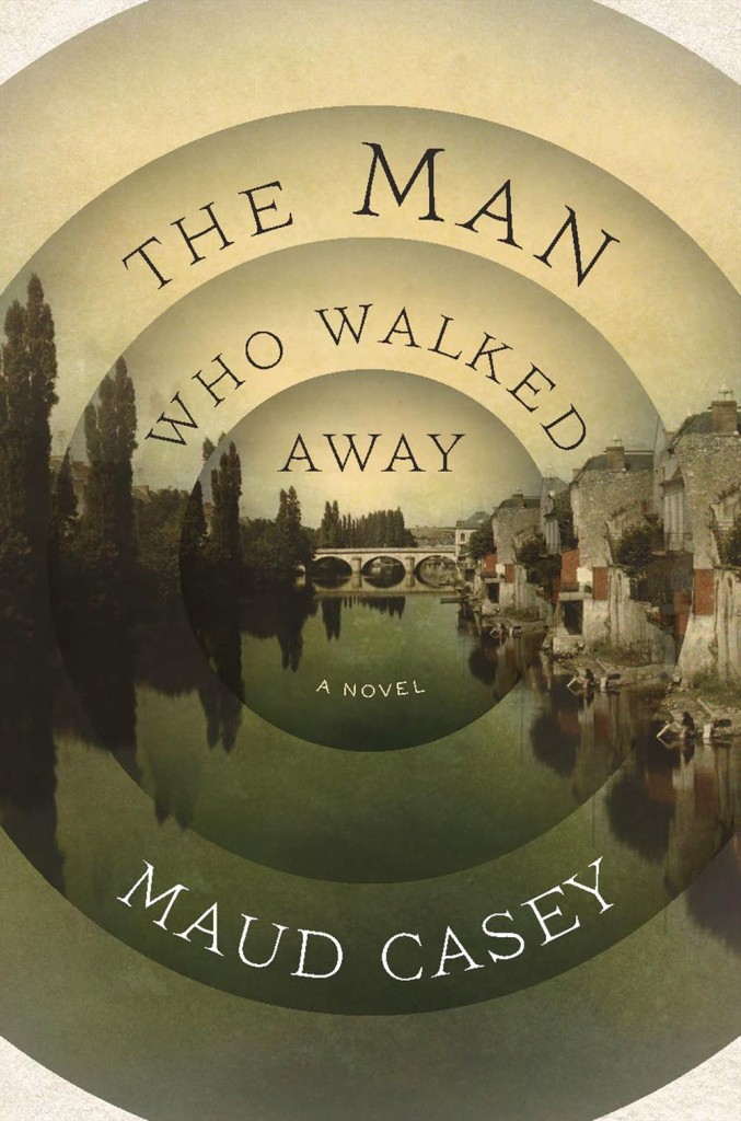
The Man Who Walked Away by Maud Casey; design by Natalie Slocum (Bloomsbury March 2014)

9781781090145
Black Moon by Kenneth Calhoun; design by James Paul Jones (Hogarth March 2014)

UPDATE:

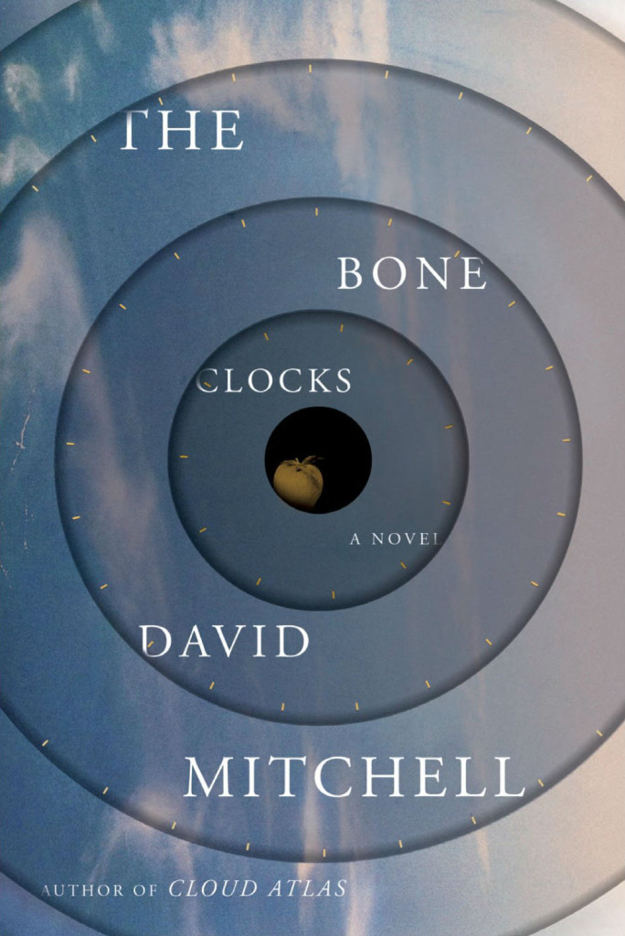
The North American cover design for the new David Mitchell is too on-trend to ignore:

the-bone-clocks-mitchell
The Bone Clocks by David Mitchell; design by Peter Mendelund and Oliver Munday (Random House September 2014)

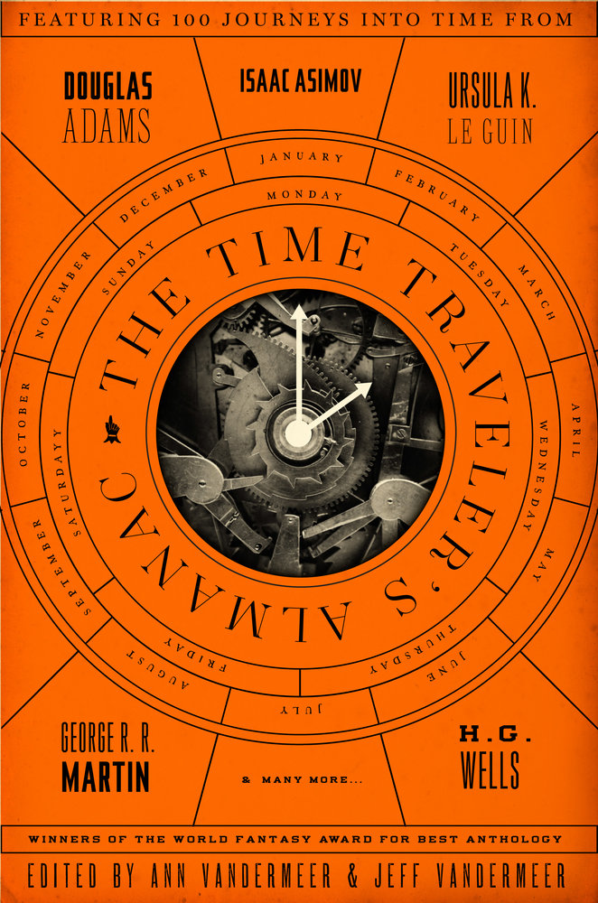
And I rather like this as well:

9780765374240
The Time Traveler’s Almanac edited by Ann Vandermeer & Jeff Vandermeer; design by Will Staehle (Tor Books March 2014)

UPDATE 2:

Although this isn’t vertically centred, the cover to A Deeper Sense of Place (Oregon State University Press November 1 2013) seems like it belongs here, as much for the colour palette as anything. The design, which pre-dates most of the covers here, is by David Drummond.

Doern art

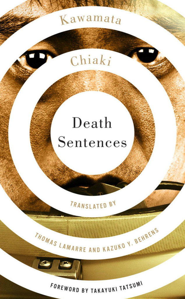
Also not quite centred vertically, but most definitely ahead of the curve (as it were), is Michel Vrana‘s design for Death Sentences by Kawamata Chiaki (University of Minnesota Press February 2012):

death-sentences

8 Comments

Mike Langley, Sign Painter

A rather lovely short film on sign painter Mike Langley by Dress Code:

(via I Love Typography)

Comments closed

Good Design is Good Business

cognitive-puzzle

Good Design is Good Business is a beautiful Tumblr archive of hi-res IBM visuals, compiled by Sue, an New York-based art director at Ogilvy for IBM.

(via Quipsologies)

Comments closed

Shape: A Short Film about Design

shape_still_webres_08_0

Shape is a lovely short film about design. Designed and directed by Johnny Kelly, and written by Scott Burnett, the film was commissioned by PIVOT Dublin to encourage young people to think about the world around them and where design fits in:

shape_still_webres_09_0

Kelly and Burnett recently talked to Creative Review about the project:

The duo looked at other recent design films, including Helvetica, Urbanized and Press Pause Play. They also found influence in films from the past, including Why Man Creates by Saul Bass, and “pretty much every educational/informational film made for IBM in the 60s and 70s”, says Burnett. In the end it was Charles and Ray Eames’ Powers of Ten that proved most useful. “Powers of Ten did offer the eventual breakthrough but conceptually rather than visually,” says Burnett. “Eventually the only thing that made sense was to zoom out and not make design the subject, but have it instead as the invisible catalyst in the story. Once we realised that then a lot of the early ideas found their way into the story which we just made nice and simple – a day in the life where the changes that are happening around us all the time are made visible.”

You can find out more about the project at SHAPEMAKECHANGE.

Comments closed

Q & A with Isabel Urbina Peña

Untitled-2

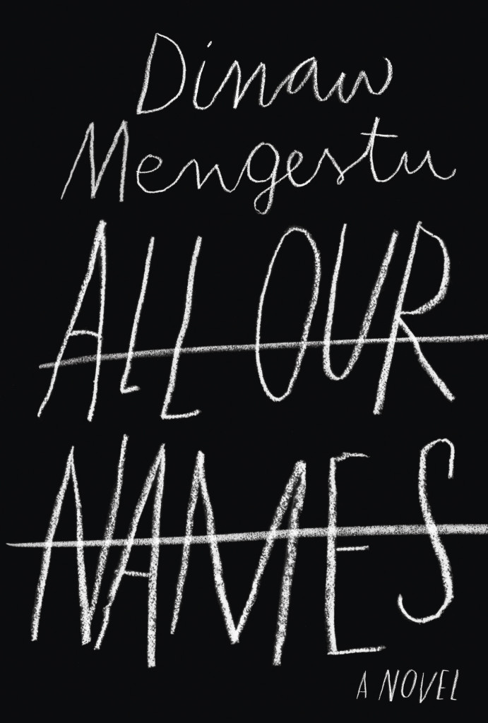
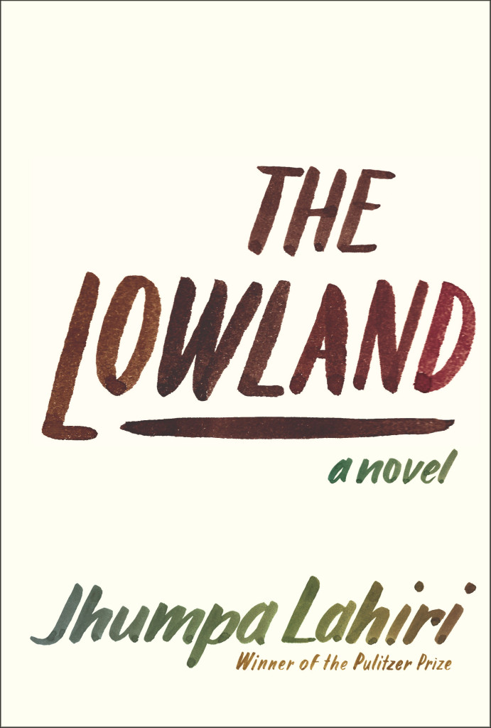
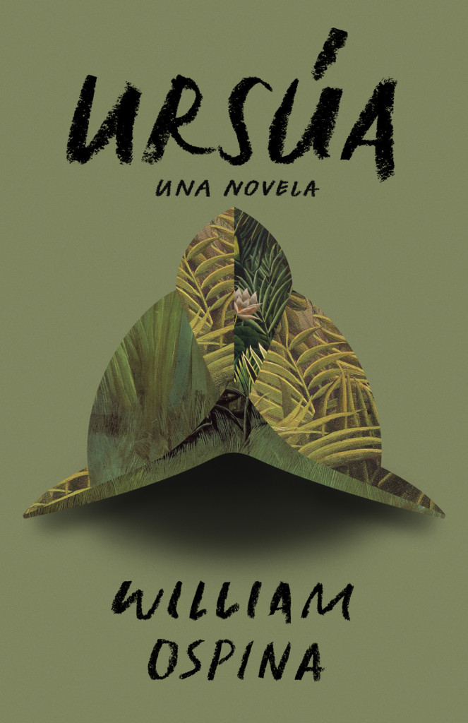
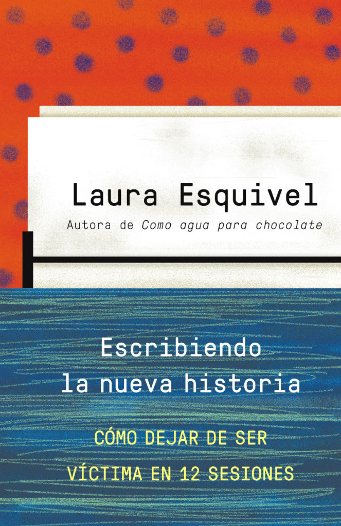
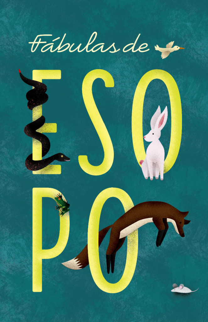
If you’ve walked into a North American bookstore recently, or you’ve been paying attention to the book reviews on this side of the Atlantic, you will have no doubt seen the stylish black cover for All Our Names by Dinaw Mengestu with its distinctive chalkboard lettering. Or perhaps you remember the hand-lettered cover for the Knopf edition of The Lowland by Jhumpa Lahiri? It was one of my favourite covers of the past year. Both are the work of Venezuelan designer Isabel Urbina Peña. Now based in New York City, Isabel is a cover designer for Random House and creator of a typographic zine called Rants from a Stranger.

Since relaunching her website earlier this year, Isabel’s cover designs have been featured on numerous blogs already (including here), but I was thrilled to have the opportunity to talk to her earlier this month about her work and career in greater depth.

Isabel and I corresponded by email. Here is our conversation:

Untitled-3

Do you remember when you first became interested in design?

I think because of my parents, art was in my life since I can remember. But, when I was in 7th grade there was a big boom of internet start-ups in Venezuela and I remember clearly “deciding” that I wanted to be a graphic designer then…I was 13 and the concept of what graphic design was at the time was probably wrong, but that moment definitely steered me in this direction. Also, there was a moment in my “foundation year” in college where one of my type teachers talked about how the “typographer” was present in the page, but invisible to the reader and that just flipped a switch in my brain.
Is anyone else in your family creative?

Both of my parents are architects and they really motivated my sister and me creatively while growing up.

We spent half of our childhoods going to museums, plays, as well as ceramic, poetry and creative writing classes. My dad also paints and belongs to a drawing circle. When I was little he would sit with me and walk me through art books or give me a canvas and ask me to paint from inspiration, or even from some big painting like Van Gogh’s sunflowers. Paul Klee, Gauguin and Chagall are a few of the artists that I discovered through them when I was six or seven… I have to say my mind was blown, I still cherish those moments.

Untitled-2

Were there a lot of books in your house growing up?

A ton. My dad also reads a LOT… So he wanted me to be “a reader.” I would get books for Christmas, birthdays, holidays, regular days…no Nintendo growing up… believe me that was tough, haha. He really sparked a love for reading and I would find new material everywhere; at my grandma’s I would read through all my uncle’s adventure books; at garage sales I started picking up Penguin paperbacks because they looked so simple and literary. Reading felt like something my dad and I shared, but it was also mine to discover.

Did you study design in Venezuela?

Yes, I studied at a small school called ProDiseño. Until very recently the “campus” was literally a two-flight house with a tub and a living room. Classes were really small, so everyone knew each other. The school started after a group of 80 students from IDD (Instituto de Diseño Neumann) left to start their own school. Neumann was founded by a large group of European immigrants who taught them design through the Bauhaus principles. Prodiseño had a very strong inclination towards clean, conceptual design. Everything had a purpose and “a why.” The content always came first; then the form. It was a very special experience and it prepared me to do anything (design, typography, illustration, animation, motion graphics…) and most importantly taught me to learn how to “think.” It was a very complete, Renaissance-style education.

Untitled-4

Is there a strong arts/design community in Caracas?

Definitely, though it is a rather small one compared to New York City, it is very interesting.

There are a lot of events that support the arts and design and mostly DIY culture. A lot of self-proposed shows and collectives that put on parties with great visuals and self-produced posters. Also, a lot of zines and self-published publications are popping all over town.

How is living in New York different?

Well, New York is different in every way: from the variety of people you meet to the cultural experiences that are available to you. Living here, for me, has been a rich experience loaded with references of all kinds, and motivation. If anything it makes me expect more from myself and aim higher.

How long have you lived there?

This is my 6th year in New York, but it honestly feels like I just got here. Of course, I’ve learned so much and evolved, but it feels like it never gets old.

escribiendolanuevahistoria_web

Does what’s going on in Venezuela worry you?

YES, I am glad you asked.

I am extremely worried by what’s going on in Venezuela and I think not enough people know about our situation. Protests started almost two months ago and people are being murdered and attacked on the streets daily and there doesn’t seem to be any change in the attitude of the current government. The truth is the people have the right to protest for the many problems that Venezuelan people are dealing with right now (the extreme insecurity they live in, the rapidly increasing inflation rates, the scarcity of many basic necessities and the extreme corruption, just to name a few) and the way that the government is handling this protests is, just, criminal. There are human right violations occurring left and right and even though there is proof (video and photos) for a lot of these events, the government is turning a blind eye and not doing anything to impart justice. Instead they focus their efforts in bullying opposition leaders and undermining the people’s rights. It is very, very sad and scary for all Venezuelan people and unfortunately change won’t come easily… but Venezuelans are still fighting hard, hopefully with a brighter future awaiting for all.

Can you describe your process for designing a book cover?

I start by reading the book and the TI (Title Info) sheet, getting familiar with the author and his backlist, if there is one. I take a bunch of notes and list ideas while and after I’m reading. I try to list everything—you never know when the “silliest” idea will spark something good. I’ll do a mood board and sketch a selection of these ideas in small (2 x 3 inches or so) detailed thumbnails with pencil and paper. Depending on the book, developing these ideas might be on or off the computer. I do a lot of paperback-size pencil sketches to define a lot of the lettering shapes and details.

Sometimes I will ink and do minimal clean up in the computer and sometimes I digitize the lettering in a font editing software and make the comps. Once I do that, I usually present a range of “developed” ideas and looks to my art director. We discuss if we need to adjust or tighten anything and then show the editors.

fabulasdeesopo_web

What are your favourite kinds of projects to work on?

Honestly, I am quite new at this, and I try to get the most out of any project. Figuring out what best represents the book I’m working on is one of the things I enjoy the most. That said, I really love doing all the cover art from scratch, and creating a “unique” design with custom lettering and illustrations.

Can you tell me about your zine “Rants from a Stranger”?

Rants from a Stranger is a self-published “booklet” inspired by zines, graphic novels, comics and the DIY culture. I like to call it a “typographic novel,” though it doesn’t really qualify as a graphic novel because of its length, and it is more on the zine realm. I love type and lettering and this was the perfect excuse to hand-letter more and produce a periodical self-published piece where I had full control of the creative direction.

I thought it would be fun and different to develop a series of “comics” without illustrations and solely use lettering as the “characters” of the story. So far there are two black and white issues and the third issue (special edition, in color) is coming out in late April as a collaboration with a very talented musician and artist from Venezuela, Mariana Martin Capriles, aka Mpeach. I’m really excited about this issue because of our collaboration, and also because it comes with a paper record player and a flexi EP record of her new song, “Boogaloo Mutante.”

Who are some of your design heroes?

Gerd Leufert, Gego (Gertrude Goldschmidt) and Nedo Mión Ferraro were very important figures in my formation as a designer and I still look through their books every time I have a chance. Their students, now well known graphic designers, and former teachers of mine, like Álvaro Sotillo, Gabriela Fontanillas and Carlos Rodríguez have always inspired me through their impeccable work and dedication.

Doyald Young’s lettering work take my breath away, and old school type designers like W.A. Dwiggins and Frederic Goudy are daily inspirations.

Who do you think is doing interesting work right now?

So many brilliant folks out there! Freddy Arenas, my super talented other half, does amazing motion graphics and illustration.

In the cover design world, my co-workers are doing great stuff, all the time. Linda Huang, Joan Wong, Pablo Delcán, Kelly Blair, Megan Wilson, Peter Mendelsund, Carol Carson, Stephanie Ross… From the type, design, art and illustration world Jesse Ragan, Village, Kris Sowersby, OCD, Steve Powers (ESPO), Sergio Barrios, Wayne WhiteCraig Ward, Alex Trochut, Elizabeth Carey Smith, Gustavo Dao, Suzi Sadler, Ryan Bernis, Priyanka Batra, Sasha Prood, Ping Zhu, Victo Ngai, Elana Schenkler, Geoff McFetridge, Nobrow Press, quite a mix…

I could keep going…

What advice would you give a designer starting their career?

Try harder. I think it’s really important to be critical of your own work and be able to accept its faults. Always, strive for more and be hungry. At the same time, embrace your mistakes, learn from them and move on to the next project. I am a big fan of tweaking and fixing til the end of days… but sometimes you just have to learn to let go of projects and keep going. Erik van Blokland said to our Cooper Type class (regarding typeface design), “Release early and release often; recognize what you did wrong in the project and try again.” I remind myself to do that everyday.

I think you should always try to work in what you love and feel passionate about. Even if it means reinventing yourself and making up your own projects in your spare time. This is where the good work will be. Don’t be afraid to make changes and try different things if you need to.

Untitled-10

What’s in your ‘to read’ pile?

I’m currently reading Americanah by Chimamanda Ngozi Adichie and Inter Views by James Hillman. I really want to read Dissident Gardens by Jonathan Lethem, My Age of Anxiety by Scott Stossel and The Goldfinch by Donna Tartt from this past season.

Someday, I’d love to re-read Cortazar’s Hopscotch (Rayuela) and all of Jorge Luis Borges.

The list goes on…

Do you have system for organizing your books?

Ha, no. I used to be very organized and had them alphabetically, color code them, etc… Those days are over… Nowadays, I move them around pretty often and they stay wherever they land.

Do you have a favourite book?

Not really a favourite single book, but I do have an influential shortlist: Virginia Woolf’s The Waves, L’Étranger by Albert Camus, Cuentos de Amor, Locura y Muerte by Horacio Quiroga, Piedra de Mar by Francisco Massiani, Ficciones by Jorge Luis Borges, Oscar Wilde’s Collection by Siruela (Biblioteca de Babel).

Thanks Isabel!

4 Comments