Skip to content
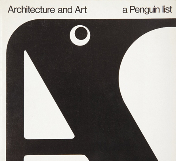
I decided to go in a slightly different direction with my covers list this year (see my lists for 2012, 2011, and 2010). It’s just a straight up list of the fifty covers designs with a few annotations and links a long the way. I’m sorry for woeful under-representation of Australian and NZ designers, and for completely ignoring the entire non-English-speaking world. I will try and do better in 2014. But until then, here, in alphabetical order, are my fifty covers of 2013:
Close Not Touching is a beautiful short film by DILLONROSE.COM about the work of designer and typographer Gerald Cinamon.
Born in Boston in 1930, Cinamon moved to England in 1960, eventually becoming chief designer at Penguin Books. Strongly influenced by Swiss design, Cinamon utilized a combination of bold colour, clean lines and sans serif typography that was unique in British book design at the time. Now an influence on a new generation of type-inspired designers, the film includes a conversation between Cinamon and David Pearson:

An exhibition of Cinamon’s work, Gerald Cinamon: Collected Work Since 1958, opened at the ICA in London this week, and new book Graphic Design Gerald Cinamon, designed by Danny McNeil at SEA design, is available here.
Although a live appearance by Cinamon has had to be cancelled, Pearson will be discussing text design at Penguin at the institute on September 13.
A full-length feature documentary about Cinamon by DILLONROSE.COM will be available to download from iTunes in February 2014.

Pushkin Press have posted an interesting Q & A with author Ryu Murakami, whose new novel, From the Fatherland, with Love, was published last month:
For me, there’s nothing ordinary or routine about writing novels, though I’ve been doing it for thirty-seven years. When I write, even now, my brain is in a mode that’s different to everyday consciousness. So the words always come; I never find myself unable to write. Perhaps the fact that I consider myself a “cult novelist” helps. Though I’m famous in Japan and have achieved some status as an author, my works are by no means mainstream. They aren’t really accepted by the majority, and I don’t imagine that most people here understand them. And that motivates me to keep on writing.
The rather splendid cover is by David Pearson, I believe.
Or a Few Thoughts on the Cover Design of The Bell Jar (An Illustrated Essay of Sorts)
In his recent essay ‘Graphic Design Criticism as a Spectator Sport’ designer Michael Bierut (author of 79 Short Essays on Design) suggested that “at a time where more people than ever are engaged with design,” design criticism has been reduced to a “seemingly endless series of drive-by shootings punctuated by the occasional lynch mob, conducted by anonymous people with the depth of barroom philosophers and the attention span of fruit flies.”
Unsurprisingly, I thought of Mr. Bierut during the recent furore about the cover design of The Bell Jar.

When Faber and Faber published a 50th anniversary edition of Sylvia Plath’s novel last month with a brightly coloured new cover, they can hardly have expected a controversy. But the design, which features a photograph of a woman holding a compact and touching up her make-up, was, it turned out, nothing less than “a ‘fuck you’ to women everywhere.” It was so truly hideous, that if “Sylvia Plath hadn’t already killed herself, she probably would’ve” when she first saw it. It was “THE BELL JAR as chick lit” — “1990s chick lit“!
It wasn’t much better when the designers weighed in. If the diplomatic Jamie Keenan thought Faber hadn’t “got it quite right,” Barbara DeWilde was less equivocal: “it’s a travesty… I’m still almost speechless that it was published in this form.”
We are, of course, morbidly fascinated by Plath, who died tragically young — there are at least 3 new books about her life being published this year alone. That The Bell Jar is both semi-autobiographical and her only novel makes our opinions about it even more intense.
But just how much of the criticism was actually fair?
On the face of it, the image isn’t entirely inappropriate. Mirrors (and photographs) are a recurrent motif in the book (one of its working titles was The Girl in the Mirror). The novel even begins with Esther working for a fashion magazine in New York. She talks about her looks, her clothes and her make-up. She carries a compact in her bag. Esther is fixated with appearances even as she struggles against being defined by hers.

Nor is the new design some kind of “chick lit makeover” — that just seemed like a convenient, if inaccurate, headline. While defining what qualifies a ‘chick lit’ is notoriously difficult, the cover has none of whimsy usually associated with the genre. Furthermore the new design wasn’t a sudden attempt to make the book look more feminine. The beautiful Faber Firsts cover from 2009 designed by Mark Swan also uses a glamorous retro image (albeit a disturbingly cropped one).
In fact, the new cover, also designed by Swan, is much more jarring than the Faber Firsts’ almost romantic image. There’s an angular sickliness to it — an awkward, unpleasant toxicity. The bright colours are unnaturally heightened, the pose mannered, the jerky lettering like “loops of string lying on the paper” blown askew.
As Faber themselves would later would confirm, it was meant to unsettle. The intent “was that the image of the expressionless woman ‘putting on her mask’ and the discordant colour palette would suggest ambivalence and unease.”

Certainly the new cover, is harder to like. It is indisputably ugly, especially compared to Swan’s earlier design or the original Faber cover from 1967 (pictured above) designed by Shirley Tucker (if not more so than this Warholian shocker from 1998). But tasteful covers rarely stand out on the shelves and from a marketing perspective there isn’t anything necessarily wrong with something being dissonant. It can be startling effective as Peter Mendelsund’s covers for Simone de Beauvoir demonstrate. Disruptive designs can also provoke interest in new readers and there is even some anecdotal evidence this is precisely what has happened with The Bell Jar — it is, apparently, “doing the business.”

Still, the design of The Bell Jar fails, at least as an accurate representation of the book. The mirror’s reflection does nothing to imply the introspection or detachment of the novel — only a coquettish vanity and narcissism. The woman in the photograph is just too put-together, too worldly. The mannered glamour is reminiscent of the stifling fashion photography of the 1950’s. This isn’t a 19 year-old’s face, “bruised and puffy and all the wrong colours.” There is no ennui or anxiety on display. No hint of poverty or isolation. Nothing of the suicidal depression aor a person coming apart. There is none of the disappointment. It is just an icily cool model posing for a photograph — an image Esther herself denies:
The magazine photograph showed a girl in a strapless evening dress of fuzzy white stuff, grinning fit to split, with a whole lot of boys bending in around her. The girl was holding a glass full of a transparent drink and seemed to have her eyes fixed over my left shoulder on something that stood behind me, a little to my left. A faint breath fanned the back of my neck. I wheeled around.
The night nurse had come in, unnoticed, on her soft rubber soles.
“No kidding,” she said, “is that really you?”
“No, it’s not me. Joan’s quite mistaken. It’s somebody else.”

To make matters worse for Faber, they also revealed the new cover shortly after Penguin Classics reissued new editions of George Orwell with cover designs by David Pearson. The contrast is unfavourably stark. Where Pearson deftly combines wit and originality with respect for material (not to mention Penguin’s design heritage), the stock photography, anachronistic type and bright colours of The Bell Jar seem crass and gaudy.

Comparisons with similarly stylish new editions of Kafka and Joyce designed Peter Mendelsund, Truman Capote designed by Megan Wilson, and Ralph Ellison designed by Cardon Webb, are unequally unflattering. It’s not hard to see that Plath, like so many other women writers, has been decidedly short-changed.
As Fatema Ahmed, noted in her post ‘Silly Covers for Lady Novelists‘ for the London Review Books blog, “the anniversary edition fits into the depressing trend for treating fiction by women as a genre, which no man could be expected to read and which women will only know is meant for them if they can see a woman on the cover.”
In recent years, contemporary writers as diverse as Francine Prose, Jodi Picoult, Jennifer Weiner, Meg Wolitzer, Fay Weldon, and Lionel Shriver have all noted how fiction by women is marginalized. No matter that women buy the most books, women writers are less well-reviewed, win fewer literary awards, and all too often the covers of their books don’t accurately reflect nature of the work itself.

If books by Jonathan Franzen, Chad Harbach and Ben Marcus are designed to look different and stand out on the shelves, contemporary literary fiction written by women tends to look the same regardless of the book’s subject matter. All too often there is a photograph of woman on the cover — pretty, domesticated, inoffensive and wistful. The assumption is that women only want to read certain kinds of stories, and that men don’t want to read books by women at all. In discussing the treatment of her own work, Shriver dryly pointed out, “publishing’s notion of ‘what women want’ is dated and condescending.”

This isn’t always true, of course. Hilary Mantel’s Thomas Cromwell novels defy all expectations. See Now Then, Jamaica Kincaid’s first novel in 10 years, has a type-only cover. The Casual Vacancy by J. K. Rowling is notable for its hand-drawn lettering and calculated, corporate blandness. Both the American and the British editions of Zadie Smith’s NW — designed by Darren Haggar/Tal Goretsky and Gray318 respectively — are stunning. Alison Forner’s sinister canned cranberries for May We Be Forgiven by A. M. Homes is a neat inversion of domesticated happiness. The Penguin Modern Classics reissues of Carson McCullers designed by Jim Stoddart — with images selected by Penguin Press picture editor Samantha Johnson — also demonstrate that 20th century classics by women do not have to suffer from poor design or gender stereotypes.

There are surely other isolated examples too. But one can’t help thinking they are exceptions that prove the rule, and it is a particularly bitter irony that Plath’s novel about a young woman struggling with society’s expectations of her should, 50 years later, expose that woman writers are still stereotyped and treated poorly in comparison to their male counterparts. My sense is, however, that this latest controversy is a sign that the tide is turning. Women, both writers and readers, are being more outspoken about what is wrong with the way their books are handled by publishers and the media. They expect more and they expect better. This is the upside of design as a spectator sport. White middle-aged men are no longer the only voices being heard. Thankfully.
I was recently asked for my opinion on the new cover of The Bell Jar for an article in the Chicago Tribune. This an edited and expanded version of my comments to journalist Nara Schoenberg for that article. Thanks to everyone who gave feedback on an earlier draft of these remarks.
Snowstorm…something, something… Snowstorm… Hmm, what? Oh right. Here we go…
Pick Up a Pearson — A profile of book designer David Pearson in the New York Times:
The chillingly eloquent jacket of “Nineteen Eighty-Four” is the work of the British graphic designer David Pearson He is responsible for the design of four more books that have been reissued by Penguin in the Great Orwell series of paperbacks. From the horror movie typography on “Animal Farm” to the Vorticist-inspired illustration that Mr. Pearson commissioned from Paul Catherall for “Down and Out in Paris and London,” each of the covers exhibits the wit, thoughtfulness and ingenuity that have come to distinguish his work.
“David manages to combine respect for tradition with playfulness and a light touch,” said the graphic design historian Emily King. “He also has a brilliant understanding of the book as a physical object.”
Kvelling — Gerald Howard on the 50th anniversary of the New York Review of Books, at Salon:
Last week, my colleague at Doubleday came by my office with an austere-looking 11-by-15-inch broadsheet. Good God! It was a facsimile edition of the first issue of the New York Review of Books, Feb. 1, 1963. The advertising director and I sat there kvelling over this wondrously manifested printed object from another universe, with its Murderers Row of reviewers weighing in on many books that all these years later still matter, its old-school book ads with their quaint frontal appeals to the reader’s higher cultural aspirations…
The Literaries — A great essay Eddie Campbell about comics criticism at The Comics Journal:
Moving sideways at this point takes me to another recurring argument that falls within the jurisdiction of the present rant. I refer to the incessant debate over who authored Marvel Comics, was it Stan Lee or was it Jack Kirby?… The literaries are inclined to debate whether the furnishing of a plot is enough of a claim to authorship, or whether the real writer in this case was the artist. Once the argument gets started it can go in any direction, and is just as likely to deny that a plot was ever given in the first place, because it is obligatory that everybody who wasn’t there have an opinion and take sides. None of that has ever mattered, as far as I’m concerned, though I acknowledge that the ownership of successful movie franchises could make a difference to this party or that. But the movies do not interest me and I do not care. None of them have ever captured the thing that made Marvel comics exciting to me in 1965 when I discovered them for myself.
And finally…
Amazon Unpacked — A long, must-read piece at the FT on Amazon’s warehouse in the former mining -town of Rugeley, Staffordshire:
As online shopping explodes in Britain, helping to push traditional retailers such as HMV out of business, more and more jobs are moving from high-street shops into warehouses like this one. Under pressure from politicians and the public over its tax arrangements, Amazon has tried to stress how many jobs it is creating across the country at a time of economic malaise. The undisputed behemoth of the online retail world has invested more than £1bn in its UK operations and announced last year that it would open another three warehouses over the next two years and create 2,000 more permanent jobs. Amazon even had a quote from David Cameron, the prime minister, in its September press release. “This is great news, not only for those individuals who will find work, but for the UK economy,” he said.
People in Rugeley, Staffordshire, felt exactly the same way in the summer of 2011 when they heard Amazon was going to occupy the empty blue warehouse on the site of the old coal mine. It seemed like this was the town’s chance to reinvent itself after decades of economic decline. But as they have had a taste of its “jobs of the future”, their excitement has died down…
You can probably guess where it goes from there (but you should still read it)…

Although I’ve only just posted my favourite book covers of 2012, here’s an early contender for the 2013 list: George Orwell’s 1984 designed by David Pearson for Penguin UK.
According to David, his initial proposal was a die-cut version of the cover, but the final design (more effective in my opinion) uses matt black foil to obscure the lettering instead.

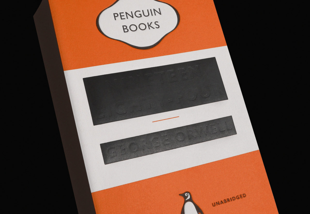
This new edition will be available on January 3rd.
The Casual Optimist turned 4 years old at the end of last week. While not exactly a historic achievement, the blog has lasted the length of a presidency and exactly 3 years, 11 months longer than I thought it would. In order to celebrate this minor triumph, I thought I would post some memorable book covers from the last 4 years. It was going to be 10 covers, then it was 20… It quickly became 25, then it was 30… by 30 I figured I might as well do 40… I missed 40 and had to cap it at 50. It was just for fun and not meant to be a definitive survey — it’s just 50 covers that have stuck in my mind. Let me know what you would’ve included in the comments. Leave a comment or send me an email if I am missing details or have incorrectly attributed something.
The keen-eyed among you will also notice that there are no covers from 2012. I’m keeping my powder dry. You can expect a post of my favourite covers of the year in the not too distant future. You can let me know your picks for 2012 in the comments as well. In the meantime, I’m going on vacation so this will be my last post for a while.
So here you go — 50 great covers with some occasional notes. Enjoy…

I first came across the London-based (and wonderfully-named) design studio We Made This by way of founder Alistair Hall’s prodigious collections of ephemera and found type on Flickr. The chances are I found these either via Ace Jet 170, a fellow designer and collector (and cyclist) who I interviewed last week, or Alistair’s page on Ffffound. It wasn’t until later than I discovered that We Made This also designed book covers and had actually worked with David Pearson on several covers for Penguin’s Great Ideas series.
More recently, We Made This has come to the attention of the literary community for the stylish and witty designs for the Ministry of Stories, and its fantastical shop front Hoxton Street Monster Supplies. The bold, flat typographic designs for the Hoxton Street Monster Supplies store are, of course, characteristic of the work produced by We Made This — taking inspiration from the best of British post-war design and Alistair’s love of printed vintage ephemera to produce something sharp, modern and irreverent but also, somehow, local and warm.
Alistair and I chatted by email.
When did you first become interested in design?
I did art at A-level, and loved it, and the artists I gravitated towards tended to have a fairly graphic sensibility – Jasper Johns, Richard Long, Jenny Holzer, David Hockney. Anything with a bit of typography caught my eye. But I didn’t realise that graphic design existed as a separate discipline, and certainly not as a career. It was never really talked about. So I studied Art History and English at Leeds University, then worked as a production assistant on TV commercials for a year or so. While I was working out what to do next, I was vaguely thinking about moving into films, so I read the BFI book Inside Stories: Diaries of British Film-makers at Work. In the book, the producer Julie Baines talks about going to see the proofs of the poster for her film. It was like a lightbulb went on in my head – “Ah, that’s what I want to do. Make posters.” So in 1999 I went to Central Saint Martins to do the BA Graphics course, and adored it – particularly when it came to the physical making of stuff – screenprinting, letterpress, etching, bookbinding, and photography (this was before digital cameras had really got going).
Is the joy of actually making things yourself integral to what you do?
Hell yes. It’s like therapy. In fact, it’s something I’ve been thinking about a lot lately. Running a blog, as I’m sure you know, is hugely satisfying – it generates fascinating conversations with people from across the design spectrum, and from across the planet. But crikey it eats up a lot of time! And having run the We Made This blog for coming up on six years, I think this year I’m going focus on it less, and use some of the time I was spending on the blog to make some actual physical stuff.
Why did you decide to start your own agency? What were you doing before?
When I left college I was lucky enough to get a place at the design studio CDT, which was then being run by the lovely Mike Dempsey (the D of CDT). The studio did a fine mix of branding, print, editorial and environmental work – I spent a year and a half there, and learnt a vast amount. My favourite job there was the work we did for the Royal College of Art’s Summer Shows in 2003, for which I wrote and set a chunk of copy that we used on invitations, leaflets, signage and the catalogue. It was fairly tongue in cheek, but a lot of the students hated it. At around that time NESTA launched a short residential course that helped young creatives to set up businesses, and I got a place on that (as did a few of the students who’d been at the Royal College – there was a distincly uncomfortable silence once I owned up to that bit of work). The course was brilliant, and as soon as it finished, I handed in my resignation and set up We Made This.


What interests you about ephemera?
Well, I guess there’s a few things. There’s that feeling that you’re discovering something that no-one else necessarily knows about – these things aren’t design classics by big name designers, they’re little bits and bobs created by anonymous designers. I suppose I must feel some affinity with that… They’re enormously evocative of different periods, so there’s something there about the joy of wallowing in the past – that can be as much about the language used on them as on the design itself. Then there’s the fact that a lot of it is quite utilitarian, almost un-designed, with function dictating form, which always has an inherent beauty and honesty. Mainly though, I think all designers are just visual magpies – it’s in our DNA to get woefully overexcited about old bits of paper and old signs, and to want to take them home to feather our nests.
Do you collect specific kinds of things?
No, I’m way too undisciplined for that. I guess I do loosely focus on design from around the 1890s through to the 1950s. I tend to find most of my stuff at the regular Ephemera Society fairs in London – they’re brilliant sales that happen every few months, where ephemera traders get together and sell their wares: old luggage labels, theatre playbills, invoices, maps, all that kind of thing.
Where else do you look for inspiration?
Well, I think the most important part of the design process is research, and you never really know where that might lead you. If I was being unecessarily fanciful, I’d say it’s a bit like being a private detective – the brief is the case, and the solution to the case is out there somewhere. You just have to know where to look, who to interrogate. But you don’t have to wear a trenchcoat.
I might start with some online research but I try to move to something physical as quickly as possible. Living in London we’re blessed with a vast wealth of fantastic libraries, museums and galleries, and I often find myself heading to them to find specific visual references. The City of London Libraries’ online catalogue is often one of my first points of call – of the libraries it covers, the St Bride Library is particularly lovely, though at the time of writing, it’s open by appointment only.
I have a Ffffound page too, which is useful as an online scrapbook for keeping track of any visual bits online that catch my eye. Though we were discussing in the studio the other day whether one of the dangers of the web is that we’re all looking at the same stuff at the same time. A particular style can become omnipresent very quickly – it’s called the world wide web for a good reason – and it’s possible that regional design styles are rather fading away as a result, and everything is becoming a tad homogeneous. The web is great, but you know, approach with caution.

What was it like working with David Pearson on the Great Ideas series?
Hideous. A really unpleasant experience. Although he comes across as one of the loveliest people you could hope to meet, what a lot of people don’t realise about Dave is that he has borderline psychopathic tendencies that often manifest themselves in verbal, and occasionally physical, abuse.
Actually, it was annoyingly pleasurable. I think he was very skilled at knowing which covers each of us (the series was designed by David himself, Phil Baines, Catherine Dixon and me) would work well on. He pretty much let us get on with it, providing just a few gentle nudges here and there. He has a very thoughtful approach to design – in fact, I think he’d make an incredible art director. (If he can get a grip on the psychopathy, obviously.) Of course, the brief was just a gift. And after the books started selling by the bucketload, I think Penguin were happy to let most of the cover designs sail through.

Do you often get asked to design book covers?
Not as often as I’d like. Designing books is generally a real pleasure, particularly as you have such a concrete thing at the end of it. (Well, you have done historically… more on that below.) But I’m very lucky that I get to work on such a breadth of different types of work – though I do sometimes worry that I’m a jack of all trades, master of none. Maybe I should start focusing a bit more…
How did you get involved in the Ministry of Stories?
That all came about after I saw the film of Dave Eggers’ inspiring TED talk about his brilliant 826 literacy project. I posted the film on our blog, and asked if anyone was going to be setting up something similar in London. On the back of that post, a few of us got together and chatted loosely about how a London version of 826 might work. Things pootled along gently for a while, until Lucy Macnab and Ben Payne (the brilliant project directors) secured some funding, at the same time as Nick Hornby, who had been thinking about setting up something similar himself, joined the gang.
The Ministry follows the model of the 826 centres: a writing centre where kids aged 8-18 can get one-to-one tuition with professional writers and other volunteers; with the centres being housed behind fantastical shop fronts designed to fire the kids’ imaginations (and generate income for the writing centres). In our case, the shop is Hoxton Street Monster Supplies – Purveyor of Quality Goods for Monsters of Every Kind.


The identity for the Ministry itself grew out of an extensive series of branding workshops where hundreds of names for the project were mulled over. Lots of Post-It notes later, we eventually gravitated towards a group of names that had a slightly tongue-in-cheek air of authority about them. While that was going on, I happened to stumble upon my grandmother’s old post-war ration book, featuring the Ministry of Food logo, which seemed like the right sort of name and look for the project. There was also a fantastic exhibition about the Ministry of Food on at the Imperial War Museum, which was great for visual research.
 What was the design process like for the Hoxton Street Monster Supplies project?
Well, it was just a real pleasure really. A stupid amount of work, far more than I’d anticipated, but a real pleasure.
The story is that the shop was established in 1818, and ever since then has served the daily needs of London’s extensive monster community. It stocks a whole range of essential products for monsters. You can pick from a whole range of Tinned Fears (each of which comes with a short story from authors including Nick Hornby and Zadie Smith), a selection of Human Preserves, bars of impacted earwax, jars of daylight for vampires with S.A.D.; and a variety of other really rather fine goods.
I was given a fairly free rein by Lucy and Ben, which made things much easier, and right from the start I had a really clear idea of how it was all going to look. Of course, we had the brilliant work of the various 826 stores to use as inspiration, particularly the gorgeous Brooklyn Superhero Supply Co., designed by Sam Potts.
It was quite a full-on process though. For example, for the products: it meant coming up with the initial ideas for what they might be, working out how to produce them, naming them, writing the copy for the packaging, designing the packaging, and then actually putting the products together in the days before we opened. Fortunately we had a fantastic team of incredibly talented volunteers working on that whole process.
Have you read any interesting books lately?
I’ve just finished George Orwell’s 1984, which rather ridiculously I’d not read before, and which I loved. I’ve been going through a stage of reading some classic literature, so I’ve also recently read Dracula, Treasure Island and Huckleberry Finn. From a more contemporary point of view, I’ve also just read Alan Hollinghurst’s The Stranger’s Child, which was great – not quite up there with some of his other stuff, but still great. I definitely lean toward fiction when it comes to reading.
Do you have a favourite book?
The Day I Swapped My Dad for Two Goldfish, which is a kid’s book written by Neil Gaiman, and illustrated by Dave McKean, (who also did the brilliant Batman graphic novel, Arkham Asylum). It’s hilarious and beautiful.
As far as Really Serious Grown Up Fiction goes, The Master and Margarita blew me away when I read it. In fact, I think it might be about time to read it again.
On the more populist side, I love Iain M Banks’ science fiction novels, particularly the Culture novels, such as Consider Phlebas.
What does the future hold for books and print design?
Hmm. Just let me get this crystal ball powered up…
Ah, heck, I’m no expert. I’m not sure what’s going to happen next, but as someone who designs covers now and again, I have been having a think about what’s going on right now with books and print. (And it is perhaps useful here to make the distinction between literature, which is the content, and books, which are the containers of that content.) I think for literature, it’s an amazing time, with a whole raft of new ways for readers to experience the written (or typed) word. For books, obviously things are looking a bit more rocky. But I don’t think it’s all gloom and doom.
(I should point out up front that I don’t own a Kindle, nor an iPad, so I’m still effectively a luddite. I don’t have anything against either of those devices really. I already own a Mac, a Macbook Pro, and an iPhone, so I just couldn’t bring myself to rush out and grab another bit of Apple’s admittedly lovely kit.)
I think the two fundamental recent changes are: where you get your literature from, and what form that literature takes.
To set the scene, if we look just a few years back, it used to be that where you bought literature from was bookshops; or you’d borrow it from a library, or from friends and family. It would come in either hardback or paperback form – you could get audio books too, but mainly your literature came in the form of printed ink on paper pages, bound between two covers and a spine, and with some sort of hopefully appealing cover design.
So, to look at where you now buy your literature. More than likely you might go to one of the big three: Amazon, Apple, or Google; or possibly directly to a publisher’s site. You might still go along to a bookshop, where you can browse books on tables and shelves, picking them up, feeling them, touching them, even smelling them. But that’s going to become more and more unlikely.
So, you’re going to buy your chunk of literature. You might still choose to buy it in the form of a printed book. But you’re looking increasingly likely to download it, perhaps to your e-reader, with its monochrome e-ink screen and reflowable text; or perhaps to a shiny tablet, where it might be enhanced with moving images and audio. Or perhaps you’ll download it to your smartphone, either as an e-book, or as a dedicated app.
So if that’s where we’re at, how’s it working for us right now?
If we look at the first bit, the where, then I think the big problem is that no-one has really come up with anything online that beats the experience of browsing books in a shop. Obviously Amazon has all the bells and whistles of recommendations, similar items, suggestions based on your browsing history and so on, but good lord, it’s so cluttered! Apple’s iTunes is cleaner, but is still hardly an enjoyable experience. And publishers’ websites are almost universally hideous. (Canongate are perhaps the exception there, with their canongate.tv site, which at least feels like it’s heading in the right direction.)
Online retail of literature seems to still be stuck at the stage of apologetically showing you little thumbnails of book covers, as if admitting that these rectangles of pixels are just substitutes, and that the actual physical book cover will make up for it. But hey, we might never get that actual physical book cover now! So why not show us big beautiful images for the literature we’re thinking of buying. Maybe if you thought of these images as the equivalent of film posters, then you’d start to think in a different way? This should all be done so much better.
Looking at the second bit, the form our literature takes, how’s that doing?
It seems that the days of the paperback are numbered. E-readers and tablets and smartphones have dug its grave, and they’re just standing around waiting for the coffin to arrive.
The book cover, which as well as a sales tool, used to be a visual catalyst for our memories of a piece of literature, well, that’s been sidelined on e-books. As I’ve already mentioned, when you’re buying online, you’re limited to a small thumbnail. Once downloaded, sometimes you glimpse it on your device as the story first begins, but often you don’t. That seems like a lost opportunity. Surely we can do better? I saw that John Gall recently posted a possible triptych cover for an iPad edition of a book, which is an interesting new idea (unfortunately, it got rejected).
Meanwhile, the outside of your device always stays the same – after all, the device is more a library than it is a book. So the pleasure of seeing what book someone was reading, perhaps on the beach or on the tube, that’s gone. (Of course, if you want to surreptitiously read porn in public, these are happy times for you!)
Also, now that literature has become partially disconnected from its package, it starts to exist more in your head. In some ways, that could be a good thing – more pure somehow, your experience of literature no longer so influenced by the marketing team and the cover designer. But equally, an additional texture (literally and metaphorically) has been removed.
I think e-readers are pretty good, but not yet brilliant, particularly when it comes to page transitions, which are still a grimly disruptive moment in your reading, far more disruptive than turning a physical page. And you’d be more upset if you lost one than if you lost an actual book; and as everyone likes to point out, you can’t really read them in the bath. (But how many people exactly are still taking baths? And of those, how many are reading in their baths? Have they tried reading in bed? It’s far better.)
Tablets like the iPad or the Kindle Fire are great for enhanced experiences, like Faber and Touch Press’s version of T.S. Eliot’s poem The Wasetland, but less good for reading lengthy texts. Just too damn bright. Apps like Enhanced Editions’ version of Nick Cave’s The Death of Bunny Munro are interesting too, bringing lots of extra mulitmedia stuff to the party. But apparently rather costly to develop.
(If I may digress slightly, Apple’s new iBooks Author app looks quite exciting as a cheap way for designers to self-publish work. Yes it means you’re tied to the iPad rather than any other device, but still… shiny!)
From a more philosophical point of view, as Jonathan Franzen recently pointed out, there’s something distinctly unsettling about the the fact that screen based text lacks permanence. If it’s not printed, it may well change – just as in Orwell’s Ministry of Truth in 1984, where historical documents were constantly revised to suit the Party’s needs. Of course, that’s an issue for all digital media. Similarly, you can’t really lend an e-book to a friend. And can you pass on your library of e-books to your children? What will happen to all that digital content in the future?
So, overall it feels like there’s yet some work to be done with e-books before they really live up to their potential. And obviously it means that the satisfaction of producing a concrete ‘thing’ is no longer there, which is a shame. But they’re here to stay, so it’s pointless for us as designers to stick our heads in the sand while lamenting the death of the book. Better to look to the exciting new possibilities.
And, anyway, while e-books are doing their thing, they’ve also thrown fresh light on physical books – we’ve started re-examining why we love their physical form, we’ve started to treasure them again. It’s not a new area (the Folio Society has been creating beautiful high-end editions of books for years), but it’s obviously now an expanding area. You can see this with Penguin’s hardback F.Scott Fitzgeralds, and their Clothbound Classics series, as well as the gorgeous Fine Editions from White’s Books. For book designers, that opens up lots of exciting possibilities.
Gosh, I rather rambled on there. I’m sure far wiser and more people than me will have a much clearer idea of where the industry might be going.

Thanks Alistair!

Elegant Simplicity — A nice profile of book designer David Pearson at Spitalfields Life:
On the basis of “Penguin By Design,” David was given the job to design the covers for Penguin Great Ideas, an experimental series of low-budget books with two-colour covers. “I’m not an illustrator and I can’t take photographs, so I decided to do all the covers with type,” explained David, almost apologetically. Yet David’s famous landmark designs for these books, derived from his knowledge of the history of Penguin covers, were a model of elegant simplicity that stood out in bookshops and sold over three million copies. “I saw people picking them up and they didn’t want to put them down!” he confided to me, rolling his eyes in delight, “They were a phenomenon.” Then he placed a hand affectionately upon a stack of copies of this series for which he has now designed one hundred covers.
My interview with David is here.
Books Mattered — David L. Ulin on the late Barney Rosset for The LA Times:
For Rosset, the mission was simple: Books mattered, they could be dangerous, they could change your life. Writers were heroes, “cosmonauts of inner space,” to borrow a phrase from “Cain’s Book” author Alexander Trocchi, their function less to reassure than to destabilize, to challenge the assumptions by which society was made.
This could happen in all sorts of ways — Beckett’s unflinching absurdism (“Ever tried. Ever failed. No matter. Try Again. Fail again. Fail better”), Burroughs’ scabrous cynicism (“A functioning police state needs no police”), Miller’s sense of living at the end of history, when all the so-called verities had collapsed beneath their own sanctimonious lies.
See also: Barney Rosset obituary in The Guardian.
Sprawling Tentacles — Alexandra Manglis reviews Alan Moore: Storyteller by Gary Spencer Millidge for the Oxonian:
The work and the man have morphed together resulting in a giant Moore myth that fans and comic creators alike have difficulty surmounting, its tentacles sprawled out far beyond his small Northamptonshire home. The infamous Guy Fawkes mask, for one, created in Moore’s anarchist comic V for Vendetta, has been worn by protesters from Tahrir Square to Occupy Wall Street, and Moore is indubitably proud of the anarchist symbol’s use in real civil unrest. Yet the symbol’s popularisation is largely due to the comic’s adaptation into a Hollywood blockbuster, from which Moore removed his name and refused to take royalties. Moore’s stories have become bigger than the man himself; the images he has authored have grown beyond him and often, as in the case of V for Vendetta, in spite of him.
See also: Paul Gravett’s review for The Independent; The Guardian celebrates 35 years of British comic 2000AD
And finally…
Geoff Dyer, author of Zona, interviewed at Bookforum:
Failure is quite interesting, and it’s something I have a certain amount of experience with. I wasn’t a failure in the way lots of people are failures—I could always get published, that was pretty straightforward. Literary failure is funny because it’s not like you get this massive slap in the face and become a figure of ridicule. It’s more that you do this thing, you write this book, and then this big thing is poised to happen on publication. And nothing happens. It’s just a weird non-event. The literary Richter scale doesn’t register any kind of tremor. That was happening to me for a very long while, and then I managed to persuade myself that these serial failures were perhaps a kind of liberation in that it meant I was free from any kind of pressure from publishers. The stakes were so low that it didn’t really make any kind of difference to anybody that I went from writing a novel to writing a book about the First World War. So I’ve certainly known what it’s like for a book to simply, well, disappear.


