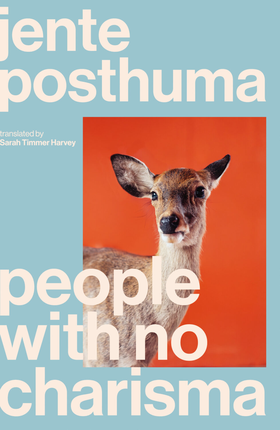
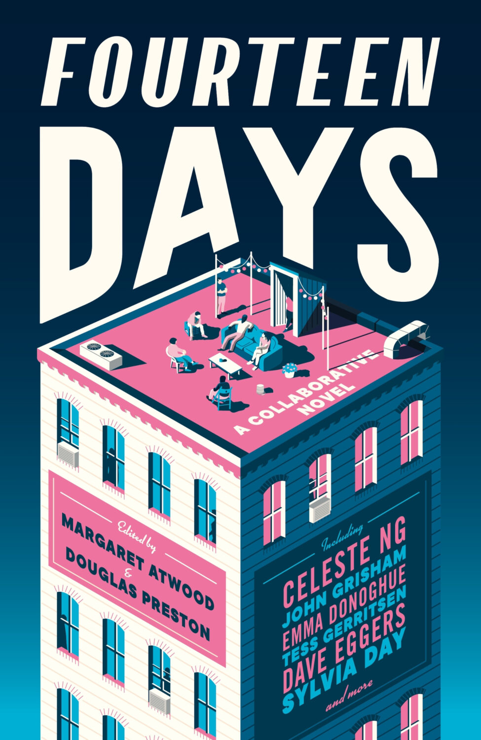
I took a long-planned week off in March, so this month’s post was somewhat cobbled together around that trip and somehow we’ve ended up with lots of great covers to show for it! I should take vacation more often! There’s some particularly fun typography, some nice illustration, and some of the usual weirdness. Enjoy!
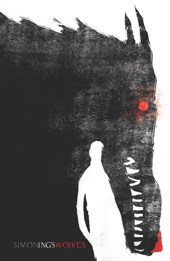
I had a hell of time trying to remember what this reminded me of, I think it is Jeffery Alan Love‘s illustration for the cover of Wolves by author Simon Ings published by Gollancz way back in 2014.
Coincidentally, the cover of Wolves and other Simon Ings titles from Gollancz were among the ABCD Award winners in 2015, and if you’re interested in reading about this year’s ABCD awards, which took place earlier this month, Vyki Hendy has a write up at SPINE.
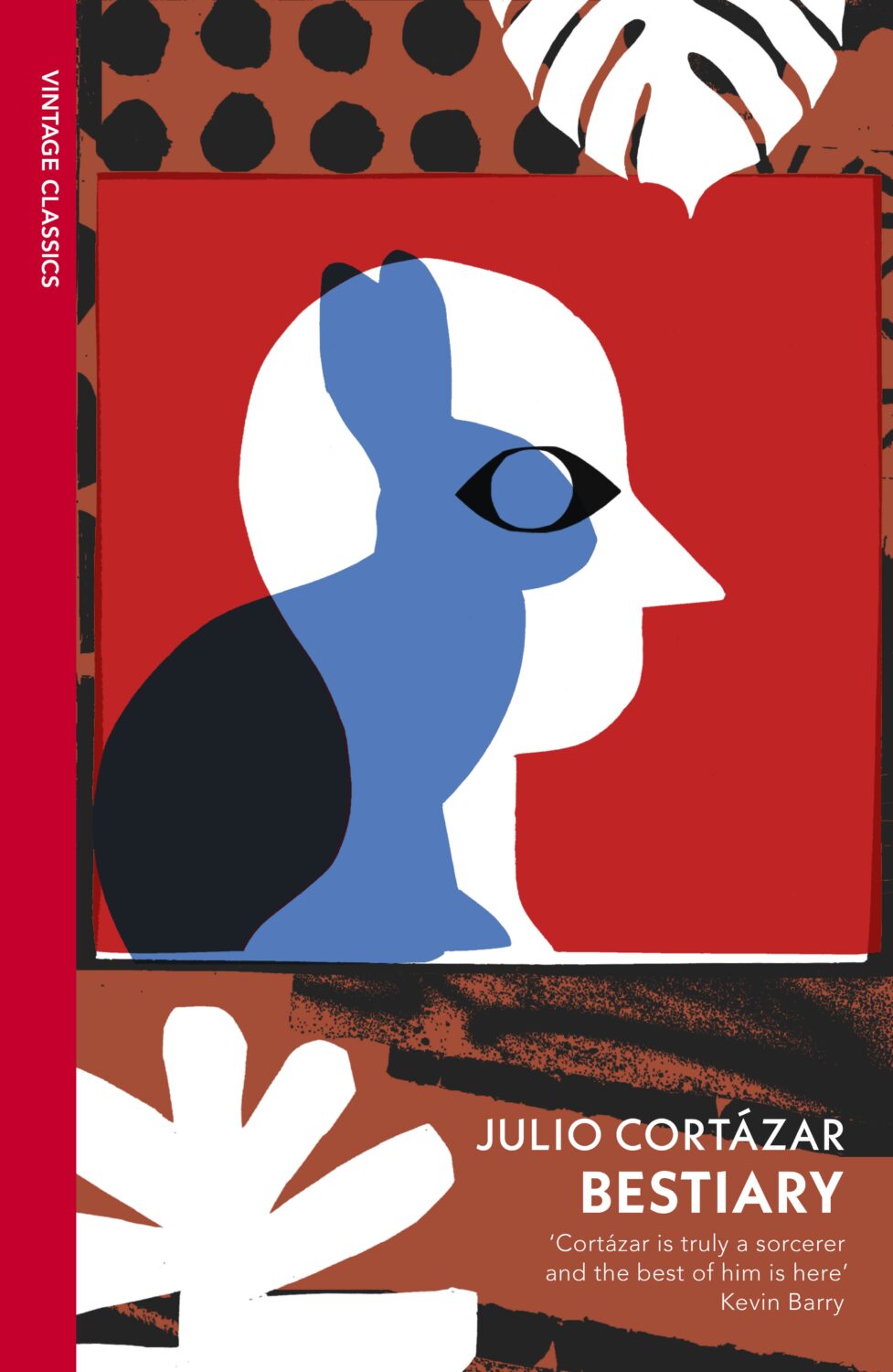
Some of my favourite covers this year were series designs. I loved the Julio Cortázar Vintage Classics editions with covers illustrated by Stephen Smith, AKA Neasden Control Centre. I was lucky enough to meet art director Suzanne Dean for coffee when she visited Toronto this summer, which was lovely. Her Haruki Murakami designs for Vintage Classics and Harvill are always a delight too.
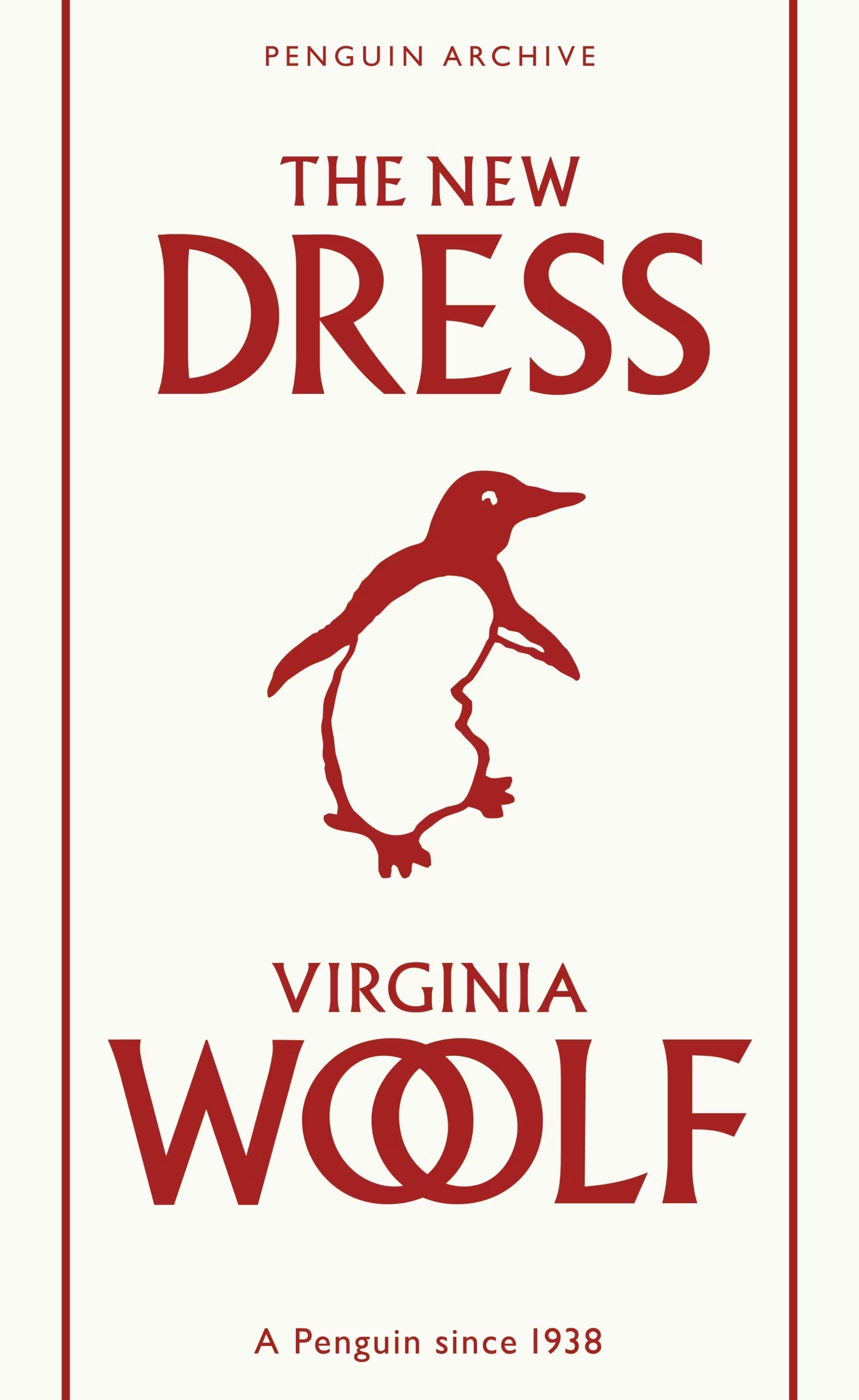
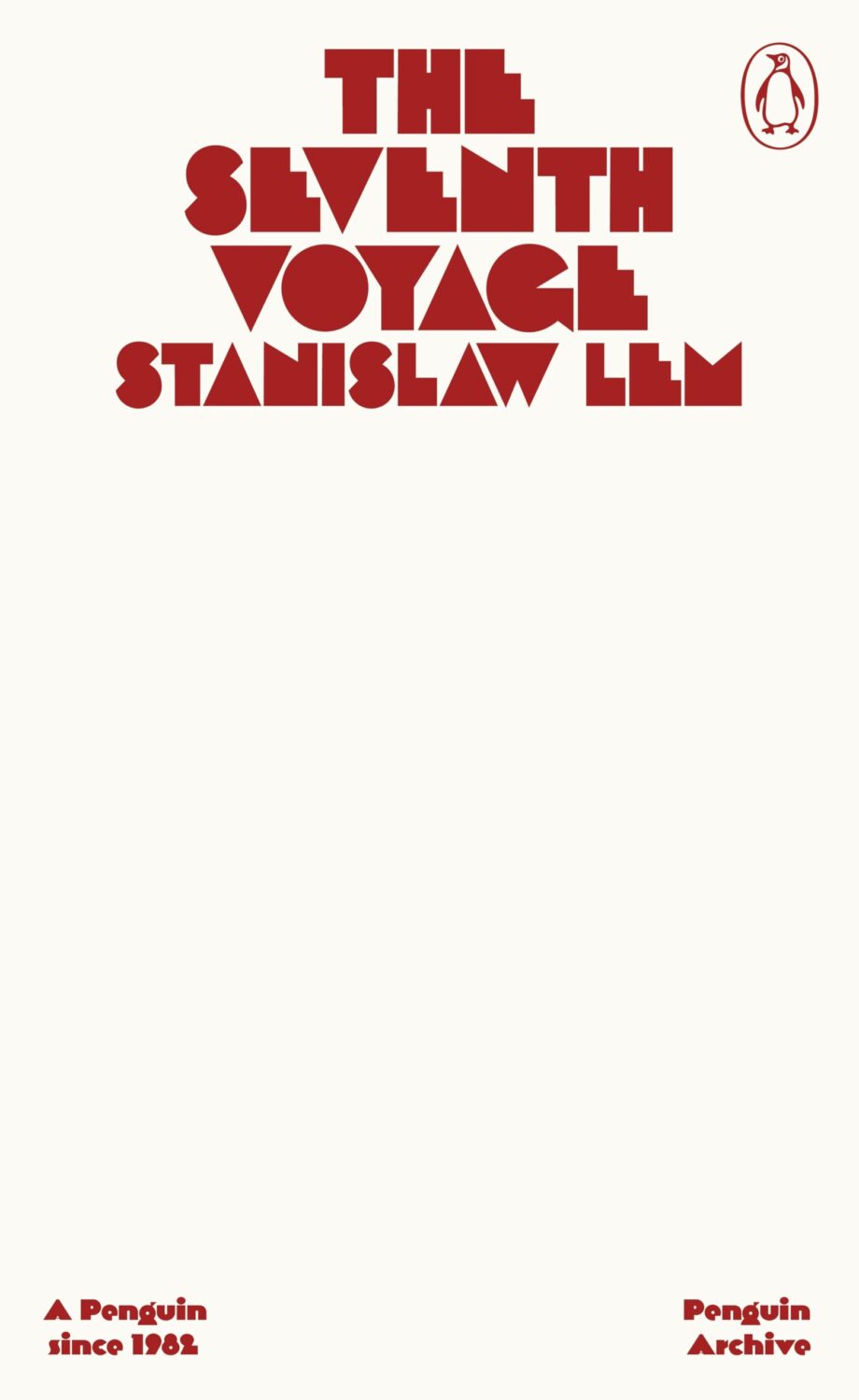
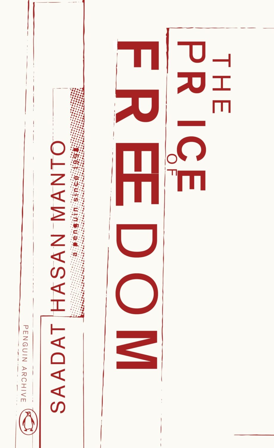
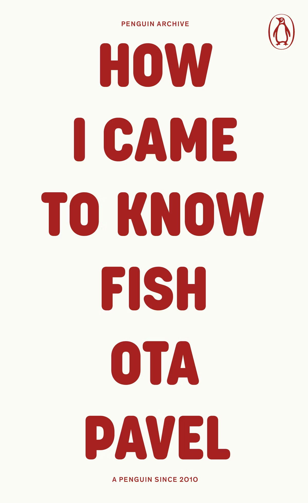
The typographic covers for the ‘Penguin Archive’ designed by Jim Stoddart triggered my curiosity. Published in April to celebrate 90 years of Penguin Books, the designs use typography to evoke the different eras of the publisher. You can read more about the series and the design process at Creative Review. But which historic Penguin covers inspired type choices in the first place?
There was some really nice series design from independent publishers this year too. I really liked Luísa Dias‘s covers for Wild Hunt Books’ Northern Weird Project. I wanted to feature them here when the final book of the series, Turbine 34 by Katherine Clements, came out last month, but time was not on my side. Fortunately, Zachary Petit talked to Luísa about the series for PRINT in April.
In Solvej Balle’s On the Calculation of Volume septology a women repeats the same day over and over again, and Matt Dorfman‘s covers for the New Direction editions are a really creative take on loops and repetition. The first two books came out last year and were featured in my October 2024 post so they’re not on this year’s list even though the third book was published in November. There are, however, two covers from a different Danish septology included below.
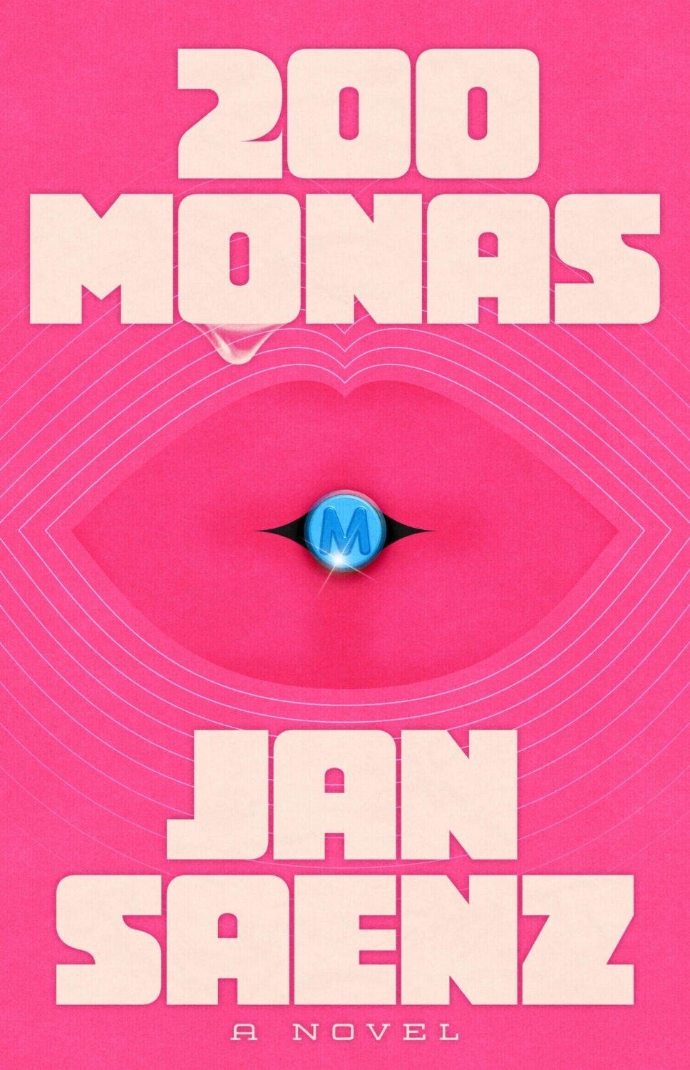
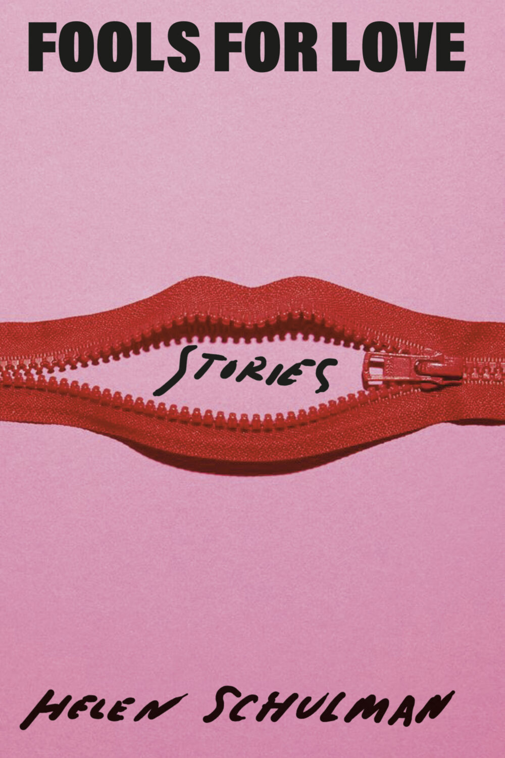
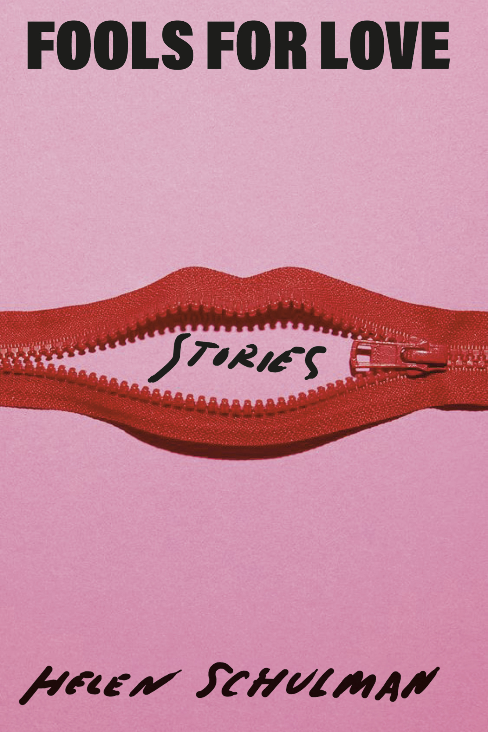
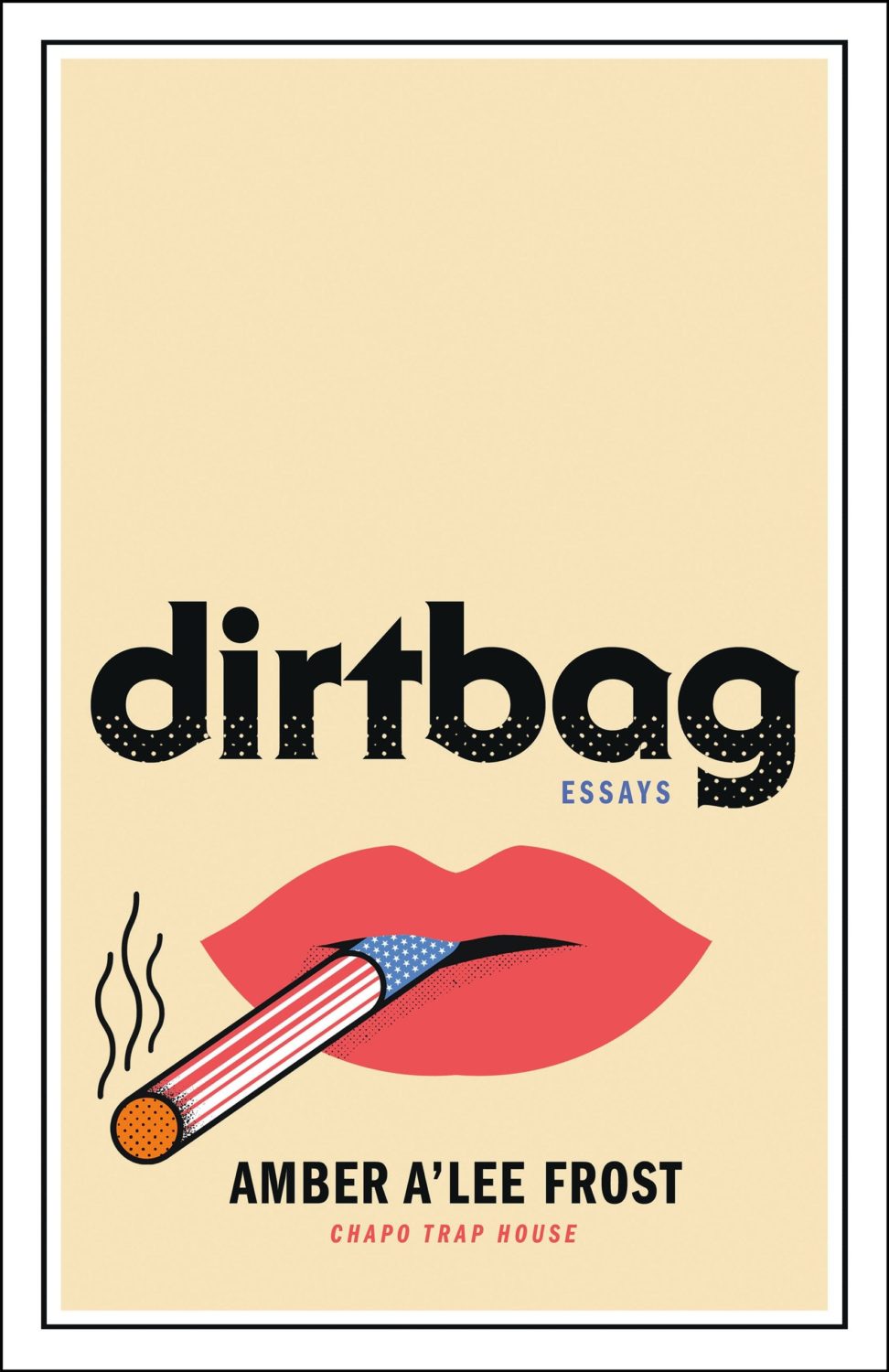
In terms of trends, Alban Fischer noticed that there have been a lot of close-ups of lips recently, something which I Need A Book Cover also picked up on.
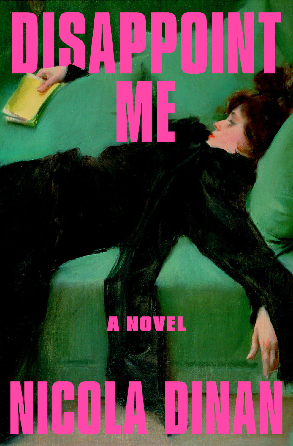
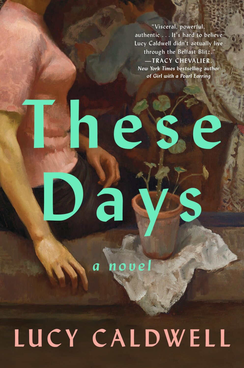
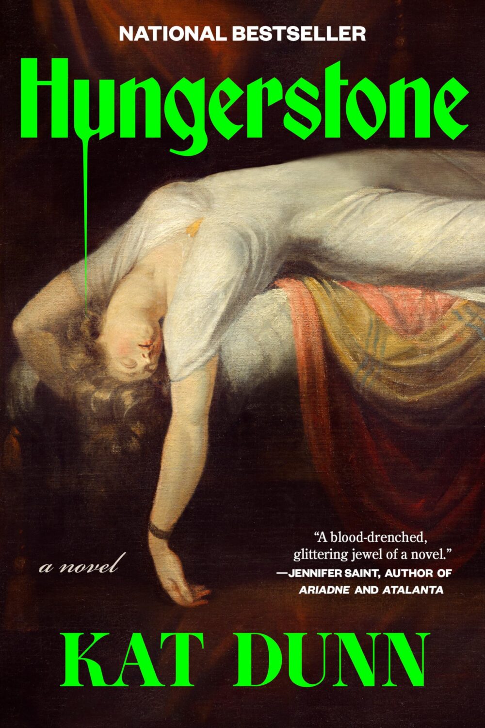
One strand of the ‘trend you’re seeing everywhere’ was paintings of women in various states of repose. There was a lot of elegant ennui and it almost felt like an art school version of well-dressed and distressed covers at times.
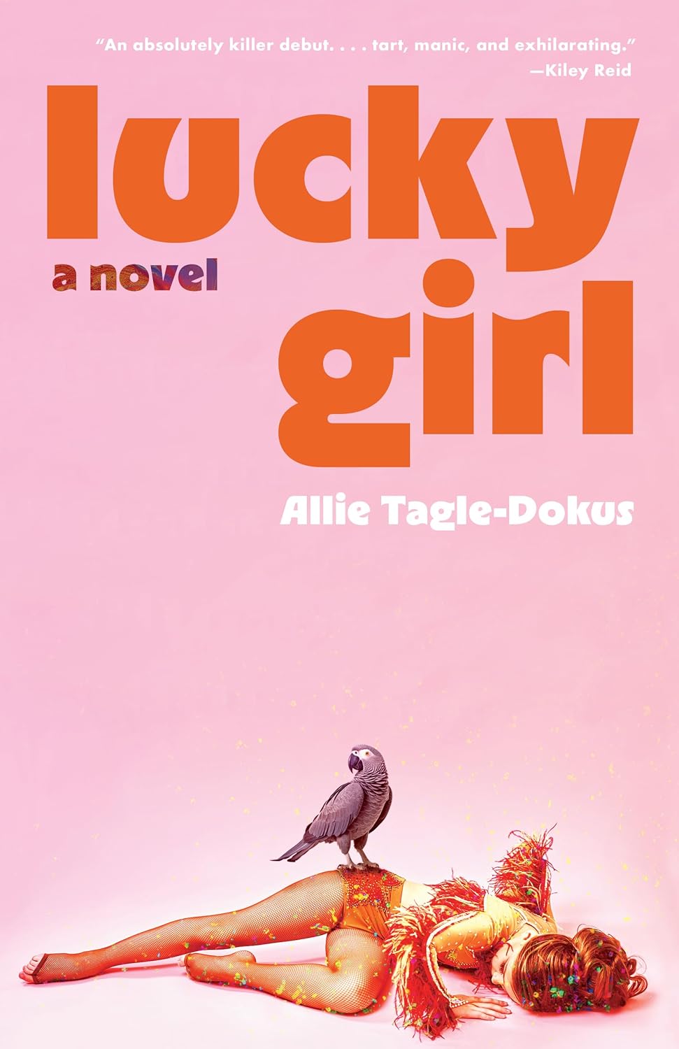
Disappoint Me by Nicola Dinan; design by Rachel Ake; art ‘After the Ball’ by Ramon Casas i Carbo (Dial Press / May 2025)What a Time to be Alive by Jenny Mustard; cover art by Shannon Cartier Lucy (Sceptre / April 2025)These Days by Lucy Caldwell; design by Ploy Siripant; art ‘Woman in the Window’, by Alberto Morrocco (SJP Lit / April 2025)Hungerstone by Kat Dunn; design by Alicia Tatone; art ‘The Nightmare’ by Henry Fuseli
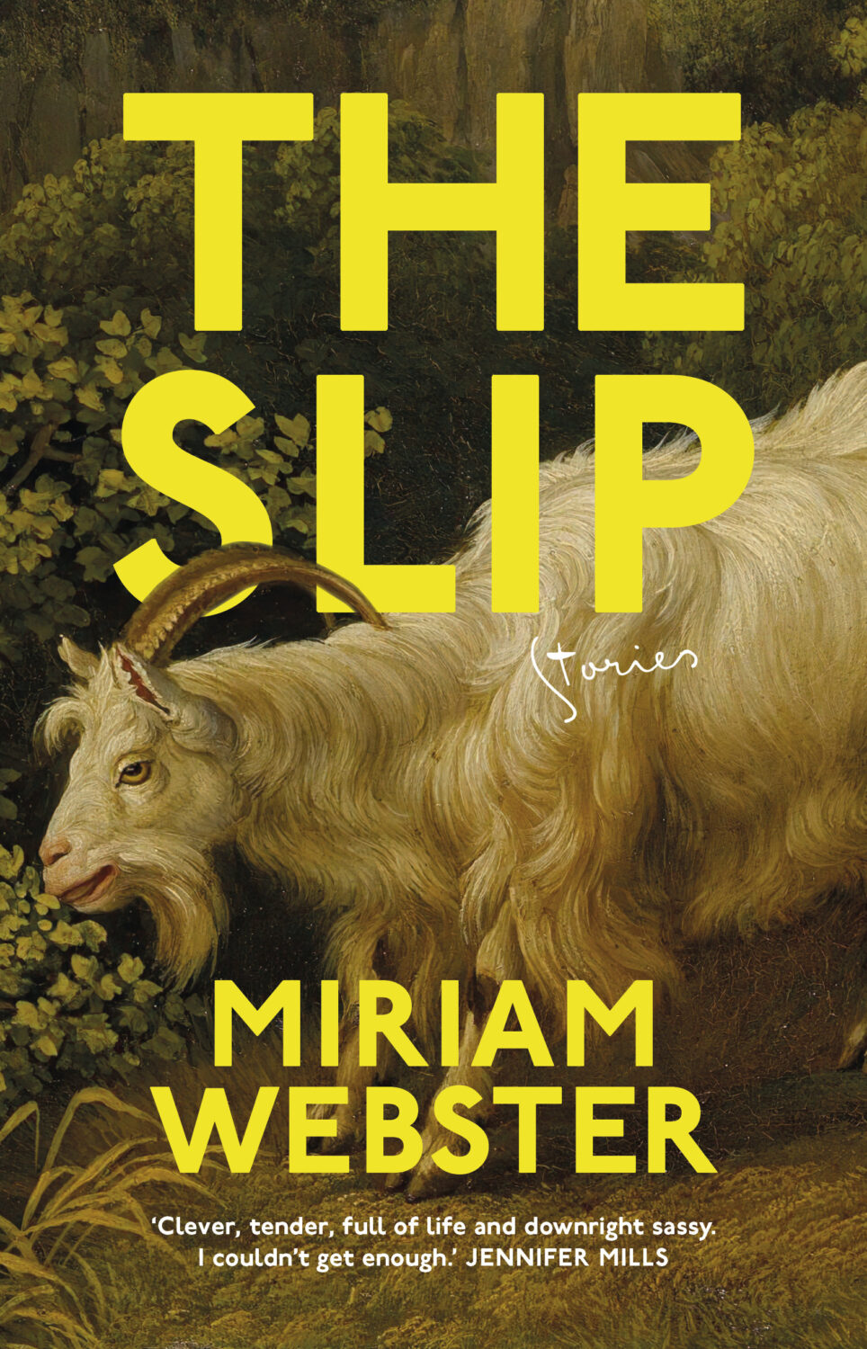
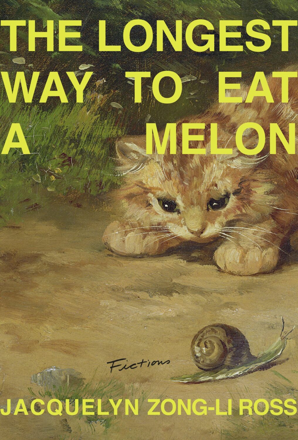
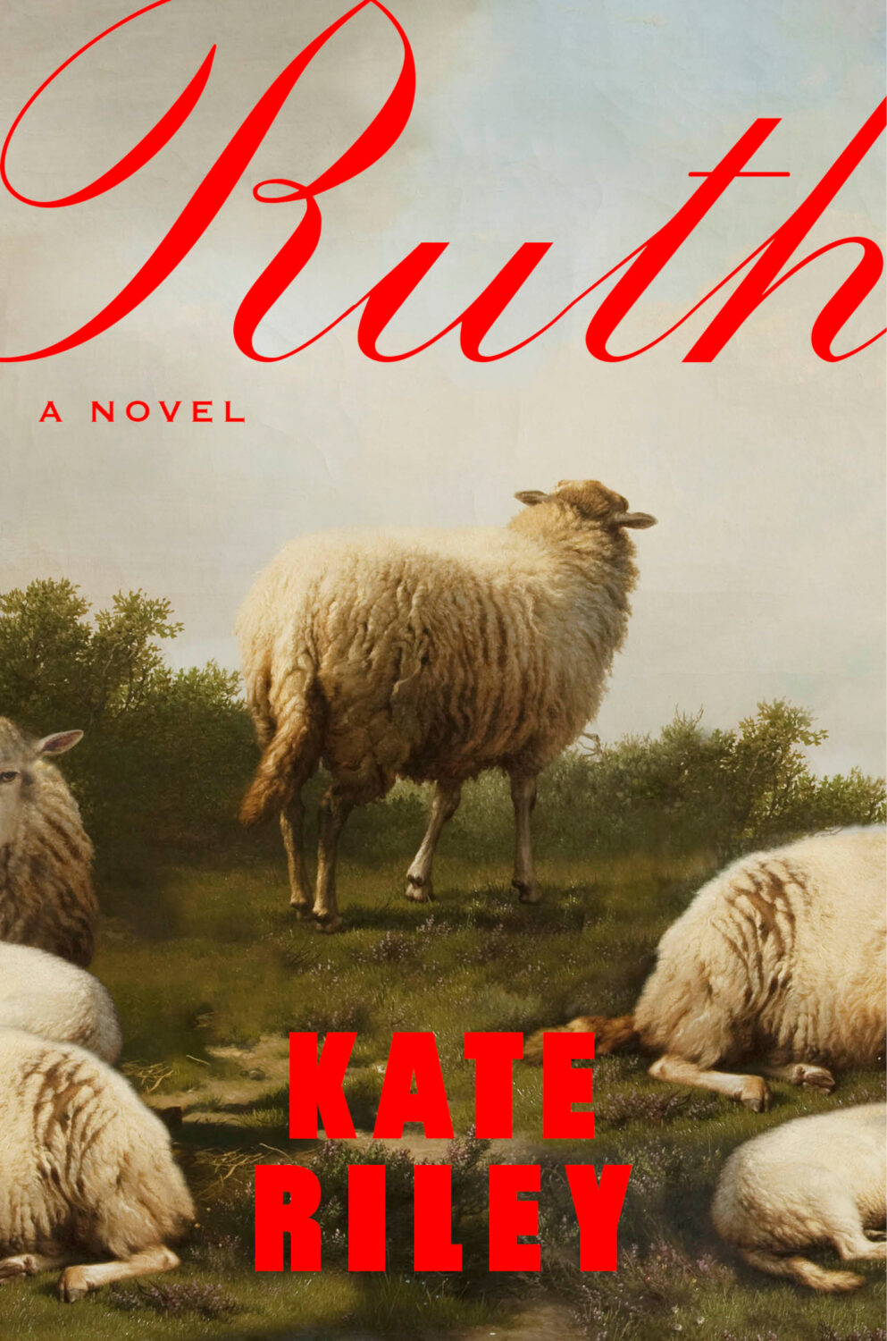
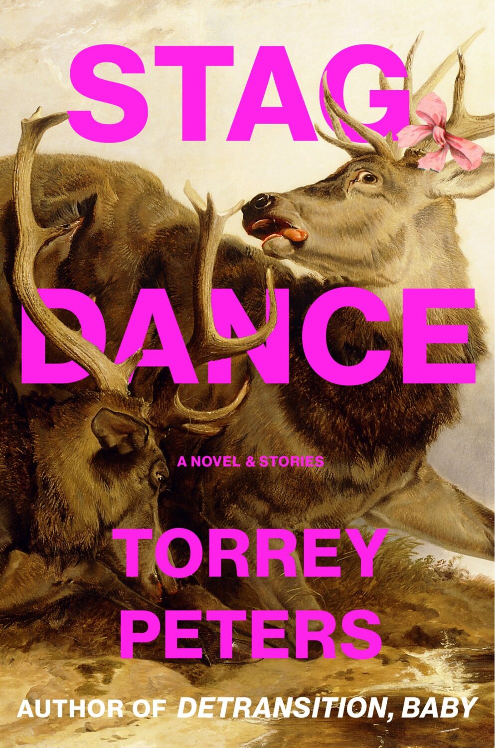
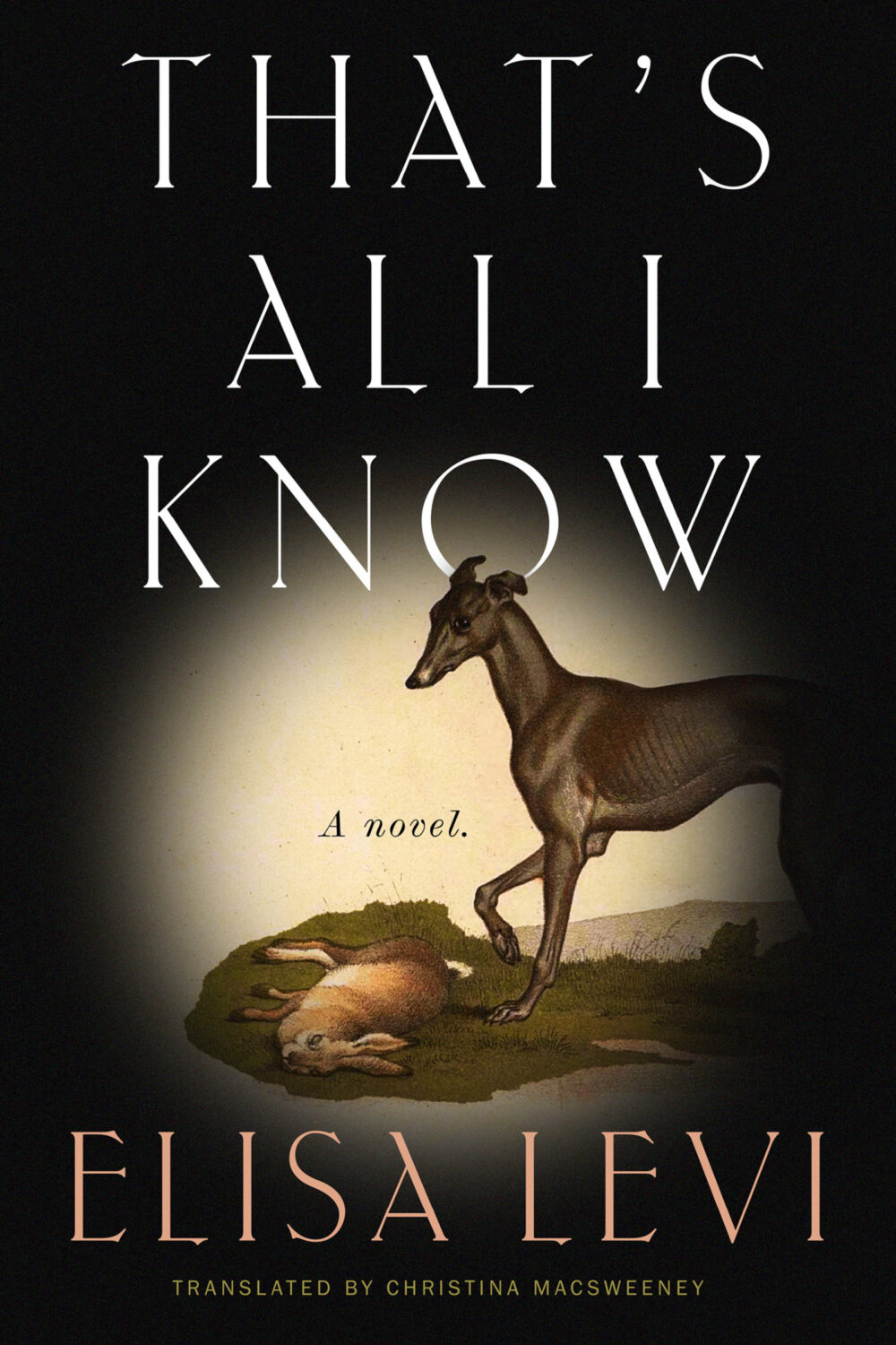
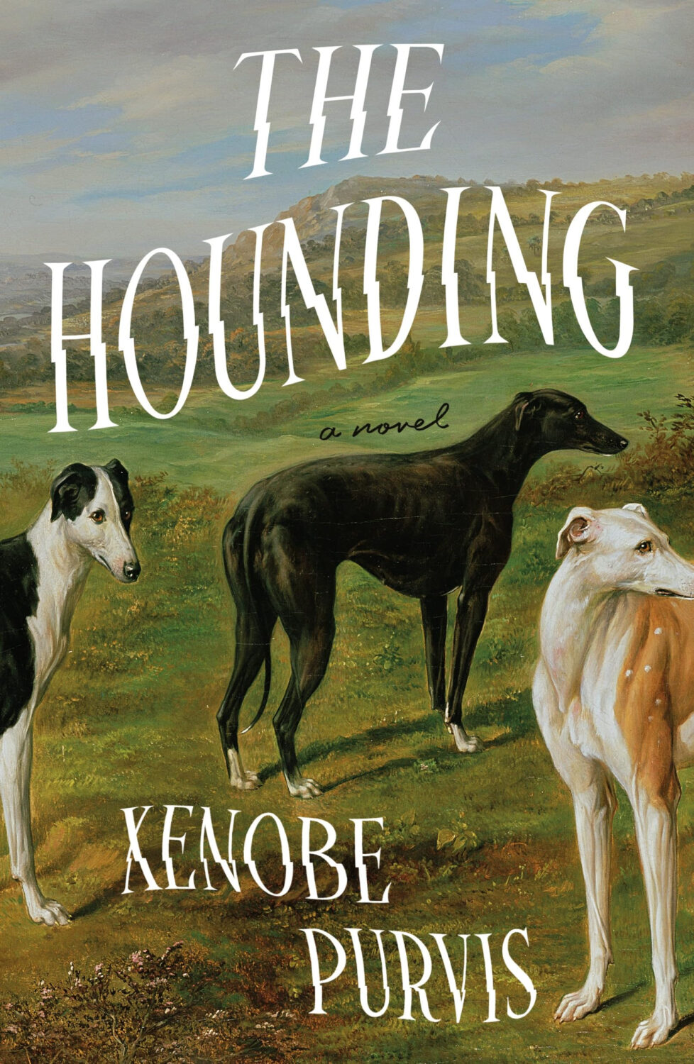
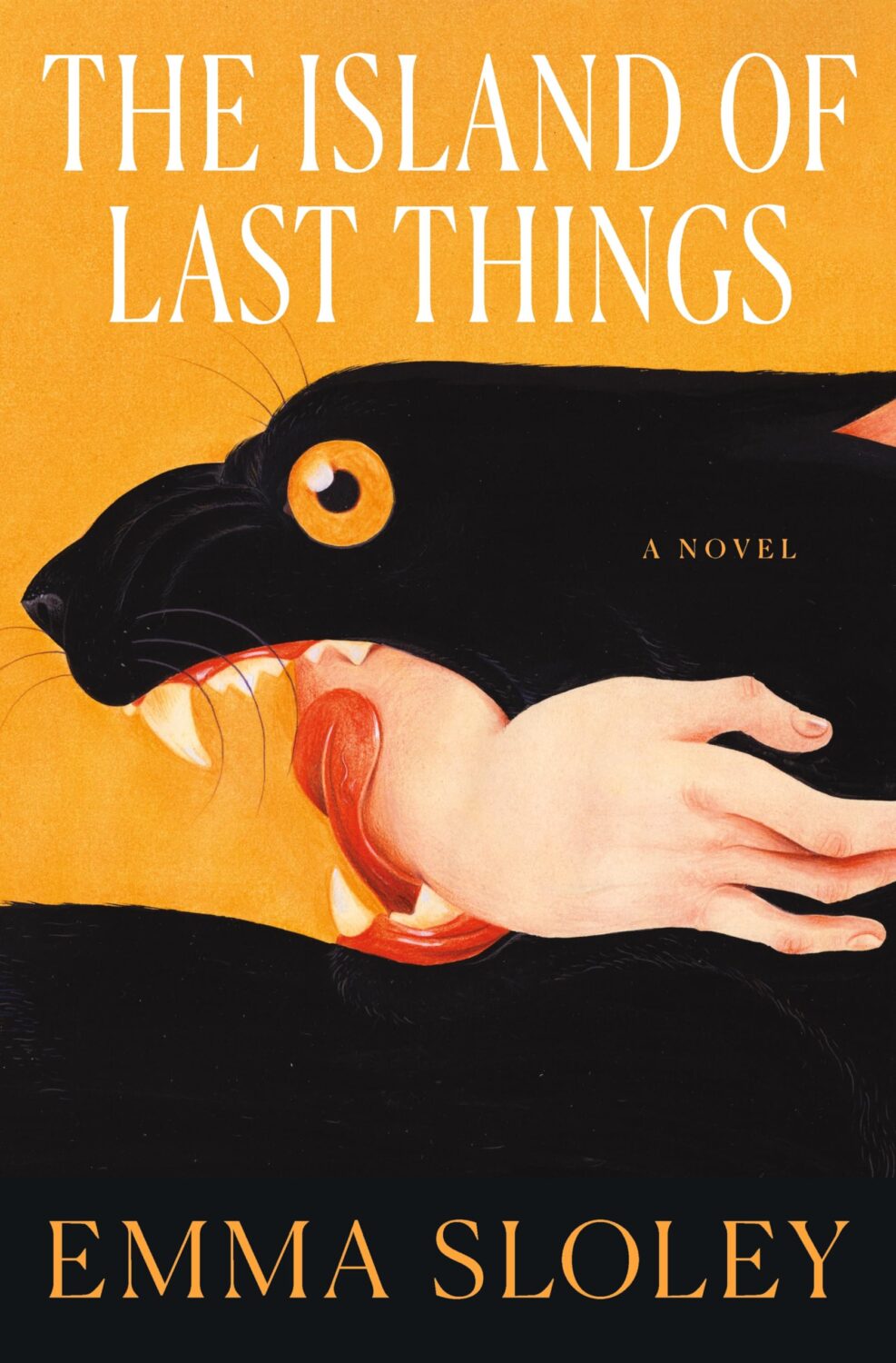
Another strand was historical paintings of animals, which fits with the “old-timey animals” covers Patrick Redford wrote about for Defector last year.
I think the success of these covers largely depends on the image selection and the cleverness of the crop. I’m sure we will see more of them going forward, but doing it well is probably harder than it looks.
I don’t have a good name for this next trend, but in my mind I’ve been referring to this as “corner type” because of the way the text seems to turn the corners the cover. I guess what it is really doing is framing the central image. I don’t know if this is new, but I noticed it a lot this year.
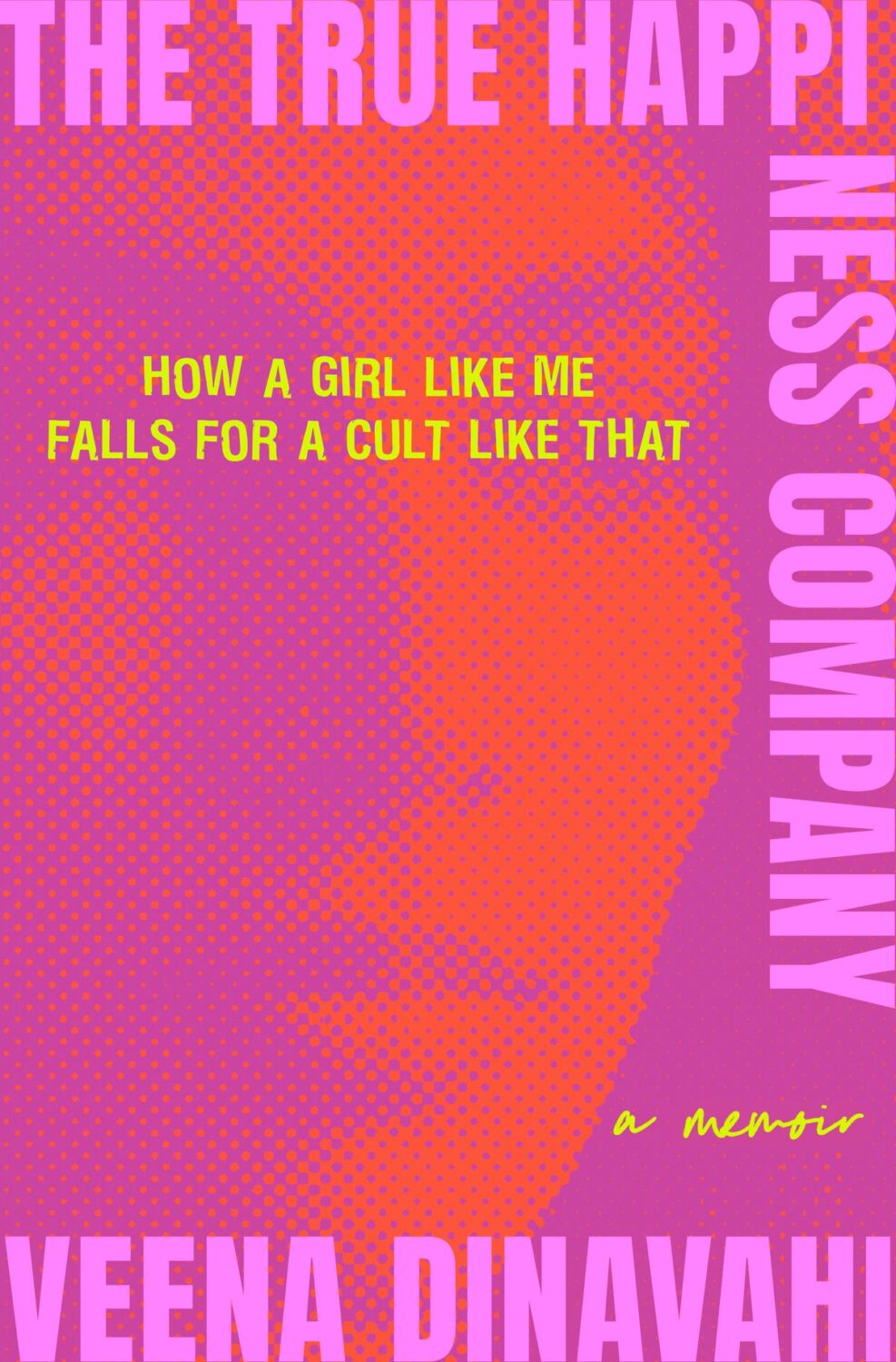
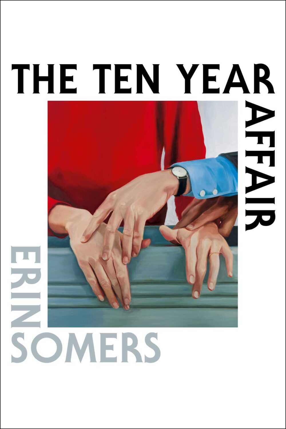
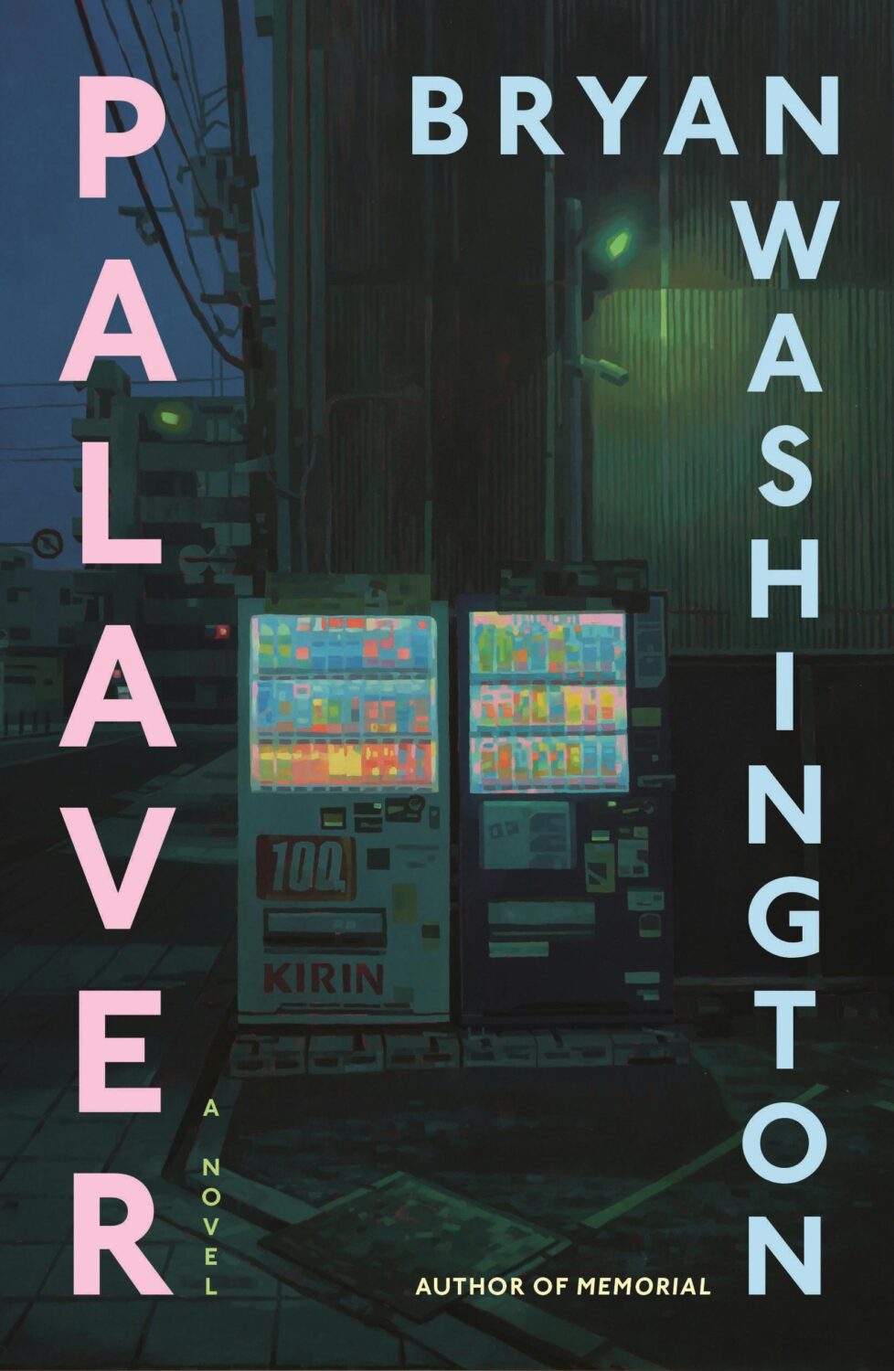
Culpability by Bruce Holsinger; design by Rodrigo Corral (Spiegal & Grau / July 2025)The True Happiness Company by Veena Dinavahi; design by Rachel Ake (Random House / May 2025)The Ten Year Affair; by Erin Somers; design by Emily Mahon; cover art by Shannon Cartier Lucy (Simon & Schuster / October 2025)Palaver by Bryan Washington; design by Na Kim; art by Keita Morimoto (Farrar, Straus & Giroux / November 2025)
I mentioned a wave of retro-nostalgic horror and suspense covers back in 2023 (I could’ve sworn it was last year until I checked!), but it feels like designers are still having fun with it as the genre as a whole gets more mainstream attention.
And speaking of nostalgia, I feel like covers inspired by 1980s advertising and airbrush art are suddenly a thing. There are a few examples from 2025, but it might be something we see more of next year as well.
Lastly, I just wanted to say thank you to everyone who supported the blog this year, especially the folks that helped out with cover images, credits, and corrections. I really appreciate you taking the time to reach out, and I’m sorry if you sent me a note and didn’t hear back. I try my best to read and reply to everything, but this is a one man show and sometimes life has other plans.
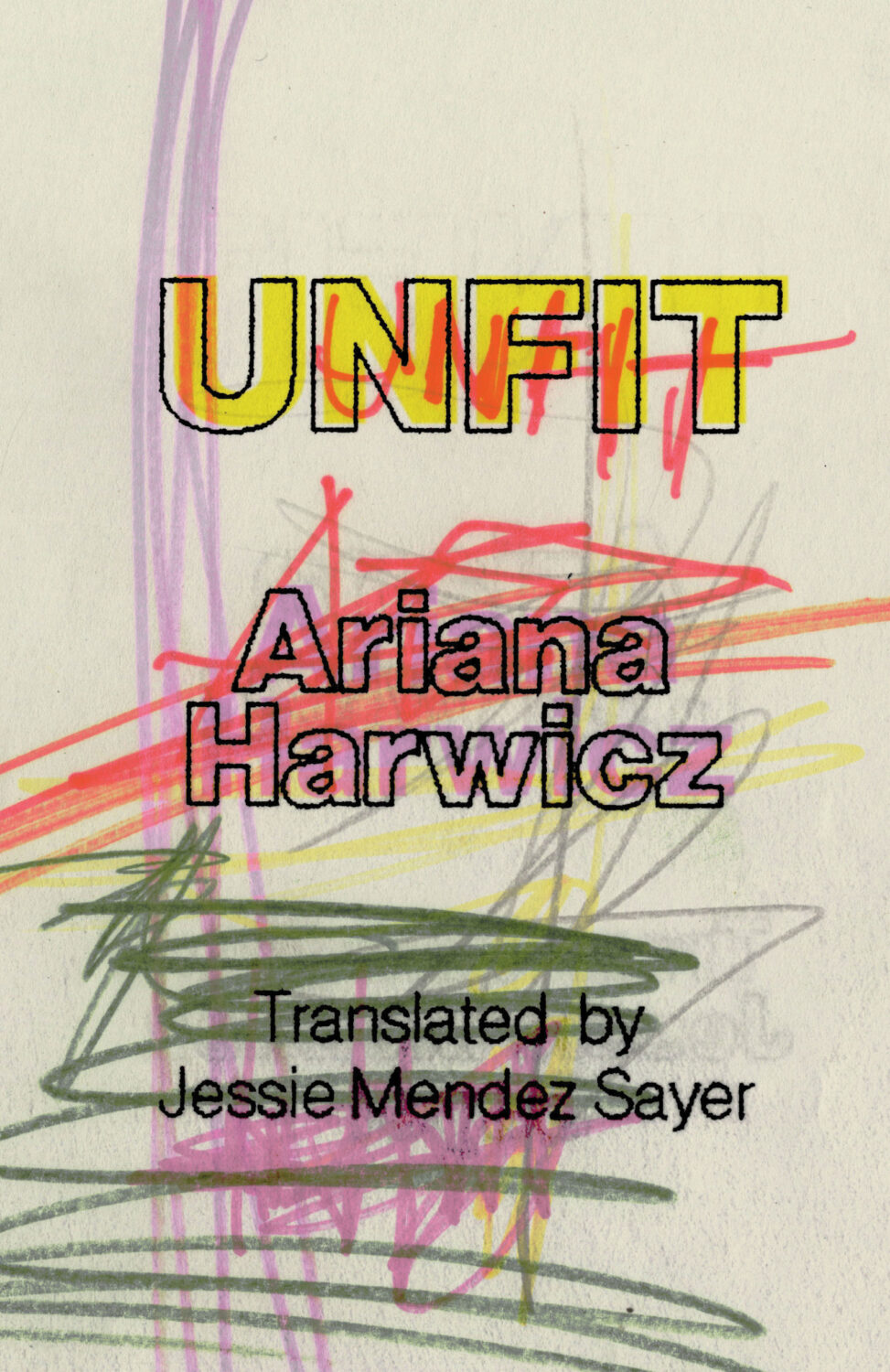
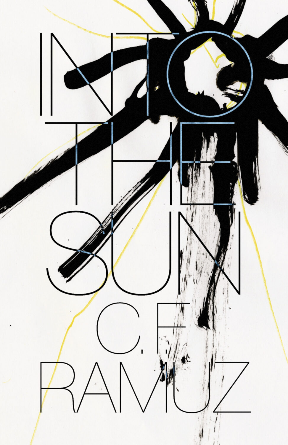
Unfit by Ariana Harwicz, translated by Jessie Mendez Sayer; design by Erik Carter (New Directions / October 2025)Into the Sun by C. F. Ramuz translated by Olivia Baes &, Emma Ramadan; design by Erik Carter (New Directions / August 2025)
Zone Rouge by Michael Jerome Plunkett; design by Jaya Nicely (Unnamed Press / September 2025)Open Up by Thomas Morris; design by Jaya Nicely (Unnamed Press / April 2025)
Somehow it is the end of July, and I am once again rushing to get this done. I think it’s a decent mix of covers this month though, with some big books, some indies, a few type-only covers, some nice art, and a couple of trends to watch out for. I’m glad it’s all come together, even if it is last minute!
Thanks to everyone who took time to help me with cover images and design credits over the past couple of weeks (days!) — it’s really, really appreciated! I hope everyone is having a good summer.
Hello! I hope you’re safe and well wherever you are.
Before we get to the covers, a couple of brief admin things. First up, there have been a couple of behind-the-scenes changes at the CO this past month. They’ve solved a few tech issues for me and hopefully no one else has noticed. Secondly, I’ve been tinkering with the RSS. I’m not sure that’s quite right yet, so apologies if it’s not been working as expected. Let me know if you’re experiencing any weirdness.
I also wanted quickly mention that the deadline for the DPI mentorship scheme has been extended to April 12th. I’m not involved with the DPI, but some really great people are so if you are a designer from an under represented background living in the UK or Ireland, you should think about applying!
Anyway, it’s a really big post this month! The are lots of great covers with the UK, Australia and Canada all represented, as well as the usual folks from US. There are some compare-and-contrasts, a couple of covers from indie presses, a couple of covers for translations, and a couple of poetry covers too. There’s even a meandering digression in the middle (sorry). Enjoy!
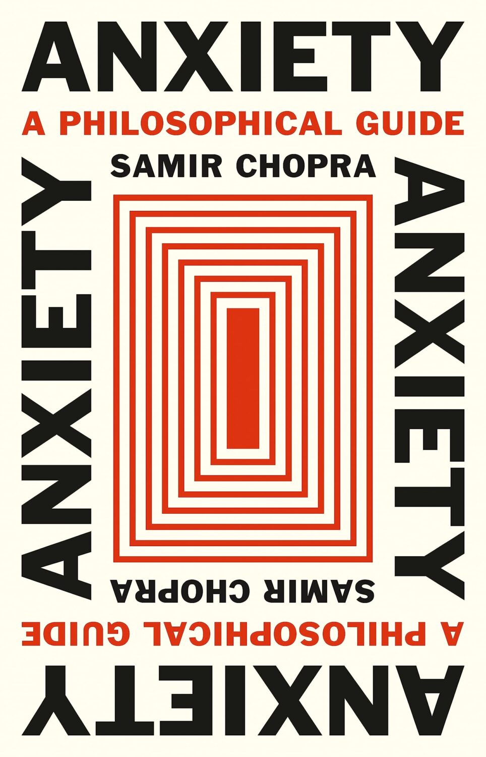
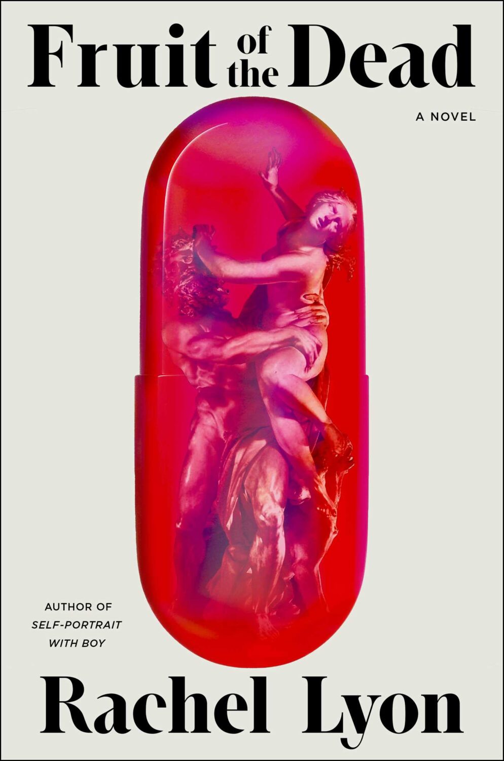
Anxiety by Samir Chopra; design by Karl Spurzem (Princeton University Press / March 2024)
So this cover sent me down a bit of a rabbit hole. It reminded me of a cover design from a few years ago. It didn’t really look the same but, in my mind at least, this other cover featured a blue-red capsule shape (possibly a stretched illustration of a planet and its core) centred on a white background with black Swiss-style sans serif type. It was not exactly minimalist, but clean and precise. I think I saw it on Twitter back in the day. I thought it was maybe literary sci-fi or pop science, and published by one of the big American imprints. I was also pretty convinced that it was designed by Alex Merto or possibly John Gall. One of the dudes.
This is not the first time I have thought about this cover, and I can, or at least could, picture it quite clearly. The problem is that I can find no evidence of this cover ever existing, and the more I think about, the more the details shift and doubt creeps in. I don’t seem to have posted it anywhere, and I can’t find it in the usual places. It’s possible that I am getting some of the crucial details wrong, mentally combining a couple of covers into one, or it was something other than an actual book cover. But maybe this is some kind of Visual Mandela Effect thing, and this design that I’ve believed existed for years is actually a figment of my imagination.
My search has felt a bit like the online equivalent of walking into a bookstore and asking for the book with the blue cover. It has made realise that we have very few tools to find cover designs in a systematic way, especially since the Book Cover Archive stopped being a going concern. You just kind of have to browse and I hope you eventually look in the right place (or risk slowly lose your sanity).
Anyway, if this mystery cover is ringing any bells with you, please let me know and put me out of my misery. I have been going slightly crazy. (This sort of thing happens more than I care to admit by the way, but it is particularly bad this time! And, no, I do not have much of a life. Why do you ask?)
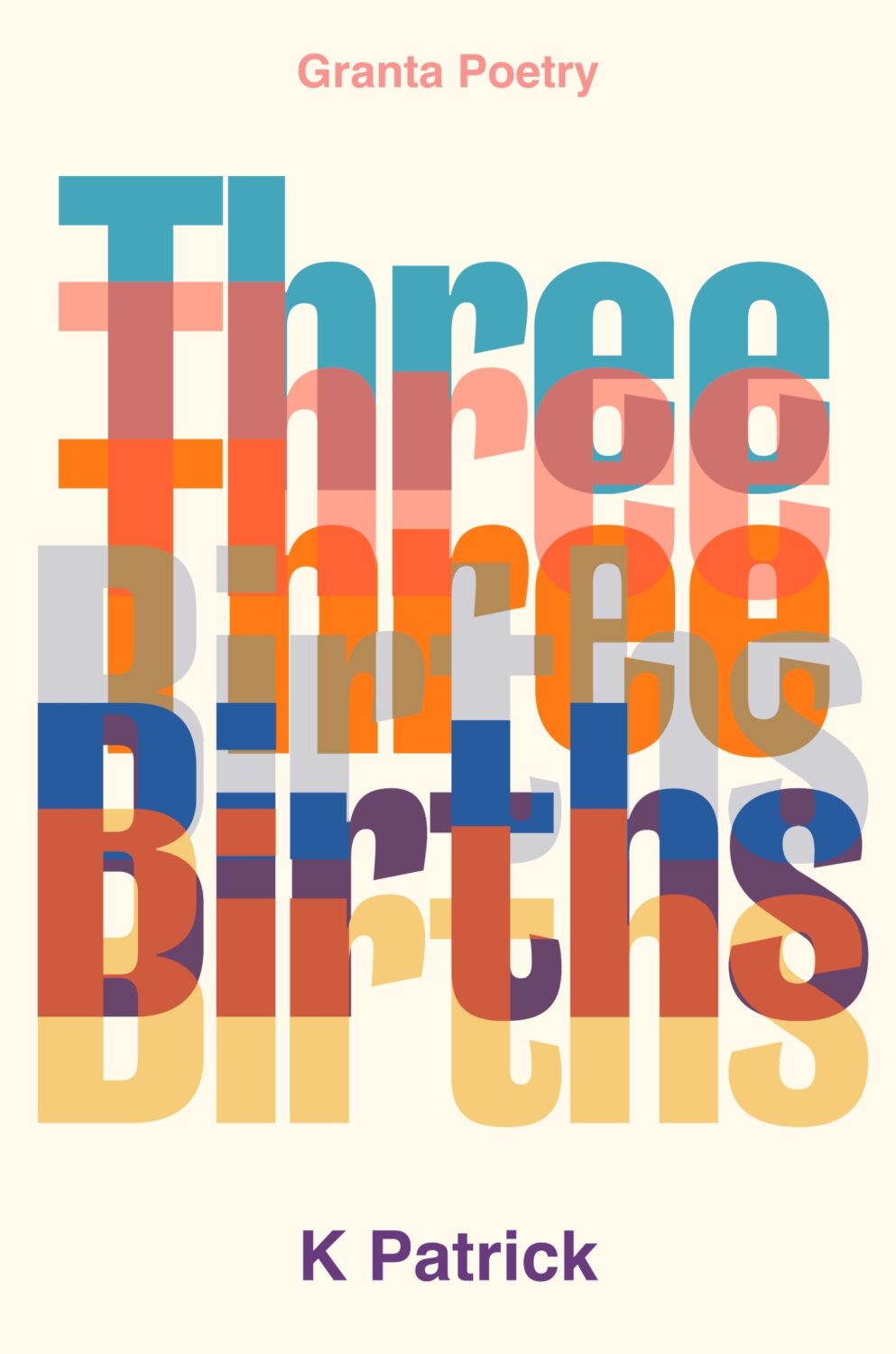
(Thanks to Jon Gray for helping me with the design credit for this and the other Granta title Three Births below. Publishers: post the design credits with your cover reveals!)
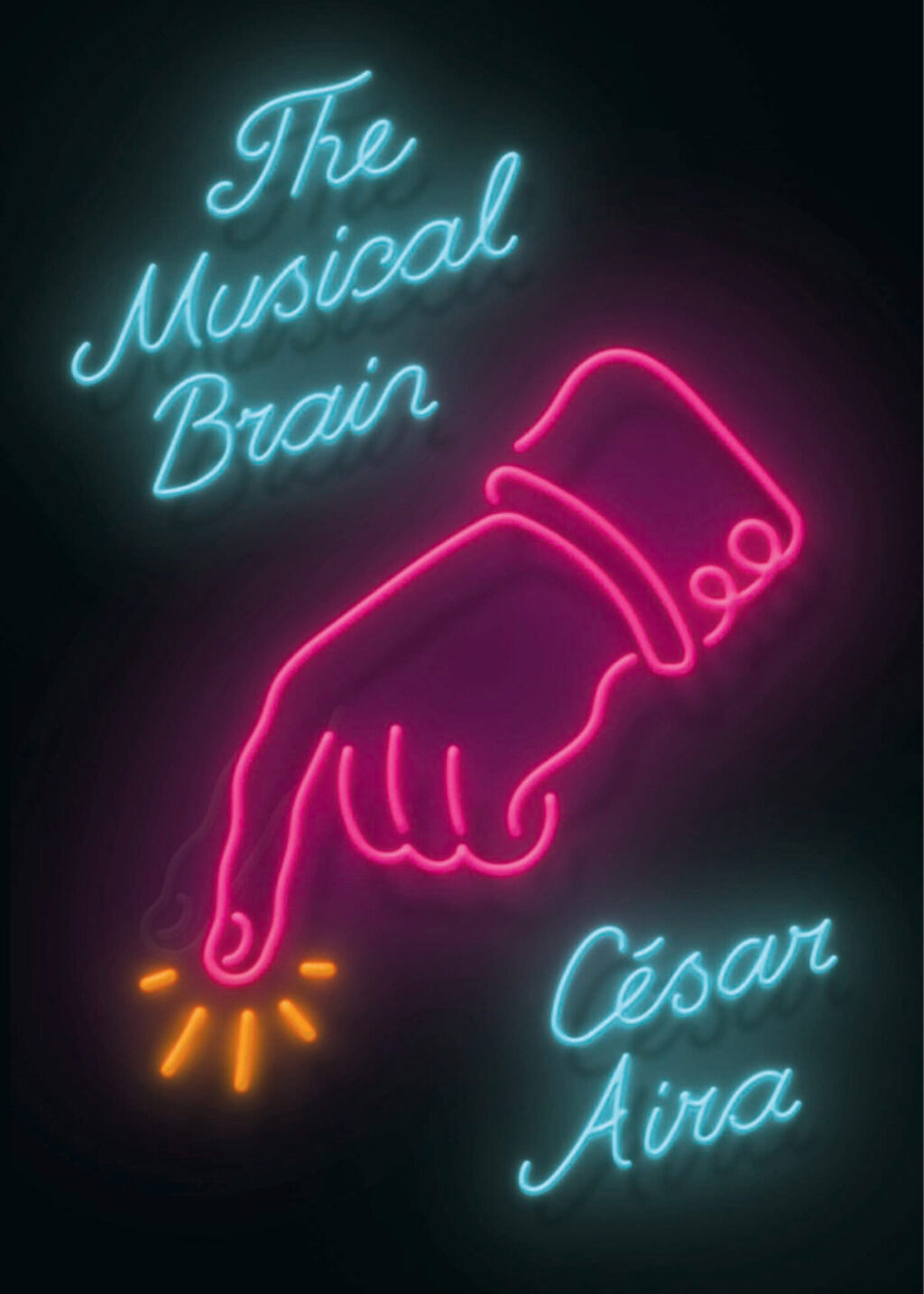
While looking for the other, possibly imaginary, book cover, I came across the cover for the New Directions edition of The Musical Brain by César Aira designed by Rodrigo Corral and Zak Tebbal a few times. It was on one or two best of 2015 lists, including mine.
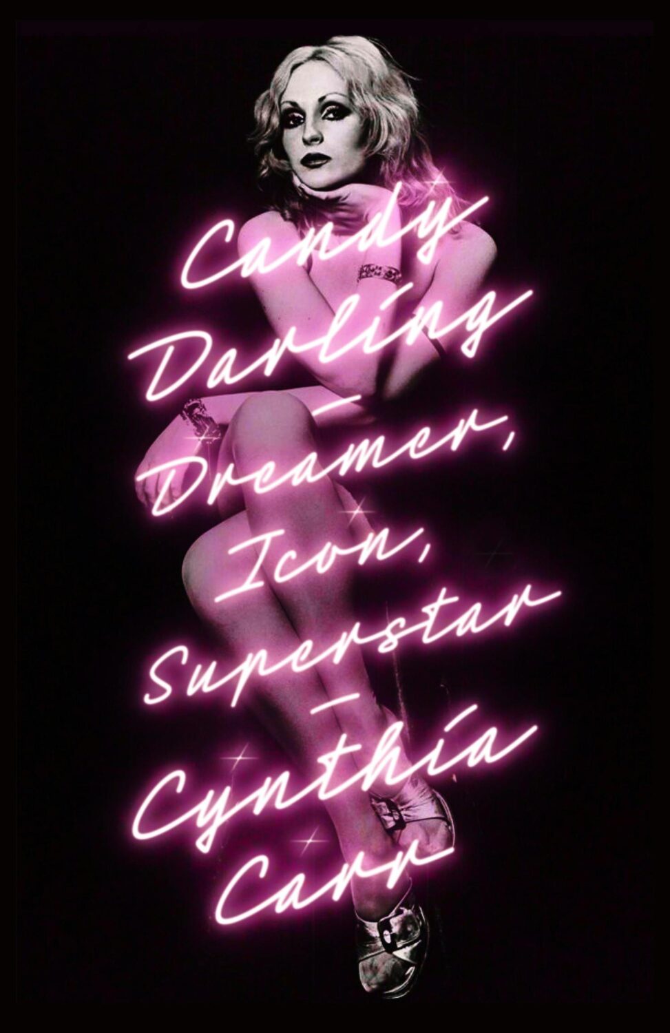
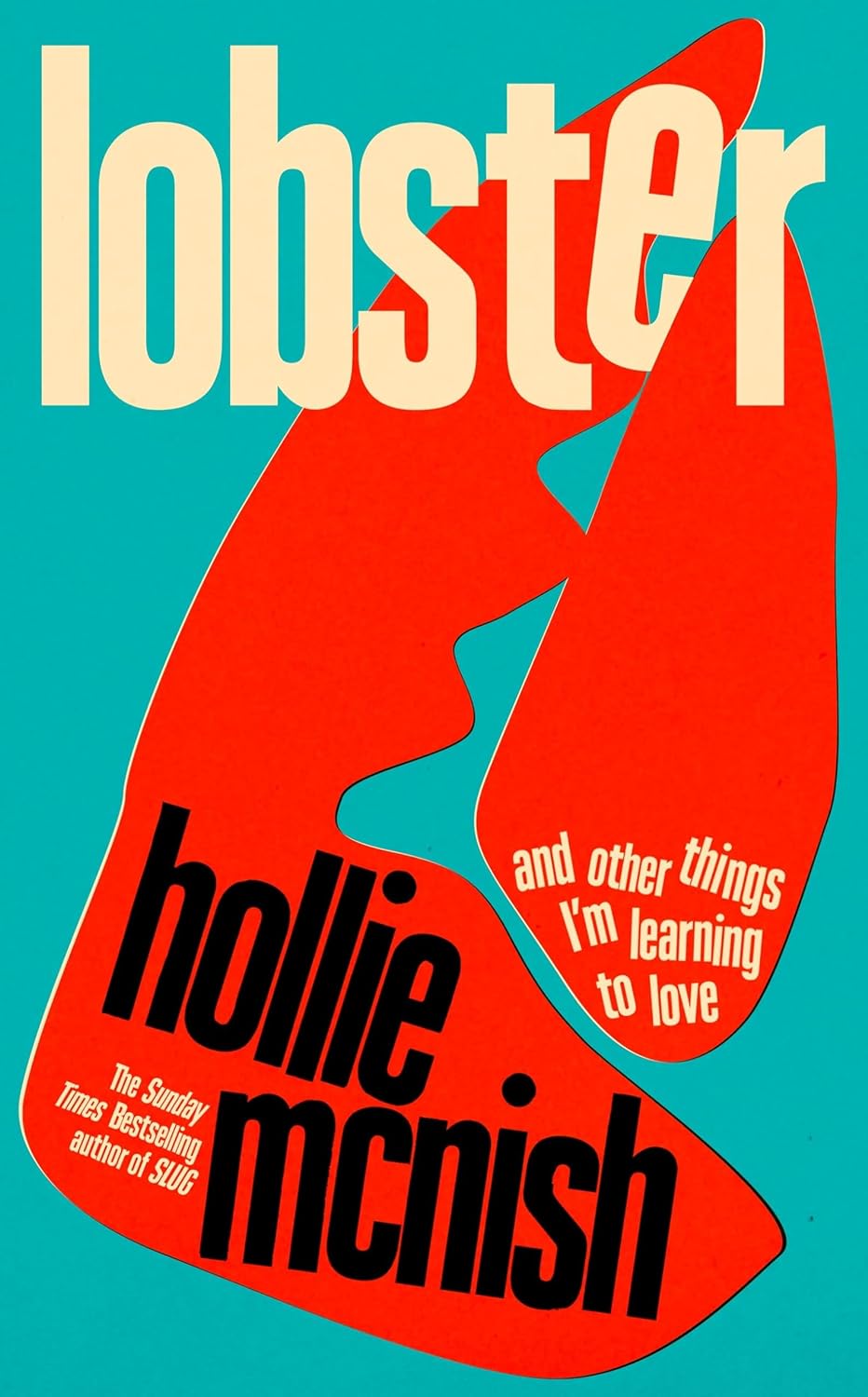
Is neon-style lettering on covers a bit of thing? (see also Candy Darling above)
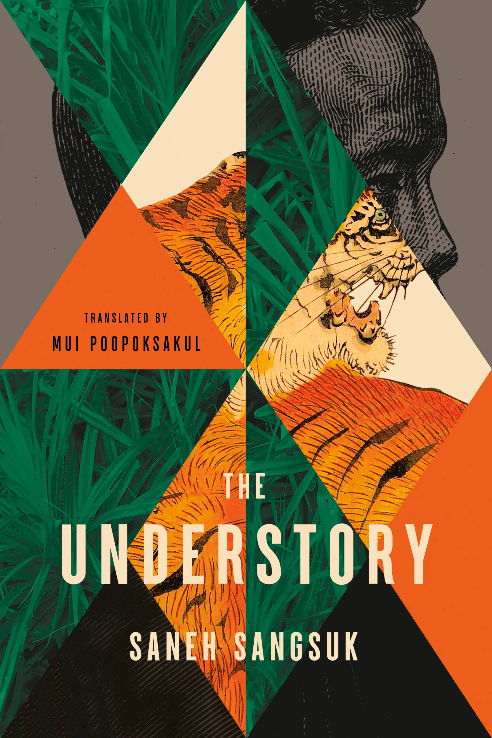
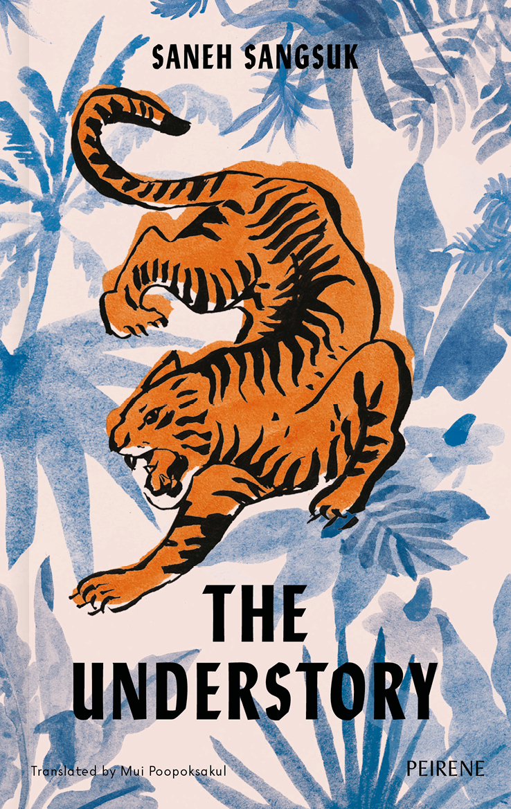
The cover of the UK edition of The Understory, published by Peirene Press in October last year, was designed by Orlando Lloyd. The illustration is by Miki Lowe.
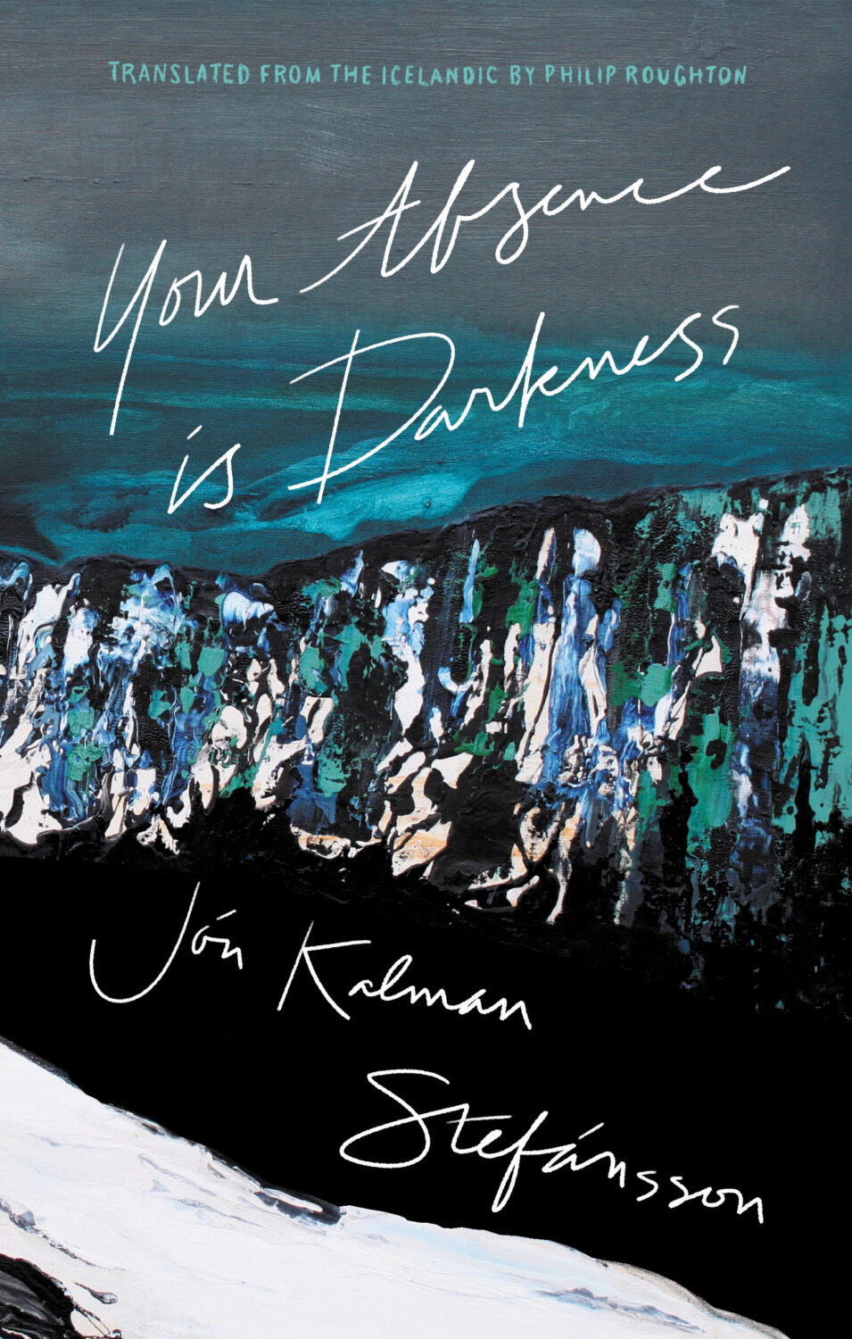
Your Absence is Darkness by Jón Kalman Stefánsson; design by Jason Arias (Biblioasis / March 2024)
Hey. I hope you’re safe and well and caught up on your podcasts, shows, and TBR pile.
I thought this was going to be a short post this month, and then it turned into a long one — or longer than expected at least. I don’t have too much to add to the covers. I’m busy, you’re busy. It’s almost October, literally no one has time for this! But there are some lovely covers this month. There’s a bit autumnal orange and ennui, some nice type, and a couple of Canadian covers (for those keeping count), and a couple of appropriately off-beat ones from our friends at New Directions.*
American Gun by Cameron McWhirter and Zusha Elinson; design by Rodrigo Corral (Farrar, Straus & Giroux / September 2023)
Fear by Robert Peckham; design by Tom Etherington (Profile / September 2023)
Goth by Lol Tolhurst; design by Timothy O’Donnell (Quercus Publishing / September 2023)
This whole thing is ridiculously in my wheelhouse. The cover photo is by the author (of course!), and there’s a fun note about trying to source the type in Timothy’s Instagram post about the design.
Grand Tour by Elisa Gonzalez; design by Na Kim (Farrar, Straus & Giroux)
I’m not sure it was the intention, but I like the trippy film title / goth art project quality of this.
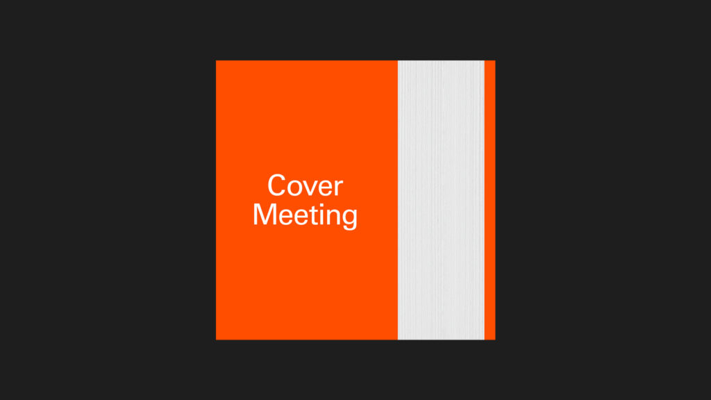
The Lights by Ben Lerner; design by David Pearson (Granta / September 2023)
Hopefully you’ve all had chance to listen to David on the Cover Meeting podcast by now. It’s really good!
The cover of the US edition published by FSG was designed by Thom Colligan. It’s interesting that they’re similar and yet different. I wonder if it was brief or just a creative coincidence?
I’m sure I’m not the only one to get Edward Hopper vibes from this cover.
The cover of the UK edition was designed by Suzanne Dean with a cover illustration by Anna Morrison.
*A bit of admin from last month: I finally managed to spend some time browsing a bookstore and I was able to ascertain that the cover of the US edition of Bridge by Lauren Beukes was designed by Kirin Diemont. Apologies to Kirin for not crediting her at the time in last month’s post. It’s updated now)
Steve has recorded eight episodes for the first season, with a new episode released each week, and a second season planned for 2024.
The first episode, released earlier this month, is a wide-ranging conversation with David Pearson. David discusses his time at Penguin, working freelance, the issues of low pay in the industry, as well as his design process and the challenges of creating interesting work.
Sam by Allegra Goodman; design by Donna Cheng; photograph by Mariam Sitchinava (Dial Press / January 2023)
I’m not sure exactly why, but I just assumed this was a UK cover when I first saw it (despite it literally having “New York Times Bestselling Author” in all-caps at the top!).
Sing, Nightingale by Marie Hélène Poitras; translated by Rhonda Mullins ; design by Ingrid Paulson (Coach House / February 2023)
For some reason this makes me think of the ‘weird nature’ (including animals with human eyes!) in Annihilation by Jeff Vandermeer, which is still one of my favourite novels of the last 10 years…
True Life by Adam Zagajewski; design by Jeff Clark (Farrar, Straus & Giroux / February 2023)
I also saw Pete Garceau’s cover for School House Burning by Derek W. Black recently, which snuck past me when it was published by PublicAffairs in September 2020 but still seems terribly au courant…
Wolfish by Erica Berry; design by Keith Hayes; illustration by Rokas Aleliunas (Flatiron / February 2023)
“Cover design in the US went from being house-styled, design driven and idiosyncratic (think Grove Press or New Directions or whatever Push Pin was up to) to the ‘big book look’ of the 1970s defined by designers like Paul Bacon. Make the type as large as possible, centre it, and combine with some non-specific imagery. That look still defines what we see on the bestseller list to this day. It established a generic way for covers to look and a familiar shorthand for sales teams and booksellers to understand – ‘aah, this must be a … big book!’. It ignored design principles of layout, composition and conceptual thinking that had been codified over the previous 50 years in favour of a commercial literal-ness. It also took away a lot of the fun.”
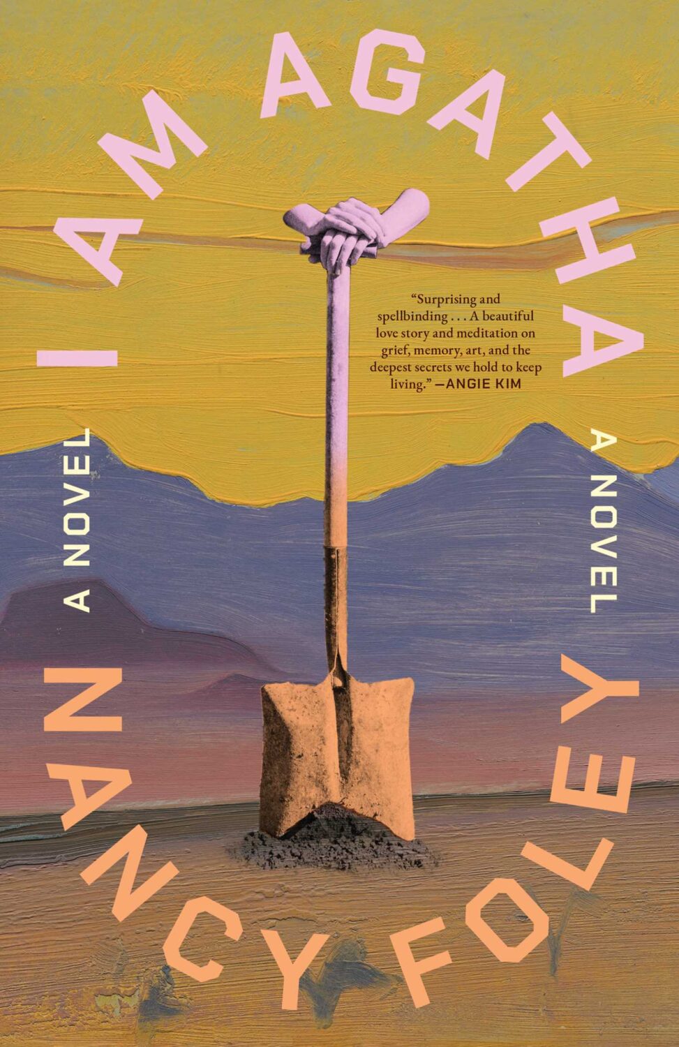
Jamie Keenan’s review of Joe Orton and Kenneth Halliwell’s naughty cover for The Secret of Chimneys by Agatha Christie is also a good time.
Earlier this year, a Canadian magazine asked me what the latest trends in book cover design were. I don’t think I had a very satisfactory answer. 2021 felt very much like a continuation of 2020, which itself felt like a year on hold.
The trends that came to mind were not exactly new. In no particular order: big faces (big sunglasses!); cropped faces; hands; mouths; postmodern typefaces;1 big skies; rainbows; gradients; the colour orange; psychedelia; collage; contemporary painting.
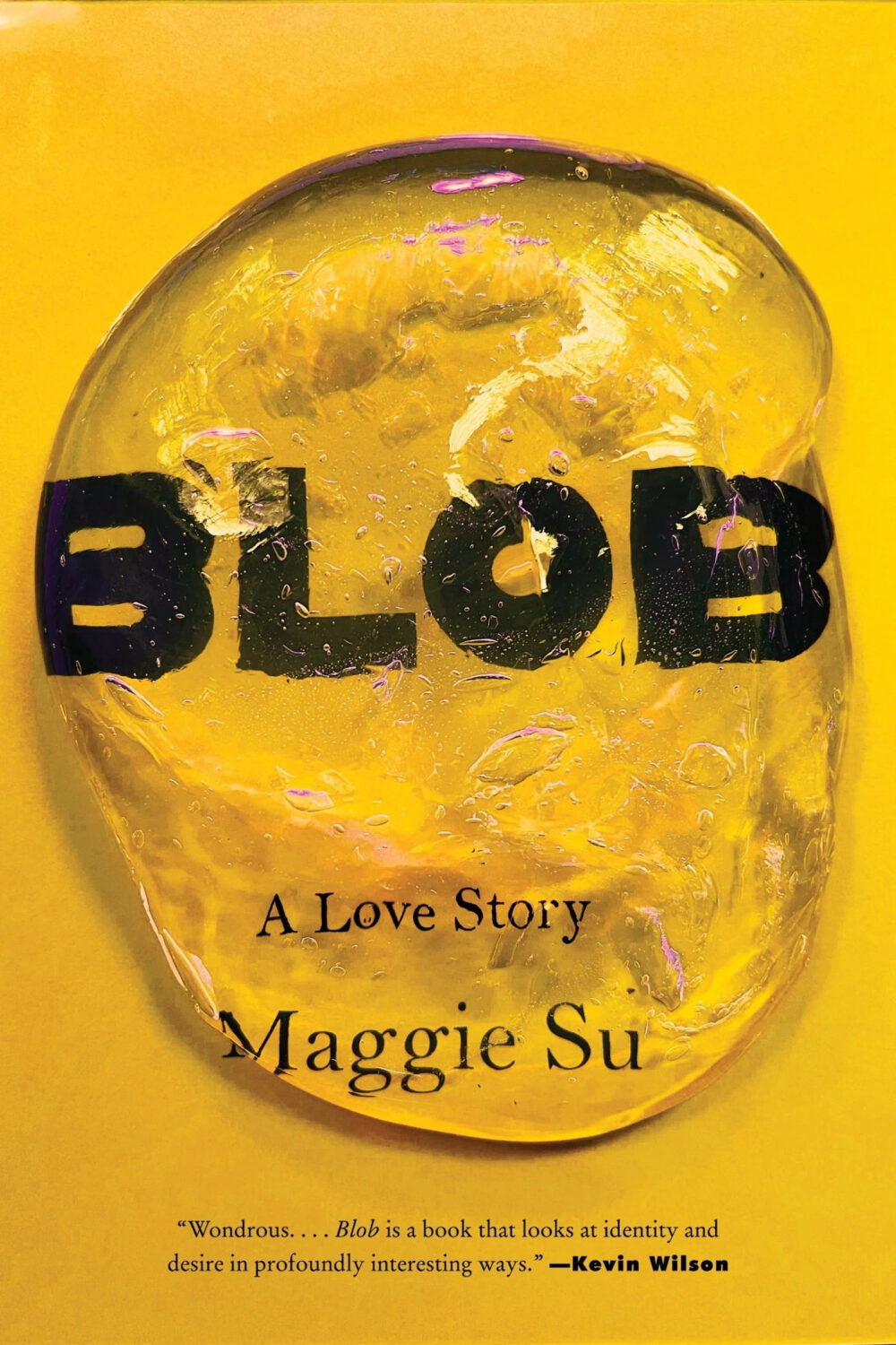
A lot was made of “blob” covers this year. I’m not sure that anything has really changed since Vulture published this article about “blocky” covers in 2019. They seemed like much the same thing.
Design is about the constraints and, as it turns out, the constraints around designing commercial literary fiction covers that have to work just as well online as in bookstores can lead to similar design solutions — large, legible type, and bright, abstract backgrounds. 2 The surprising thing is not that a few covers look the same when you squint; it’s that more of them don’t.
There were a lot of good covers (that didn’t look alike) in 2021. LitHub posted 101 of them. Still, it didn’t exactly feel like a vintage year.
Do I say that every December? Possibly.
A few years ago I worried that covers were moving in a more conservative direction, particularly at the big publishers. I’m not sure this has come to pass, at least not in the US. There are plenty of covers from the big, prestigious American literary imprints in this year’s list, as there were last year, and every year before that.
There are fewer covers from the UK in this year’s list than in previous years though, and I feel less confident about the situation there. From a distance, things seem a little sedate. I may be mistaken. It’s quite possible I haven’t see enough covers — or perhaps enough of the right ones — from British publishers to get a good sense of the overall picture.3
It would not be a surprise, however, if publishers were feeling a little risk-averse at the moment. We are two years into a global pandemic, experiencing a major supply chain issues, and living through a seemingly endless series of sociopolitical crises.
Nor would it be a surprise if designers were personally feeling the effects too — I’m not sure we are talking about this enough, and I’m not sure I know how to.
Thank you to everyone who has supported the blog in 2021. It means a lot. Here are this year’s book covers of note…
Na Kim talked to PRINT about her career and the designs for the Ditlevsen series in February. If, like me, you were wondering about typeface on the covers, it’s Prophet from Dinamo apparently.
If you’re wondering about the Super-Seventies Sally Rooney typeface, it is Ronda designed by Herb Lubalin and Tom Carnese (I only know because I asked).
Thank you to everyone who has supported the blog in 2021. It means a lot.
I am not convinced that the term “postmodern” quite captures what I mean here (and/or worse, implies something different in the context of typography), but it’s the best I’ve got. I’m not talking about the kind of experimental typography you might associate with the likes of Wim Crouwel or Emigre, or the aesthetic of someone like David Carson. What I am trying to get at is idiosyncratic type that purposely exaggerates or plays with letterforms, and doesn’t conform to function-first modernism. To my mind, this would include some typefaces from the 1960s and 70s, as well as some more contemporary type. In a sense what I am describing is display faces — and I think the eclectic, innovative use of type in Victorian advertising might be an inspiration to designers here — but I don’t think it is just about size. ↩
This will be the last of the monthly cover round-ups for 2021 because I have to turn my attention to the year as a whole, but there are some really top-notch covers in this month’s post so it feels like a good place leave off…
The cover of the UK edition, publishing next year I believe, was designed by Jack Smyth:
Jacket Weather by Mike DeCapite; design by Michael Salu (Soft Skull / October 2021)
I was reminded of the cover of The Empty Chair by Bruce Wagner designed by Gregg Kulick from what seems like an age ago (2013 I think?) . It’s very possible I have been doing this for too long…
A bit of a bumper post this month with a ton great covers, lots of old friends, a couple of designers that are new to me, and maybe an early contender (or two) for the ‘best of the year’ list.
I haven’t posted enough of David’s covers lately. They are always fun. I was struggling to think what this one reminded me of. I’m wondering if it’s maybe Raymond Hawkey’s black and white cover designs for Len Deighton? Or something from Pelican / Penguin in the 1970s?
Come On Up by Jordi Nopca; design by Roman Muradov (Bellevue Literary Press / February 2021)
The cover of the UK edition, published this month by Bloomsbury, was designed by Greg Heinimann.
Rachel Willey’s design for Patricia Lockwood’s memoir Priestdaddy is still one of my favourite covers of recent years (hard to believe it is from 2017!).
O by Steven Carroll; design by Gray318 (HarperCollins Australia / February 2021)
What would you call this background colour? Light brown? Dark beige? Anyway, it seems to be a thing. We could probably include As You Were cover here too, although it doesn’t have the red-orange accent colour.
The Witch’s Heart by Genevieve Gornichec; design by Adam Auerbach (Ace Books / February 2021)
I didn’t blog much this year. It felt strange to be posting about something as trivial as book covers during a deadly pandemic. 2020 has been a tough year. I feel lucky that my family are safe and well, and I have kept my job and my health. I know others have not been so fortunate.
It has been hard.
I haven’t read much and I’ve struggled to keep track of new work. Toronto has been in lockdown for most of 2020. Browsing bookstores hasn’t been possible, and I didn’t spend as much time as usual trawling for covers online. Perhaps unsurprisingly, a lot of covers in this year’s post are featured here for the first time.
Looking back at last year’s post, I was apparently feeling gloomy about the state of things in 2019 too.1 If I remember correctly, I was — in the midst of everything — trying to get through sales conference, wrap up a big project before the holidays, and feeling more than a little stressed. Somehow I still managed to write a little bit about the trends I was seeing. A few things — painterly covers for example — seem to have continued into 2020. Lydian certainly hasn’t gone away. It felt so common, in fact, I stopped keeping track of individual examples. On the other hand, I did see less Avant Garde for which I am quietly grateful (although I’m not sure that’s a popular sentiment).
At The Literary Hub, Emily Temple declared 2020 to be “the year of enormous pink lady faces on book covers.” While at Spine Magazine, Viki Hendy collected together examples of covers with type around the edges. I don’t know that I have a lot to add that. There were a few new meta, books on book covers this year, which is always a delight. And I think perhaps collage might be having a moment too, which is fun. Although we may be overdoing the half-face compositions.
Suppose A Sentence by Brian Dillon; design by Katy Homans; art by John Stezaker (NYRB / September 2020)
The Lightness by Emily Temple; design by Ploy Siripant; art by Beth Hoeckel (William Morrow / June 2020)
There is, of course, a lag. Trends always bleed over from one year to the next. One of this year’s “big books”, Such a Fun Age by Kiley Reid, which featured a bright and bold cover designed by Vi-An Nguyen, was published in the US on December 31, 2019. A lot of 2020 books have been delayed until 2021. But I wonder how the changes in the way we work and consume brought on by the pandemic — designing in isolation for an audience that is now browsing predominantly online — will change things in the next couple of years. Will we see more experimentation or less? Will there be demand for beautiful tactile objects, or will we more fully embrace digital reading experiences? There’s a lot to ponder…
Anyway, thanks to all the folks who have supported the Casual Op this year and encouraged me to keep it going. I’m sorry that I have not responded to all the emails I have received. I’m going to try to be a bit better with that in future. Hopefully there have been some silver linings for you in 2020, and you can still find some joy in a few good book covers…
Afterland by Lauren Beukes; design by Lauren Wakefield (Penguin / July 2020)
Also designed by Lauren Wakefield:
The Driftwood Girls by Mark Douglas-Home; design by Lauren Wakefield (Penguin / April 2020)
The Honey and the Sting by E. C. Freemantle; design by Lauren Wakefield (Penguin / September 2020)
We Are All the Same in the Dark by Julia Heaberlin; design by Lauren Wakefield (Penguin / August 2020)
Sadly, Adalis unexpectedly passed away in July 2020. I only knew Adalis through her work, but she is such a huge a loss to our community. There is a GoFundMe page if you wish to donate to her family.
Also designed by Adalis Martinez:
losi by Molly Ball; design by Adalis Martinez (Henry Holt & Co / May 2020)
Dominicana by Angie Cruz’ design by Adalis Martinez (Flatiron / August 2020)
Love is an Ex-Country by Randa Jarrar; design by Adalis Martinez (Catapult / February 2021)
You can find a short interview with John in which he discusses his cover for Red Pill at Bear Books, and you can read about his design process for Weather by Jenny Offill at Spine Magazine.


