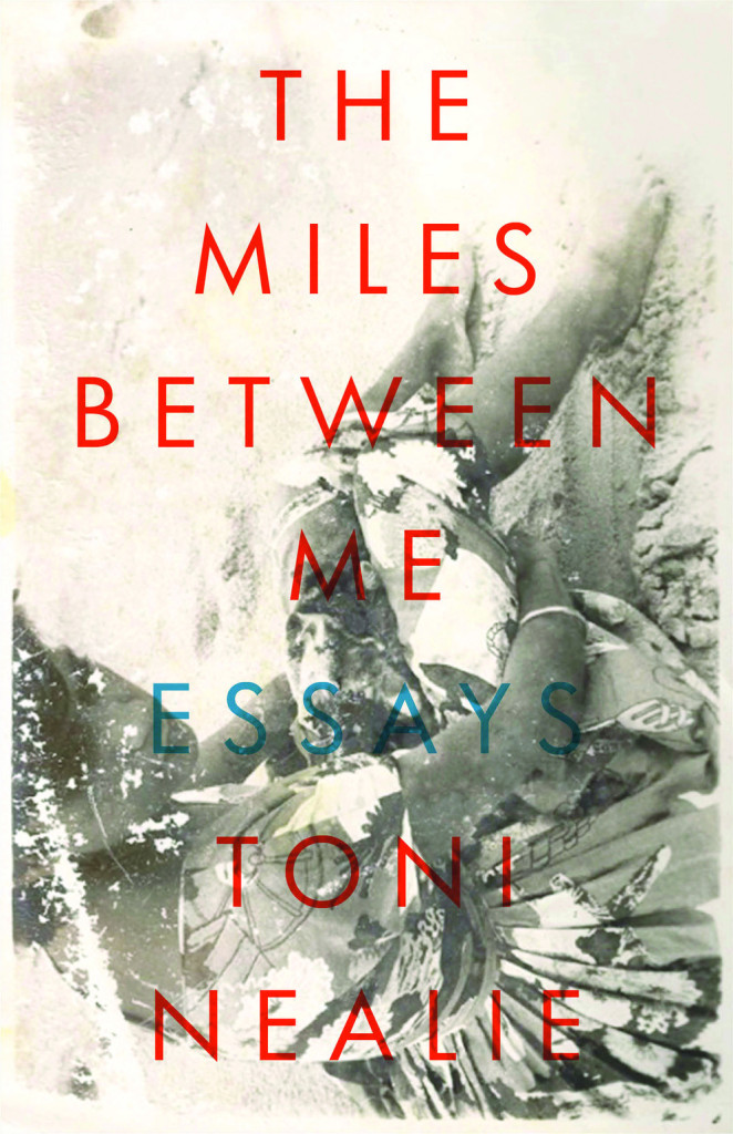
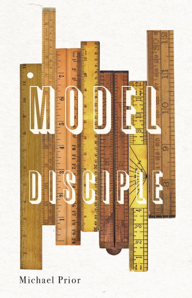
It’s almost the first day of spring, the snow and ice have just about melted in Toronto (for now!), and everything is still awful, so it must be time for March’s book covers of note!
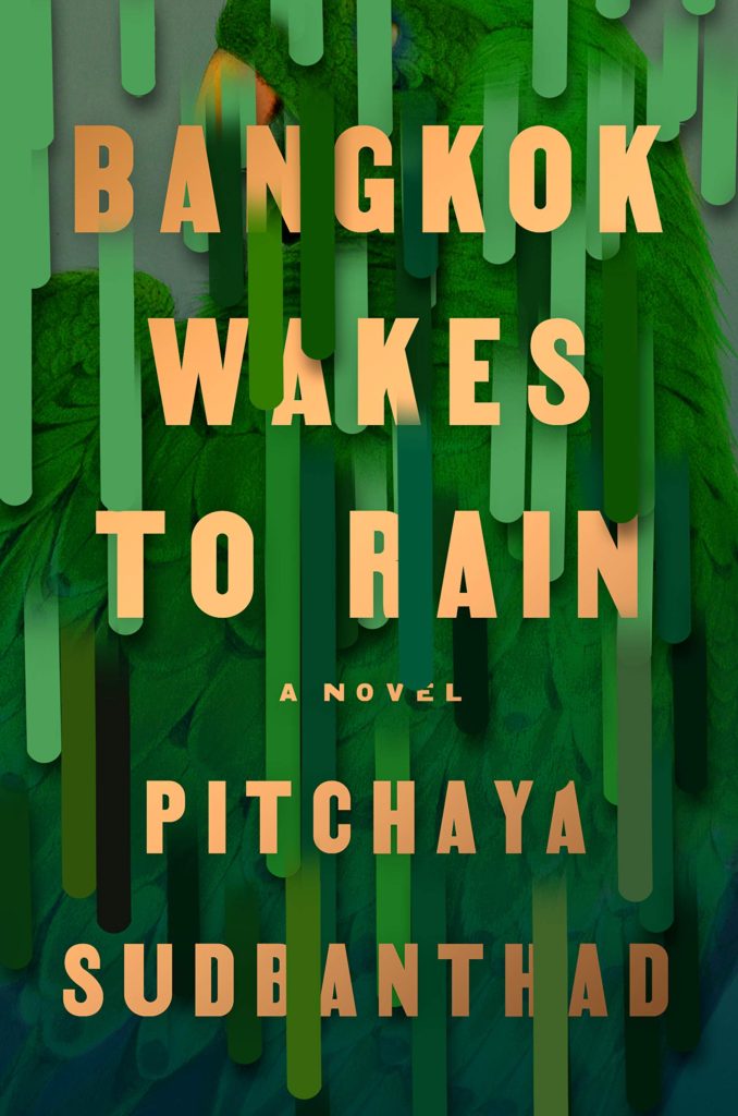
Bangkok Wakes to Rain by Pitchaya Sudbanthad; design by Grace Han (Riverhead / February 2019)
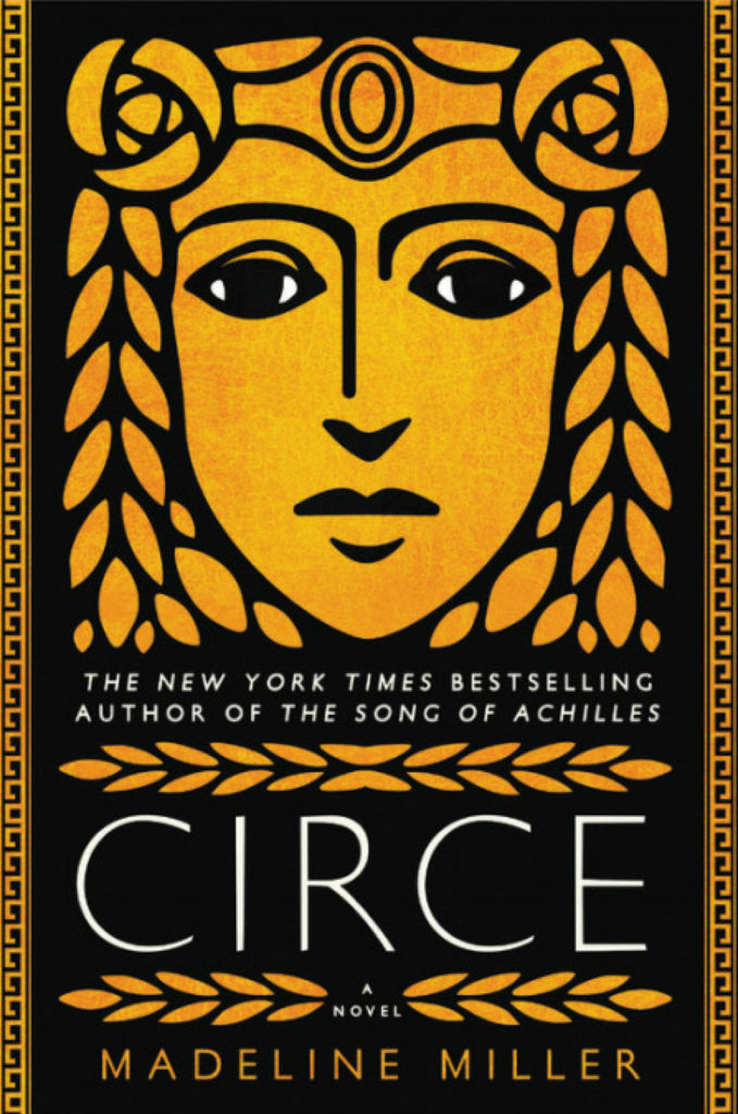
This is the Turkish edition of Men in Space by Tom McCarthy. I like how the composition and colour palette echo the cover of the US edition published by Vintage, designed by John Gall:
It also reminds of the golden leaf cover for ‘True Faith’ by New Order designed by Peter Saville.
The Cook by Maylis de Kerangal; design by Na Kim (Farrar, Straus & Giroux / March 2019)
(I feel like a Freudian could have a field day with this cover.)
The cover of the US edition published by Ballantine (I couldn’t find an image without the book club sticker… sorry), was designed by Caroline Teagle Johnson. The book is getting a lot of buzz so I’ve seen both versions of the cover a lot online. It’s a pretty striking photo. I’m curious about where it came from…
Daisy Jones and The Six by Taylor Jenkins Reid; design by Lauren Wakefield (Hutchinson / March 2019)
Daisy Jones and The Six by Taylor Jenkins Reid; design by Caroline Teagle Johnson (Ballantine / March 2019)
This is my last monthly round-up for 2018. Next month I’ll post my round-up for the year. I have to confess that I have not given the blog 100% of my attention of late, so if you think that there are covers I might’ve overlooked this year please feel to send them my way for consideration.
The blackletter is similar, I believe, to the type used for the movie title / credits, and the chevrons are a nice reference to a design that appears in the movie. The Guardian reviewed the book last month if you are curious. (And someone in the UK needs to buy it for me as a Christmas present!)
Usually I’m a bit reluctant to post the covers of celebrity books, but this is pretty great.
Celebrity book covers are often look beautiful — the recent memoirs by Sally Fields and Michelle Obama come to mind — but often that’s because of a glamourous photograph. The designer’s job is just to get out of the way. That makes sense from a marketing point of view, it’s just not terribly interesting from a design perspective. This feels like it has a bit more to it somehow. Or maybe it’s just more fun…
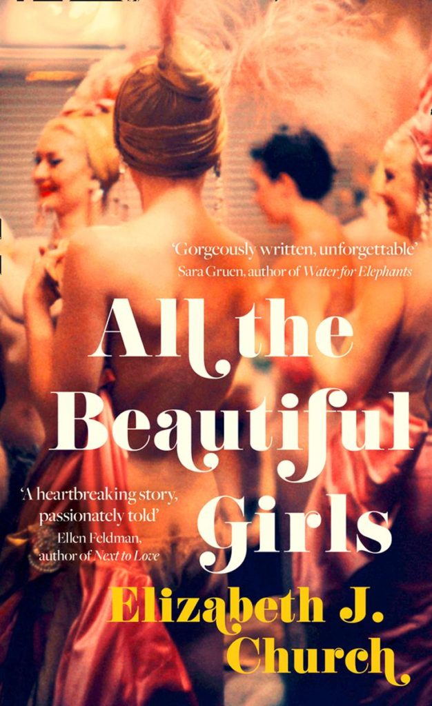
That all said, I have started to see this kind of swashy retro type pop-up more frequently of late. A couple of recent examples that come to mind are the covers of All the Beautiful Girls by Elizabeth J. Church, designed by Anna Morrison (Fourth Estate), and The Dakota Winters by Tom Barbash designed by Allison Saltzman (Ecco):
I would guess the fonts are Bodoni or variants thereof, but no doubt someone with a better eye for type will be able to tell us for sure.
UPDATE: Anna Morrison tells me the font she used for All the Beautiful Girls is Cabernet, which just goes to show what I know. According to the ever-useful Fonts in Use, Cabernet is “an uncredited revival of Benguiat Caslon, a 1970s Photo-Lettering typeface by Ed Benguiat.” I’m pretty sure Benguiat Caslon was used for the iconic Philip Roth covers in the 1970s so I probably should’ve recognized it…
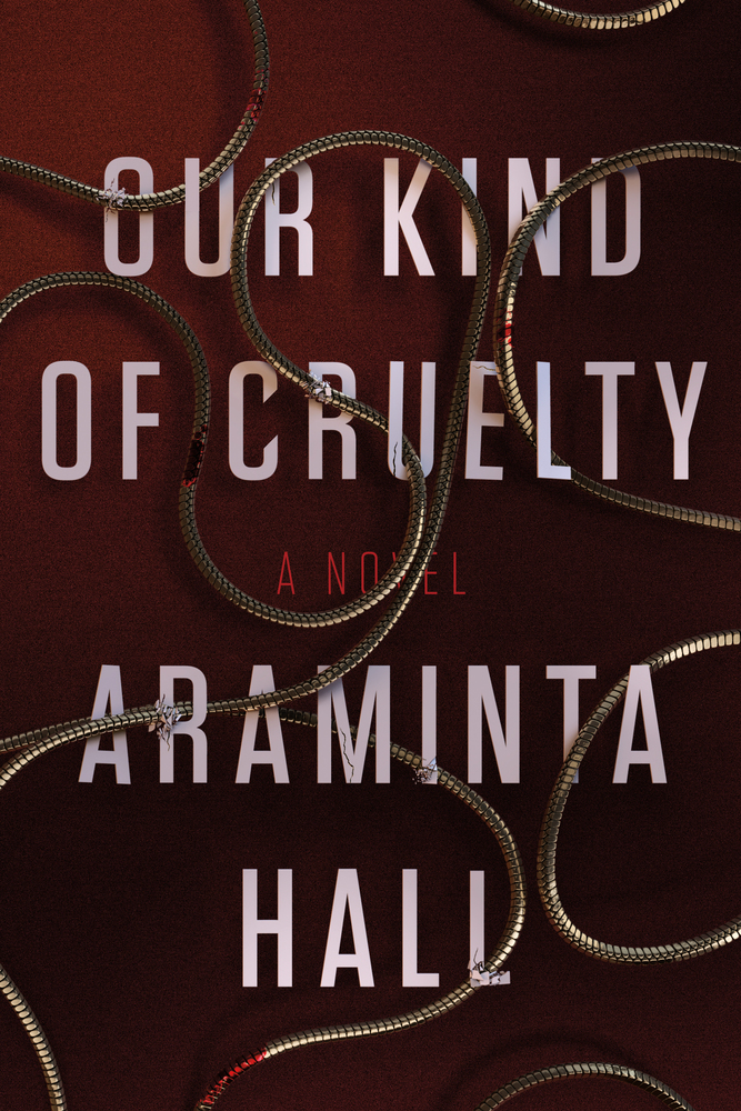
I had it in my mind that snaky red covers with big white type were very “in” for thrillers right now, but the only other example I could think of was the US cover for Our Kind of Cruelty by Araminta Hall designed by Alex Merto, which is really not that similar…
I feel like I should at least try to collect some of the best political covers from the past year or so together into a post at some point. On the other hand, I really don’t want to…
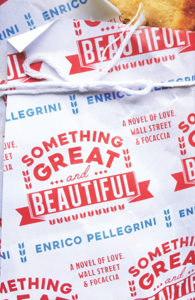
I’m not entirely sure why, but cover of Something Great and Beautiful brought to mind the 2014 cover of the UK edition of The Empathy Exams by Leslie Jamison, designed by Tom Darracott for Granta. They’re really not that similar, and yet…
Son of Amity by Peter Nathaniel Malae; design by David Drummond (Oregon State University Press / October 2018)
Thanks to a combination of disk storage issues, the AUPresses Book, Jacket, and Journal Show, breaking my wrist, general anxiety, and utter despair at the latest round of horror, corruption and lies to the south, this month’s covers post is…well, late. Fuck it. Donate to a good cause. 1
Aroused by Randi Hutter Epstein; design Zoe Norvell (W.W. Norton / June 2018)
There have been a number of covers making use of work by famous photographers in recent months. I think the risk of this approach is that the image overwhelms the text. If the photograph is so important, perhaps it is better to just to get out of the way and let it speak for itself? (If, ahem, the ‘interested parties’ will let you, of course!)
The cover for the US edition, published by Henry Holt, was designed by Nicolette Seeback. For me, it’s made by the cat wrapping around the spine onto the back cover. Listing the ten arguments on the back is also a really nice touch.
The Canadian edition, published by Knopf Canada and designed by Leah Springate, takes a photographic approach. I think it’s a good example of how the Canadian market can be quite different from the UK (and the US)…
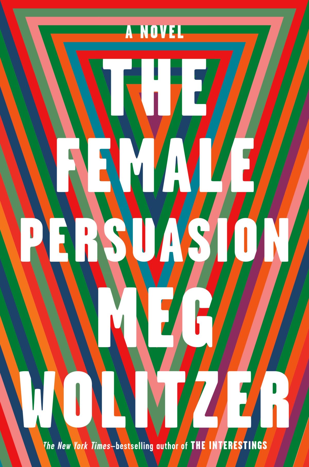
I like how the design for The Female Persuasion has bands of colour similar to those on Lynn Buckley’s cover design for The Interestings, but uses them in a completely different way…
Patient X by David Peace; design by Luke Bird (Faber & Faber / April 2018)
And on the subject of David Peace, Steve Panton has designed new covers for the Red Riding Quartet (1974, 1977, 1980 and 1983) published by Serpent’s Tail this month:
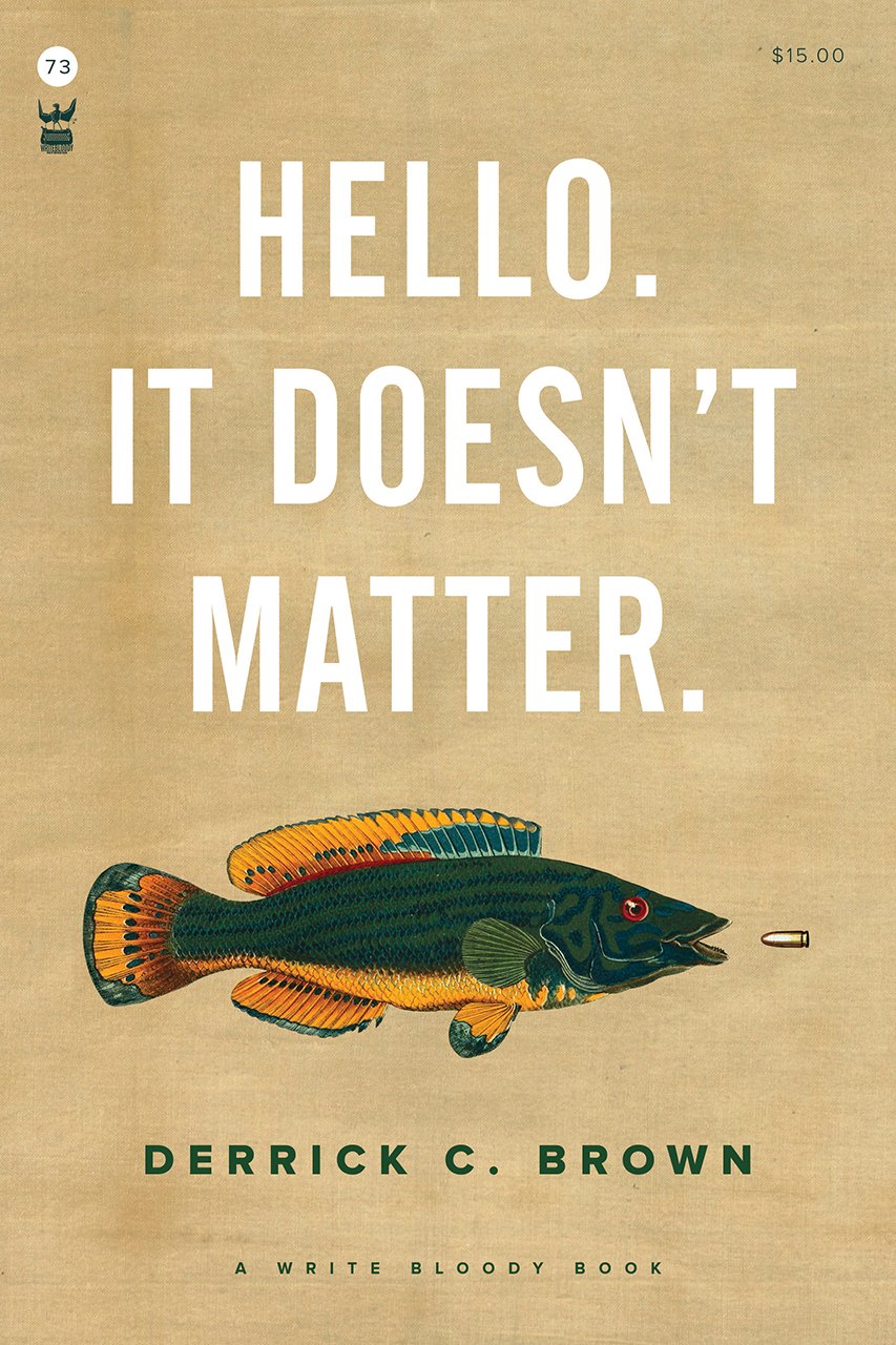
Funnily enough, I was just discussing the prevalence of big and centred white sans serif type on contemporary book covers on Twitter. While it’s common (see the covers of The Female Persuasion and Hello, It Doesn’t Matter above!), it’s also effective when it’s done well. That said I did think that David Pearson — a designer well known for his typographic covers — made a good general point about big type:
The idea that legibility is enhanced by big type is so flawed. Big type surrounded by busyness is often no more legible than small type surrounded by space. Perhaps it is the space that people are scared of. Our idiot eyes might look at the wrong part of the cover.
Lots to see this month, including several YA covers (which I know will please some regular readers), some ‘big’ literary fiction, and a couple of confrontational nonfiction covers to round it out. Enjoy!
Aetherial Worlds by Tatyana Tolstaya; design by Stephanie Ross (Knopf / March 2018)
Although it pains me a little to say it, I think Amazon’s ‘book club’ imprint Lake Union are doing an impressive job commissioning appealing covers for their intended market. I would be interested to hear about the process from designers who’ve worked with them.
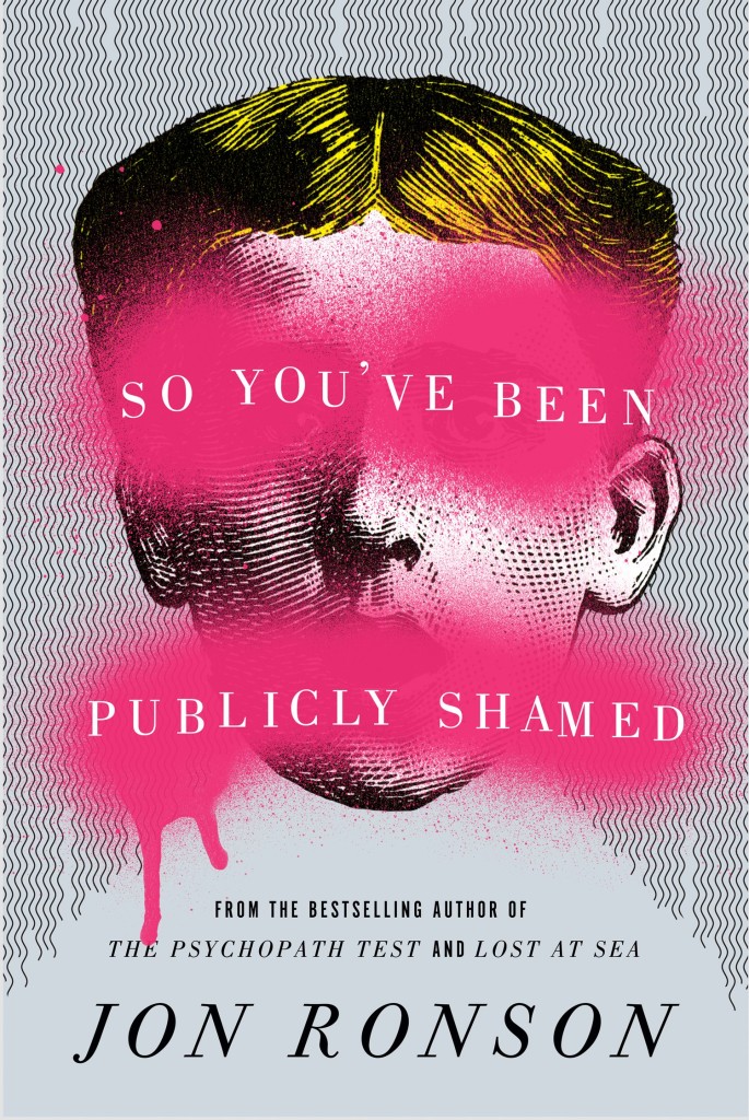
I like this cover very much–especially the type. The illustration and colour combination remind me of Matt Dorfman’s 2011 cover for The Pyschopath Test by Jon Ronson (Riverhead):
It’s interesting to see the UK publisher go in such a different direction from the US cover (designed and illustrated by Sandra Chiu) which, as I noted back in January, seems very on trend internationally to me.
I felt like this cover might be a little too much when I first saw it online, but I bet it will look absolutely stunning in print and piled up on tables.
For reference, I have a pinboard of contemporary covers that make use of Lydian, the typeface used here. It was designed for American Type Founders by Warren Chappell in 1938, and it’s very distinctive (those ‘R’s!), so it’s interesting to me that it suddenly has this kind of cult popularity.
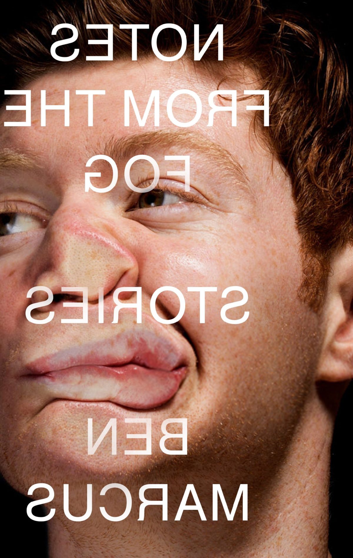
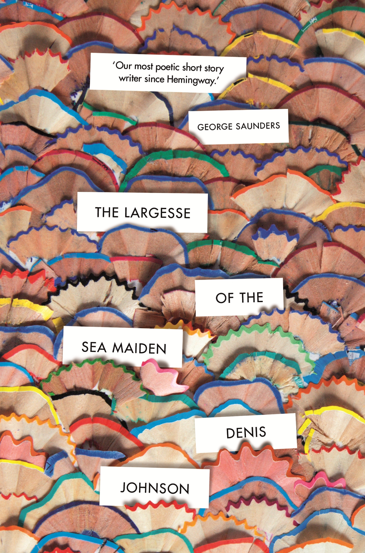
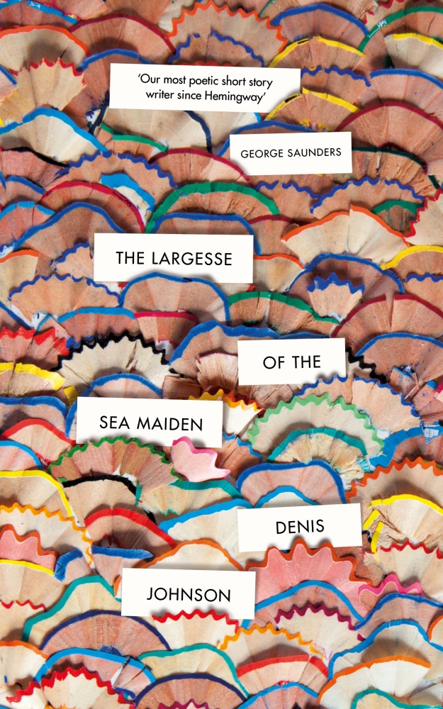
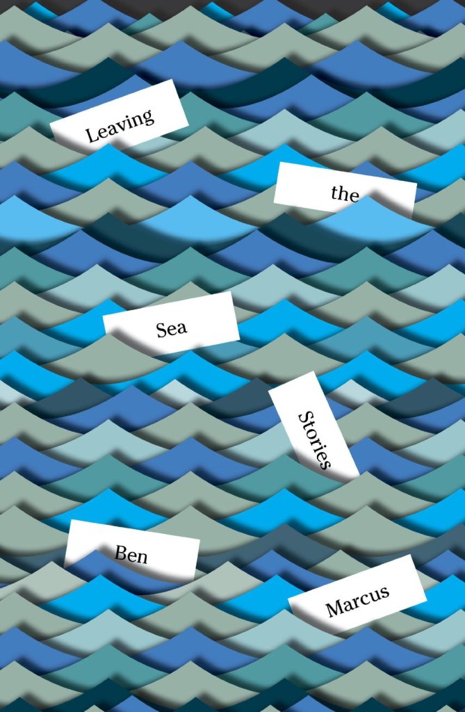
The pencil shavings are delightful of course, but I did immediately think of Peter Mendelsund‘s covers for Leaving the Sea (2014) and The Flame Alphabet (2012) by Ben Marcus.
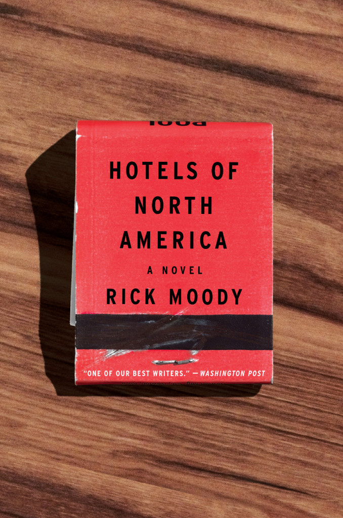
Can anyone tell me if there is a term for this kind of semi dust jacket? It seems like more than just a belly band.
The upside-down ‘POLICE’ shield is an interesting decision. It gives the illustration a kind of authenticity (I assume it is based on an actual example), but it also subtly implies something about the contents of the book (as does the not so subtle decision to show a police officer in riot gear rather than more approachable attire!).
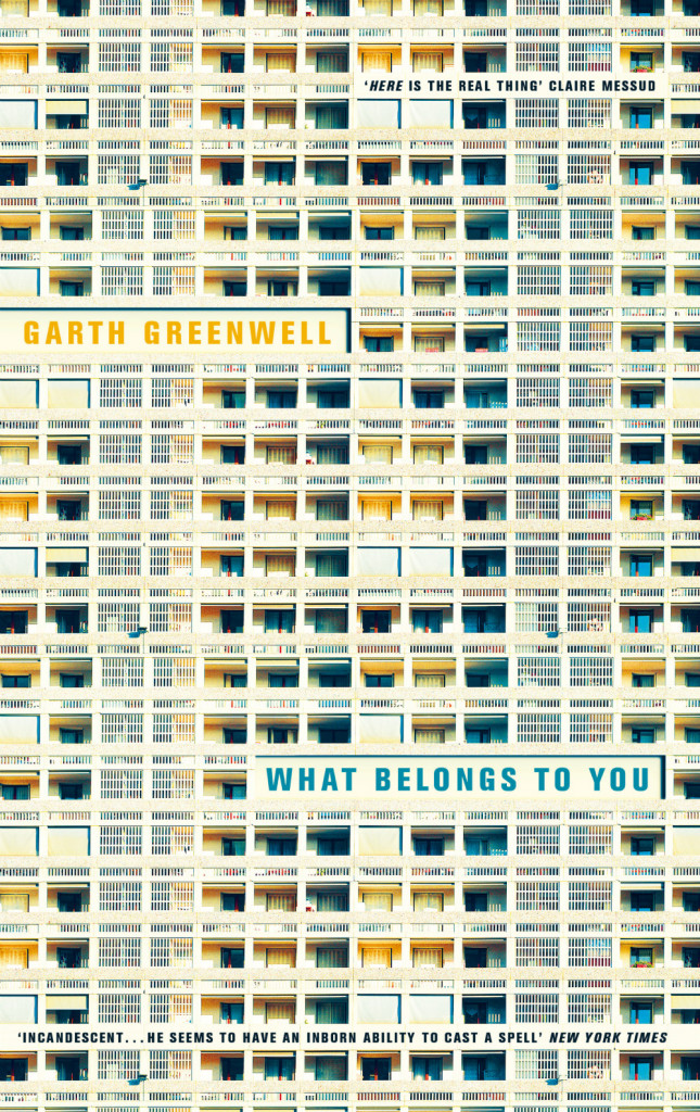
What Belongs to You by Garth Greenwell; design by Justine Anweiler (Picador / April 2016)
This is a variant on the cover of the US edition from FSG designed by Jennifer Carrow, which is also very nice (especially the zig-zag of the type), but I especially like the Andreas Gursky-like edge-to-edge grid and hyper-real colour of the UK edition.
What Belongs to You by Garth Greenwell; design by Justine Anweiler (Picador / April 2016)
Back in 2014, there were signs that book cover design was maybe, just maybe, having a moment. Suzanne Dean was on the BBC. Peter Mendelsund was on… well, everything. But if 2015 has felt a little quiet by comparison, there were still plenty of reasons to be cheerful. This year’s list includes over 120 covers by 60 designers, and there is little doubt in my mind that this really is a golden time for book design.
Thank you to all the art directors, designers, and publicists who have supported the blog this year, and who make posts like this possible. Thanks too, to my local bookstore TYPE for letting me browse their shelves.
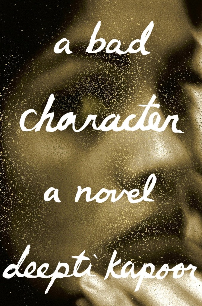
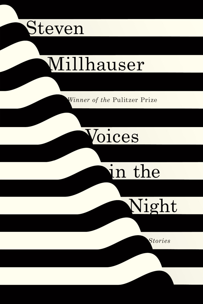
A Bad Character by Deepti Kapoor; design by Janet Hansen (Knopf / January 2015)Voices in the Night by Steven Millhauser; design by Janet Hansen (Knopf / April 2015)Empire of the Senses by Alexis Landau; design by Janet Hansen (Pantheon / March 2015)
(Oliver Munday’s cover design for the US edition of the Book of Numbers published by Random House is also great.)
Also designed by Suzanne Dean:
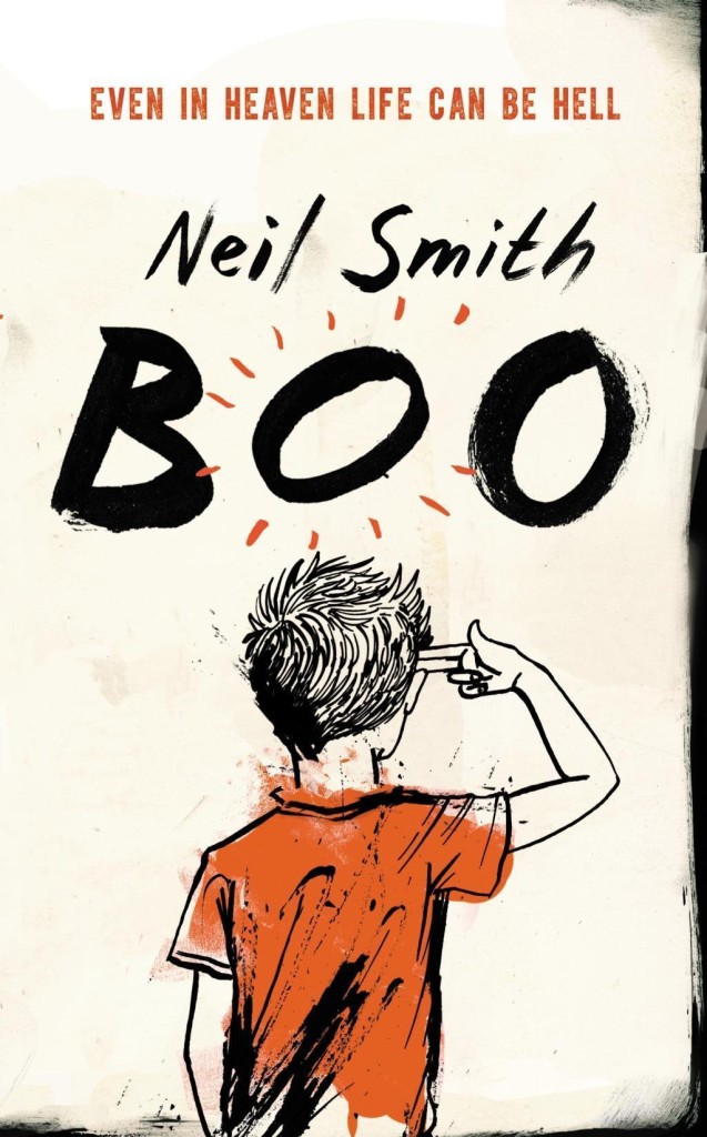
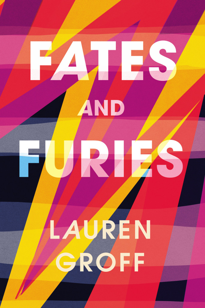
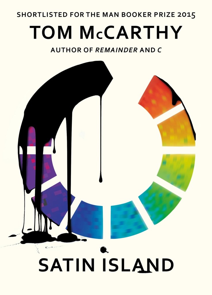
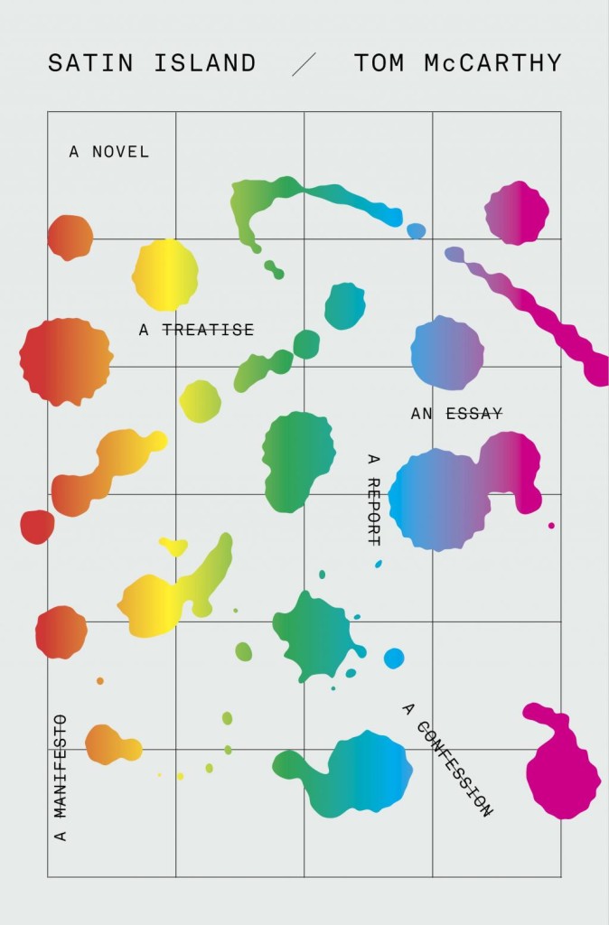
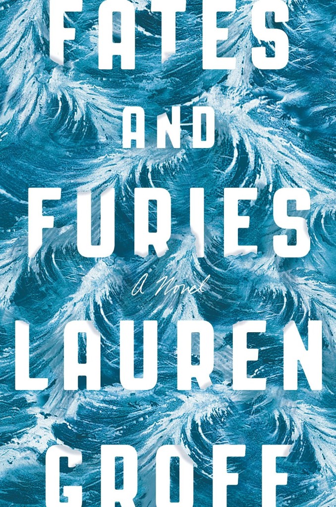
Boo by Neil Smith; design Suzanne Dean; illustration by Stephanie von Reiswitz (William Heinemann / May 2015)Fates and Furies by Lauren Groff; design by Suzanne Dean (William Heinemann / September 2015)Satin Island by Tom McCarthy; design by Suzanne Dean (Jonathan Cape / March 2015)
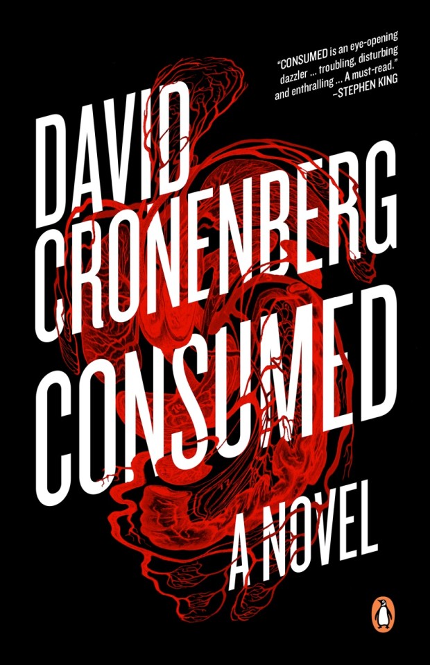
Consumed by David Cronenberg; design by David A. Gee (Penguin Canada / September 2015)Why the World Does Not Exist by Markus Gabriel; design by David Gee (Polity / June 2015)Economics After Capitalism by Derek Wall; design by David A. Gee (Pluto Press / July 2015)
Unabrow by Una Lamarche; design by Zoe Norvell (Plume / March 2015)Anything You Want by Derek Sivers; design by Zoe Norvell (Portfolio / September 2015)
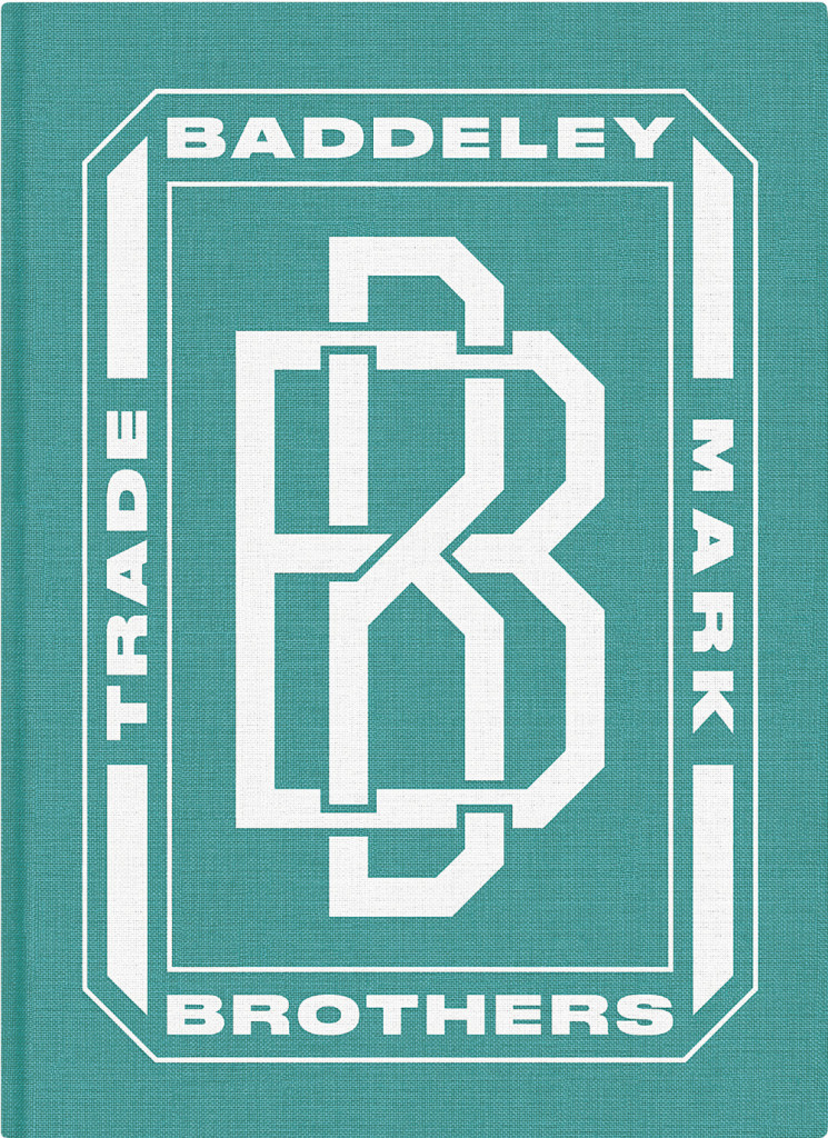
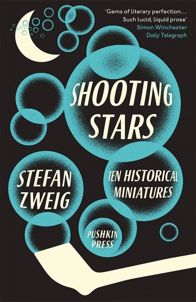
Karate Chop by Dorthe Nors; design by David Pearson (Pushkin Press / February 2015)Baddeley Brothers by The Gentle Author; design David Pearson (October 2015)Shooting Stars by Stefan Zweig; design by David Pearson (Pushkin Press / February 2015)
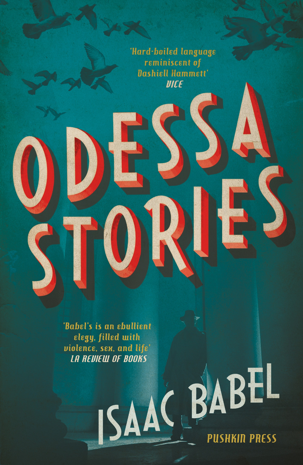
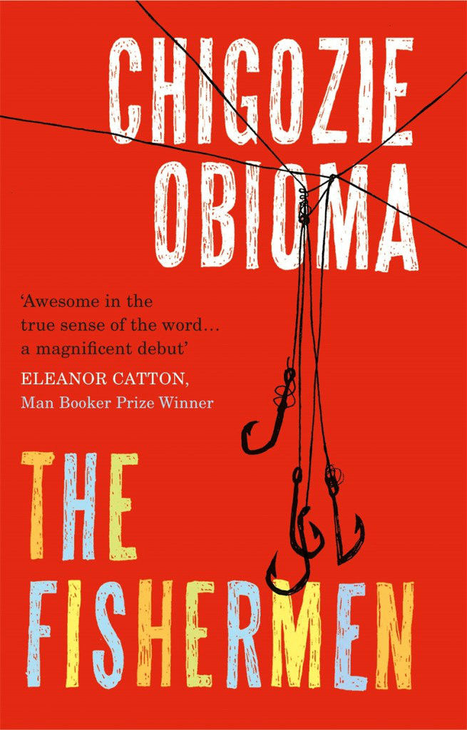
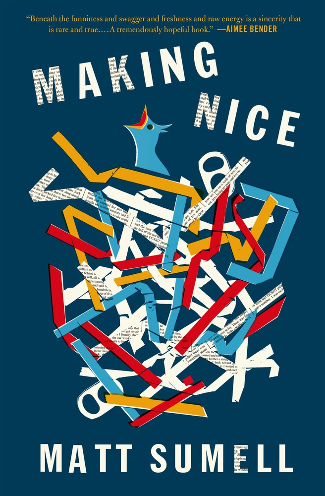
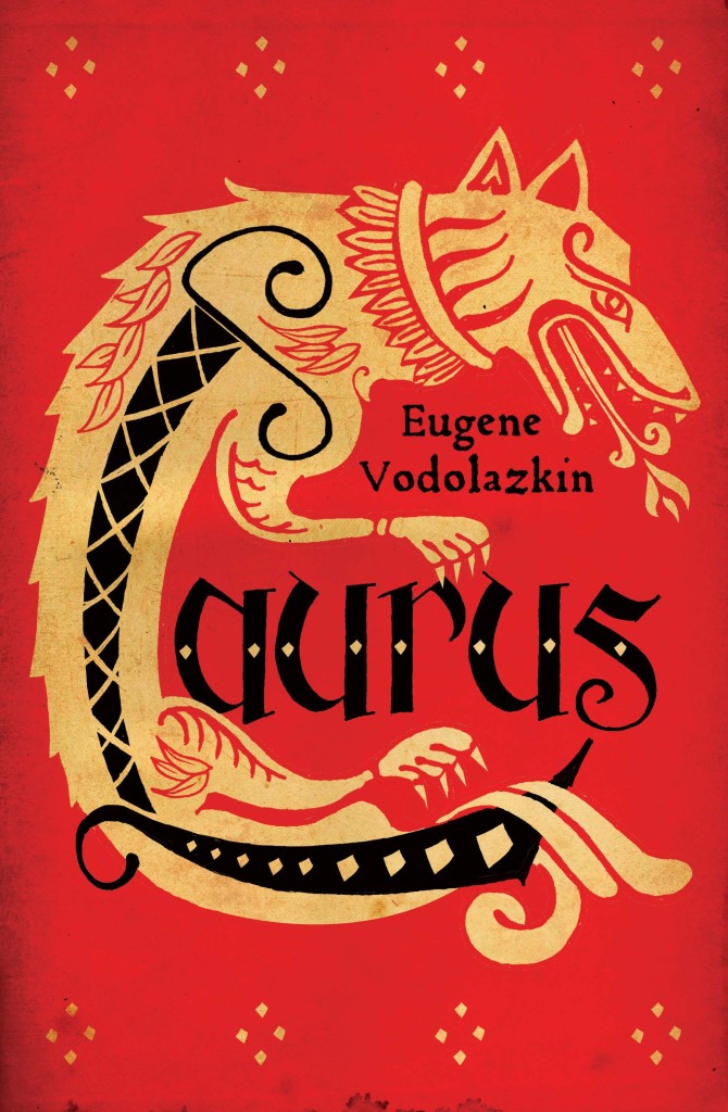
The Fishermen by Chigozie Obioma; design by Gray318 (Pushkin Press / February 2015)Making Nice by Matt Sumell; design by Gray318 (Henry Holt & Co. / February 2015)Laurus by Eugene Vodolazkin; design Gray318 (Oneworld / October 2015)
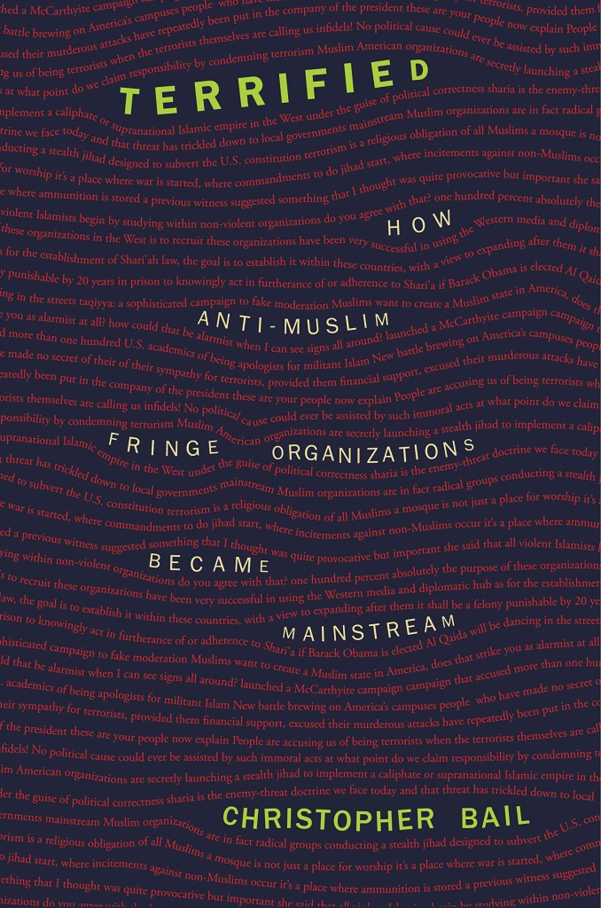
Terrified by Christopher A. Bail; design by Amanda Weiss (Princeton University Press / January 2015)The Little Big Number by Dirk Philipsen; design by Amanda Weiss ( Princeton University Press / June 2015)
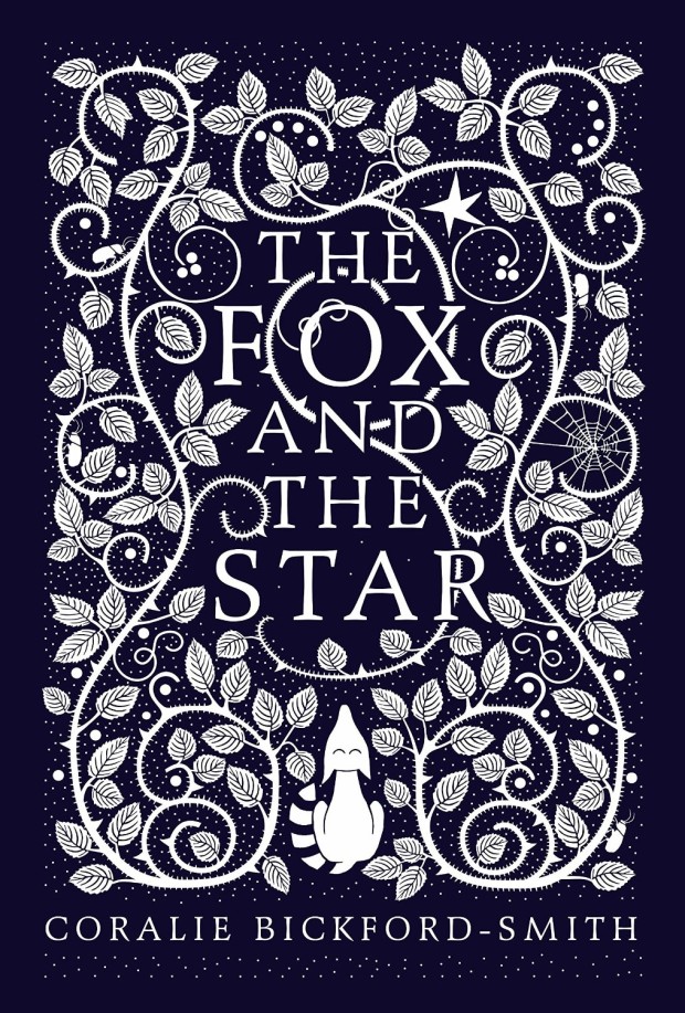
The Fox and the Star, written, illustrated and designed by Coralie Bickford-Smith (Particular Books / August 2015)
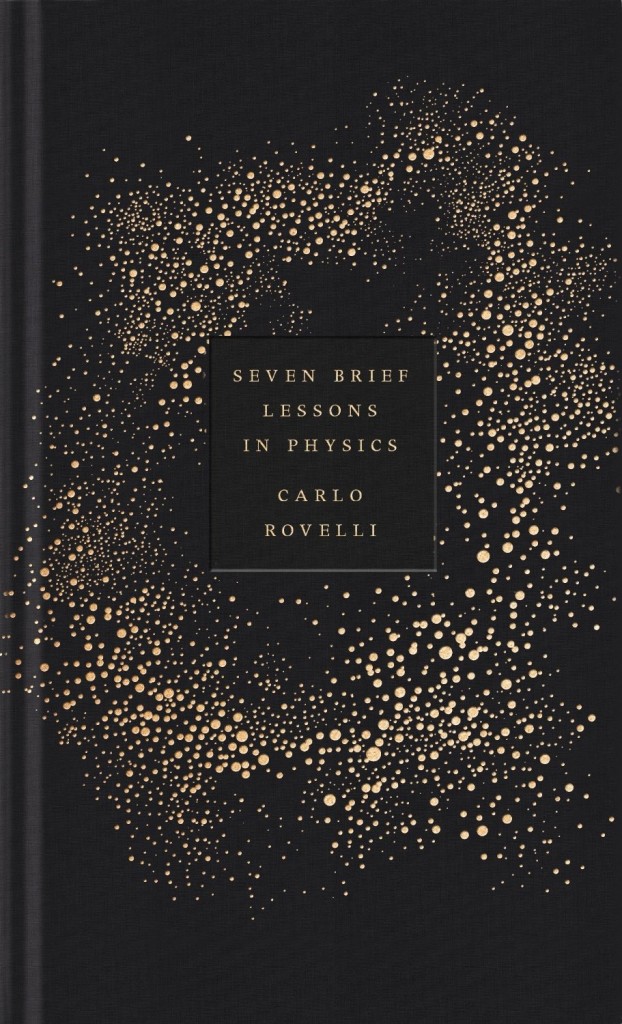
Also designed by Coralie Bickford-Smith:
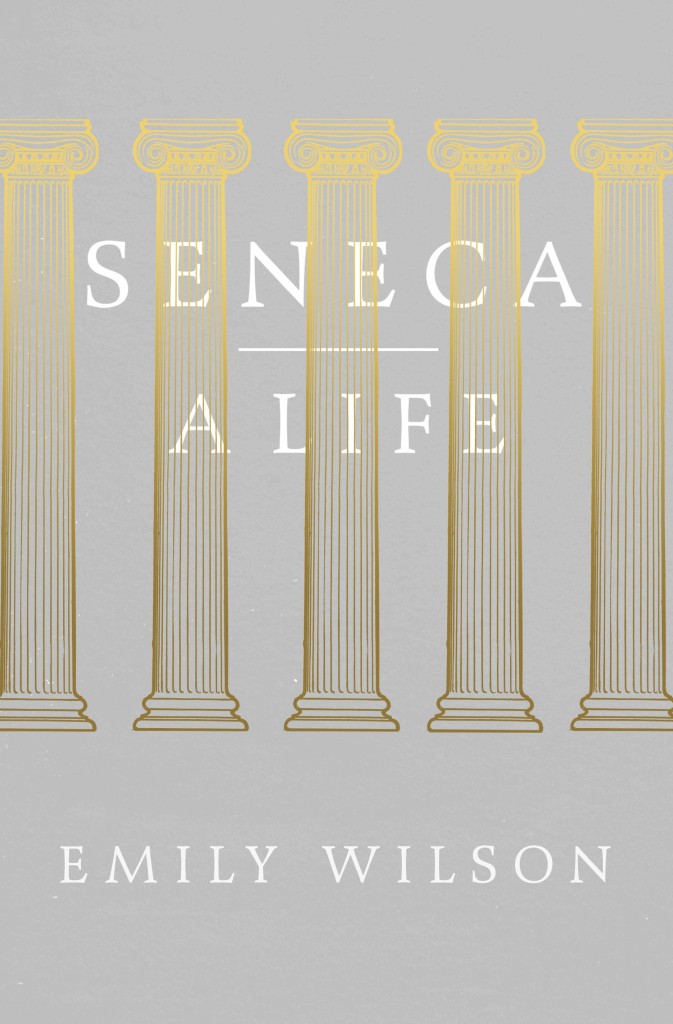
Seven Brief Lessons on Physics by Carlo Rovelli; design by Coralie Bickford-Smith (Allen Lane / September 2015)Seneca: A Life by Emily Wilson; design by Coralie Bickford-Smith (Allen Lane / March 2015)
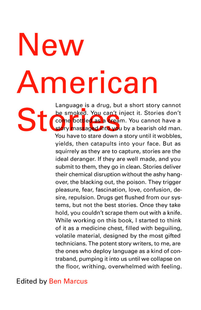
Satin Island by Tom McCarthy; design by Peter Mendelsund (Knopf / February 2015)New American Stories edited by Ben Marcus; design by Peter Mendelsund (Vintage / July 2015)Building Art: The Life and Work of Frank Gehry by Paul Goldberger; design by Peter Mendelsund (Knopf / September 2015)
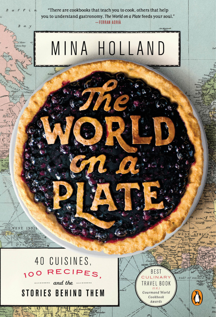
World on a Plate by Mina Holland; design by Nick Misani (Penguin / May 2015)
KL by Nikolaus Wachsmann; design by Alex Merto (Farrar, Straus & Giroux / April 2015)
Also designed by Alex Merto:
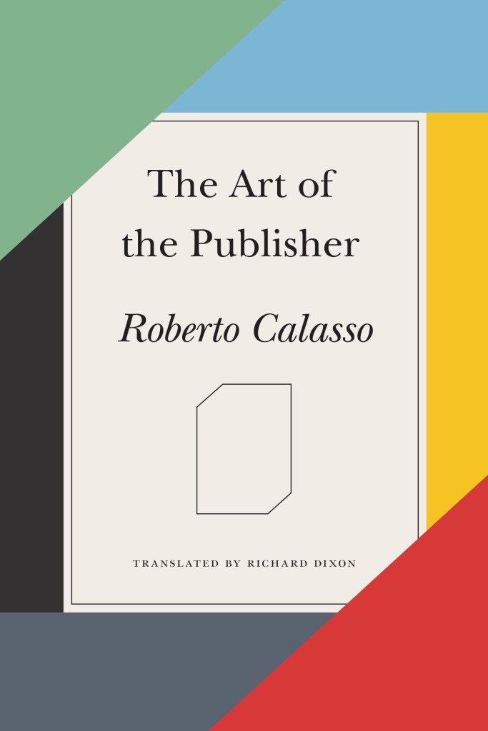
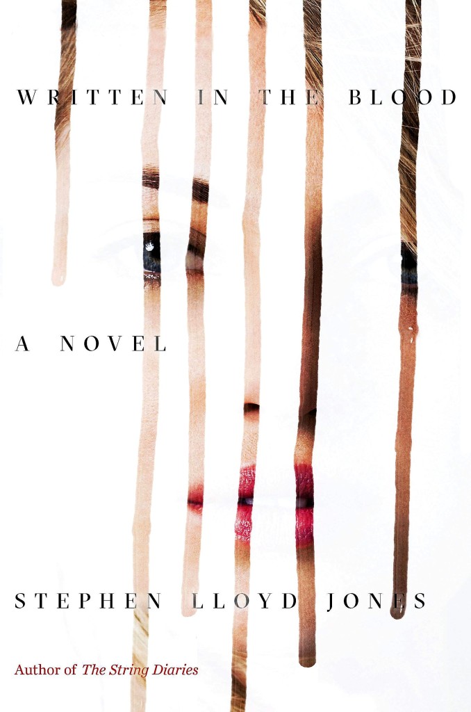
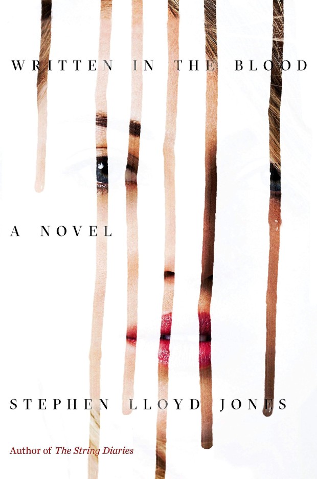
Earth by Hubert Krivine; design by Alex Merto (Verso Books / April 2015)The Art of the Publisher by Roberto Calasso; design by Alex Merto (FSG / November 2015)Written in the Blood by Stephen Lloyd Jones; design by Alex Merto (Mulholland Books / May 2015)
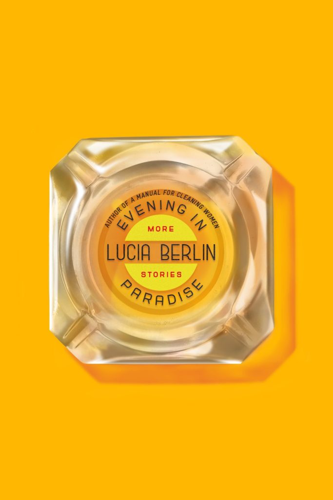
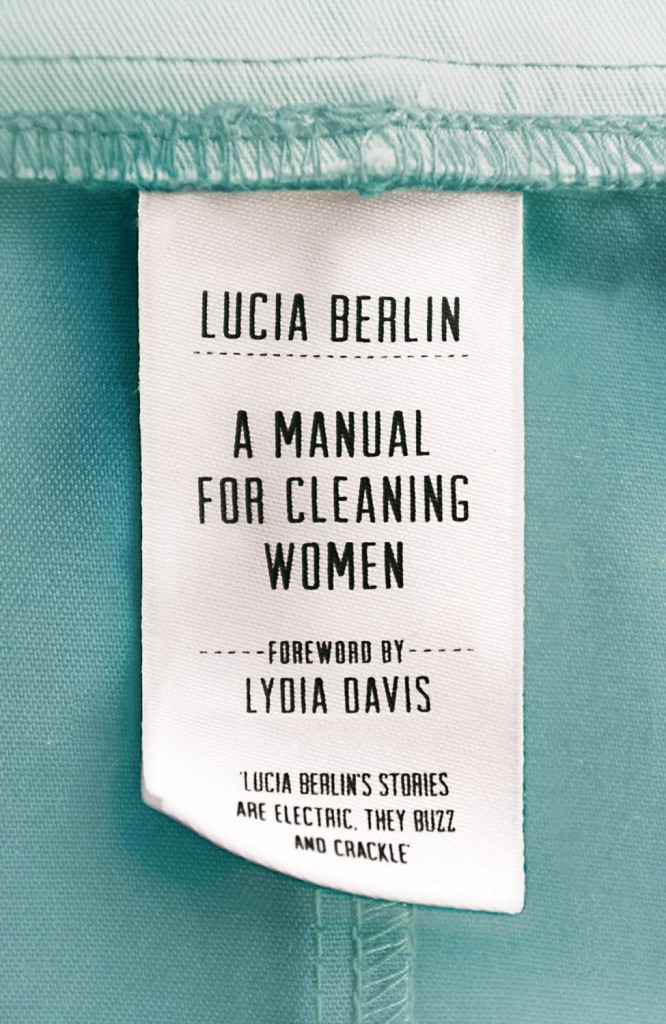
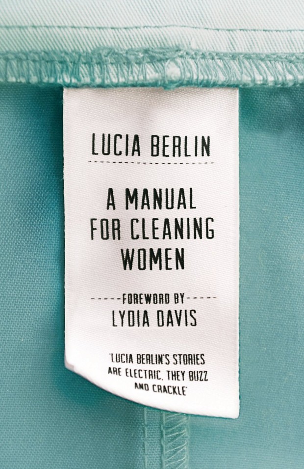
A Manual for Cleaning Women by Lucia Berlin; design by Justine Anweiler; photography Jonathan Simpson (Picador UK / September 2015)
Also designed by Justine Anweiler:
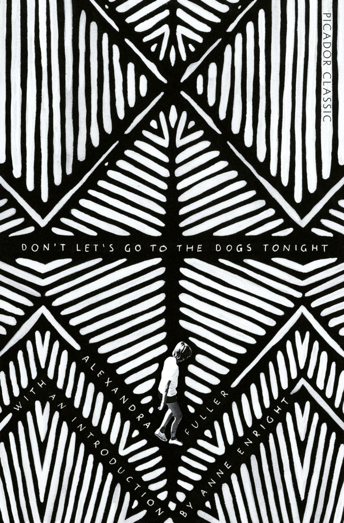
All This Has Nothing To Do With Me; design by Justine Anweiler; illustration Daphne van den HeuvelDon’t Let’s Go To the Dogs Tonight by Alexandra Fuller; design by Justine Anweiler (Picador / January 2015)
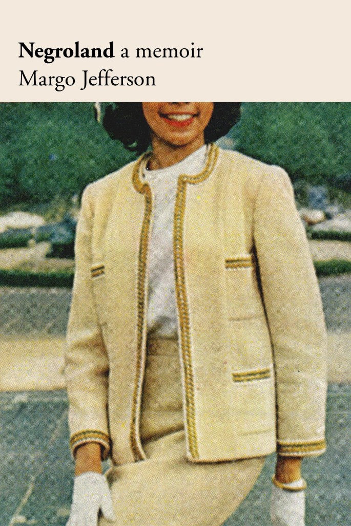
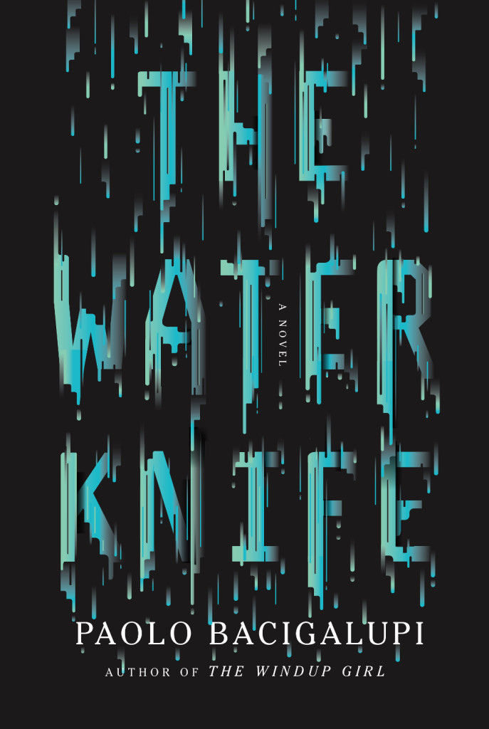
Negroland by Margo Jefferson; design by Oliver Munday (Pantheon / September 2015)American Warlord by Johnny Dwyer; design by Oliver Munday (Knopf / April 2015)The Water Knife by Paolo Bacigalupi; design by Oliver Munday (Knopf / May 2015)
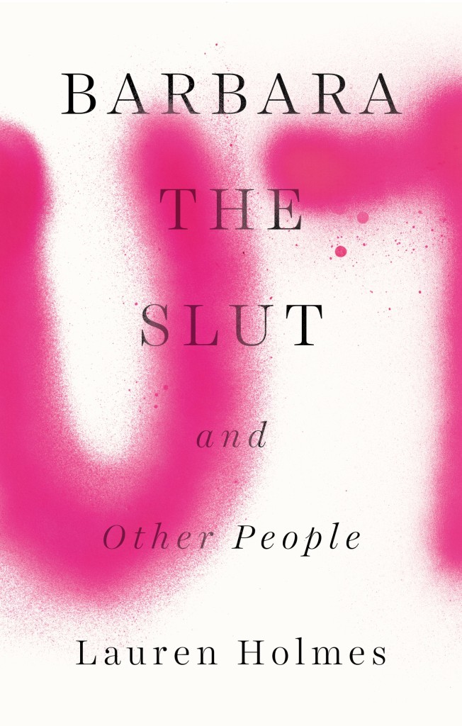
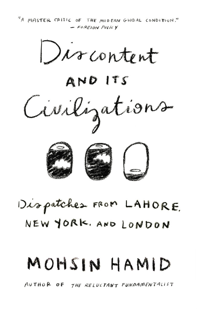
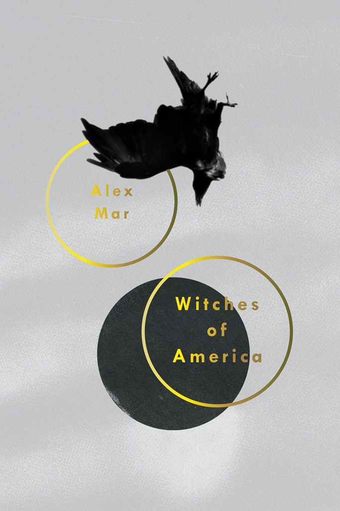
Barbara the Slut by Lauren Holmes; design by Rachel Willey (Riverhead / August 2015)Discontent and its Civilizations by Mohsin Hamid; design by Rachel Willey (Riverhead / February 2015)Witches of America by Alex Mar; design by Rachel Willey (Sarah Crichton Books / Ocotber 2015)
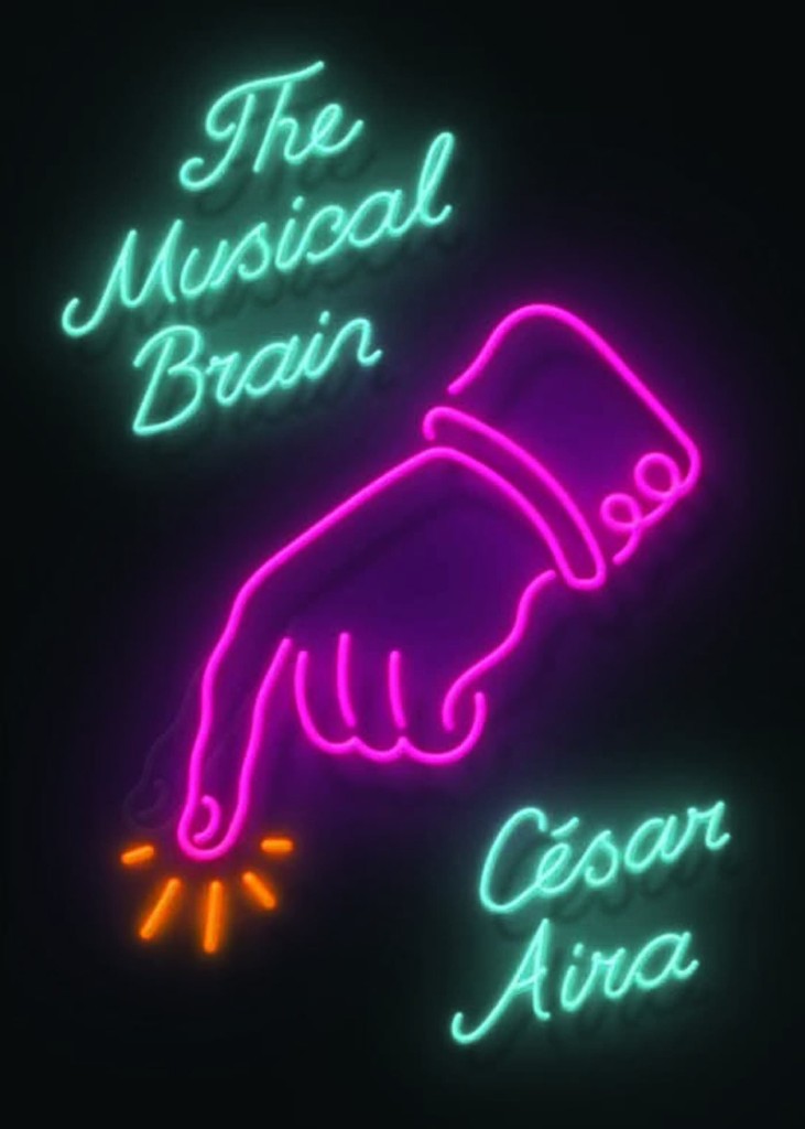
Munich Airport by Greg Baxter; design by Anne Twomey (Twelve Books / January 2015)
This is actually a rather special lenticular cover that imitates the effect of flashing neon.
Also from Rodrigo Corral:
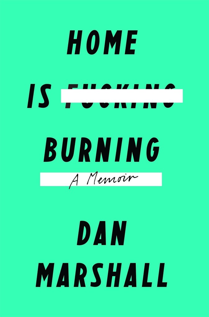
Home is Burning by Dan Marshall; design by Rodrigo Corral (Flatiron / October 2015)Fates and Furies by Lauren Groff; design by Rodrigo Corral and Adalis Martinez (Riverhead / September 2015 )
Of Beards and Men by Christopher Oldstone-Moore; design Isaac Tobin (University of Chicago Press / December 2015)
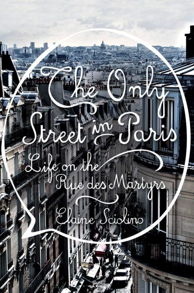
The Only Street in Paris by Elaine Schiolino; design by Strick&Williams (W.W. Norton / November 2015)
Also from Strick&Williams:
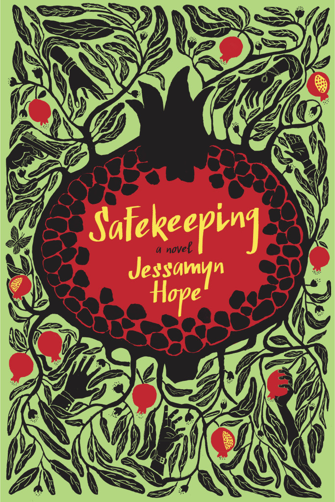
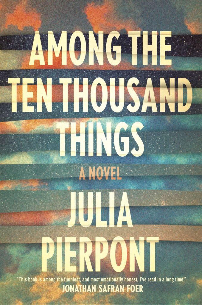
Safekeeping by Jessamyn Hope; design by Strick&Williams (Fig Tree / June 2015)Among the Ten Thousand Things by Julia Pierpoint; design by Strick&Williams (Random House / July 2015)
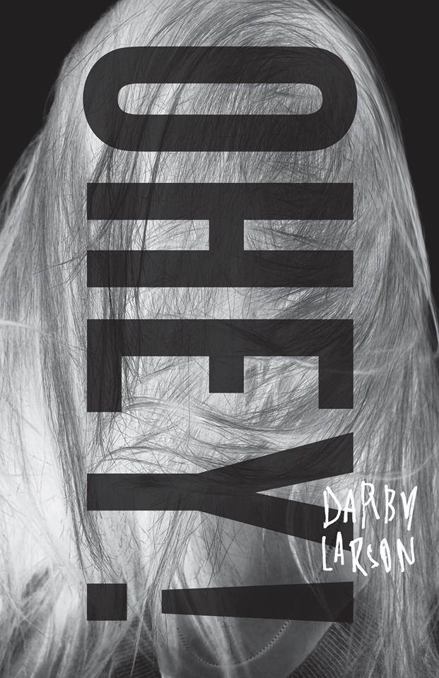
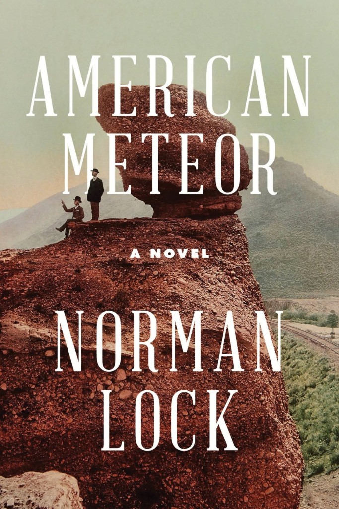
Ohey! by Darby Larson; design by Alban Fischer (CCM / May 2015)American Meteor by Norman Lock; design by Alban Fischer (Bellevue Literary Press / June 2015)Every Living One by Nathan Haukes; design by Alban Fischer (Horse Less Press / March 2015)
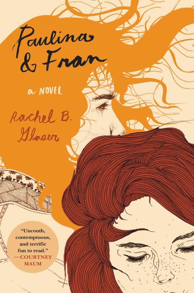
Paulina and Fran by Rachel B. Glaser; illustration Kaethe Butcher; typography Nina LoSchiavo (Harper Perennial / September 2015)
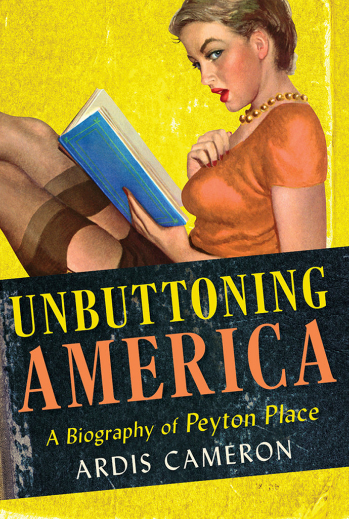
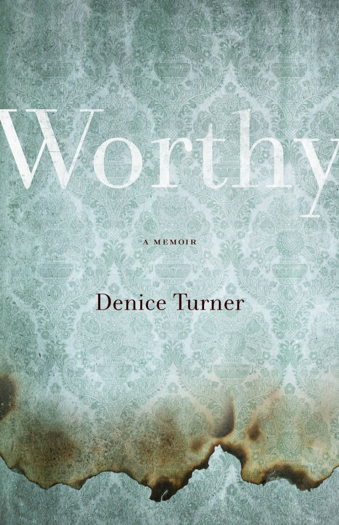
Unbuttoning America by Ardis Cameron; design by Kimberly Glyder; illustration by Al Moore (Cornell University Press / May 2015)Worthy by Denice Turner; design by Kimberly Glyder (University of Nevada Press / April 2015)
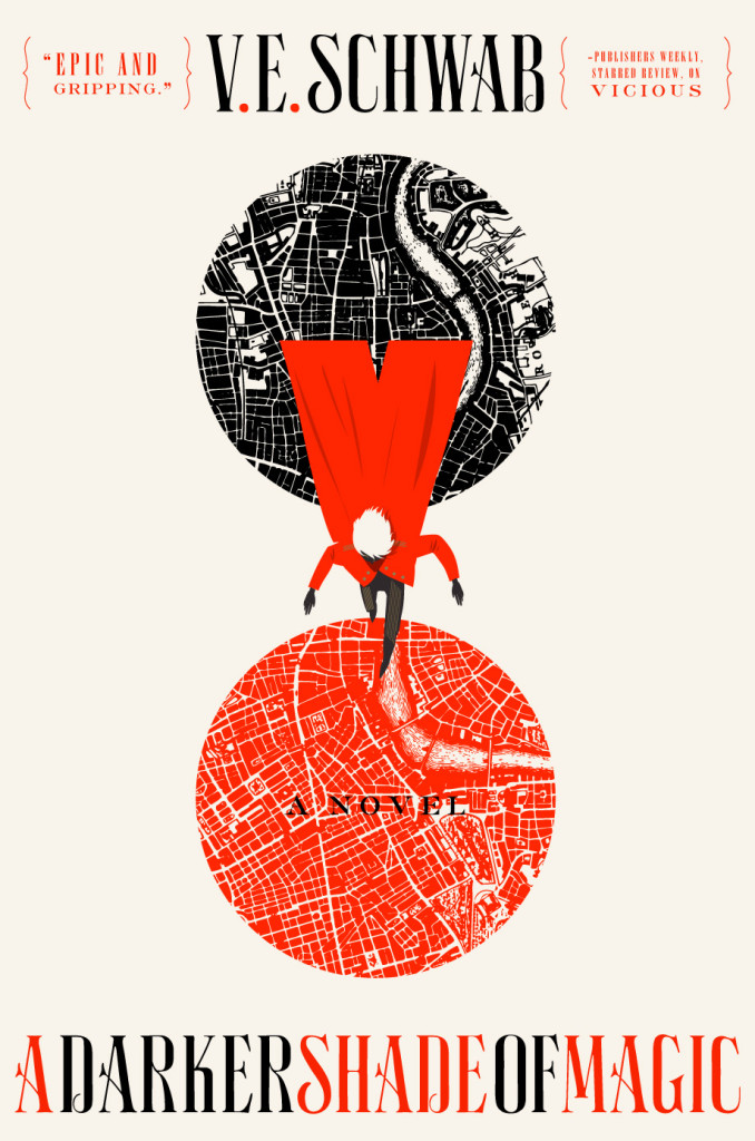
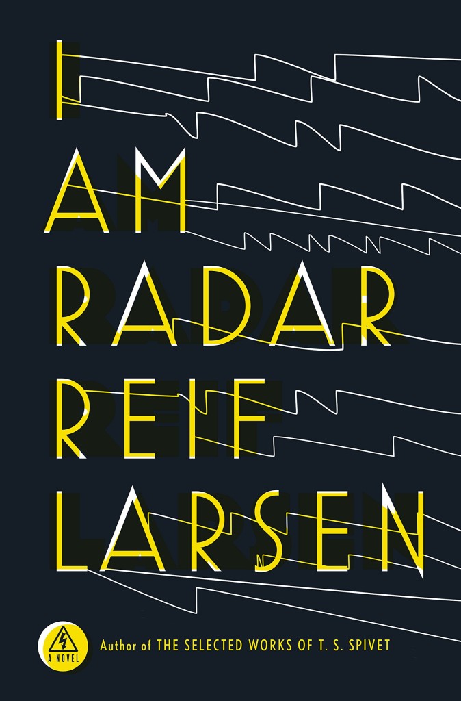
A Darker Shade of Magic by V. E. Schwab; design by Will Staehle (Tor / February 2015)I Am Radar by Reif Larsen; design by Will Staehle (Penguin / February 2015)
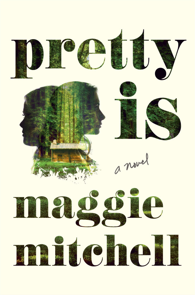
Pretty Is by Maggie Mitchell; design by Lucy Kim (Henry Holt / July 2015)
Real Life Rock by Greil Marcus; design by Rich Black (Yale University Press / October 2015)
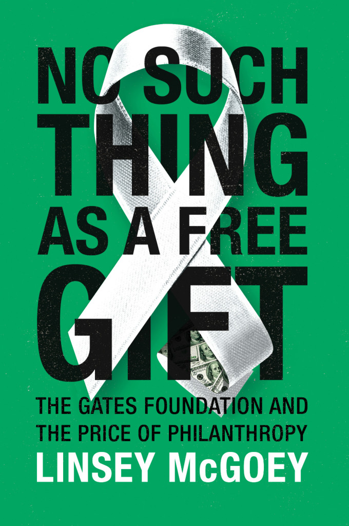
No Such Thing as a Free Gift by Linsey McGoey; design by James Paul Jones (Verso / October 2015)How Music Got Free by Stephen Witt; design by James Paul Jones (The Bodley Head / June 2015)The Rise of the Novel by Ian Watt; design by James Paul Jones (Vintage / October 2015)
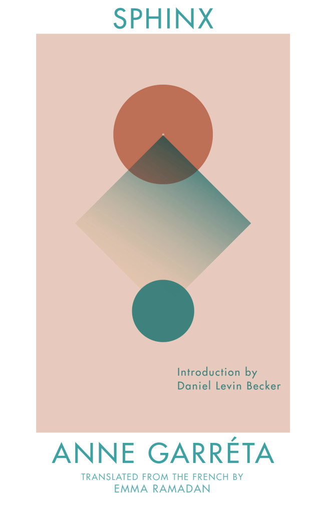
The Sphinx by Anne Garréta; design by Anna Zylicz (Deep Vellum / May 2015)
Also designed by Anna Zylicz:
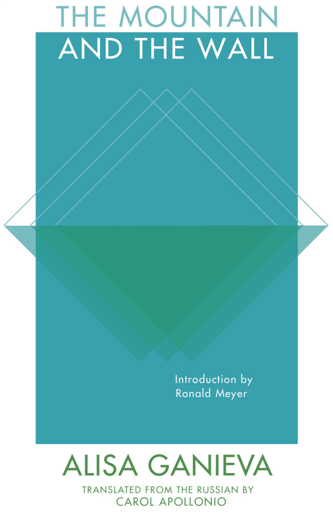
The Mountain and the Wall by Alisa Ganieva; design by Anna Zylicz (Deep Vellum / June 2015)The Indian by Jón Gnarr ; design by Anna Zylicz (Deep Vellum / May 2015)
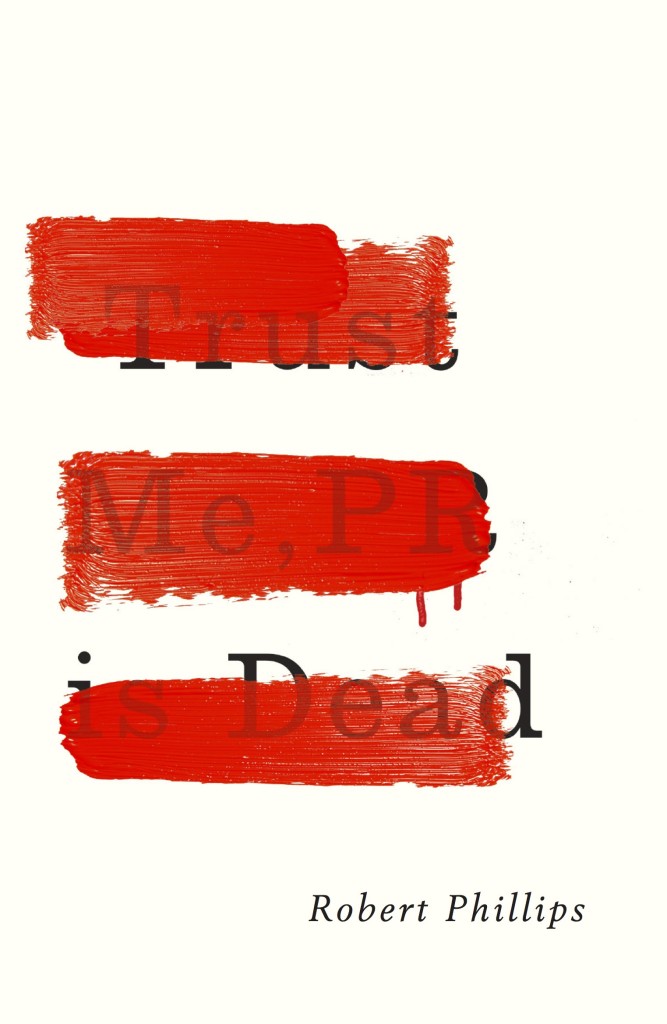
Trust Me, PR is Dead by Robert Phillips; design by Jamie Keenan (Unbound / June 2015)Wake Up, Sir! by Jonathan Ames; design by Jamie Keenan (Pushkin Press / May 2015)
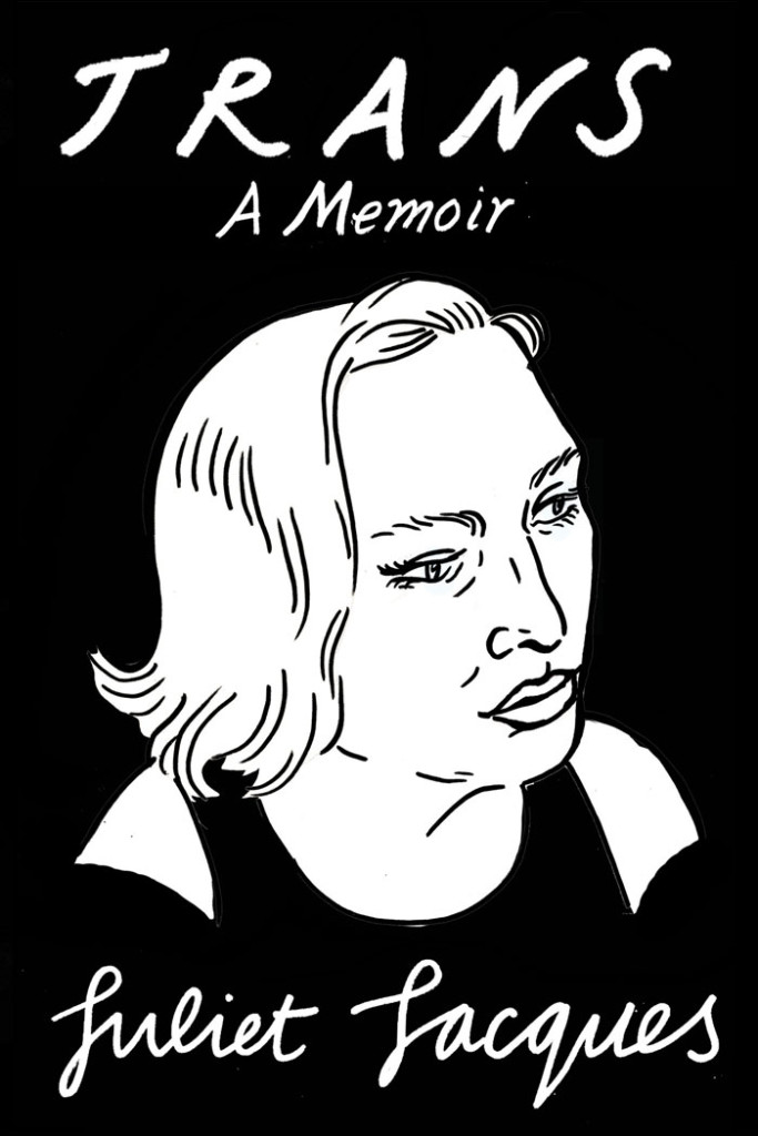
Trans by Juliet Jacques; Design and illustration by Joanna Walsh (Verso / September 2015)
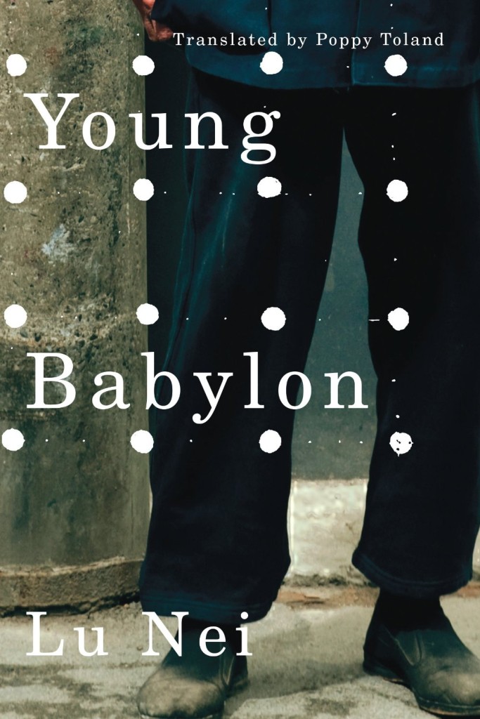
Wall Flower by Rita Kuczynski; design by David Drummond (University of Toronto Press / August 2015)Young Babylon by Lu Nei; design by David Drummond (AmazonCrossing / September 2015)
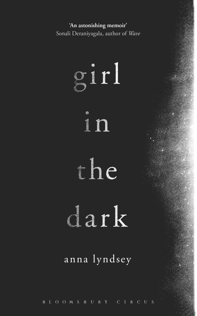
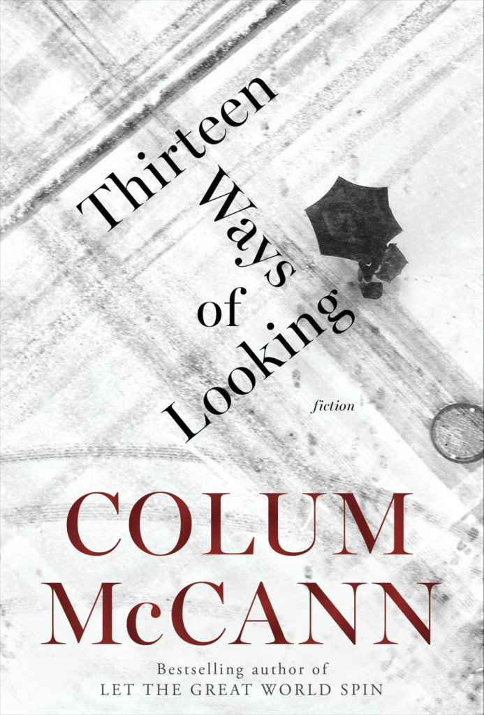
Girl in the Dark by Anna Lyndsey; design by Greg Heinimann (Bloomsbury / February 2015)Thirteen Ways of Looking by Colum McCann; design by Greg Heinimann; photograph by Julio Gamboa (Random House / October 2015)
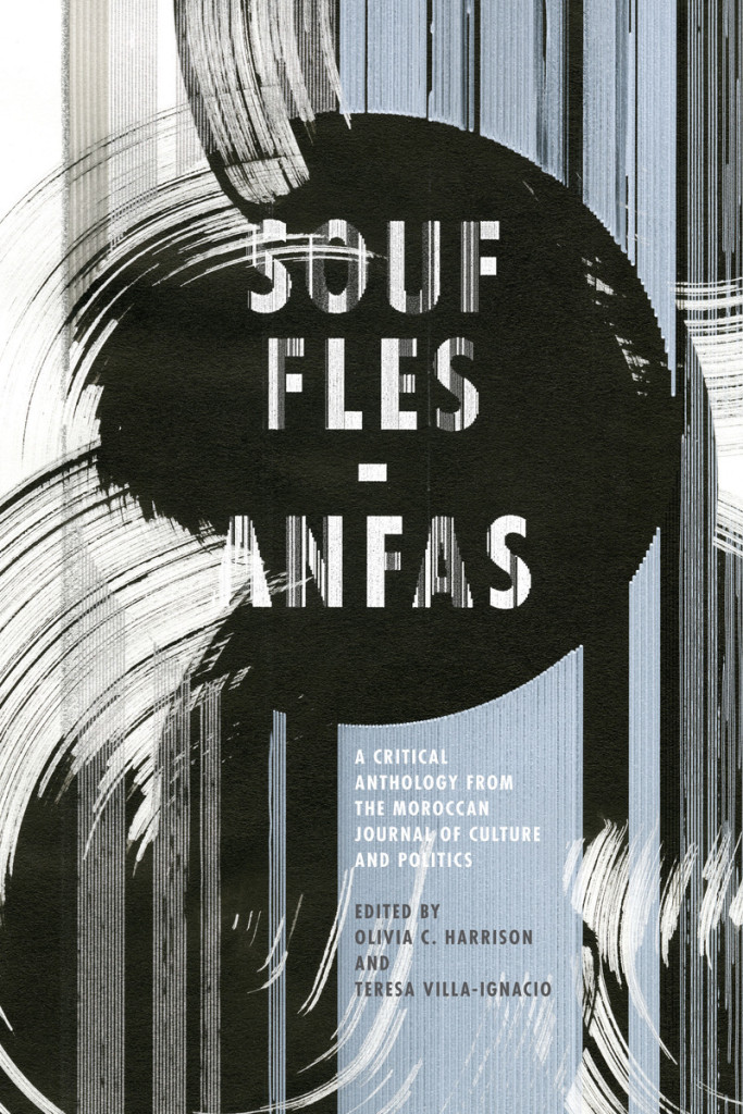
Souffles-Anfas edited by Olivia C. Harrison and Teresa Villa-Ignacio; design Anne Jordan and Mitch Goldstein (Stanford University Press / November 2015)Capitalism in the Web of Life by Jason W. Moore; design by Anne Jordan and Mitch Goldstein (Verso / August 2015)


