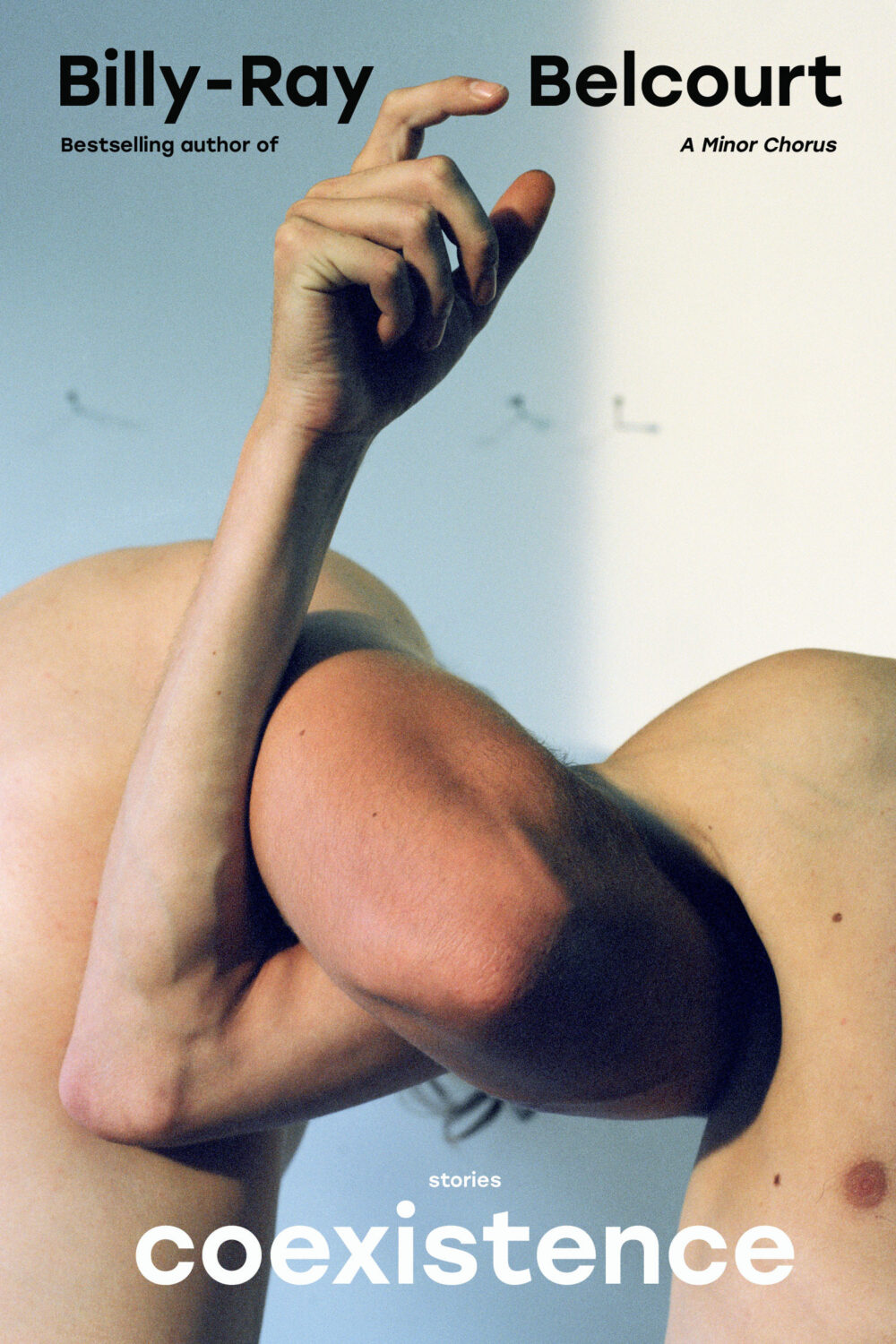
Hey. I hope you’re keeping safe and well. I’m posting this late on the last day of the month, but hopefully it was worth waiting for.
I will let you get to the covers posthaste, but before I go, today (September 30th) is also Orange Shirt Day and National Day for Truth and Reconciliation in Canada, so I would like take a moment to acknowledge and remember the survivors of residential schools, their families and the kids who didn’t come home. <3
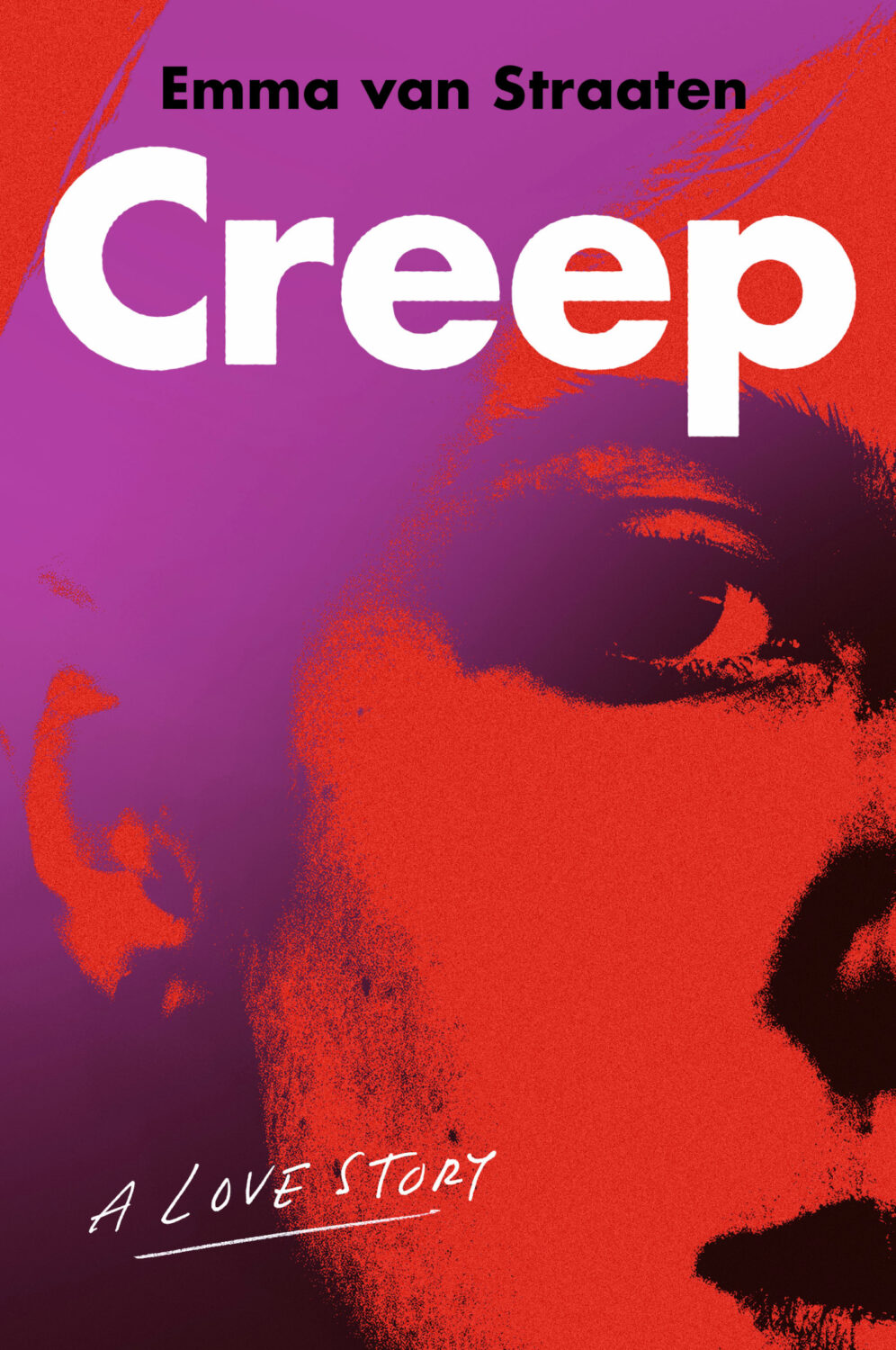
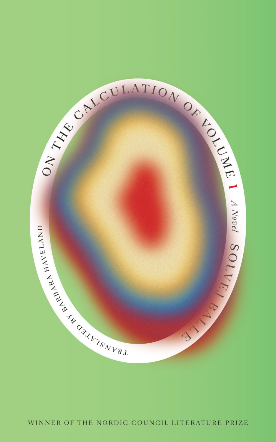
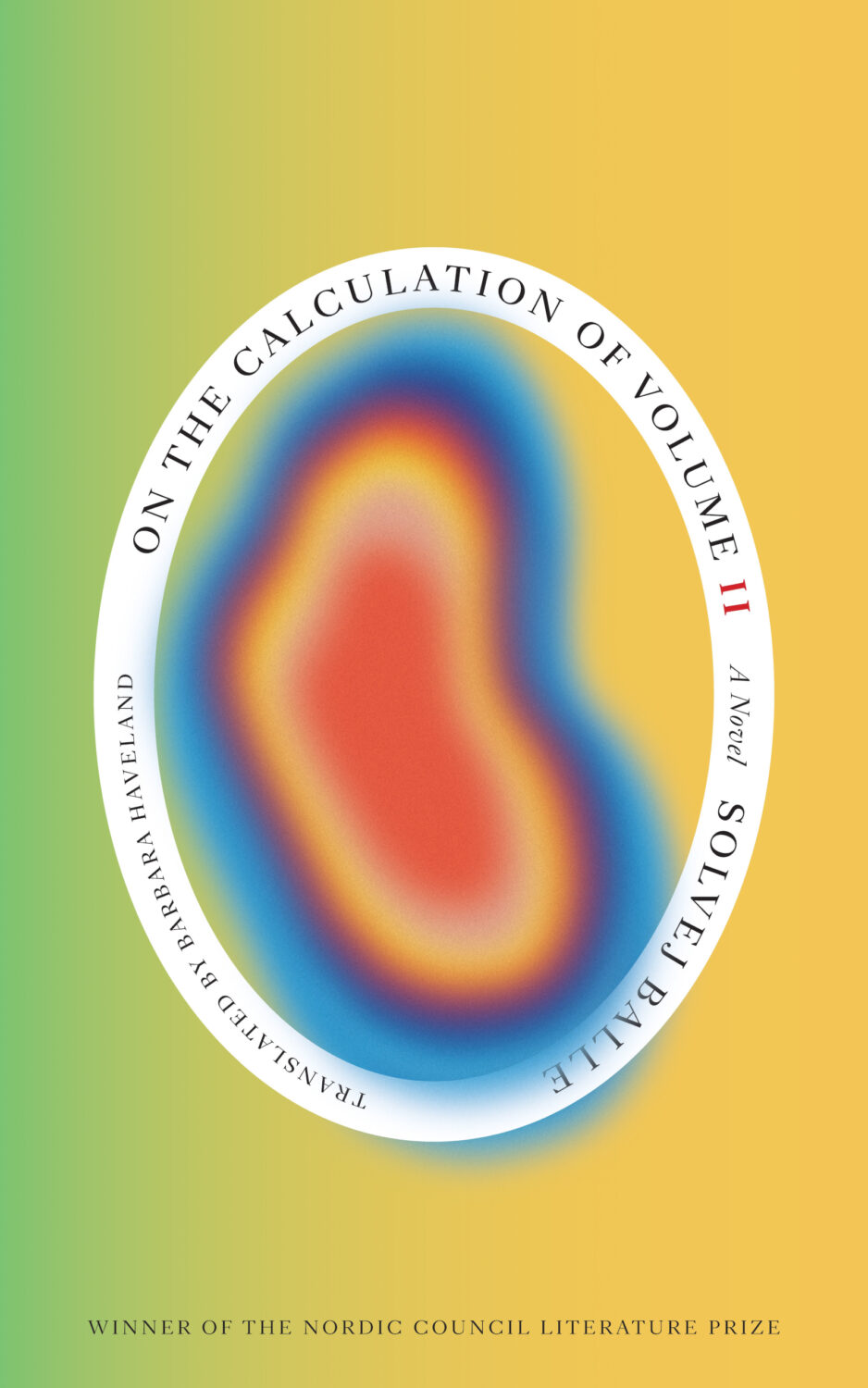
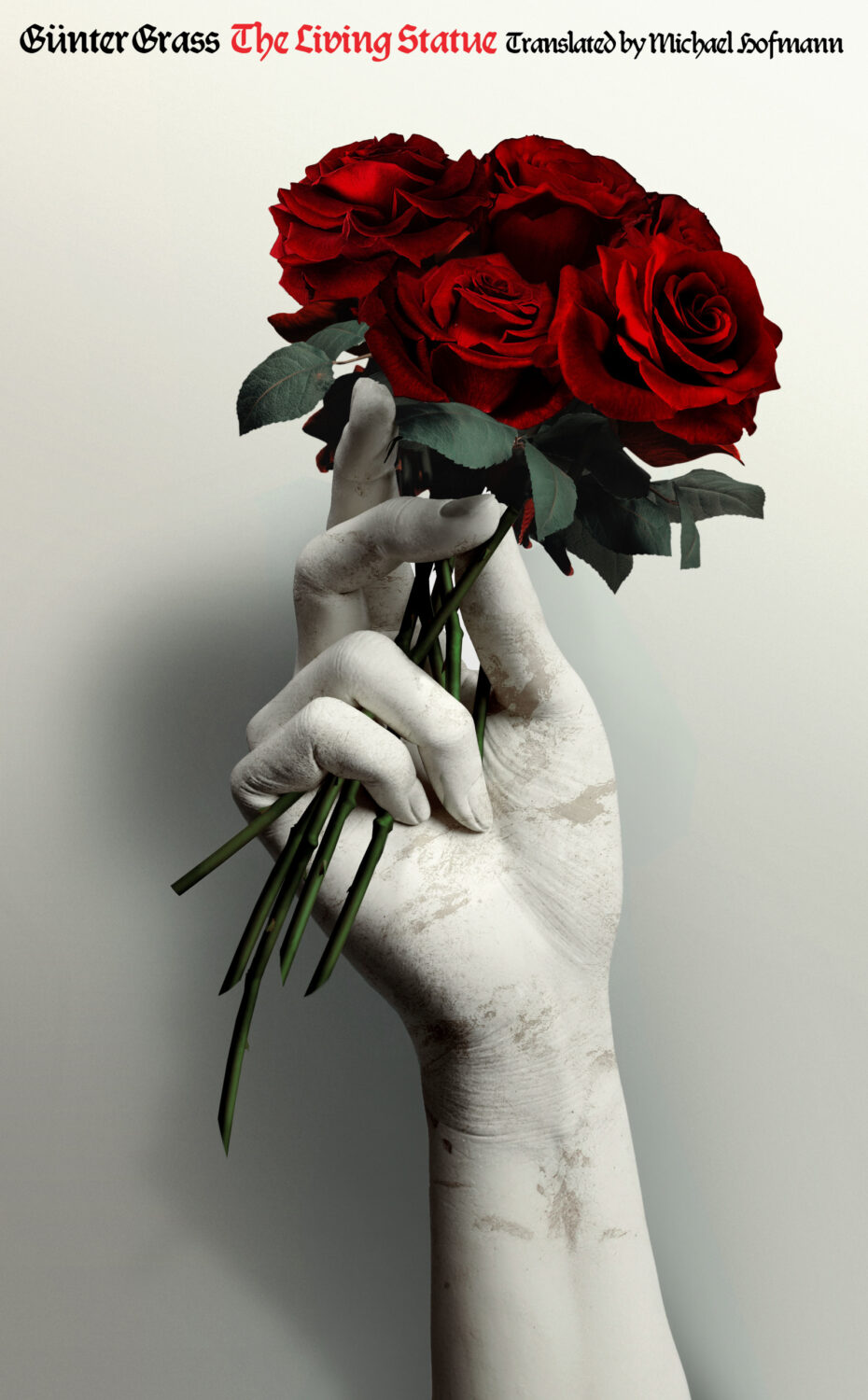
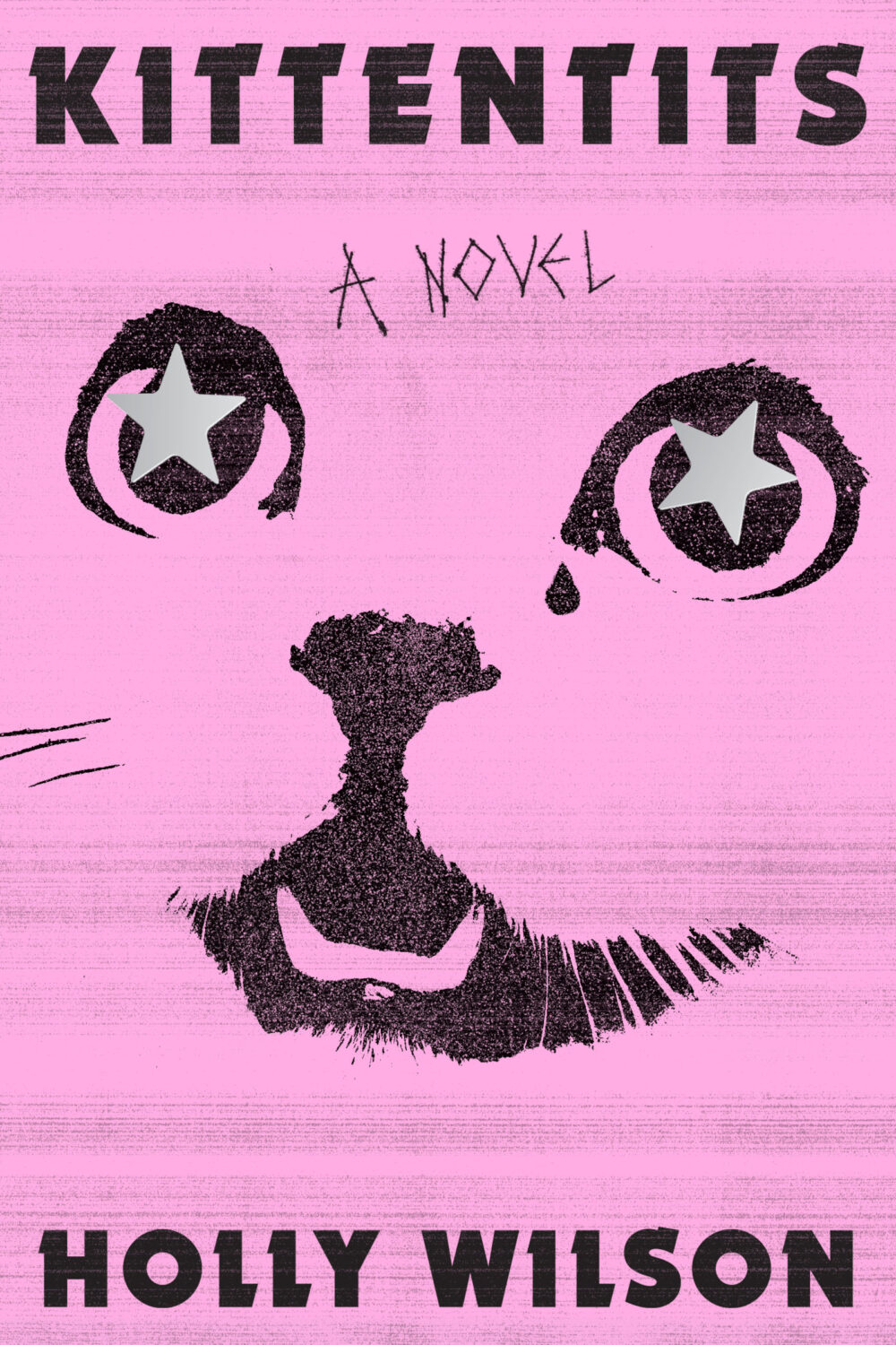
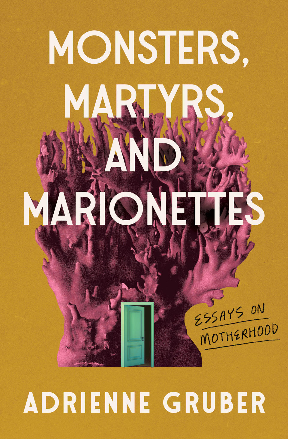
This is holographic foil just in case it’s not obvious from the above (and if someone at Head of Zeus / Bloomsbury is reading and wants to fire me a better cover image that would be great!)
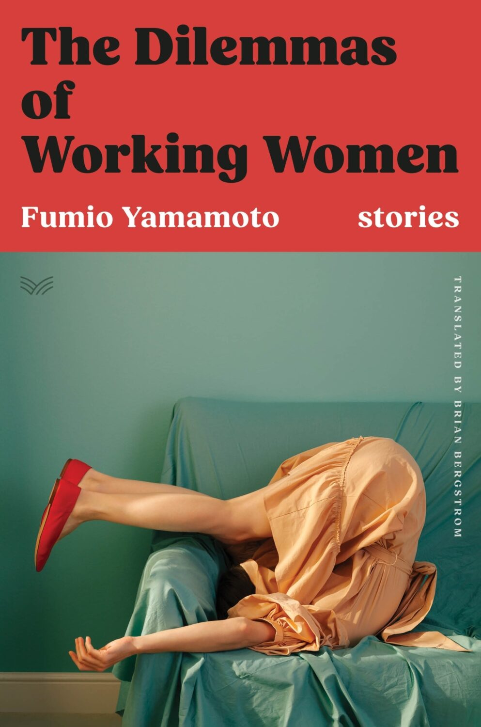
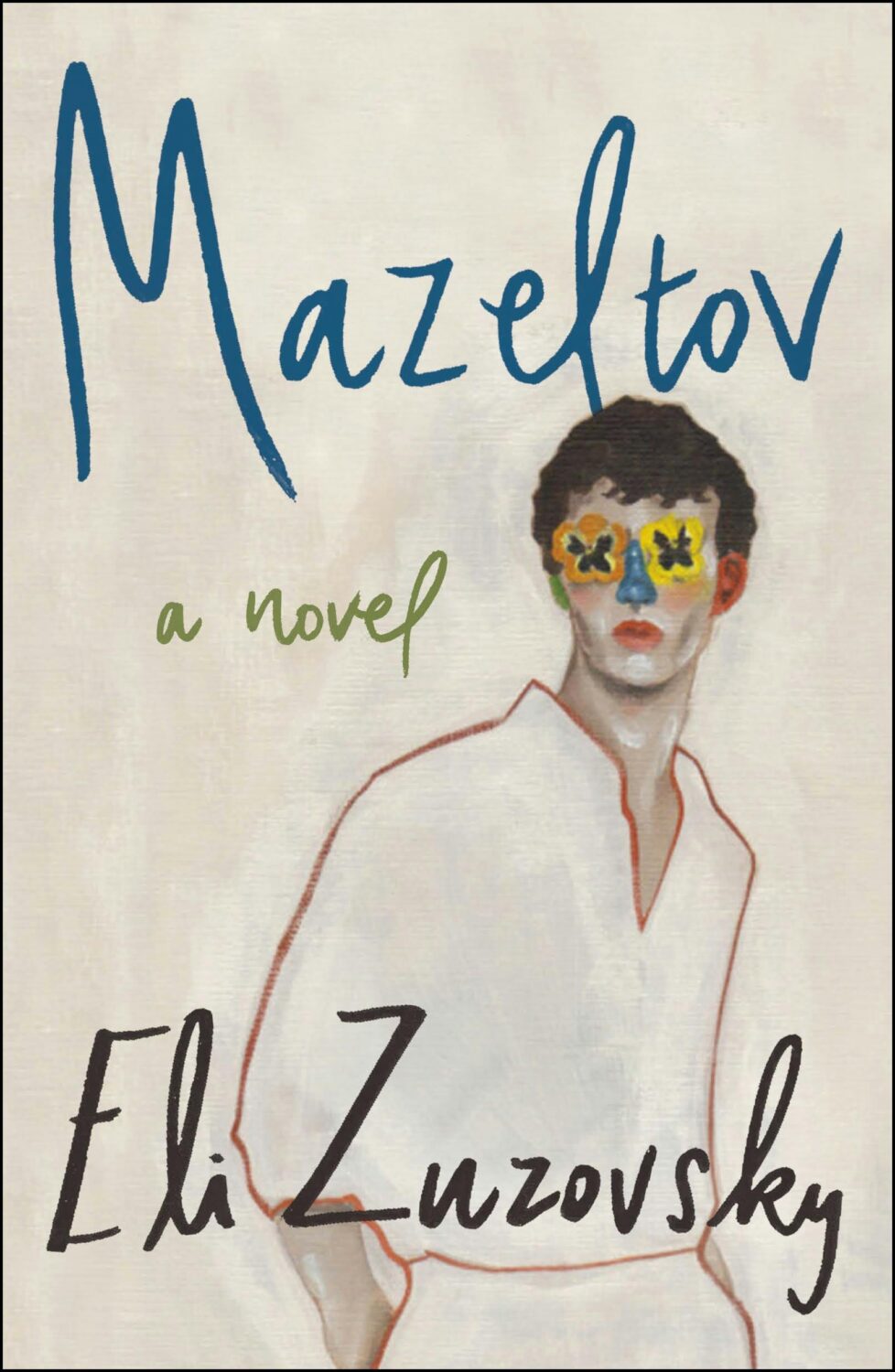
With this and the cover of The Dilemmas of Working Women designed by Sarah Kellogg (featured last month), we may have a new sub-genre of ‘well dressed and distressed’. Are there other examples?
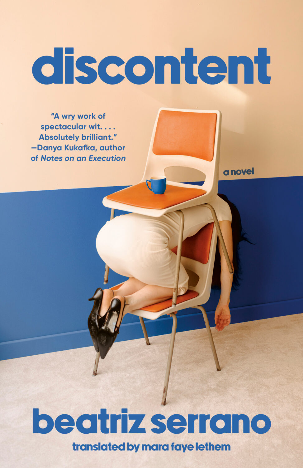
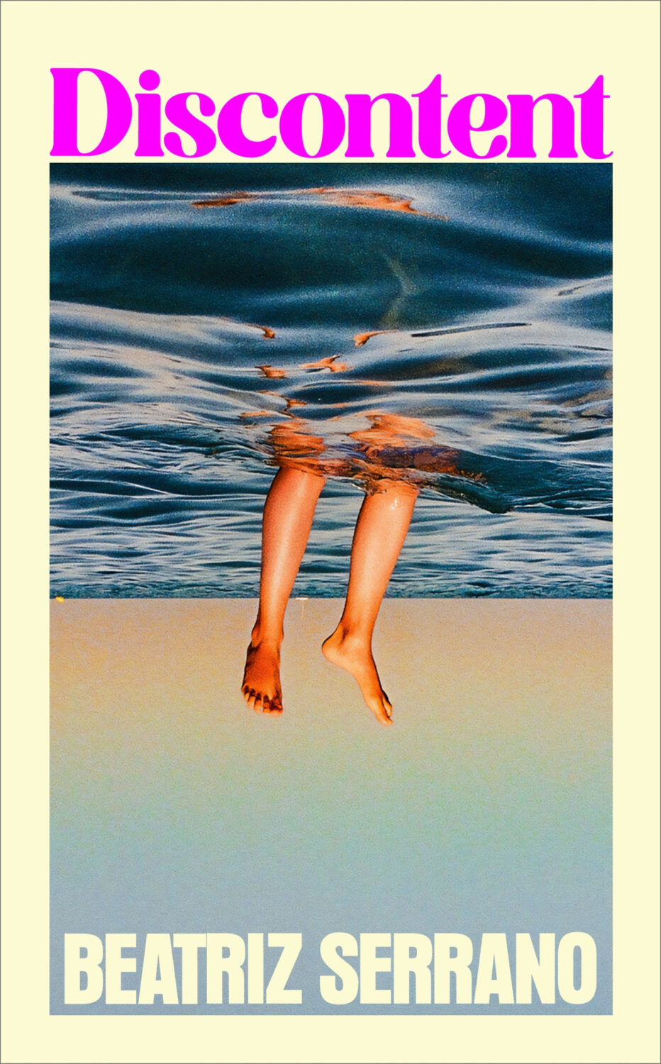
Possibly a different kind of distress, the UK edition of Discontent, published last month by Harvill Secker, was designed by Kris Potter using a photograph by Laurent Tixador.
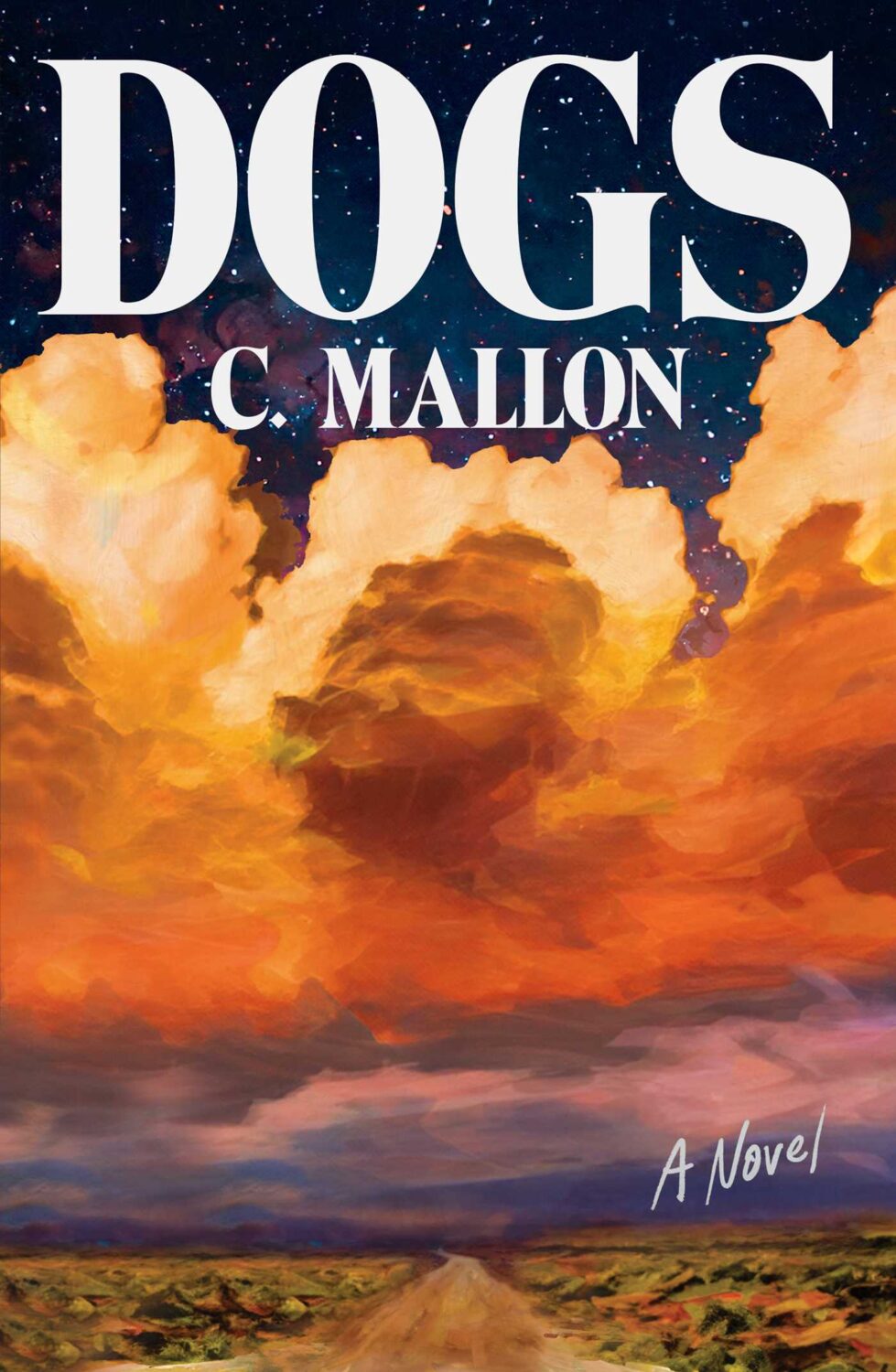
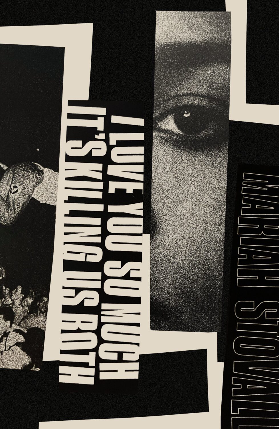
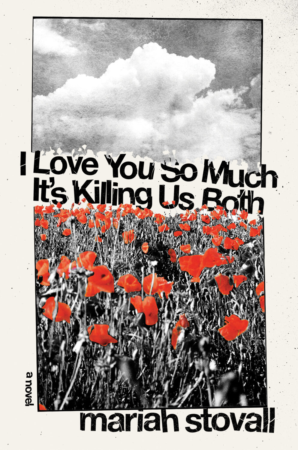
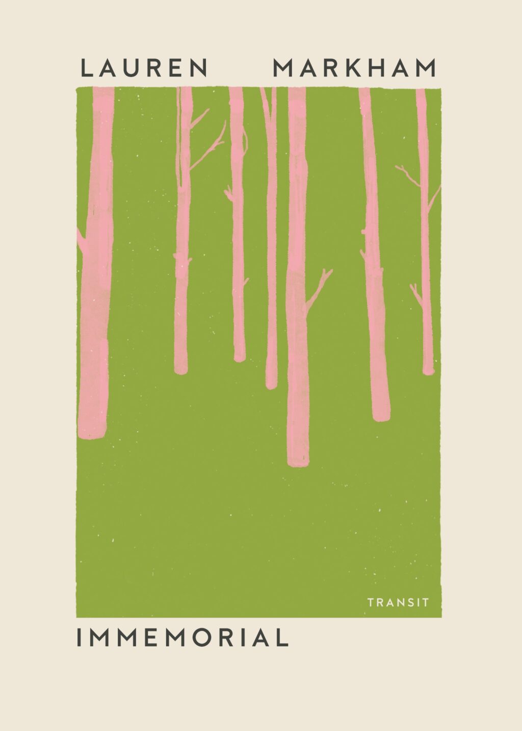
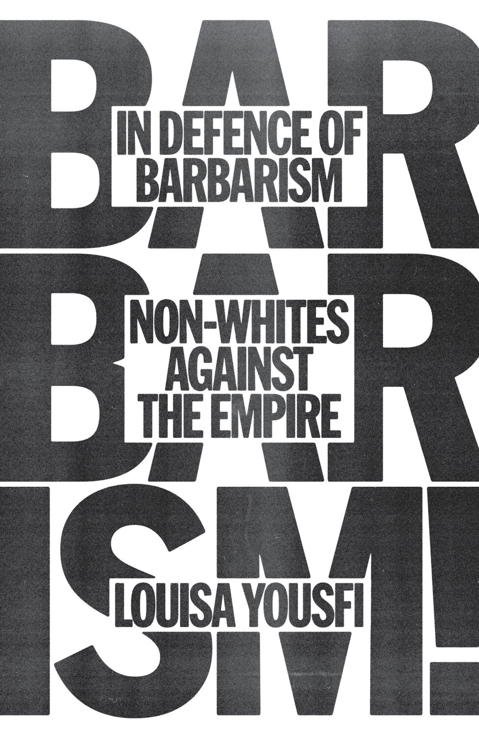
Dogs by C. Mallon; design by Jaya Miceli (Scribner / August 2025)
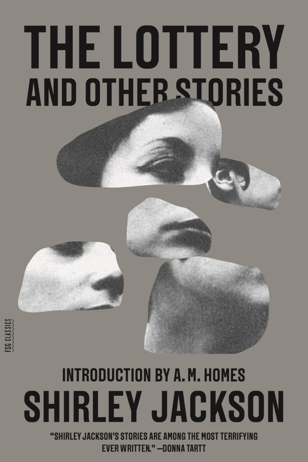
Is the “blob cut-out” a thing? I kind of thought it was but then I couldn’t think of any other examples except maybe this Paul Sahre / Erik Carter cover for The Lottery and Other Stories by Shirley Jackson from a few years ago, which is more of a collage really. Are they any other examples?
Hey, I hope you’re safe and well. This month’s post is a big one so I’m pretty much going to let you get on with it, but before I do, I just wanted to mention that I’ve included a gallery of all this month’s covers as the bottom of the post so you can click through them all. This is in response to a reader email about the size of the covers on screen. I think the gallery looks nice, but I am worried that it’s going to play absolute havoc with the RSS / email so apologies in advance if that’s case. Anyway, enjoy this month’s covers, and let me know what you think.
Hey, I hope you are good. It’s a stressful time and everyone is super busy trying to hold it together, but here we are at the end of October with another post that is both rushed and yet wordier than ever! As usual, I won’t be doing a covers round-up in November. I have to start working on the massive end of year post so I can get it done in something resembling a timely and relevant manner. I am open to last minute submissions if you think I have missed a cover, or you have something coming out between now and December. I can’t promise to include everything, but it would be especially great to hear from you if you’ve done something cool for a university press or an independent publisher this year. The only requirement is that the book was published and on shelves in 2024. If it was published in a non-English speaking part of the world, be sure to include a link to where people can find out more about the book (and ideally buy it) that isn’t Amazon.
On a related note, I have compiled an annual post of YA covers for, I don’t know, years now (10 maybe?). I don’t read a lot of YA, and it’s not a category I am very involved in professionally, so the posts take quite a long time to compile and I usually end up publishing them early in the New Year, which is less than ideal. So I guess my question is: do you still want a YA round-up? Folks used to ask for them, and now they don’t, which just be general fatigue and the fragmented nature of things at the moment, but the posts don’t attract submissions or much feedback, and interest seems to be waning. Obviously I don’t think I do a great job (if that wasn’t abundantly clear already!), but I haven’t really seen anyone else do one either, so I’ve kept doing it. I don’t know… I’m not a big a believer in clicks or engagement metrics as a measurement of anything useful, so I happy to do it if even just a couple of you say it’s still valuable. Or maybe it is just time to call it quits? Let me know what you think…
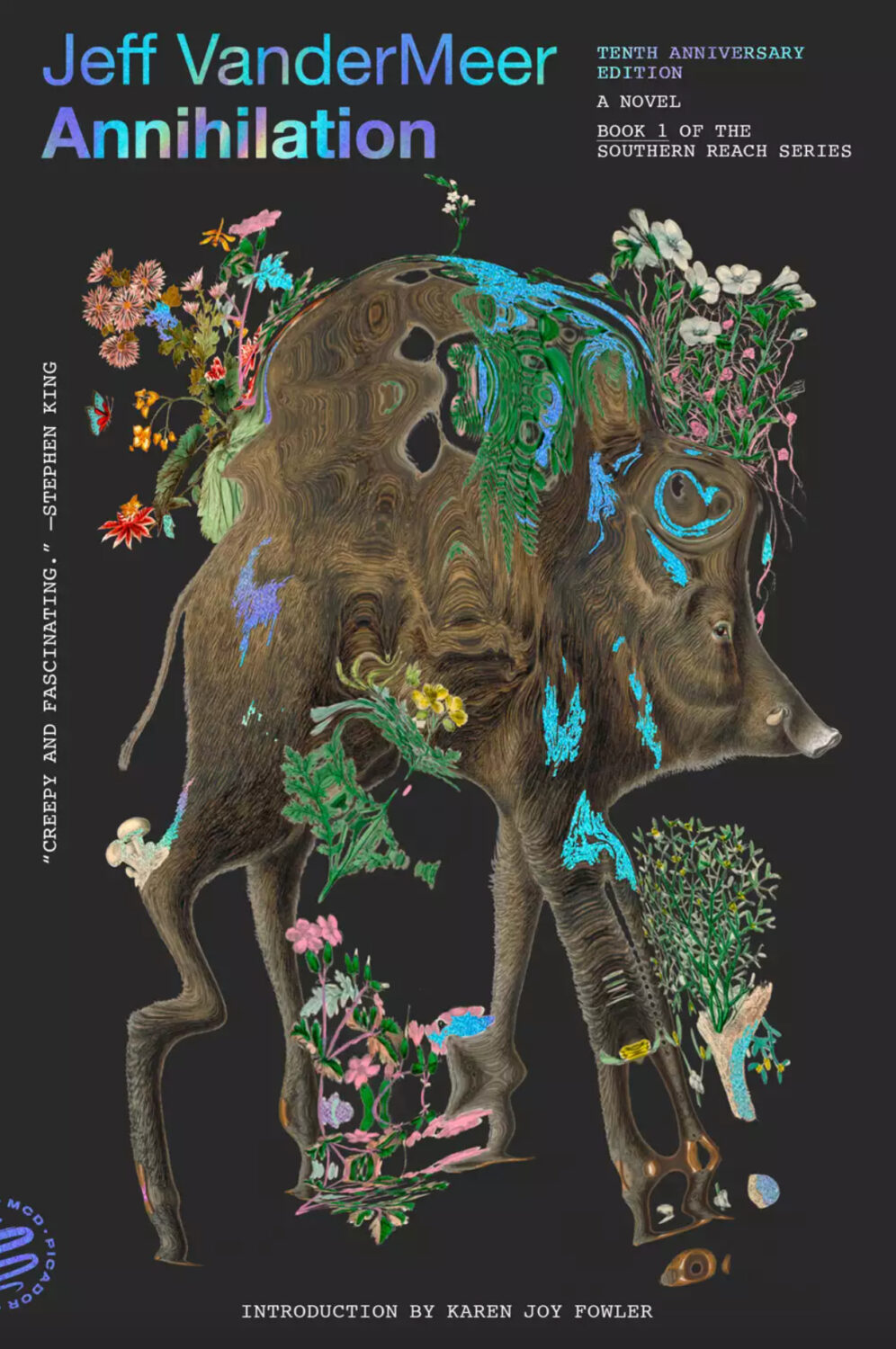
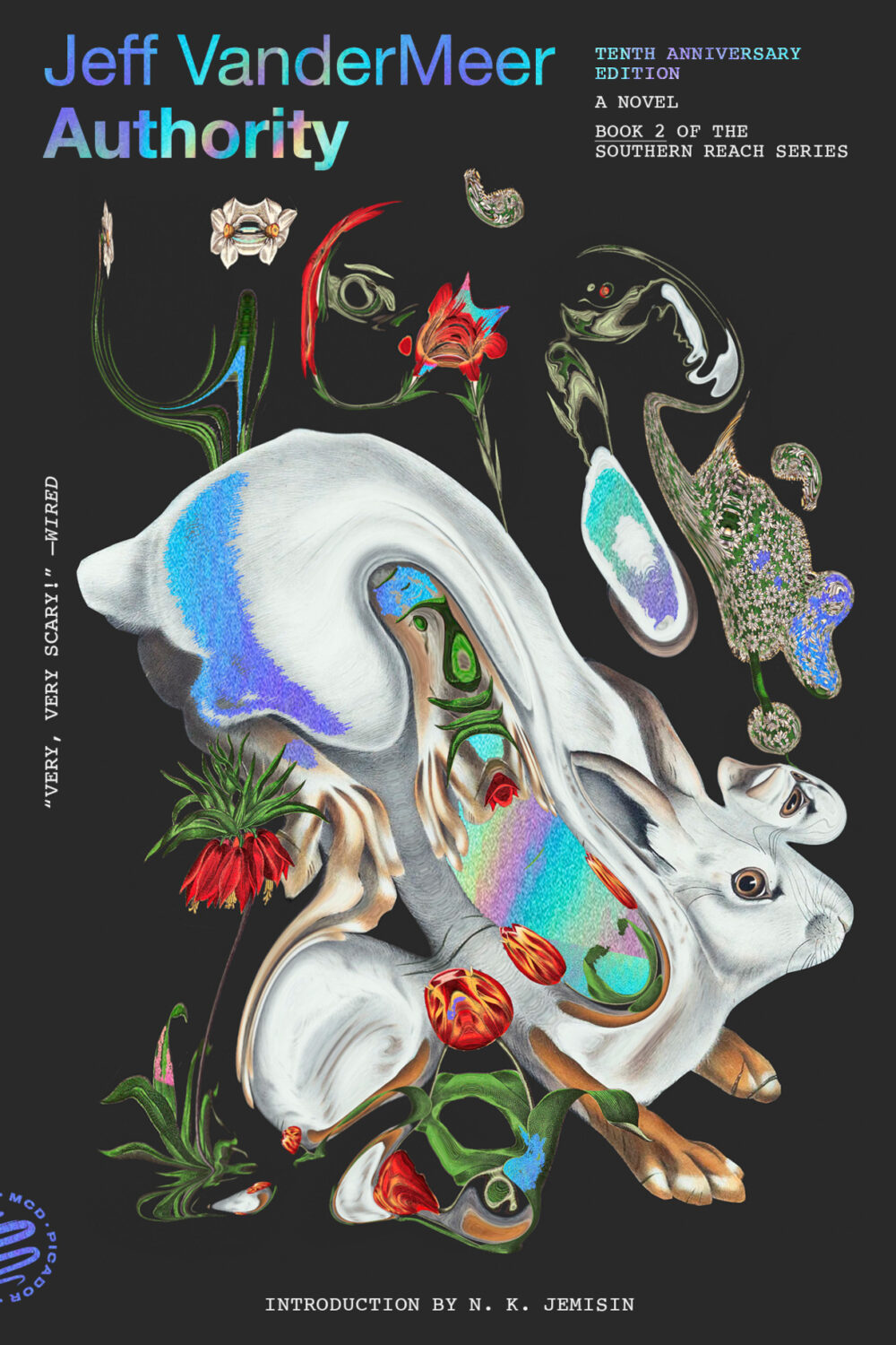
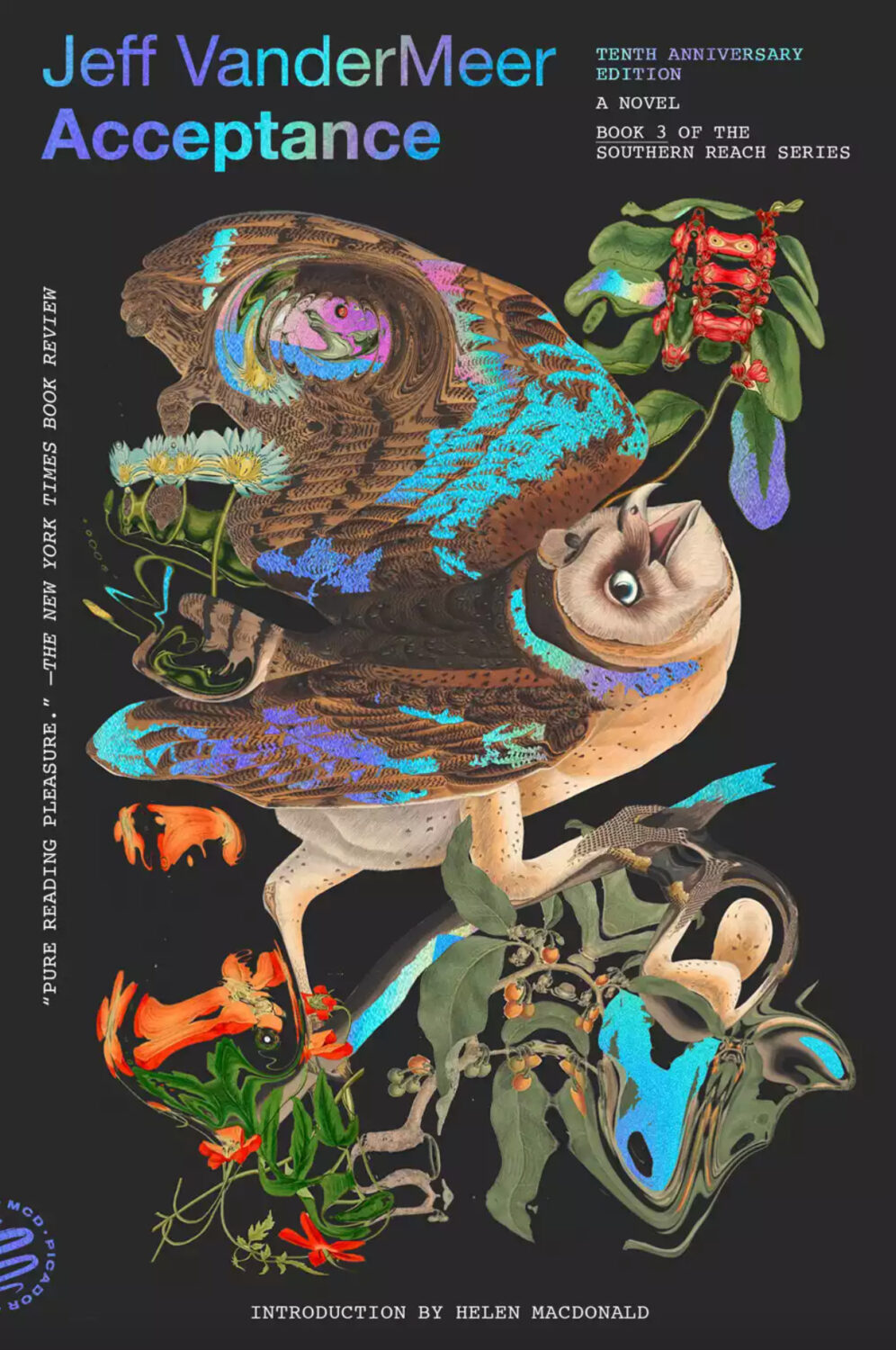
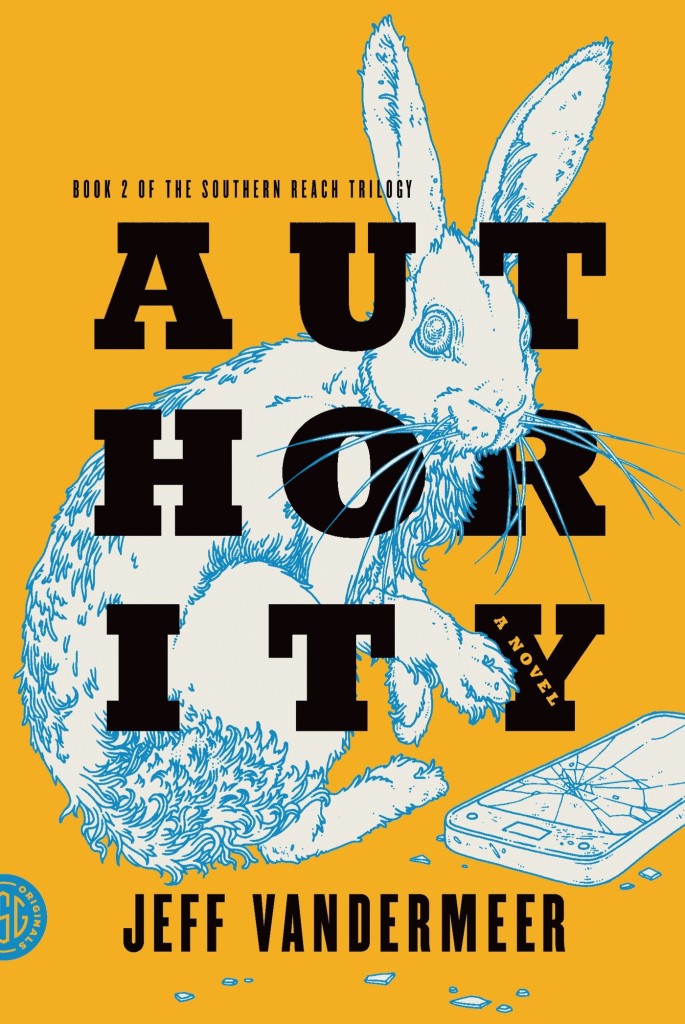
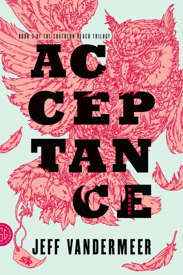
Pablo Delcan also designed the covers of the 10th anniversary editions of the previous books in the Southern Reach series, Annihilation, Authority, and Acceptance, published by Picador earlier this year.
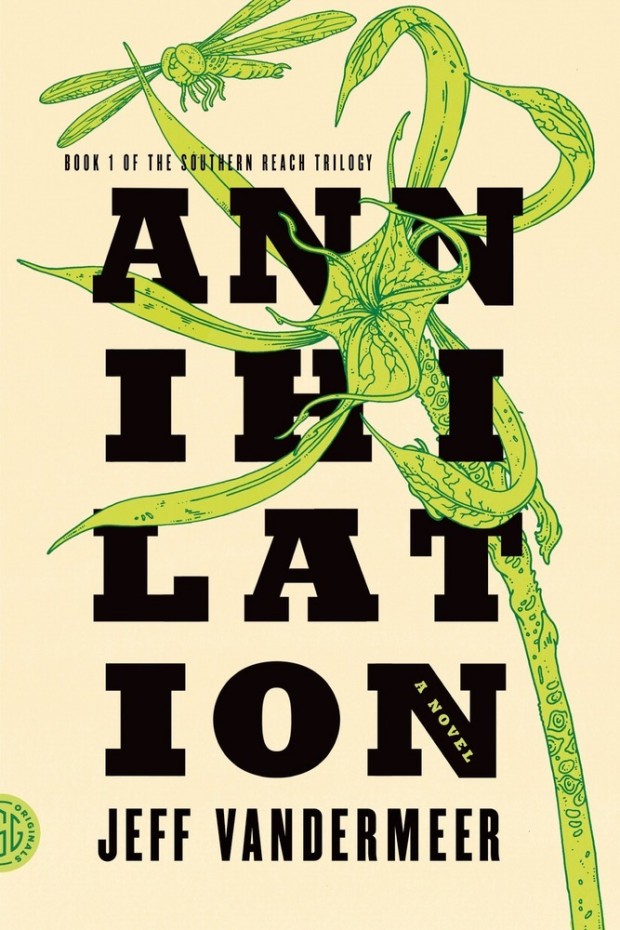
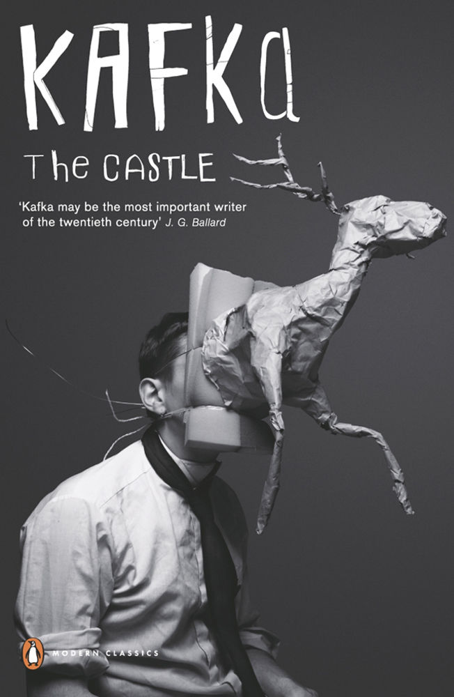
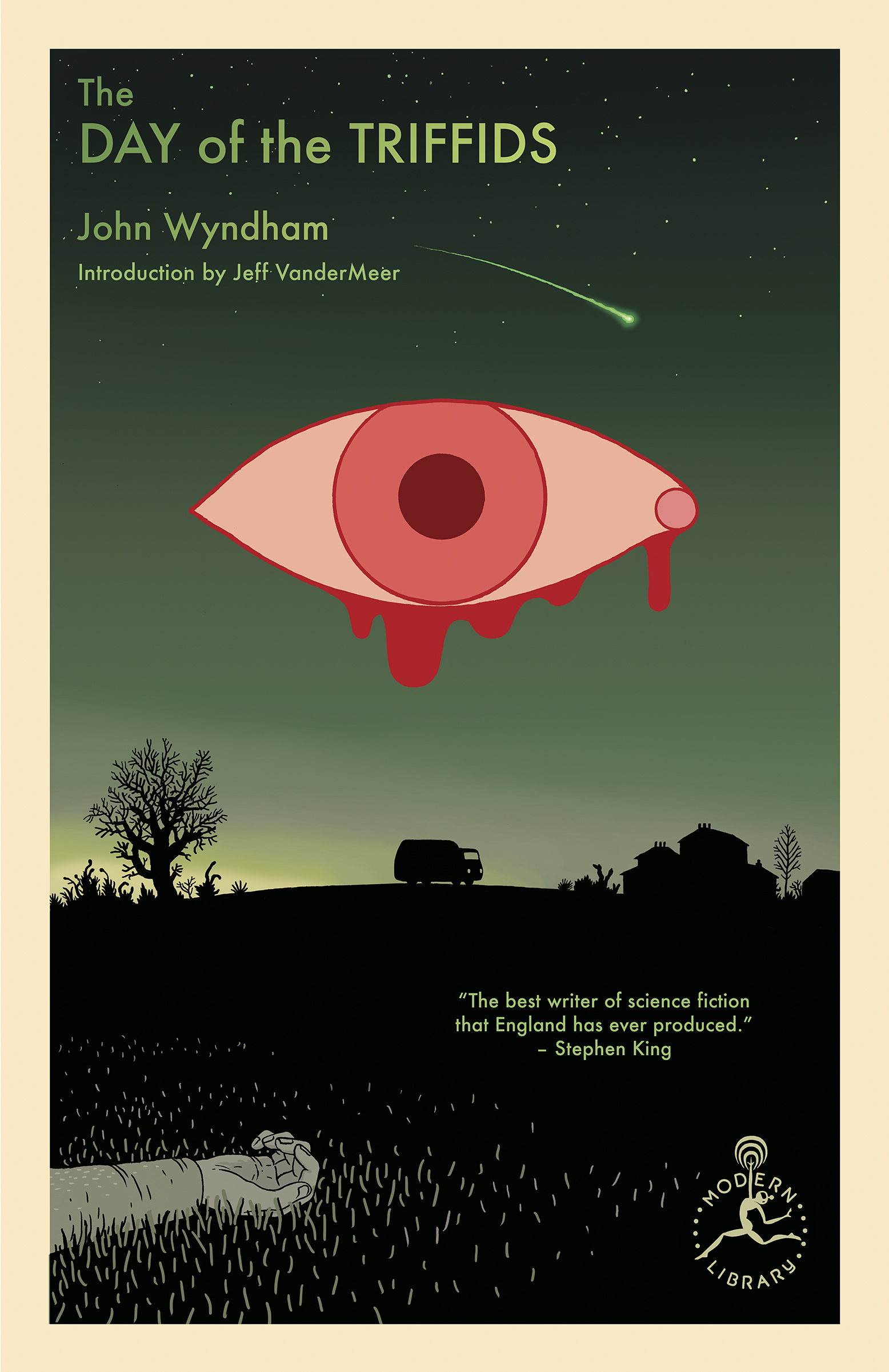
I’m still quite partial to the original US covers the trilogy (as was) designed by Charlotte Strick with illustrations by Eric Nyquist. The cover of Annihilation reminds me of The Day of the Triffids, which coincidentally has has an introduction by Jeff VanderMeer if you have the Modern Library edition. (The slightly bonkers cover of the Modern Library edition was designed by Cassie Gonzales with an illustration by comic book artist and illustrator Anders Nilson). Anyway, I’m a little sad that I can’t get the prequel to match the rest of my existing set.
Annihilation by Jeff VanderMeer (US); design by Charlotte Strick; Illustration by Eric Nyquist (FSG / 2014)Acceptance by Jeff VanderMeer (US); design by Charlotte Strick; Illustration by Eric Nyquist (FSG / 2014)
This feels very familiar, but I can’t put my finger on why. The best I’ve got is that it looks like a poster for a theatre production. It feels very European. The austerity of it gives late 1980s-90s vibes. I don’t know. I think it’s great.
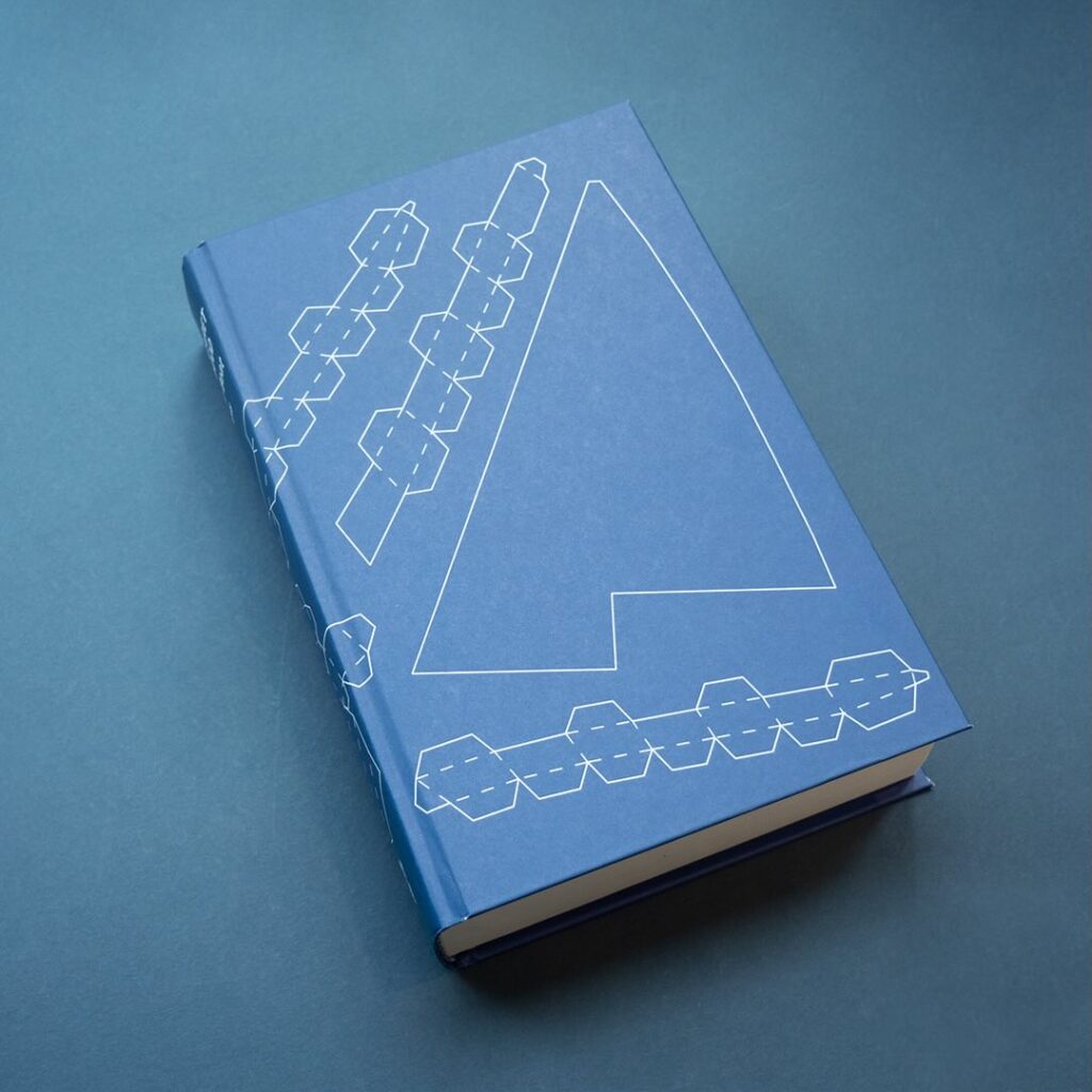
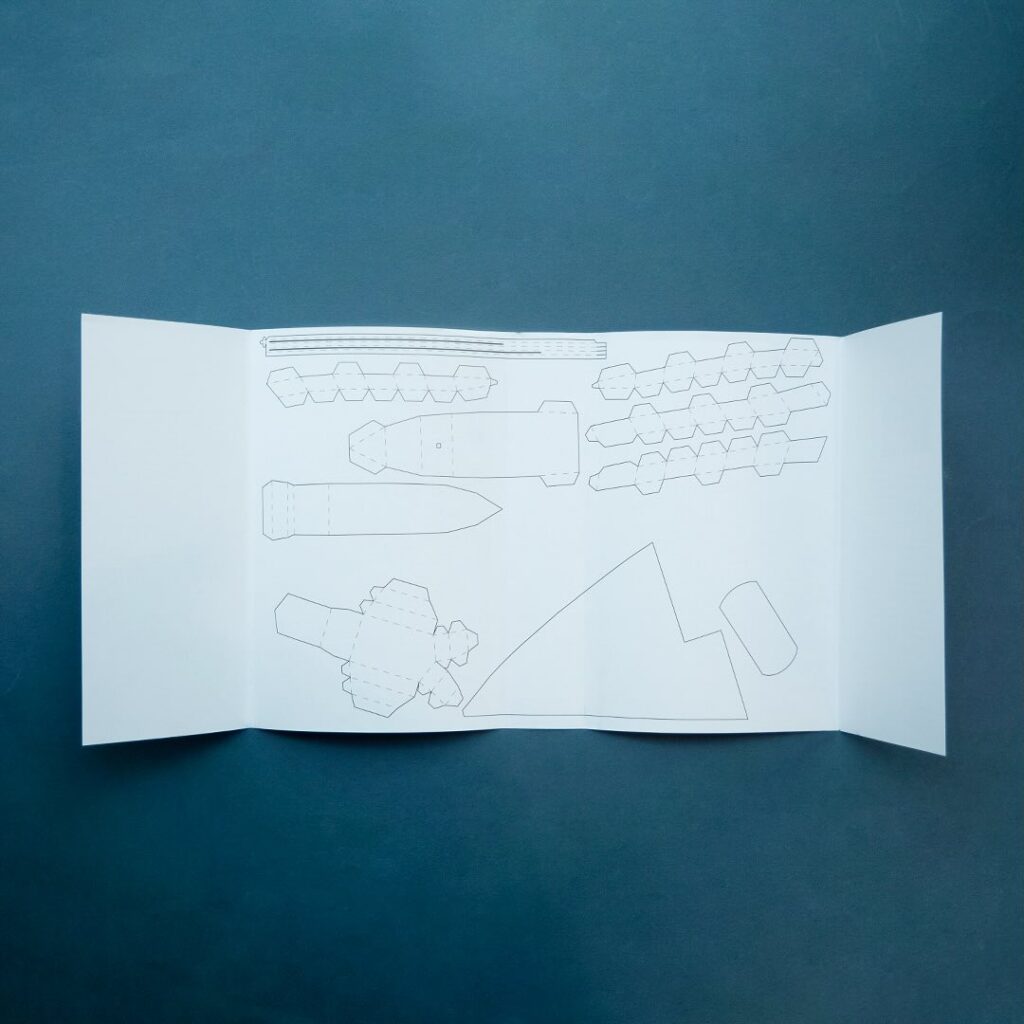
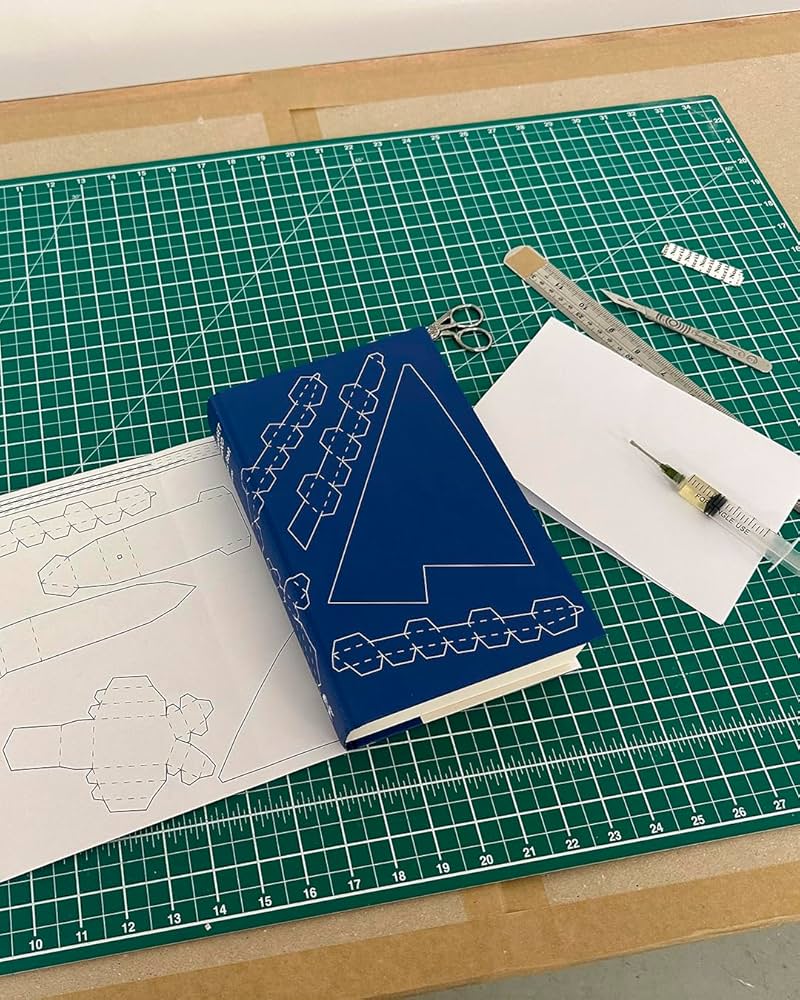
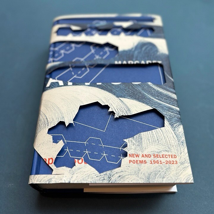
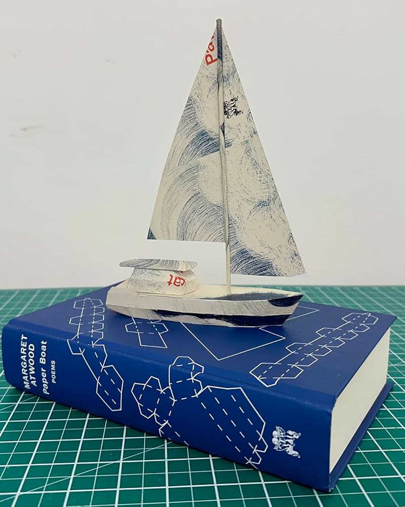
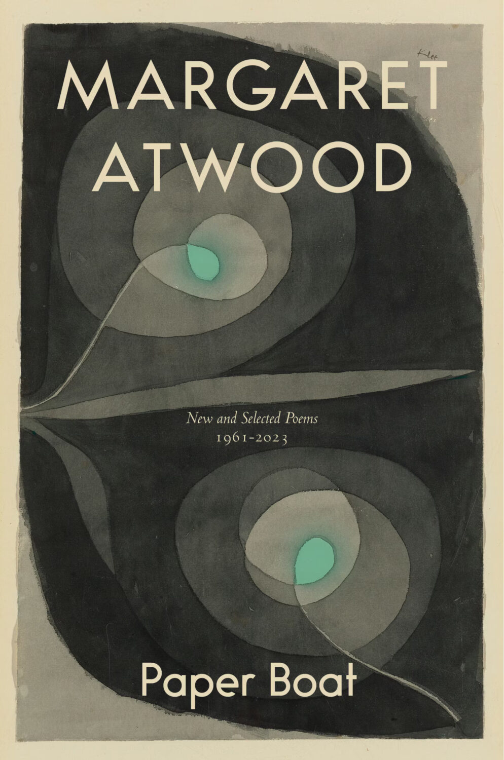
Remarkably, the design incorporates a template for paper boat that can be cut from the dust jacket and stuck together.
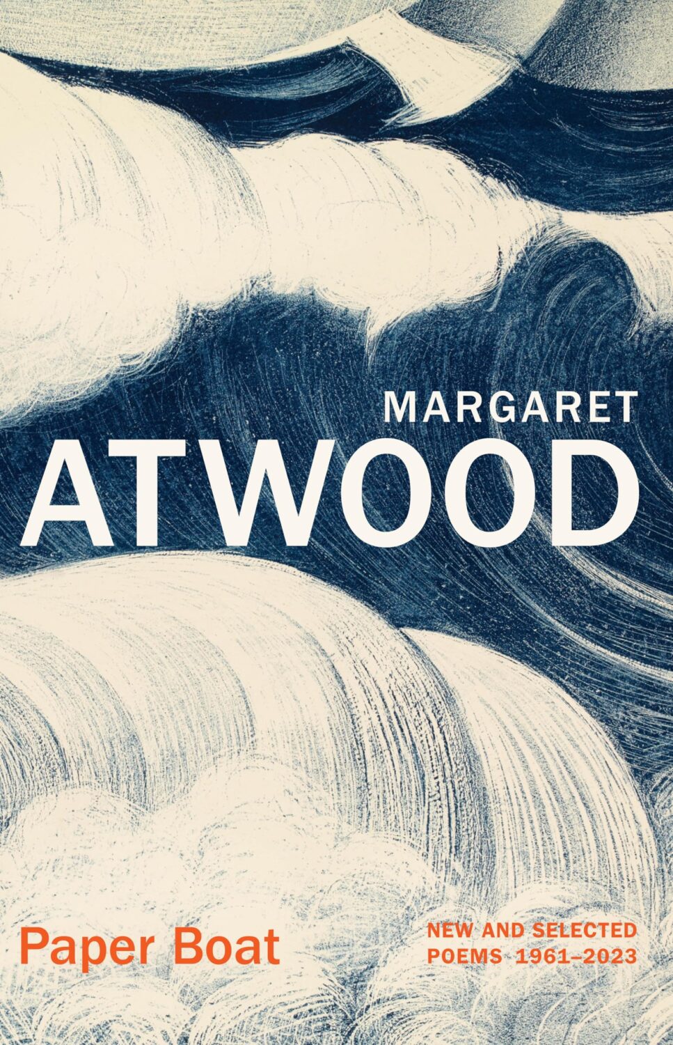
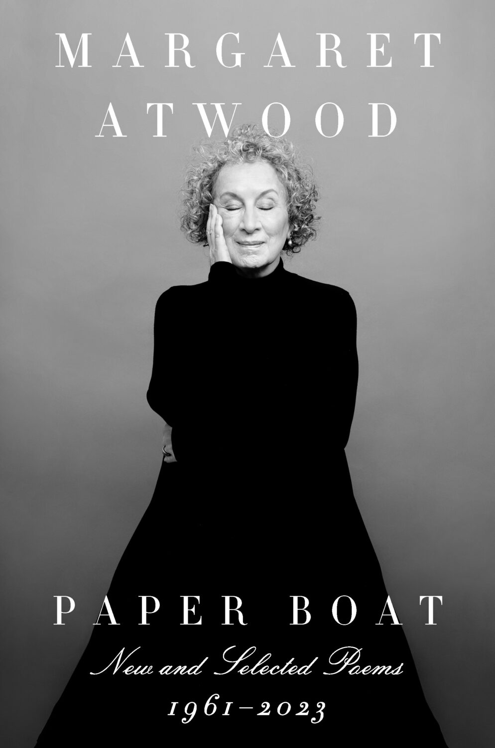
The cover of the Canadian edition of Paper Boat, published by McClelland & Stewart, was designed by Kelly Hill using art by Paul Klee. The cover for the US edition published by Knopf was designed by Janet Hansen. The photograph is by Ruven Afanador. It’s interesting to me that it was the US decided to use a portrait on the cover. I mean it’s a beautiful photograph and Margaret Atwood is very distinctive looking, but I would imagine she would be more recognizable to Canadians than to Americans? Anyway, it’s not often you see three entirely different approaches in the UK, US and Canada for a poetry collection.
I hope you’re keeping safe and well. Between work trips and sales conference it’s been a few weeks for me, and there are a lot of covers this month, so I am going to stop prattling and let you get straight to the post…
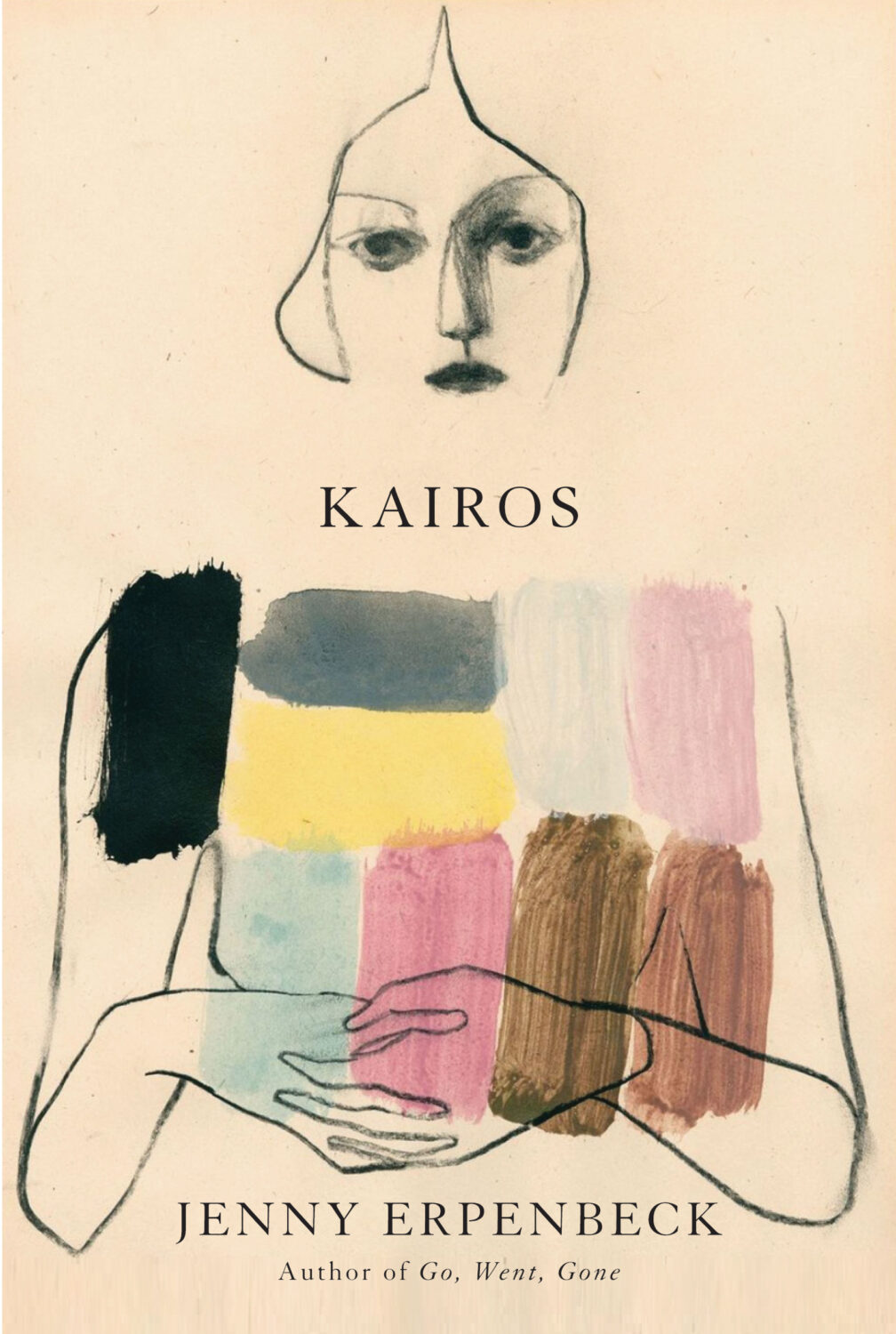
Kairos by Jenny Erpenbeck; design by John Gall (New Directions / May 2024)
This is the cover of the newly released US paperback. John Gall also designed the cover for the hardback, published by New Directions last year. Author Jenny Erpenbeck and translator Michael Hofmann recently won the 2024 International Booker Prize with Kairos.
This composition brings to mind David Pelham’s covers for J. G. Ballard. (On a semi-related note, air-brushed covers are probably overdue a revival. Or is it a dying art now?)
At the turn of the year, writer and activist Cory Doctorow coined the term “enshitification.” Although he was specifically describing the process of online services getting worse for users, it was hard not to see it everywhere in 2023.
In his annual look at the year’s best book covers for the New York Times, art director Matt Dorfman recounts a friend describing 2023 as a “year of survival”, a year of “no growth, no withering, just getting by.”
This year saw a centuries-old business contending with rounds of buyouts and layoffs, alongside an endless news cycle involving two brutal wars from which no authors, friends, enemies or strangers were immune from accountability for any unrehearsed sentiment they might voice in passing. Add to this the ongoing concern about how artificial intelligence will affect a business historically dependent upon human creativity — yet through it all, there was still the matter of making books, and their covers, to get on with.
I read Matt’s piece the same day I read an article by Kyle Chayka in the New Yorkerabout his search foran epochal term to “evoke the panicky incoherence of our lives of late.” The suggestions range from the bland ‘Long 2016,’ to the incredibly ominous-sounding ‘Chthulucene,’ the Lovecraftian ‘New Dark Age,’ and the frankly terrifying and plausible ‘Jackpot’ from William Gibson’s 2014 novel The Peripheral.
This was the context of life and work in 2023.
Matt notes some designers found inspiration in the zeitgeist. He’s not wrong. But, ironically perhaps, I feel less optimistic about the overall picture than he does.
At the risk of repeating what I’ve written in the past couple of years, it’s like we’re stuck in a holding pattern, circling the same design ideas. Trends have stuck around. A lot of covers feel safe. Some of this was the books themselves. I’m not sure exactly how many celebrity memoirs is too many, but I’m pretty sure we reached that point and sailed right past it in 2023. No doubt some of it is sales and marketing departments sanding down all the edges and demanding the tried and true (see Zachary Petit’s alternative best of 2023 piece on killed covers for Fast Company). But I would not be surprised if it designers were just getting caught up in the churn — too many books, too many covers, and too much other stuff to worry about.
Or maybe it’s just me.
Rouge by Mona Awad; design by Oliver Munday (Simon & Schuster / September 2023)Silver Nitrate by Silvia Moreno-Garcia; design by Regina Flath (Del Rey Books / July 2023)Our Share of Night by Mariana Enriquez; design by Donna Cheng (Hogarth / September 2023)
One of the themes of the year was nostalgia, which I’m sure can also be put down to the present being pretty fucking awful. It was apparent across almost all genres, including literary fiction, but nowhere more so than in the resurgent supernatural suspense and horror categories. There were creative stylistic mashups with retro vibes, along side fastidious Stranger Things-like homages to the 1980s and Stephen King.
Looking Glass Sound by Catriona Ward; design by Katie Klimowicz (Tor / August 2023)The Only One Left by Riley Sager; design by Kaitlin Kall (Dutton / June 2023)Come Closer by Sara Gran; design by Caroline Johnson (Soho Press / September 2023)
One genuinely pleasant surprise was the number of interesting covers from Canadian publishers this year. They’ve been quietly risk-averse in recent years, so it was nice to see a few bolder design choices getting approved. I was happy to see a Canadian cover was one of the top picks on Literary Hub’s (very, very long) list of the best covers of 2023.
There were other things to cheer this year too.
The Lights by Ben Lerner; design by David Pearson (Granta / September 2023)Total Reset by Sinéad Brady; design Steve Leard (HarperCollins / March 2023)How to Build a Boat by Elaine Feeney; design by Zoe Norvell (Biblioasis / November 2023)
Spine continued to give space to designers to talk about their work in a way I’ve never been able to do consistently here. You can find their 2023 cover picks here.
David Pearson started the Book Cover Review, a website for short reviews of book covers.
Zoe Norvell’s I Need A Book Cover, a resource for book cover inspiration as well as place for authors and publishers to connect with designers, also went live.
Steve Leard launched Cover Meeting, a podcast series of in-depth interviews with cover designers (including David and Zoe among others). As Mark Sinclair notes in his piece on book cover design this year for Creative Review, Steve’s conversations shed light on wider concerns in the industry as well as each designer’s individual process. Have a listen if you haven’t already.
Berlin by Bea Setton; design by Emily Mahon; cover image by Nataša Denić (Penguin Books / May 2023)
Also designed by Emily Mahon:
Lost Believers by Irina Zhorov; design by Emily Mahon (Scribner / August 2023)Do Tell by Lindsay Lynch; design by Emily Mahon; illustration and lettering by Studio Martina Flor (Doubleday / July 2023)
B.F.F. by Christie Tate; design by Ben Wiseman (Avid Reader Press / February 2023)
The Illiterate by Ágota Kristóf; design by Oliver Munday (New Directions / April 2023)
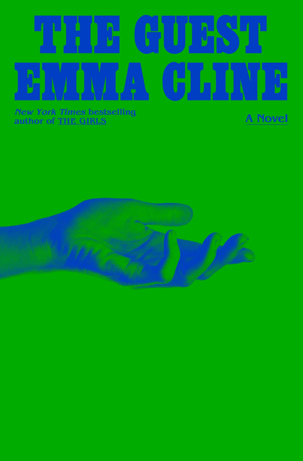
Also designed by Oliver Munday:
The Guest by Emma Cline; design by Oliver Munday (Random House / May 2023)Life on Delay by John Hendrikson; design by Oliver Munday (Knopf / January 2023)
Sublunar by Harald Voetmann; design by Jamie Keenan (New Directions / August 2023)
Also designed by Jamie Keenan:
The Dimensions of a Cave by Greg Jackson; design by Jamie Keenan (Granta / October 2023)Dr. No by Percival Everett; design by Jamie Keenan (Influx Press / March 2023)
The cover for the UK and Australian edition of Blue Hunger, published by Scribe, was designed by Luke Bird (and thank you to Guy Ivison at Scribe for providing the design credit). It’s an interesting contrast I think:
You know, I started 2022 with such good intentions and yet here we are again at the end of January on a paved road to hell. At least there are some lovely book covers to look at this month. Sigh.
Print Magazine did a piece last year on Amistad Books’ repackaging of Zora Neale Hurston’s work. I’ve featured a couple of the covers here in the past too.
Earlier this year, a Canadian magazine asked me what the latest trends in book cover design were. I don’t think I had a very satisfactory answer. 2021 felt very much like a continuation of 2020, which itself felt like a year on hold.
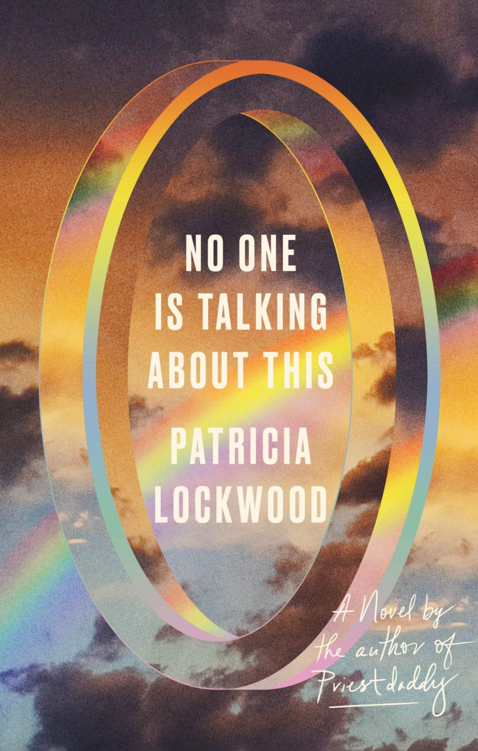
The trends that came to mind were not exactly new. In no particular order: big faces (big sunglasses!); cropped faces; hands; mouths; postmodern typefaces;1 big skies; rainbows; gradients; the colour orange; psychedelia; collage; contemporary painting.
A lot was made of “blob” covers this year. I’m not sure that anything has really changed since Vulture published this article about “blocky” covers in 2019. They seemed like much the same thing.
Design is about the constraints and, as it turns out, the constraints around designing commercial literary fiction covers that have to work just as well online as in bookstores can lead to similar design solutions — large, legible type, and bright, abstract backgrounds. 2 The surprising thing is not that a few covers look the same when you squint; it’s that more of them don’t.
There were a lot of good covers (that didn’t look alike) in 2021. LitHub posted 101 of them. Still, it didn’t exactly feel like a vintage year.
Do I say that every December? Possibly.
A few years ago I worried that covers were moving in a more conservative direction, particularly at the big publishers. I’m not sure this has come to pass, at least not in the US. There are plenty of covers from the big, prestigious American literary imprints in this year’s list, as there were last year, and every year before that.
There are fewer covers from the UK in this year’s list than in previous years though, and I feel less confident about the situation there. From a distance, things seem a little sedate. I may be mistaken. It’s quite possible I haven’t see enough covers — or perhaps enough of the right ones — from British publishers to get a good sense of the overall picture.3
It would not be a surprise, however, if publishers were feeling a little risk-averse at the moment. We are two years into a global pandemic, experiencing a major supply chain issues, and living through a seemingly endless series of sociopolitical crises.
Nor would it be a surprise if designers were personally feeling the effects too — I’m not sure we are talking about this enough, and I’m not sure I know how to.
Thank you to everyone who has supported the blog in 2021. It means a lot. Here are this year’s book covers of note…
Na Kim talked to PRINT about her career and the designs for the Ditlevsen series in February. If, like me, you were wondering about typeface on the covers, it’s Prophet from Dinamo apparently.
If you’re wondering about the Super-Seventies Sally Rooney typeface, it is Ronda designed by Herb Lubalin and Tom Carnese (I only know because I asked).
Thank you to everyone who has supported the blog in 2021. It means a lot.
I am not convinced that the term “postmodern” quite captures what I mean here (and/or worse, implies something different in the context of typography), but it’s the best I’ve got. I’m not talking about the kind of experimental typography you might associate with the likes of Wim Crouwel or Emigre, or the aesthetic of someone like David Carson. What I am trying to get at is idiosyncratic type that purposely exaggerates or plays with letterforms, and doesn’t conform to function-first modernism. To my mind, this would include some typefaces from the 1960s and 70s, as well as some more contemporary type. In a sense what I am describing is display faces — and I think the eclectic, innovative use of type in Victorian advertising might be an inspiration to designers here — but I don’t think it is just about size. ↩
This will be the last of the monthly cover round-ups for 2021 because I have to turn my attention to the year as a whole, but there are some really top-notch covers in this month’s post so it feels like a good place leave off…
The cover of the UK edition, publishing next year I believe, was designed by Jack Smyth:
Jacket Weather by Mike DeCapite; design by Michael Salu (Soft Skull / October 2021)
I was reminded of the cover of The Empty Chair by Bruce Wagner designed by Gregg Kulick from what seems like an age ago (2013 I think?) . It’s very possible I have been doing this for too long…
The don’t look that similar side by side, by I was reminded of Will Staehle‘s 2018 cover for Circe by Madeline Miller, and the UK cover of the more recent Sistersong by Lucy Holland, designed by Melissa Four (I’m fairly sure I’ve seen an orange/red version of the Sistersong cover. Perhaps it was an ARC?).
Circe by Madeline Miller; design by Will Staehle (Little Brown & Co / April 2018)
When I first saw this cover I immediately thought there was some kind of link to Josef Albers ‘Homage a Square’ series, but nobody else seems to have mentioned it, so perhaps it is coincidental? Is that possible? I should probably pick up the book!
A bit of a bumper post this month with a ton great covers, lots of old friends, a couple of designers that are new to me, and maybe an early contender (or two) for the ‘best of the year’ list.
I haven’t posted enough of David’s covers lately. They are always fun. I was struggling to think what this one reminded me of. I’m wondering if it’s maybe Raymond Hawkey’s black and white cover designs for Len Deighton? Or something from Pelican / Penguin in the 1970s?
Come On Up by Jordi Nopca; design by Roman Muradov (Bellevue Literary Press / February 2021)
The cover of the UK edition, published this month by Bloomsbury, was designed by Greg Heinimann.
Rachel Willey’s design for Patricia Lockwood’s memoir Priestdaddy is still one of my favourite covers of recent years (hard to believe it is from 2017!).
O by Steven Carroll; design by Gray318 (HarperCollins Australia / February 2021)
What would you call this background colour? Light brown? Dark beige? Anyway, it seems to be a thing. We could probably include As You Were cover here too, although it doesn’t have the red-orange accent colour.
The Witch’s Heart by Genevieve Gornichec; design by Adam Auerbach (Ace Books / February 2021)
Aeneis by Vergilius; design by Gray318 (Jaguar / 2019)
Jon will surely not thank me for mentioning this, but the Aeneid cover reminds me of the brilliant 2007 Penguin Modern Classics editions of Kafka designed by Mother and Jim Stoddart (featuring photographs by Gary Card and Jacob Sutton), and I can’t pass up the opportunity to post them here. They still look extraordinary…
(And in the process of looking for images, I cam across a nice essay from a couple of years ago by designer Clare Skeats discussing the Kafka covers at Grafik)
High School by Tegan & Sara; design by Na Kim (MCD / September 2019)
The cover of the Canadian edition published by Simon & Schuster Canada (left) was designed by Emy Storey. The cover of the UK edition published by Virago (right) was adapted from the Canadian design by Nico Taylor.
Sontag by Benjamin Moser; design by Tom Etherington; photograph by Richard Avedon (Allen Lane / September)
The cover of the US edition published by Ecco was designed by Allison Saltzman. Title only appears on the spine (which, if my social media is anything to go by, gets big high fives from book designers everywhere).
The New York Times ran a short article about the genesis of this cover earlier this year.
For the font-curious, the typeface is Alias Harbour according to the folks at Fonts In Use. Another calligraphic type alternative to the ubiquitous Lydian perhaps?


