Meh. February. At least it’s almost over (and the book covers are good).
The Bear by Andrew Krivak; design by Alban Fischer (Bellevue Literary Press / February 2020)
(I read an ARC of The Bear last year (full disclosure: the folks that pay me distribute Bellevue Literary Press in Canada), and haven’t really stopped talking about it since, so I may as well mention here too. It’s very sincere, and reminiscent of the kind of Cold War science fiction in which war and environmental catastrophe have led to the end of civilization. It is not dystopian though. It reads rather like beautiful melancholy fable. I liked it a lot.)
One for the meta-covers list (and does the use of Lydian on the cover of a book on the cover of book count as ironic?)
The Mercies by Kiran Millwood Hargrave; design by Lucy Kim (Little Brown & Co / February 2020)
The cover of the UK edition published by Picador was designed by Katie Tooke I believe (and if anyone can tell me who the did the illustration — based on traditional Norwegian folk art rosemaling — I would be grateful!)
Verge by Lidia Yuknavitch; design by Rachel Willey (Riverhead / February 2020)
Whistleblower by Susan Fowler; design by Catherine Casalino (Viking / February 2020)
Nice type.
Weather by Jenny Offill; design by John Gall (Knopf / February 2020)
There haven’t been very many John Gall covers on the blog recently, so it’s a delight to post two in the same month. And this really is a most Gallian of John Gall covers.
The cover of the UK edition of Weather, published by Granta, was designed by Gray318…
The previous post about the latest cover of the NYT Magazine reminded me that Tom Gauld‘s cartoons for New Scientist magazine (like the one above, although maybe not actually the one above because it’s new!) are going to be available in book form. Department of Mind-Blowing Theories will be available in April!
Antiquarian booksellers are part scholar, part detective and part businessperson, and their personalities and knowledge are as broad as the material they handle. They also play an underappreciated yet essential role in preserving history. THE BOOKSELLERS takes viewers inside their small but fascinating world, populated by an assortment of obsessives, intellects, eccentrics and dreamers.
According to their Facebook page, the film is in theatres next month.
As I mentioned in my 2019 round-up, the cover of the UK edition, published by Picador this month, was designed by Ami Smithson and features black and white photograph by Mark McKnight.
There is a bit of story to this post. The short version is that I started it in 2018 to celebrate 10 years of the blog. When that deadline went whooshing past, I thought I would rework it for the end of 2019 as a look back at the decade. Now in 2020, with the risk of another deadline coming and going before I get it exactly right, I am just going to post this as it is — a collection of covers from the past 10 years1 that I quite like!
I always feel a bit guilty about this post. Readers seem to like it, but I don’t actually see a lot of young adult books day-to-day, so I am far too reliant on the covers people put in front of me to make it a really representative list. To make matters worse, it is now very late and very rushed. Nevertheless, there are some really great YA (and middle-grade!) covers here that I wanted to share. Feel free to tell me about all the ones I missed in the comments! Happy New Year!
2019 has felt interminable. It has also felt like there are never enough hours in the day to keep up. You can’t talk to me about TV shows or movies. I haven’t seen any.
When it comes to books, I’m fortunate enough to work in the industry. But what hope do casual readers have of finding the good stuff when the same few titles dominate the conversation and there is so much else competing for their attention?
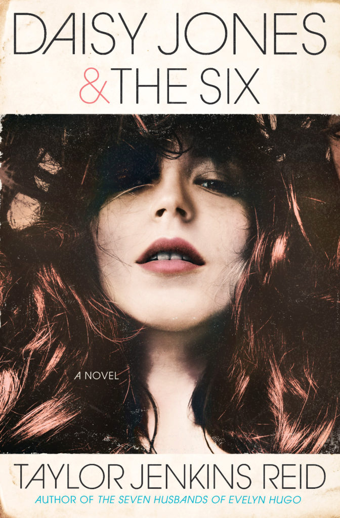
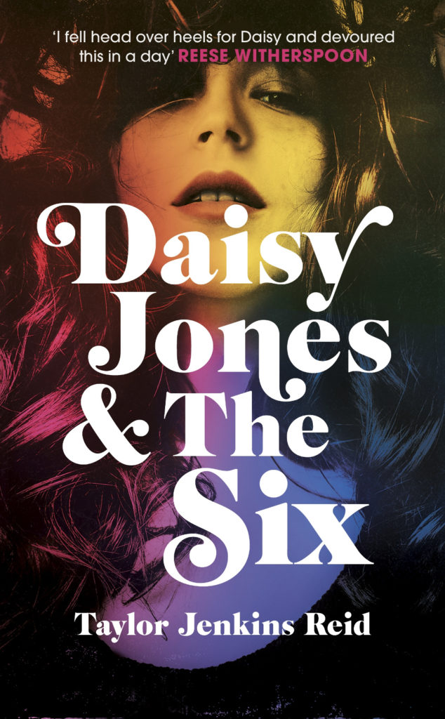
Daisy Jones and The Six by Taylor Jenkins Reid; design by Caroline Teagle Johnson (Ballantine / March 2019) Daisy Jones and The Six by Taylor Jenkins Reid; design by Lauren Wakefield (Hutchinson / March 2019)
Daisy Jones and the Six had a glamorous, louche 1970s look. The US and UK editions, designed by Caroline Teagle Johnson and Lauren Wakefield respectively, took slightly different directions with the type, but the photograph (a stock image apparently) felt ideally suited to social media.
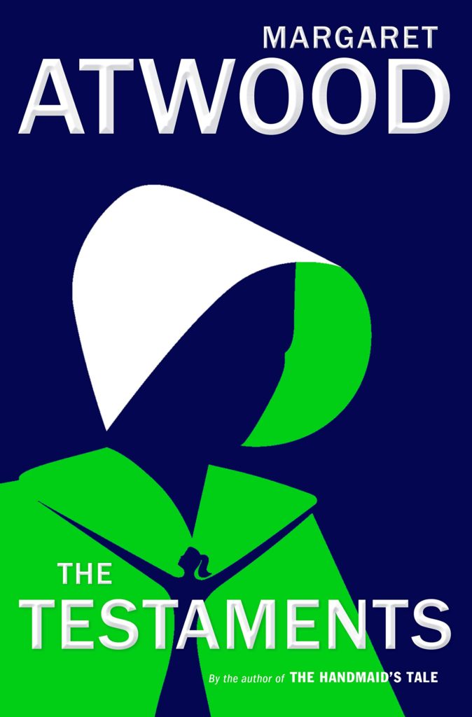
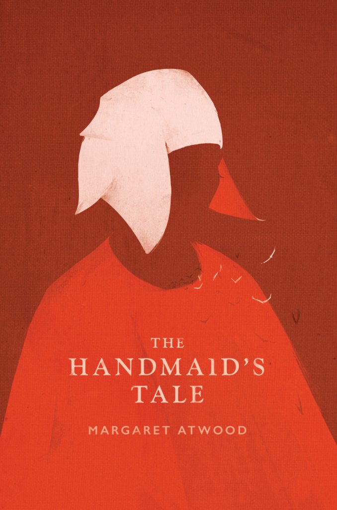
The Testaments by Margaret Atwood; design by Noma Bar (Chatto & Windus / September 2019)The Handmaid’s Tale by Margaret Atwood; art direction by Christopher Moisan; illustration by Patrik Svensson (Houghton Mifflin Harcourt / April 2017)
The Testaments was everywhere and, like the recent Vintage Classics reissue of The Handmaid’s Tale, the cover illustration was unmistakably by Noma Bar. We live in an age where every cult movie and TV show gets a ‘minimalist’ poster now, and I found that The Testaments looked too familiar for me to find it engaging. It didn’t help that the cover of the 2017 US reissue of the The Handmaid’s Tale by Swedish illustrator by Patrik Svenson had already featured a similar 3/4s silhouette. Nevertheless, it was perhaps a bolder cover choice than I’m giving it credit for. If nothing else, it showed that bright green on book covers — once cursed and reviled — is suddenly all the rage!
In terms of trends, 2019 felt more like a continuation of previous years rather than a break with the past. There was a kind of conservatism to a lot of the covers I saw. My sense was that highly polished designs that looked comfortingly familiar were being approved over riskier ones that stood out from the crowd. The most interesting covers often came from small publishers, especially New Directions who seem to be giving a bit more creative license to the designers they work with (some of whom have 9-5s at much bigger publishers!).
Big centred blocks of utilitarian white type over elaborate backgrounds continued to be a mainstay. It’s the book cover as poster, and it works at any size, so I don’t think it’s going away any time soon.
Handwriting and hand-lettering remained popular too, although my sense is that enthusiasm is starting to wane as publishers are opting for greater legibility and designers are turning back to vintage type styles to give a sense of authenticity and craft. (I’m willing to admit the evidence might not back me up on this, however!)
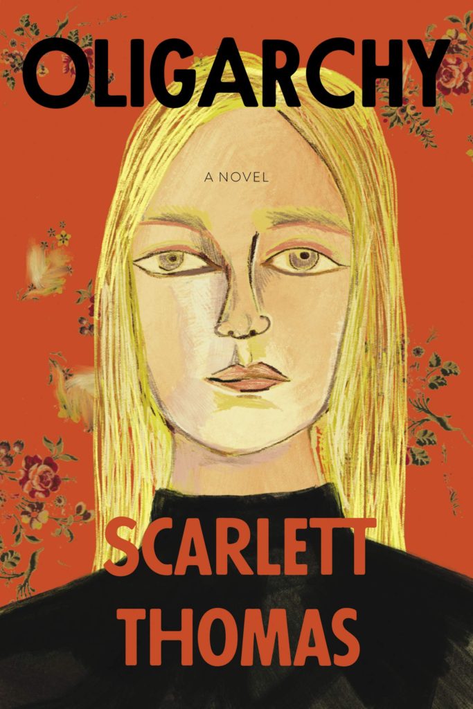
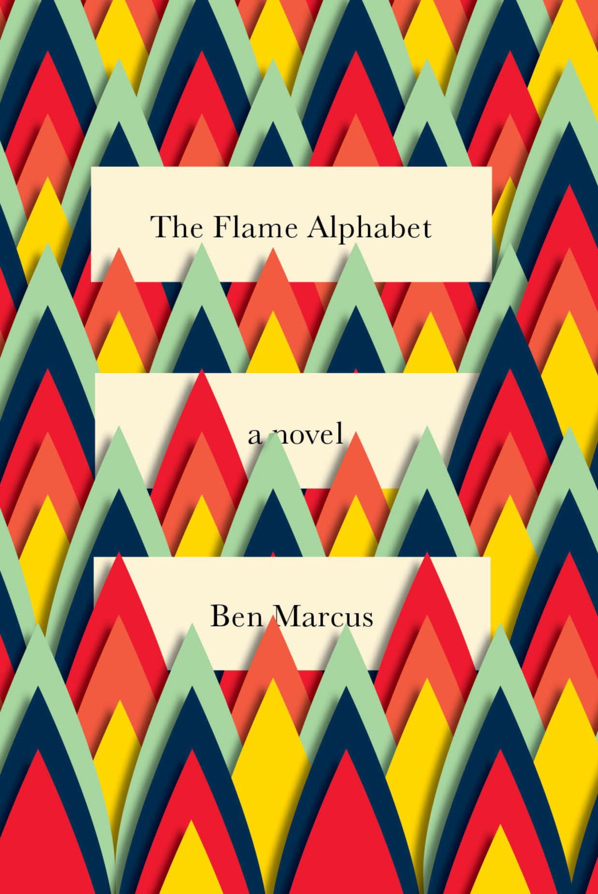
Fun, swishy 1970s-inspired serifs like Benguiat Caslon revival Cabernet are back. People keep trying to make ITC Avant Garde — another iconic 1970s typeface — happen again too. I don’t think it works for the most part, but I can see why designers think it’s cool in a coked-up New York way. Warren Chappell’s earnest calligraphic sans serif Lydian, originally released in 1938, continued its unlikely rise as a go-to literary typeface. It even got an explainer at Vox.
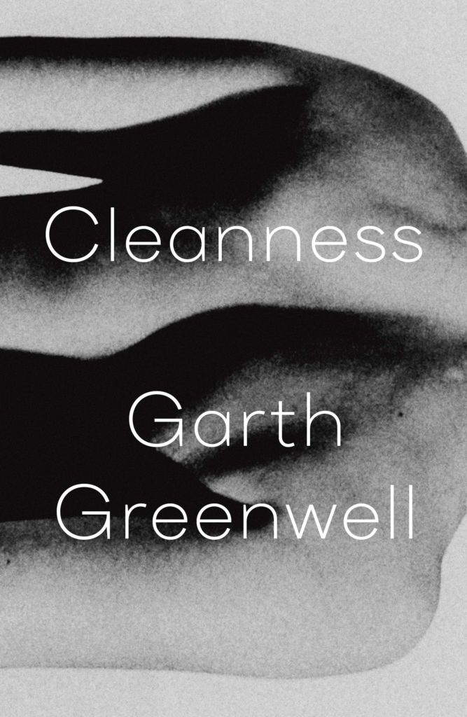
Black and white portrait photography has been the staple of biographies and classics for years, so it was interesting to see closely cropped black and white photographs used on the covers of a couple of new literary novels this year. This isn’t entirely new obviously. Black and white photography has long been used to signify that something is “art” (as opposed to, say, “pornography”). But I think the latest iteration of trend was started by Cardon Webb‘s 2015 cover for A Little Life by Hanya Yanagihara which used a black and white photograph by the late Peter Hujar.
Coincidentally the cover of the US edition of Garth Greenwell’s new novel Cleanness, publishing early 2020, was designed by Thomas Colligan and uses contemporary black and white photograph by Jack Davison. (The UK edition, designed by Ami Smithson fits this trend a little less neatly, but features black and white photograph by Mark McKnight)
Something that I didn’t anticipate was the use of contemporary landscape and figure painting on the covers of some the big literary releases of the year. Like black and white photography, it felt almost pre-digital — a grasp at traditional values of craft. I don’t know if I would go as far as to say it is a rejection of post-modernism. But maybe it is? I don’t know. Discuss amongst yourselves.
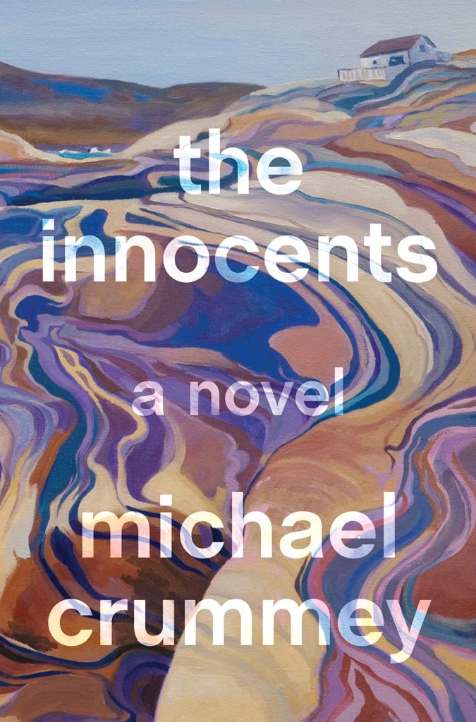
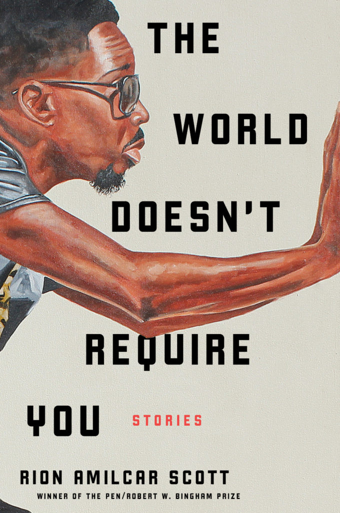
The Innocents by Michael Crummey; design by Emily Mahon; art by Diana Dabinett (Doubleday / August 2019)The World Doesn’t Require You by Rion Amilcar Scott; design by Laywan Kwan; art by Fahamu Pecou (Liveright / August 2019)Inland by Téa Obrecht; design by Jaya Miceli; art by Tamara Ruiz (Random House / August 2019)
Thank you to all the designers and art directors who’ve been in touch and helped me identify covers for my posts. I’m sorry if I haven’t replied to your message. It’s been a year.
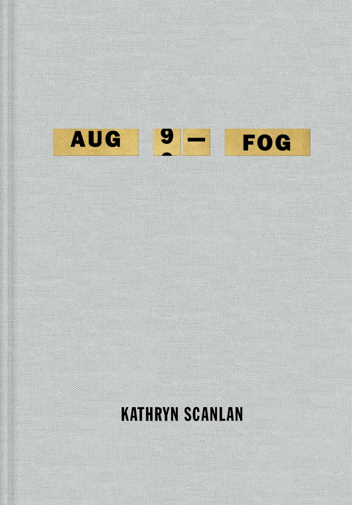
Aug 9 — Fog by Kathryn Scanlan; design by Na Kim (Farrar Straus & Giroux MCD / June 2019)
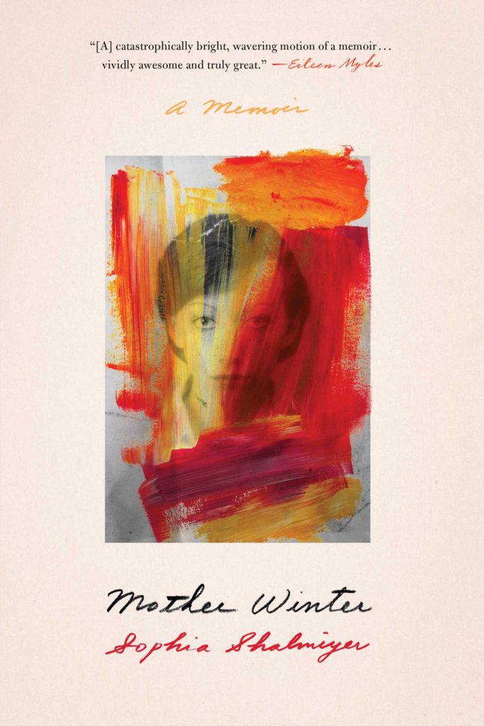
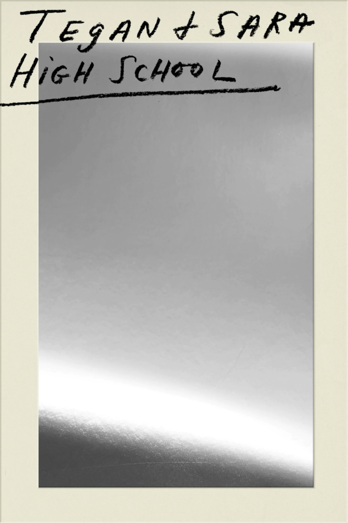
Also designed by Na Kim:
Lie With Me by Philippe Besson; design by Na Kim (Scribner / April 2019)Mother Winter by Sophia Shalmiyev; design by Na Kim (Simon & Schuster / February 2019) High School by Tegan & Sara; design by Na Kim (MCD / September 2019)
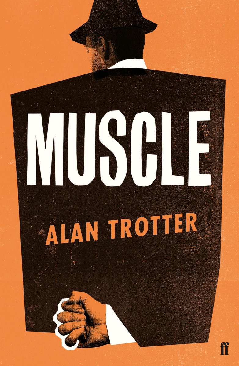
Muscle by Alan Trotter; design by Gray318 (Faber & Faber / February 2019)
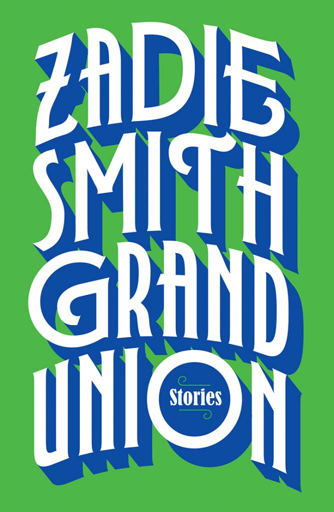
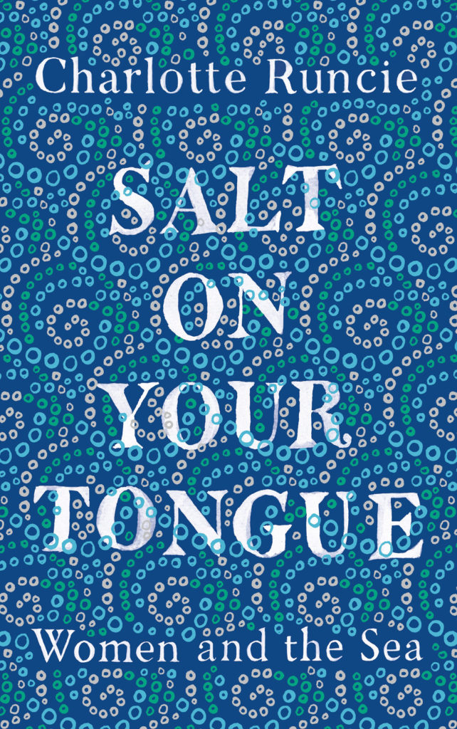
Also designed by Gray318:
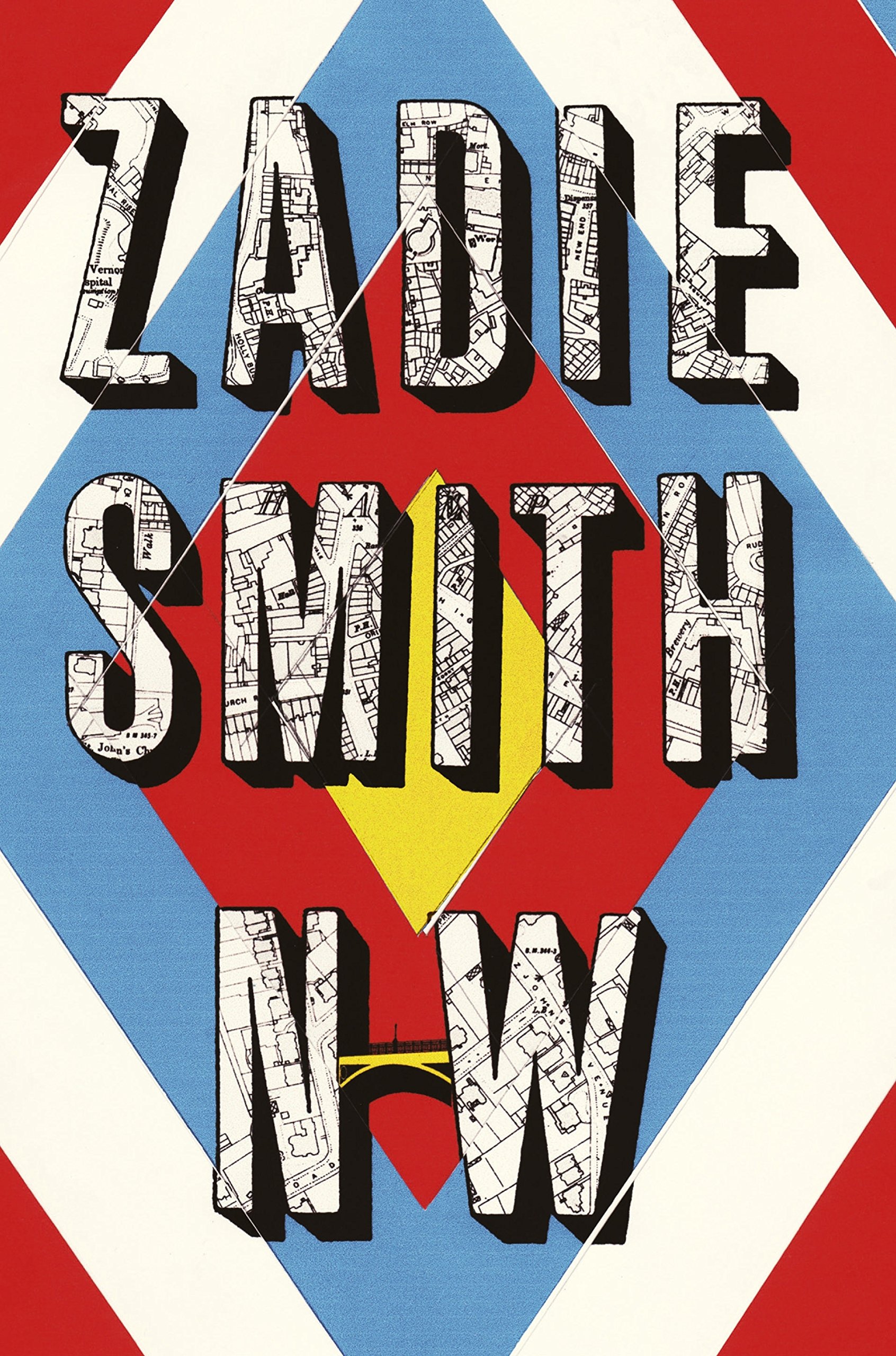
Quichotte by Salman Rushdie; design by Gray318 (Jonathan Cape / August 2019) Grand Union by Zadie Smith; design by Gray318 (Hamish Hamilton / October 2019)Salt On Your Tongue by Charlotte Runcie; design by Gray318 (Canongate / January 2019)
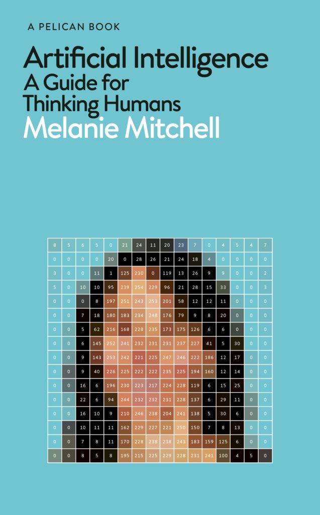
What We Really Do All Day by Jonathan Gershuny and Oriel Sullivan; design Matthew Young (Pelican / September 2019)Artificial Intelligence by Melanie Mithcell; design by Matthew Young (Pelican / October 2019)
One Day by Gene Weingarten; design by David Litman (Blue Rider / October 2019)
Oliver Munday wrote about designing the cover for New Directions at Literary Hub earlier this year.
He also designed a lot my favourite covers this year…
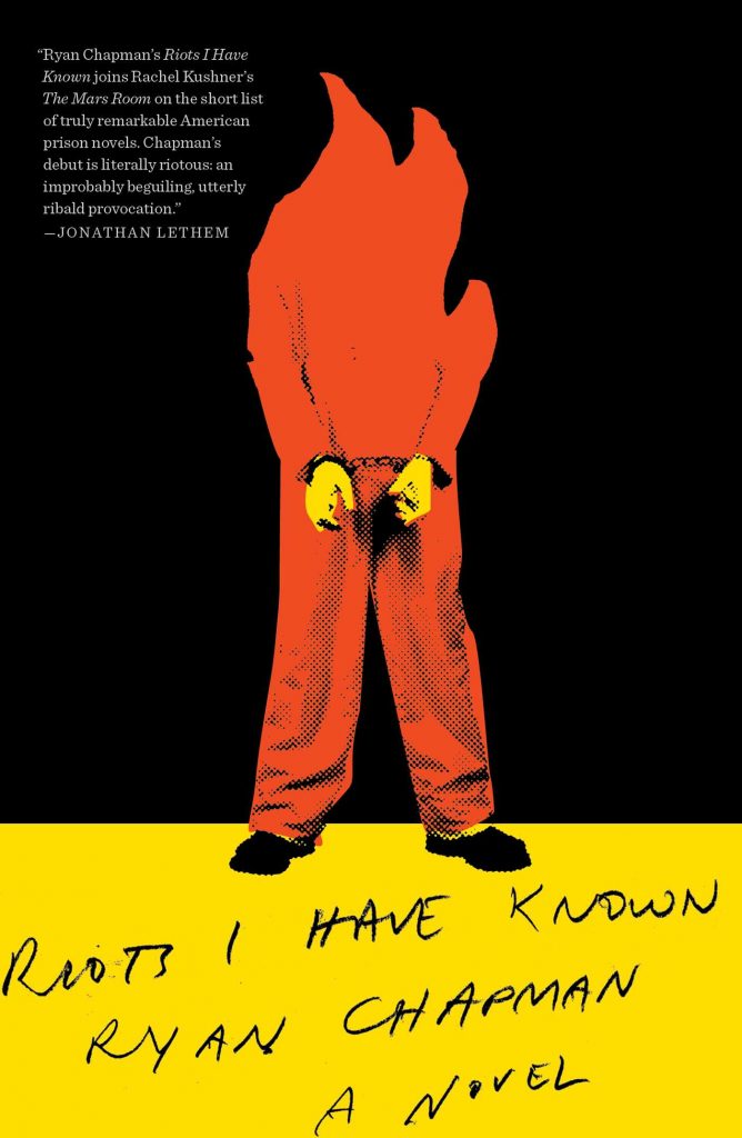
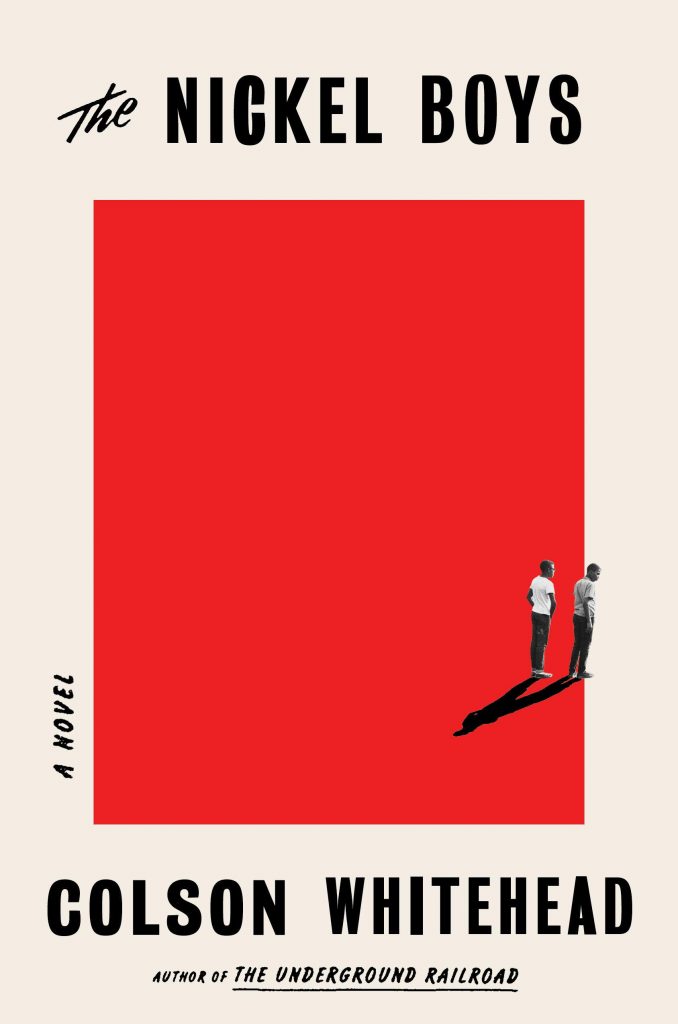
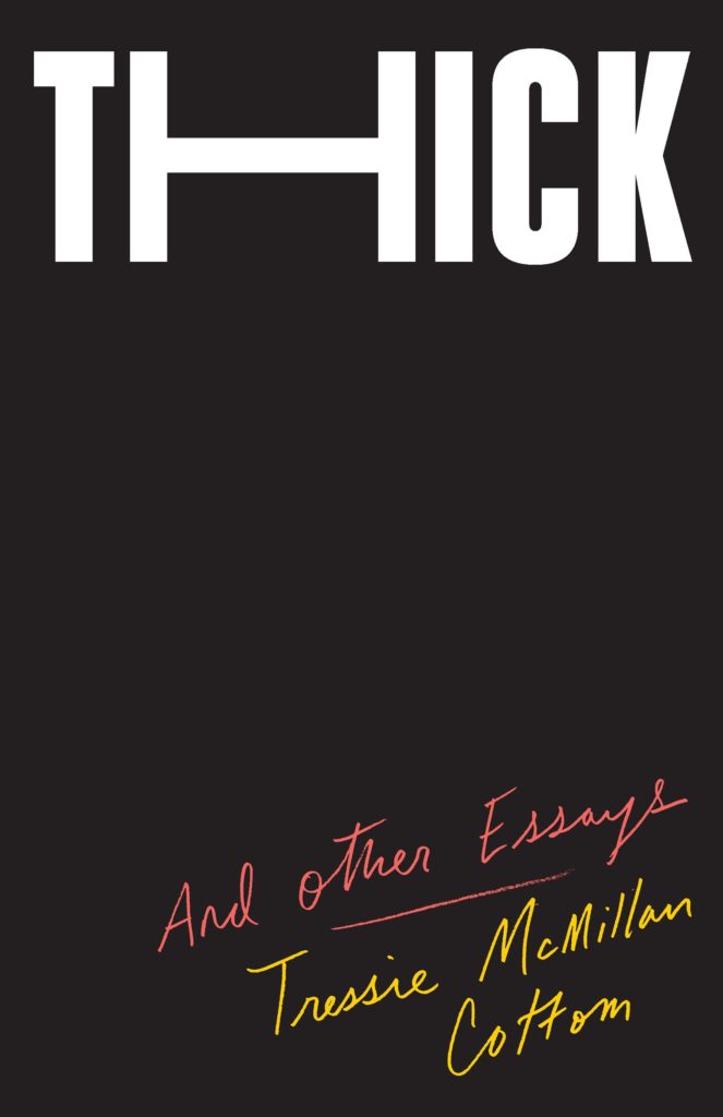
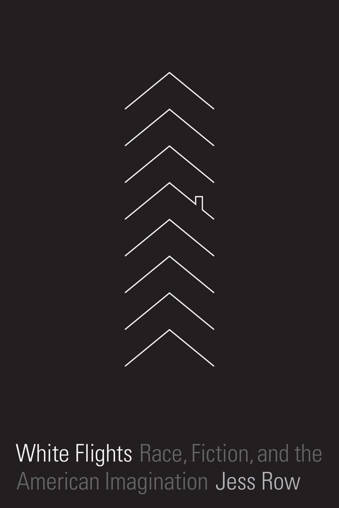
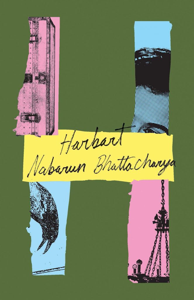
Riots I Have Known by Ryan Chapman; design by Oliver Munday (Simon & Schuster / May 2019)The Nickel Boys by Colson Whitehead; design by Oliver Munday (Doubleday / July 2019)Thick by Tressie McMillan Cotton; design by Oliver Munday (The New Press / January 2019)White Flights by Jess Row; design by Oliver Munday (Graywolf / August 2019) Harbart by Nabarun Bhattacharya; design by Oliver Munday (New Directions / June 2019)
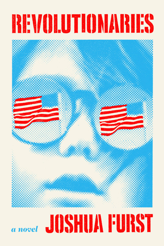
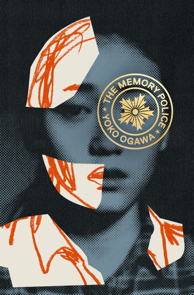
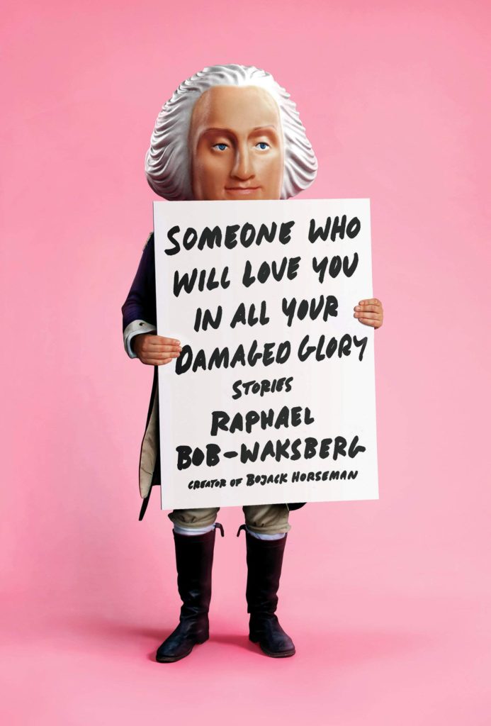
The Revolutionaries by Joshua Furst; design by Tyler Comrie (Knopf / April 2019)The Memory Police by Yoko Ogawa; design by Tyler Comrie (Pantheon / August 2019)Someone Who Will Love You in All Your Damaged Glory by Raphael Bob-Waksberg; design by Tyler Comrie; illustration Justin Metz (Knopf / June)
The Volunteer by Salvatore Scibona; design by Rachel Willey (Penguin / March 2019)
Also designed by Rachel Willey:
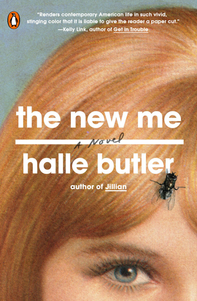
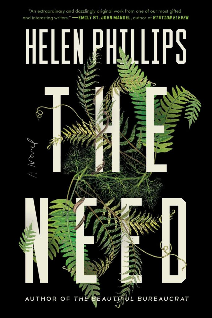
The New Me by Halle Butler; design by Rachel Willey (Penguin / March 2019) The Need by Helen Phillips; design Rachel Willey (Simon & Schuster / July 2019)
Oh hey, it’s October, AKA the best month of the year, so this is the last of my monthly cover round-ups for 2019. My look back at the year will be coming soon, so if I have shamefully overlooked your work for the past 10 months, or you want to share a cover design for a book that is coming out in November or December, now would be a really great time to drop me a line! High resolution images are always appreciated. This goes double if you design or illustrate YA covers. 1
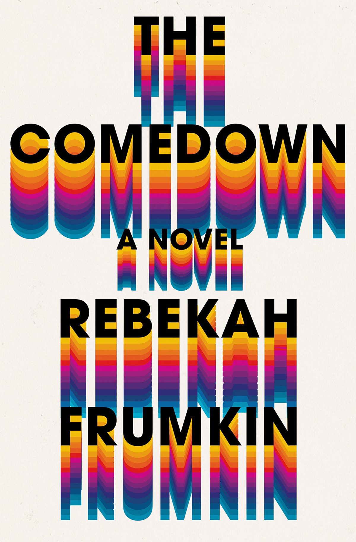
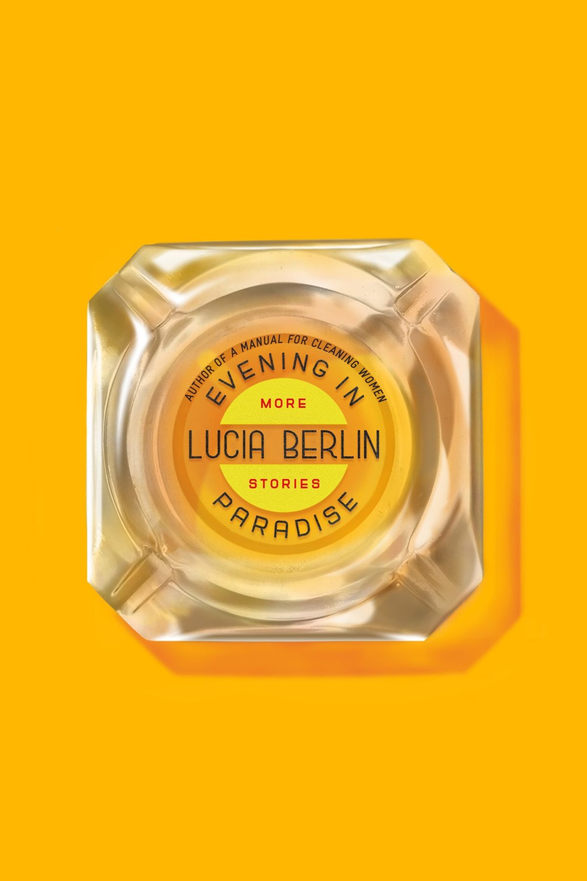
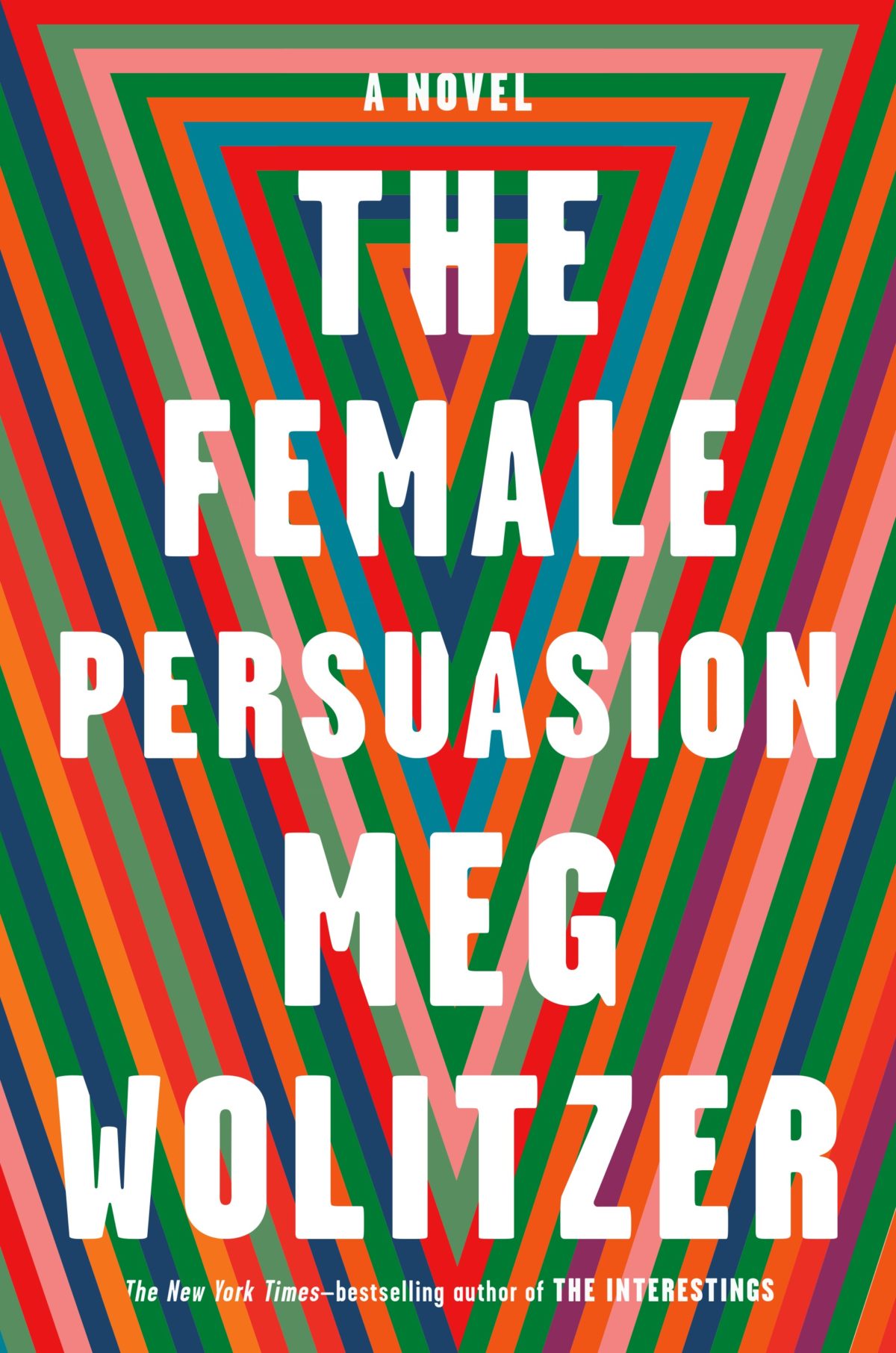
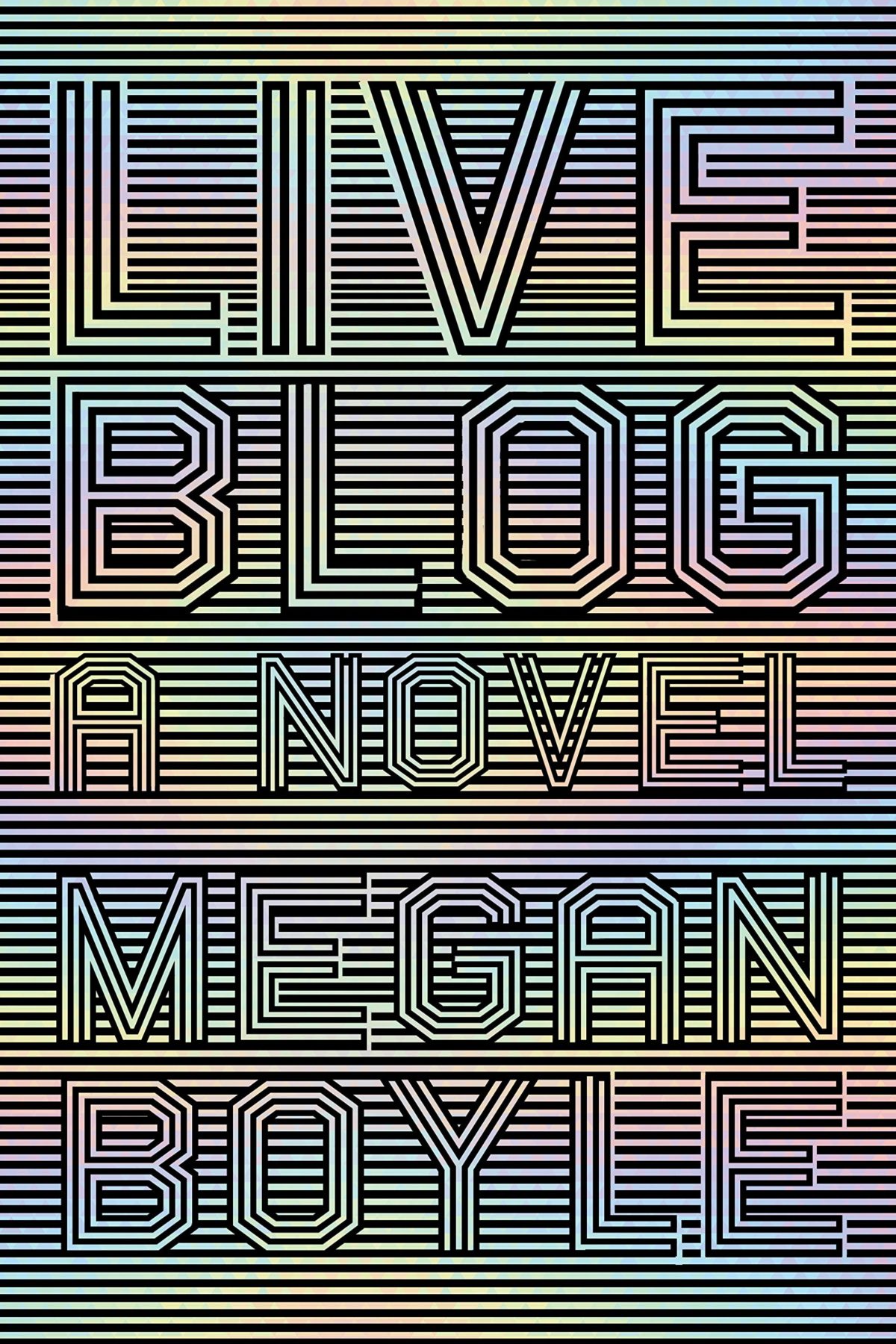
Are we seeing the beginnings of a psychedelia revival? There are a couple of covers coming in 2020 in addition to these three that make me think we might be…
Mister Miracle by Tom King and Mitch Gerads was unexpectedly one of my favourite comics this year. I hadn’t previously read any books set in the ‘Fourth World’ despite it’s massive influence on comics and films. I’ve always found Jack Kirby’s grandiose, dialed up to 11, vision of the New Gods to be a little too much, even for Jack Kirby.1 But the constant overwhelming ridiculousness of it all is one of the themes of Mister Miracle. How do you stay sane, let alone have a normal life with a family, when you are constantly ground down by the world you find yourself in, and confronted daily with situations that are tragic, absurd, and just so much bigger than you?
At the Daily Beast, Entertainment Editor Melissa Leon talks to author Tom King about how his experiences as a CIA counterintelligence officer and his personal struggles with stress and anxiety shaped the book.
“The book started when I had one of those first-episode-of-the-Sopranos panic attacks and I ended up in the hospital,” he says. “It was one of those things where you ask the doctor, ‘Am I dying or am I crazy?’ And they tell you you’re crazy and you’re like, woo-hoo! Oh, wait a second.” He laughs. “I thought I was a pretty tough guy. I’d been to war twice, I’d had three kids. In my own little nerdy corner of the world I was pretty successful. But there was something brittle inside of me.”
Mister Miracle was his chance to write about those brittle parts—and about the creeping suspicion in the age of Trump that reality is fundamentally, metaphysically even, coming undone… Unremarkable events [unfold] in heightened, surreal circumstances; sometimes touching, funny, or grim. The juxtapositions are essential to King, who likens the scenes to the memory of debriefing a source in Iraq in 120-degree weather. “We were both sweating and talking about a guy getting his head chopped off. It was horrible,” he remembers. “But it was my wife’s birthday.” He recalls shuffling into a corner, calling his wife, and singing “Happy Birthday” in half-hushed tones. “That’s what life is, right? The mundane lives right next to the crazy.” …
It sounds all very grim, but somehow it isn’t. At least not completely. There is a lot of humour and affection in it too, which is why I think it works. Somehow King finds a way to be (just about) life-affirming in the end.
Gerads layered artwork is also extraordinary and, at times, beautiful. Laid out on the page in a metronomic 9 panel grid, the glitches, blurs, and repetition add to the sense of dislocation and detachment from reality, like life is being filtered and replayed through a screen.
Part of Mister Miracle’s ambition is to capture a feeling many know intimately, but which can be hard to put into words. King and Gerads articulate that dread succinctly, often with a single phrase: “Darkseid Is.” Panels black out without warning, flashing the phrase in typewriter lettering. It interrupts moments of loneliness or disassociation. But it can also be a punchline, or a shrug: When Big Barda says it, for example, she could just as well say “shit happens.”
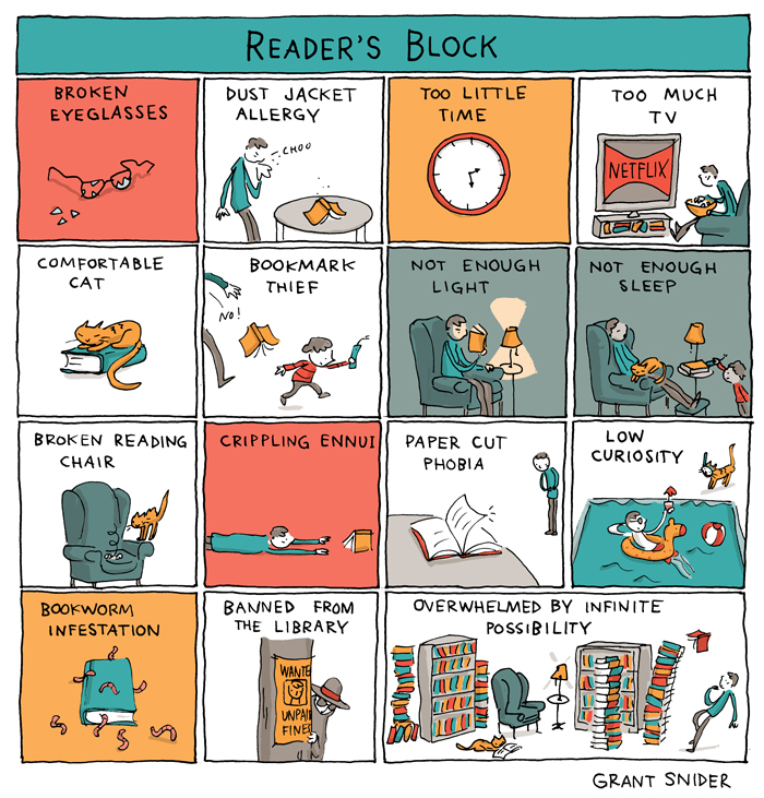
I’ve been in a bit of reading slump of late so I can relate to this recent cartoon by Grant Snider for the New York Times Books Review (although, thankfully, I’ve not been banned from the library!).


