
Designer Roberto de Vicq de Cumptich interviewed by Debbie Millman for Design Matters. Wonderful stuff:
Roberto’s most recent book Men of Letters & People of Substance is published by Godine:

Comments closed
Books, Design and Culture
Designer Roberto de Vicq de Cumptich interviewed by Debbie Millman for Design Matters. Wonderful stuff:
Roberto’s most recent book Men of Letters & People of Substance is published by Godine:
Comments closed
Snowstorm…something, something… Snowstorm… Hmm, what? Oh right. Here we go…

Pick Up a Pearson — A profile of book designer David Pearson in the New York Times:
The chillingly eloquent jacket of “Nineteen Eighty-Four” is the work of the British graphic designer David Pearson He is responsible for the design of four more books that have been reissued by Penguin in the Great Orwell series of paperbacks. From the horror movie typography on “Animal Farm” to the Vorticist-inspired illustration that Mr. Pearson commissioned from Paul Catherall for “Down and Out in Paris and London,” each of the covers exhibits the wit, thoughtfulness and ingenuity that have come to distinguish his work.
“David manages to combine respect for tradition with playfulness and a light touch,” said the graphic design historian Emily King. “He also has a brilliant understanding of the book as a physical object.”
Kvelling — Gerald Howard on the 50th anniversary of the New York Review of Books, at Salon:
Last week, my colleague at Doubleday came by my office with an austere-looking 11-by-15-inch broadsheet. Good God! It was a facsimile edition of the first issue of the New York Review of Books, Feb. 1, 1963. The advertising director and I sat there kvelling over this wondrously manifested printed object from another universe, with its Murderers Row of reviewers weighing in on many books that all these years later still matter, its old-school book ads with their quaint frontal appeals to the reader’s higher cultural aspirations…
The Literaries — A great essay Eddie Campbell about comics criticism at The Comics Journal:
Moving sideways at this point takes me to another recurring argument that falls within the jurisdiction of the present rant. I refer to the incessant debate over who authored Marvel Comics, was it Stan Lee or was it Jack Kirby?… The literaries are inclined to debate whether the furnishing of a plot is enough of a claim to authorship, or whether the real writer in this case was the artist. Once the argument gets started it can go in any direction, and is just as likely to deny that a plot was ever given in the first place, because it is obligatory that everybody who wasn’t there have an opinion and take sides. None of that has ever mattered, as far as I’m concerned, though I acknowledge that the ownership of successful movie franchises could make a difference to this party or that. But the movies do not interest me and I do not care. None of them have ever captured the thing that made Marvel comics exciting to me in 1965 when I discovered them for myself.
And finally…
Amazon Unpacked — A long, must-read piece at the FT on Amazon’s warehouse in the former mining -town of Rugeley, Staffordshire:
As online shopping explodes in Britain, helping to push traditional retailers such as HMV out of business, more and more jobs are moving from high-street shops into warehouses like this one. Under pressure from politicians and the public over its tax arrangements, Amazon has tried to stress how many jobs it is creating across the country at a time of economic malaise. The undisputed behemoth of the online retail world has invested more than £1bn in its UK operations and announced last year that it would open another three warehouses over the next two years and create 2,000 more permanent jobs. Amazon even had a quote from David Cameron, the prime minister, in its September press release. “This is great news, not only for those individuals who will find work, but for the UK economy,” he said.
People in Rugeley, Staffordshire, felt exactly the same way in the summer of 2011 when they heard Amazon was going to occupy the empty blue warehouse on the site of the old coal mine. It seemed like this was the town’s chance to reinvent itself after decades of economic decline. But as they have had a taste of its “jobs of the future”, their excitement has died down…
You can probably guess where it goes from there (but you should still read it)…
Comments closed
Although I’ve only just posted my favourite book covers of 2012, here’s an early contender for the 2013 list: George Orwell’s 1984 designed by David Pearson for Penguin UK.
According to David, his initial proposal was a die-cut version of the cover, but the final design (more effective in my opinion) uses matt black foil to obscure the lettering instead.

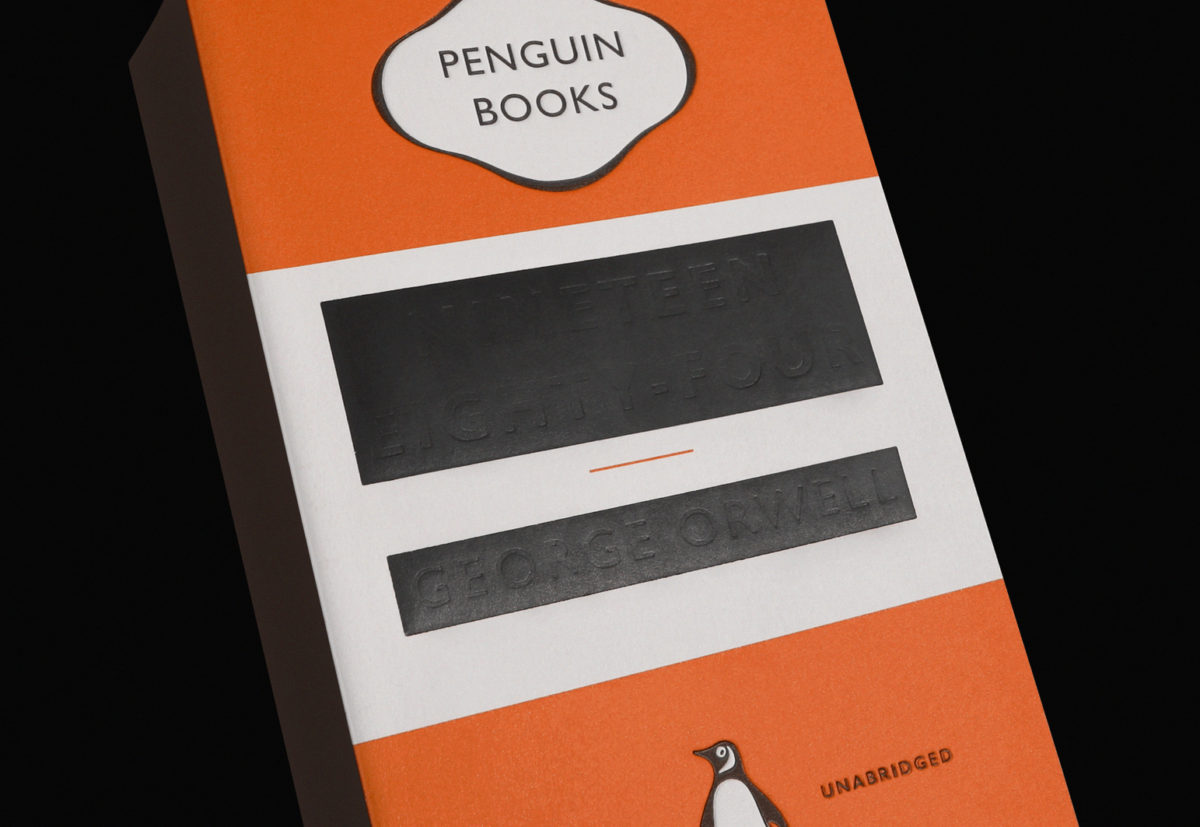
This new edition will be available on January 3rd.
14 Comments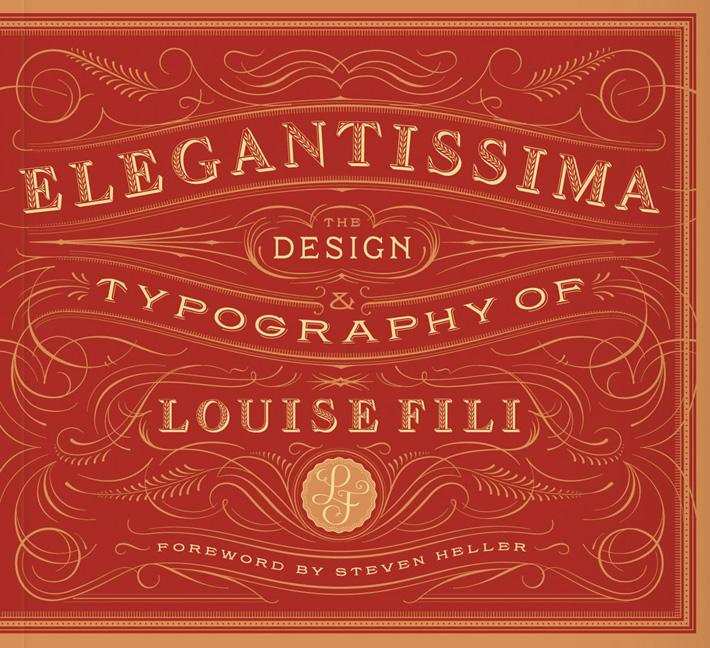
Designer, and former art director of Pantheon, Louise Fili discusses her work with Debbie Millman on Design Matters:
Design Matters With Debbie Millman: Louise Fili Interview mp3
Elegantissima, the first monograph of Fili’s work, was published earlier this year by Princeton Architectural Press (who are, for the record, are distributed in Canada by my employers, Raincoast Books)
Comments closed
In a fascinating and wide-ranging conversation, design historian Steven Heller talks about design and his recent book 100 Ideas That Changed Graphic Design with Debbie Millman on Design Matters:
Design Matters: Steven Heller mp3

Heller really is an astonishingly prolific author.
(Full disclosure: 100 Ideas That Changed Graphic Design is published by Laurence King and is distributed in Canada by my employer Raincoast Books)
Comments closedDesigner David Pearson recently gave a lecture at the Walker Arts Center as part of the Insights 2012 Design Lecture Series:
My interview with David is here.
(via Ace Jet 170)
Comments closed Tracing History — Alice Rawsthorn on the beauty of printed books for the New York Times:
Some things seem to designed to do their jobs perfectly, and the old-fashioned book is one. What else could be quite as efficient at packaging so many thousands of words in a form, which is sufficiently sturdy to protect them, yet so small and light that it can be carried around to be read whenever its owner wishes? The pages, type, binding and jacket of a traditional printed book do all of the above, as well as giving its designer just enough scope to make the result look beautiful, witty or intriguing.
(pictured above: Blaise Cendrars’s 1919 book ‘‘La fin du monde, filmée par l’ange,’’ designed and illustrated by Fernand Léger.)
Down bpNichol Lane — Founder and publisher of Coach House Books Stan Bevington talks to The Varsity about the history of the storied indie press:
Coach House purchased a photo-offset lithography machine, which allowed images to be transferred photographically to aluminum printing plates. Oil-based ink adhered to the images on the plates, which were then used to print the pages of a book… In the 1960s, this was cutting-edge technology. According to Stan, offset lithography was a tremendous step forward in the publishing industry because it “drastically liberated” the process of creating printing plates. But the text of a book still had to be typeset by hand, which left publishers relatively restricted in other areas of design. As Stan thumbs through additional books that were printed using offset lithography, he laughs and points out that they are all set in the Helvetica typeface.
Captain Crunch — Alan Moore on DC Comics planned Watchmen prequels at Fast Company:
“There’s been a growing dissatisfaction and distrust with the conventional publishing industry, in that you tend to have a lot of formerly reputable imprints now owned by big conglomerates… As a result, there’s a growing number of professional writers now going to small presses, self-publishing, or trying other kinds of [distribution] strategies.
“The same is true of music and cinema… It seems that every movie is a remake of something that was better when it was first released in a foreign language, as a 1960s TV show, or even as a comic book. Now you’ve got theme park rides as the source material of movies. The only things left are breakfast cereal mascots.”
See also: Tom Spurgeon’s ‘21 Not Exactly Original Notes On More Watchmen, Written At A Slight Remove‘:
Comments closedWatchmen is something of a perfect Internet-era story, and as such serves as a reminder of how much we’re driven by and limited to the nature and form of the way news stories develop now. You couldn’t build a story like this in a laboratory. The… Watchmen story is about a product; people like products. It’s about the hype for a product, which in many ways and for many fans has become the best part of any arts-product experience. Because the work itself doesn’t exist yet, arguments can be made on its behalf positing an ideal outcome or a disastrous one — your choice.

Debbie Millman talks with designer and self-confessed typomaniac Erik Spiekermann on the latest episode of Design Matters:
Design Matters with Debbie Millman: Erik Spiekermann mp3
Comments closed
Peter Mendelsund — senior book designer at Knopf, art director for Vertical Press and all-round superstar — talks to Debbie Millman on Design Matters:
DESIGN MATTERS: Peter Mendelsund mp3
I interviewed Peter last year about his book cover design for the Knopf edition of Tom McCarthy’s novel C, and you can read a short essay I wrote about his cover for the Schocken editions of Kafka here.
1 Comment
Designed by the brilliant Michael Salu, the cover for Diana Athill’s forthcoming collection of letters, Instead of a Book, features a stunning portrait of the author by acclaimed British photographer Rankin (co-founder of Dazed & Confused in case you were wondering).

To coincide with the release of the new book in October, Granta are also reissuing paperback editions of Athill’s books Stet, Yesterday Morning and Instead of a Letter with cover designs incorporating Rankin’s photographs.
I don’t think I have made any secret of my love of Stet, Athill’s book about her time as an editor at Andre Deutsch. But I have always been disappointed by the discouraging cover on the tatty copy on my bookshelf, and it makes me incredibly happy to finally see an edition that seems to capture something of Athill’s personality.

Athill’s writing is unflinching and it is remarkable to see that reflected in Rankin’s stark portraits. According to Michael, who art directed series and designed all the covers, “the idea was to not to shy away from age and experience, but to celebrate it and Diana’s distinct personality.” Certainly, it is hard not to be taken by the keenness of Athill’s eyes. One gets the sense she does not suffer fools gladly. There is something of a retired headmistress about her. But I love how in the photograph for Instead of a Letter, Rankin captures Athill’s thumb hooked under her necklace. The author doesn’t appear to be particularly aware that she’s doing it, but it is beautiful and poignant touch.

The type is set in Gill Sans. Of course.
Comments closed John Gall’s new cover for the paperback edition of C by Tom McCarthy. It can’t have been easy following this monster of cover.
NPR listeners pick their 100 favourite science fiction and fantasy books. On first glance, it looks like a diverse and wide-ranging selection.

Downloadable issues of De Stijl from 1917 to 1920. They’re in Dutch of course, but still! (via Coudal).
And finally…


Eye Magazine has a nice feature on Frederic W. Goudy’s 1918 book The Alphabet: Fifteen Interpretative Designs.
Comments closed
 Pentagram partner Angus Hyland has designed book covers for Canongate, Penguin and others. On the latest Design Matters podcast, Hyland discusses childhood brand recognition, Tintin, music, dyslexia, book design and his new book Symbol, co-authored with Steven Bateman, with host Debbie Millman:


Disclosure: Symbol is published by Laurence King and distributed in Canada by my employer Raincoast Books.
Comments closed