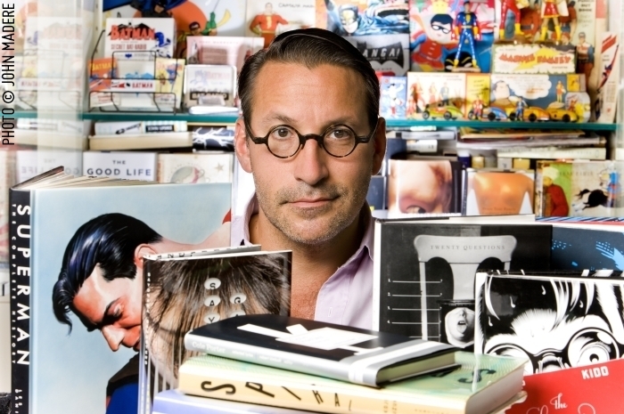
 Kicking off a new season Design Matters, designer and art director Chip Kidd in conversation with Debbie Millman:
Published October 22, 2013
Books, Design and Culture
Kicking off a new season Design Matters, designer and art director Chip Kidd in conversation with Debbie Millman:

I’ve been a fan of Luke Pearson‘s work since picking up a copy of Hilda and the Midnight Giant from Nobrow Press a year or so ago. The beautiful illustrations, quality printing and oversize format gave it the exotic feel of the comics albums British school kids used to sneak back from vacations in France (and maybe still do?). Despite my immediate sense of nostalgia, the comic itself was fresh, different and delightfully free of cynicism. I read it over and over with my kids, and then savoured it on my own after they were asleep.
Happy to find a kids comic that adults could also love, I quickly went back and found a copy of Hildafolk (recently reissued in hardcover as Hilda and the Troll) and bought Hilda and the Bird Parade as soon as it was published. While seemingly drawing inspiration from Northern European stories and Tove Jansson’s magical Moomin books, Hilda’s world has it’s own, unique mythology — a strange wood man, truculent elves, troll rocks, sea spirits, salt lions, flying furballs, and lonely, ancient giants. The wide-eyed and blue-haired child and her mother are a curious and reassuring modern presence in this old and magical world. The fantastical is everyday to them — something to be fitted around work and school. Their problems are the problems of the real world — where to live, how to make friends with the neighbours, how to do the right thing…

This juxtaposition of the modern and the magical is also evident in Luke’s comics for adults. But where the Hilda comics are unabashedly bright and joyful, the adult comics are filled with melancholy and sadness. Like Kevin Huizenga‘s Glenn Ganges comics, the fantastical in Luke’s adult comics is shadowy, nightmarish, and all the more unsettling for its appearance in mundane, familiar settings. The monsters and ghosts in stories like like You Mustn’t Be Afraid (included in the anthology Nobrow 7: Brave New Worlds), and the full-length graphic novel Everything We Miss, are the personal demons (sometimes scary, sometimes familiar) of the world weary, not the new friends of a child in unexplored territory. But for all their apparent differences, at their heart the Hilda stories and Luke’s adult comics are fundamentally about the same things: people, relationships, and about understanding one’s place in the world.
I recently spoke to Luke for the Raincoast Blog about ‘The Boy Who Drew Cats,’ his wonderful contribution to the newly published kids anthology Fairy Tale Comics. Here, we talk about his influences, his comics and his book cover illustrations. We corresponded by email.

When did you first start drawing comics?
When I was very young. I think I probably started drawing speech bubbles as soon as I figured out how to draw people. I used to draw comics about a character called Super Rabbit and show it to my grandparents.
Did you always want to be a professional cartoonist?
I probably did at some point when I was a child. It was obviously something I always thought about, but I was only really familiar with the smallest selection of comics and was entirely ignorant to how the industry worked, so it seemed like a crazy, unachievable dream to ever expect to get to that point. I eventually wound up going to university to study illustration and going into that I was prepared to basically just try and be an illustrator and it was only through the process of that that I remembered that comics were something that I still liked doing and that it was actually weird that I wouldn’t be doing them.

What was the inspiration for the Hilda books?
I draw really heavily on Scandinavian folklore (particularly Icelandic and Norwegian) for the Hilda comics. I got hooked on that initially from researching Icelandic folktales for a map project we were set at university. I really liked how strange and low-key they were. Not much happens and then the weirdest thing will happen, but it’s described really plainly and matter-of-factly and then it will end really abruptly. I tried to fuse some of the stuff I’d read for that with memories from an earlier family holiday to Norway which had a big effect on me and set a bunch of ideas in motion that for a long time I had nothing to do with.

The series has drawn comparisons to Tove Jansson beloved Moomin stories. Has Jansson been an influence on your work?
The 1990 tv series was my first exposure and I always felt like it was key in the shaping of my psyche somehow. I came relatively late to discovering the full breadth of what she did. If I had to choose to have an idol, I guess she would be it, maybe. So obviously she is a big influence on me, as a cartoonist, illustrator and a writer. I always feel a bit weird about any comparison though, because I can’t tell if it’s meant kindly or if it’s more like ‘I can see where you steal your ideas’. Hilda was designed very self consciously, at least initially, to resemble a kinder Little My.

Your contribution to Fairy Tale Comics, ‘The Boy Who Drew Cats’, has a similar magical quality to Hilda. What attracted you to the story?
It was actually one of a couple of stories suggested to me by Chris Duffy, who edited the book. I liked how far removed it felt from the kind of Brothers Grimm stories that I generally think of when I think ‘fairytales’. It’s more like a horror story with a lot of weird details that seemed fun to me. I liked the Japanese setting. I was also completely unfamiliar with it so I didn’t have to feel the weight of past interpretations on me as I adapted it.

I love that the child at the centre of ‘The Boy Who Drew Cats’ looks a lot like Harold from ‘Harold and the Purple’ Crayon. Has Crockett Johnson been an influence on your work?
Actually no! I’m not super familiar with Crockett Johnson’s work at all. He actually started off as Charlie Brown and then I pulled his features around a bit.

Do you approach your comics for kids differently from your adult comics?
I think this is the only kids comic I’ve done that isn’t a Hilda comic. Usually I’d point out that I draw my kids comics (Hilda) in a different style to how I tend to draw my adult stuff. I guess really I’m just talking eyes here. Hilda is full colour with big eyes and my other comics tend to be limited colour with dot eyes. This is full colour with dot eyes so I guess it sits in the middle. Less superficially, I’d say I try to be really clear in regards to storytelling and try and wrap things up neatly with my children’s work.
Briefly, could you describe your working process?
I generally draw and ink on paper, scan, colour in photoshop. I switch between brush pens, brushes, fineliners and dip pens. I don’t have any particular paper that I always use. I’m starting to enjoy occasionally inking in photoshop now, which I’m just using a wacom tablet for.

How is illustrating a book cover different from drawing comics?
Other than involving the same technical skills, it’s different in every way. I guess you are kind of trying to ‘tell a story’ with a cover, but really you just want to create an image that’s striking, intriguing, aesthetically pleasing and somehow captures the tone of the book. I’d say it feels a lot easier than a comics page, because you can just spend all your time fine tuning and perfecting this one thing until it’s ready, rather than having to worry about fifteen different images and making sure they all look good and all fit on the page and make sense when read one after the other. That said, it’s a totally different thing and requires different skills.

Are there any books you would love to illustrate?
Watership Down or something by Franz Kafka. I wouldn’t want to do them in the style I draw my comics though. My taste in book covers is not quite in sync with the ones I’ve actually drawn.
What have you read recently?
I just finished reading Tenth of December by George Saunders. I just bought a couple of collections of Michael Dougan comics which I really like.
How did you get involved with Adventure Time?
I got an email asking if I wanted to take a storyboard test, which I took and I guess they liked it. There’s no interesting story there really. I’ve boarded on two episodes so far, ‘Candy Streets’ and ‘Frost & Fire’ and should be doing some more some time soon.

Where do you look for inspiration, and who are some of your cartooning heroes?
I try to just pay attention to things and take everything in as inspiration in some way or another. But you know, I also just look at tumblr and stuff like every one else does. Some of my heroes are Tove Jansson, Chris Ware, Osamu Tezuka, Gene Deitch and Philippa Rice.
Who else do you think is doing interesting work right now?
Loads of people, but the more I list the more I feel like I’m missing out. My favourite cartoonist right now is Anatola Howard.
Have you thought about creating web-comics?
Yes, but I can’t see myself ever having a dedicated site for a specific regularly updated comic. I usually put my shorter comics online if I can and I wish I could do that more often. I can definitely see myself doing a regularly updated thing for a limited period of time at some point.
Do you worry about the future of books and print?
I can’t say it’s ever kept me up at night.
Thanks Luke!
2 Comments
Designers Jason Kernevich and Dusty Summers talk about their work, inspirations and starting up their own studio The Heads of State (10 years ago now!), at The Great Discontent:
Dusty: I remember looking at album covers when I was 13 and can recall the smell of the ink on the booklet for In Utero. I knew that was graphic design, but it was more about the album and the beautiful artwork. I think that’s where my interest in design started.
Jason: Yeah. I made this fateful choice of wearing a Sonic Youth t-shirt to a guidance counselor recruitment. It had a Raymond Pettibon drawing on it and my recruiter said, “That’s Raymond Pettibon. He’s in the MoMa.” That made a connection for me that something could live in the punk and fine art worlds at the same time. Then, when someone at Tyler made a statement that the record covers Pettibon did for Black Flag were graphic design, that connected it even more for me.

I talked to Jason and Dusty about their book cover design and other work way back in 2010.

If you are going to be in London on September 25th, Stories from the Fold, a mini-conference about book design at the St. Bride Library looks terribly interesting. Curated by designer Becky Chilcott, speakers include Jon Gray (AKA Gray318), Clare Skeats, and host of others.
Sounds like a great way to spend an evening to me.
Tickets are £25.00 (£20.00 for students).
Comments closed
Just in time for the 50th anniversary of Interaction of Color by Josef Albers, Yale University Press has partnered with the Josef and Anni Albers Foundation and Potion Design to create an interactive digital edition of the book for the iPad.
In this video, Michelle Komie, senior editor of art and architecture at Yale University Press, discusses the project:
While this sampler for the app includes commentary by Knopf art director Peter Mendelsund:

On a recent episode of Design Matters Debbie Millman spoke to Brenda Danilowitz, Chief Curator at the Josef and Anni Albers Foundation, and Philip Tiongson, a principal at Potion, about Josef Alber’s book and the new digital edition:
And, of course, Interaction of Color is still available as a good old book.
Comments closed
Penn State alumnus Chip Kidd discusses his career at length in a recent interview conducted at the university by host Patty Satalia:
Kidd’s novel The Cheese Monkeys is loosely based on his time at Penn State.
Comments closed
Since I was an infant, I have feared my father’s den. Based on its ancient relics and mass clutter, I have since referred to the location as “Steven Heller’s Cave.”
Steven Heller’s son Nicolas (A.K.A. Ricky Shabazz) has made short video about the apartment where his father stores some of his more controversial design artifacts and ephemera:
Bonkers.
Comments closedI haven’t posted a lot of book covers recently, so to amend the situation here’s a completely unscientific selection of a few designs that have caught my eye recently:

Middle C by William Gass; Design by Gabriele Wilson

Sorry Please Thank You by Charles Yu; Design by Cardon Webb

On the Map by Simon Garfied; Design by Roberto de Vicq

Me and the Devil by Nick Tosches; Design by Keith Hayes

Lionel Asbo by Martin Amis; Design by Jamie Keenan

The Flamethrowers by Rachel Kushner; Design by Charlotte Strick

London Underground by Design by Mark Ovenden; design by Matthew Young

The Silence of Animals by John Gray; designer unknown (image: Animalia N.1 by Carnovsky)
NB: You can find more book cover designs at The Accidental Optimist and my Pinterest.
Comments closed
Massimo Vignelli discusses his approach to book design:
[vimeo http://vimeo.com/64811872 w=500]The video was produced by Pentagram’s Michael Bierut and Aron Fay for Mohawk’s “What Will You Make Today?” campaign, and is accompanied by a limited edition journal that reproduces Vignelli’s grid from the film.
Comments closed
The esteemed Tom Gauld recently posted a delightfully bonkers new cover illustration for Stevyn Colgan’s book Constable Colgan’s Connect-O-Scope, and I thought it was about time we had a retrospective of Tom’s book covers around here:

The Three Musketeers by Alexandre Dumas (2007)

The Tribes of Britain by David Miles (2006)

Strange Eventful Histories by Shiamin Kwa (2012)

Stories by Neil Gaiman and Al Sarrantonio (2011)

Shadow Show edited by Sam Weller and Mort Castle (2012)

Family Fang by Kevin Wilson (2011)

The Damned Busters by Matthew Hughes (2011)

Costume Not Included by Matthew Hughes (2012)

Hell To Pay by Matthew Hughes (2013)

Nobrow #6 by various (2012)

Goliath by Tom Gauld (2012)
And finally, Tom’s new book You’re All Just Jealous of My Jetpack has just been published:

You can read my Q & A with Tom here.
(full disclosure etc., Tom’s two most recent books, Goliath and You’re Just Jealous of My Jetpack, are published in North America by Drawn & Quarterly and distributed in Canada by my employer Raincoast Books)
Comments closed
Tom Gauld’s collection of cartoons, You’re All Just Jealous of My Jetpack* has just been released in US and Canada.
* For the sake of full disclosure, Tom’s new book is published by Drawn & Quarterly and distributed by my employer Raincoast Books.
Comments closed
In part one of our conversation, Misha Beletsky, art director at Abbeville Press, discussed his interest in the work of German-born designer and calligrapher Ismar David, the subject his recent book The Book Jackets of Ismar David, published by RIT Press. In this second and final part of our interview, Misha and talks about his own work as a designer and an art director:

How did you become interested in design?
The father of a boyhood friend in Russia was a book designer. He had a photo lab set up in his closet, took pictures of letters, and pasted them up with rubber cement. Having access to creation of the book, that holy of the holies of the bookish world I grew up in seemed like magic. I thought it was the coolest thing in the world. One day I tagged along with this friend to take night classes at the Moscow Printing Institute. Suddenly, I felt it was no longer a world I could enjoy as a guest, but a world I could be a part of. I felt it was not only something I liked doing, but an area where I could make a real difference. When I arrived in the US, one particular image from a RISD catalog influenced my decision to choose this school over others: a photograph of a calligraphy class. The unassuming black-and-white image spoke to me more than all lavish and clever full-color catalogs of other schools not because I wanted to become a calligrapher, but because I knew this was a place that based its design education on a solid ground. The essential training in typography I received at RISD laid the ground for my summer internship with David R. Godine, Publisher in Boston. This small press started out as a letterpress printing shop in a barn and over the years has been responsible for more important books on book design and typography than any single publisher in this country. There I caught the bug of fine printing. I began appreciating printer’s ink, impression, and paper, and there I was indoctrinated about the proper use of old style figures and small caps. I learned to consider all elements of the book as a part of one system where the whole is more than a sum of its parts and each part is integrally related to each other. Empowered by my discovery of the letterpress, I went back to school to spend my Senior year hand-setting metal type, carving woodcuts, and printing my own limited-edition books. My first job after school designing book interiors for Alfred A. Knopf was the best way to apply the ideals of fine printing to real-life trade publishing. Knopf house style had changed little since the heady days of W.A. Dwiggins, George Salter, and Warren Chappell. I explored every nook in the corporate library, taking in every book designed by the best designers of the 30s, 40s, and 50s. Their lessons are still with me today.

Could you describe your book cover design process?
Most of the books I design are art books, which usually implies I am responsible for both the cover and the interior design. This means I have a rare privilege of making sure the cover and the interior design agree. I usually start from the inside out: I decide on the interior typography first, and then move on to the jacket. Unlike most trade books, where cover designers are only limited by their imagination and their budget in the choice of the artwork, the cover image for illustrated books usually comes from within the book. I select an image, crop it, and design the typography. This limitation made me keenly aware of how much you can do with type alone and sympathetic to the designers of the past who were able to achieve great results with limited tools.

What do you look for in a designer’s portfolio?
I look for understanding of and an eye for traditional book typography. Only a handful of portfolios out of hundreds I reviewed had it.

Do you see any prevalent trends in contemporary book design?
There is a relatively new trend of purely decorative covers and bindings by Coralie Bickford-Smith and others that seems to be a reaction to the overwhelming number of clever designs. As far as interiors go, by and large, I see a lot of unexciting work of decent quality and very little great work. I keep waiting for a resurgence of good typography, but it has not arrived yet.

What advice would you give a designer starting their career?
Read Ben Shahn’s The Shape of Content. Learn calligraphy, drawing, and printmaking. Learn letterpress printing from metal type. Manual skills cannot be emphasized enough.

Who are some of your design heroes?
Bruce Rogers, the subject of my new book. He had an almost unfathomable sensitivity to typography. In his lifetime he was famous to a point of embarrassment. Today he is hardly ever talked about. Yet, to me he remains the most versatile and the most accomplished practitioner of our craft.

Another name is Vladimir Favorsky, a towering genius of Russian graphic arts, completely forgotten outside of Russia. For many years he taught at VKhuTeMas, the Russian sister-school of the Bauhaus (which evolved into the design department of Moscow Printing Institute where I briefly studied), yet he was in opposition to the Constructivist ideas espoused by most professors there. He developed an original design philosophy of his own that integrated Avant-garde ideas with the traditional craft of wood engraving. Ironically, his fusion of the old and the new may prove more relevant today than the radical rejection of the old by his famous modernist colleagues.

What does the future hold for book cover design?
Who knows? What does the future hold for visual art or for our culture at large? It seems we’ve been living in a cultural twilight zone. We’ve tried Modernism and we came to a logical dead end, we’ve tried revolting against Modernism, and we’ve become tired of that, too. What’s next? I hope we can learn to build on top of what the previous generations learned instead of rejecting whatever the last fashion was and trying to outdo it. In the words of Goethe that Ismar David loved to quote, “What you inherited from your fathers, acquire it to make it your own.”

Thanks Misha! (And I couldn’t resist including this…)
