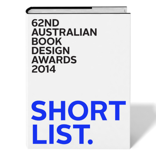
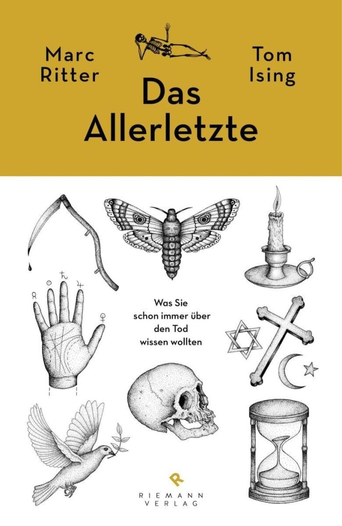
The Book Design Awards are Australia’s longest running graphic design awards, but in 2013 the Australian Publishing Association decided to discontinue them. To keep the awards running for a 62nd consecutive year, a group of Australian designers formed the ABDA as an independent, non-profit entity in March 2014.
There is some lovely work up for this years awards, and you can download full a list of the nominees as a PDF. Here are a few of the book covers that caught my eye:
The brilliant Jason Booher, whose cover for A History of Histories featured in my previous post, kindly just sent me his original design for the book. I think this could be the meta-cover to end all meta-covers. Sadly, the editor decided it might be a little too much of a good thing.
You can be as happy or as miserable doing design as anything else you decide to do. It doesn’t matter what it is; it only matters that you commit to it. Do you care? Can you commit? That’s it. I don’t necessarily believe graphic design is any better or worse than other careers you can choose, but I do think the dedication has to be there. Yes, there is the dignity of work, but—and maybe this is just selfishness—whether you’re a plumber, a policeman, or an architect, if you don’t look forward to going to work in the morning, that’s really sad. That’s where a lot of people end up for various reasons.
Illustrator and designer Paul Sahre recently spoke to The Great Discontent about his work. It seemed like as good an excuse as any to post just a few of his book covers.
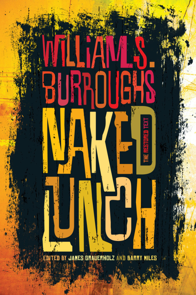
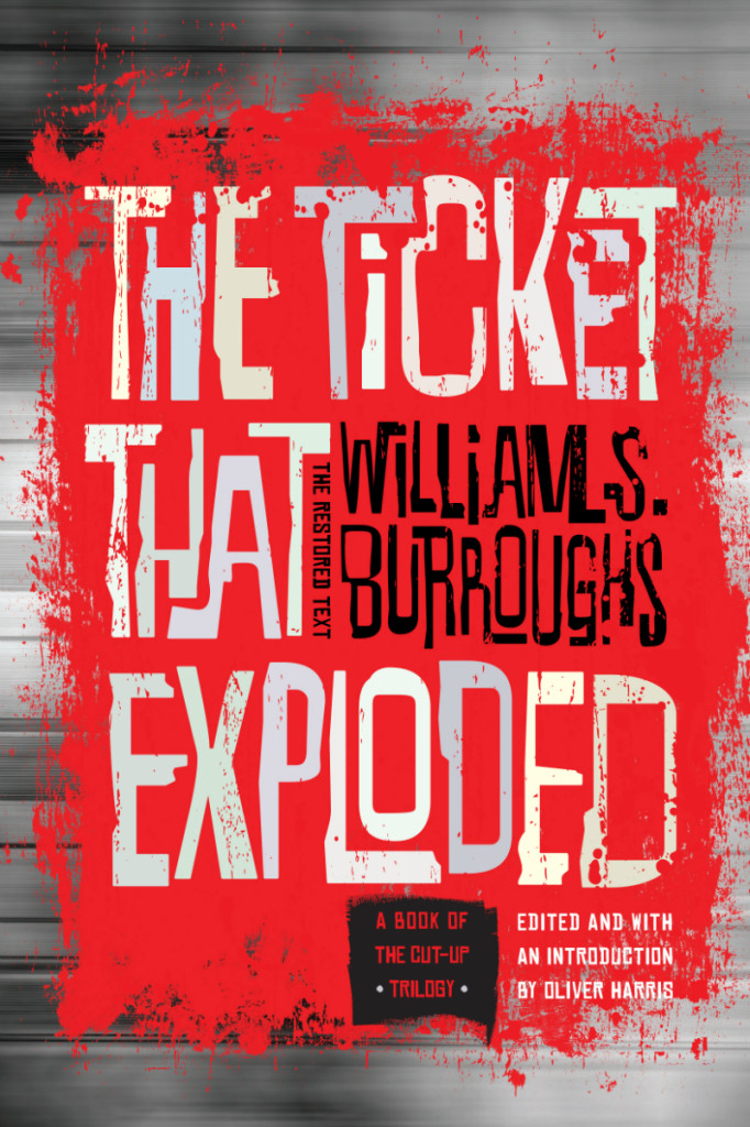
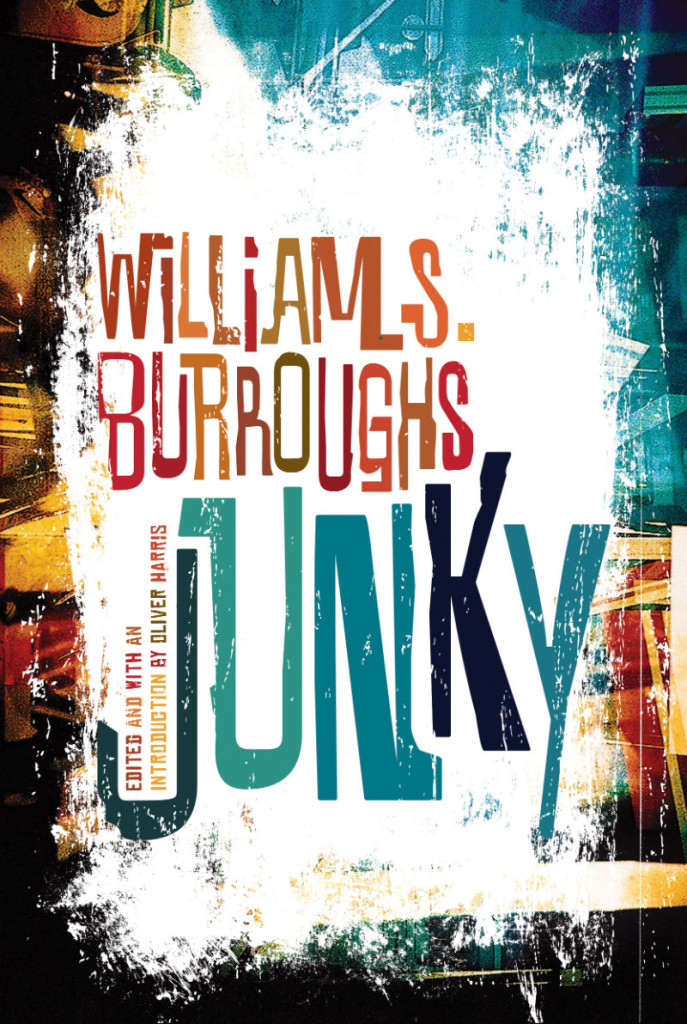
Roberto de Vicq de Cumptich recently redesigned a series of classic William S. Burroughs novels for Grove Atlantic with rather splendid “acid colors and Blue Note jazz graphics”:
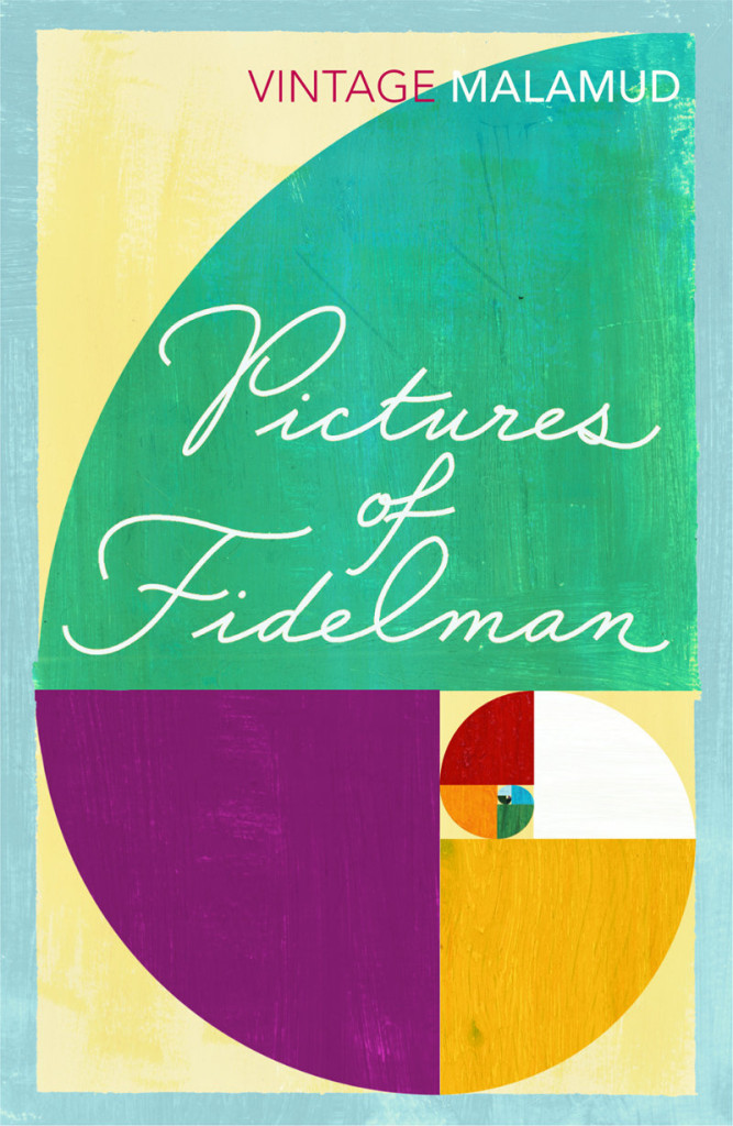
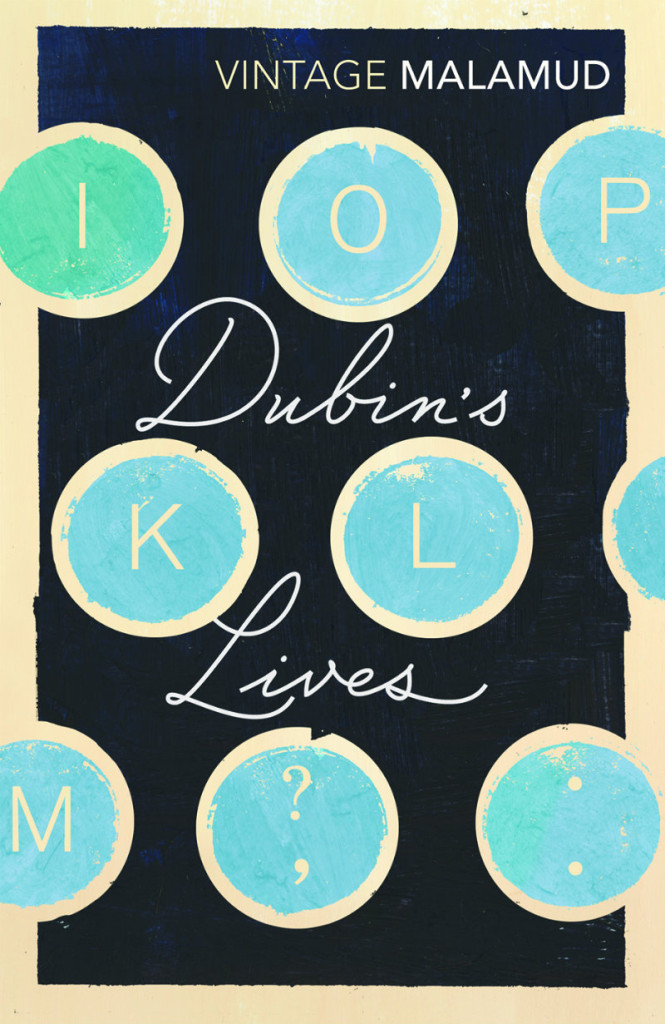
Available in the UK this month, Vintage Classics has released a series of Bernard Malamud novels with beautiful new covers designed in-house by Matt Broughton, with additional title type by Ruth Rowland.
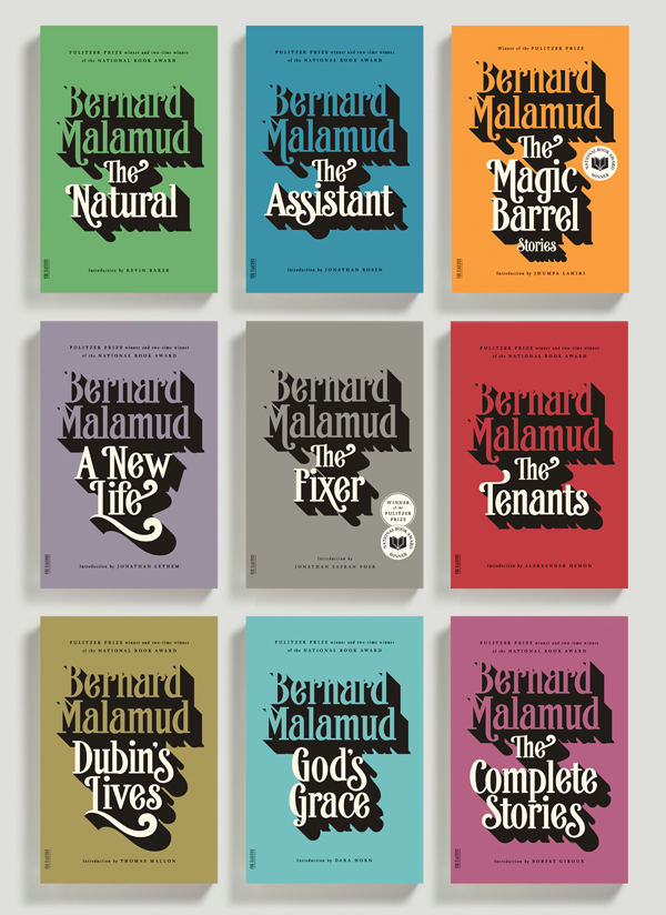
In the US, art director Charlotte Strick and typographer Jude Landry have also redesigned the Farrar, Straus & Giroux editions of Bernard Malamud’s novels.
At FSG’s Work in Progress blog, Charlotte and Jude talk about their work on the new covers.
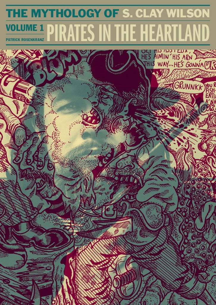
Designer Jacob Covey recently posted a short essay on his personal Facebook page about his cover design for Pirates in the Heartland, the first volume of Patrick Rosenkranz’s biography of underground cartoonist S. Clay Wilson. I asked Jacob if I could repost it in its entirety here, but the book’s publisher Fantagraphics had beaten me to it. While you can read the whole piece on their blog, here’s a short excerpt:
In publishing, one has to approach a cover with the information of an expert and the ignorance of a browser. In biographies, a photo of the subject is generally employed for good reason: The viewer immediately knows this is a book about a person. (Hence the trend in fiction of generally cropping off the heads of models or having them looking away — this is not about THEM.) But Wilson is recognizable only by his artwork, so a photo alone isn’t enough information. Ultimately, my solution is a kind of psychedelia but a practical one: Pirate art (a favorite theme of Wilson) overlaying a mythic portrait of young Wilson. Creation and creator in color overlays that force your eye to try to unhook one from the other.
I generally consider it a failure when cover design requires a band of color upon which to set the type. In this case, it allowed for the art to be the primary feature, to be a bit uncontrolled, while the type treatment is an anchor that harkens classic album design. This kind of visual messaging is trying to align Wilson with rebels and rockstars without making false promises. The trickiest part was simply finding Wilson art that had ANY white space so his portrait could connect with the viewer. The dual function of his artwork blowing the brains out, simultaneously, of Wilson and another of Wilson’s creation was too wonderful to pass up but I’m going to leave the symbology of such things to the viewer.
I first came across Jessica’s name in 2009. I was trying to convince Peter Cocking, then art director at Douglas & McIntyre, to agree to an interview. Peter, in his way, was having absolutely none of it (and still isn’t, really), but he did suggest that I talk to his senior designer Jessica Sullivan, “the best book designer in the country.” Nothing came of it then, but I did start to pay attention to Jessica’s work — to be honest, it was hard to miss her distinctive style, impeccable typography, and quite how many Alcuin Awards she was winning!
Now, five years after that original conversation with Peter, Jess is now working as a freelance designer and part-time art director for Greystone Books, and still delivering some of the best book covers in the country. In this interview she discusses her work, her career, and offers some advice for designers starting out today.
Jess and I corresponded by email.
When did you first become interested in design?
I took an art class for the very first time in grade ten. My teacher was a graphic designer and one of his clients was A & W. My 15-year-old self thought that was just about the coolest job I could have imagined.
From that day forward any time anyone asked me what I wanted to be when I grew up, I said Graphic Designer. Even though I didn’t really know what that meant.
Did you study design at school?
My determination to be a designer was thwarted by a scholarship to UBC, so after a bit of a detour, I rerouted and attended the Emily Carr Institute of Art + Design and received a BA in Communication Design.
Where did you start your career?
I think I started my career at school. I had this perception that landing a design job on my own was going to be impossible (I’m not sure why). I had it in my head that my first job would materialize through one of my instructors. I treated school like a very long job interview, only not so well-dressed. By fourth year an offer came by way of my typography instructor Peter Cocking, then Art Director at Douglas & McIntyre. A position was created for me and the two of us became the new in-house design department. And a book designer was born.
How long were you at Douglas & McIntyre?
9.5 years. During my tenure I married, had babies, designed hundreds of books and experienced a bankruptcy—theirs, not mine.
Has working freelance been very different from working in-house?
In almost every way. I’ve always enjoyed my job, but now I enjoy so many more aspects of it. There is a lot that’s rewarding outside of the work itself. You’re fairly invisible in an in-house scenario. There’s little you can change about process and there is an historical nucleus to the way things are done. It’s a lot simpler to affect change when it’s just me I’m dealing with. I’m pretty easy to work with.
Are you still designing books and book covers?
Yes, absolutely. I just design more than books now.
What have you worked on recently?
I’ve recently designed a book series for MOA [Museum of Anthropology] at UBC, I’m currently working on a visual identity for an editing and writing services company which I’m having a lot of fun with, and I just wrapped up a project for an exhibition of Japanese woodblock prints from the 1800s. I also continue my work with Greystone Books as their art director. A position which adds balance and bit of chaos to my work flow and ensures I leave the house at least once a week. It also guarantees a few good laughs—it’s a great office to work in.
What are your favourite kinds of projects?
I love it when after your first meeting you’ve not only fallen for the project itself (you have a vision for it, you can’t wait to get started, you can SEE how you’re going to make a difference and bring something to this thing) but you’ve also fallen for the people, the client. Every time this happens, and I’ve been very fortunate over the past 14 months as it’s happened quite frequently, I walk away from those meetings like there are tiny, little clouds under my feet.
What kind of books present the greatest creative challenges?
Fiction covers. I don’t know if I hate them or love them. It’s such a hard market, competitive and over saturated, so the cover becomes of utmost importance. It’s usually the most painful genre when designs are rejected, and I’m generally unfazed by rejections at this point in my career, it’s just part of the job. But I’m fairly opinionated regarding fiction and powerless in terms of persuasion, so it can make for a tortured process. And I might be over exaggerating a bit here.
Can you describe your process for designing a book cover?
If it’s fiction, I read the book, otherwise I read the synopsis and familiarize myself with the content and tone. Then I think. That’s probably the most important stage. Generate as many ideas and concepts from all that thinking. Source imagery or create imagery or have imagery created. Add type. Explore, test, judge, select, refine. Judge, select, refine. Judge, select, refine. Sleep. Wake up and see if I still agree with myself. Submit.
What advice would you give a designer starting their career?
1. Be professional at school. Be on time, hand things in by deadline. Design communities are often small. You will encounter your instructors out in the world. They will remember you if you pissed them off with your laziness. They will not hire you.
2. You only get out of school what you put into it. They can’t teach you to be a good designer; that comes from work and practice. Ensure that every instructor you encounter enriches your education—you are paying for it.
3. Continue to grow. If your job becomes boring—challenge yourself. Give yourself personal goals within your projects. Ensure that everything you create is adding to your own personal archive. When you’ve amassed what you need don’t be scared to leave and move on to the next challenge.
Is there a supportive design community in Vancouver?
I’m not really sure. I do feel I am part of a supportive community—although it’s not actually composed entirely (or much at all) of fellow designers. I’ve been told one exists in Toronto, and I have to admit, I am very curious about it all.
Where do you look for inspiration, and who are some of your design heroes?
I try to be aware of my surroundings, to makes connections of all kinds, not just in design. I like old things and new things and mixing the two together. I’m always looking at stuff. Printed stuff: books, magazines, wallpaper, packaging. Moving stuff: movies, documentaries, TV, birds. Invented stuff: art, architecture, interior design, music, fashion. Stuff that just exists: fish—which have the most amazing colour palettes, snow affirms the beauty of white space.
That’s a hard one. I’ve been so busy lately that I honestly haven’t had time to read anything besides work related matter. I used to read in transit and at night, so I consumed a lot of books on a monthly basis. Now I write proposals and tend to email on the bus rides and research in the evenings and fall asleep before I can finish a page of the book that’s sitting next to my bed, Ingenious Pain. The last book I read that I really devoured was Million Little Pieces which is strange because I almost exclusively read novels.
I don’t really see that much changing, to be honest. Unless we’re no longer allowed to use paper, and we go back to the time where stories are housed in people’s memories. And then I’ll be useless for a number of reasons. I have a terrible memory for that kind of detail.
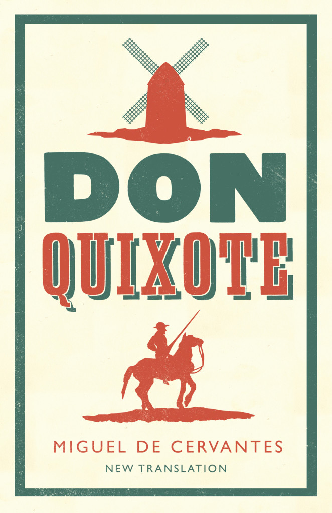
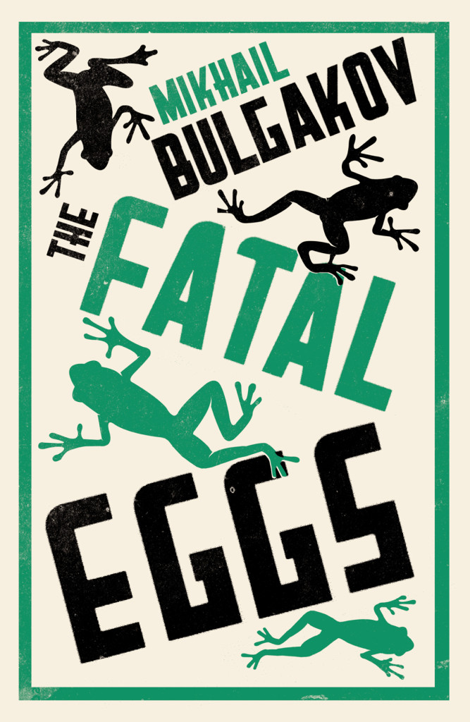
I decided to go in a slightly different direction with my covers list this year (see my lists for 2012, 2011, and 2010). It’s just a straight up list of the fifty covers designs with a few annotations and links a long the way. I’m sorry for woeful under-representation of Australian and NZ designers, and for completely ignoring the entire non-English-speaking world. I will try and do better in 2014. But until then, here, in alphabetical order, are my fifty covers of 2013: