Skip to content

Tag: Design

Books Covered by Stuart Bache

reunion of ghosts design by jo walker

Designer Stuart Bache, art director of Oneworld Publications, has started a new vlog about book cover design. In his latest video, Stuart looks at the cover for A Reunion of Ghosts by Judith Claire Mitchell, designed by Jo Walker:


And if that wasn’t enough, Stuart is also writing a column on book design for UK trade magazine The Bookseller. The most recent post is on new covers for classic crime novels.

Comments closed

Russian Plays in Translation Designed by John Gall

The brilliant John Gall has designed a wonderful set of minimal book covers for Theater Communications Group’s Russian drama series:

Month-in-the-country-mech_670
A Month in the Country by Ivan Turgenev (Theatre Group Communications / February 2015)

The-Inspector-Mech-ID5_670
The Inspector by Nikolai Gogol (Theatre Group Communications / June 2015)

Cherry-Orchard-front.6.16_670
The Cherry Orchard by Anton Chekhov (Theatre Group Communications / August 2015)

1 Comment

Today in Micro-Trends: Post-it Notes

Heaven-cover

Sticking post-it notes to the front of books is a very real thing in the book industry — at least in the corners I’ve occupied — so perhaps it’s no surprise that they’ve made into cover designs too.

The first cover I can think of to incorporate a post-it was the hardcover of Heaven in Small by Emily Schultz, designed by Ingrid Paulson (House of Anansi in 2009).1 Interestingly, while the paperback, also designed by Ingrid (see below), kept the post-it, it no longer tricks the eye in quite the same way.

The last couple of years has seen a small flurry of post-it note book covers. I particularly like Nathan Burton‘s designs for rising literary star Valeria Luiselli, but post-it notes seem particularly in vogue for young adult covers, so we might well be seeing a few more in the coming months…

9780141357034
All the Bright Places by Jennifer Niven; design by Lucy Kim and Alison Impey; hand-lettering by Sarah Watts (Knopf / January 2015)


Faces in the Crowd and Sidewalks by Valeria Luiselli; design by Nathan Burton (Coffee House Press & Granta / May 2013 & May 2014)

9780887849565
Heaven is Small by Emily Schultz (paperback); design by Ingrid Paulson (Anansi / April 2010)

9780374535308

Lions and Shadows by Christopher Isherwood design by Charlotte Strick; illustration by Dan Funderburgh (Farrar, Strauss & Giroux / November 2015)

Christopher Isherwood series; design by Charlotte Strick; illustrations by Dan Funderburgh (Farrar, Strauss & Giroux / 2013-2015)

Last Time We Say Goodbye design Erin Schell
The Last Time We Say Goodbye by Cynthia Hand; design by Erin Schell (HarperTeen / February 2015)

queen-of-bright-shiny-things-design-anna-booth
The Queen of Bright and Shiny Things by Ann Aguirre; design by Anna Booth; photography by Jon Barkat and Gary Spector (Feiwel & Friends / April 2015)

then we came to an end design Jamie Keenan
Then We Came to the End by Joshua Ferriss; design by Jamie Keenan (Little, Brown & Co. / March 2007)2

4 Comments

Book Covers of Note June 2015

I don’t know where last month went, but somehow it’s June already and it’s time for another selection of recent book covers:

General Theory of Oblivion design by Julia Connolly
A General Theory of Oblivion by José Eduardo Agualusa; design by Julia Connolly (Harvill Secker / June 2015)

the-hourglass-factory-design-melissa-four
The Hourglass Factory by Lucy Ribchester; design by Melissa Four (Simon & Schuster / January 2015)

how music got free design James Paul Jones
How Music Got Free by Stephen Witt; design by James Paul Jones (The Bodley Head / June 2015)

in the beginning illustration Robert Frank Hunter
In the Beginning was the Sea by Tomás González; cover illustration by Robert Frank Hunter (Pushkin / May 2015)

intimacy idiot design spencer kimble
Intimacy Idiot by Isaac Oliver; design by Spencer Kimble (Scribner / June 2015)

lesser beasts design by Nicole Caputo
Lesser Beasts by Mark Essig; design by Nicole Caputo (Basic Books / May 2015)

LivingInTheSound
Living in the Sound of the Wind by Jason Wilson; design by Leo Nickolls (Constable / June 2015)

London Overground design by Richard Bravery
London Overground by Iain Sinclair; design by Richard Bravery (Hamish Hamilton / June 2015)

lucky alan design ben wiseman
Lucky Alan and Other Stories by Jonathan Lethem; design by Ben Wiseman (Doubleday / February 2015)

manhattan mayhem design by Timothy ODonnell
Manhattan Mayhem edited by Mary Higgins Clark; design by Timothy O’Donnell (Quirk Books / June 2015)

motorcycles ive loved design by rachel willey
Motorcycles I’ve Loved by Lily Brooks-Dalton; design by Rachel Willey (Riverhead / April 2015)

muse design by gabriele wilson
Muse by Jonathan Galassi; design by Gabriele Wilson (Knopf / June 2015)

professor in the cage design by matt dorfman
The Professor in the Cage by Jonathan Gottschall; design by Matt Dorfman (Penguin / April 2015)

ResistanceIsFutile_R.indd
Resistance is Futile by Jenny Colgan; design by Hannah Wood; illustration by Pietari Posti (Orbit / May 2015)

rise design by greg heinimann
Rise by Karen Campbell; design by Greg Heinimann (Bloomsbury / March 2015)

thank you goodnight design Kimberly Glyder
Thank You, Goodnight by Andy Abramowitz; design by Kimberly Glyder (Simon & Schuster / June 2015)

tongues of men or angels design by Jamie Keenan
The Tongues of Men or Angels by Jonathan Trigel; design by Jamie Keenan (Little Brown / May 2015)

9780385352871
The Water Knife by Paolo Bacigalupi; design by Oliver Munday (Knopf / May 2015)

9780385350174
When the Doves Disappeared by Sofi Oksanen; design by Kelly Blair (Knopf / February 2015)

world does not exist design david gee
Why the World Does Not Exist by Markus Gabriel; design by David Gee (Polity / June 2015)

The White Company design James Paul Jones
The White Company by Arthur Conan Doyle; design by James Paul Jones (Vintage / June 2015)

wonder garden art and design thomas doyle
The Wonder Garden by Lauren Acampora; art and design by Thomas Doyle (Grove Press /May 2015)

why-information-grows-design-richard-green
Why Information Grows by Cesar Hidalgo; design by Richard Green (Allen Lane / June 2015)

Comments closed

The Retiring Type: Intelligent Life on Edward Johnson

3679629462_bc4885b1ef_o

At Intelligent Life, Catherine Nixey tells the story of Edward Johnson, creator of the London Underground’s typeface:

The Underground didn’t commission a font to look different from commercial ones simply to sell it straight back to the commercial world. But that world wanted the font nevertheless. And so Johnston’s pupil Eric Gill obliged, creating Gill Sans, which would go on to be used on everything from the classic Penguin Books design to the BBC logo (since 1997)—and, later, many a Word document.

There is some suggestion that even Gill, not a man to be easily abashed, may have felt uneasy about this. He sent Johnston a letter that manages to turn, in a moment, from humility to boastful defiance. “I hope you realise”, he wrote, “that I take every opportunity of proclaiming the fact that what the Monotype people call ‘Gill’ Sans owes all its goodness to your Underground letter. It is not altogether my fault that the exaggerated publicity value of my name makes the advertising world keen to call it by the name of Gill.”

Did Johnston mind? We don’t know exactly. “I don’t think there was bitterness,” says his grandson. Though there was no money, either. “He was so lacking in business sense, he never charged a going rate for his work and so couldn’t make ends meet.” For the Underground font, Johnston was paid 50 guineas—about £4,000 in today’s money (he handed 10% of it on to Gill). By the time he died in 1944, “the finances were in a terrible state,” Andrew Johnston adds. “There had been a fund started by calligraphers in America to help this destitute master craftsman.”

(image via Mikey Ashworth on Flickr)

Comments closed

Virago Modern Classics Daphne du Maurier

JamaicaInn_YA

This summer UK publisher Virago is publishing two sets of Daphne du Maurier’s most famous titles with new and beautifully illustrated covers.

According to editorial director Donna Coonan, du Maurier’s reputation has flourished in recent years. She is also an author with cross-generational appeal. “The heroines of her best-known novels are young women at a turning point in their lives,” says Coonan. “These are beautifully written books that are exciting, suspenseful and brilliantly atmospheric. There is passion, danger, romance . . . and pirates!”

For over a decade Virago published du Maurier’s backlist with a uniform style. “They sat nicely together in a set, but were starting to look a little dated and lacked individuality,” says art director Nico Taylor. “I had never read du Maurier before, but once I got stuck in I realised just how diverse her writing is which led me to the idea that presenting each novel with a distinctive, individual look would be the best way to ensure du Maurier’s work continues to look fresh.”

Rebecca

For the first three titles in series (there are a staggering 17 or so more to come!), Taylor worked with illustrators Neil Gower (Jamaica Inn, Frenchman’s Creek) and Jordan Metcalf (Rebecca). “It became clear that it would be hard to avoid some of the obvious reference points from each title, but I was keen that they were used in an integrated or suggestive way… all credit has to go to the illustrators for imagining their respective covers in such distinctive ways.”

Rebecca_YA


Alongside this refreshed backlist, Virago is also planning to introduce these same three classics — French Man’s Creek, Jamaica Inn, and Rebecca, — to young adults with new covers by Iacopo Bruno. “This was a great opportunity to show that du Maurier is a big contribution to the gothic novels popular with this age group of readers,” says art director Sophie Burdess. “I wanted to create a set of covers primarily composed of evocative gothic typography that gave du Maurier the authority and appeal she deserves as well as giving a feel for the individual themes of each novel,” she continues. “[Iacopo] is a rare and exceptionally beautiful illustrator and hand lettering artist who knows just how to pitch the work for a younger audience… the task of creating a set of beautiful compositions of elegant hand lettering and vignette illustrations was very safe in his hands.”

Comments closed

Today in Micro-Trends: Rotate 90°

downtown owl design paul sahre
design by Paul Sahre (2008)

Turning the picture sideways is not exactly new (the brilliant John Gall and Paul Sahre (thanks for the reminder, Jacob!) were experimenting with it years ago), but there has been a spate of commercial covers making use of images rotated through ninety degrees in the past couple of years. It seems like a such peculiar thing to have caught on, and yet here we are:

california

California by Edan Lepucki; design Julianna Lee (Little Brown & Co. July 2014)

empty-chair-kulickThe Empty Chair by Bruce Wagner; design by Gregg Kulick (Blue Rider Press / December 2013)

girl in the moonlight design by mumtaz mustafa painting horacio g garcia
The Girl in the Moonlight by Charles Dubow; design by Mumtaz Mustafa; painting by Horacio G. Garcia (William Morrow / May 2015)

green on blue

Green on Blue by Elliot Ackerman; design by Oliver Munday & Jaya Miceli (Scribner / February 2015)

i-saw-a-man

I Saw a Man by Owen Sheers; design by Emily Mahon; photograph by Mike Lambert (Nan A. Talese / June 2015)

Sugar design by M S Corley

Sugar by Deirdre Riordan Hall; design by M. S. Corley (Skyscape / June 2015)

waiting for the apocalypse design kimberly glyder

Waiting for the Apocalypse by Veronica Chater; design by Kimberly Glyder (W. W. Norton / February 2009)

we-are-not-ourselves-design-christopher-lin

We Are Not Ourselves by Matthew Thomas; design by Christopher Lin (Simon & Schuster / August 2014)

Comments closed

Gray318 TYPO Talk Berlin

everything is illuminated gray318

“I’m not a designer, not an illustrator, and certainly not a type designer – I’m a misfit…Publishing – that’s where people who don’t quite fit in end up.”

The TYPO Talks blog recaps Jon Gray‘s recent talk at TYPO Berlin:

Gray looked around for inspiration and got interested in old hand written signs often posted at churches. Written by sign writing dilettantes who need to communicate something to their fellow churchgoers, to Gray these signs tell a story, they speak of dedication, personality, of love. The signs reference a specific time and place, an idiosyncratic personality and character. Gray took the loose and spontaneous quality of the handwriting on these signs and used it for the cover of “Everything is Illuminated”.

What he got gave him one of these rare moments where “You make something and you know it works, it’s something new – I made it and it was completely me. I liked it, Penguin loved it, the author was all over it.” Published in 2002, the rough all-over hand-lettering on the cover contrasted strongly with the clean lines and vector graphics that had been dominating graphic design for a while then. It was the avant-garde of what Steven Heller called “The Decade of Dirty” when handmade aesthetics became fashionable again. And it marked the very beginning of the still ongoing revival of hand-lettered typography.

Comments closed

Australian Book Design Awards Winners 2015

Congratulations to all the 2015 Australian Book Design Awards Winners!

caro was here design gayna murphy
Caro Was Here by Elizabeth Farrelly; design by Gayna Murphy

consumer-behaviour-in-action design regine abos
Consumer Behaviour in Action by Peter Ling, Steven d’Alessandro, Hume Winzar; design Regine Abos

A Fairy Tale by Jonas T. Bengtsson; design by Allison Colpoys

fictional woman design tara moss and matt stanton
The Fictional Woman by Tara Moss; design Tara Moss & Matt Stanton

Movida Solera by Frank Comorra & Richard Cornish;  design by Daniel New
Movida Solera by Frank Comorra & Richard Cornish; design by Daniel New

What Came Before by Anna George; design by Laura Thomas

You can find all the winning designs on the Australian Book Designers Association website.

Comments closed

Book Covers of Note May 2015

This month’s post is very heavy on illustrated and hand-lettered covers for some reason, but it’s all the prettier for it…

all-this-has-nothing-to-do-with-me-design-Justine-Anweiler-illustration-Daphne-van-den-Heuvel
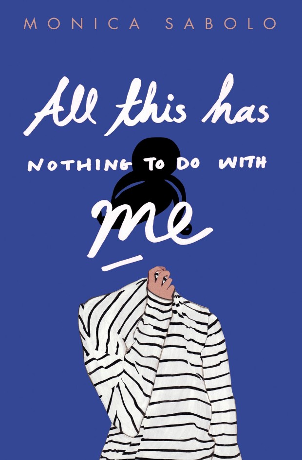
All This Has Nothing To Do With Me by Monica Sabolo; design by Justine Anweiler; illustration by Daphne van den Heuvel (Picador / April 2015)

ANWWIC
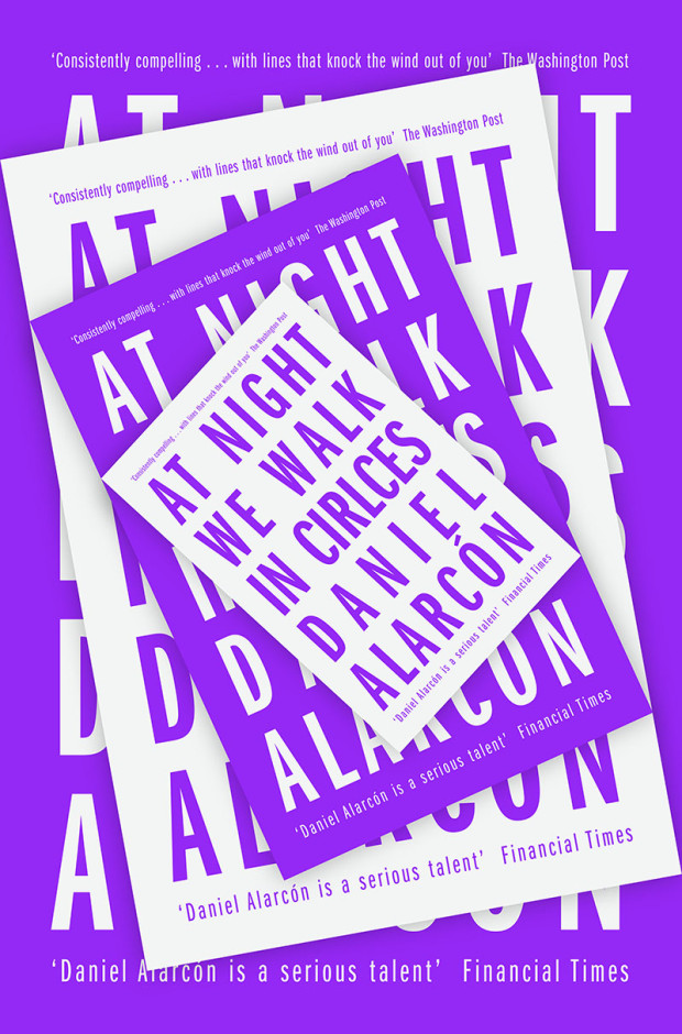
At Night We Walk in Circles by Daniel Alarcón; design by Jonathan Pelham (Fourth Estate / May 2015)

b-and-me-christopher-lin
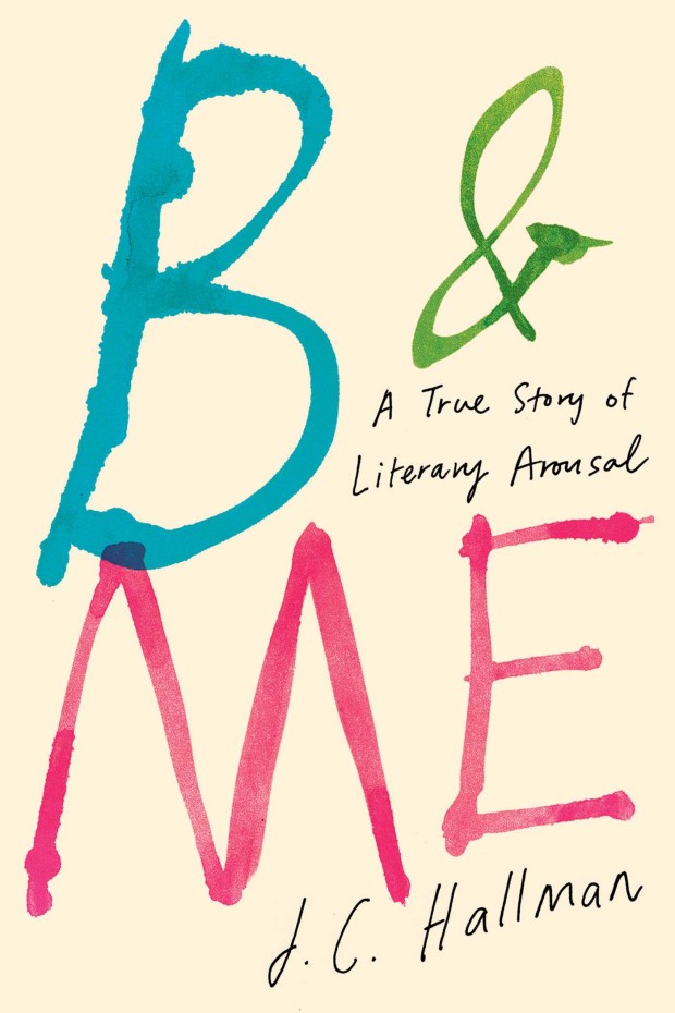
B & Me by J. C. Hallman; design by Christopher Lin (Simon & Schuster / March 2015)

bees-design-by-sara-wood
The Bees by Laline Paull; design by Sara Wood (Ecco / May 2015)

The jacket for the US hardcover of The Bees, designed by Steve Attardo, was a book cover of note in May 2014.

black snow cover design keith hayes
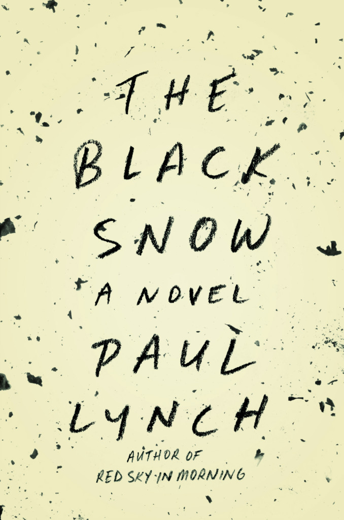
Black Snow by Paul Lynch; design by Keith Hayes (Little, Brown & Co. / May 2015)

boo-design-isabel-urbina-pena
Boo by Neil Smith; design by Isabel Urbina Peña (Vintage / May 2015)

conviction-design-maria-elias-cs-neal
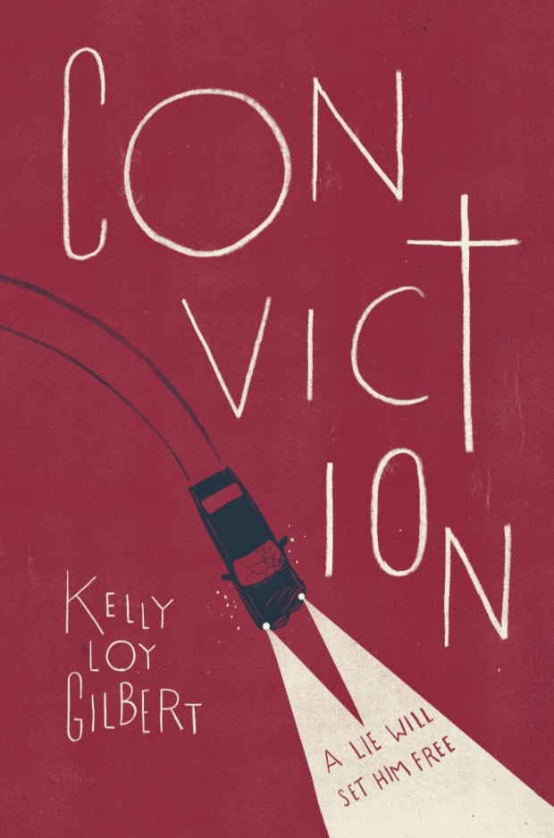
Conviction by Kelly Loy Gilbert design by Maria Elias; illustration by Christopher Silas Neal (Disney-Hyperion / May 2015)

eden-west-design-matt-roeser
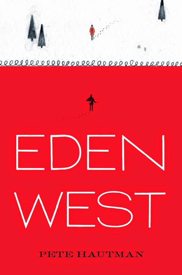
Eden West by Pete Hautman; design by Matt Roeser (Candlewick / April 2015)

AlexisLandau_EmpireOfTheSenses_3
Empire of the Senses by Alexis Landau; design by Janet Hansen (Pantheon / March 2015)

herzog design by Lynn Buckley
Herzog by Saul Bellow; design by Lynn Buckley (Penguin / May 2015)

how-to-clone-a-mammoth-design-jason-alejandro
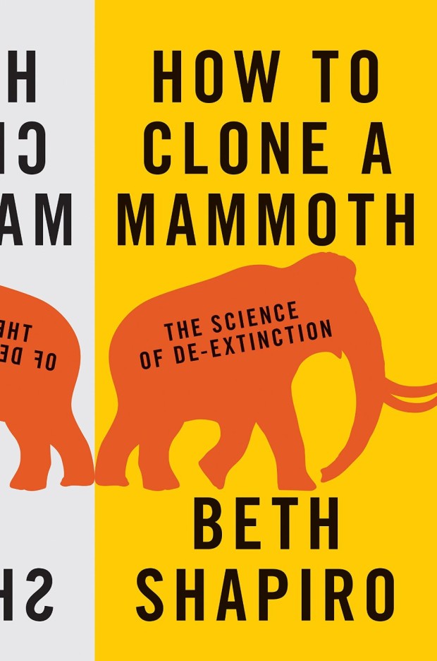
How to Clone a Mammoth by Beth Shapiro; design by Jason Alejandro (Princeton University Press / April 2015)

kl-design-alex-merto
KL by Nikolaus Wachsmann; design by Alex Merto (Farrar, Straus & Giroux / April 2015)

life-and-death-of-sophie-stark-design
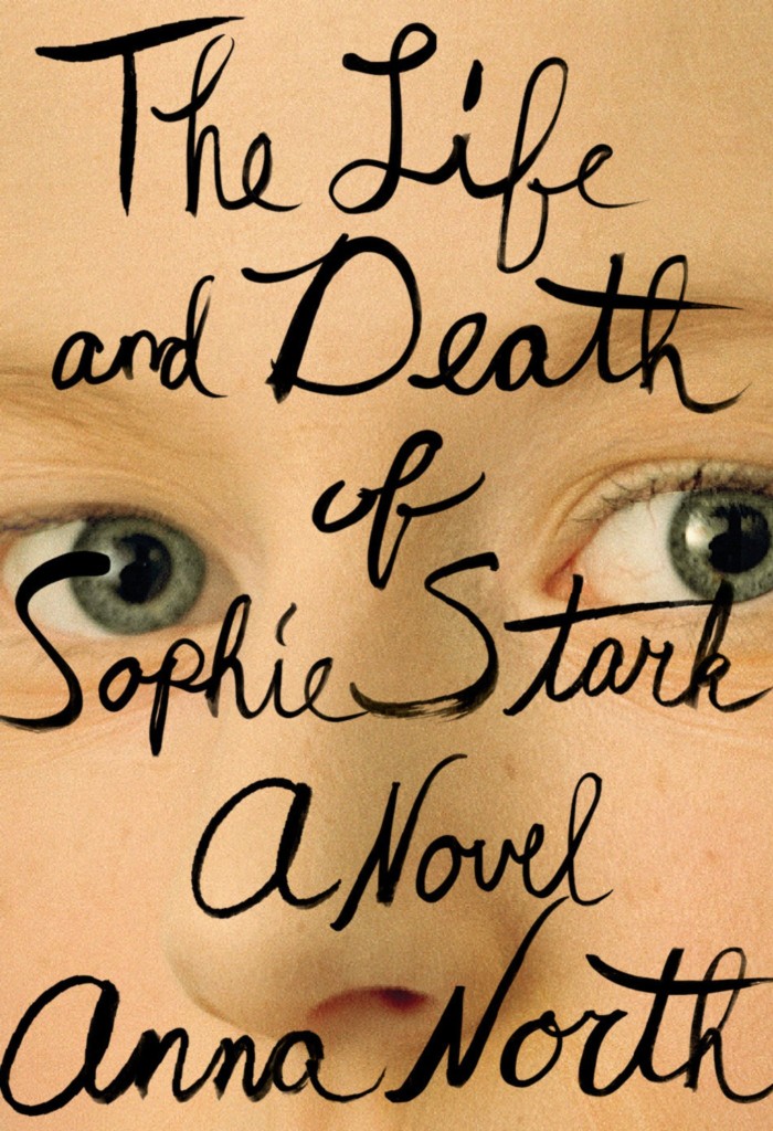
Life and Death of Sophie Stark by Anna North; design by Spencer Kimble (Blue Rider Press / May 2015)

lifted-by-the-great-nothing-art-cs-neal
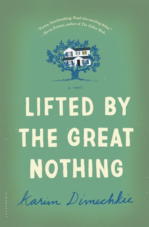
Lifted by the Great Nothing by Karim Dimechkie; design by Katya Mezhibovskaya; illustration by Christopher Silas Neal (Bloomsbury / May 2015)

Further proof, were it needed, that Christopher would do a great covers for Harper Lee.

Mislaid design by Allison Saltzman
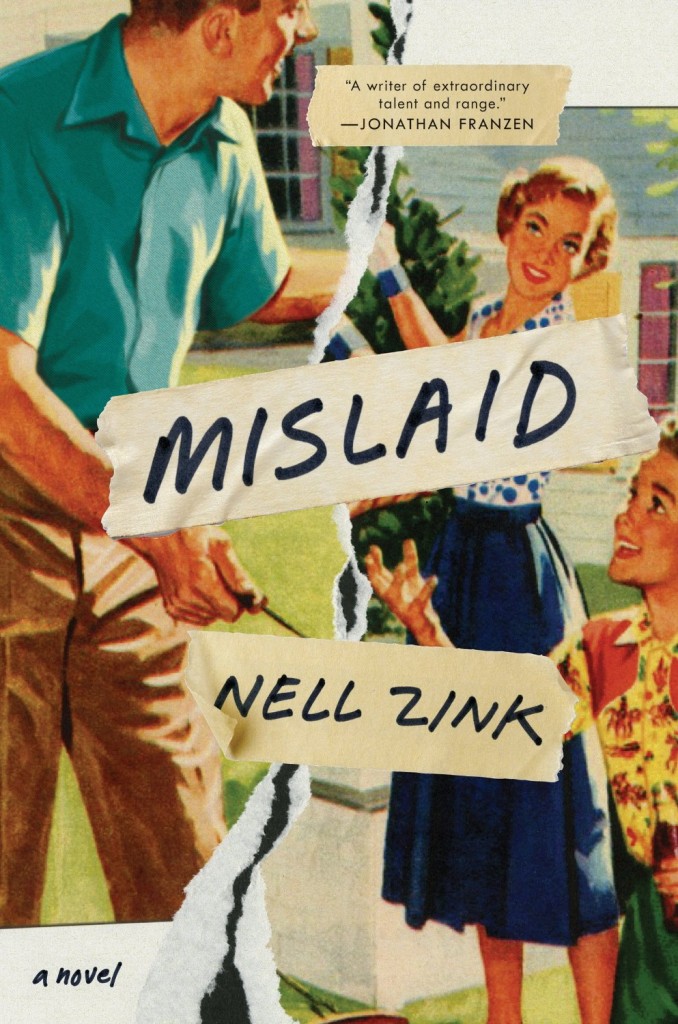
Mislaid by Nell Zink; design by Allison Saltzman (Ecco / May 2015)

my-documents-design-illustration-sunra-thompson
My Documents by Alejandro Zambra; design & illustration Sunra Thompson (McSweeney’s / April 2015)

nightmare-and-geezenstacks-art-ms-corley
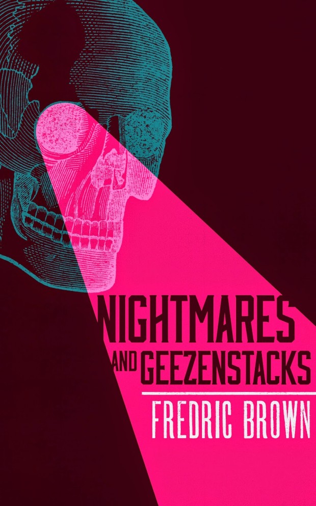
Nightmares and Geezenstacks by Fredric Brown; design by M. S. Corley (Valancourt Books / April 2015)

odysseus-abroad-design-o-munday
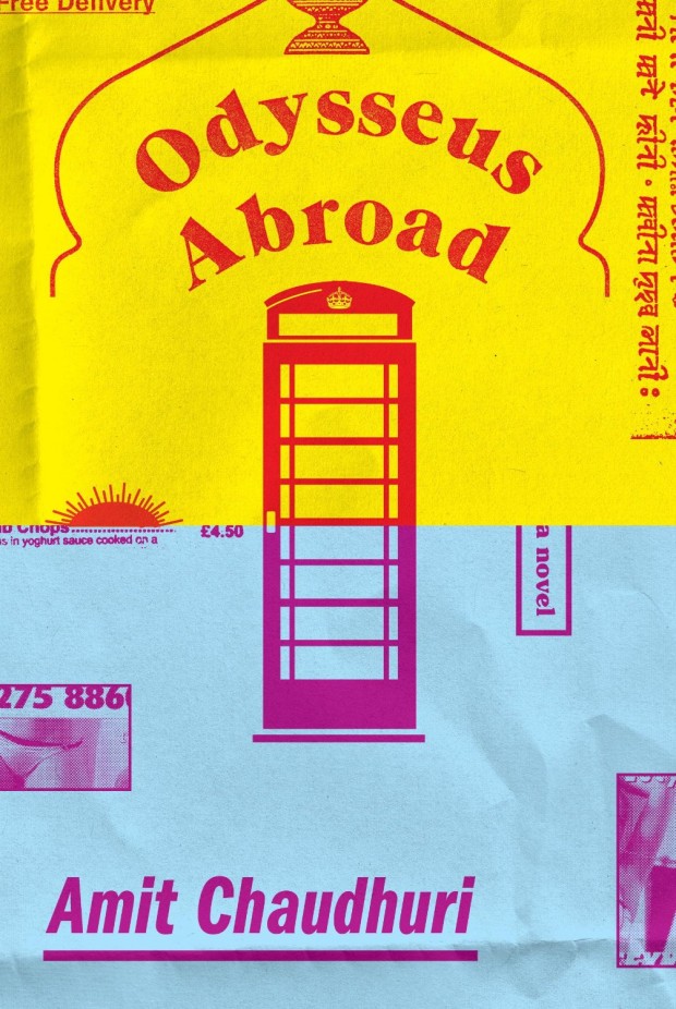
Odysseus Abroad by Amit Chaudhuri; design by Oliver Munday (Knopf / April 2015)

ohey design by Alban Fischer
Ohey! by Darby Larson; design by Alban Fischer (CCM / May 2015)

schlump-design-suzanne-dean-illustration-clare-curtis
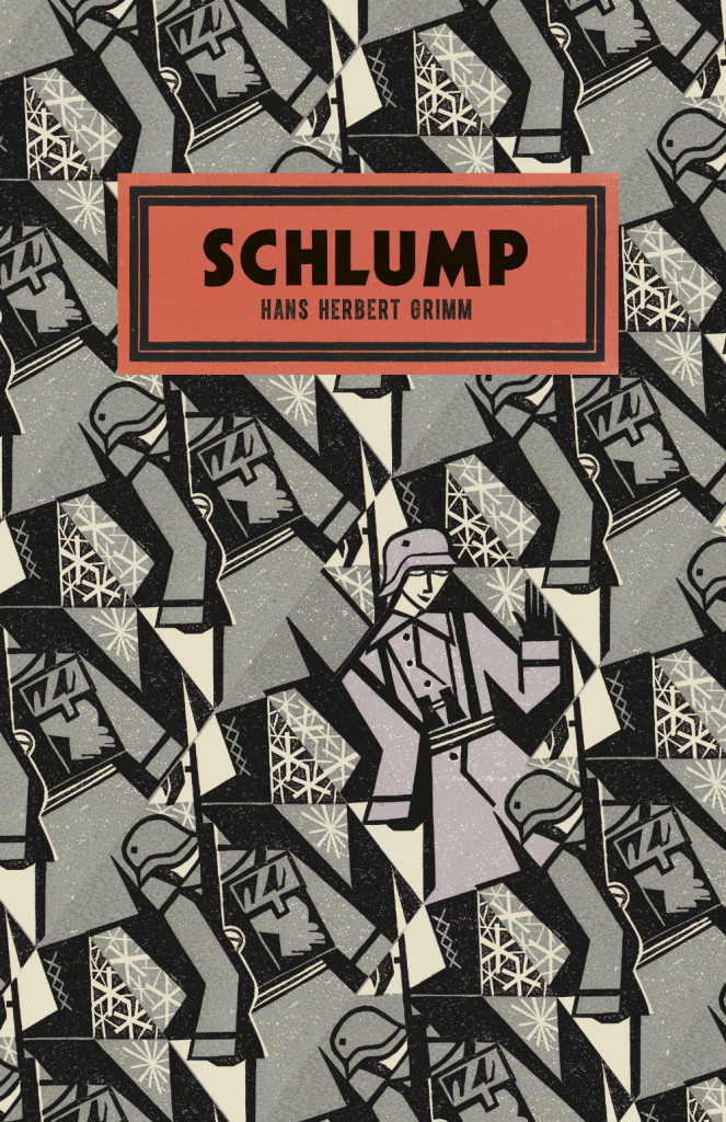
Schlump by Hans Herbert Grim; design by Suzanne Dean; illustration by Clare Curtis (Vintage / May 2015)

smoke-gets-in-your-eyes-design-pete-adlington
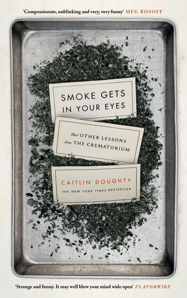
Smoke Gets in Your Eyes by Caitlin Doughty; design by Peter Adlington (Canongate / April 2015)

The US edition, designed by David High, was a book cover of note in September 2014.

upright-thinkers-art-tom-gauld
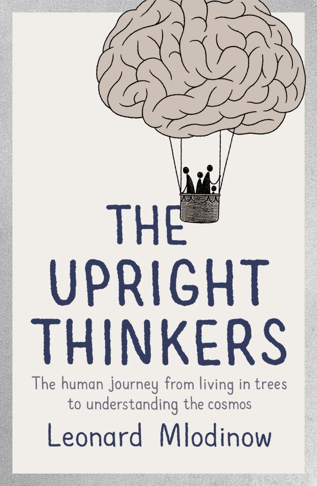
The Upright Thinkers by Leonard Mlodinow; cover art by Tom Gauld (Allen Lane / May 2015)

visiting-hours-spencer-kimble
Visiting Hours by Amy Butcher; design by Spencer Kimble (Blue Rider Press / April 2015)

wake-up-sir-illustration-jamie-keenan
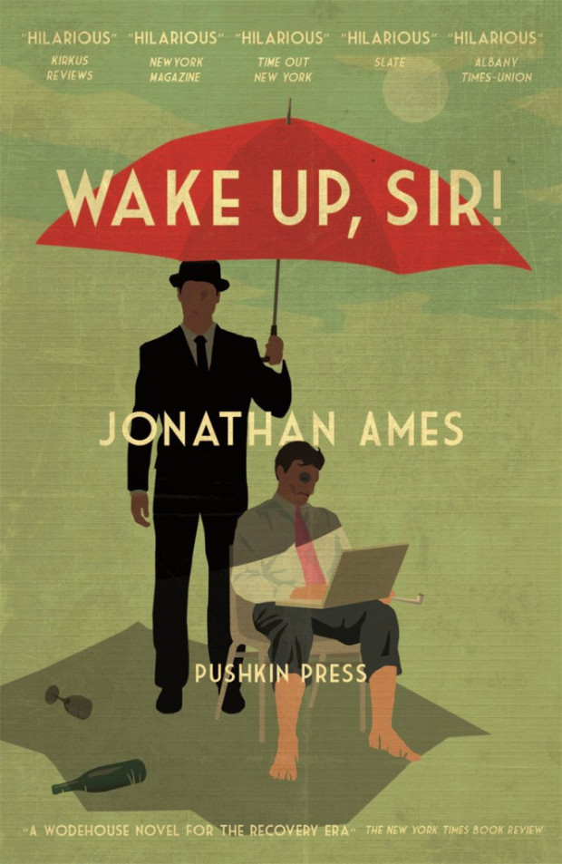
Wake Up, Sir! by Jonathan Ames; design by Jamie Keenan (Pushkin Press / May 2015)

1 Comment

Freunde von Freunden: Erik Spiekermann Interview

Freunde von Freunden visit the apartment and studio of designer and typographer Erik Spiekermann:

A look around his tidy, if eclectic, home offers an eye pleasing sampler of the designer’s interests. One of his home’s main attractions is his two-story bookshelf, mostly filled with titles pertinent to his profession and only accessible by the seated pulley system Spiekermann developed for one of his favorite leisure activities – browsing his massive library and getting lost in his passion for words and images. “It’s almost like a safety net having all my books here. I have a lot of cool stuff that other people don’t have, and I love browsing and discovering books I’ve had 50 years. I’d love to spend time just browsing through my bookshelves. Every time I go to look for something I find something else, you get totally stuck. There’s nothing better than getting stuck on a Sunday afternoon with books you’ve forgotten about.”

MG_9983

And on a related note, Madeleine Morley spends a day at Spiekermann’s print workshop, p98a for Port magazine:

The process of printing is repetitive, slow, and surgical, but also very peaceful and contemplative – like knitting or carpentry. We insert pieces of paper into the letterpress, rotate the handle, stack the print on a drying rack, re-ink the font, then start again. By this point, we begin to develop a consistent and robot-like rhythm, but we’re a clunky, less graceful team in comparison to  guild of typographers.

I ask [Alexander] Nagel why he prefers this method of design: “It has more… sinne,” he replies, using a German word that is difficult to translate. The term means ‘touch’ or ‘sense’. It refers to the haptic, but also means ‘significance’. This is something people say a lot about the printed page and its physical tangibility, but it’s something you don’t quite appreciate until you’re actually building one of these templates from metal, wood and paint.

Comments closed

Ladislav Sutnar: Visual Design in Action — Facsimile Edition

Ladislav-Sutnar-VDA-original

I don’t post too many crowd-funded publishing projects here on the Casual Optimist — there are so many of them, and so few seem really significant — but I’m more than happy to support the Designers and Books

campaign to create a facsimile reprint of Visual Design in Action by modernist graphic designer Ladislav Sutnar. First published in 1961, and out of print for decades, it looks very worthy of a revival:

You can read more about the book and the campaign here.

Ladislav-Sutnar-VDA-01

Ladislav-Sutnar-VDA-02

Comments closed