Skip to content

Tag: Design

Australian Book Design Awards 2015 Shortlist


Australian Book Designers Association recently announced the shortlist for the Australian Book Design Awards 2015 and, as in previous years, there are some great covers to be seen.

I particularly like that they have an award for Young Designer of the Year. The designers shortlisted this year are Alissa Dinallo, Hazel Lam, and Imogen Stubbs:

The full list can be downloaded as a PDF from the ABDA blog. The winners will be announced Friday, May 22nd in Sydney.

Comments closed

Salman Rushdie and Adult-YA Crossovers

rushdie

The cover of the US edition of Salman Rushdie’s first adult novel in seven years. Two Years Eight Months and Twenty-Eight Nights (Random House, September 2015), was revealed on Buzzfeed last week.1 While the cover itself is perfectly fine, the most remarkable thing about it is how much it looks like a novel for young adults.

I was immediately reminded of the cover of The Fault in Our Stars by John Green, designed by Rodrigo Corral (Penguin 2012)…

fault-in-stars-nyt

…and the lovely hand-lettered YA covers of Australian designer and illustrator Allison Colpoys:

why-we-took-the-car-design-allison-colpoys

After some further thought, however, I realised that it is even more reminiscent of the cover for the novel Waiting for Doggo by Mark B. Mills, designed by Yeti Lambregts (Headline, November 2014), which made me wonder if, perhaps, we are starting to see more adult covers that look like YA?

Since the success of Harry Potter, publishers have known that adults read ‘children’s books’ for pleasure, and they will often try to appeal these to older readers with more mature covers. On Twitter last week, American YA cover designer Erin Fitzsimmons (interviewed on the blog here), identified this as ‘crossover appeal.’ But crossover appeal can go both ways, and it seems that adult covers are being designed to reach the widest possible audience too.

This trend is more pronounced in the UK where bright and whimsical illustrated covers are common for commercial fiction. The vibrant cover of the UK edition of Two Years Eight Months and Twenty-Eight Nights (and the accompanying backlist) — beautifully illustrated by Sroop Sunar and unveiled today — is a perfect example:

two-years-illustration-sroop-sunar

According to CMYK, the Vintage Books design blog, Sunar was inspired by printed ephemera found in India around the time of Independence, and the brightly coloured covers would work equally well for YA as for adult fiction:

rushdie-uk-backlist-illustration-sroop-sunar

US publishers have (I think) been slower to market adult fiction to younger readers in this way. Although hand-lettering has become very common on US covers for a while now, photographic images still dominate commercial fiction covers. Compare, for example, the UK cover of Station Eleven by Emily St. John Mandel, illustrated by Nathan Burton (left), with US edition designed by Abby Weintraub (on the right):

From my own experience, I can also think of at least one quirky illustrated cover — for an upcoming literary novel that the publisher has very high hopes for — that was killed at the last minute in favour of a more traditional photographic one. The original design could easily have been for a gothic Young Adult fantasy. The new cover, much less ambiguous, is clearly intended for adult book clubs.

Even so, Two Years Eight Months and Twenty-Eight Nights and a few other recent covers suggest that US publishers are willing to experiment, and as audiences for YA and adult fiction become harder to differentiate, we will only see more covers that blur those lines.

Comments closed

Today in Micro-Trends: Neon Signs

bright-shiny-morning

Inspired by the recent Blur album cover designed by Tony Hung (read more about it here) amongst other things, here are a selection of (relatively) recent books cover designs using lettering inspired by neon signs (pictured above: Bright Shiny Morning by James Frey, designed by the one and only Gray318 in 2008):

9780375424991-brothers
Brothers by Yu Hua; design by Jonathan Sainsbury (Random House / January 2009)

ham on rye design by Steve Attardo


Bukowski series; design by Steve Attardo (Ecco / July 2014)

event-design-cb-king
Event by Slavoj Žižek; design by Christopher King (Melville House / August 2014)

extreme-centre-tariq-ali-design-dan-mogford
The Extreme Centre by Tariq Ali; design by Dan Mogford (Verso / March 2015)

the-girl-who-was-saturday-night-design-leo-nickolls
The Girl Who Was Saturday Night by Heather O’Neill; design by Leo Nickolls (Quercus / March 2015)

9780385352604
Glow by Ned Beauman; design by Oliver Munday (Knopf / January 2015)

hotel life design by simon pates
The Hotel Life by Javier Montes; design by Simon Pates (Hispabooks / October 2013)

inherent-vice-design-haggar-goretsky
Inherent Vice by Thomas Pynchon; design by Darren Haggar and Tal Goretsky; illustration by Darshan Zenith / Cruiser Art (Penguin / August 2009)

9780143573258
Kissing in America by Margo Rabb; design by Erin Fitzsimmons; art by Thomas Burden (HarperCollins / May 2015 )

last-days-of-shanghai-design-jason-snyder
Last Days in Shanghai by Casey Walker; design by Jason Snyder (Counterpoint / December 2014)

978-0-385-53807-7
Love Me Back by Merritt Tierce; design by Emily Mahon; illustration by Rizon Parein (Doubleday / September 2014)

make-something-up-design-james-paul-jones
Make Something Up by Chuck Palahniuk; design by James Paul Jones (Jonathan Cape / May 2015)

mammons-kingdom
Mammon’s Kingdom by David Marquand; cover art by Mr Whaite (Allen Lane / May 2014)

milk-bar-life-tosi
Milk Bar Life by Christina Tosi; design by Walter Green (Clarkson Potter / April 2015)

musical-brain
The Musical Brain by César Aira; design by Rodrigo Corral (New Directions / March 2015)

no-regrets-design-jennifer-heuer
No Regrets Coyote; design by John Dufresne; design by Jennifer Heuer (W. W. Norton / July 2014)

pluto-design-jonathan-pelham
Pluto by Glyn Maxwell; design by Jonathan Pelham (Picador / April 2013)

yes-please-design-tbd
Yes Please by Amy Poehler; design by Mary Schuck (Dey Street Books / October 2014)

3 Comments

Observer Editions: Abbott Miller

9781568987262_cfl

The first in a new series of video interviews with people making books, Pentagram partner Abbott Miller talks to Design Observer about his recent monograph Abbott Miller: Design & Content:

And this is just a reminder to myself as much as anything: the fantastic typeface on the book’s cover is Calibre from Klim Type Foundry.

Comments closed

Go Set A Watchman

This post was updated April 4, 2015 with additional illustrations and commentary.

Earlier this week, the US and UK covers for the new Harper Lee novel, Go Set a Watchman, were revealed online to great excitement and — because design criticism is a spectator sport — no small amount of derision.

go-set-a-watchman-US

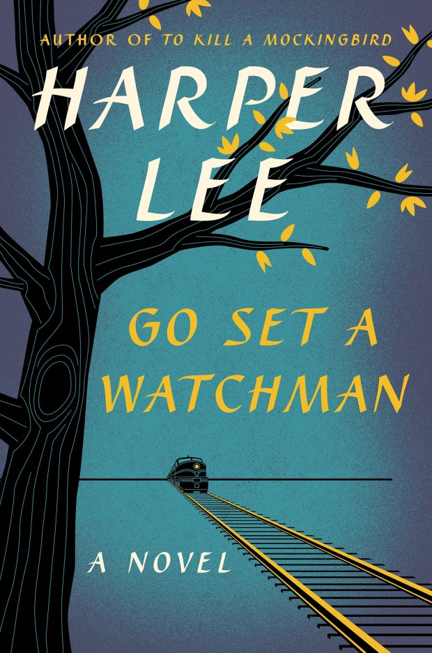
The US cover was designed by Jarrod Taylor for HarperCollins. An apparent homage to the classic post-war American book covers designed by the likes of W. A. Dwiggins, George Salter, and Ismar David, there was some suggestion, on Twitter at least, that it bore an uncanny resemblance to the dust jacket of the first edition of Ayn Rand’s Atlas Shrugged (published in 1957), designed by Salter himself.

Certainly, the covers do compliment each other — a testament to how well Taylor has captured the tone of the period — but the minor similarities grind to a halt at yellow train lines and the design of a headlamp. The composition, colour, and lettering are all quite different. More importantly in my opinion, the mood of the covers is in stark contrast. Go Set A Watchmen, with its (faux) hand-brushed letters, golden leaves, old-fashioned locomotive, and evening blue hue is wistful and nostalgic. The ruler-straight horizon and railway sleepers give it steadiness and calm. It evokes both the passing of time and the desire, perhaps, to return to the past.

Atlas Shrugged, on the other hand, is simply a period piece. The design itself, with its hot purple sky, rugged mountains, ominous dark tunnel, tilted railway sleepers, and — let’s face it — bloody enormous red warning light, is far from nostalgic. It’s all fear, urgency and speeding danger — the stencilled letters telling you (in case you hadn’t quite figured it out yet) that this book means serious business… Armchair psychoanalysts have at it.

In fact, the cover of Go Set A Watchman is an update of the original dust jacket of To Kill A Mockingbird (published in 1960) designed by Shirley Smith — the autumnal leaves making a nice allusion to both the author and her previous book, as well as an indication of where the new novel might take us.

But, for all the vintage styling, there is a kind of efficiency to new design that is, I think, unmistakably modern. The illustration, the colour palette, and even the brush-stroke typography, all have the feel of contemporary commercial fiction. It will not look out of place either online, or along side other bestsellers in Barnes and Noble.

Harper-Lee-UK

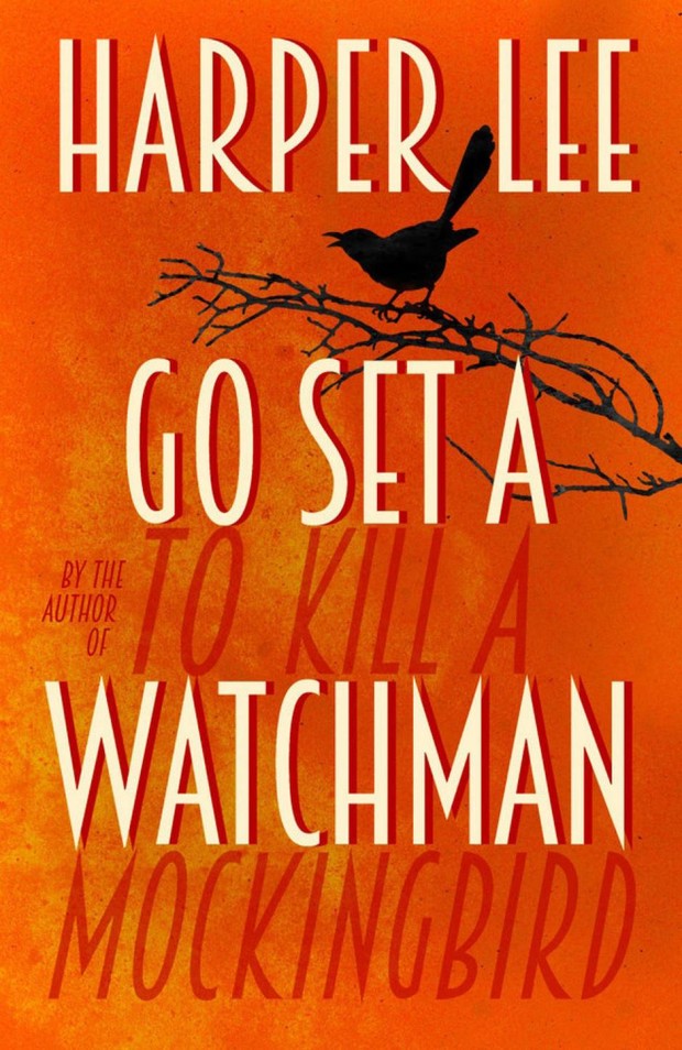
UK cover is, in the British fashion, being credited to the in-house design team at William Heinemann rather than to an individual designer1.

Also looking to evoke the past, it appears to draw inspiration from the typography of vintage film.

It’s a nod, perhaps, to the Academy Award-winning (and much beloved) film adaptation of To Kill A Mockingbird starring Gregory Peck (1962), but the burning orange background, red shadows and dark silhouettes suggest — unintentionally perhaps — an earlier literary film adaptation, Gone with the Wind (1939).2

The Art Deco-inspired typography is also perplexing. While To Kill A Mockingbird is set in early 1930s, Go Catch A Watchmen is apparently set 20 years later — well after the heyday of Art Deco (but firmly in the post-war period that inspired the US cover).

Stylistically too, there is something about the combination of illustration and type that feels rather inauthentic and, as a consequence, the cover has a sort of unsatisfying post-modernism gloss. It is much less successful at evoking the period than Ben Wiseman’s noir-inspired design for The Hilliker Curse by James Ellroy (published in 2010) for example.

Even so, there’s no getting away from the fact that it is vibrant and bluntly effective. Less book jacket than a glaring burnt orange advertisement, it is meant to be read at small sizes online (pre-orders, pre-orders, pre-orders….), or piled up at a distance.  If you miss the author’s name and the silhouette of a mockingbird at the top of the cover, the words To Kill A Mockingbird loom large at the bottom.

This bold placement of the old title between the lines of the new triggered a slew of obvious jokes on Twitter, but it is actually rather ingenious — the designer neatly accommodates a remarkably large font size and, at the same time, slides in a wry allusion to the long shadow of To Kill A Mockingbird — a far wittier, nuanced joke than the repeated ‘Go Set A To Kill A Watchman Mockingbird’ gags online. For all its brash intent, it’s a cleverer cover than it first appears.

Ultimately, neither the UK cover or its American counterpart are going to win design awards. But neither are they terrible, and given the expectations for this book (and the controversy surrounding it), we should be grateful for that. Certainly we should not blame the designers who have produced surprisingly effective covers given the limitations they were surely working under. Covers for high-profile (and expensive!) books always involve compromises of one sort or another, and already risk-averse publishers become even more timid when so much is riding on a single title. As we saw in 2012 with The Casual Vacancy by J. K. Rowling, big books often get blandly familiar, easily recognisable (and readable) covers rather than conceptual, original designs. The book industry is behind readers on this who — after years of exposure to Apple products — are more sophisticated about design than ever before, but Go Set A Watchman was never going to be the book that brought publishers up to date.

UPDATE: If you’re curious about what designers think of the Go Set A Watchman covers, Peter Cocking, Brian Morgan, Ingrid Paulson, and Michel Vrana share their thoughts with the Globe & Mail, while at The Guardian, Stuart Bache gives his considered opinion.

7 Comments

Jason Booher: “being a book cover designer is possibly the best job in the world.”

Booher_LotF

At the AIGA’s Eye on Design blog, Margaret Rhodes talks to Jason Booher, art director of Penguin imprint Blue Rider Press, about book cover design:

The key to creating stellar covers, according to Booher, is to first throw out the tired adage about not judging books by them. “Graphic design is really about selling things,” he says. Lest that sound soulless, the good news here is that Booher is selling other people’s creative ideas. And while every book is unique, Booher says he starts by reading the six or so manuscripts he gets per season, and then mentally digests them all. “You read it, you try and find the soul of the book, something that makes it special, and make it come alive,” he says.

Comments closed

Vintage Feminism

9780099595731

Earlier this month Vintage UK published new editions of The Second Sex by Simone de Beauvoir, The Beauty Myth by Naomi Wolf, and A Vindication of the Rights of Woman by Mary Wollstonecroft.

As CMYK, the Vintage design blog, revealed, these new editions were designed in-house by the talented Mr. Matthew Broughton, and feature black and white photography by Anton Stankowski on The Beauty Myth and A Vindication of the Rights of Woman, and Joy Gregory on my personal favourite, The Second Sex.

Interestingly, Vintage have also published  smaller format ‘short editions’ of the same three books — The Second Sex, The Beauty Myth, and  A Vindication of the Rights of Woman — featuring key extracts from the main texts.

In contrast to the sharp photographic covers above, the short editions feature illustrated covers designed by Gray318 with something of retro, E. McKnight Kauffer or Alvin Lustig, feel:

9781784870393


3 Comments

Affordable, Unabridged and Pocket-sized: 80 Years of Penguin Books

penguin

At BBC Arts, Brian Morton writes about 80 years of Penguin paperbacks:

The ubiquity of Penguin books in modern British publishing conceals a paradox best expressed by founder Allen Lane’s colleague and biographer Jack Morpurgo, who said that even in Allen Lane’s lifetime, Penguin became “the least typical member of the genus it was said to have created”.

There had been paperbacks before Penguin – all French books were paperback for instance and Woolworth’s, soon to be a key outlet for the new imprint, sold their own cheap editions – but few ranged so eclectically and wide.

And, in a second article, he looks at the legacy of their covers:

No other house had quite Penguin’s confidence in design. Pan Books, which began publication a decade after, in the mid 40s, were defined by a Mervyn Peake colophon of the god playing his pipes, a hint perhaps that here was a house that wasn’t going to trouble you with books on microeconomics or English churches… but with something more sensuous and possibly sensual…

…At the opposite extreme, but no less successful in their way, were the Fontana Modern Masters which began publication under Frank Kermode’s editorship in the 1970s, combining seriousness, a quick-crib approach to major thinkers and a stunning simple visual device, which was that each group of books featured a tessellating cut-up of an abstract painting by Oliver Bevan.

Buy them all, lay them out on your table and you had a bit of modern art. Painterly abstraction and san-serif typeface seemed to go together and seemed to fit as well as Bevan’s angles…

…But it was Penguin which continued to perfect the idea of cheap books as items that might be collected and displayed.

Comments closed

Student Editions by Ákos Polgárdi

DK-Jokai-KEF

These rather fabulous typographic covers were designed by Ákos Polgárdi for Európa Könyvkiadó‘s Student Editions series. Works of classic literature from Hungary and around the world, each cover features text from the book as a background pattern.

student-editions-1 student-editions-2student-editions-4 student-editions-3

You can see more of Ákos’ book covers on his website.

Comments closed

50 YA Covers for 2014

Like all the best things on The Casual Optimist, this post started life as a conversation on Twitter. The topic this time was the under-representation of YA book designers in all these end of the year cover lists. YA covers are becoming more and more sophisticated, yet my posts this year have rarely featured them, so feel that I am unquestionably at fault here. To make some kind of amends, I thought I would post a selection of 50 YA covers from 2014. Many, many thanks to all the book designers and publishing folk (including my colleagues Alisha, Brooke, and Megan at Raincoast) for their suggestions and assistance. And special thanks to Serah-Marie and Derek at Type Books for letting me browse their shelves with my notebook in hand…

belzhar
Belzhar by Meg Wolitzer; design by Kristin Smith (Dutton / September 2014)

beauty-of-the-broken-9781481407090_hr
Beauty of the Broken by Tawni Waters; design by Regina Flath (Simon Pulse / October 2014)

DorothyMustDie
Dorothy Must Die by Danielle Paige; design by Ray Shapell (HarperCollins / April 2014)

EggandSpoon
Egg and Spoon by Gregory Maguire; design by Matt Roeser (Candlewick / September 2014)

everything-leads-to-you
Everything Leads to You by Nina LaCour; design by Theresa Evangelista (Dutton / May 2014)

falling-into-place
Falling into Place by Amy Zhang; design by Paul Zakris (Greenwillow Books / September 2014)

far-from-you
Far From You by Tess Sharpe; design by Whitney Manger; cover photograph by Yojik (Disney-Hyperion / April 2014)

firecracker
Firecracker by David Iserson; design by Emily Osborne (Razorbill / October 2014)

forever
Forever by Judy Blune (Reissue Edition); design by Lizzy Bromley (Atheneum Books for Young Readers / April 29, 2014)

girl-defective
Girl Defective by Simmone Howell; design by Debra Sfetsios-Conover; illustration Jeffrey Everett (Atheneum Books for Young Readers / September 2014)

girl-on-a-wire
Girl on a Wire by Gwenda Bond; design and illustration by Neil Swaab ( Skyscape / October 2014)

9780670016785B
Half Bad by Sally Green; design by Tim Green / Faceout Studio (Viking Juvenile / March 2014)

The Here And Now
The Here and Now by Ann Brashares; design by Natalie Sousa (Delacorte Press, April 2014)

high-and-dry
High and Dry by Sarah Skilton; design by The Heads of State (Amulet Books / April 2014)

House of Ivy and Sorrow
House of Ivy and Sorrow by Natalie Whipple; design by Erin Fitzsimmons (Turtleback Books / April 2014)

if-you-find-me
If You Find Me by Emily Murdoch; design by Sinem Erkas (Indigo / January 2014)

ill-give-you-the-sun
I’ll Give You the Sun by Jandy Nelson; design by Theresa Evangelista  ( Dial / 2014)

into-the-grey
Into the Grey by Celine Kiernan; design by Matt Roeser (Candlewick / August 2014)

Jackaby
Jackaby by William Ritter; design by Joel Tippie / Jdrift (Algonquin Young Readers / September 2014)

lets-get-lost
Let’s Get Lost by Adi Alsaid; design by Natalie Sousa (Harlequin Teen / July 2014)

like no other
Like No Other by Una LaMarche; design by Emily Osborne; cover illustration by Michael Kirkham (Razorbill / September 2014)

9780374346676
Love Letters to the Dead by Ava Dellaira; design by Andrew Arnold (FSG Books for Young Readers / March 2014)

9781452110219
The Meaning of Maggie by Megan Jean Sovern; design by Amelia May Mack (Chronicle Books / June 2014)

My-True-Love-Gave-to-Me
My True Love Gave to Me edited by Stephanie Perkins; design & illustration by Jim Tierney (St. Martin’s Griffin / October 2014)

no-one-else-can-have-you
No One Else Can Have You by Kathleen Hale; design by ​​Michelle Taormina (HarperTeen / January 2014)

100-sideways-miles-9781442444959_hr
100 Sideways Miles by Andrew Smith; design by Lucy Ruth Cummins (Simon & Schuster for Young Readers / September 2014)

paper-airplanes
Paper Airplanes by Dawn O’Porter; design by Maria T. Middleton (Amulet / September 2014)

PlayForTheCommandant
Playing for the Commandant by Suzy Zail; design by Matt Roeser (Candlewick / October 2014)

promise-of-shadows
Promise of Shadows by Justina Ireland; design by Lucy Ruth Cummins; cover art by Luke Lucas (Simon & Schuster Books for Young Readers / March 2014)

ring-and-the-crown
The Ring and the Crown by Melissa de la Cruz; design by Tanya Ross-Hughes; model photo by Ali Smith; title type by Mario Hugo (Hyperion / April 2014)

ruin-and-rising
Ruin & Rising by Leigh Bardugo; design by Jen Wang (Henry Holt & Co. / June 2014)

The previous two books in the series, also designed by Jen Wang:

Salvage
Salvage by Keren David; design by Sophie Burdess (Atom / July 2014)

say-what-you-will
Say What You Will by Cammie McGovern; cover art by Ann Shen; design by Alison Klapthor (HarperTeen / June 2014)

schizo
Schizo by Nic Sheff; design by Kristin Smith (Philomel /September 30, 2014)

since-youve-been-gone
Since You’ve Been Gone by Megan Matson; design by Lucy Ruth Cummins; photography by Meredith Jenks (Simon & Schuster Books for Young Readers / July 2014)

Smart
Smart by Kim Slater; cover illustration by Helen Crawford-White / Studio Helen (Macmillan Children’s Books / June 2014)

AvaLavender
The Strange and Beautiful Sorrows of Ava Lavender by Leslye Walton; design by Matt Roeser (Candlewick Press / March 2014 )

side-effects-may-vary
Side Effects May Vary by Julie Murphy; design and illustration by Annemieke Beemster Leverenz (Balzer + Bray / 2014)

this-side-of-salvation
This Side of Salvation by Jeri Smith-Ready; design by Karina Granda (Simon Pulse / April 2014)

Tape
Tape by Steven Camden; cover art by Keri Smith (HarperCollins Children’s Books / January 2014)

tease
Tease by Amanda Maciel; design by Erin Fitzsimmons (Balzer + Bray / April 2014)

9781596437746
This One Summer by Mariko Tamaki & Jillian Tamaki; design by Jillian Tamaki & Colleen AF Venable; cover art Jillian Tamaki (First Second / May 2014)

To_all_the_boys
To All the Boys I’ve Loved Before by Jenny Han; design by Lucy Ruth Cummins; photographer Anna Wolf (Simon & Schuster Books for Young Readers / April 2014)

trouble-9781442497726_hr
Trouble by Non Pratt; design by Lucy Ruth Cummins; illustration by Dermot Flynn (Simon & Schuster Books for Young Readers / June 2014)

truth-about-alice
The Truth About Alice by Jennifer Mathieu; design by Elizabeth H Clark (Roaring Brook Press / June 2014)

two-girls-staring
Two Girls Staring at the Ceiling by Lucy Frank; design by Rachael Cole; cover art Elinor Hills (Schwartz & Wade / August 2014)

we-were-liars
We Were Liars by E. Lockhart; design by Angela Carlino (Delacorte Press / May 2014)

9780374384678
The Winner’s Curse by Marie Rutkoski; design by Elizabeth H Clark; photography by Ali Smith (FSG Books for Young Readers / March 2014)

9781419712357
Winterkill by Kate A. Boorman; design by Maria T. Middleton; illustration by Shane Rebebschied (Harry N. Abrams / September 2014)

year-of-the-rat
The Year of the Rat by Clare Furniss; design by Matt Johnson (Simon & Schuster Childrens Books / April 2014)

Thanks all


3 Comments

ABCD 2015

abcd-logo
As I am still working on my 2014 cover posts, it seems like a good time to let you know that the Academy of British Cover Design (ABCD) has announced its second annual cover design competition.

The competition is open to any designer based in the UK for covers published in 2014. There are ten categories:

Children’s
Young Adult
SciFi/Fantasy
Mass Market
Literary Fiction
Crime/Thriller
Non-fiction
Series Design
Classic/Reissue
Women’s Fiction

You can see the previous winners here.

Comments closed

Hazlitt Interview with Peter Mendelsund

Peter_Mendelsund

Book designer and author Peter Mendelsund discusses his books Cover and What We See When We Read with Christopher Frey for the Hazlitt podcast:

Comments closed