A little bit later than scheduled, here is my October selection of book covers. There are three from Verso, and two by James Paul Jones, but I think it’s still another month of interesting, diverse, and eclectic work. I hope you agree…
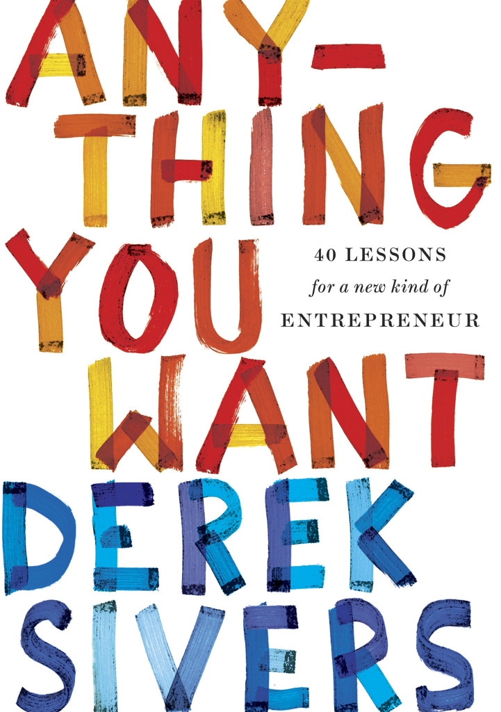
Anything You Want by Derek Sivers; design by Zoe Norvell (Portfolio / September 2015)
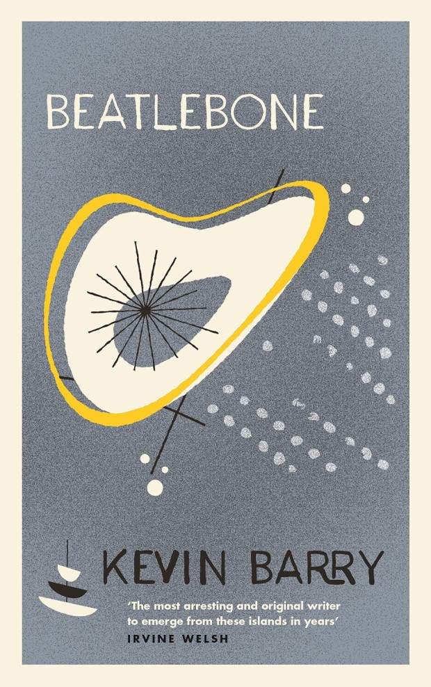
Beatlebone by Kevin Barry; design by Rafi Romaya (Canongate / October 2015)
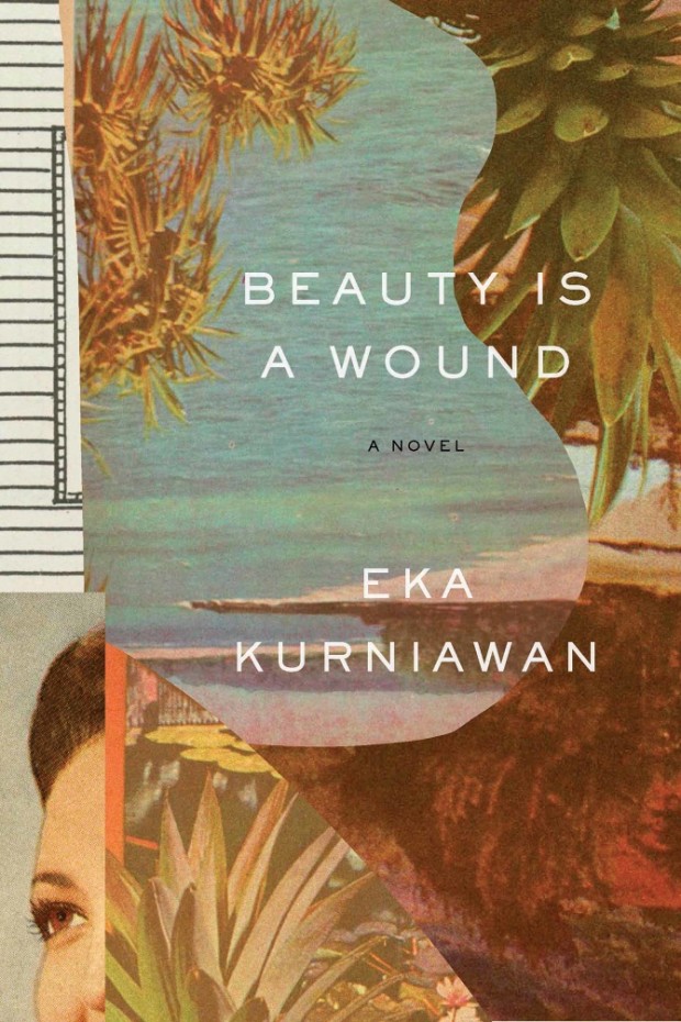
Beauty is a Wound by Eka Kurniawan; design by John Gall (New Directions / September 2015)
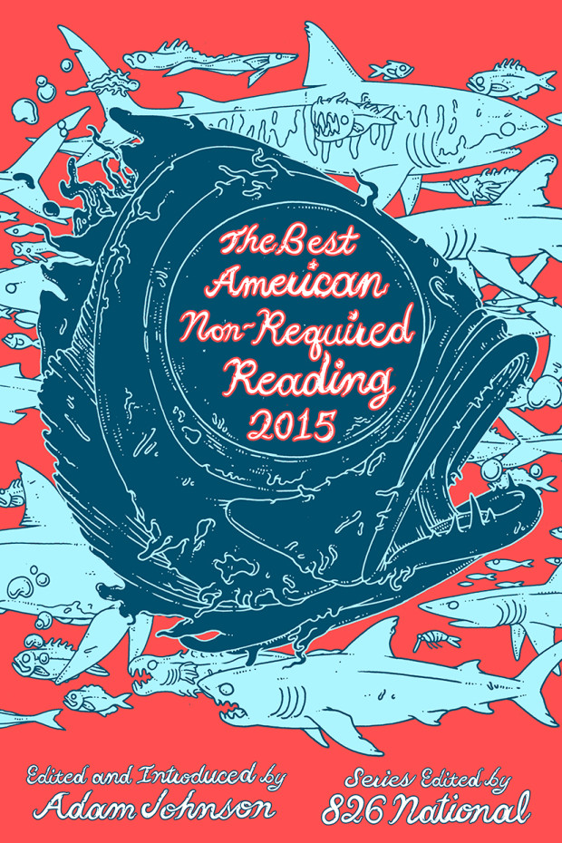
The Best American Non-Required Reading 2015; cover art by Eric Nyquist (Mariner / October 2015 )

Black Earth by Timothy Snyder (US); design by Darren Haggar (Penguin Random House / September 2015)

Black Earth by Timothy Snyder (UK); design by Suzanne Dean; photograph Alex Majoli / picture research Lily Richards (The Bodley Head / September 2015)
The US cover, designed by Darren Haggar is on the left; the UK cover designed by Suzanne Dean is on the right.
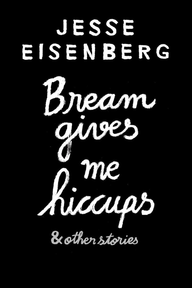
Bream Gives Me Hiccups design by Jean Jullien (Grove Atlantic / September 2015)

Building Art: The Life and Work of Frank Gehry by Paul Goldberger; design by Peter Mendelsund (Knopf / September 2015)
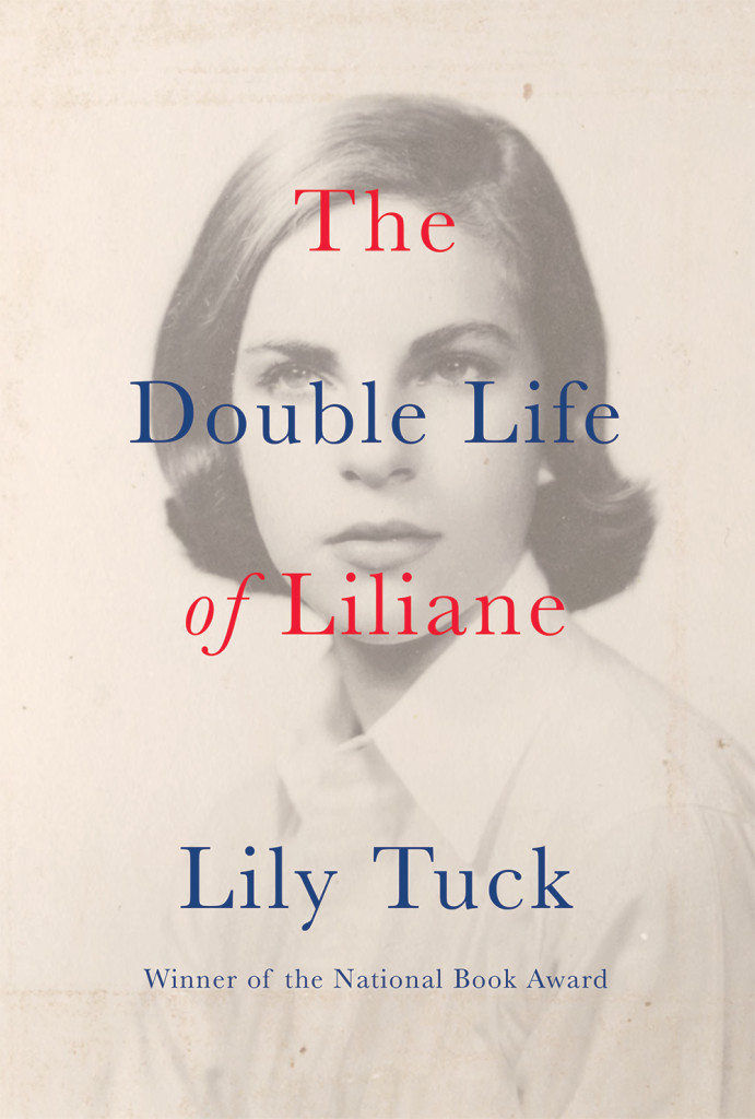
The Double Life of Liliane by Lily Tuck; design by Abby Weintraub (Grove Atlantic / September 2015)
(I was raving about this cover on Twitter no so long ago. It really needs to be seen in person because the image doesn’t do it justice at all. The finish on the jacket is lovely and gives the design a beautiful nuance and subtlety)
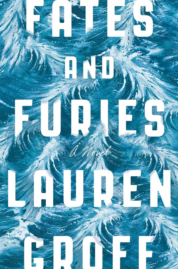
Fates and Furies by Lauren Groff; design by Rodrigo Corral and Adalis Martinez (Riverhead / September 2015 )

The Great British Dream Factory by Dominic Sandbrook; design by Jim Stoddart (Allen Lane / October 2015)
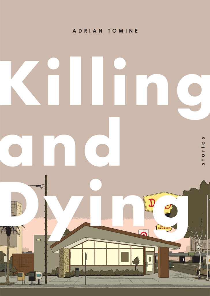
Killing and Dying by Adrian Tomine; cover art and design by Adrian Tomine (Drawn & Quarterly / October 2015)
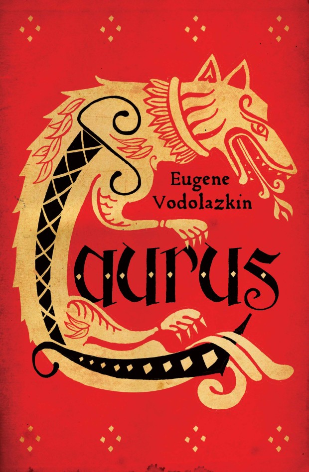
Laurus by Eugene Vodolazkin; design Gray318 (Oneworld / October 2015)
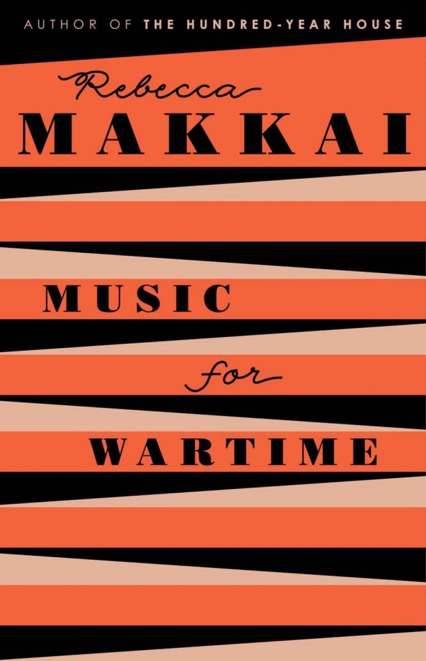
Music for Wartime by Rebecca Makkai; design by Lynn Buckley (Viking / June 2015)
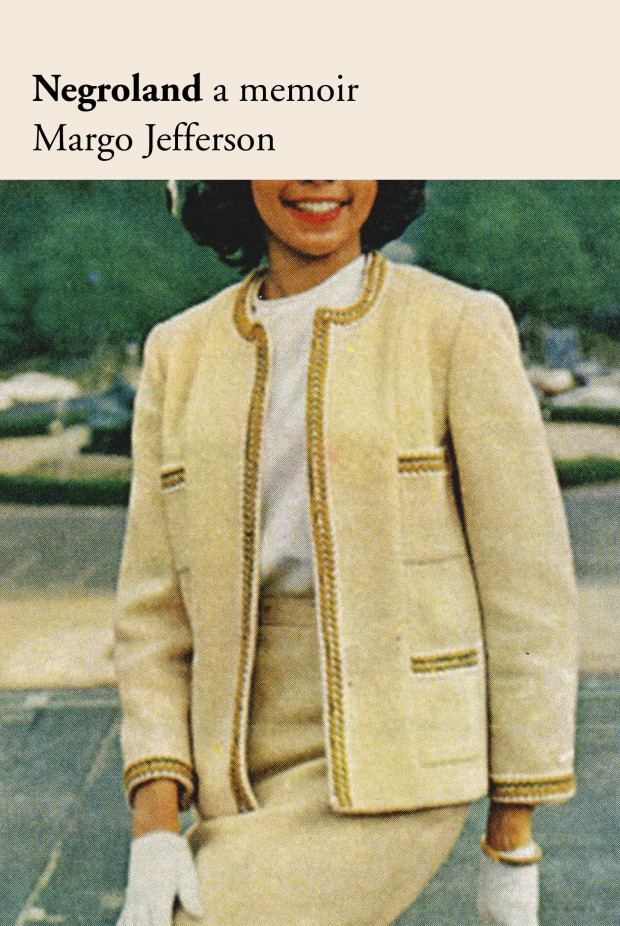
Negroland by Margo Jefferson; design by Oliver Munday (Pantheon / September 2015)
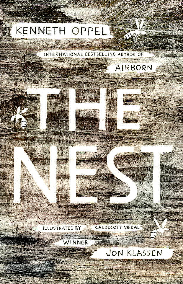
The Nest by Kenneth Oppel; cover art by Jon Klassen (Simon & Schuster / October 2015 )
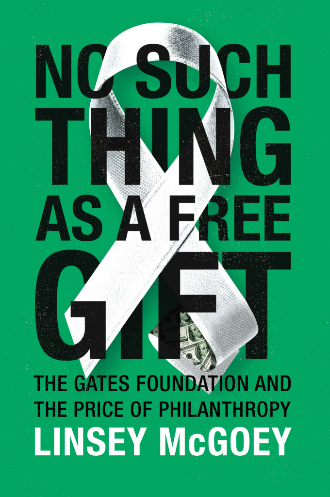
No Such Thing as a Free Gift by Linsey McGoey; design by James Paul Jones (Verso / October 2015)
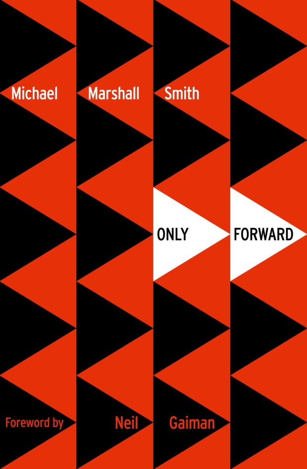
Only Forward by Michael Marshall Smith; design by Stuart Bache (HarperCollins / May 2015)
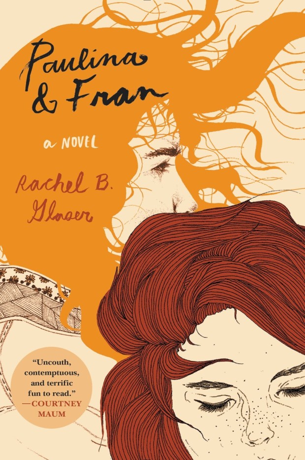
Paulina and Fran by Rachel B. Glaser; illustration Kaethe Butcher; typography Nina LoSchiavo (Harper Perennial / September 2015)
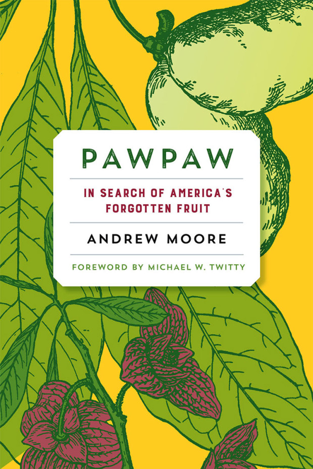
PawPaw by Andrew Moore; design by Kimberly Glyder (Chelsea Green / September 2015 )

The Rise of the Novel by Ian Watt; design by James Paul Jones (Vintage / October 2015)

Scorper by Rob Magnuson Smith; design by Dan Mogford; illustration by John Vernon Lord (Granta / October)

The Seasons of Trouble by Rohini Mohan; design by David A. Gee (Verso / October 2015)
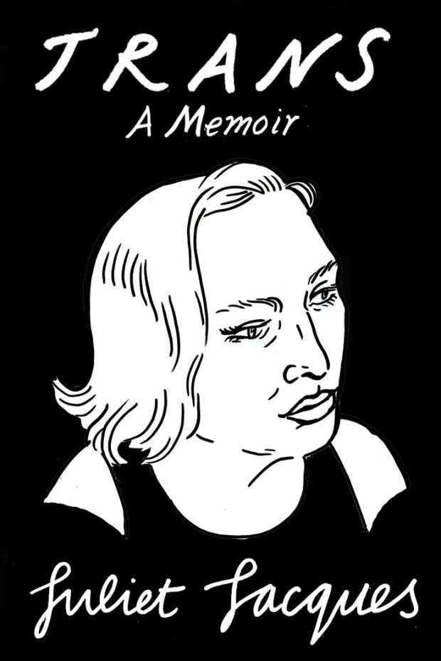
Trans by Juliet Jacques; Design and illustration by Joanna Walsh (Verso / September 2015)


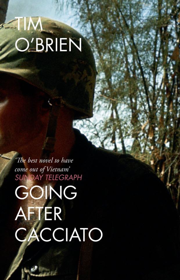


 The
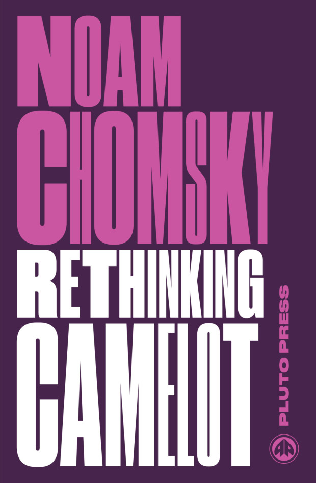
The