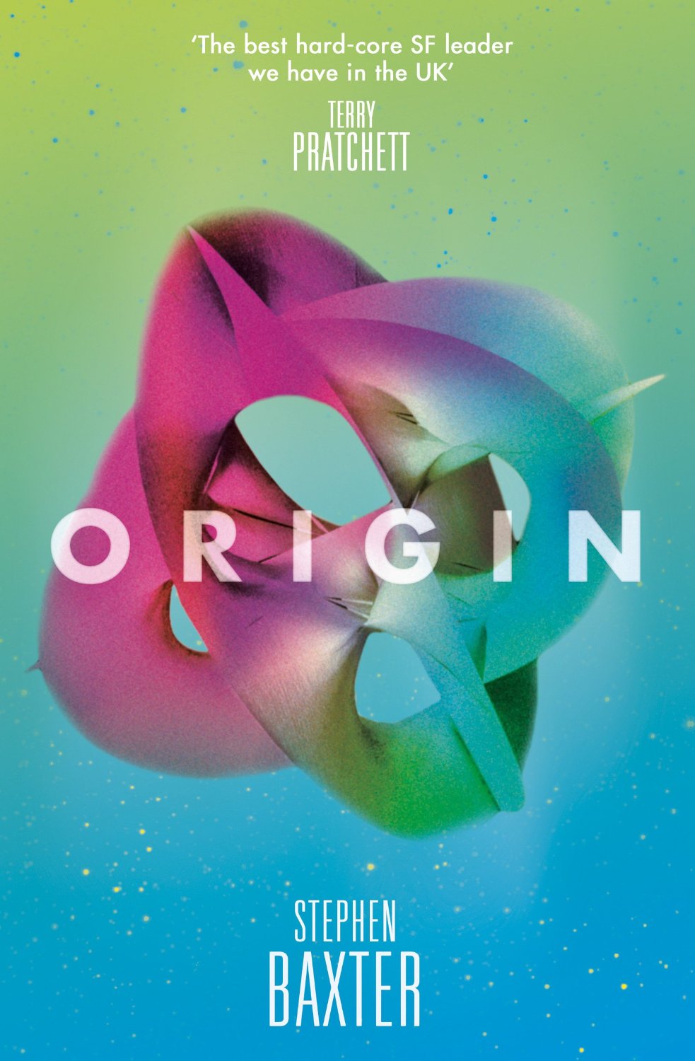
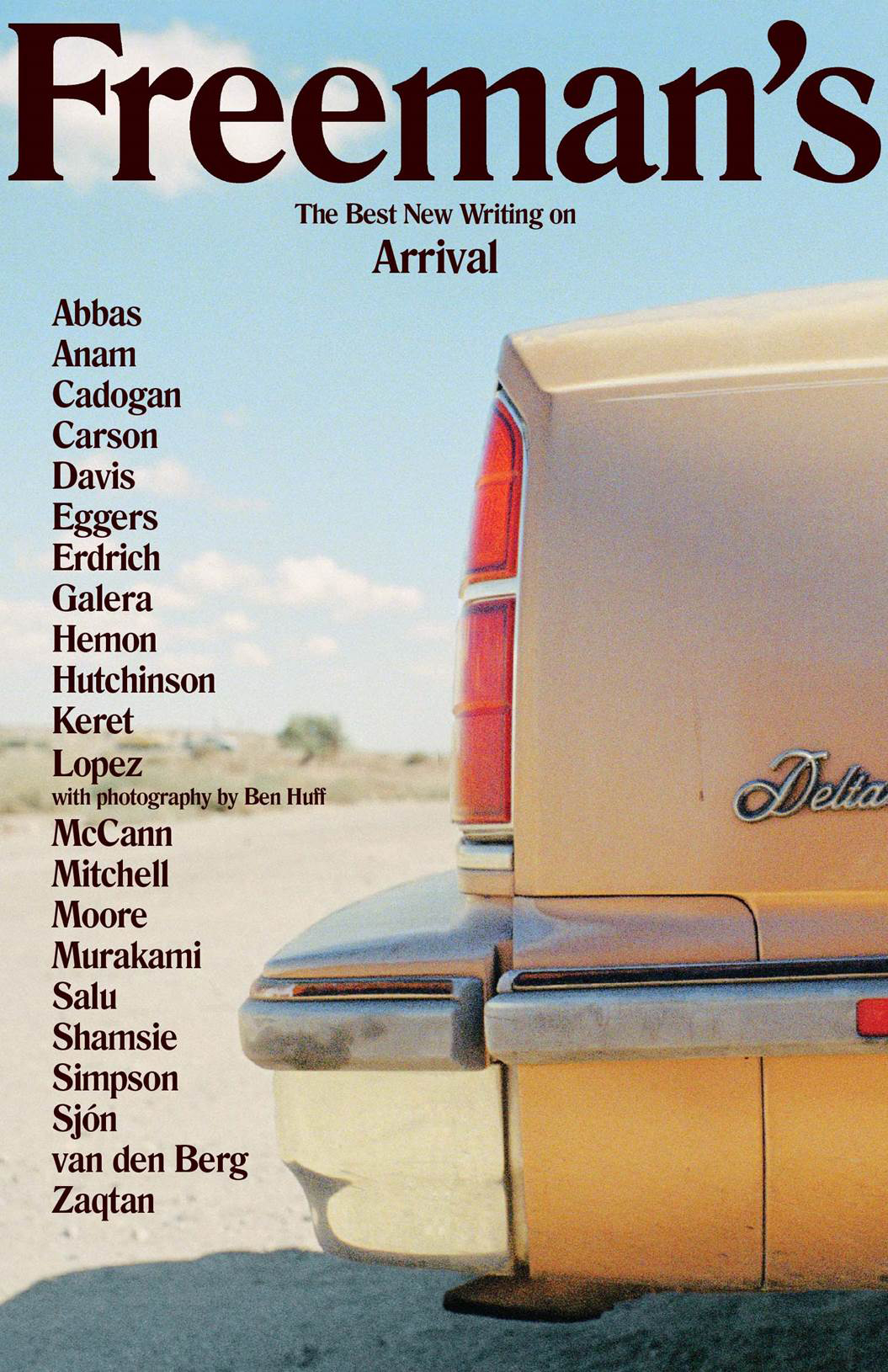
The very first Freeman’s anthology was published in fall this year, but hopefully this design will set the tone for the rest of the series. The second volume is scheduled for next year.
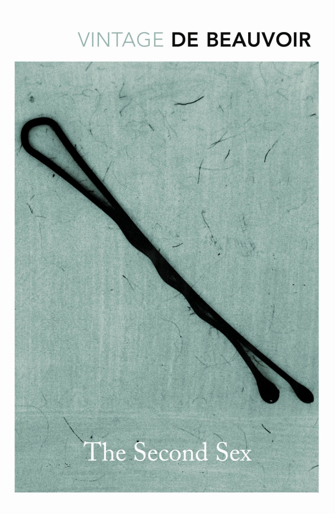
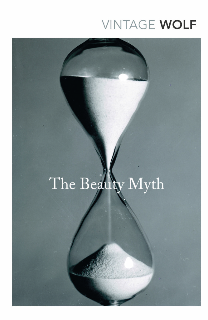
Vintage Feminism; design by Matthew Broughton (Vintage / 2015)
Little Black Classics; design by Jim Stoddart (Penguin / 2015)
Although the early reviews have not been especially kind to the Ben Wheatley film adaptation of J.G. Ballard’s High-Rise, the trailer looks amazing. The Anthony Royal Architecture website is also a nice touch.
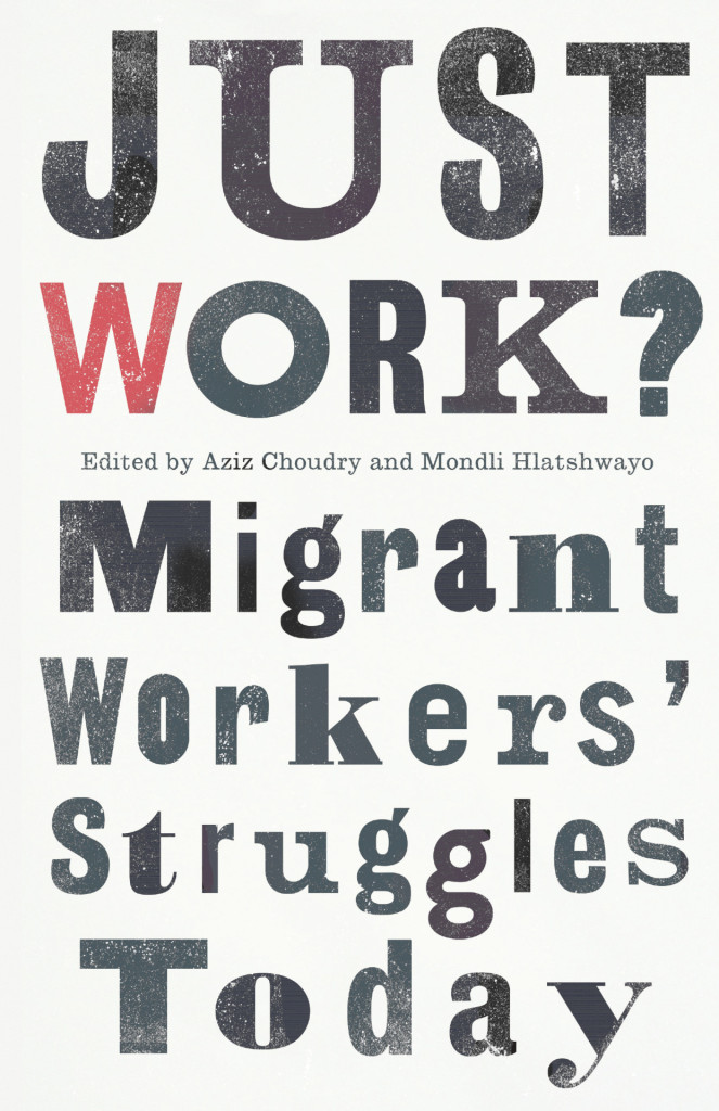
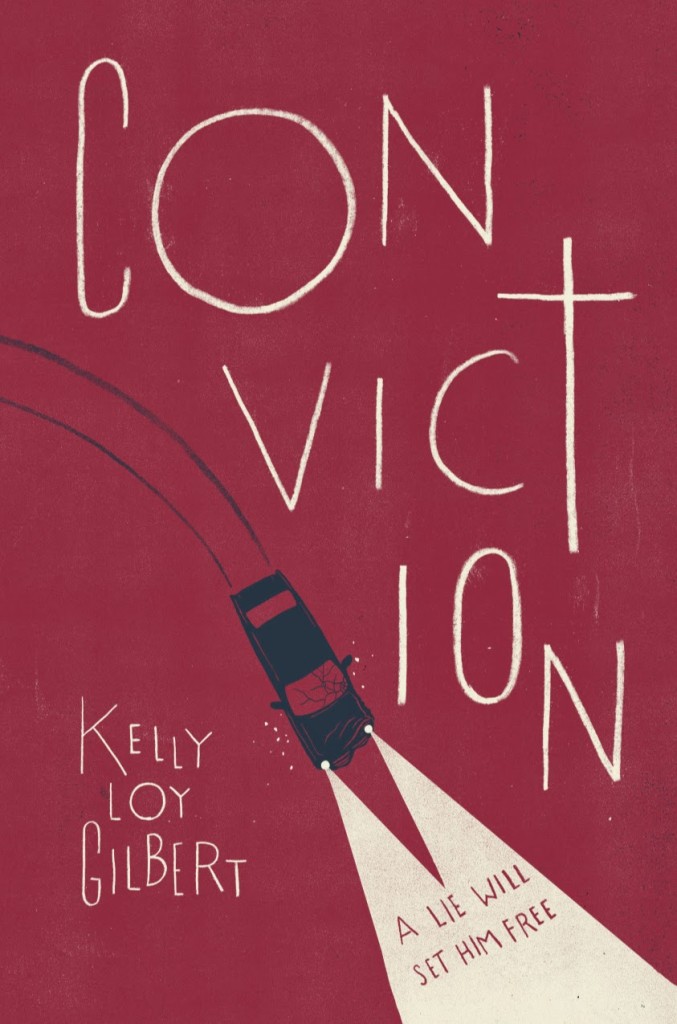
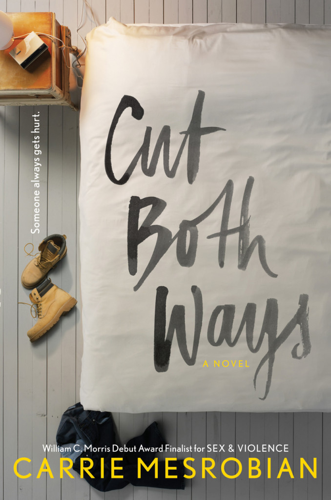
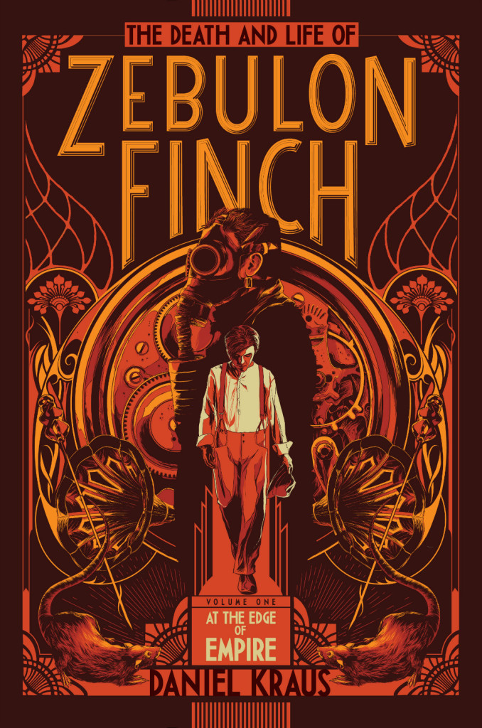
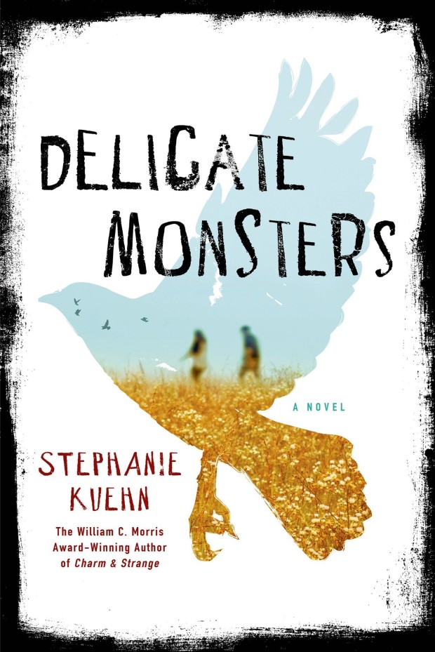
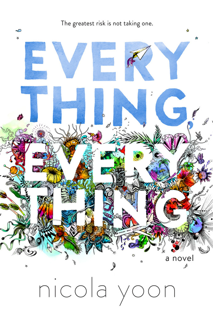
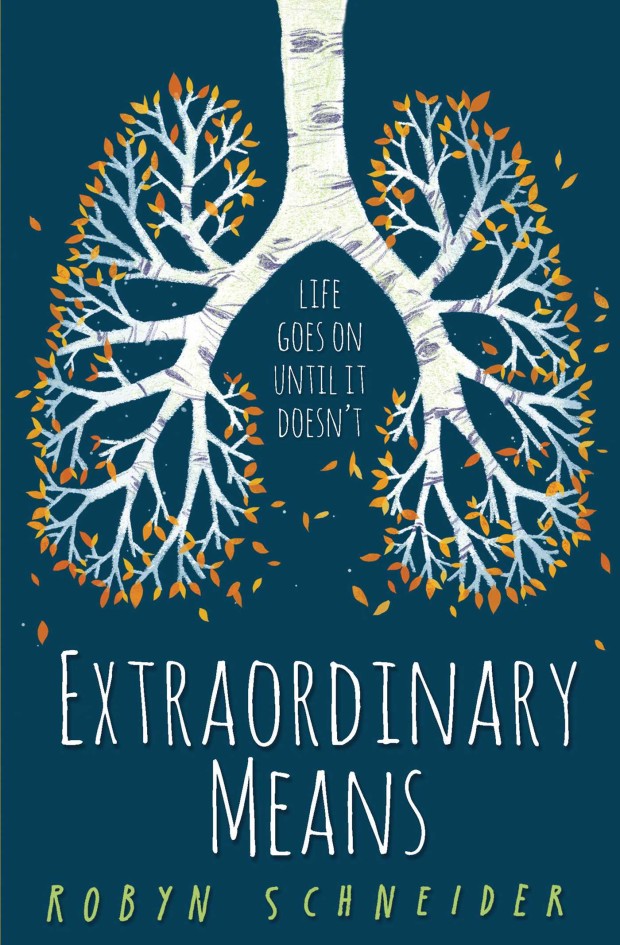
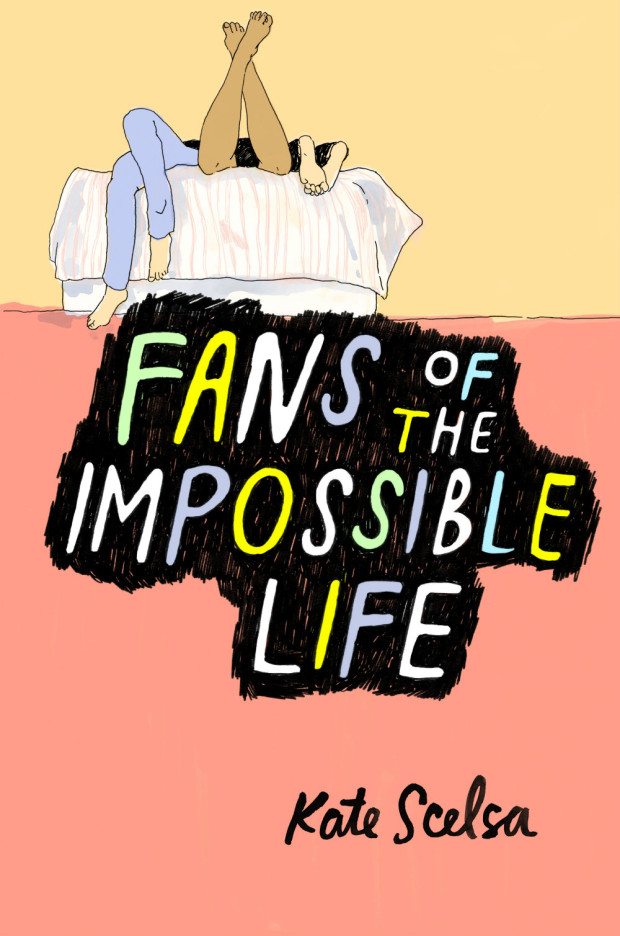
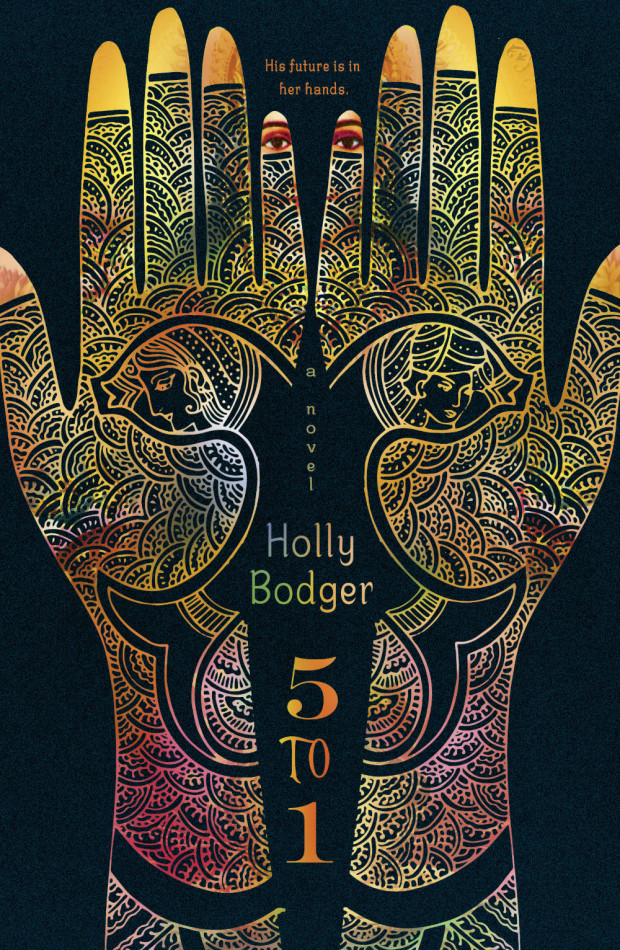
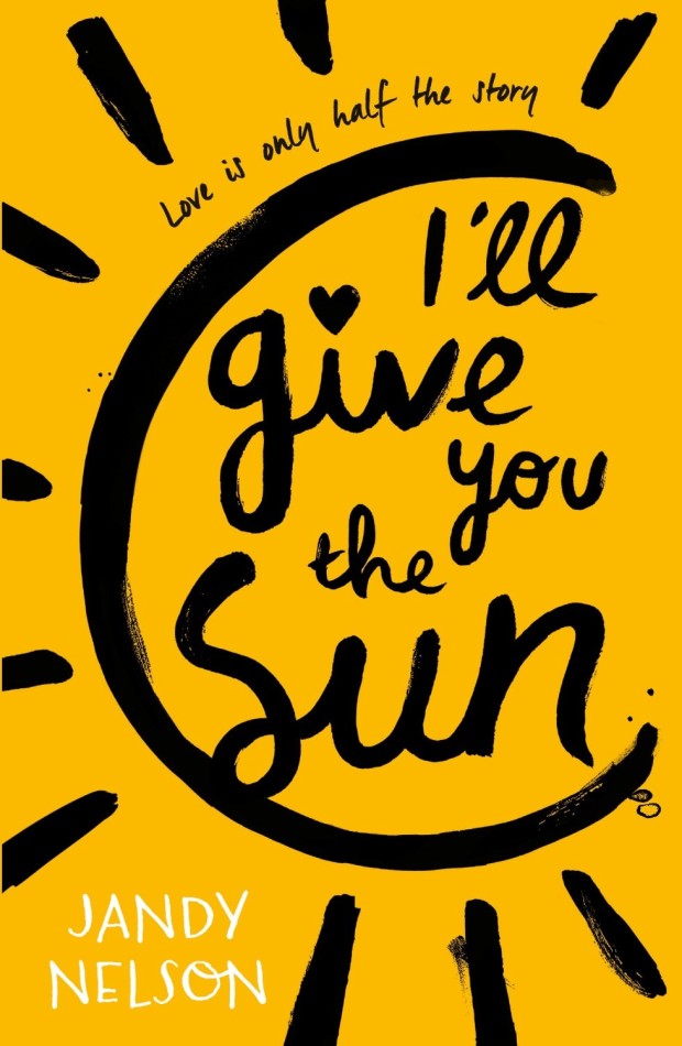
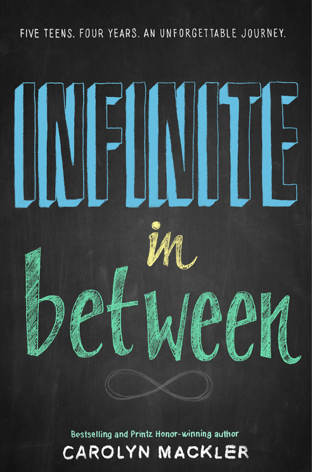
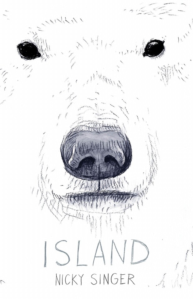
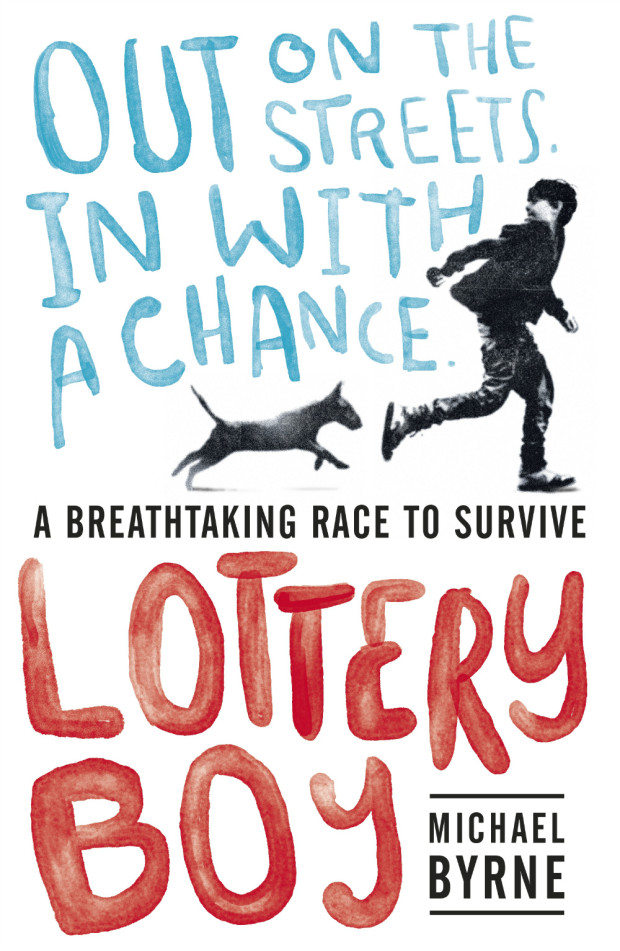
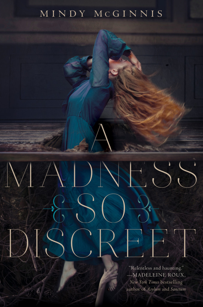
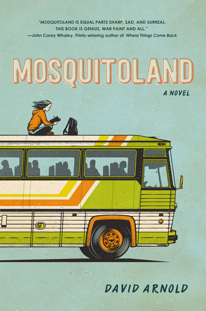
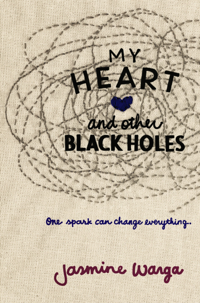
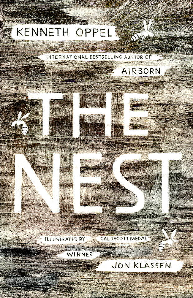
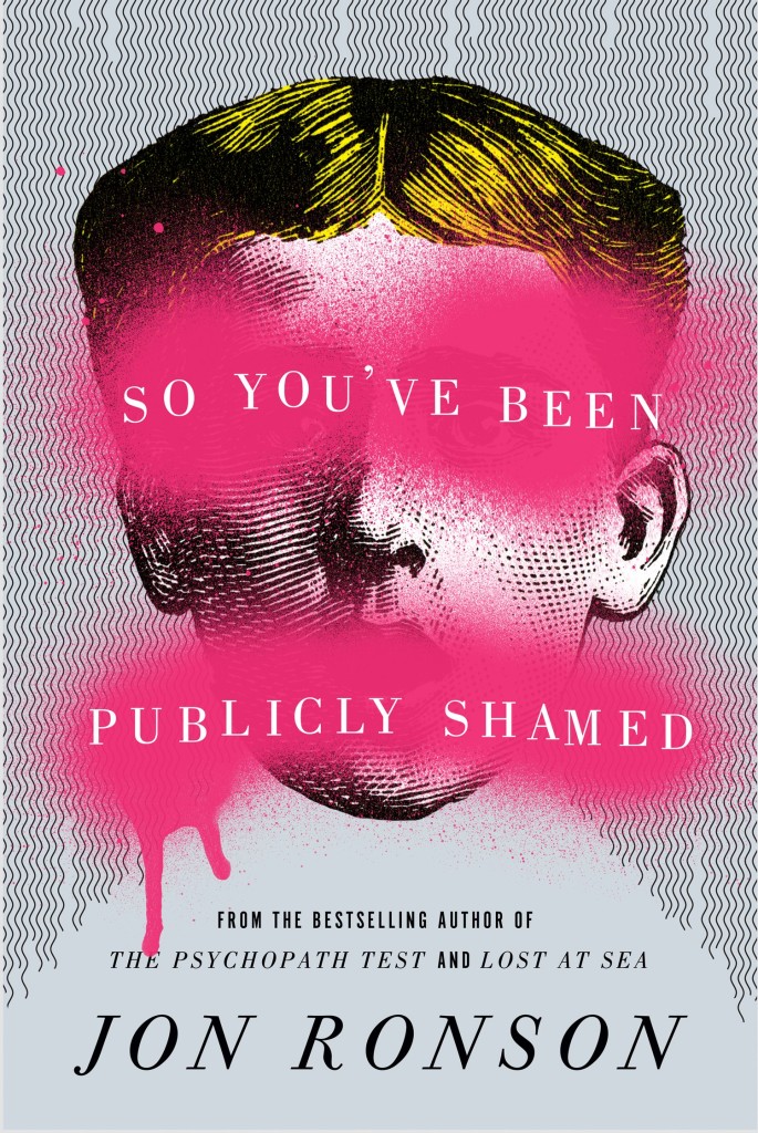
As my 2014 post was such a hit, here is my second annual look at the past year’s young adult book covers. This isn’t my speciality, so this list is a lot more of a crowd-sourced effort than my very personal adult list. A special thank you to all the designers who have made suggestions in the past couple of weeks — you know who you are! — and if there are any burning omissions, please let me know in the comments!
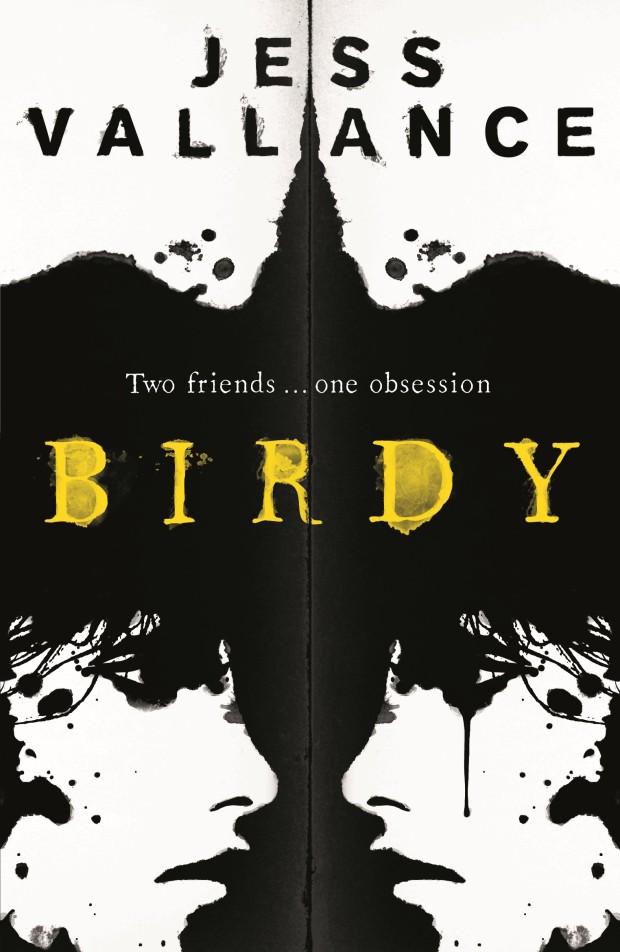
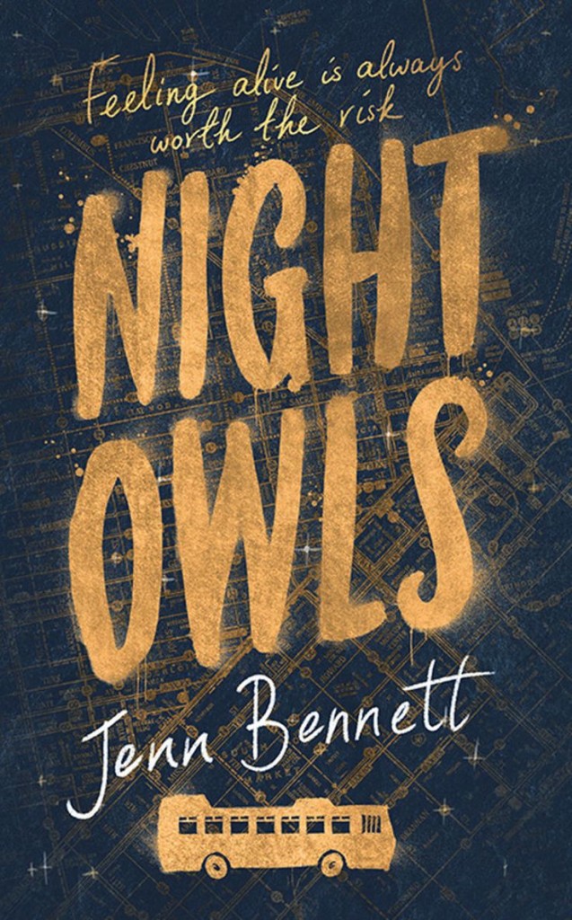
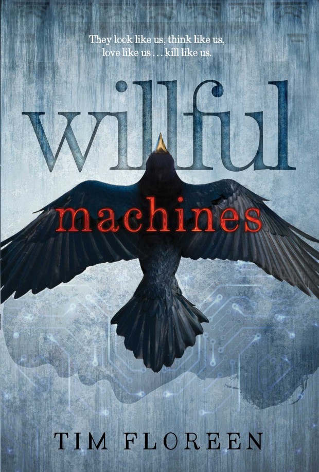
Birdy by Jess Vallance; design by Jet Purdie (Hot Key Books / July 2015)
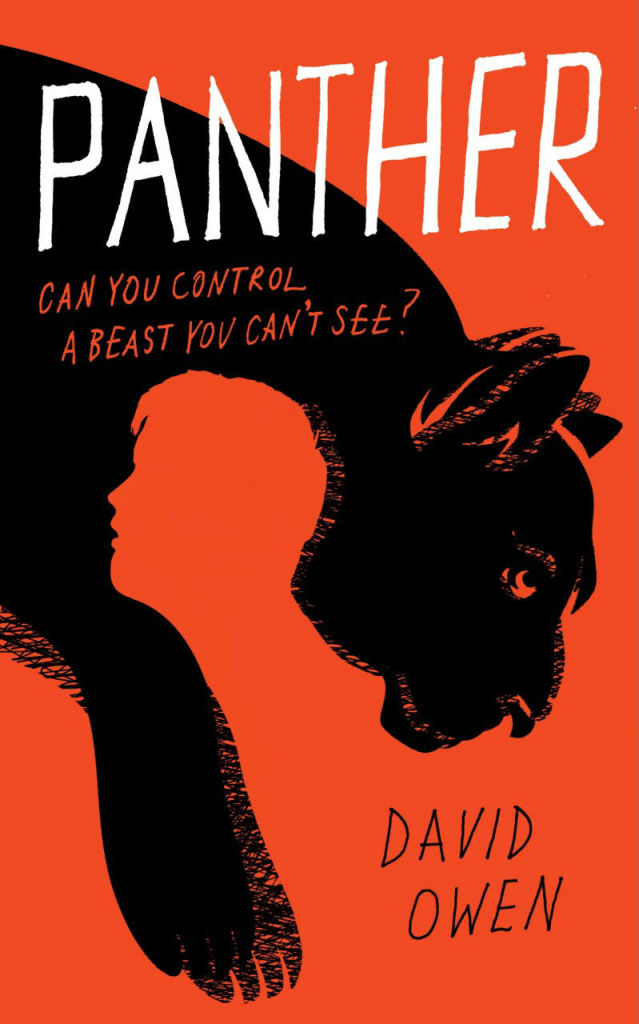
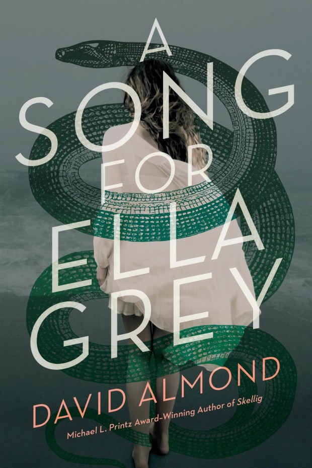
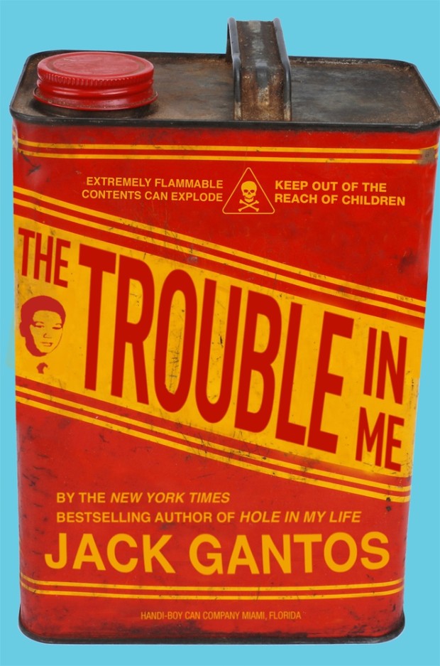
This lung-tree illustration is just incredible, but it is worth noting that this UK cover is actually an adaptation of the killed US cover (HarperCollins).
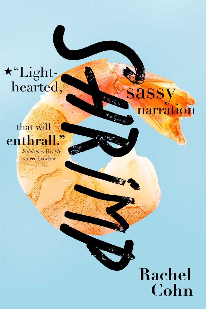
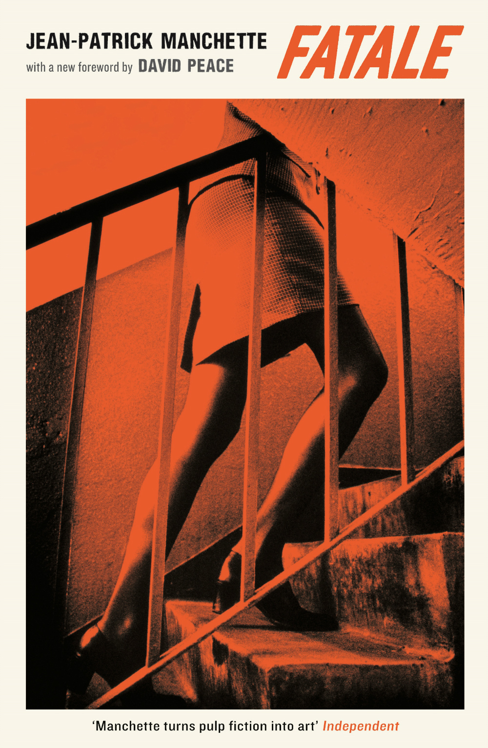
(This probably needs to be seen in person as the blue is, I believe, a metallic finish, and the back cover is the image reversed in a lovely orange-red).
Back in 2014, there were signs that book cover design was maybe, just maybe, having a moment. Suzanne Dean was on the BBC. Peter Mendelsund was on… well, everything. But if 2015 has felt a little quiet by comparison, there were still plenty of reasons to be cheerful. This year’s list includes over 120 covers by 60 designers, and there is little doubt in my mind that this really is a golden time for book design.
Thank you to all the art directors, designers, and publicists who have supported the blog this year, and who make posts like this possible. Thanks too, to my local bookstore TYPE for letting me browse their shelves.
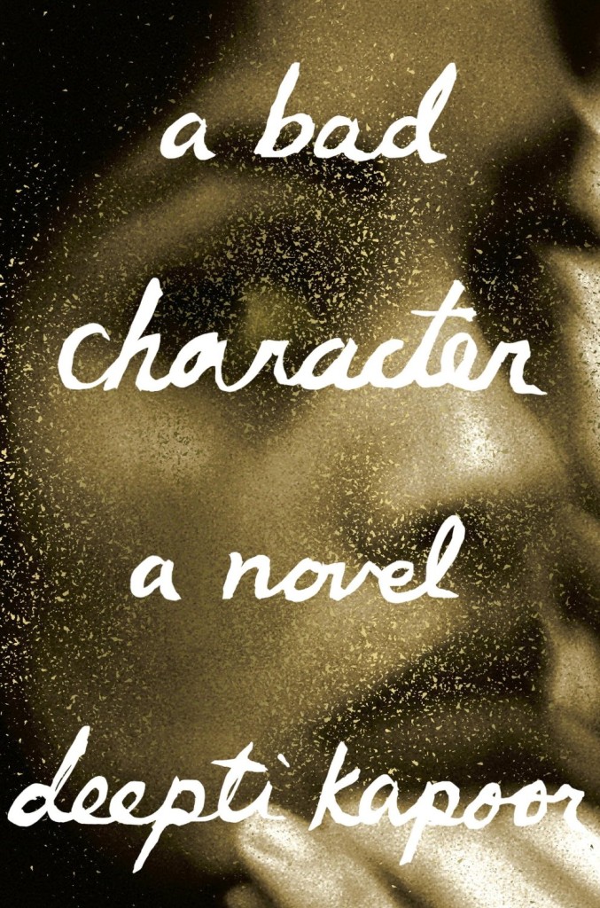
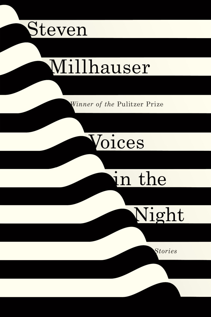
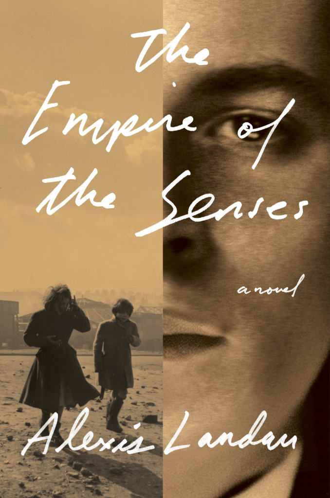
A Bad Character by Deepti Kapoor; design by Janet Hansen (Knopf / January 2015)Voices in the Night by Steven Millhauser; design by Janet Hansen (Knopf / April 2015)Empire of the Senses by Alexis Landau; design by Janet Hansen (Pantheon / March 2015)
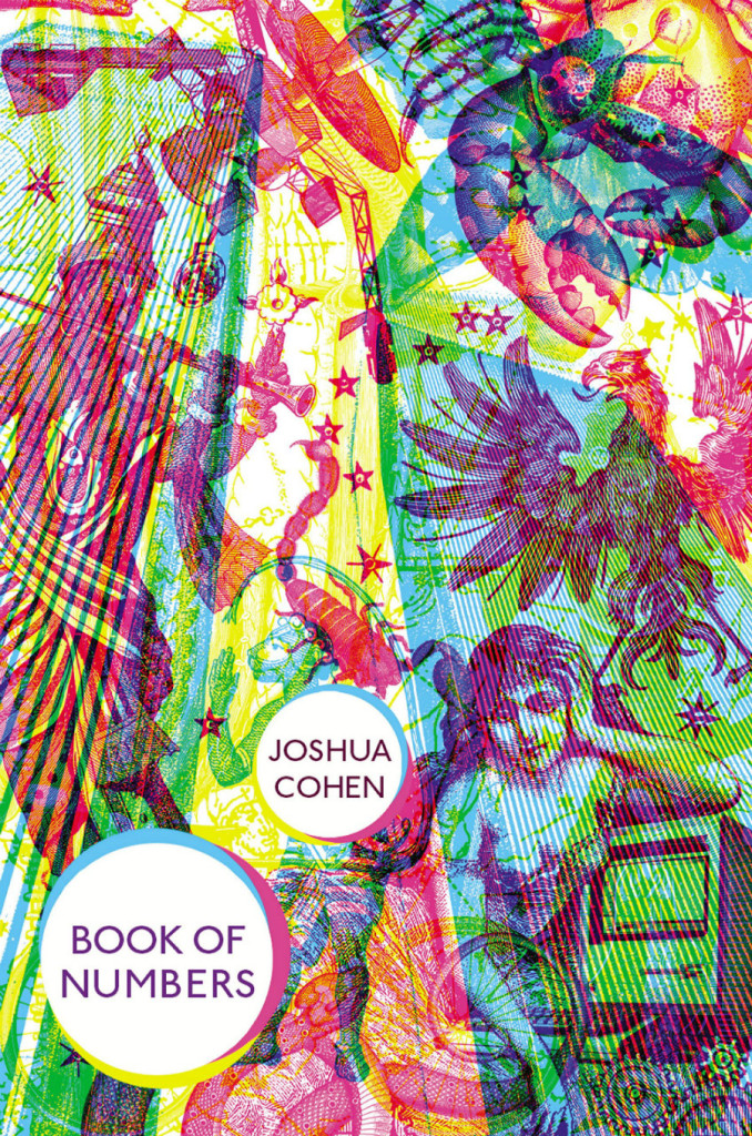
(Oliver Munday’s cover design for the US edition of the Book of Numbers published by Random House is also great.)
Also designed by Suzanne Dean:
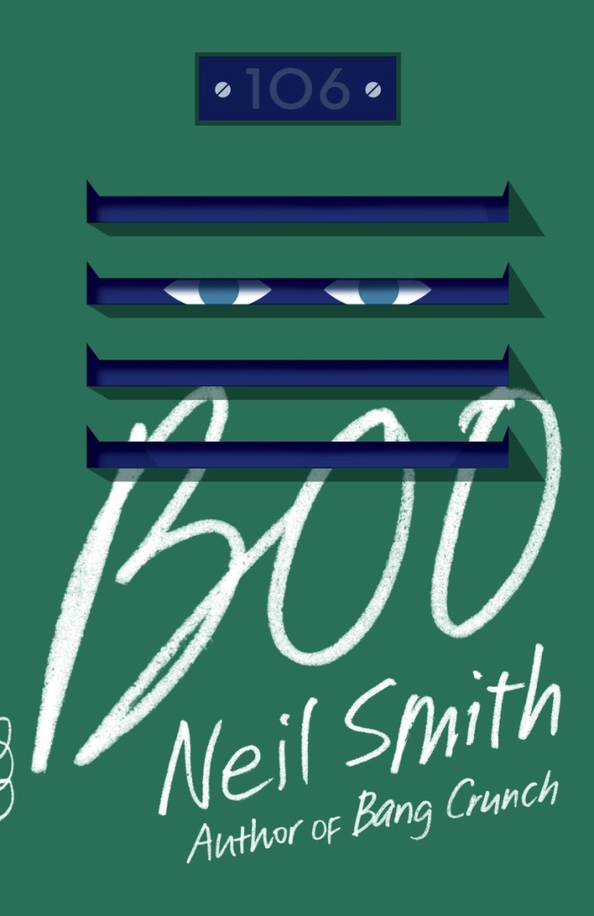
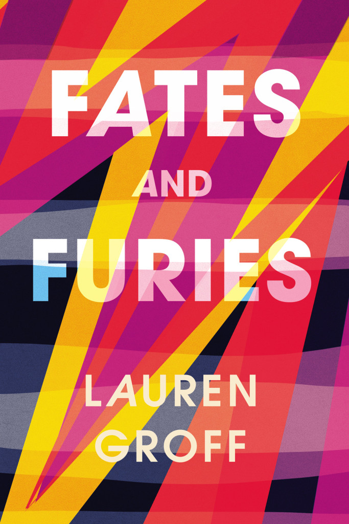
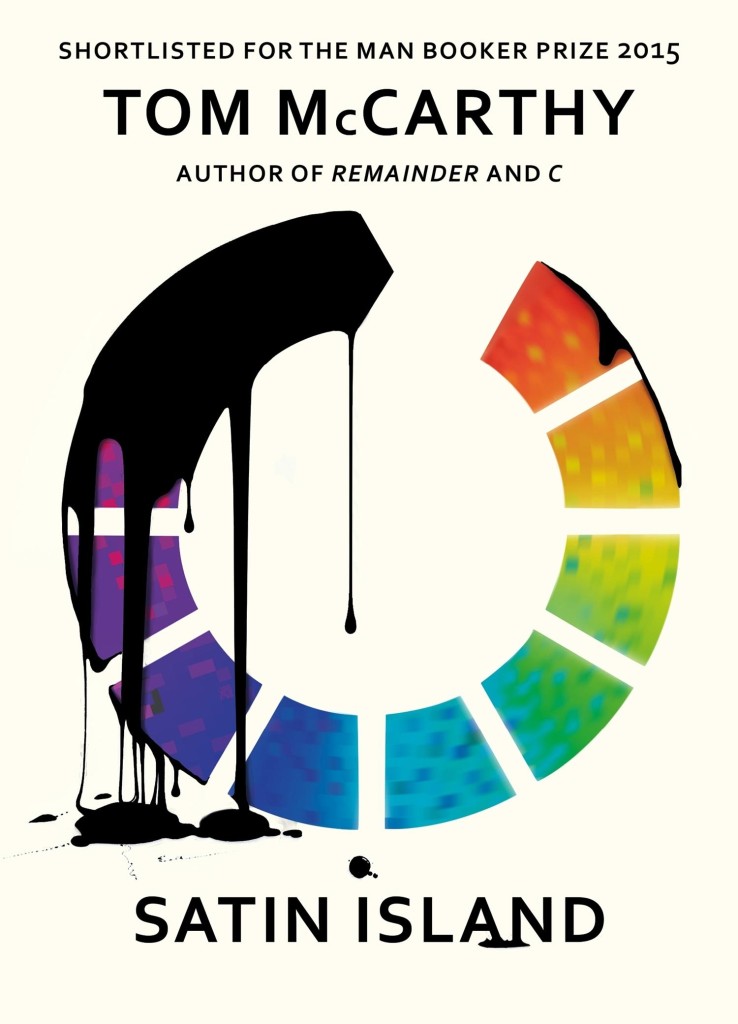
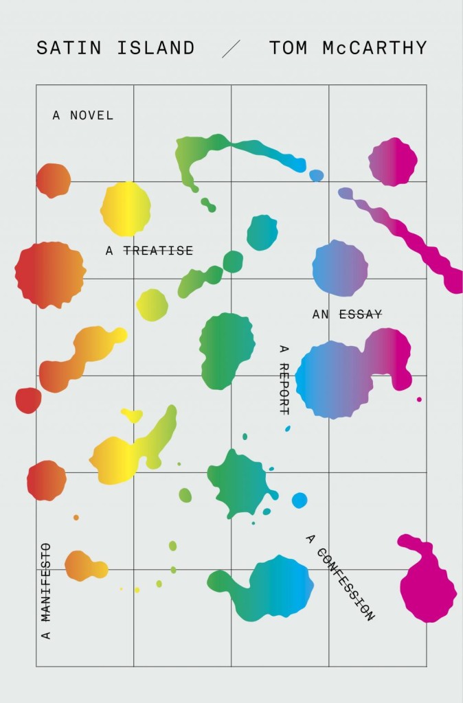
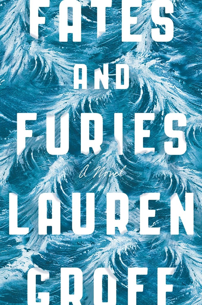
Boo by Neil Smith; design Suzanne Dean; illustration by Stephanie von Reiswitz (William Heinemann / May 2015)Fates and Furies by Lauren Groff; design by Suzanne Dean (William Heinemann / September 2015)Satin Island by Tom McCarthy; design by Suzanne Dean (Jonathan Cape / March 2015)
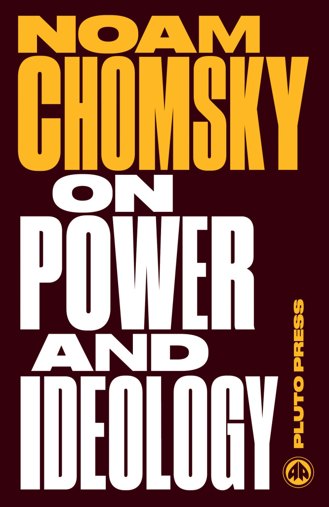
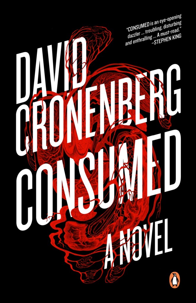
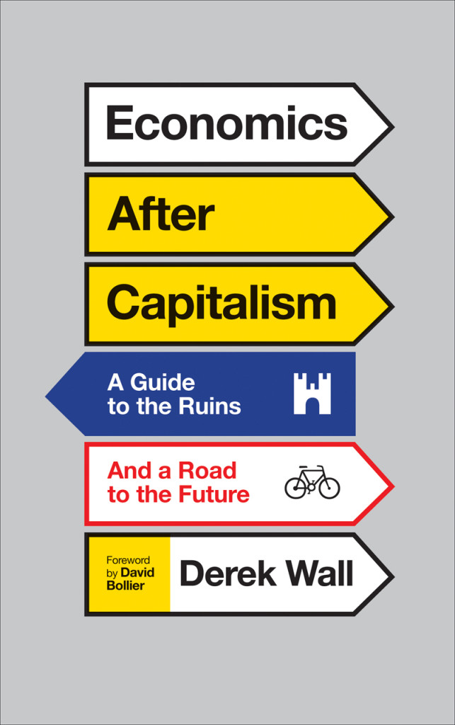
Consumed by David Cronenberg; design by David A. Gee (Penguin Canada / September 2015)Why the World Does Not Exist by Markus Gabriel; design by David Gee (Polity / June 2015)Economics After Capitalism by Derek Wall; design by David A. Gee (Pluto Press / July 2015)
Unabrow by Una Lamarche; design by Zoe Norvell (Plume / March 2015)Anything You Want by Derek Sivers; design by Zoe Norvell (Portfolio / September 2015)
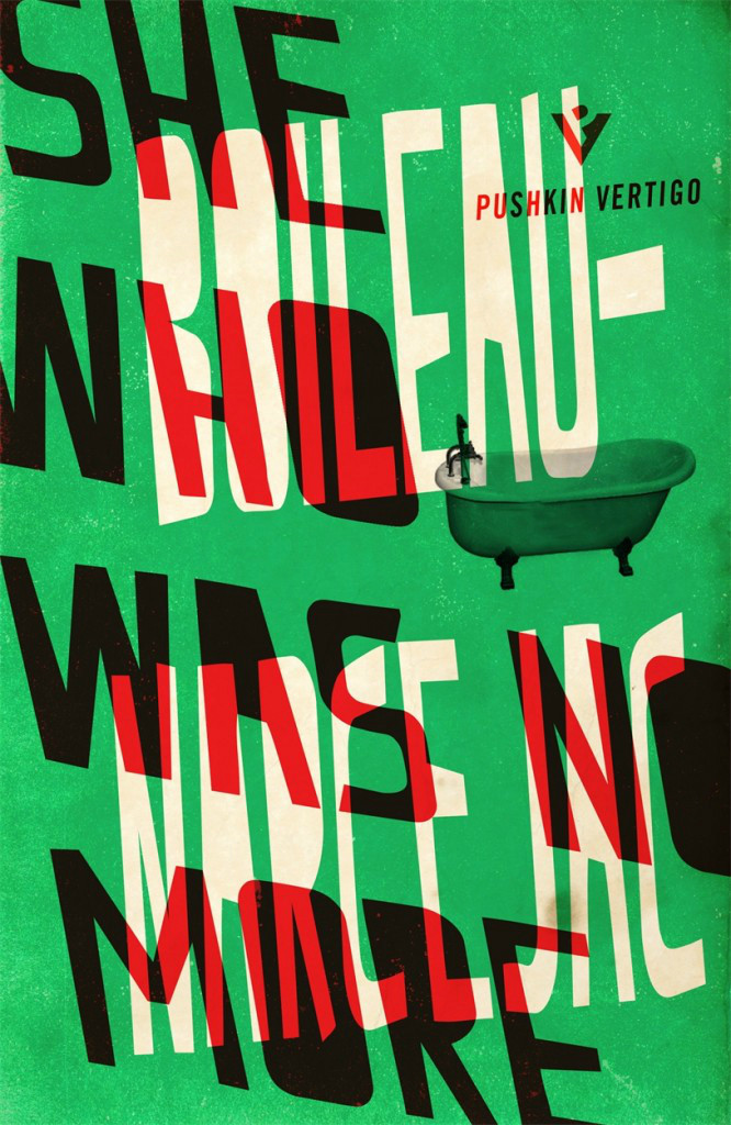
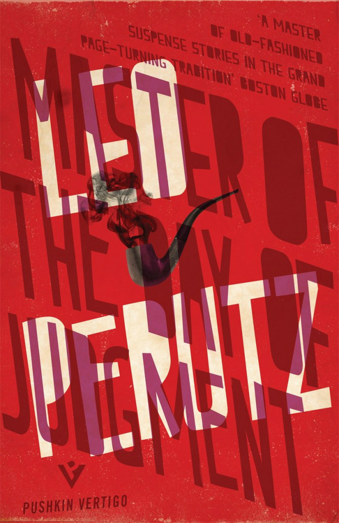
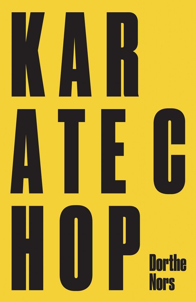
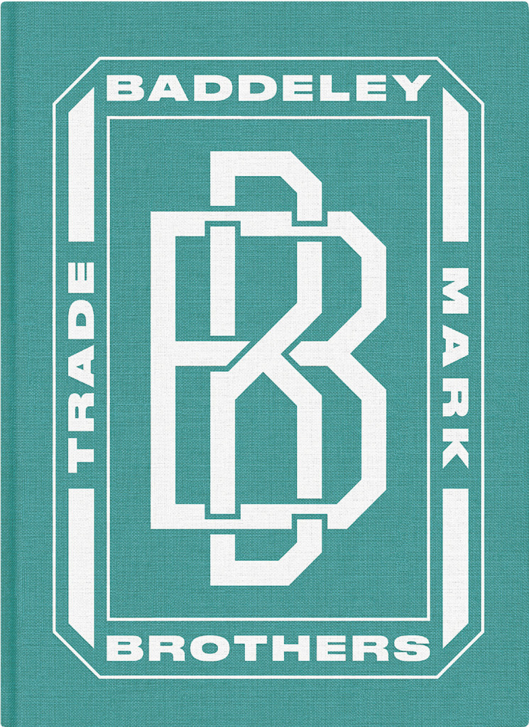
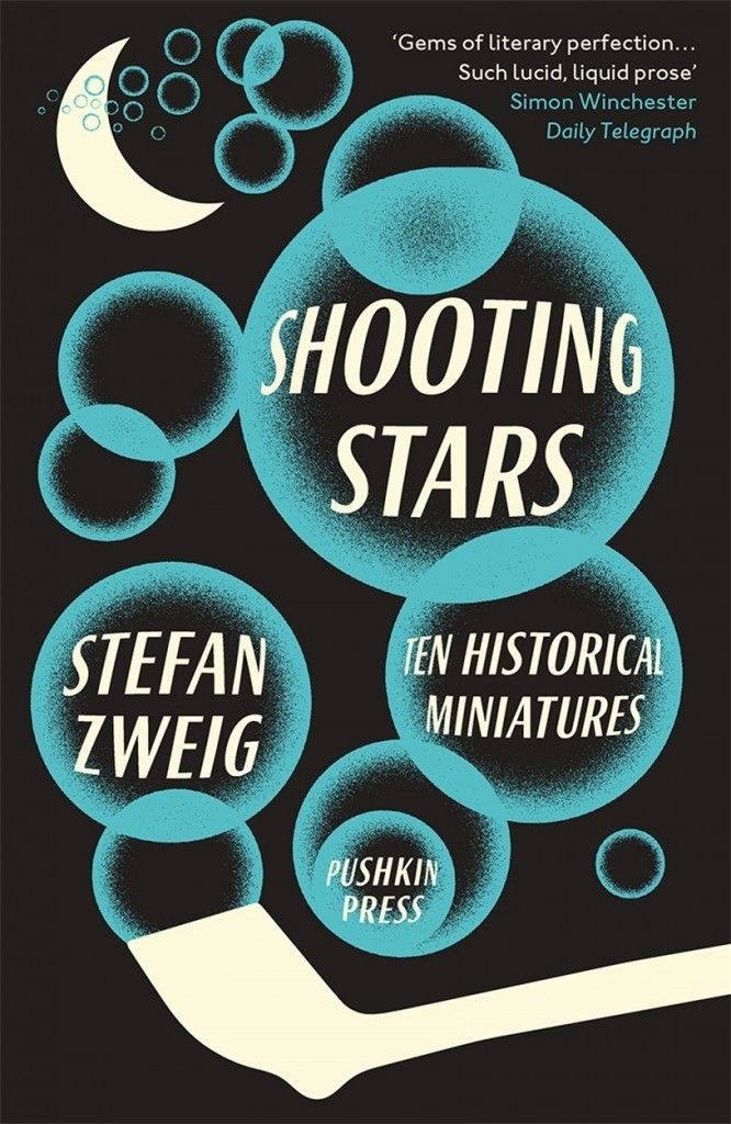
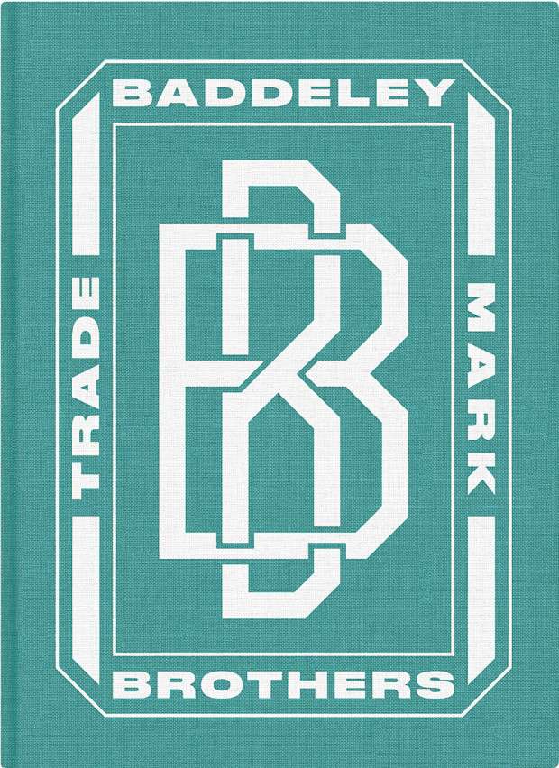
Karate Chop by Dorthe Nors; design by David Pearson (Pushkin Press / February 2015)Baddeley Brothers by The Gentle Author; design David Pearson (October 2015)Shooting Stars by Stefan Zweig; design by David Pearson (Pushkin Press / February 2015)
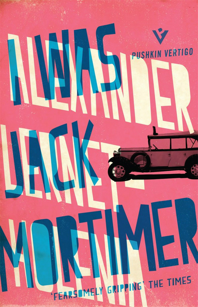
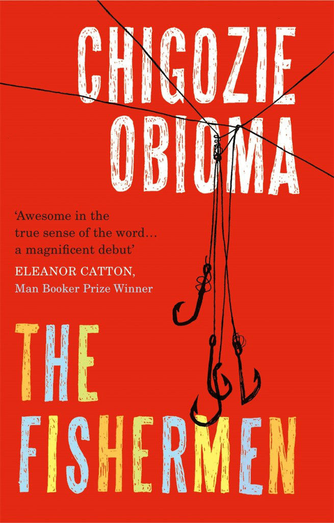
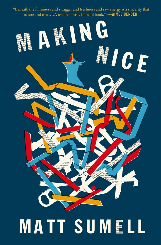
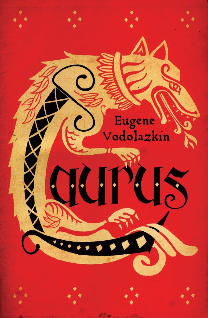
The Fishermen by Chigozie Obioma; design by Gray318 (Pushkin Press / February 2015)Making Nice by Matt Sumell; design by Gray318 (Henry Holt & Co. / February 2015)Laurus by Eugene Vodolazkin; design Gray318 (Oneworld / October 2015)
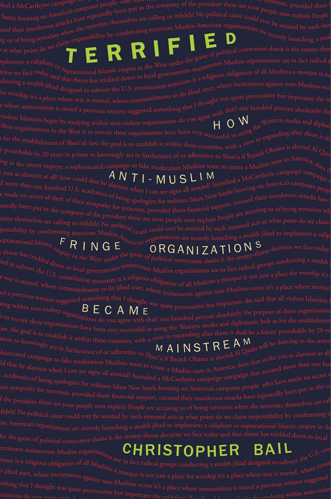
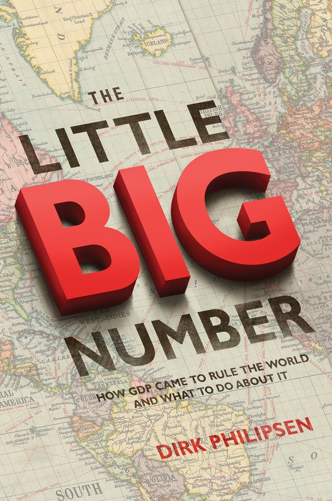
Terrified by Christopher A. Bail; design by Amanda Weiss (Princeton University Press / January 2015)The Little Big Number by Dirk Philipsen; design by Amanda Weiss ( Princeton University Press / June 2015)
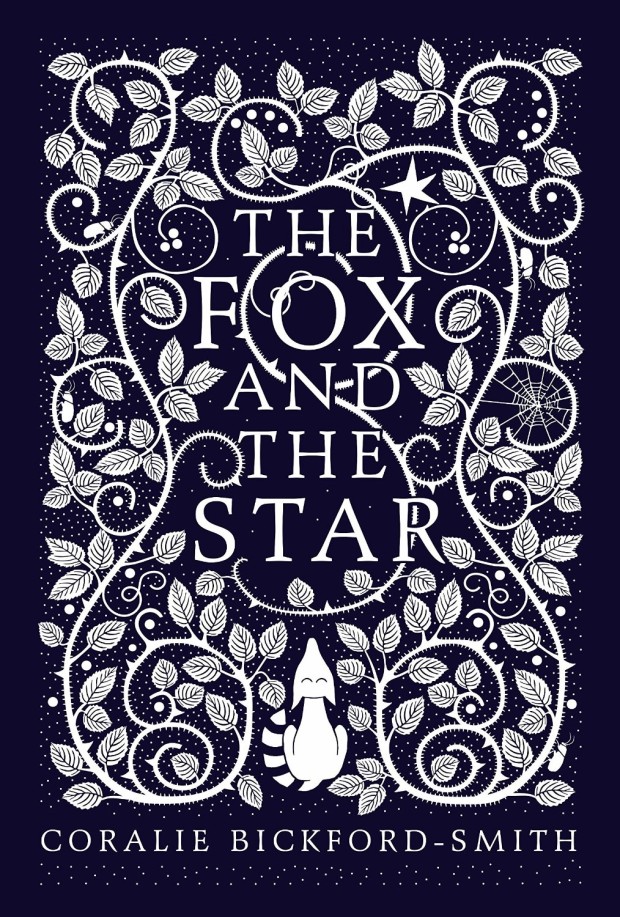
The Fox and the Star, written, illustrated and designed by Coralie Bickford-Smith (Particular Books / August 2015)
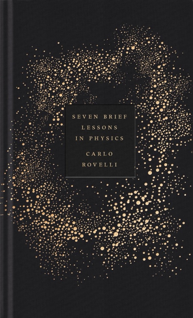
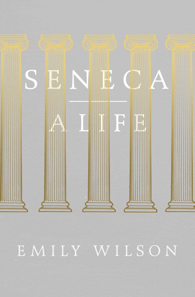
Also designed by Coralie Bickford-Smith:
Seven Brief Lessons on Physics by Carlo Rovelli; design by Coralie Bickford-Smith (Allen Lane / September 2015)Seneca: A Life by Emily Wilson; design by Coralie Bickford-Smith (Allen Lane / March 2015)
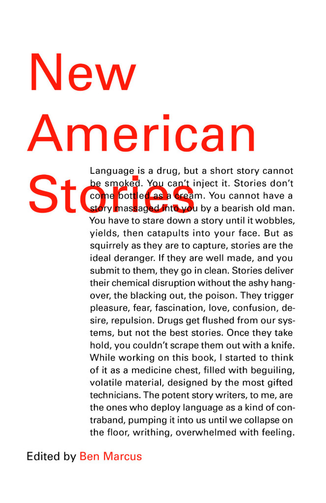
Satin Island by Tom McCarthy; design by Peter Mendelsund (Knopf / February 2015)New American Stories edited by Ben Marcus; design by Peter Mendelsund (Vintage / July 2015)Building Art: The Life and Work of Frank Gehry by Paul Goldberger; design by Peter Mendelsund (Knopf / September 2015)
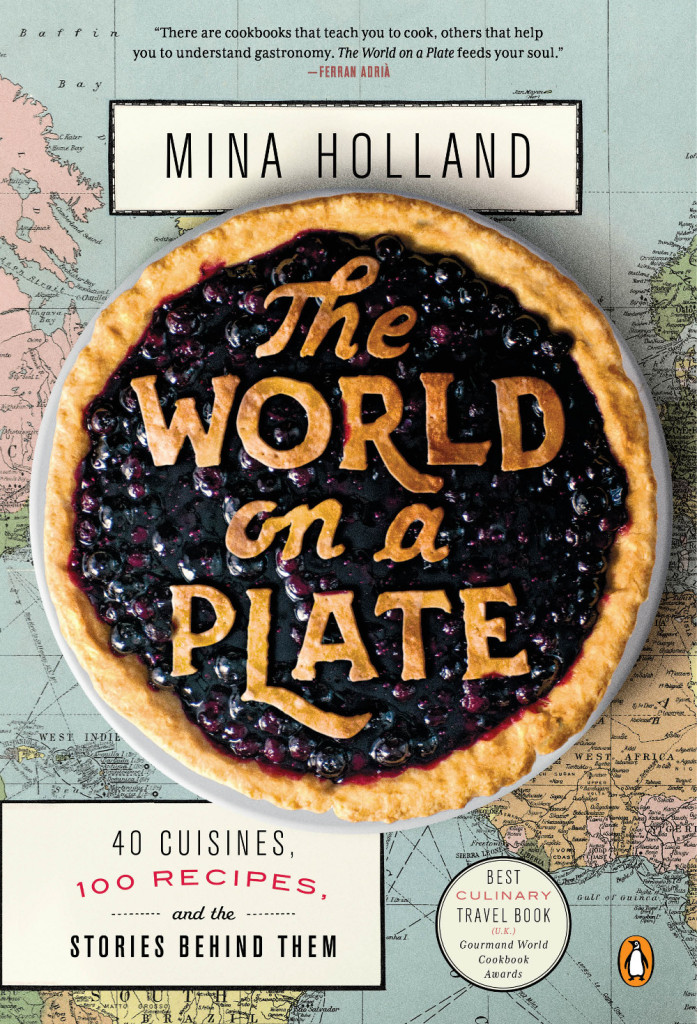
World on a Plate by Mina Holland; design by Nick Misani (Penguin / May 2015)
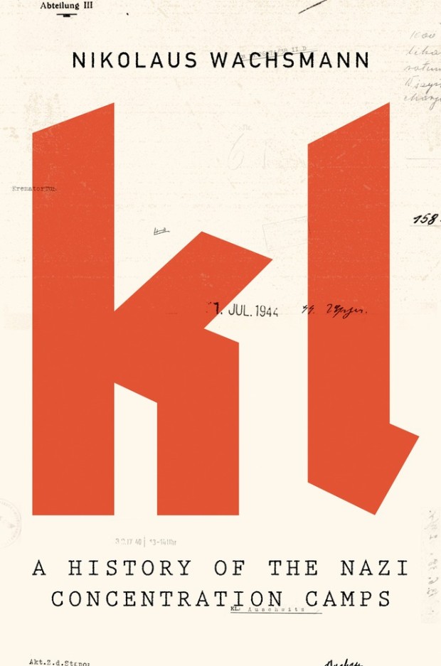
KL by Nikolaus Wachsmann; design by Alex Merto (Farrar, Straus & Giroux / April 2015)
Also designed by Alex Merto:
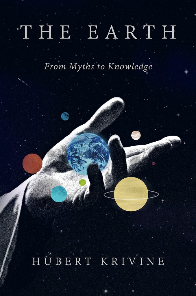
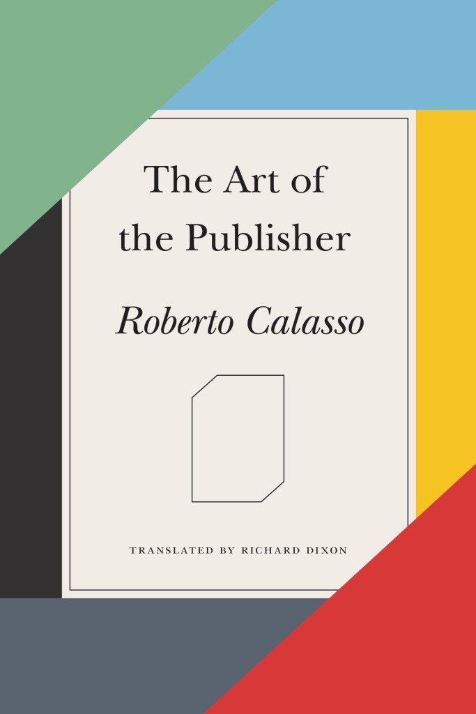
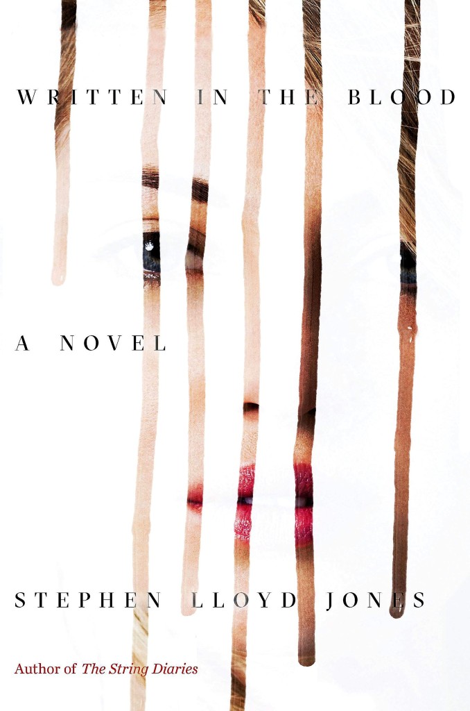
Earth by Hubert Krivine; design by Alex Merto (Verso Books / April 2015)The Art of the Publisher by Roberto Calasso; design by Alex Merto (FSG / November 2015)Written in the Blood by Stephen Lloyd Jones; design by Alex Merto (Mulholland Books / May 2015)
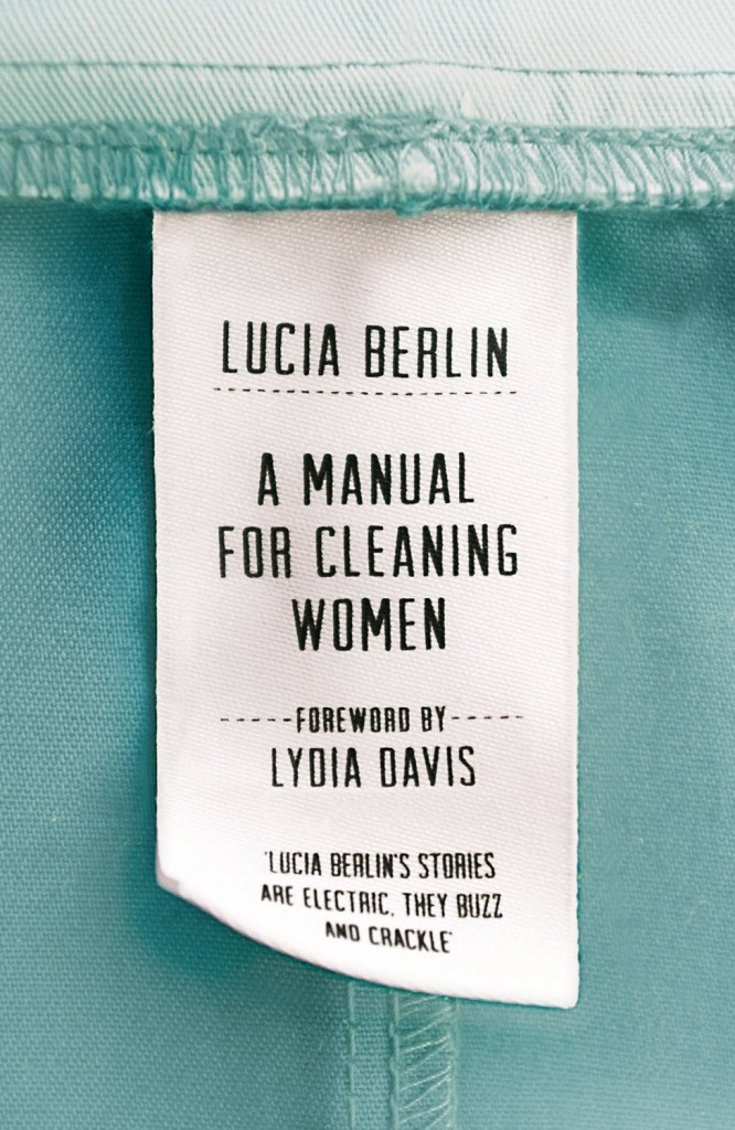
A Manual for Cleaning Women by Lucia Berlin; design by Justine Anweiler; photography Jonathan Simpson (Picador UK / September 2015)
Also designed by Justine Anweiler:
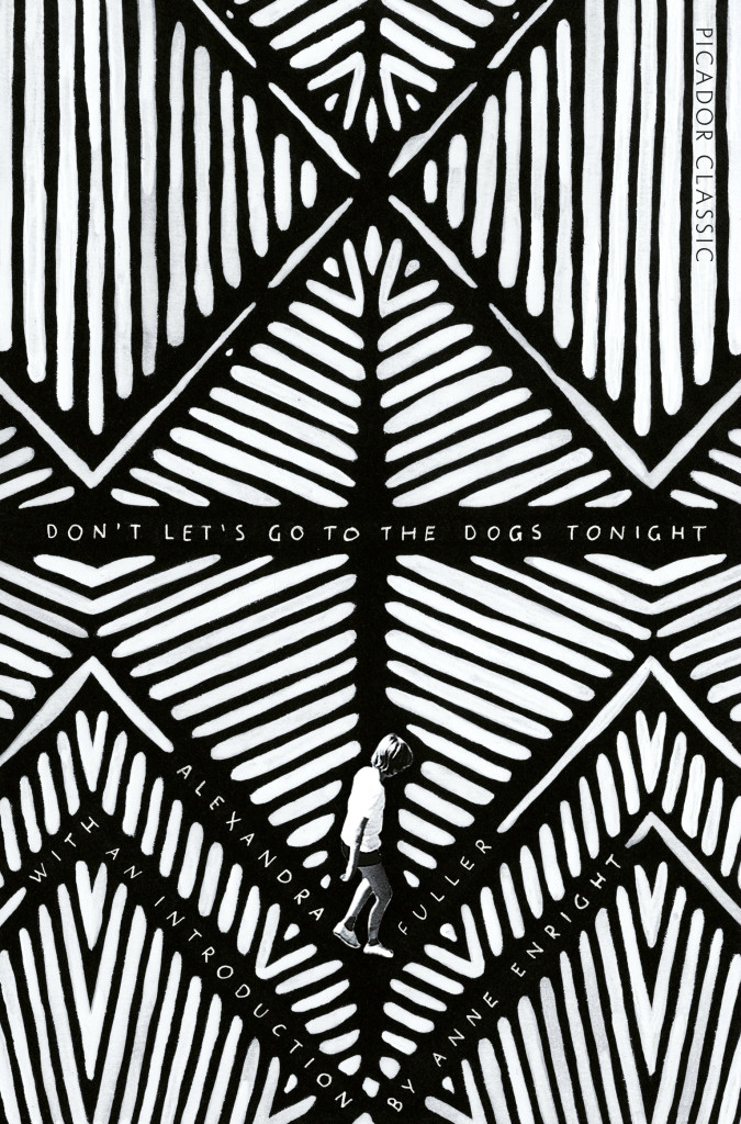
All This Has Nothing To Do With Me; design by Justine Anweiler; illustration Daphne van den HeuvelDon’t Let’s Go To the Dogs Tonight by Alexandra Fuller; design by Justine Anweiler (Picador / January 2015)
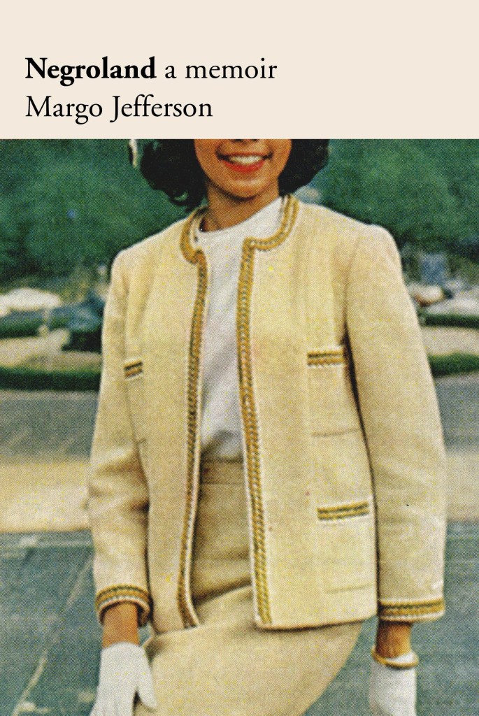
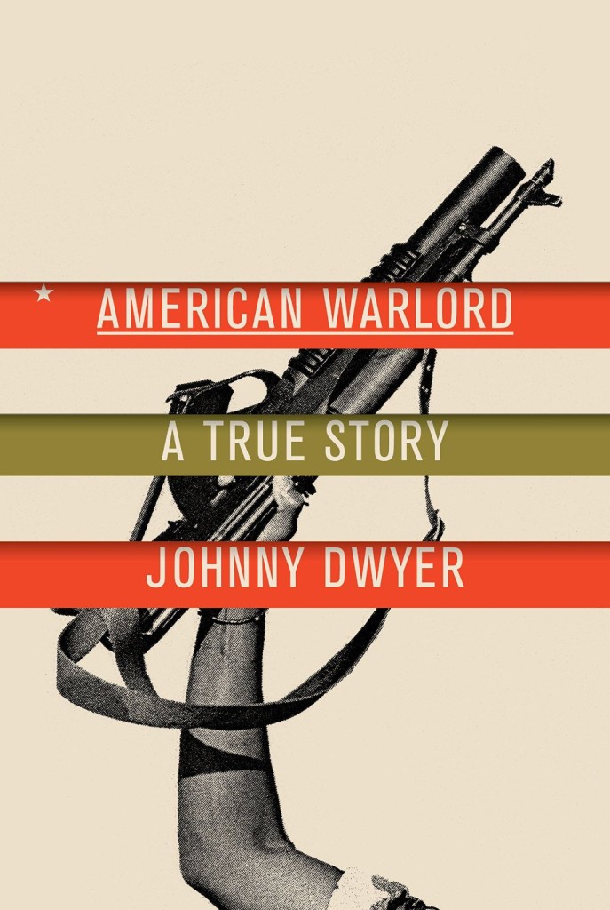
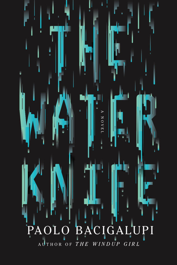
Negroland by Margo Jefferson; design by Oliver Munday (Pantheon / September 2015)American Warlord by Johnny Dwyer; design by Oliver Munday (Knopf / April 2015)The Water Knife by Paolo Bacigalupi; design by Oliver Munday (Knopf / May 2015)
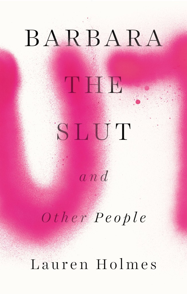
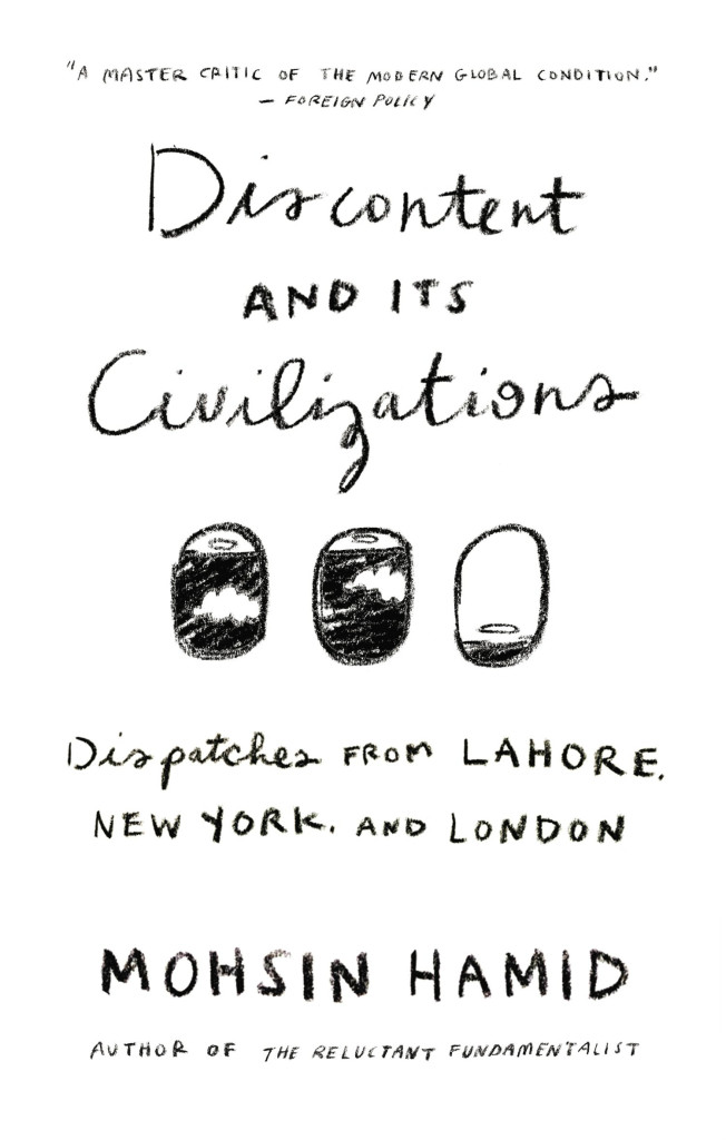
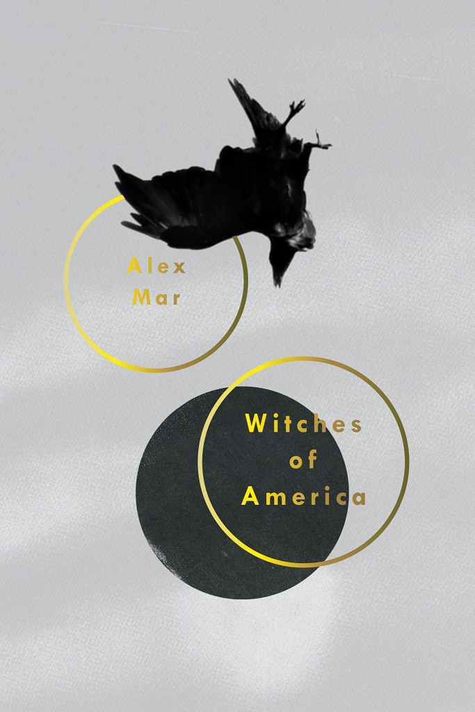
Barbara the Slut by Lauren Holmes; design by Rachel Willey (Riverhead / August 2015)Discontent and its Civilizations by Mohsin Hamid; design by Rachel Willey (Riverhead / February 2015)Witches of America by Alex Mar; design by Rachel Willey (Sarah Crichton Books / Ocotber 2015)
Munich Airport by Greg Baxter; design by Anne Twomey (Twelve Books / January 2015)
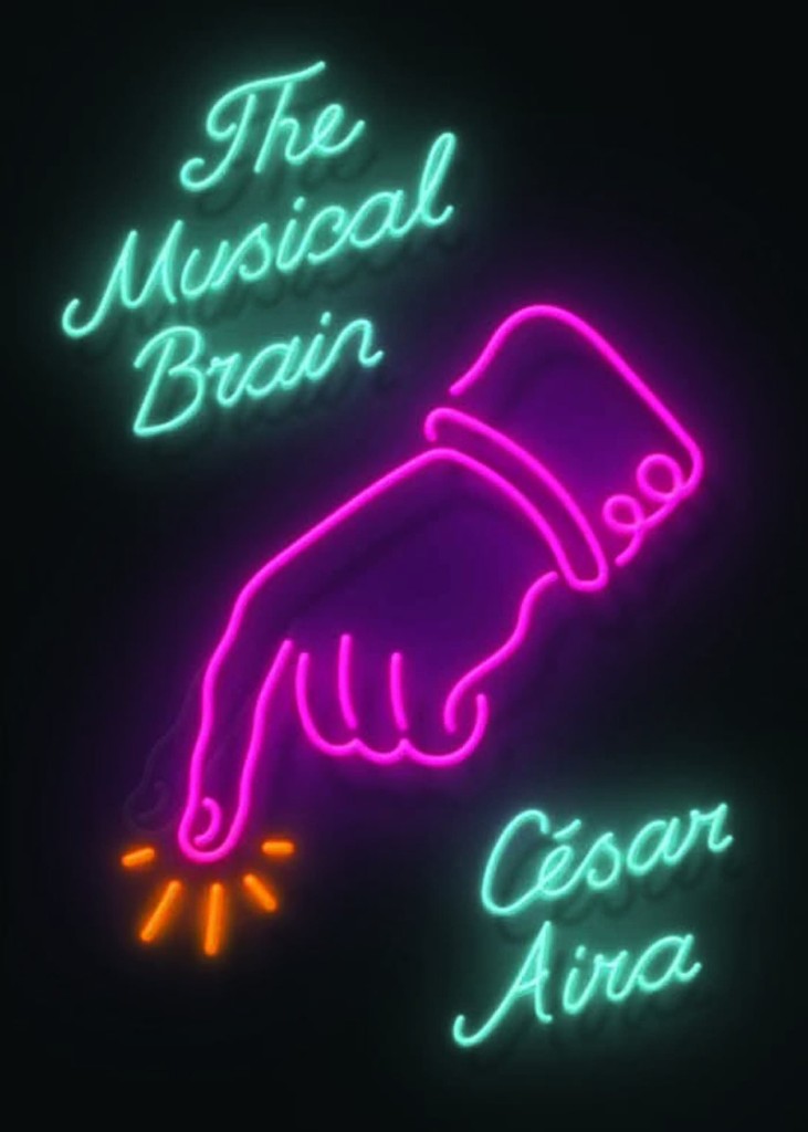
This is actually a rather special lenticular cover that imitates the effect of flashing neon.
Also from Rodrigo Corral:
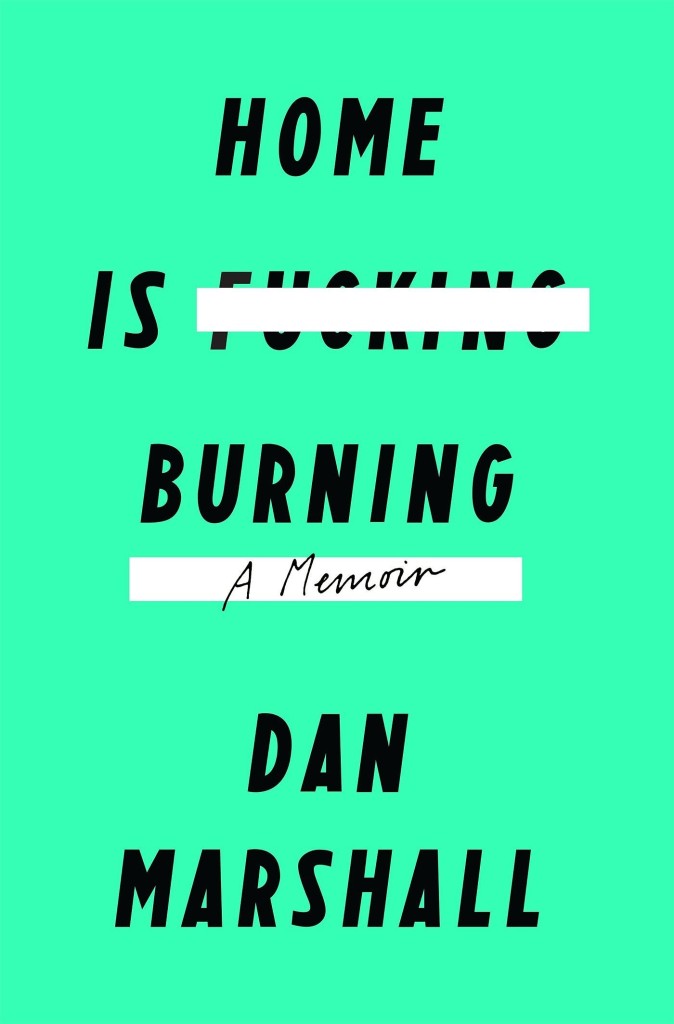
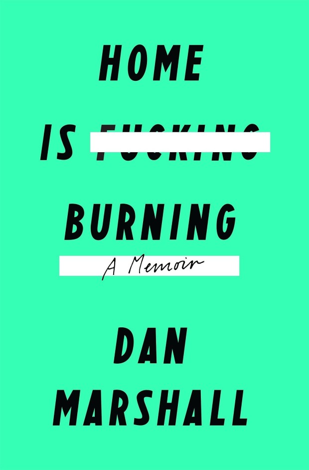
Home is Burning by Dan Marshall; design by Rodrigo Corral (Flatiron / October 2015)Fates and Furies by Lauren Groff; design by Rodrigo Corral and Adalis Martinez (Riverhead / September 2015 )
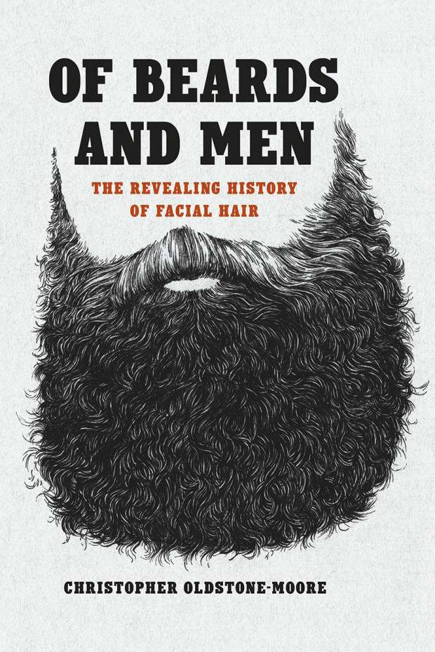
Of Beards and Men by Christopher Oldstone-Moore; design Isaac Tobin (University of Chicago Press / December 2015)
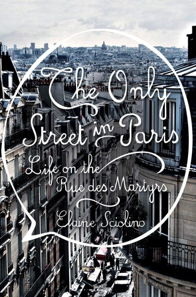
The Only Street in Paris by Elaine Schiolino; design by Strick&Williams (W.W. Norton / November 2015)
Also from Strick&Williams:
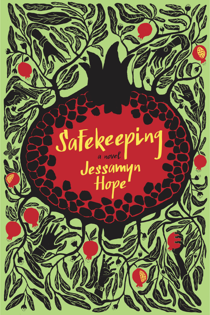
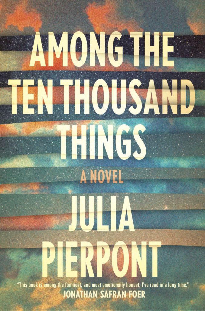
Safekeeping by Jessamyn Hope; design by Strick&Williams (Fig Tree / June 2015)Among the Ten Thousand Things by Julia Pierpoint; design by Strick&Williams (Random House / July 2015)
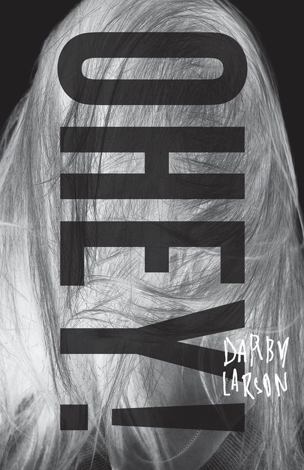
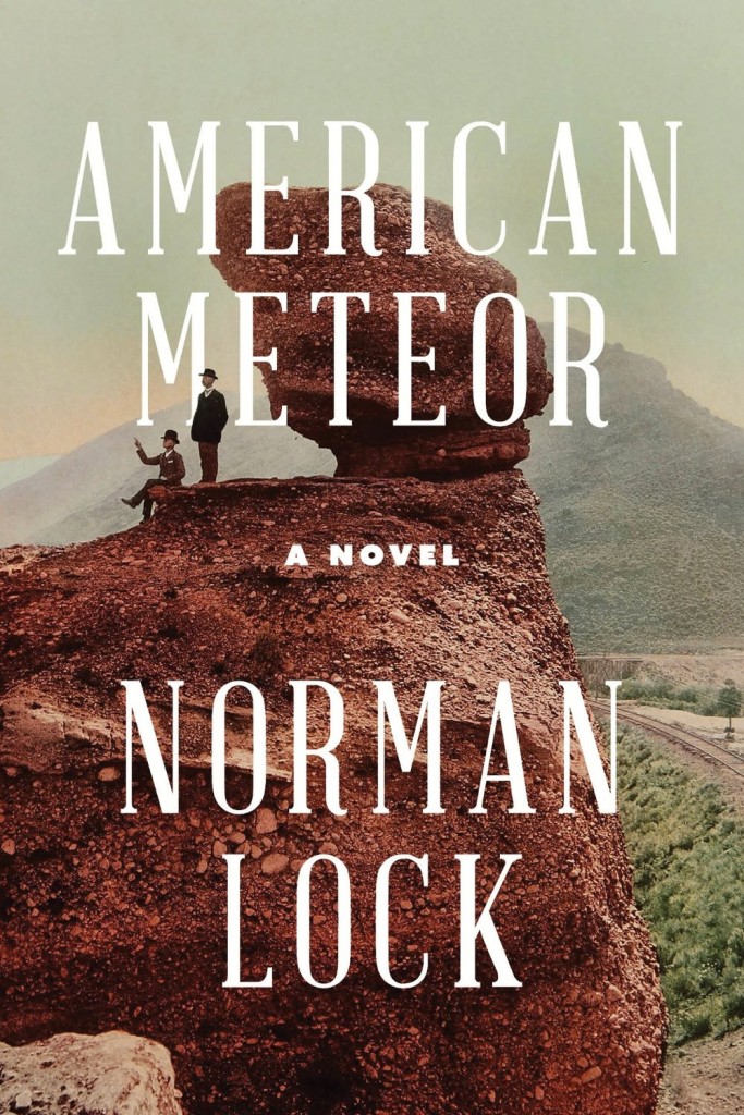
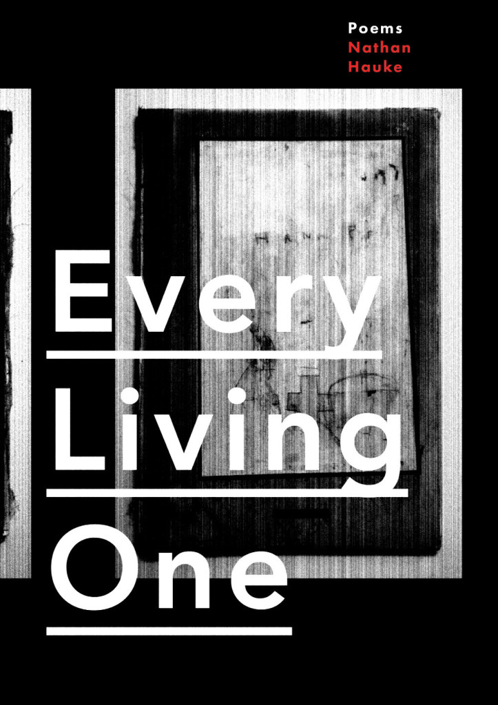
Ohey! by Darby Larson; design by Alban Fischer (CCM / May 2015)American Meteor by Norman Lock; design by Alban Fischer (Bellevue Literary Press / June 2015)Every Living One by Nathan Haukes; design by Alban Fischer (Horse Less Press / March 2015)
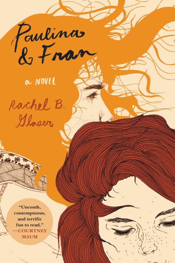
Paulina and Fran by Rachel B. Glaser; illustration Kaethe Butcher; typography Nina LoSchiavo (Harper Perennial / September 2015)
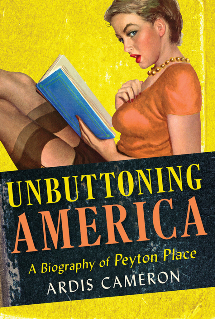
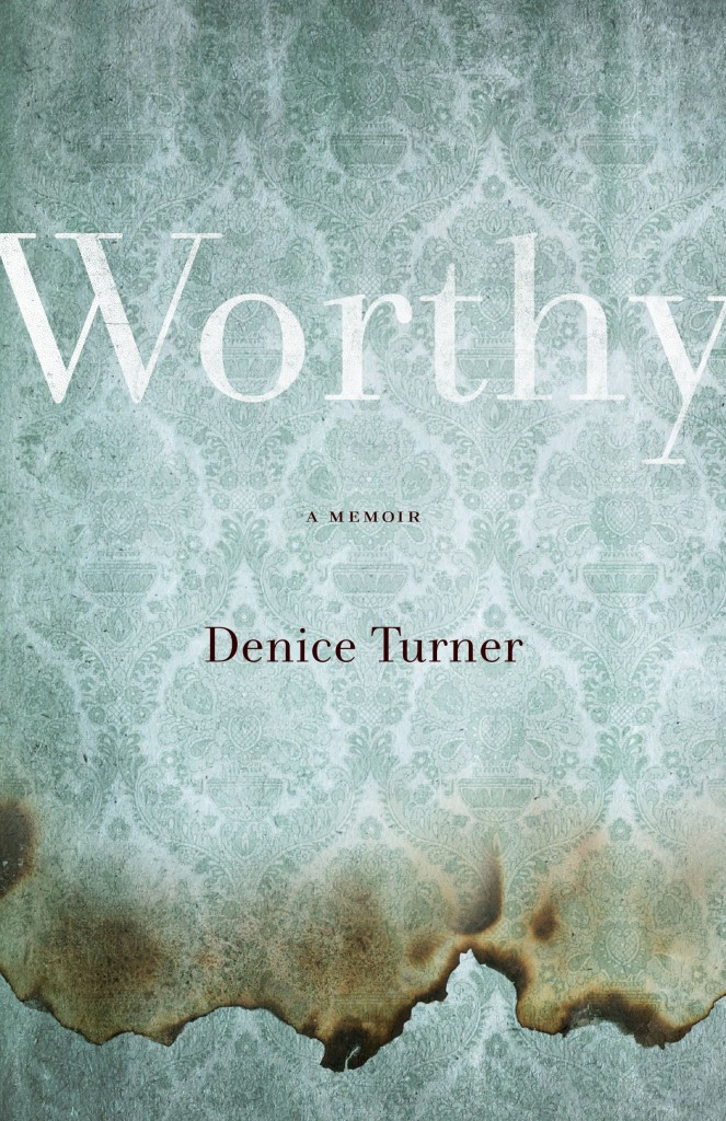
Unbuttoning America by Ardis Cameron; design by Kimberly Glyder; illustration by Al Moore (Cornell University Press / May 2015)Worthy by Denice Turner; design by Kimberly Glyder (University of Nevada Press / April 2015)
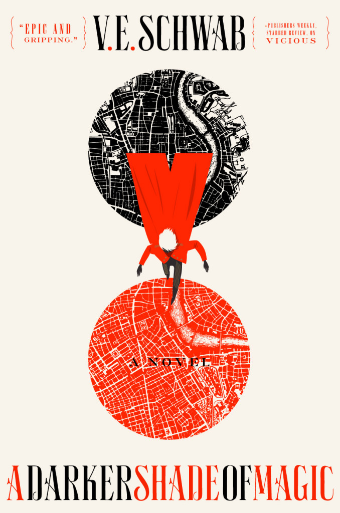
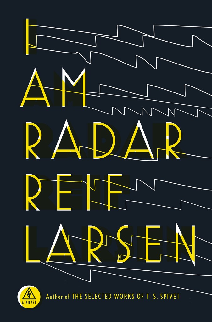
A Darker Shade of Magic by V. E. Schwab; design by Will Staehle (Tor / February 2015)I Am Radar by Reif Larsen; design by Will Staehle (Penguin / February 2015)
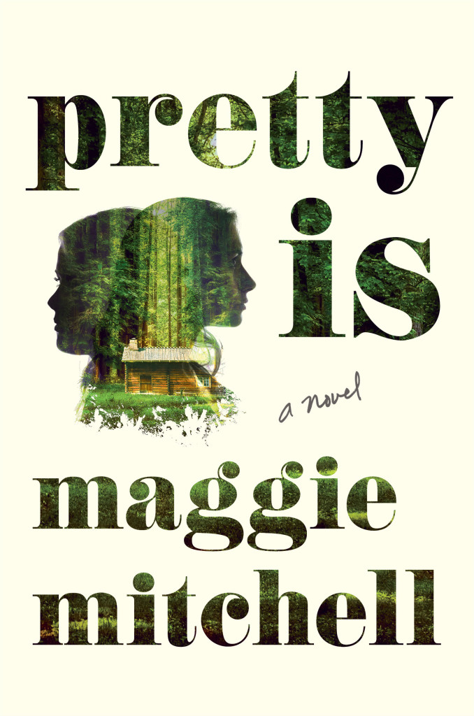
Pretty Is by Maggie Mitchell; design by Lucy Kim (Henry Holt / July 2015)
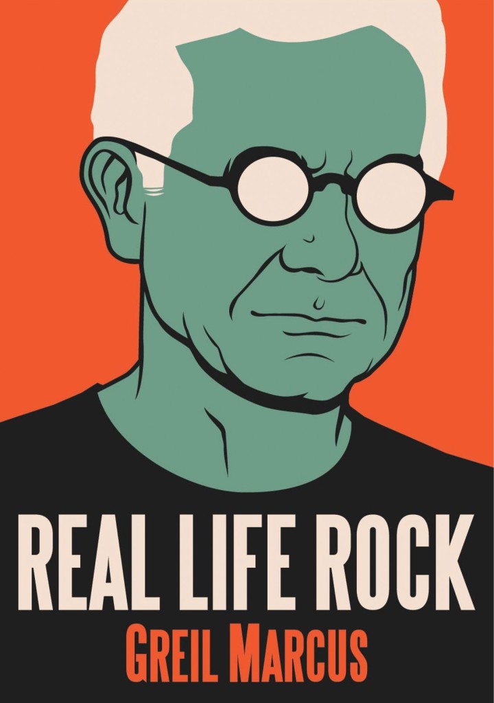
Real Life Rock by Greil Marcus; design by Rich Black (Yale University Press / October 2015)
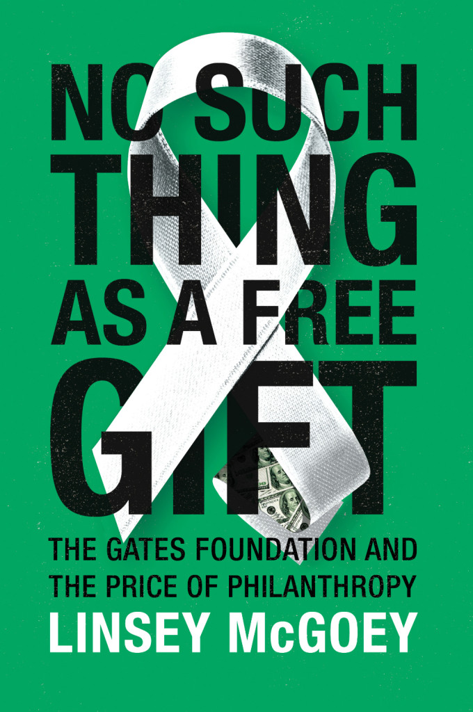
No Such Thing as a Free Gift by Linsey McGoey; design by James Paul Jones (Verso / October 2015)How Music Got Free by Stephen Witt; design by James Paul Jones (The Bodley Head / June 2015)The Rise of the Novel by Ian Watt; design by James Paul Jones (Vintage / October 2015)
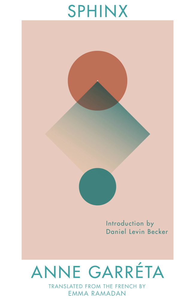
The Sphinx by Anne Garréta; design by Anna Zylicz (Deep Vellum / May 2015)
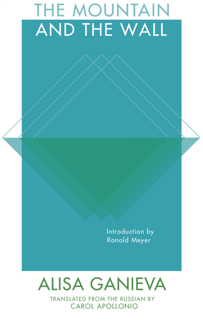
Also designed by Anna Zylicz:
The Mountain and the Wall by Alisa Ganieva; design by Anna Zylicz (Deep Vellum / June 2015)The Indian by Jón Gnarr ; design by Anna Zylicz (Deep Vellum / May 2015)
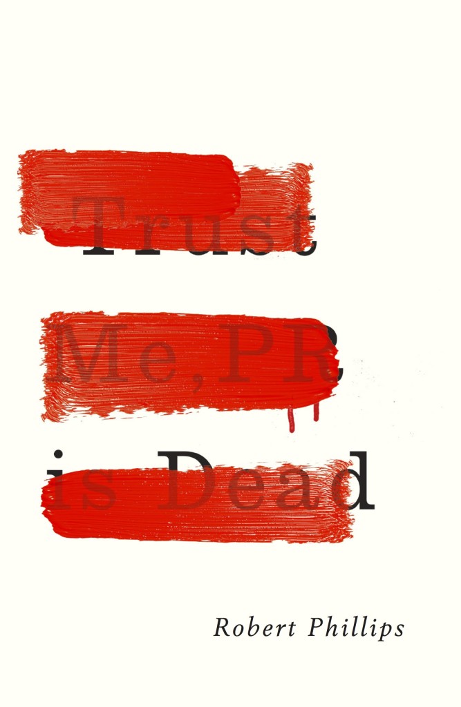
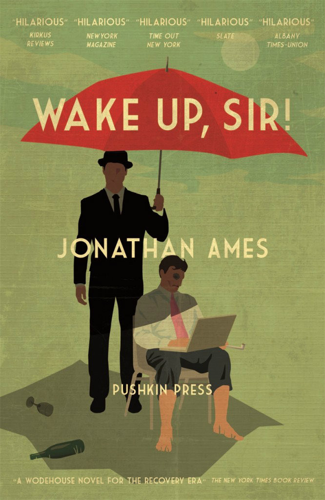
Trust Me, PR is Dead by Robert Phillips; design by Jamie Keenan (Unbound / June 2015)Wake Up, Sir! by Jonathan Ames; design by Jamie Keenan (Pushkin Press / May 2015)
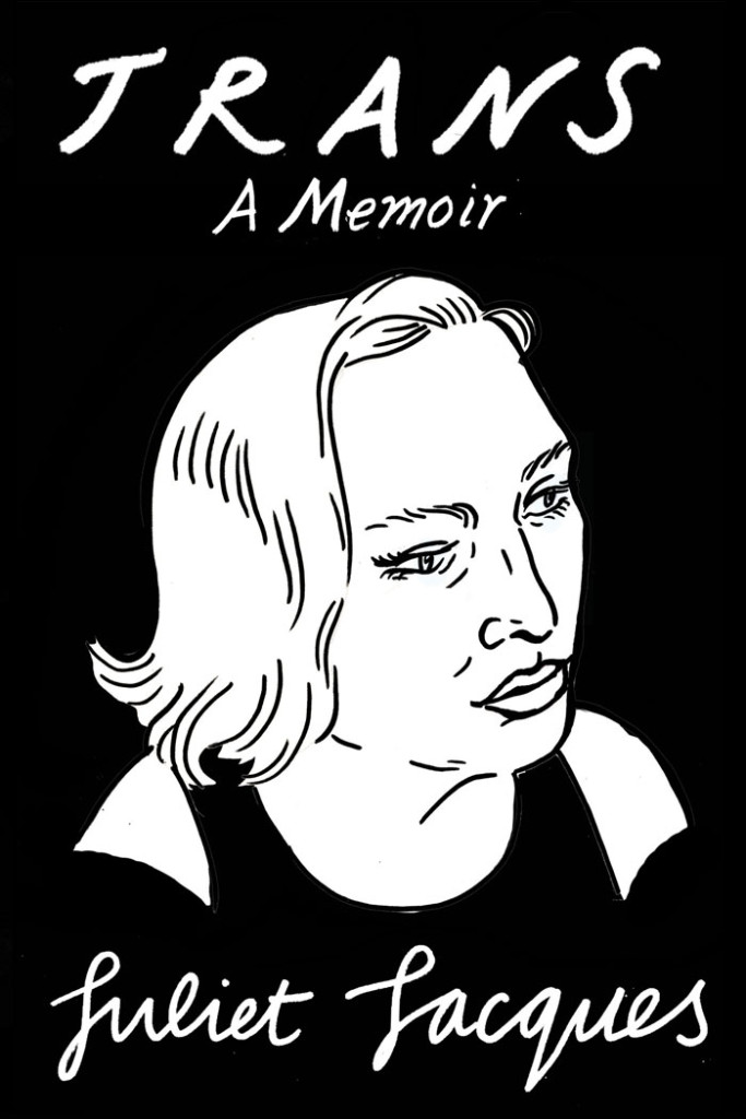
Trans by Juliet Jacques; Design and illustration by Joanna Walsh (Verso / September 2015)
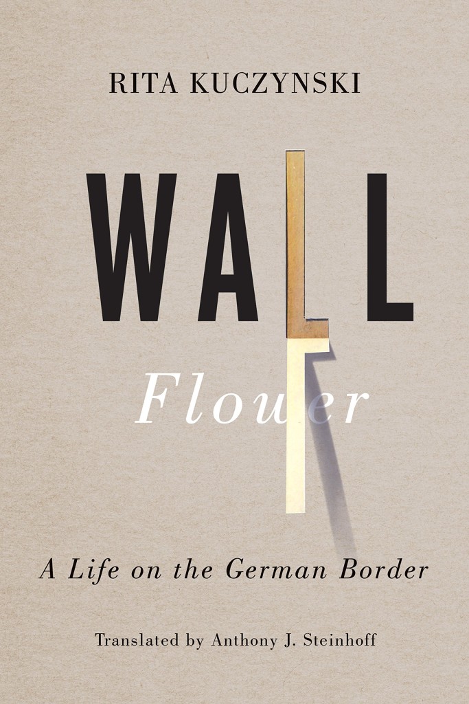
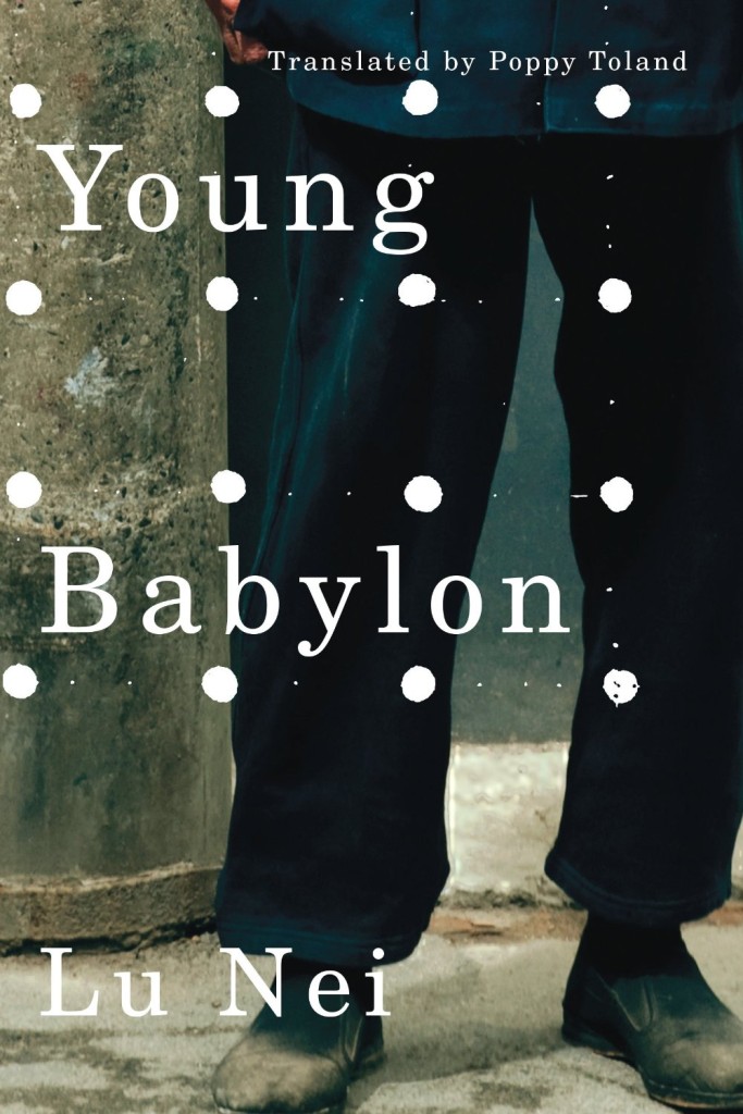
Wall Flower by Rita Kuczynski; design by David Drummond (University of Toronto Press / August 2015)Young Babylon by Lu Nei; design by David Drummond (AmazonCrossing / September 2015)
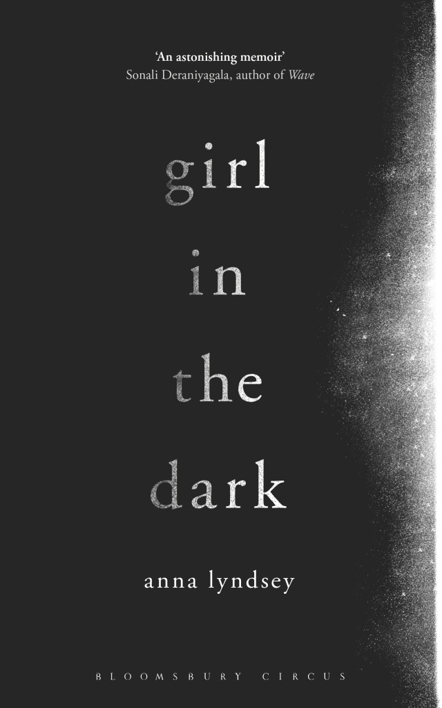
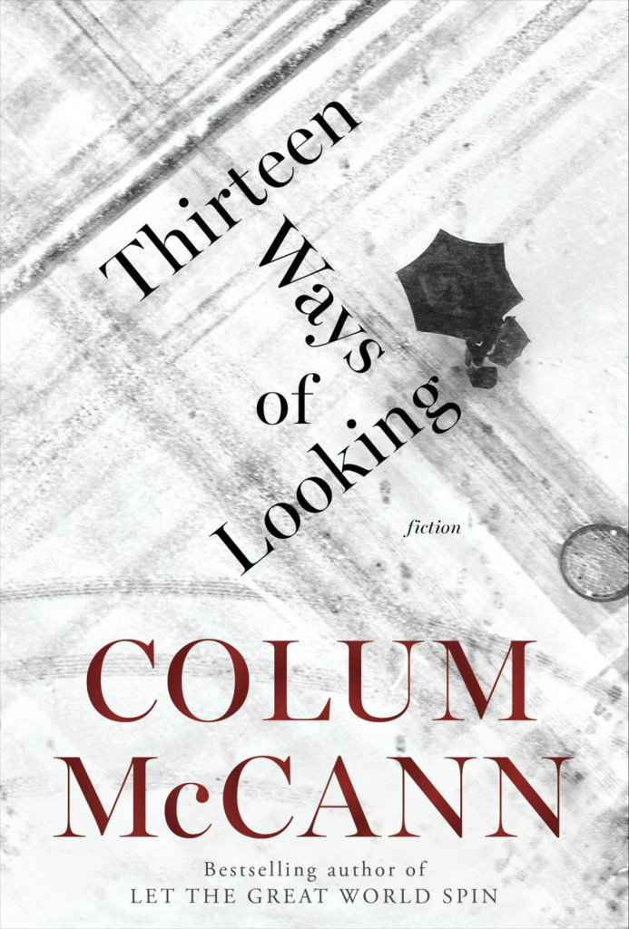
Girl in the Dark by Anna Lyndsey; design by Greg Heinimann (Bloomsbury / February 2015)Thirteen Ways of Looking by Colum McCann; design by Greg Heinimann; photograph by Julio Gamboa (Random House / October 2015)
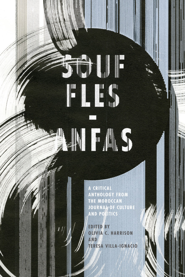
Souffles-Anfas edited by Olivia C. Harrison and Teresa Villa-Ignacio; design Anne Jordan and Mitch Goldstein (Stanford University Press / November 2015)Capitalism in the Web of Life by Jason W. Moore; design by Anne Jordan and Mitch Goldstein (Verso / August 2015)
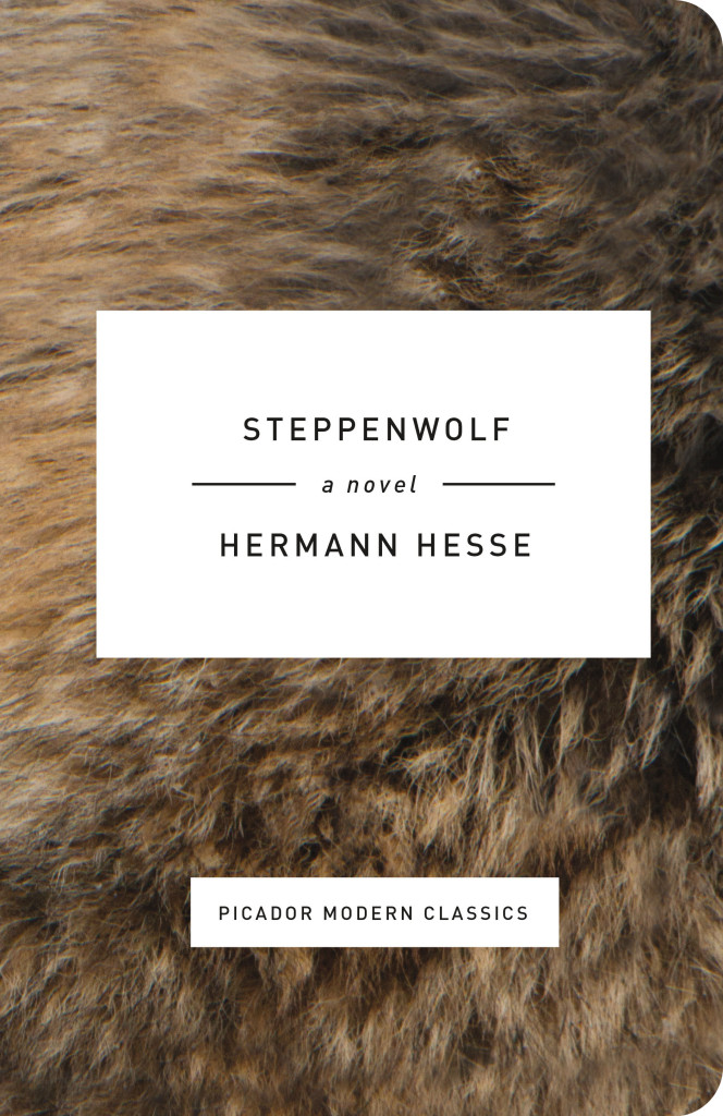
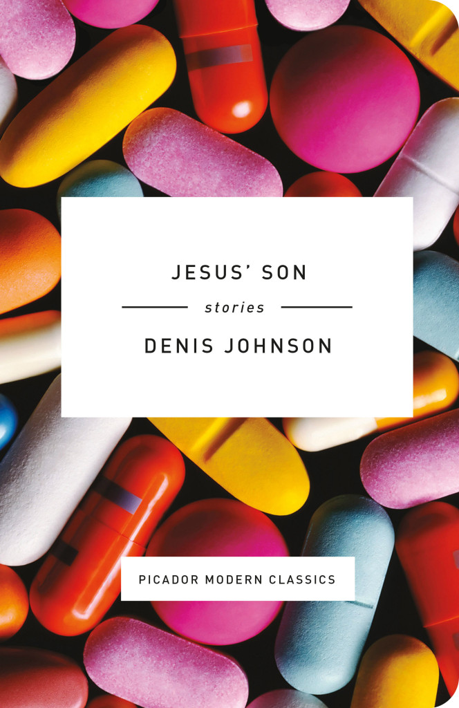
Originally founded in 1995 as a publishing house for sophisticated hardcovers and reprint paperbacks, Picador USA is celebrating its twentieth anniversary this month with a set of four small limited edition modern classics with covers designed by Kelly Blair. Printed on pearlized cream stock, with rounded corners and colourful full-bleed imagery, the books look like exquisite pocket-sized treats.
According to creative director (and long-time friend of the blog) Henry Sene Yee, the books were the brainchild of Stefan von Holtzbrinck, head of Macmillan Publishing. “With Picador’s 20th Anniversary approaching, Stefan wanted us to celebrate it with some special printings. There were these tiny volumes in Europe that caught his eye, and he wanted us to do something like that.”
While still deciding which titles to include, and on the exact format and size, Henry worked out some early ideas in a notebook-sized format, using lines and shapes to represent the theme or narrative of each book. Facing a tight deadline however, Henry didn’t have time to finish the project by himself. He had a difficult decision to make. “Giving away a dream project is the hardest thing to do, but you have to be selfless and match up the best talent with the books.”
Henry, who has been at Picador from the very beginning, was determined to acknowledge the art department’s contribution to the publisher’s history. “One of my very first assistants was Kelly Blair. She is a brilliant designer and illustrator, and is now herself an Art Director at Pantheon / Knopf. If this project was going to celebrate the history of Picador and I couldn’t design it myself, I thought it should be someone who was there with me at the very beginning. Kelly made poetic sense, and made it feel better about letting go. A little.”
Kelly’s initial ideas included illustrations and some all-type solutions. “All were great,” says Henry, “but Kelly wanted to send me one more last-minute idea even though she wasn’t sure she liked it as much as her first ones. Of course that was the one we all loved and printed! Sometimes when a solution seems simple, we doubt its value.”
In addition to the new covers, Steven Seighman redesigned and re-typeset each book making them easy and inviting to read, even at the smaller size. “Even though they look great online,” says Henry, “it’s not until you have the actual wrapped and bound book in your hands that you appreciate its power and the beauty of print in the small format size.”
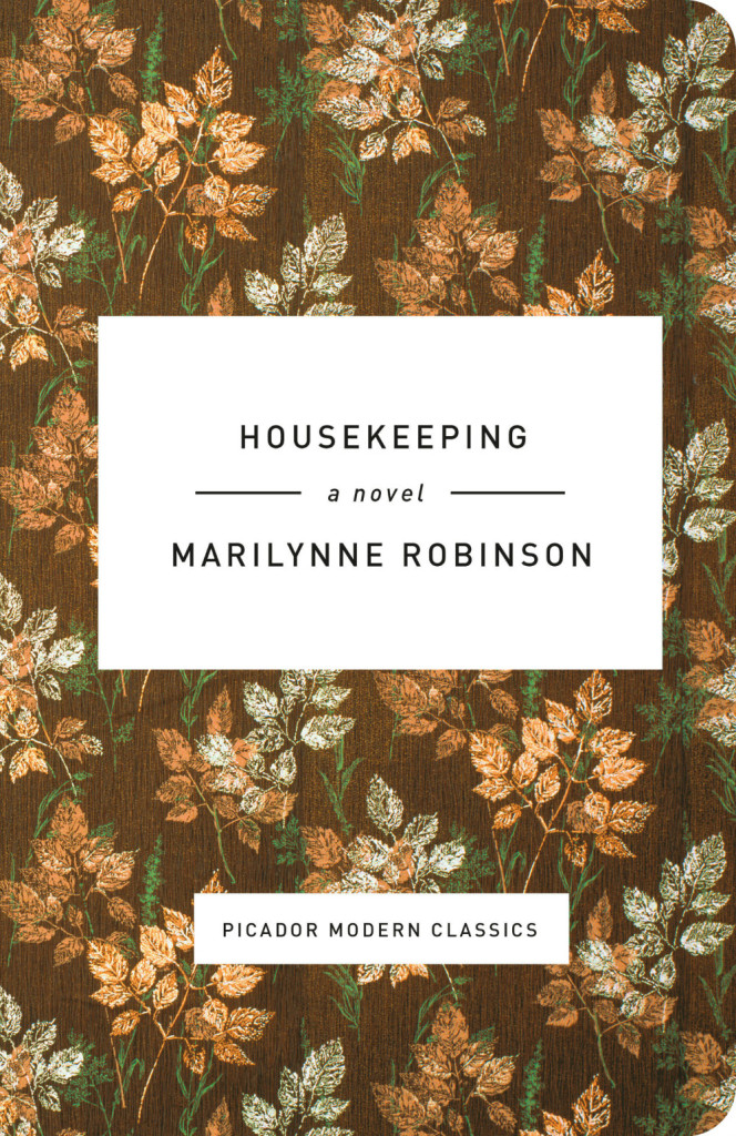
The Twentieth Anniversary Picador Modern Classics — Housekeeping by Marilynne Robinson, Jesus’ Son by Denis Johnson, Steppenwolf by Herman Hesse, and The Virgin Suicides by Jeffrey Eugenides — were published last week in the US. Thanks to art director Henry Sene Yee for talking to me about the project.
Next month I’ll say goodbye to 2015 with my annual list of my favourite covers of the year. Until then, here’s November’s book covers of note, my last monthly covers post for the 2015:
(I previously included Devin’s cover in my November 2014 post before discovering that publication had been postponed until 2015. It’s so good that I figure it deserved a second shot now the book is finally coming out this month.)
Because film is a visual medium, each project comes with an established aesthetic, which for a designer can be inspiring but also sometimes limiting. The challenge is in figuring out how best to channel that aesthetic—either by distilling it down to a single still composition, or somehow bouncing off of it in an interesting way.
I try not to make such a strong distinction between “illustration” and “design.” Almost everything I make involves some custom-created components, whether it’s type or image or decorative elements or whatever, so for me it’s not such a hard line between the two disciplines. Whatever technique will best solve a problem—assuming it’s within the limits of my abilities—I’ll give it a try.
Because we have access to such great films, we’re lucky enough to be able to call on the best illustrators in the world to work on them, so really it’s total hubris that I ever design anything myself. When I draw something myself, it’s usually because I have such a strong, specific idea of what it has to be that I would be literally dictating exactly what to draw and how, which is no fun for anyone. You’ve got to leave room for the artist to surprise you, otherwise why bother?
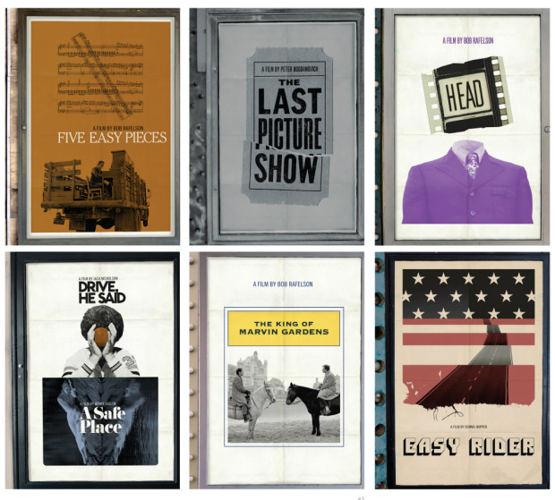
And on Newman’s own blog, Skillman selects his 10 favourite Criterion DVD covers.
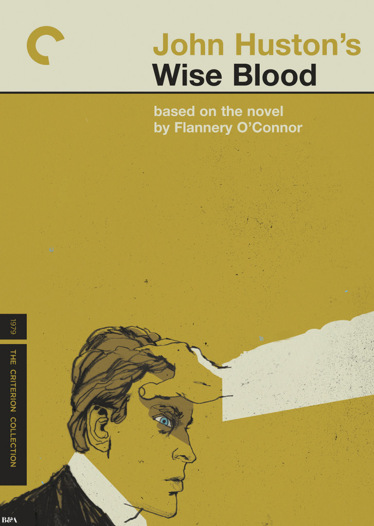
In a fascinating piece for the Paris Review, art director and book designer Charlotte Strick talks to the Criterion Collection’s head art director Sarah Habibi, and designer/art director Eric Skillman about their work:
“There are cases where everyone thinks of a movie in one way, but Criterion feels the director was aiming to say something different than what is typically thought. So for us, it’s about repositioning the film to show that it’s not actually the film that marketing people said it was all those years ago.” Package design can do a lot of this work. Instead of traditional marketing meetings, Criterion holds what they call “brief meetings,” in which the staff reviews a film’s historical significance—where it occurred in the director’s career, its genre, the political climate, and so on. After a brief, they typically have two to three weeks for initial cover sketches. Habibi referred to this as “the heavy lifting period,” in which they aim to nail down the look and style they’re after. Once a cover direction has been selected, another three months is spent refining the artwork and carrying the visual language throughout the entire package so that the design feels truly unified. Design by committee, Habibi insisted, never produces the most inspired work, so to ensure that the designs don’t become muddled by too many voices, they strive to keep the approval process as simple as possible and the meetings quite intimate with only the art department, the in-house producer, and the most senior staff weighing in.
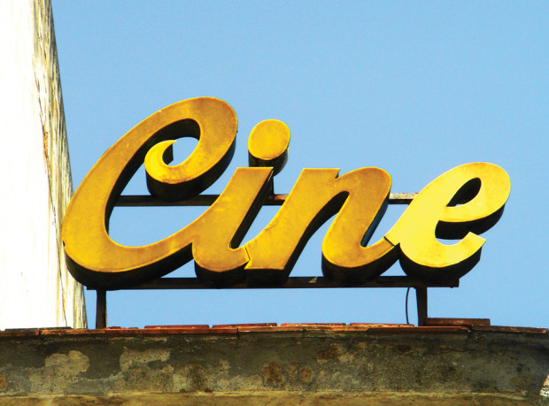
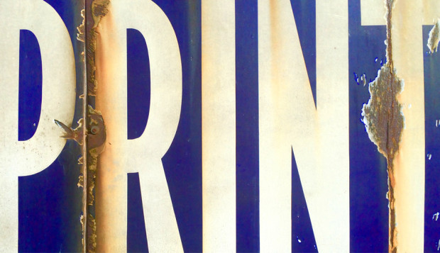
Website Typorn1 talks to Stephen ONeill about his photographs of found type, lettering, and signs, TypeChap:
“I’m always on the look out for the vernacular and spectacular, documenting beautiful old letters and signage before they disappear… Through my photographs I want to provide inspiration for designers, sign-writers and photographers to keep these wonderful old letterforms alive… It’s interesting to see how positively clients react to type. One very dry financial client I worked for, were totally sold on some letterpress ads (very much influenced by the great Alan Kitching) and it became their house style for about 3 or 4 years – something of a miracle in an industry swamped with weak stock imagery”
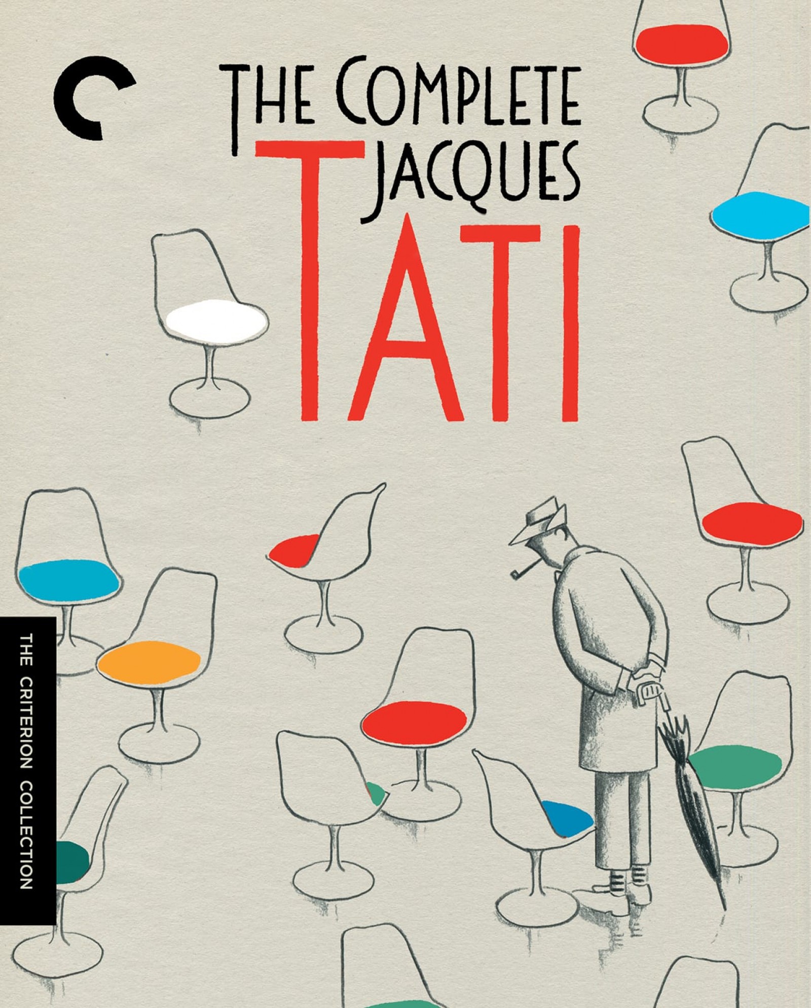
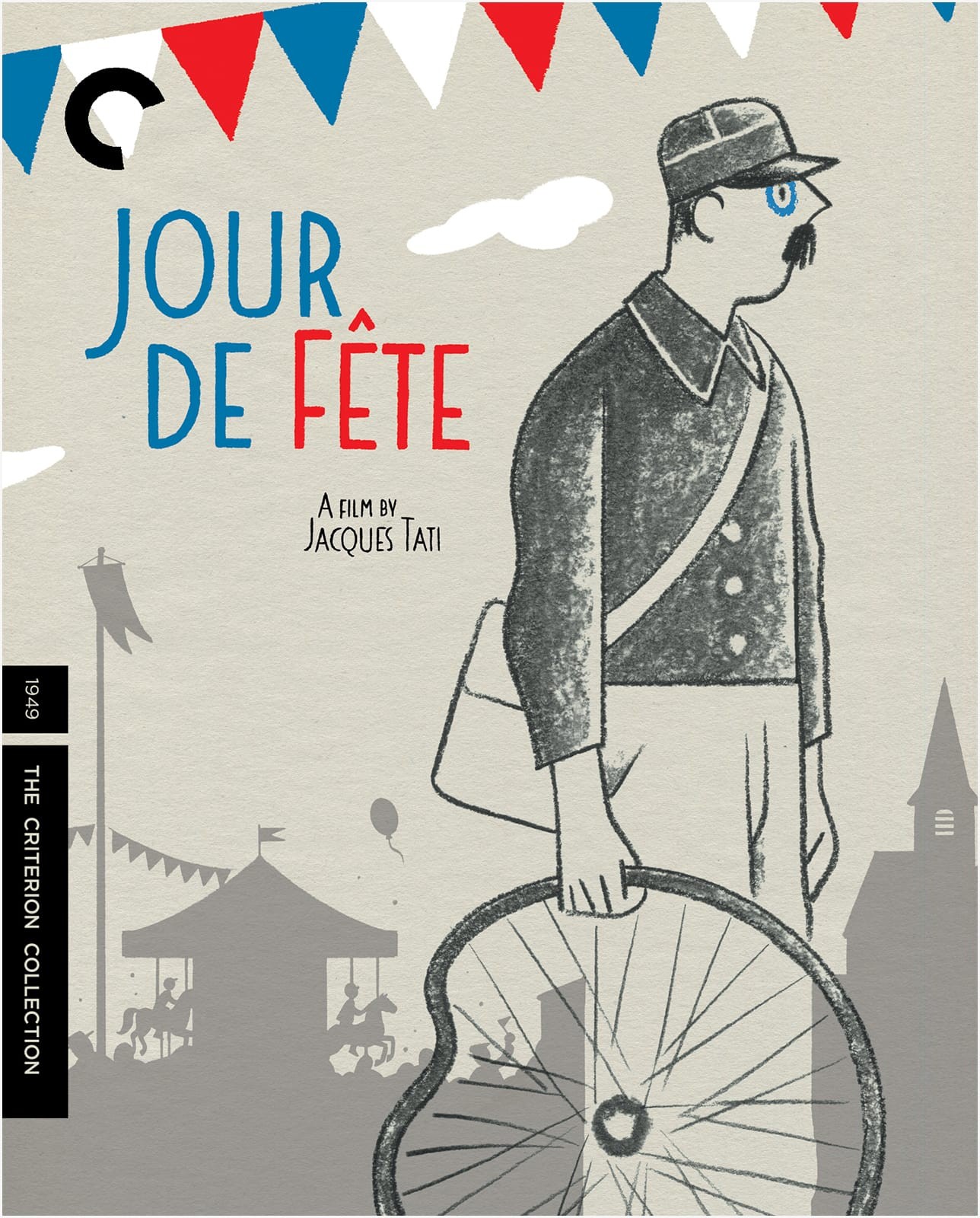
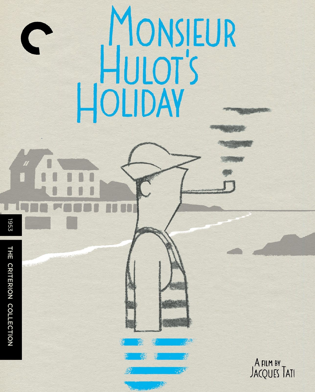
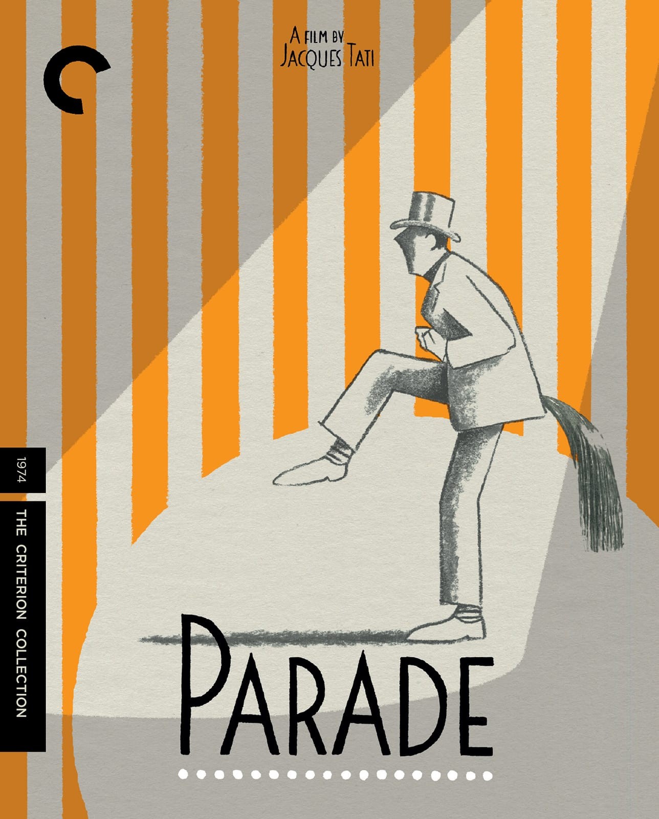
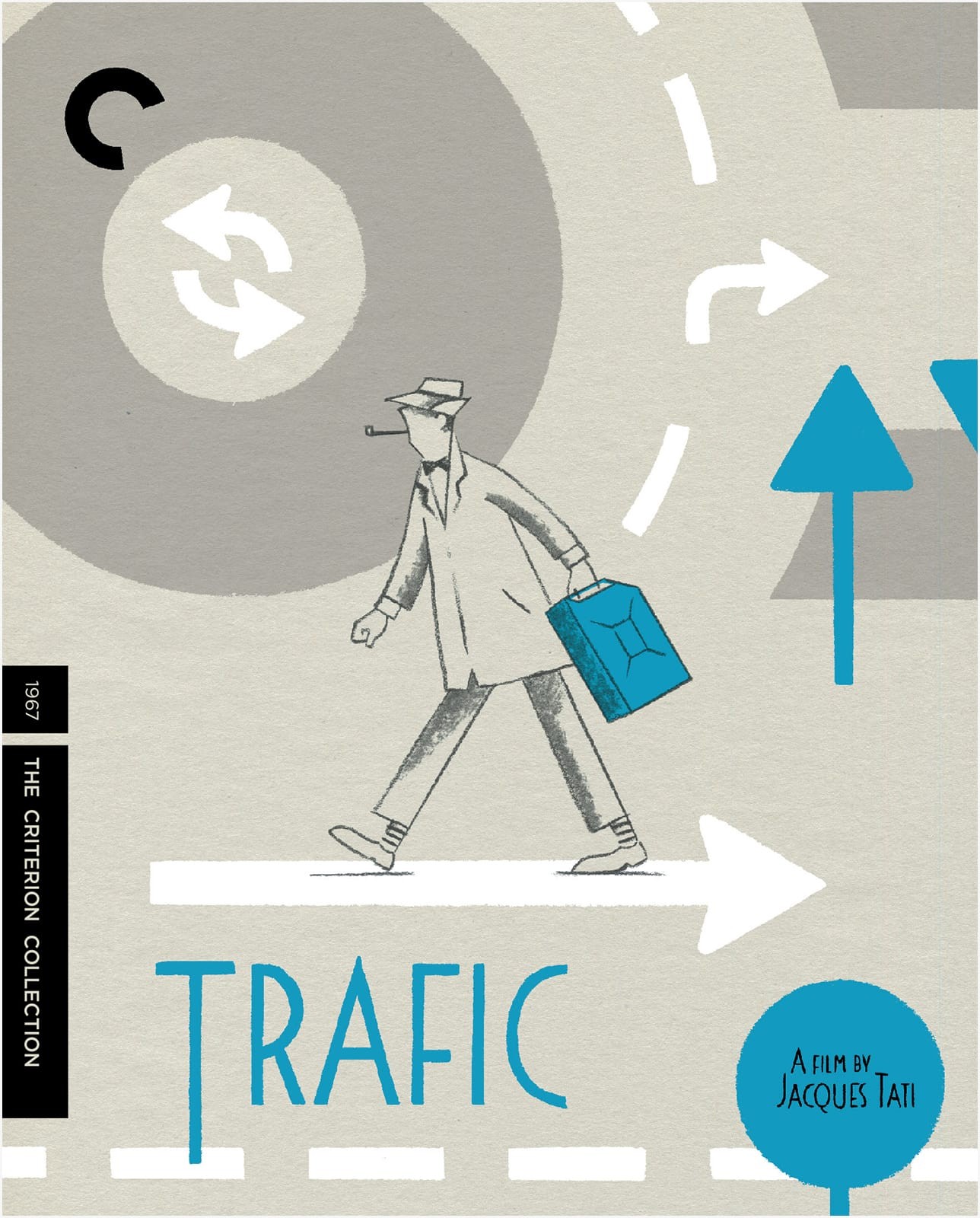
I am at least a year late on this, but I do love these covers for the Criterion Collection box set of Jacques Tati films. The illustrations are by Belgian illustrator David Merveille who has also created a series of books inspired by the work of Jacques Tati. Currently, only Hello, Mr. Hulot is available in English, but I believe a second book, Mr. Hulot on the Beach, will be published in English in 2016 by NorthSouth Books.
You can see more of David’s designs and illustrations for the box set on his blog.
Thanks to designer Andy Allen for bringing these covers to my attention. Images and other interesting stuff via Adrian Curry’s marvellous Movie Poster of the Week column.