I think designers might have brains that are set up slightly differently to ‘normal’ people (there are always a lot of left handed people design departments). Quite often someone will mention authors and titles of books to me and it won’t mean anything, but when I look those books up on Amazon and see some pictures, I’ll realise I’ve read them or even worked on them. Words don’t seem to lodge in my brain in the same way that images do – I’m useless at remembering people’s names, but I can recognise someone because I sat next to them on a bus three years ago. When I read a book, I’m not sure if I experience in the way you’re supposed to do. It’s hard to describe, but from reading a book I get a sense, in quite an abstract way, of what the tone of the cover for that book should be. Each book seems to create its own world with its own rules and logic. And working on a book you don’t like is always easier – there’s nothing worse that trying to design a cover for your favourite book. It’s like being so keen to be friends with someone that you instantly become the most boring person in the world.
Filmed at D&AD Judging 2015 earlier this year, David Pearson talks about designing books, and picks out some of 2015’s best examples of the art:
David designed the cover of this year’s D&AD annual, and he recently talked to It’s Nice That about that process:
“The only way I’ve been able to hand over any work and feel ok about it is to throw an inordinate amount of time into thinking and thinking and editing and thinking. Then when you hand it over you know you’ve really tortured yourself thinking about what you can get rid of. It’s amazing we ended up with something as clean as we did: you have to get rid of absolutely everything.”
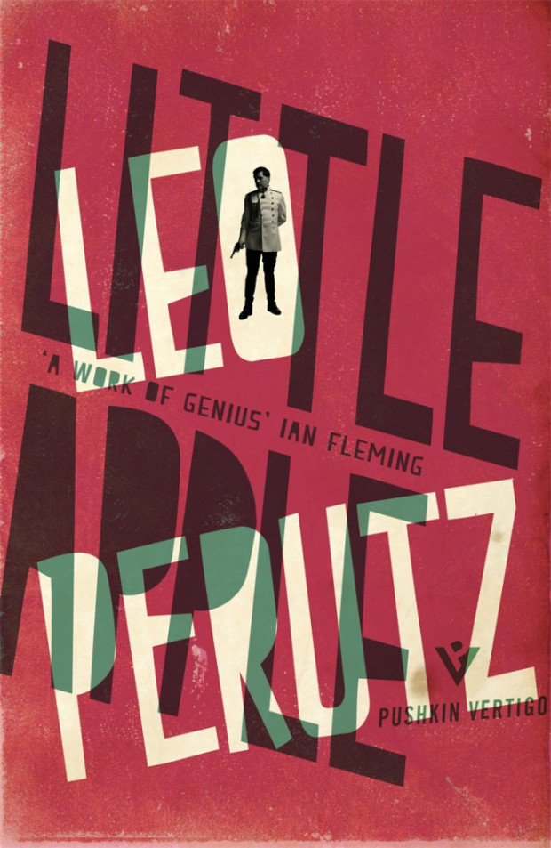
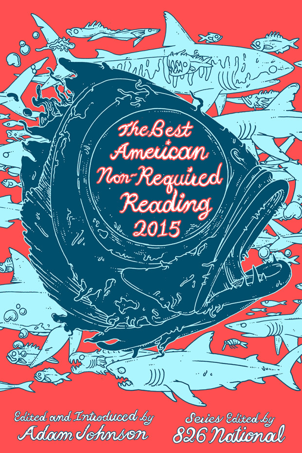
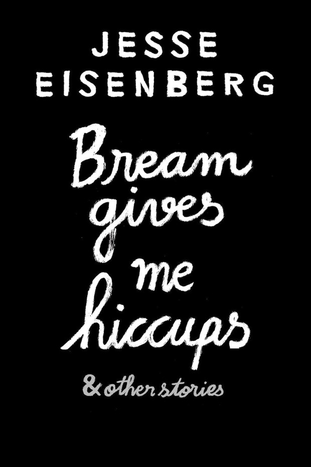
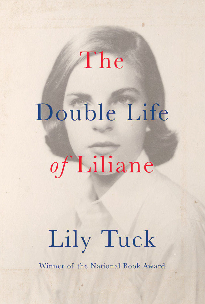
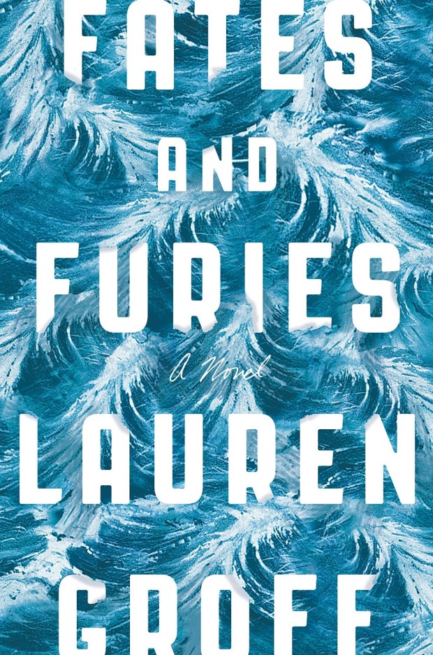
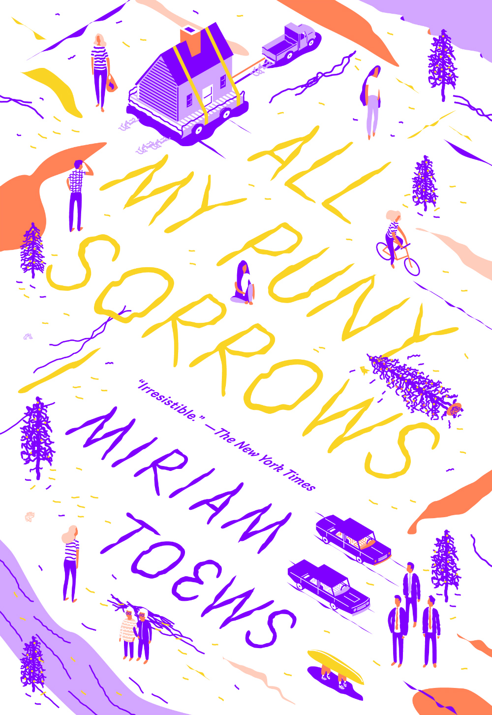
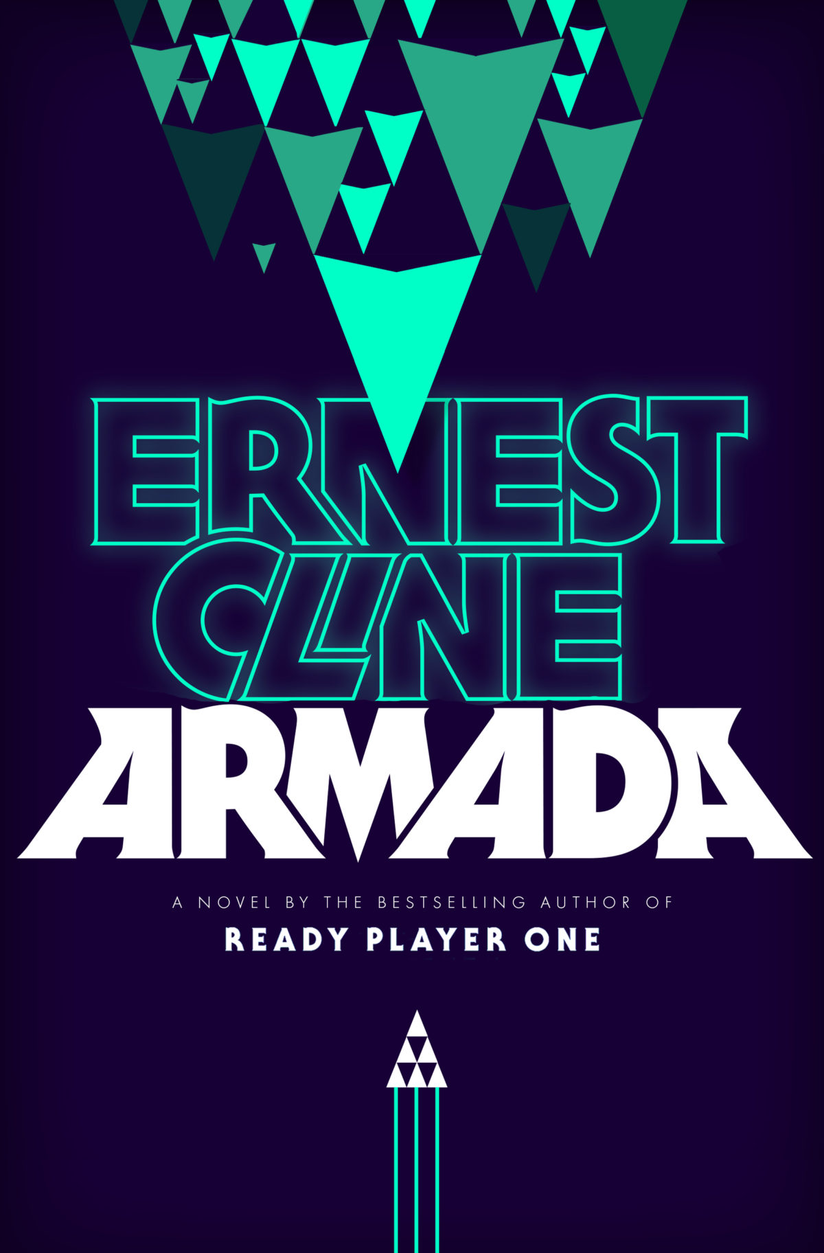
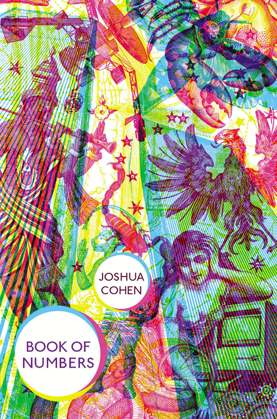
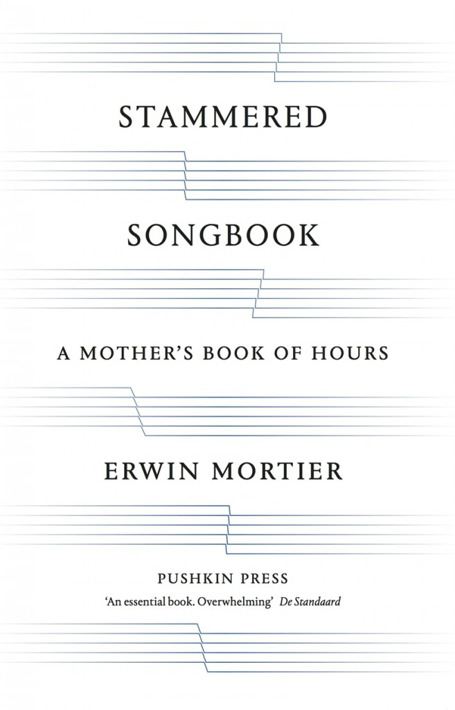
A little bit later than scheduled, here is my October selection of book covers. There are three from Verso, and two by James Paul Jones, but I think it’s still another month of interesting, diverse, and eclectic work. I hope you agree…
(I was raving about this cover on Twitter no so long ago. It really needs to be seen in person because the image doesn’t do it justice at all. The finish on the jacket is lovely and gives the design a beautiful nuance and subtlety)
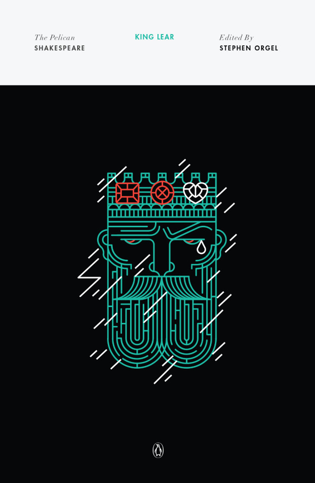
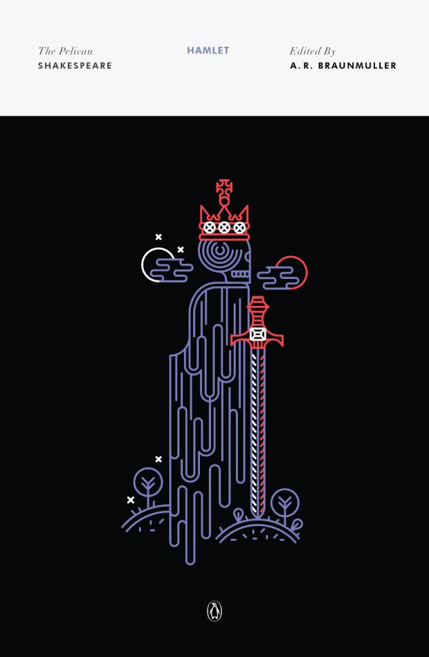
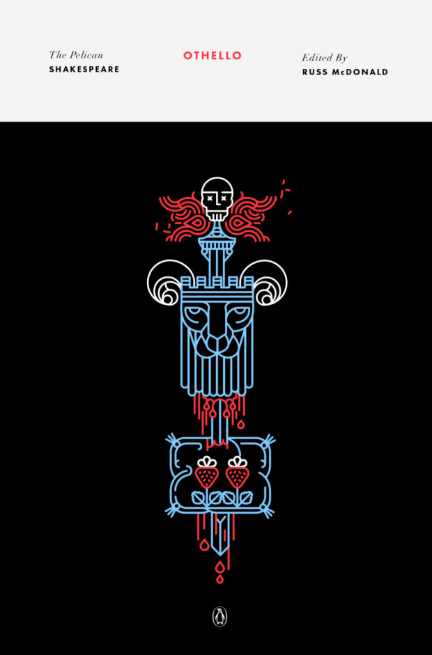
Continuing with the recent series design theme here on The Casual Optimist, creative director Paul Buckley let me know about new set of covers for the Pelican editions of Shakespeare. The covers were designed by newcomer Manuja Waldia, who studied Graphic Design at NIFT, New Delhi and the Milwaukee Institute of Art & Design. Waldia has been commissioned to design the entire series (which is a lot of book covers!), and as a Paul said, “she gives the last two male icon artists to do that (Milton Glaser and Riccardo Vecchio) a run for their money.”
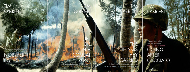
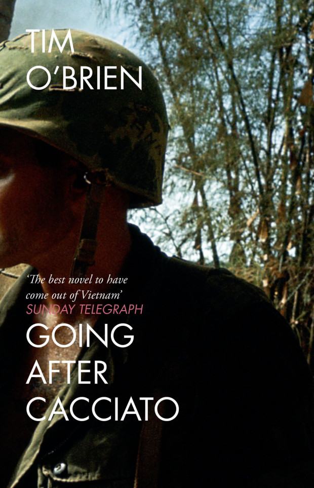
As I mentioned on Twitter yesterday, designer Jo Walker recently redesigned the covers of Tim O’Brien’s classic Vietnam war novelsIf I Die in a Combat Zone, Going After Cacciato,The Things they Carried, andNorthern Lights for 4th Estate in the UK. The series uses a single, searing photograph of a burning Vietnam village taken in 1965 by photographer Dominique Berretty spread over the four covers. The effect is extraordinary, and the design is an interesting contrast to Cardon Webb‘s (also brilliant) typographic covers for the US editions, published by Broadway.
You can read more about Jo’s design process for the series on the 4th Estate blog.
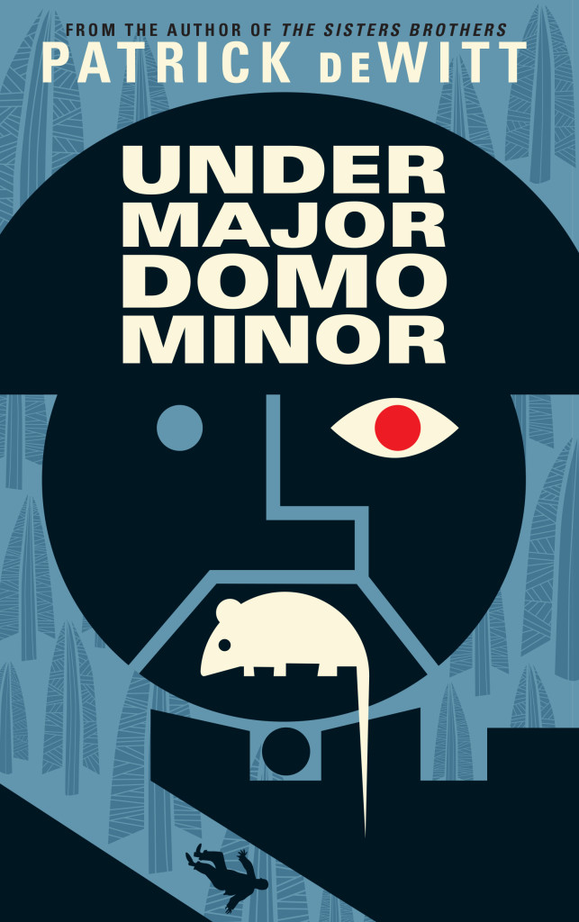
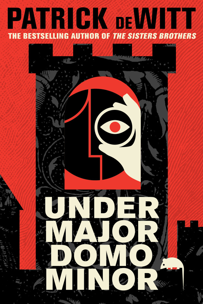
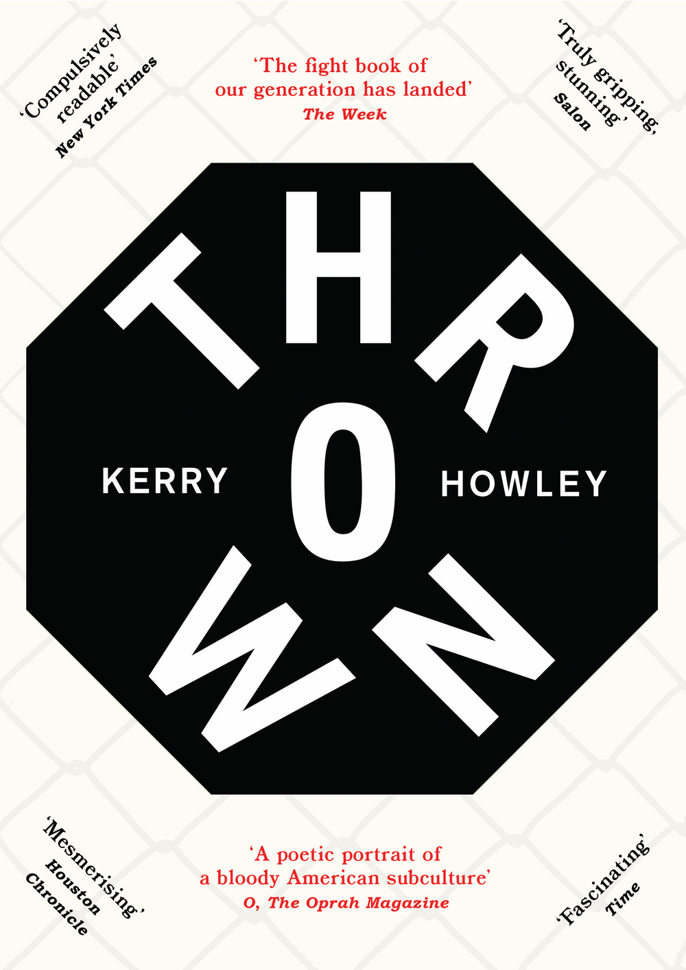
Next month sees the publication ofUndermajordomo Minor, the new novel by award-winning Canadian author Patrick deWitt.
An “ink-black comedy of manners”, itapparently involves an Alpine castle, a mysterious Baron Von Aux, and a lot of bad behaviour — including, if the Quill and Quire‘s Steven W. Beattie is to be believed, “an extravagant act of Hieronymus Bosch-like grotesqueness… perpetrated upon a large rat.”
It sounds a little like a horror movie directed by Wes Anderson. Or Terence Fisher doing something nasty to Gilbert and Sullivan.
While the cover for the US edition (published by Ecco) was designed by the talented Sara Wood, the UK and Canadian editions of Undermajordomo Minor feature the distinctive artwork of Dan Stiles, the American illustrator and designer who designed the covers of deWitt’s previous novels The Sisters Brothers and (the reissued) Ablutions.
Granta (UK)
House of Anansi (Canada)
Although Stiles has created different designs for Granta, and House of Anansi, the UK and Canadian covers (both featuring that unfortunate rat) have strong echoes of those previous books. According to the Canadian art director Alysia Shewchuk, this was a deliberate decision. “Dan Stiles created a very a distinctive look for The Sisters Brothers — highly stylized, dark yet playful — and we wanted to pick up these threads in our cover for Undermajordomo Minor.”
This is most apparent in the Anansi cover. Its bold geometric design is similar to Stiles’s theatrical cover for Granta, but its colour palette and texture bring it back to the The Sisters Brothers.
Interestingly, the focus of the Canadian cover is different too. “We’d seen early versions of the covers for both the US and the UK editions, and while we liked the different directions they’d each gone in, for our edition we thought it was important to feature the main character (Lucy Minor) and the castle where he lives and works,” says Shewchuk. “Dan understood exactly what we were looking for and he nailed it on the first go-around.”
Undermajordomo Minor will be published on September 3rd in the UK, September 5th in Canada, and September 15th in the US.
In the meantime, watch the slightly Monty Python-esque trailer made by artist Joanna Neborsky, with music by deWitt’s brother Nick deWitt, released today:
Correction: When first posted, I stated incorrectly that the US cover was also designed by Dan Stiles. The final design and illustration for the Ecco edition of Undermajordomo Minor is by Sara Wood. The post has been amended and updated to credit Sara for her work.
As others have noted, it is a little odd that the project is being announced now when the winners have been chosen rather than when the competition opened (why wasn’t the cost of the catalogue factored into the entry fee?), and I wonder if a traditional publisher could not be found to partner on this project, but even if it feels like something of an afterthought, a well-designed catalogue would still be a lovely thing to have.
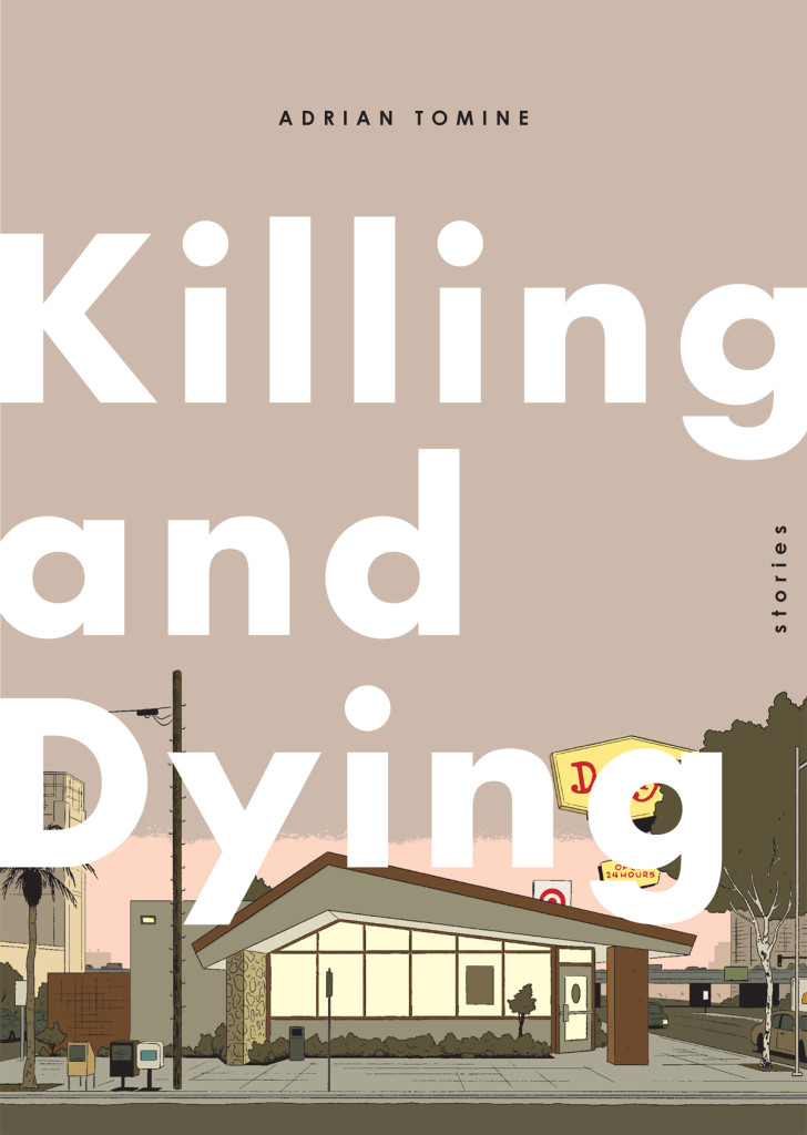
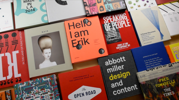
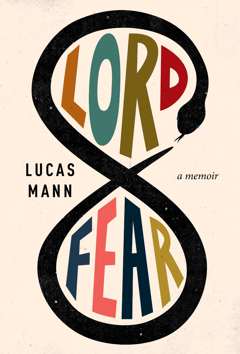
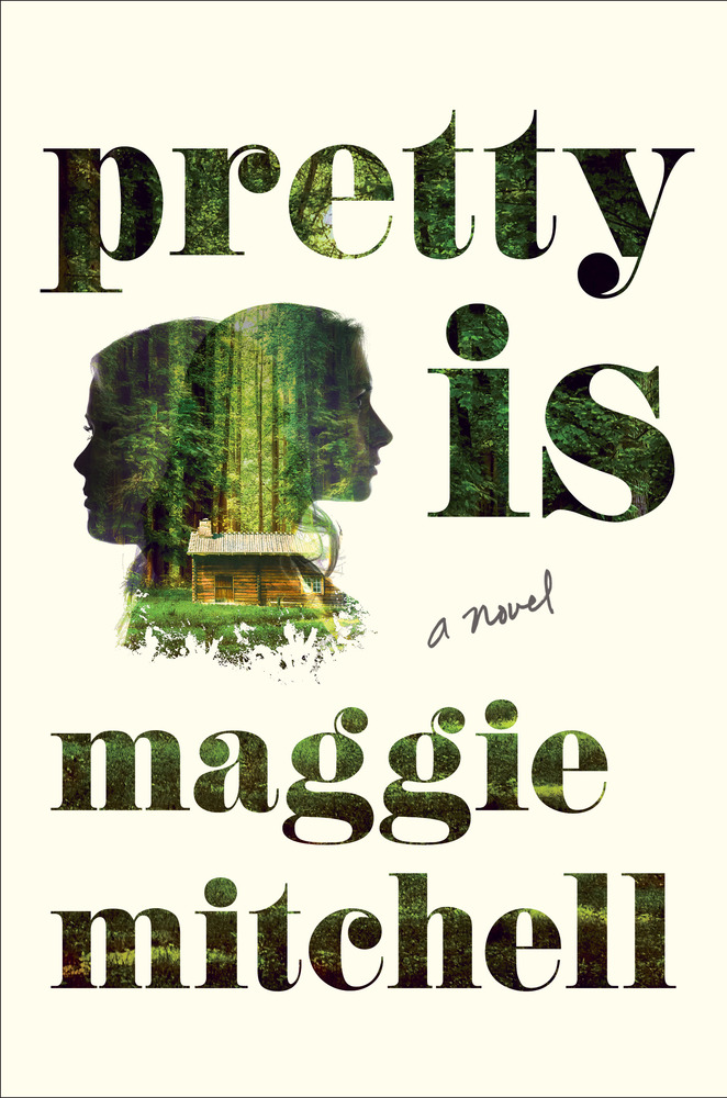
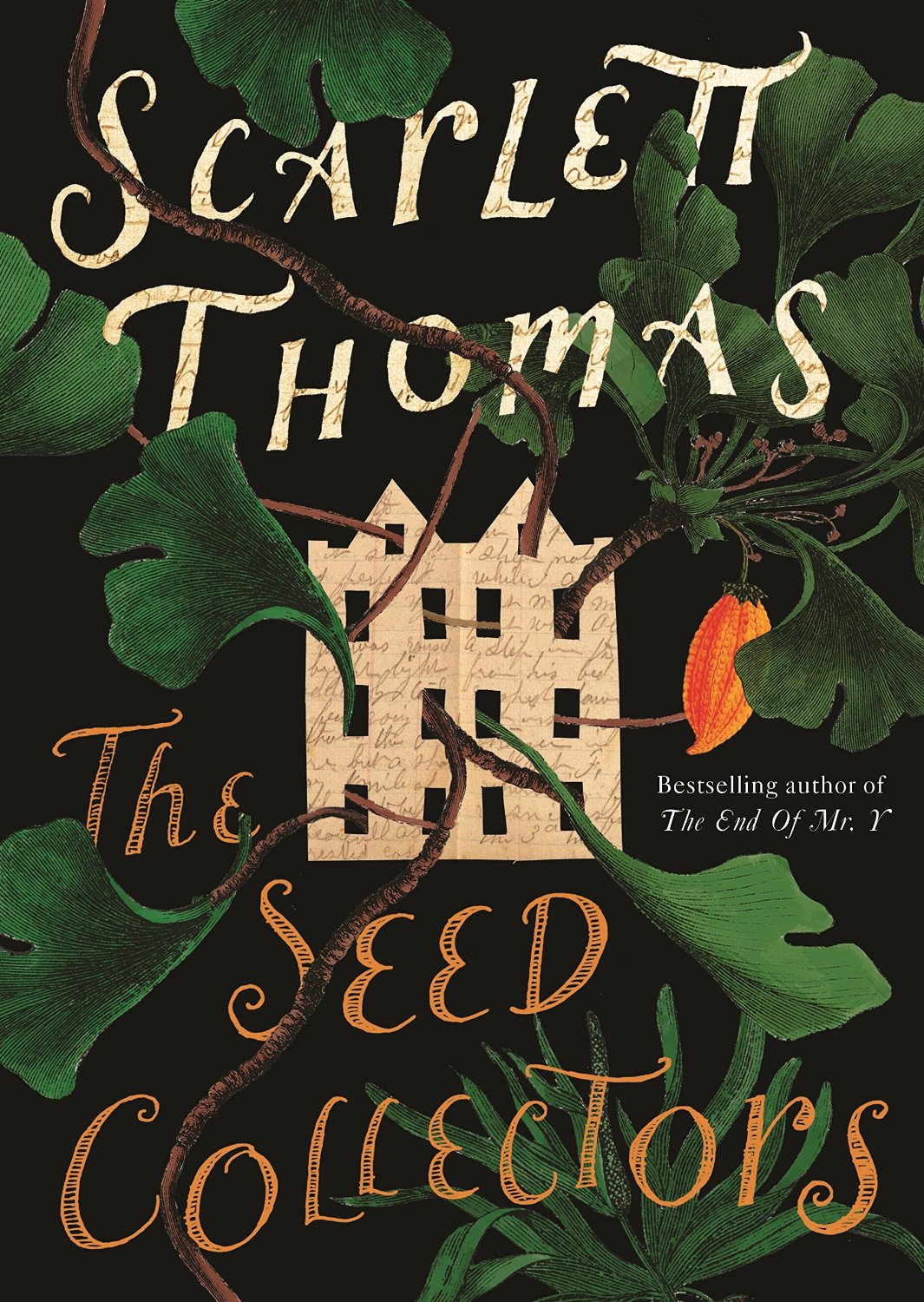
It’s finally summer, and because July is traditionally something of a quiet month in publishing, I’m taking the opportunity to catch up on a few covers that I missed earlier in the year…