Skip to content

Tag: art

The Fox and the Star by Coralie Bickford-Smith

fox and the star

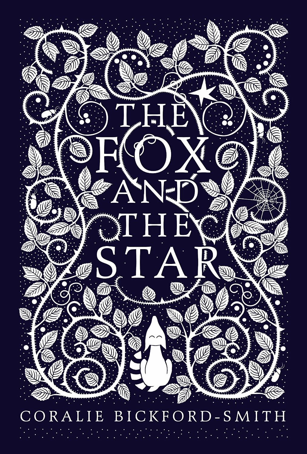
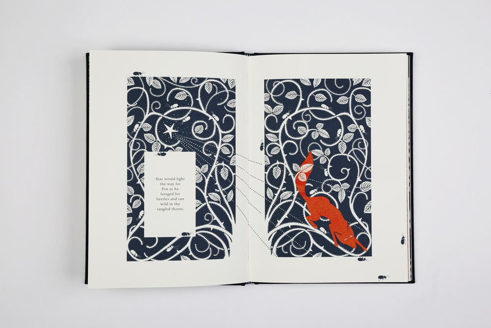
At the Penguin blog, the remarkable Coralie Bickford-Smith talks about The Fox and the Star, a new book she has written, illustrated and designed:

The inspiration comes from a place of personal experience that I wanted to document. It’s a life lesson that I found hard to learn; one of love, loss and the ability to adapt to the constant changes that are a part of life. On a visual level my inspiration came from my design heroes, William Blake and William Morris. My love of pattern and book design is evident in the illustrations.

It looks absolutely beautiful as you can see:

fox and the star int

And here’s Coralie talking about the project:

The Fox and the Star is available from Particular Books August 27.

Comments closed

Françoise Mouly: No House Style

Sarah Shatz: Françoise Mouly

It’s Nice That has a great interview with the remarkable Françoise Mouly, co-founder of comics anthology Raw, editorial director of TOON Books, and, of course, art editor at The New Yorker:

“One of the things we had at Raw which I have tried to keep is not having a house style, it doesn’t all look alike. Raw really was the sum of its parts but you can’t say that Raw magazine was Joost Swarte or Charles Burns or Sue Coe.

“At The New Yorker when I came in there was a house style, a nice cat-on-the-windowsill type watercolour and you could look at the covers and see the common denominator. I have tried to never let it settle into, ‘Oh that’s a New Yorker cover’ except in the approach.”

Comments closed

Geoff McFetridge: Table Talk

6 Dots Geoff McFetridge

The set up of this interview with artist Geoff McFetridge is a little too cool for school, but the artist himself is disarmingly nerdy:


Comments closed

Robert Frank: The Man Who Saw America

05mag-05index-t_CA0-jumbo
Katy Grannan for The New York Times

This weekend’s New York Times Magazine has a remarkable profile of photographer and filmmaker Robert Frank by writer Nicholas Dawidoff:

Frank absorbed artistic influences all over New York. Edward Hopper’s moody office-scapes, restaurant interiors and gas pumps were not in fashion when Frank discovered the painter: ‘‘So clear and so decisive. The human form in it. You look twice — what’s this guy waiting for? What’s he looking at? The simplicity of two facing each other. A man in a chair.’’ Frank’s creative day to day was informed by the Abstract Expressionist painters he lived among. Through his window, Frank studied Willem de Kooning pacing his studio in his underwear, pausing at his easel and then walking the floor some more. ‘‘I was a very silent unobserved watcher of this man at work. It meant a lot to me. It encouraged me to pace up and down and struggle.’’ He also saw the downside of an artist’s life: ‘‘I used to watch de Kooning work, and then I’d walk down the street and see him drinking and lying in the gutter. Somebody’s bringing him upstairs. You drink because you have doubts. Things seem to crumble around you.’’

Online, the Times also revisits The Americans, Frank’s best known work and “one of the most influential photography books of all time.”

“Parade — Hoboken, New Jersey,” 1955. Robert Frank
Comments closed

The Endless Combinations of Robert Rauschenberg

Monogram, Robert Rauschenberg (1955–59)

At the New York Times, Dan Chiasson visits the archive of the late Robert Rauschenberg, currently housed in a high-security warehouse in Westchester, N.Y.. Unsurprisingly, perhaps, it looks “a little like a cross between Charles Foster Kane’s Xanadu and a suburban Lowe’s”:

A source material, for Rauschenberg, could have been almost anything. Among the most prolific and consistently surprising American artists, he worked for over 50 years in a variety of media from feathers, stuffed goats, socks and neckties to cardboard, grass and scrap metal, in genres including choreography, costume design, photography, printmaking and painting. He is most famous for the “combine,” a form he more or less invented that merged three-dimensional collages with sculpture, sometimes with the batty ingenuity of a Rube Goldberg. Few works capture so arrestingly the process that brought them into being: In a finished Rauschenberg, you see a goat, a tire, a tennis ball, but more than that, you see the insights that brought them together. Each component keeps its integrity within a composition in which everything contributes to a profound effect of overall beauty. Indeed, few artists of his era so unabashedly strove for beauty, even majesty: The logic of his work, beginning with cast-offs and flotsam, demanded it. It was the dare he put to himself in everything he made.

Comments closed

The Expensive Notebook Company

I know it’s the second Tom Gauld cartoon I’ve posted today, but this one for The New Yorker is magnificent:

Gauld-Expensive-Notebook-Company-1200

1 Comment

Samplerman

samplerman-01

Thanks to David Gee (and others), who alerted me to the extraordinary Samplerman comics this week.

You can read an interview from earlier this year with Yvan Guillo, the French cartoonist and designer behind Samplerman, at It’s Nice That:

I’ve always downloaded tonnes of scans of American comics, from the golden age to the bronze age. I could scan the ones I have but I’ve done it only once or twice. I don’t really read the stories, but I love how they look: the cheap paper, the bright primary colours, the screen-tone, the drawings, the conventional representation of landscapes, the simplicity of the lines. I have to make a choice among this mountain of graphic elements. I pick what I like: face, hand, clothes, tree, car, text balloon etc. and start to (digitally) cut them out. At the same time I start to place the elements on one or several pages made of blank comic panels. Some elements are duplicated, rotated, arbitrarily cut in half, reduplicated and mirrored. It’s a mix of kaleidoscope and collage; I add, I move, I replace until I feel it’s done. At the end it has to remain visually surprising and dynamic.

samplerman-03

Bonkers.

1 Comment

Criterion Designs

criterion-designs

Another book for the wishlist (because in a shocking development no one gave it to me for Christmas), Criterion Designs features covers, art, and sketches art commissioned for the Criterion Collection. It looks beautiful…

criteriondesigns_gallery6_large
criteriondesigns_gallery9_large

Comments closed

The Complete Little Nemo

Cover

If you were wondering what to get me for Christmas this year, Taschen recently published Winsor McCay: The Complete Little Nemo 1905–1927which collects together all 549 of Winsor McCay’s extraordinary Little Nemo strips.

First published in The New York Herald in 1905, McCay’s innovative, beautifully detailed strips have been available online for sometime, and there have been attempts at reprint collections before, but this oversize edition looks absolutely gorgeous:

11

13

15

16

Comments closed

A Little Film About… Jean Jullien

dear-reader

Another cover featured in this month’s round-up was Jean Jullien‘s illustrated design for Dear Reader by Paul Fournel, published by Pushkin Press. In this short film by Handsome Frank, Jullien talks about his work, drawing with a brush, his relationship with technology, and laughing at yourself:

(via It’s Nice That)

Comments closed

Penguin Modern Classics The Cut-Up Trilogy by William Burroughs

Following on from yesterday’s post on Penguin’s pocket hardback classics, Penguin Modern Classics are also reissuing William Burroughs’ cut-up trilogy with menacingly dark collage cover art by Julian House:

9780141396064

9780141189789

9780141189772

Comments closed

Alan Kitching and Monotype

AK_PR

Well, this is absolutely lovely — a short film about letterpress typographer, designer, artist (and accordion player) Alan Kitching, and a set of posters he created with Monotype to celebrate the centenary of five influential designers born in 1914: Tom Eckersley, Paul Rand, FHK Henrion, Josef Müller-Brockmann and Abram Games:

(via David Pearson)

1 Comment