I recently came across this short PBS Artbound documentary from 2021 on artist, educator, and social justice advocate Corita Kent (1918-1986), which is well worth 20 minutes of your time.

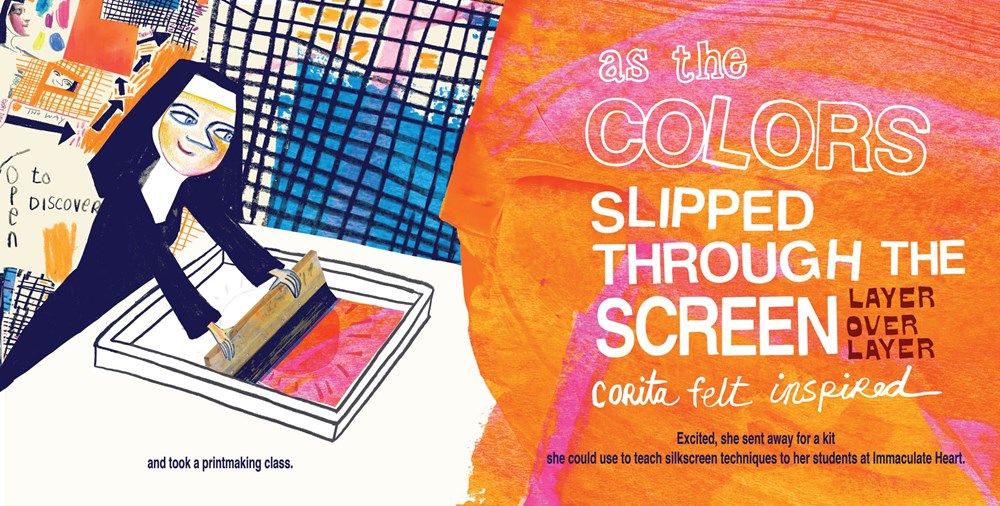
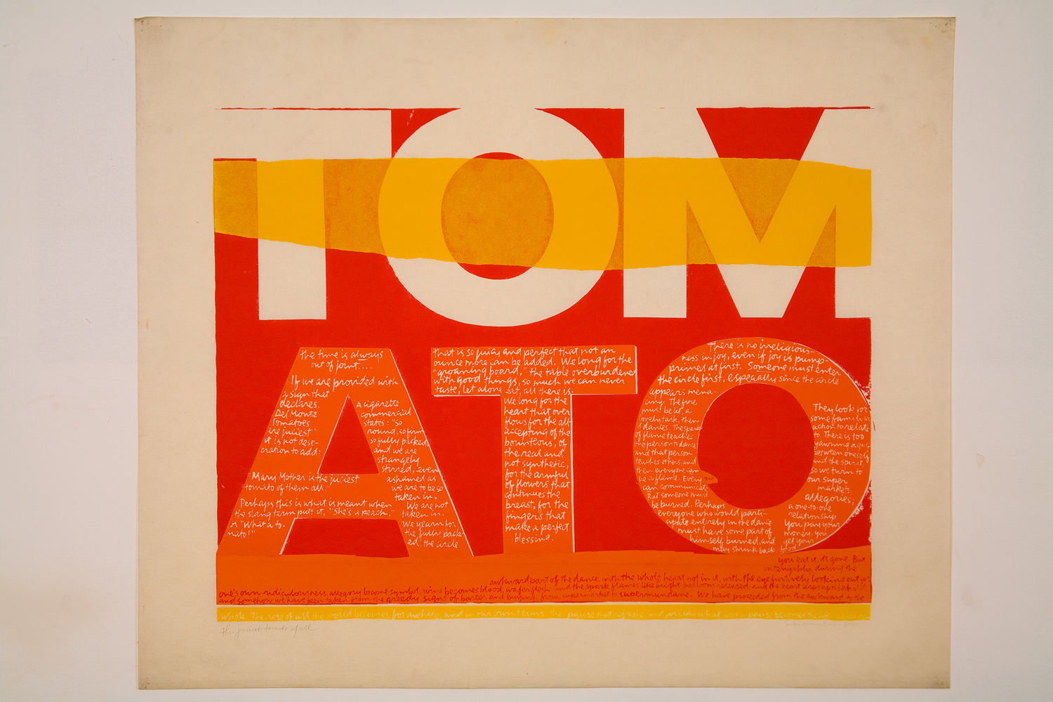
I don’t remember when I first came across Sister Corita’s work. It was probably not until I moved to Canada and became more interested in design and applying typography and lettering to art. Certainly, she was not someone I learnt about in school. It’s hard to know whether that is the result of a parochial British education, or more generalized misogyny and prejudice in art history, or a bit both. But, as the documentary makes clear, she remains a source of inspiration for artists, designers, and teachers 40 years after her death.
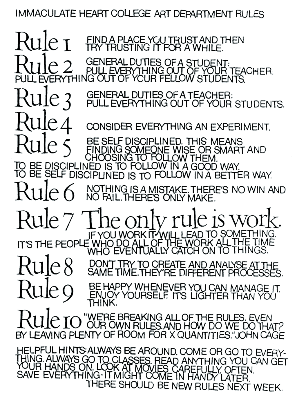
The ‘Ten Rules’ she helped create with the students of the Immaculate Heart College Art Department seem as relevant today as they must have at the time they were first written:
You can listen to former students, artists, community organizers, and others read and reflect on the Ten Rules here.
(Video via Letterform Archive!)
Comments closed