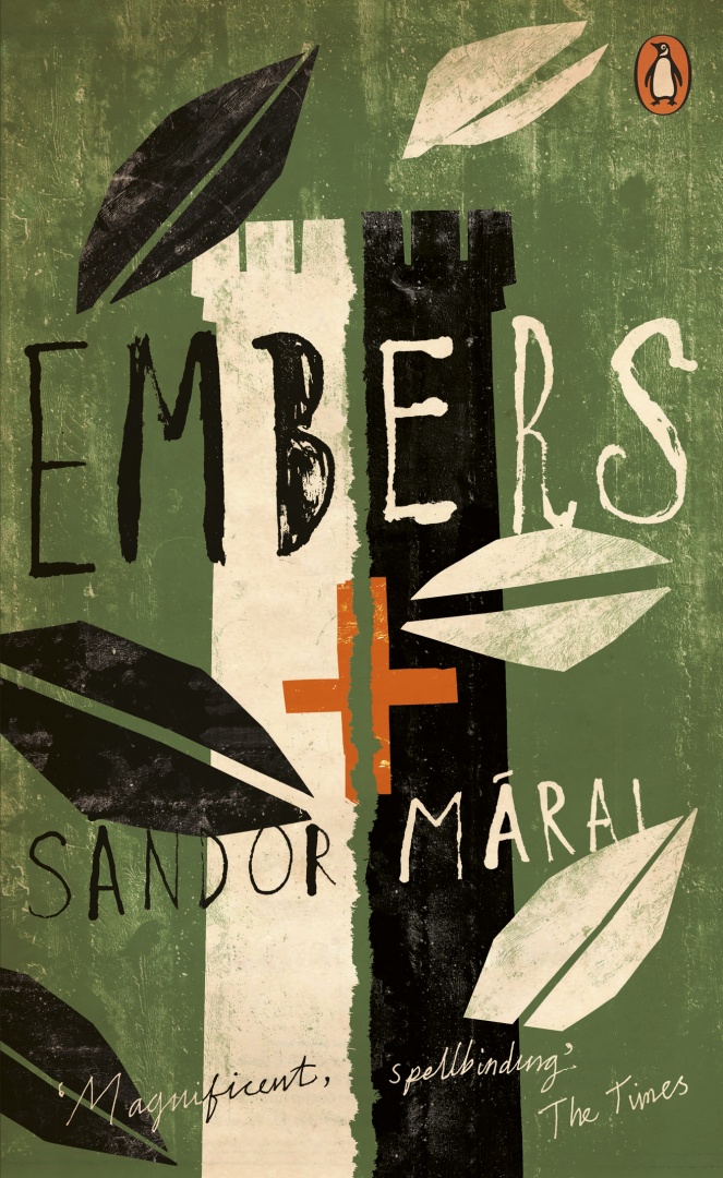
The latest additions to Penguin’s ‘Essentials’ series, released this month, have some rather splendid new covers, including Jon Gray‘s wonderful design for Embers by Sandor Márai, Julian House’s typographic design (with echoes of Robert Brownjohn) for The Spy Who Came in from the Cold, and David Foldvari‘s illustrated design for How Many Miles to Babylon by Jennifer Johnston.
The Spy Who Came in From the Cold by John LeCarre; design Julian House (Penguin / 2016)
How Many Miles to Babylon by Jennifer Johnston; design David Foldvari (Penguin / 2016)
You can see more of the new Penguin Essentials covers, and read about the design process, at Design Week.
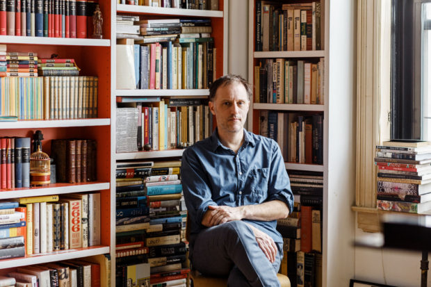
In this profile of Peter Mendelsund in the June issue of Rhapsody Magazine,there is a lovely bit about the designer’s architect-artist father:
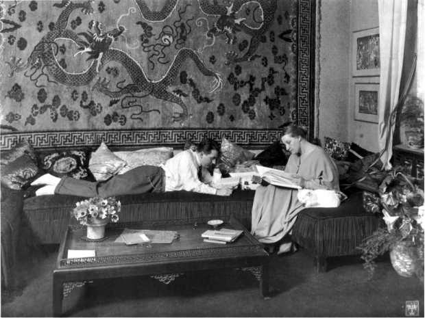
In the living room of Knopf associate art director Peter Mendelsund’s Upper Manhattan apartment, inspiration is everywhere: a battered, sea-green first edition of Ulysses; a toy version of the rocket Tintin takes to the moon; the vertebra of a blue whale; and, on top of his baby grand piano, a wooden model of a convention center made by his father, in the mid-’70s, when he worked for a New York architecture firm. It was never built, because the firm didn’t win the competition (Renzo Piano did), nor were any of his other models, because, in his late 30s, Benjamin Mendelsund was diagnosed with a brain tumor and devoted the rest of his life—he died at 48—to sculpture and painting. “He cut out all the bureaucracy of architecture,” Mendelsund says, “and turned to this.” He points to a small canvas painted entirely black except for two rectangles—two faded photos of a barn’s loft, its window open to the bright of day.
That image of a window onto a window is central to the signature style that’s made Mendelsund one of our preeminent book jacket designers: geometric, fascinated with negative space, striving to capture infinity through simplicity. You see the painting echoed in his cover for Martin Amis’s 2006 novel, House of Meetings, for which he photographed a tiny simulacrum of a room, its perspective slanting toward a miniature door. You see it in his many book jackets with drop-cuts—holes carved out of an image—like the diamond torn from a woman’s face on an early cover for The Girl With the Dragon Tattoo, back in 2005 when it was called The Man Who Hated Women. And you see it in his May 11, 2015, New Yorker cover, which features an American flag smashed like a storefront window, a single star-shaped hole evoking the myriad emotions of last year’s civil unrest in Baltimore.
His father’s second act as an artist also helps explain how, at 33, Mendelsund had the confidence to abandon his career as a classical pianist (“Eventually, I realized that I’d never truly be world class”) and reinvent himself. His wife suggested he try something visual—he was always drawing; he had designed their wedding invitation. “Sometimes the obvious things take a long time to see.”
The first large Moholy-Nagy exhibition in this country in over 50 years may also be, its organizers say, the largest anywhere. It packs around 300 works into Frank Lloyd Wright’s great spiral — perhaps a record itself. They represent some dozen mediums including painting and sculpture, film and projection, works on paper as well as graphic, set and exhibition design and several forms of photography.
The show provides a bracing picture of both the extent and the unity of Moholy-Nagy’s art as it moves up the ramp, superbly styled for the occasion by Kelly Cullinan, the museum’s senior exhibition designer. Her scheme separates Moholy-Nagy’s achievement into separate strands and then braids them together fluidly. The abstract paintings and sculptures dominate the museum’s signature bays; most films are displayed in small alcoves between the ramps. Moholy-Nagy’s extensive writings and graphic design are displayed on each level in vitrines, whose bright rectangular lids manage to evoke the colorful trapezoids in his paintings. And his complex involvement with photography is played out on free-standing partitions, enabling close study of the interplay of documentary, photomontage and camera-less photograms — a term he invented — sometimes made using his own sculpture. Certain forms and motifs reappear in different mediums, and the give and take between photography and painting is one of the show’s driving forces.
It sounds like a must-see.
Moholy-Nagy: Future Present is at the Guggenheim until September 7. The exhibition is also travelling to Chicago and Los Angeles.
‘Dominique’ by Eugene Fromentin. Copyright 1948; No print date (circa 1952-53). Grove Press dust jacket on an imported hardcover originally published and printed by The Cresset Press (London). Cover design by Roy Kuhlman.
‘America Day by Day’ by Simone de Beauvoir. Grove Press, 1953. Hardcover. Cover designed by Roy Kuhlman.
Kuhlman is best known, of course, for the brilliant mid-century modern book covers he designed for Grove Press. The site is not comprehensive — at least not yet — but given the number of covers and other pieces Kuhlman must have designed over his career that is, perhaps, not surprising. Archiving his work must be a massive undertaking. Hopefully there is much more to come.
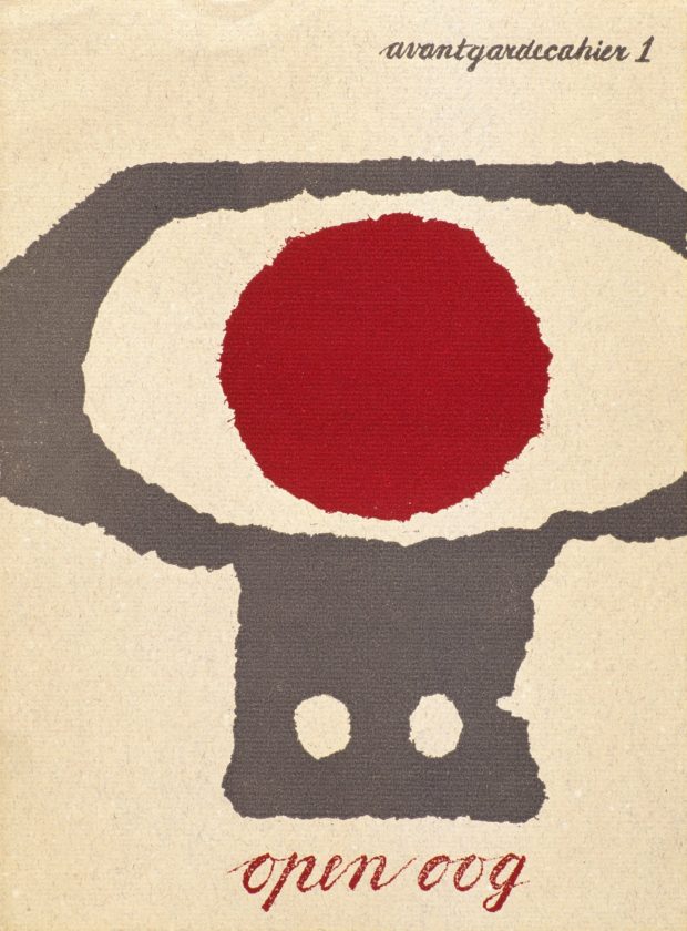
Writing for The Guardian, Simon Garfield (Just My Type), visits the first UK retrospective Dutch designer and curator Willem Sandberg:
“This is printed on wallpaper, very asymmetric … an amazing thing really,” Fraser Muggeridge, the curator, says as he shows me his collection of Sandberg ephemera in his studio in London’s Smithfield. It is a space Sandberg would have admired, with its display of promotional work for emerging artists and galleries crowding in from the walls. “I don’t think he was trying to make the most perfect work, but it was always free-spirited and arresting.” His letters were highly sculptural, revealing negative space; at first glance a torn “T” becomes a sideways “E”. They speak of his obsession not only with making intricate objects by hand, but also with solid branding: his graphics for the Stedelijk created a look and mood for a museum that today would require a huge budget and corporate pitching.
Astonishingly, most of Sandberg’s catalogues and posters were a sideline, designed in the evenings and at weekends. Sandberg was the director of the museum from 1945 to 1962, and his close relationship with the local state printer produced an identity that transformed the Stedelijk into one of Europe’s first truly modern galleries. He created what he liked to refer to as an “Anti-Museum”, rejecting the traditional dark and hushed rooms and creating something bright and accessible, a place of social interaction. He championed young artists, and he succeeded in attracting people who had barely set foot in a museum before. There was a shop, a learning centre and a cafe, all brave innovations in the middle of the century. As was Sandberg’s scheme to get the Stedelijk a little more noticed in the city: he painted the entire building white.
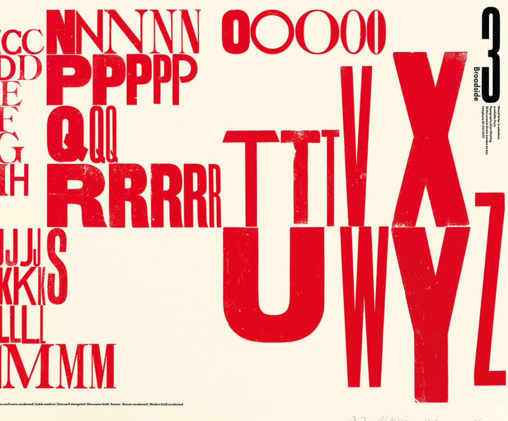
Related to my post earlier today, typographer Alan Kitching also talked to It’s Nice That this week about printing with letterpress, and a new monograph documenting his work:
Kitching started Omnific studio with Martin Lee and Derek Birdsall, who he had met through Anthony Froshaug, in the late 1970s. They worked from a studio in Covent Garden, then still surrounded by typesetters and other service people, until rents shot up and they moved out to a toy factory in Islington. By this time some foundries were starting to sell off their type, and Omnific bought up a press and installed it at their new studio: “All this type was selling off cheap, cheap-ish, and it was the last chance to get this stuff. So we bought it all and I continued printing there for around three years until I decided I wanted to leave. I didn’t really know what I was going to do but I wanted to buy the press and the type and go and print somewhere”, Kitching says. “I didn’t want to be a jobbing printer but I wanted to start out on my own. It was a very precarious thing to do because we were successful, well-established, and I was taking a backwards step, it was a bit of a leap in the dark.”
The new book, Alan Kitching: A Life in Letterpress, will be published Laurence King on April 7. A ‘Collectors Edition‘ of only 200 copies featuring a limited edition, numbered print by Kitching will also be available. Laurence King have produced four short teaser trailers for the book:
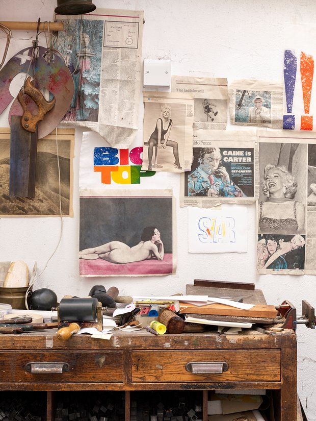
The Guardian visits the London home of designer, artist and typographer Alan Kitching:
The rooms in Alan Kitching’s home are arranged like one of his letterpress prints. Some are stacked, some are wedged, some aren’t in the right place. One dominates, while others bow out. But each room, like each letter, makes an impact and has a purpose.
From the outside, it’s obvious this isn’t an ordinary home: three large, shop-style window panels showcase Kitching’s iconic prints – word-based images in big, bold type. A fourth is given over to local notices: jumble sales and student art shows. “That was Celia’s idea,” Kitching says. “She was more gregarious than me.” Celia Stothard, his late wife, bought the property 19 years ago. She chose it for its flexibility: a place for them to live and hold talks, exhibitions and performances. She was a designer and artist, too, as well as a jazz singer.
The building is a former alehouse in Kennington, south London, buttressed up against a courthouse (local folklore has it that Charlie Chaplin used to come here to fetch jugs of ale for his mother). Storage rooms cascade off the back of the ground floor, where Kitching runs the Typography Workshop, into a cellar crammed with his extensive, 19th-century type collection. Upstairs, a high-ceilinged mezzanine has a reading nook reachable only by the swivel of a library ladder.
At the Paris Review blog, Henry Giardina considers the relationship between film director Fritz Lang and writer Thea von Harbou, with particular reference to their adaptation of the epic poem Die Nibelungenlied for the screen:
Fritz Lang and Thea von Harbou weren’t collaborators so much as co-conspirators: they had one of the strangest, most fruitful partnerships in the history of film, an erotic and artistic alliance that helped the new medium establish an emotional and political grammar. In the course of their eleven-year marriage, the pair, who met in 1920, made roughly a dozen films, often with Von Harbou writing the screenplays—adapted largely from her own work—and Lang in the director’s chair. They shared an expressive aesthetic vision, an exacting work ethic, and an almost tyrannical unwillingness to compromise with others. They changed people’s minds about their movies and, in radical ways, they changed each other. Their dedication manifested in odd ways—even though, a year into their affair, the bloom had already gone off the rose, they continued to live together, work together, and keep up the pretense of monogamy for another decade. She looked past his philandering; he looked past her increasingly fascist politics; they kept a full calendar. “We were married for eleven years,” von Harbou said later, “because for ten years we didn’t have time to divorce.”
Rauschenberg’s references to other media aren’t just tricks. They’re an integral part of the way he connects the language of his images to that of a wider world. Collagists had always done this, ever since the invention of collage. Braque and Picasso brought newspaper clippings and headlines into their images, though these had to be scaled to the actual size of the printed page—you couldn’t effectively do a cubist collage six feet high, it would need too many elements.
The same was true of Kurt Schwitters, with his bus tickets and cigarette wrappers and bits of wood or rusty iron. But around 1962, Rauschenberg began to use not things but the images of things. He gathered photos and enlarged them into silk screens, so that they could be printed directly on the canvas. This had two main effects. First, it enormously increased his image bank, because just about everything in the world, from mountains to beetles, from spermatozoa to Thor-Agena rockets, has been photographed. And second, by reusing silk-screened images from one painting to the next, it let him use repetition and counterpoint across a series of works in a way that wasn’t possible, or not easily possible, if he had been using things themselves. In doing this, he was adapting to the great central fact of American communication, its takeover by the imagery of television.
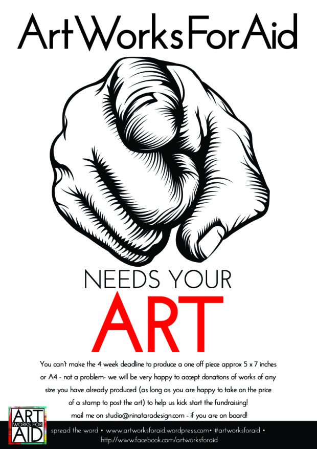
In response to the refugee crisis currently unfolding in Europe, designer and illustrator Nina Tara has set up Art Works For Aid.
Nina is asking artists, illustrators, designers and photographers to donate small works of art to be sold at auction to raise funds for organizations such as Human Relief Foundation helping refugees.
If you would like to help by buying an artwork, the first AforA auction is today. If you’re a ‘creative’ and you would like to donate a work of art just send an email to Nina.
You can find more information about the initiative on the AforA blog, and see images of some of the work that has already been donated on the AforA Facebook page.