A lovely short film about bookbinder Don Taylor made by Tate Young and Ian Daffern for the new online daily Toronto Standard:
Comments closed
Published April 8, 2011
Books, Design and Culture
A lovely short film about bookbinder Don Taylor made by Tate Young and Ian Daffern for the new online daily Toronto Standard:
Comments closed
 Book Art: Iconic Sculptures and Installations Made from Books by Paul Sloman, a 220-page overview of contemporary art, installation, and design created with and from books , published Gestalten.
La Mémoire Retrouvée — Edmund de Waal, author of The Hare with the Amber Eyes, on his family’s connection to Proust, for The Daily Telegraph:
Proust played with the interpenetration of the real and the invented; his novels have a panoply of historical figures who appear as themselves mingling with characters reimagined from recognisable people. Elstir, the great painter who leaves his infatuation with Japonisme to become an Impressionist, has elements of both Whistler and Renoir, but has another dynamic force. And Proust’s characters stand in front of actual pictures. The visual texture of the novels is suffused not just with references to Giotto and Botticelli, Dürer and Vermeer, Moreau, Monet and Renoir, but by the act of looking at paintings, by the act of collecting them, remembering what it was to see something, the memory of the moment of apprehension.
Doomed — Jonathan Coe, author most recently of The Terrible Privacy of Maxwell Sim, on film adaptations of books for The Guardian:
In the course of their famous book-length interview, François Truffaut once asked Alfred Hitchcock about his approach to literary adaptation, and Hitch’s response was as magisterial, worldly and mischievous as one would expect: “What I do is to read a story only once, and if I like the basic idea, I just forget all about the book and start to create cinema. Today I would be unable to tell you the story of Daphne du Maurier’s The Birds. I read it only once, and very quickly at that.”

Circumventing the Male Gaze — The New Yorker‘s Hilton Als on photographer Judy Linn and a new book collecting her photographs of Patti Smith:
I wonder what Patti and Judy saw in one another—I mean, beyond the description Judy provides in her little essay at the back of the book. What is the energy that one being picks up on, and how does it complement the other’s? Judy and Patti went to Detroit one summer and worked for a local paper and Crawdaddy, respectively; Patti wrote rock criticism and Judy took pictures. Lester Bangs was their friend. The world got bigger. Collaboration can be vexing, but there’s not a note of complaint in their work together. The pictures are documents of girls doing things together, sometimes in their summer dresses. And when there’s a third person present—Mapplethorpe, some other boy—they make a little room for him, but he’s rarely center frame; the pictures are rare in that they circumvent the male gaze and thus approval; instead, they document how each woman’s vision is equal to the other’s.
And finally…
Designer Data — The New York Times on data visualization:
Visual analytics play off the idea that the brain is more attracted to and able to process dynamic images than long lists of numbers. But the goal of information visualization is not simply to represent millions of bits of data as illustrations. It is to prompt visceral comprehension, moments of insight that make viewers want to learn more.
And on a related note: The Infographic Inforgraphic by Ivan Cash.
Comments closed
Award-winning Canadian illustrator and cartoonist Jillian Tamaki (Gilded Lilies, Skim and Indoor Voice*) has embroidered (embroidered!) three beautiful cover designs for a new classics series Penguin Threads to be released this Fall. They are all breathtaking.


There are more details and images of the designs on Jillian’s blog.
*Disclosure: Indoor Voice is published by Drawn & Quarterly and distributed by my employer Raincoast Books.
1 CommentA short profile of Benedikt Taschen from CBS Sunday Morning:
Comments closed“Please do not be cynical. I hate cynicism. For the record, it’s my least favorite quality, it doesn’t lead anywhere. Nobody in life gets exactly what they thought they were going to get. But if you work really hard and you’re kind, amazing things will happen. I’m telling you, amazing things will happen. I’m telling you, it’s just true!”
Jacob Gilbreath, a graphic design student at Oklahoma State University, created this great kinetic typography project — inspired by Lou Dorfsman’s Gastrotypographicalassemblage — from the dialogue of Conan O’Brien’s farewell on The Tonight Show on NBC:
1 Comment
Will Schofield’s wonderful blog A Journal Round My Skull has been relaunched as 50 Watts using the Cargo platform:
The new name has something to do with Charlie Watts, Beckett’s Watt, Charles Wright & the Watts 103rd Street Rhythm Band, dim light bulbs, riots, cheap amps, chaos theory, and the friend who threatened violence if I didn’t drop my old moniker.
I didn’t threaten violence, but I certainly got the name wrong more times than I care to mention. 50 Watts looks great and I should be able to remember the name this time.
Make sure you update your bookmarks and RSS reader.
Comments closed
Here’s an interview with the New York-based artist James Gallagher, curator of an exhibition of contemporary collage called Cutters (currently on display at the West Cork Arts Centre in Ireland, February 7th-March 12th) and co-editor of the book Cutting Edges published by Gestalten:
The book include collages by John Gall, Art Director at Vintage and Anchor Books, who actually mentioned the work of James Gallagher in our recent Q & A.


The Hare with Amber Eyes: A Hidden Inheritance, Edmund de Waal’s memoir about his extraordinary Jewish family and an inherited collection of ornamental Japanese carvings called netsuke, was on many of last year’s “best-of” lists and is high on my current ‘to-read’ list. The author talks about the book with Eleanor Wachtel on CBC Radio’s Writers & Company:
CBC Radio Writer’s & Co: Edmund de Waal Mp3
Edmund de Waal, who is also a successful ceramicist, is also profiled in The Guardian:
Comments closedDe Waal and his netsuke have been much discussed over the past seven or eight months, but even now he is “completely taken aback” by the success of a book which is an “odd matrix of personal obsessions”. (We talk in the upstairs room of his south London studio – downstairs are three kilns, his wheel and a bag of clay, ready for him to get to work in the afternoon.) Yet that it is so personal and springs from these obsessions (Japan, objects, memory), drawing on his expertise as a potter, is surely a clue to its enormous appeal. How things are made and handled, he writes, and what happens to them “has been central to my life for more than 30 years”.

I posted about Peter Mendelsund’s reinterpretations of Kafka for Schocken Books rather breathlessly earlier this week, and I wanted to revisit them now I’ve had some time for greater reflection.
The covers are exceptional designs and surprising reinterpretations of Kafka. What particularly interested me, however, is that they are also a surprising direction for Mendelsund to go in.
As Peter himself notes in his original post, the natural impulse when designing Kafka is to draw on the avant-garde art movements of the early 20th Century. These movements — which smashed together fine art, design, typography, photography, montage, and film — burgeoned in Central and Eastern Europe in aftermath of the Russian Revolution and the First World War, a period when Kafka himself was writing (he died in Vienna in 1924).

Unsurprisingly, recent reinterpretations of Kafka (at least the ones that have eschewed the non-design of an author photograph) have incorporated elements taken from Surrealist photography, modernist posters, and silent film.

The influence of the avant-garde is often apparent in Mendelsund’s work. Covers such as The Idiot, Crime and Punishment and The Double and The Gambler by Fydor Dostoevsky, House of Meetings by Martin Amis, and K. by Roberto Calasso all incorporate elements of Suprematism, Constructivism, DADA and other stark European art movements of the early 20th Century. The new covers, however, which focus on the humour in Kafka’s writing, move in a new direction and incorporate elements from the optimistic age of American mid-century modern design.

Mendelsund’s use simple geometric shapes, flat colour backgrounds, and stripe patterns are typical of work by Paul Rand and Alvin Lustig.


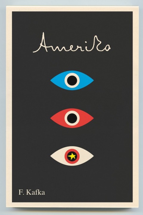
Hand-written lettering of the type we see in Mendelsund’s Kafkas is used to great effect in Lustig’s design for Kafka’s Amerika and is characteristic of several of Rand’s book covers.

As others have noted, the eye motif used by Mendelsund is also similar to Rand’s iconic IBM poster (and his unused logo for the AIGA). But in this instance at least, Rand is clearly not the only influence. His contemporary Rudolph de Harak used the same motif in his cover design for T.E. Lawrence By His Friends published by McGraw-Hill in 1963.

There are echoes too of an exhibition poster by American expatriate designer E. McKnight Kauffer who designed the cover for the Random House edition of James Joyce’s Ulysses published in 1949 (and who was reputedly an influence on Lustig), and a George Salter cover for a Robert Bloch novel, The Scarf, published by The Dial Press in 1947.


The eye motif also recalls Bill Golden’s CBS logo designed in 1951 (repeated in the British Associated Televison ATC logo), which was itself inspired by a Shaker ‘All Seeing Eye’ symbol Golden had seen. And it is perhaps no coincidence that Mendelsund’s design for The Castle (and McKnight Kauffer’s poster) is reminiscent of the masonic Eye of Providence (also known as the “all-seeing eye of God”) familiar from the US one dollar bill.


Of course, not all of these elements and influences are new to Mendelsund’s work (see his designs for The Millennium Trilogy boxed set), and the new covers draw on some of his more familiar inspirations such as Jean Arp, a founding member of the DADA movement (and likely an influence on Lustig), and post-war European design (see Germano Facetti’s design for George Orwell’s 1984 designed in the early 1960’s).


But compare the Kafka covers to Mendelsund’s recent designs for The Snowman by Jo Nesbø or C by Tom McCarthy, and the difference is striking. To look at these macabre designs for Knopf — which seem to owe more to the cut-and-paste of DADA, the punk aesthetic of Barney Bubbles or, perhaps, the anti-design of David Carson’s Ray Gun — is like looking at the work of a wholly different designer.
That Mendelsund is capable of reinterpreting and subverting mid-century modern and making it his own not only demonstrates his creative flexibility, but serves to reminds us that one of his greatest strengths as a designer is his ability to surprise and delight us.


John Gall is Vice President and Art Director for Vintage/Anchor Books, an instructor at the School of Visual Arts, and the author Sayonara Home Run! The Art of the Japanese Baseball Card.
Previously Art Director at Grove/Atlantic, Gall has been interviewed about his work by Step Inside Design, Design Bureau, and Barnes & Noble (video). He garnered even wider attention in 2009 when he commissioned a roster of high-profile designers — including Rodrigo Corral, Carin Goldberg, Chip Kidd, Paul Sahre, Megan Wilson and Duncan Hannah — to redesign twenty-one Vladimir Nabokov book covers within the confines of specimen boxes (read more about the designs at Print Magazine).

I have wanted to interview John for a long time, but as he talked about book design extensively elsewhere and regular readers are more than likely familiar with his work already, I was waiting for the right subject. It was his colleague Peter Mendelsund, who suggested that rather than discuss his book covers, I should ask John about his collages. John Gall makes collages? Yes, indeed he does. And, needless to say, they are very good.
I met John in Toronto in December last year, and we corresponded by email.

When did you first start making collages?
It’s something that I’ve been doing sporadically since forever. And when I say sporadic I mean, years or decades between doing anything.
Do you create them digitally or by hand?
All hand done. One of the reasons I do this is to get away from the computer, drop the design think and work with the hands. Its kind of liberating to not have the ability to resize things on the fly. I sometimes use a digital camera to keep track of the permutations since my brain no longer can.

Can you give me a sense of their size?
8 x 10 on up to 18 x 24
How do you chose your titles?
The titles come from things I may be thinking about, or reading, or songs I may be listening to at the time I am making them. Then I make an anagram. It now takes me a lot of time to decipher the original source and many times I cannot. Strangely, when I posted “Hot Elves,” I got a ton of hits, which made me briefly consider naming everything after comic-nerd fetishes.
Who are your artistic influences and where do you look for inspiration?
I like the same old dead people as everyone else: Kurt Schwitters, Marianne Brandt, Georges Hugnet, Rauschenberg, John Chamberlain (not dead yet!), etc. People working today who make me incredibly jealous: Fred Free, Mark Lazenby, John Stezaker, James Gallagher, Lou Beach and family, Wangechi Mutu, Clara Mata, Robert Pollard, Nicole Natri, Paul Butler, Charles Wilkin and a bunch of people I’ve met on Flickr who’s real names I do not know.
Not sure how influential any of these folks are but they do inspire me to get off my ass and get to work.

Is creating a collage a similar process to designing a cover?
Yes and no. In both cases you are moving things around on a page until they look “right”. For me, when I am doing the collage work I am eliminating the concept (and most of the time the typography) so it is reduced to forms on a page.
Graphic design is a total left brain/right brain thing. A combination of logical carefully considered thinking and intuitive personal expression. For the collage work I try to put the logical aside and exercise the intuitive muscle.

Has making collages informed your designs?
When I am stuck, I sometimes find myself thinking “What can’t I do on a book cover”? Its chance to make the wrong path and see where that leads. Force myself to make the wrong decisions. Trying to leave thoughts of what looks “good” out of the equation. Nearly impossible, but that is the goal. The hope was that these notebooks could fuel design ideas. Not so sure if that is still the case. They’ve become a thing unto their own.
Have you ever used one of your pieces in a cover?
I used them on a poster once. Attempted to use them on a skateboard design. A couple of people have tried to use them on book covers, to no avail.


Was creating a series of collages from recombined book covers cathartic?
Not really. More like, “hmmm…its 12:30 AM, I’ve spent all day working on book covers and now I’m tearing apart old covers to make new covers. Lo-ser”.
That said I’ve since started up this series again and will be posting them shortly. But I can only do these when I am away from work for a spell. Generally its like, “enough with the book covers already, is Food Jammers on yet?”.
Where do you gather your source materials from?
Most of what I work with comes in the daily mail: catalogs, magazines, etc. I intentionally try not to work with anything that is too vintage or too inherently beautiful—though I do break this rule all the time. My thinking is that all the great collage artists of the past used source material that was lying around in the trash or purchased at the local five and dime. Today we look at a Cornell piece or a Schwitters piece and marvel at the incredible printed material they had to work with. They were working with the Foodtown circulars and Bass Pro Shop catalogs of their day except, well, OK, more beautiful.
Do you still collect Japanese baseball cards?
The collecting has tapered of quite a bit since the book was published. I’m much more selective now. but if I see something particularly beautiful up for auction I’ll probably go for it. I’m not a super smart collector though. I tend to buy what I like and not what will be valuable.

Do you collect anything else?
I’m trying not to acquire to much stuff anymore and am getting ready to purge. I collect old snapshots, the occasional flashlight and I’ve recently acquired a hankering for old high school yearbooks. I’ve also been trading and collecting collage work.
Your collages are included in the recently released Graphic: Inside the Sketchbooks of the World’s Great Graphic Designers. How did that come about?
The author Steven Heller, asked me if I had anything that I’d want to contribute. I told him I keep two kinds of notebooks, one that is basically a to do list and idea book. The others are the collage notebooks. They were much more interested in those. By the way, its a beautiful book.

Untitled, James Gall (2008); Untitled, Owen Gall (2008)
You’ve collaborated with your kids on some collages. Can you tell me about ‘Dad’s Drawing Class’?
Kids are the best. The great thing about collage is that anybody can do it, but its hard to do well. Kids are naturals. They have no preconceived notions as to what looks good, just do what they like. So they are free to do whatever they want—that is, until they get old enough to become self conscious..
Dad’s Drawing Class is something I like to do with my kids while we are hanging out on vacation without cellphones and video games. We’ve done collage, some drawing exercises. I even had them drawing typographic forms one morning. My wife is also very creative and influential in this regard. She teaches a nature drawing program for children.

Where can we see your work next?
I had a couple pieces in a group show last year and some of my work will be in a book coming out next spring called “Cutters”. Showing this work is not something that I am actively pursuing. I’m not so convinced of its worthiness. I have a flickr stream, a typepad blog and if you find yourself wandering around in my attic any time soon, you will probably see some work.
Thanks John!
Images:

Artist Patti Smith, author of Just Kids, in conversation with Jonathan Lethem, author of Chronic City, earlier this year:
(via MobyLives)
Comments closed