Skip to content

Category: Miscellany

Midweek Miscellany, November 4th, 2009

Fluid — John Gall discusses his brilliant cover design for the Vintage edition of Tom McCarthy’s Remainder, which is still one of my favourite novels of the last few years.

Hamilton Wood Type Catalog No.14 (1899-1900) at Unicorn Graphics’ Wood Type Museum. I quietly obsessed with slab-serifs right now so this is like crack (via Draplin Design Co.).

And The Beat Goes On — Sarah Weinman (much missed at GalleyCat) is writing about publishing for AOL’s money and finance news blog DailyFinance.

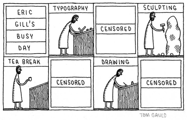
Gigantic Robot — Awesome cartoonist and illustrator Tom Gauld has a new website (to accompany his excellent Flickr photostream).

BOOM! — PW talks to Mark Waid, Editor-In-Chief of independent comics publisher BOOM! Studios:

We’re great at getting a focused message out. Because we don’t publish eighty comics a month, our inestimable marketing department does a great job of making every title important in the marketplace and every launch an event. We’re also better than the big guys at taking risks because we don’t have stockholders to answer to, or lenders who would call us crazy… We’re very much a writer-driven, idea-driven company. We start with the story first (with a talented writer) and focus on getting that right.

30 Conversations on Design — Designers, including luminaries such as Massimo Vignelli, Erik Spiekermann, Ellen Lupton and Paula Scher, answer two questions: “What single example of design inspires you most?” and “What problem should design solve next?”

Unheimlich — Sam Leith argues for scary kids books in The Guardian (confession: I’m mostly linking to this story so I could type “unheimlich” which — rather disappointingly — means “unhomely” rather than “the act of undoing the heimlich manoeuver”).

And finally…

Dutch Picture Books 1810 – 1950 at BibliOdyssey (above: ‘De Gouden Haan’ by Marietje Witteveen, 1940).

‘De Gouden Haan’ by Marietje Witteveen, 1940
Comments closed

Monday Miscellany, November 2nd, 2009

Unpublished concept jacket designs by London-based print designer Allan Sommerville for the Penguin’s Bill Bryson books (via Cosas Visuales).

Fonts — This is AWESOME: Wisconsin Public Radio’s To The Best of Our Knowledge talk fonts with Jonathan Hoefler and Tobias Frere-Jones, designers of Gotham, Matthew Carter, designer of Verdana, author Nicholson Baker, Tracy Honn, director of the Silver Buckle Press, and Kitty Burns Florey, author of Script and Scribble: The Rise and Fall of Handwriting. Listen NOW.

Many Happy Returns — Author, academic and newspaper columnist John Sutherland (The Boy Who Loved Books) on 30 years of The London Review of Books for The Financial Times:

The LRB front cover logo was “THE LONDON REVIEW of Books” – the last two words being smaller. As the typography signalled, it was the review that mattered as much as the book under review. Articles in the LRB were, and are, long: anything between 2,000 and 5,000 words. On special occasions they can run into the tens of thousands. Rates of pay seemed to me startlingly high: three or four times, in the early years at least, what the TLS paid. Miller personally appeared austerely indifferent to money. I suspect he worked for little or nothing. Nor did rises or falls in circulation appear to trouble him overmuch. Quality was all.

(There’s also a rather lovely addendum about the LRB’s personal columns, so read to the end!).

Somewhere Towards The End — A wonderful essay on editor and author Diana Athill by Ian Jack,former editor of Granta, in The Guardian:

[W]hat held me about the writing was its candour. The quality has since become an Athill trademark, though in itself candour is no guarantee of literary pleasure or interest: frank books aren’t always good books and can often be tedious by boasting of their frankness. Athill’s way of being candid is more subtle and its effect more persuasive… Part of this comes from her considerable gift as a maker of sentences, which are so lucid and direct; some of it is owed to the breaking of taboos that then surrounded female sexual behaviour; most of it, though, stems from her triumphant struggle to “get it right”, a lesson she learned from two of the writers she edited. Rhys told her that the trick of good writing was “to get it as it was, as it really was”. Naipaul said that “provided you really get it right, the reader will understand”.

The Internationalist — An all too short interview with Penguin Canada’s David Davidar, who was recently appointed CEO of Penguin’s new division Penguin International, in the Globe and Mail.

And finally… I do love Tom Gauld:

eric gills busy day

(More on Eric Gill)

Comments closed

Something for the Halloween Weekend, 2009

Dawn of the Dreadfuls — not normally my kind of book cover, but hey it’s Hallowe’en and I think Quirk Books knocked this out of the park (full disclosure: Quirk are distributed by Raincoast Books in Canada).

And continuing the spooky theme…

Hallorave — Fantagraphics have been posting previews of the first volume of Mezzo and Pirus’ “extraordinary suburban horror trilogy”, King of the Flies, on their blog all this week. Pages 1, 2, 3, 4, 5, 6. It looks intense:

Devices and Contraptions Extraordinaire — “The world’s first exhibition of steampunk art” at the  Museum of the History of Science in Oxford, England. There is a blog accompanying the exhibition by curator Art Donovan (via ReadySteadyBlog).

Dark Star — Michael Dirda’s review of The Complete Short Stories of J.G. Ballard, published by W.W. Norton, in the Washington Post:

In “The Complete Short Stories of J.G. Ballard” devastated worlds are matched with even more devastated psyches. But these aren’t simply “myths of the near future,” they are probes sent down into the desolate heart of the here and now. As Ballard knew, reality has become just a subgenre of science fiction.

And finally…just for Hallowe’en, here’s a great vintage cover for Bram Stoker’s Dracula seen at the Golden Age Comic Stories blog (via the awesome, but not entirely safe for work, This Isn’t Happiness):

Normal, non-spooky, service will resume next week…

Comments closed

Midweek Miscellany, October 28th, 2009

(The always awesome) FaceOut Books talks to Argentinian designer Juan Pablo Cambariere.

In the interview Juan Pablo mentions Alejandro Ros, “probably the greatest contemporary Argentinean designer”.

Alejandro Ros’ website — like his book design — is lovely, but it’s all Flash so you’re just going have to take a look for yourself

The Creative Review‘s second extract from Penguin by Illustrators is the text of the presentation made by artist, engraver, illustrator and designer David Gentleman.

The first extract (mentioned here) was the text of a presentation given by Romek Marber.

It’s in the Retelling — Booker winner Hilary Mantel, author of Wolf Hall, on historical fiction in The Guardian:

A novelist doesn’t sit at the keyboard sucking her thumb, thinking “what next?” A novel arrives whether you want it or not. After months or years of silent travel by night, it squats like an illegal immigrant at Calais, glowering and plotting, thinking of a thousand ways to gain a foothold. It’s useless to try to keep it out. It’s smarter than you are. It’s upon you before you’ve seen its face, and has set up in business and bought a house.

And finally…

Some lovely identity design for the McNally Jackson in NYC by Christine Celic Strohl and Eric Janssen Strohl (via DesignWorkLife). Interesting enough Eric Janssen Strohl also designs books and beautiful colophons (and again, Eric’s site is Flash and so you’re going to have take look yourself)…

Comments closed

Monday Miscellany, October 26th, 2009

The brilliant Helen Yentus has redesigned the covers of Chinua Achebe’s books for Anchor with illustrations and hand lettering by Edel Rodriguez who has some amazing sketches of her work on the series at her portfolio site.  (Covers first seen at wonderful Caustic Cover Critic blog, with additional details and links from estimable John Gall.)

Pixellated Penguin — Anna Rafferty, Managing Director of Penguin Digital (UK), profiled in The Marketer Magazine:

Although volume sales of books has dropped 9.2 per cent this year… and the onset of digital publishing means a reassessment of how content is provided, Rafferty says the recession has not affected the way she markets Penguin. “We’ve always been against paying for things. We are a content company with access to the words and opinions of the funniest, most intelligent and entertaining authors in the world.”

Difficult Women — Mary-Kay Wilmers, editor of the London Review of Books (which celebrates it’s 30th anniversary this year), profiled by Nicholas Wroe for The Guardian.

Anti-Ironic — Product designer Joey Roth (designer of the beautiful Sorapot teapot) interviewed at Boing Boing:

I see designers and companies whose work represents a disposable, ironic, trend-driven view of product design as my ideological enemies. Irony was the dominant approach a few years ago, and it’s still popular. I think it has no place in design, since physical resources are consumed when something is mass-produced, and a joke is only witty for so long. My desire to design objects that represent a more thoughtful, sustainable view grew partially from the ironic, anti-design trend I encountered as I was getting into design.

I sort of feel the same way about books…

All Cover Archive — Ben Pieratt has posted some of his early design’s for the Book Cover Archive logo at his new General Projects Blog.

Ben also had a nice post about books and logos at the BCA blog last week…

And speaking of the BCA blog, Ben recently posted about James Le Beau-Morley‘s cover design and layout concepts for 1984:

3 Comments

Something for the Weekend, October 23rd, 2009

Illustrator Jay Ryan has a new book, Animals and Objects In and Out of Water (published by Akashic Books), coming in December. Literary types might remember Jay’s cover and illustrations for Michael Chabon’s novella The Final Solution.

Jay is also touring the US in November and December with Paul Hornschemeier whose new book All and Sundry (published by Fantagraphics) is now available (via Jacob Covey).

(Un)selling — Independent sales rep John Mesjak on building trust with bookstores and readers in the Huffington Post:

I’m able to act as a guide for my bookstore buyers because they trust me. That trust comes both from recommending great books that have ended up being staff favorites and, maybe more importantly, sometimes telling a buyer, “You don’t need this book.”…Good booksellers earn trust with their own customers the same way — by providing honest suggestions and reliable advice… Booksellers shouldn’t be afraid to say, ‘I didn’t like the book.’

Small Acts of Defiance — Novelist Jonathan Lethem, interviewed in Time about his new book Chronic City, on owning a small used-book store in Maine (via Shelf Awareness):

I don’t really own the building. I guess I sort of own the books until someone comes along and buys them. I’m like the junior partner in a very funky clubhouse of a used-book store. It’s something that makes me very happy… it never crossed my mind that it was an expression of defiance. If it’s taken as that, that’s great. I did it for the pleasure. It didn’t have to do anything with my career or the Internet or the publishing world. It was just to be handling the books. I worked in used-book stores for 15 years on and off. That was the only work I ever had before becoming a full-time writer. I have a lot of osmotic book knowledge just from handling books I didn’t ever read. Turning them over in my hands, trying to figure out where they came from and why they exist and whether they should be priced at $4 or $6.

Plus ça change — Literary agent and prolific blogger Nathan Bransford summarizes (with the requisite amount hyperbole) a week that saw another wave of e-readers and an ugly price war in the US:

This was, quite simply, a massively huge week in the publishing industry. All of the various pressures on the industry seemingly came to a head: the steady rise of e-books, downward pressure on book prices… the rising clout of e-tailers, an increasingly difficult landscape for independent bookstores, and the industry’s creeping dependence on a small handful of mega-bestselling authors.

AND speaking of the pricing wars, the American Booksellers Association has asked the  Department of Justice to investigate the practices of Amazon.com, Wal-Mart, and Target.

And finally…

Co-existence — Steven Fry on on why books and the web go together in an interesting piece for the BBC earlier this year:

Very often people oddly put books against the internet… You don’t throw away your books when you buy a computer. You keep both. The beauty of living in the present day is you don’t abandon the past. The past co-exists.

ABA Asks Department of Justice to Investigate Bestseller Price Wars
3 Comments

Midweek Miscellany, October 21st, 2009

The lovely folks at Book City Jackets (mentioned previously here) have just released Artist Edition No.2 featuring original work by Nishat Akhtar, Cheeming Boey and Michael C. Hsiung.

“Can’t We All Just Get Along?” — Steve Ross, Former President at HarperCollins and Sr. VP at Random House, on publishing, e-books, and pricing at the Huffington Post:

Permeating… the conversation… is the sense that publishers are resistant to e-books for some reason. But publishers want e-books to succeed because they have the potential not only to expand readerships but leapfrog us over the historically insuperable and tenacious cancer at the heart of the business model; returnable books.

The New Old Thing — Jane Friedman, former president and chief executive of HarperCollins Publishers Worldwide, has launched Open Road which will focus on publishing e-book editions of backlist titles by well-known authors. Does this sound a lot like the original Penguin model for paperbacks to anyone else? There are more details at PW

Stet — editor and author Diana Athill is interviewed by Vit Wagner in today’s Toronto Star. Granta recently released Life Class, which collects Athill’s memoirs Yesterday Morning, Instead of a Letter, Stet, and Somewhere Towards the End in a single volume. Athill is appearing with Alice Munro at IFOA this evening.

Vit also interviewed the fascinating Antony Beevor, author of the Stalingrad and Berlin: The Downfall 1945, earlier this week.

Designer and design blogger David Airey has launched a graphic design bookstore on Amazon with his book recommendations.

And finally…

I came across this lovely looking new book on the Bauhaus while browsing  D.A.P.‘s Fall 09 catalogue. The book accompanies the exhibition Bauhaus 1919-1933: Workshops for Modernity at MoMA in New York, November 8, 2009 — January 25, 2010.

The Museum of Modern Art, New York
2 Comments

Missed Things: Friday

Floating — Toronto illustrator Michael Cho on his cover art and interior illustrations for The Amazing Absorbing Boy by Rabindranath Maharaj (published by Random House Canada).

The Ideal Studio Library — It’s Nice That interviews designer Jason Godfrey about his beautiful new book Bibiographic: 100 Classic Graphic Design Books, published by Laurence King,  (and yes, full disclosure, LK are distributed in Canada by my employer Raincoast Books):

My aim was to create the ideal studio library of graphic design books and put this into a book format. I had always felt that there was a need for a visual reference to that could give flesh to many reading lists that have been published… The really tricky choices were the more recent books as it is difficult to know whether they will become classic points of reference, time will tell if I made the right choices on these books.

Bezette Stad —  A book of poems by Paul van Ostaijen, illustrated with woodcuts by Oskar Jespers, available in full at the University of Iowa Libraries’ astonishing International Dada Archive (via the lovely Aqua-Velvet).

And finally…

ENOUGH! — The hilariously on the money Editorial Anonymous:

I REALLY NEED A FRICKING BREAK FROM THE “FUTURE OF PUBLISHING” TALK… I don’t need to read any more of these articles, and neither do you.

A quick overview:

1. Publishing is a somewhat crappy business. Which makes it PRETTY MUCH LIKE EVERY OTHER BUSINESS.
2. Publishing has a future. NO ONE KNOWS WHAT IT WILL BE.

So everyone can stop
a. COMPLAINING
and
b. COMPLAINING.

Thank you.

No, no, Thank YOU.

3 Comments

Missed Things: Thursday

Covers for The Invincible Iron Man No. 20 and 21 by Salvador Larroca and Frank D’Armata, with design by Rian Hughes (seen at the website of the author Matt Fraction). Is it just me, or do these have a whiff of Marber’s Penguin Crime series about them? Or is it more like Olly Moss?

Grey Overcoat Music —  3:AM Magazine‘s Lee Rourke talks to photographer Kevin Cummins about his new book Manchester: Looking for the Light through the Pouring Rain (published by Faber & Faber), which documents 30 years of the Manchester’s music scene. 

The Guardian also has a slide show of  photographs by Cummins (above: Ian Curtis, 1979).

And if you’re interested in Factory Records and the Manchester music scene you might also be interested in The Haçienda: How Not to Run a Club by New Order bassist Peter Hook (published by Simon & Schuster) also reviewed in The Guardian.

The Lost Pleasure of Browsing — Charles Rosen for the New York Review Blog:

I realize that mail order shopping has been going on for a long time, but have always thought that this destroys one of the pleasures of civilized life. I do not understand how one can buy clothes without trying them on, and as for books, the individual book should seduce and inspire you to buy it.

Spelling “Theatre” the British Way — Andy Ross talks to New Yorker page OK’er Mary Norris about copy editing “America’s most prestigious literary magazine” at The Red Room:

The main thing here is to respect the writer. The writers don’t have to do everything we want them to—we make suggestions. The ideal would be to give an editor a proof and have all your suggestions meet with approval. Sometimes you notice that your suggestions have not been taken, so if something bothers you, you try again. Sometimes you wear them down, sometimes you cave.

I have been on both sides of the process, as a writer and as a query proofreader. Being edited sometimes felt like having my bones reset on a torture rack. I don’t ever want to do that to a writer, but I probably have from time to time.

And bless The New Yorker for using double consonants before suffixes — “traveled” is barbaric.

And finally…

Illusive: Contemporary Illustration Part 3 published by Gestalten looks rather fine.

http://blogs.nybooks.com/post/212201723/the-lost-pleasure-of-browsing
Comments closed

Missed Things: Wednesday

Henry Sene Yee, Creative Director of Picador, discusses the elegantly understated cover design for Time by Eva Hoffman, the latest addition to Picador’s BIG IDEAS // small books series.

And I’ve mentioned this before but it bears repeating: Picador are putting their catalogues — and, therefore, their outstanding cover designs — on their Facebook page.

Logicomix by Apostolos Doxiadis and Christos H. Papadimitriou reviewed in The New York TimesThe Guardian, and FT. It sounds kind of awesome. The book also has a nice website with lots of content.

The Inevitable Frontier — Jennifer de Guzman, editor-in-chief at the independent comics publisher SLG Publishing, on digital comics in PW:

Right now, sales from digital comics aren’t going to mean we can pack up print publishing. Not even close. But despite being in the midst of it rather than a wide-eyed observer, I can see that in the near future digital comics are going to be playing a bigger role for all publishers than they do now. And it’s better to be so integrated in the change that you don’t notice that it’s happening than to find yourself left behind and marveling at “the things they can do now.”

“Issues” — A less than warm reception for the Kindle in Australia:

Jeremy Fisher, executive director of the Australian Society of Authors, said he was advising his 3000 members to resist publishing through the Kindle.

“As I understand at this point in time, Amazon asks for a very, very big discount from publishers for their works to be included in Kindle so that the return coming back to the publisher is smaller and the return coming back to the author is smaller,” he said.

“The person making the most money is Amazon.”

Hmm… Yes, well, moving swiftly on…

Jacket Whys — A really nice blog about children’s and YA book covers.

And on the subject of kids books…

Who The Wild Things Are –Artist Roger White looks at the inspiration Maurice Sendak’s Wild Things for the Boston Globe:

The Wild Things looked like nothing ever seen in a children’s book. Rendered in simple ink-hatch over watercolor sketches, they evoked a perfect mixture of proto-adult dread and anarchic, childlike glee – an eternal, platonic form of the kindly monster. From the moment they appeared in 1964, they seemed bracingly and completely original. But in fact Sendak’s monsters had a long series of ancestors and descendants…

But according to Bruce Handy, deputy editor at Vanity Fair, (and his children) kids don’t actually like Where the Wild Things Are… Umm… What?

Comments closed

Missed Things: Tuesday

Thesis Project — Mikey Burton’s illustrative reinterpretations of classic book covers for junior-high-school students. Mikey’s more recent work, including gig posters for Wilco, is also awesome.

The Writer’s Reader — Michael Silverblatt, the endlessly enthusiastic host of KCRW radioshow Bookworm, profiled in O, The Oprah Magazine (via TEV).

We Are The Friction seen at The BCA, Design Work LifeSwissMiss and others. Sing Statistics, the “collaborative concern” of designer Jez Burrows and illustrator Lizzy Stewart, and publisher of We Are The Friction, also has a great Flickr photostream (and there are images of the book launch at Edinburgh’s Analogue Books on the shop’s Flickr photostream).

It Isn’t Rocket Science — Makenna Goodman, formerly an assistant to an unpleasant sounding literary agent in New York, talks about her move to rural Vermont and happier times with publisher Chelsea Green in the Huffington Post.

Intelligent Eclecticism — Steven Heller on the groundbreaking illustrated covers used for Time‘s “soft-cover book club” throughout the 1960’s:

Eclecticism was a viable and intelligent decision. While consistent design for a series of related books makes good strategic sense, these books were bound together by the editors’ judgment. Designing them as separate entities — avoiding the impression of formulaic repetition — made the most sense for the book club but also for the artists and designers who created them. Each cover (indeed each book) had a unique integrity that raised the standard of the genre while showcasing the creators’ artistic strengths.

And finally…

On the subject of vintage book design and great illustrations, be sure to take a look at Martin Klasch blogger P-E Fronning’s set of Swedish book covers on Flickr.

Comments closed

Missed Things: Monday

I was talking about Romek Marber right before I left the building, so it seems appropriate to get things started with him too…

In an extract from a new book called Penguin by Illustrators, the Creative Review reprints the full text of the presentation made by Marber to the Penguin Collectors Society in 2007:

Much has been made of the grid; it has even been labelled ‘the Marber grid’. I believe that the pictures for the initial twenty covers, played an important part in forging the identity of the Crime series. The grid was important as the rational element of control. The consistency of the pictures contributed, as much as the grid, to the unity of the covers, and the dark shadowy photography gave the covers a feel of crime.

And on a related note, idsgn profiles Gill Sans, the ‘Helvetica of England’ which was used by Edward Young on the early Penguin paperbacks (Marber switched to Akzidenz Grotesk if memory serves…).

Coaxing — Ron Charles, Deputy Editor of the Washington Post’s Book World, interviewed in Bookslut:

The number of books keeps rising, as far as I can tell. The number of readers is stable or stagnant or even declining. When you look at the amount of space we spend covering television… I’m not criticizing my own paper, I’m criticizing my own industry. Who needs help watching TV? Reviews of television shows, I shake my head; I can figure out if I want to watch The Office or Curb Your Enthusiasm all by myself. But help me find a good novel, in this enormous stack of books at the book store. That’s a real service.

You can also follow (the surprisingly candid) Ron Charles on Twitter.

Meanwhile, Publishing Trends looks at Book Reviews, Revamped.

Correspondence — Eric Hanson, author of A Book of Ages, commemorates the 60th anniversary of the letter that inspired the lovely 84, Charing Cross Road (via The Second Pass).

If any of you haven’t read 84 Charing Cross Road, please go do so now…

The Billy bookcase turns 30 — Lucy Mangan celebrates in The Guardian.

And lastly…

I’ve linked here before on several occasions, but I just wanted to mention the all around awesomeness that is A Journey Round My Skull. Recent posts include BLICKFANG — The Eye-Catching Covers of Weimar Berlin and Thirty More Book Covers From Poland.

1 Comment