Skip to content

Category: Books

Something for the Weekend

Blown Covers — The New Yorker art editor Françoise Mouly has a Tumblr (pictured above:  “Eustace at a Stoplight—Right?,” by David Urban)

Spanking — Charles McGrath remembers the late Barney Rosset in the New York Times:

Mr. Rosset was far from a highbrow. Sometimes he signed up books without having read them. He determined to publish “The Autobiography of Malcolm X,” for example, while riding in a cab and hearing on the radio that other publishers had turned it down. And he was proud of publishing a profitable line of Victorian spanking pornography. To a considerable extent the dirty books made the arty ones possible, and Mr. Rosset wasn’t the least abashed about it.

See also: WNYC has reposted two archive interviews with Rosset from 1995 and 2008, and John Gall has posted a collection of links to reminiscences about Rosset on his blog Spine Out.

Form and Fortune — A fascinating  review  of  Walter Isaacson’s biography of Steve Jobs by Evgeny Morozov, author of The Net Delusion, in The New Republic which discusses Apple’s relation to the Bauhaus and Braun:

The design philosophy of Dieter Rams, Braun’s legendary designer, has shaped the feel and the look of Apple’s latest products more than any other body of ideas. Since joining Braun in 1955, Rams—who likes to describe his approach to design as “less, but better”—began collaborating with the faculty at the Ulm School of Design, which tried to revive the creative spirit of Bauhaus with a modicum of cybernetics and systems theory. Eventually Rams produced his own manifesto for what good design should accomplish. His “ten principles of good design” encouraged budding designers to embrace innovation and make products that were useful but environmentally friendly, thorough but simple, easy to understand but long-lasting, honest but unobtrusive. Rams wanted his products to be like English butlers: always available, but invisible and discreet.

See also:  Maureen Tkacik’s on Steve Jobs and Isaacson’s biography at Reuters.

And lastly…

James Wood reviews Edward St. Aubyn’s Patrick Melrose novels for The New Yorker:

Patrick Melrose, the protagonist of what is now a quintet of novels devoted to the Melrose family, is the scion of a wealthy dynasty almost as monstrous as the dodgier Roman emperors; he has spent much of his adult life trying to kill himself with drugs and booze. St. Aubyn’s novels have an aristocratic atmosphere of tart horror, the hideousness of the material contained by a powerfully aphoristic, lucid prose style. In good and bad ways, his fiction offers a kind of deadly gossip, and feeds the reader’s curiosity like one of the mortal morsels offered up by Tacitus or Plutarch in their chatty histories.

Comments closed

Basquiat, Bowie, and British Tailoring

Michael Salu, artistic director of Granta, talks to Crane TV about his work, influences and personal style:

Comments closed

E-Books Can’t Burn

Author Tim Parks has an interesting post on the virtues of e-books on the NYRB blog:

The e-book, by eliminating all variations in the appearance and weight of the material object we hold in our hand and by discouraging anything but our focus on where we are in the sequence of words (the page once read disappears, the page to come has yet to appear) would seem to bring us closer than the paper book to the essence of the literary experience. Certainly it offers a more austere, direct engagement with the words appearing before us and disappearing behind us than the traditional paper book offers, giving no fetishistic gratification as we cover our walls with famous names. It is as if one had been freed from everything extraneous and distracting surrounding the text to focus on the pleasure of the words themselves…Add to that the e-book’s ease of transport, its international vocation (could the Iron Curtain have kept out e-books?), its indestructibility (you can’t burn e-books), its promise that all books will be able to remain forever in print and what is more available at reasonable prices, and it becomes harder and harder to see why the literati are not giving the phenomenon a more generous welcome.

It is encouraging to see a writer at the venerable NYRB enthusing about e-books, but two things immediately spring to mind. First, that reading on the screen might present more, not fewer, distractions than reading an unconnected book. And, second, the idea that e-books — which can not only be monitored but endlessly rewritten and immediately deleted across an entire network without a reader’s permission — are some how less vulnerable than paper-ones seems, to put it politely, naive.

2 Comments

Truman Capote Designs by Megan Wilson

Megan Wilson has designed a striking new set of covers for the Vintage paperback editions of Truman Capote with some lovely bold type and photographs by Leombruno-Bodi, William Eggleston, Richard Rutledge and Olivia Parker.


Photo credits:
Music for Chameleons / Leombruno-Bodi
In Cold Blood / William Eggleston
Answered Prayers / Richard Richard Rutledge
Other Voices, Other Rooms / Olivia Parker

2 Comments

Paris Versus New York

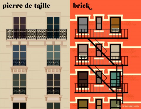
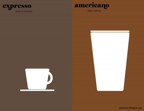
Vahram Muratyan’s playful illustrations comparing Paris and New York are now available in a beautiful new pocket-sized hardcover from Penguin.

Prints are available to buy from the Paris versus New York blog.

Comments closed

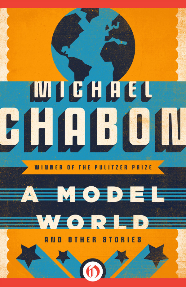
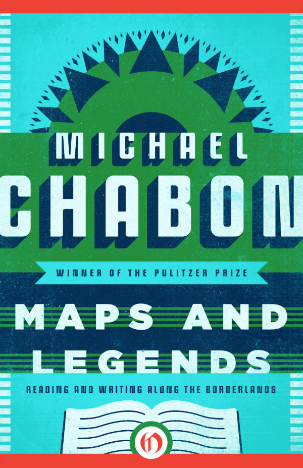
Chabon by Connie Gabbert

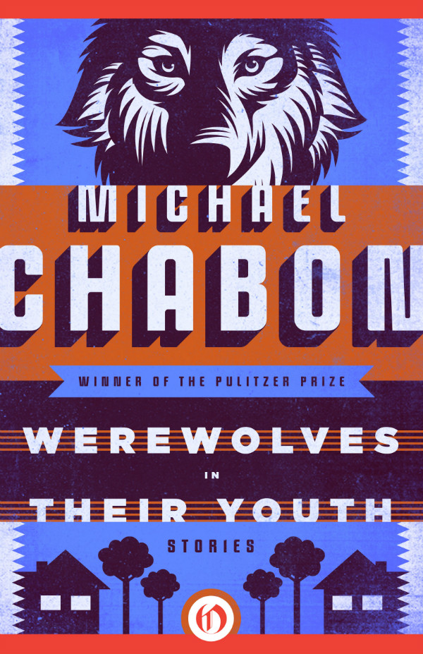
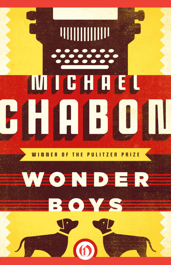
These stunning Michael Chabon covers are the work of Oregon-based designer Connie Gabbert. Although evocative in some way of faded ink, old-time letterpress, silkscreened posters and linocuts illustrations, interestingly these designs will never see actually see print themselves.

Connie knew from the start that they would be e-books and would not go to press, but apparently the design process was not that different, at least not to begin with. “It’s when the covers are approved that the process feels different,” she says. “There is no spine to build, no back cover copy, no print files to prepare. It is a bit sad to know that I won’t see the finals printed, but it’s also interesting to be a part of the e-book industry and to see the packaging exist only online.”

According to Connie, the challenge was actually making the approved cover direction work for the other four titles in the series. “The first approved cover was for Wonder Boys, and from there, I had to come up with new color palettes and new imagery for the rest of the series,” she says. “The goal was to make them look unified but individually unique. I really liked how Richard Bravery achieved this with his Chabon series, keeping the type in a fixed location, while the imagery changed from cover to cover… [T]he first stab at these covers was hand-lettered. While I love working illustrated type into cover designs, the final type feels very fitting for Chabon and the covers that he already has. I’m not often asked to create masculine covers, so it was a fun change of pace.”

You can read more about Connie’s type choices for these covers at Fonts in Use, and see more of her work on her website and design:related.

Comments closed

The Joy of Books

After organizing their bookcase at home, Sean Ohlenkamp and his wife Lisa Blonder Ohlenkamp have now done a beautiful job of ‘organizing’ the shelves of Toronto independent bookstore Type Books on Queen Street West:

Lovely.

Comments closed

Jeet Heer on Tintin

Canadian cultural critic Jeet Heer had a great piece on Tintin in Saturday’s  Globe and Mail:

Hergé belongs to the noble line of boys’ books and thrillers that includes Robert Louis Stevenson’s Treasure Island, John Buchan’s The 39 Steps, Rudyard Kipling’s Kim and Anthony Hope’s The Prisoner of Zenda… This is largely a literary tradition, but Hergé brought to it his special skill set as a visual artist. More than any other cartoonist of his era, he was attuned to the modernist revolution in the arts. Once he was wealthy, he became a discriminating collector, buying works from Joan Miró, Serge Poliakoff and other painters. Trained to see by the great modernists, Hergé applied to his cartooning an aesthetic of purification: He struggled to distill each image to the bare minimum of lines needed to convey physical information.

Comments closed

Favourite Covers of 2011

After posting my long overdue picks for 2010 last week, here are my selections for my favourite book covers of 2011.

I’m currently reading Where The Stress Falls a collection of writing by Susan Sontag published in 2001. In an essay about art she quotes Paul Valéry on the painter Corot. “One must always apologize for talking about painting” he says. I know just what he means. I feel the same way about book design. Perhaps even more than a painting, what you see is what you get with a book jacket. If you have to explain why it works, it probably doesn’t. Or you’re talking to the wrong crowd. But there’s something else too. I also feel like I need to apologize for not knowing more; for producing reductive lists like this one; for being, well, so presumptuous…

The 2011 list has changed a few times in the last few days and would likely be different again if you asked me tomorrow — not for lack of quality you understand, but simply because narrowing the list down to a manageable number and deciding which should be in the final ‘top 10’ was just plain hard. This isn’t a definitive survey of book covers in 2011 by any means (sorry!) it’s simply a list of the book jackets that caught my eye this year — designs I thought that were beautiful, a bit different, audacious, a bit out of the ordinary, a bit worthwhile…  I’m grateful to all the designers who created these covers, who gave me suggestions and helped me source the images. Once again, I’ve been struck by their generosity. Nevertheless I have surely I’ve missed some great covers. Tell me what they are in the comments.

10 Comments

Design Matters with Peter Mendelsund

Peter Mendelsund — senior book designer at Knopf, art director for Vertical Press and all-round superstar — talks to Debbie Millman on Design Matters:

DESIGN MATTERS: Peter Mendelsund mp3

I interviewed Peter last year about his book cover design for the Knopf edition of Tom McCarthy’s novel C, and you can read a short essay I wrote about his cover for the Schocken editions of Kafka here.

1 Comment

My Favourite Covers of 2010

At the end of last year, Joseph Sullivan, curator of the late lamented The Book Design Review, asked me to write about my favourite covers of 2010. I’d always stayed away from such posts in the past because it was Joseph’s thing (his 2009 list is here). But since it was Joe who was doing the asking and The BDR was on “indefinite hiatus,” how could I not?

For various reasons, the list I compiled didn’t get used in the end, and it has sat in my drafts folder for about year now. I now have a list of my favourite covers of 2011, but before I post it I thought I would share that original list from 2010, if only for a bit of context.

I’ve made a few minor alterations to the list I sent to Joe — mostly to better accommodate the series designs and to fully utilise 12 months of regret and hindsight — but it is more or less intact, in spirit at least.

I’ve included the short introduction I wrote for the original piece to explain my process (or lack thereof…).

(Hindsight = 20/20: Apparently I like negative space. A LOT).

The Top 10 Book Covers of 2010

Selecting an annual top 10 of anything — film, music, books — is fraught with difficulty. Not only do you have to sift through all things you have seen, heard, and read over the course of a year (assuming you can remember them all), you must somehow take into account all the things you meant to get to and didn’t (where does one even start?). Worse, you are haunted by the awful, inevitable realization that there were any number of incredible things so outside your usual cultural range that they didn’t even register on your consciousness — the “unknown unknowns,” to borrow Donald Rumsfeld’s immortal phrase. Fate usually decides that you will discover at least one previously unknown work of brilliance exactly 24-hours after you publicly declare your favourites…

Then, having grappled with (ignored) all those thorny issues (and plunged on regardless), there is further problem of what actually constitutes good (let alone “great”) book cover design. Part science, part art (part pleasing interested parties), good book cover design is slippery and alchemical. How does one judge? Using what criteria? Ask 10 designers and you will surely get 10 differently nuanced answers.

I have not read all the books on this list, so I cannot claim authority on appropriateness of every cover to its subject (surely an significant consideration, and yet who would want to limit their list only to the books they had read?), so my criteria, such as they were, included the quality of the overall design — the composition, image selection and typography — as well as originality, swagger and the indefinable  je ne sais quoi essential in my opinion to really great covers.

And with that complete abdication from any claim to comprehensiveness or authority, I introduce my picks for the top 10 book covers of the last year with apologies to all the designers — particularly outside of North America and the UK — whose amazing work I have missed, forgotten, or otherwise neglected.

The covers are presented in alphabetically by title.

3 Comments

Raincoast Spring Books

I was out west for the Raincoast Books spring 2012 sales conference last week. Sadly I didn’t get to see much of Vancouver or catch up with half the people I meant to, but I did get to hear about a lot of great new books including one about building (and losing) an android Philip K. Dick. It’s non-fiction. Thanks Henry Holt!

Henry Holt also have a new novel by Herta Mueller, winner of the Nobel Prize in 2009, called The Hunger Angel, and the latest from John Banville’s alter-ego Benjamin Black, Vengeance.

Picador are publishing a collected edition of Edward St. Aubyn’s Patrick Melrose trilogy in January — the first time they’ve all been properly available in the US I believe — to coincide with the US edition of his new book At Last (Farrar, Strauss & Giroux). They also have a collection of essays by Siri Hustvedt, Living, Thinking, Looking.

While there was nothing on the list quite of the magnitude of this season’s long-awaited Saul Bass: A Life in Film and Design, there are a few art and design titles that caught my eye. Princeton Architectural Press are publishing Woodcut, a book of beautiful prints by artist Bryan Nash Gill (you have surely have seen his work even if you don’t recognise the name immediately) and Up on the Roof, a collection of photographs by Alex MacLean of New York’s hidden rooftop spaces. They are also publishing a long overdue paperback edition of Michael Bierut’s Seventy-Nine Short Essays on Design, and a paperback edition of the beautiful, if overlooked, Typography Sketchbooks by Steven Heller and Lita Talarico. Lawrence King are publishing a new book on the history of picture books, Children’s Picturebooks: The Art of Visual Storytelling by Martin Salisbury and Morag Styles,  and a new edition of The End of Print by David Carson.

On the comics side, Drawn & Quarterly are publishing Jerusalem: Chronicle from the Holy City, the latest travelogue from Guy Delisle who previous books include The Burma Chronicles, Pyongyang and Shenzhen. D+Q are also publishing a new edition of Chester Brown’s controversial, scatological and long out-of-print comic Ed The Happy Clown.

I’m also looking forward to finally seeing more of Baby’s in Black: Astrid Kirchherr, Stuart Sutcliffe, and The Beatles in Hamburg by Arne Bellstorf which is being published by First Second in April (I just wish they’d gone in a different direction with the typography on the cover — the German and UK edition’s  have lovely swooping hand-drawn lettering).

And lastly — because I am big nerd and recently finished his earlier book Batman Unmasked — I’m excited about Will Brooker’s Hunting the Dark Knight: Twenty-First Century Batmanwhich is being published by I. B. Tauris in July.

Now, back to the Toronto grindstone…

Comments closed