
Another beautiful Truman Capote cover by Megan Wilson (photograph by Louise Rosskam).
Have a great long weekend.
2 Comments
Books, Design and Culture
Another beautiful Truman Capote cover by Megan Wilson (photograph by Louise Rosskam).
Have a great long weekend.
2 Comments
Designer David Pearson recently gave a lecture at the Walker Arts Center as part of the Insights 2012 Design Lecture Series:
My interview with David is here.
(via Ace Jet 170)
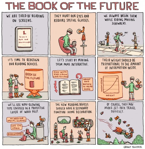
Comments closedLava lamps, egg chairs, and “and outfits that would look great in a B-52s music video”… Grant Snider’s vision of the book of the future for The New York Times Sunday Book Review!
Comments closed
A short film created for the Daily Telegraph by Glen Milner, Birth of the Book captures a book being made using traditional printing methods. Shot at Smith-Settle Printers in Yeadon, Yorkshire, the book being printed is Mango and Mimosa by Suzanne St Albans published by Slightly Foxed Editions.
1 Comment
In a fascinating conversation, Eleanor Wachtel talks to Edward St. Aubyn about his Patrick Melrose novels on CBC Radio’s Writers and Company:
CBC Radio Writers & Company: Edward St. Aubyn mp3
KCRW’s Bookworm also recently broadcast a two-part interview with St. Aubyn about the books.
Part One:
KCRW Bookworm: Edward St. Aubyn Part One mp3
Part Two:
KCRW Bookworm: Edward St. Aubyn Part Two mp3
Full disclosure: The collected edition of the first four Patrick Melrose novels has just been published in the US by Picador Books who are distributed in Canada by my employer Raincoast Books. At Last, the latest Patrick Melrose novel is published separately by Farrah, Strauss & Giroux who are distributed in Canada by Douglas & McIntyre (not my employer).
Comments closed
Ways of Designing — Steven Heller chats with British graphic designer Richard Hollis, who designed the original cover for the classic Ways of Seeing by John Berger (among other things), at Imprint:
My generation went from hot-metal to photosetting to digital. Computers have changed everything, bringing total control to the designer. But they haven’t changed the way I design. Perhaps they should have. But the way people read hasn’t changed, the sequence, letter –words–sentences–paragraphs– columns of text. Fifty years ago the printer made the corrections and changes were expensive. Now clients know that changes can be made, and designers pay with their time. The alphabet hasn’t changed, while the range of type designs available is astonishingly increased. Two or three are plenty for me.
Fringe Behaviour — Richard King, author of How Soon is Now?, on the indie record labels that changed the British music industry at The Guardian:
The improvisatory space in which the indies thrived has shrunk for several reasons. One is the ever-prevalent and finely tuned ability for corporate culture to absorb fringe behaviour and repackage it and market it as cutting edge. Another is the formalising of Britain’s creative industries, a process that has seen the development of college degrees in music business, music journalism and, indeed, being in a band, lead to industry standardisation. The independent sector’s greatest attributes – its ability to ad-lib, to trust its instincts and to hang the consequences are both impracticable and unteachable in such rigid frameworks. The sort of behaviour that allowed Wilson, McGee, Watts-Russell and their contemporaries to conceive some of their more extreme and fanciful ideas would also be something of a stretch for a human resources department to manage.
Also in The Guardian, a profile of author of author Peter Carey.
Value the Medium — Mark Thwaite interviews Benjamin Eastham and Jacques Testard, editors of literary journal The White Review, at ReadySteadyBook:
[We] believe in the value of the book as a physical object. Neither do we consider this to be an old-fashioned attitude. Publishing will go down two different routes: there’s no point knocking out a cheap, poorly bound paperback on crap paper any more because you’re as well to read the content on an electronic reader. The book as a medium has to justify itself now, it’s no longer the default option, and this is to its benefit. We’ve witnessed an upsurge in beautifully produced books, with enormous amounts of time and creativity invested in them – check out Visual Editions, for just one example, and the work of artists and independent galleries exploring the possibilities offered by the book form. The design of The White Review is important to us – the quality of the images we reproduce, the balance of the colours, the alignment and legibility of the text. We value the content, so we value the medium in which it is reproduced.
The White Review is beautifully designed by Ray O’Meara in case you were wondering.
And finally…
Robert Lane Greene on the origins of the term “dude” for More Intelligent Life:
Though the term seems distinctly American, it had an interesting birth: one of its first written appearances came in 1883, in the American magazine, which referred to “the social ‘dude’ who affects English dress and the English drawl”. The teenage American republic was already a growing power, with the economy booming and the conquest of the West well under way. But Americans in cities often aped the dress and ways of Europe, especially Britain. Hence dude as a dismissive term: a dandy, someone so insecure in his Americanness that he felt the need to act British. It’s not clear where the word’s origins lay. Perhaps its mouth-feel was enough to make it sound dismissive.
Comments closed
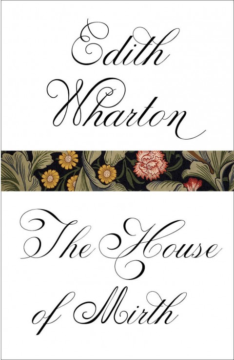
Two more beautiful cover designs for Vintage by Megan Wilson: The House of Mirth and Ethan Frome by Edith Wharton.
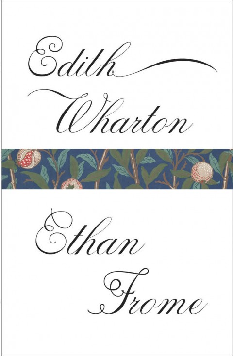
The William Morris wallpaper is a lovely touch.
Comments closed
Creative director Paul Buckley has posted the covers for the latest Penguin Graphic Classics to his Flickr. The new covers include Heart of Darkness by Hellboy creator (and Optimist hero) Mike Mignola (pictured above) and an absolute belter by Stuart Kolakovic for The Death of King Arthur:


You can read my interviews with Paul Buckley here and here.
3 Comments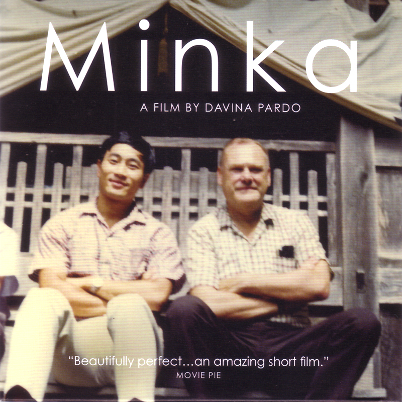
Minka is an award-winning documentary short based on John Roderick’s memoir about the traditional hand-built farmhouse he acquired 1967 while working for the Associated Press in Japan. Filmed just following Roderick’s death at 93, the film interviews architect Yoshihiro Takishita, Roderick’s adopted son who worked on the house, and explores themes of place, memory, architecture, and home. Beautiful: