Skip to content

Category: Books

Midweek Miscellany

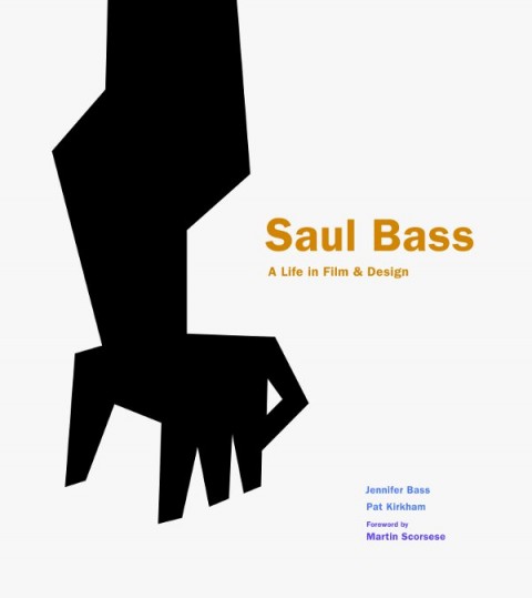
Lyra Kilston reviews Saul Bass: A Life in Film and Design for the LA Review of Books.

The Well-Made Book — An interesting article by Michael Agresta on how printed books, and their design, are changing in the digital age:

Now, as we move into the digital age, the well-made copy has come to occupy a familiar, almost nostalgic middle ground between the aura of an original and the ghostly quality of a computer file. A mass-produced paper book, though bulkier and more expensive, may continue to be more desirable because it carries with it this material presence. And presence means something—or it can, at least, in the hands of a good book designer.

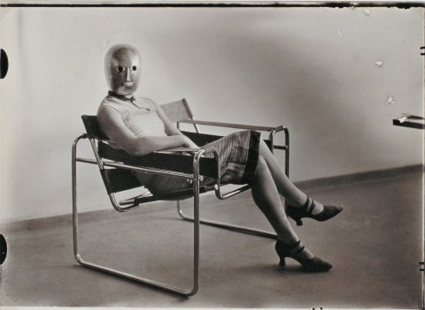
Innards and Interiors — The Bauhaus: Art as Life exhibition at the Barbican reviewed at The Financial Times:

Paul Klee favoured risotto with steamed calf’s heart, sour liver and lung ragout: in the kitchen, as in his paintings, he was obsessed with innards, interiors, reconfiguring essential forms. Wassily Kandinsky lived in a streamlined white apartment but, incongruously, cooked on a “kamin” – a Russian wood-burning stove made from heavily ornamented black iron. Josef Albers claimed “I paint the way I spread butter on pumpernickel” – robustly and straightforwardly; he called the colour mixes in his “Homage to the Square” series his “recipes”. And Swiss painter and vegetarian zealot Johannes Itten was driven out of Weimar because he hijacked the Bauhaus kitchen and alienated director Walter Gropius by producing only “uncooked mush smothered in garlic”. The Barbican’s new exhibition… gives a whole new flavour to the story of the art school long seen to embody sober, purist German modernism.

Weird Comics — Local small press publisher Annie Koyama profiled in the Quill & Quire:

Koyama says her strategy for the year ahead is “to throw everything against the wall and see what sticks,” but she acknowledges her biggest business challenge is twofold: increasing print runs to improve margins and lining up reliable distribution for the fledgling firm. After working around the clock for nearly four years… she says her goal now is to create a sustainable enterprise that can continue to fulfill its artist-centric mandate… She’s also considering expanding into children’s books. But not in the way you’d expect. “While there are a million good kids’ books out there, there aren’t a million good kids’ comics I can see – especially not weird ones,” she says.

And finally…

Maurice Sendak, “author of splendid nightmares” has passed away aged 83. The New Yorker has made a short Art Spiegelman comic about meeting Sendak available online. And here is a wonderful interview with author from December last year:

Comments closed

Signature Shakespeare Illustrated by Kevin Stanton

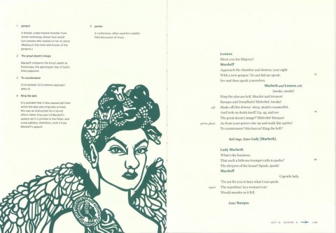
Freelance illustrator and paper artist Kevin Stanton recently contacted me about his book illustrations for the new Signature Shakespeare editions of Romeo and Juliet and Macbeth.

Art directed by Ashley Prine at Sterling Publishing, and with additional typography by the immensely talented Chin-Yee Lai, both books have laser-cut covers, as well as five laser-cut interior illustrations per book, and more than 30 other illustrations.

The results are beautiful and the project sounded like fascinating undertaking, so I thought I would ask Kevin a little more about it.

We corresponded by email.

How did the project come about?

Two years ago, at the very beginning of my foray into freelancing and just a month after graduating from Pratt, I received an unsolicited email from Pamela Horn, a Editorial Director at Sterling Signature. It turns out that a higher-up in the company had seen my work at Pratt’s Annual Pratt Show and passed my portfolio on to her!

After we met a few times, she mentioned that she’d been looking to do a project with a paper artist, and that when the right one came along she would let me know. Initially this had meant a series of Classics book covers, but that fell through. Nine months after our first interview, I got the call — Pam wanted to do a series of Shakespeare plays, starting with Romeo and Juliet and Macbeth, each with a cover and fifteen plates! And that was a dream job right there! And after some discussion with my Art Director, Ashley Prine, it got even better, even more unreal: today it is a hardcover book with a laser-cut cover, five interior two-layer laser-cut illustrations, and almost forty printed spots, spreads, act openers and motifs. And my name on the cover to boot!

How did you approach such a big project? 

The process was interesting to figure out. After hand-cutting a great deal of the book, we realized that scans of the pieces didn’t look good and there was no quick-fix for turning them into vectors. Enter my friend and assistant, Victoriya Baskin. Since my sketches before I cut are like maps of everything (I don’t freehand anything), she was able to vector it all together so that we had a product that could be printed on the pages and sent to the laser-cutter with clean, expert lines! And the work can be edited, which was our primary concern with paper.

How you feel about the final results?

It’s been an absolute dream. As a young illustrator, and one that works in paper, I couldn’t have hoped for a better display of my work than these books. I am so happy with them, although seeing them on the shelves in a book store is the most surreal experience for me. It’s a privilege to work with my entire team, and an honor to have been a part of such a phenomenal production! Much Ado about Nothing and Hamlet are next in line to be published in November!

Thanks Kevin!

You can see more of Kevin’s work on these books on his blog.

7 Comments

Design Matters with Steven Heller

In a fascinating and wide-ranging conversation, design historian Steven Heller talks about design and his recent book 100 Ideas That Changed Graphic Design with Debbie Millman on Design Matters:

Design Matters: Steven Heller mp3

Heller really is an astonishingly prolific author.

(Full disclosure: 100 Ideas That Changed Graphic Design is published by Laurence King and is distributed in Canada by my employer Raincoast Books)

Comments closed

More Matt Taylor le Carré

Under Paul Buckley’s art direction at Penguin US, UK-based illustrator Matt Taylor has produced two more stunning John le Carré covers. The type and design is by Gregg Kulick.

You can see the previous covers in the series here, and, according to Matt, there are a couple more on the way. Happy day.

Comments closed

Something for the Weekend

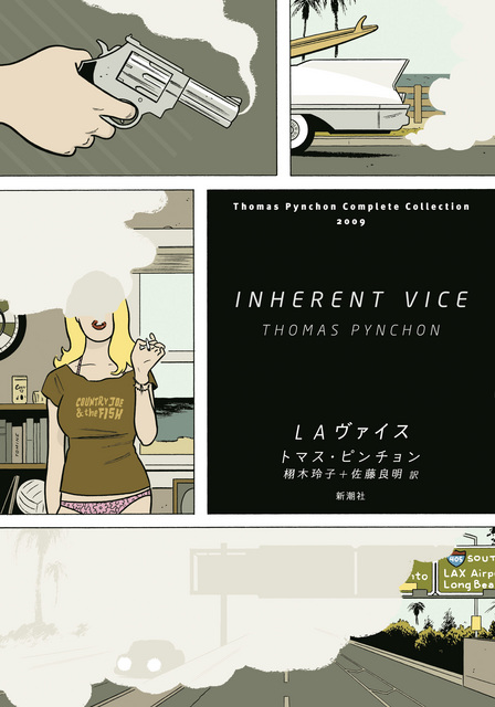
Cover illustration by Adrian Tomine for the Japanese edition of Inherent Vice by Thomas Pynchon, published by Shinchosha Publishing.

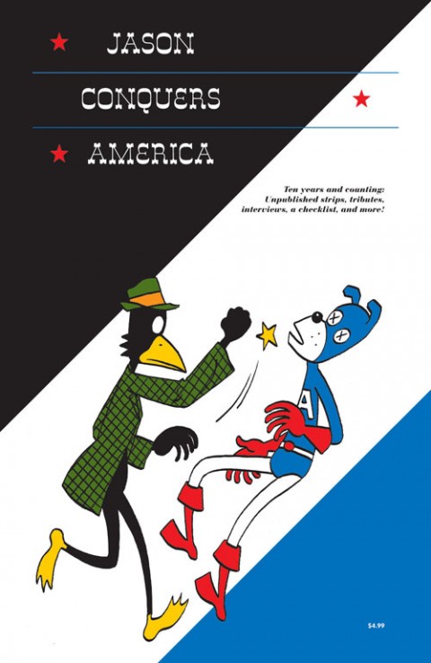
The Darkness — Norwegian cartoonist Jason profiled in The National Post:

“A comedy that has some darkness, like The Apartment, is more appealing than if it’s just fluff. Ingmar Bergman’s best film, to me, is Fanny and Alexander, that is dark, like many of his early films, but there is a joy also, an affirmation of life,” he continues. “Darkness just for being dark doesn’t interest me that much. … I prefer the vitality of something that isn’t perfect.”

Jason will be at the Toronto Comic Arts Festival this weekend, and you can read my Q & A with him here.

Bam… Bam… Bam… David L. Ulin, writing at the LA Times, on interviewing William S. Burroughs:

“Life is a cutup,” Burroughs says about halfway through his conversation with Ginsberg, referring to his technique of bisecting pieces of text and reconfiguring them as collages, letting the juxtapositions create a meaning that transcends traditional narrative. “And to pretend that you write or paint in a timeless vacuum is just simply … not … true, not in accord with the facts of human perception.”

Yes, yes, I found myself thinking, not least because four years later, Burroughs had said virtually the same thing to me. “Life is a goddamn cutup,” is how he put it. “Every time you look out the window, or answer the phone, your consciousness is being cut by random factors. Walk down the street — bam, bam, bam…. And it’s closer to the facts of your own perception, that’s the point.”

Ulin is referring to a conversation between Allen Ginsburg and Burroughs recently published in Sensitive Skin magazine.

And finally…

A Deadman’s Masterpiece — Gabriel Winslow-Yost on Tarkovovsky’s movie Stalker, the Chernobyl disaster, and the S.T.A.L.K.E.R. series of video games, for the NYRB:

The Zone in the video games is a beautifully dangerous place, bigger and grimmer than Tarkovsky’s, but somehow still appropriate. There are plenty of long, tense walks through damp weather or empty, creaking tunnels. Packs of dogs wander the landscape, ruined farmhouses give shelter from the rain; here and there the ground ripples strangely. Stalkers gather around campfires, bandits take potshots at passersby, and a man lies wounded in a ditch, begging for help. Watching Stalker, one is occasionally brought up short by remembering that it was not filmed in Chernobyl, so perfect an analogue does that event seem for the film’s images of technology and nature, beauty and danger in strange alliance. The games, at their best, can seem like a sort of miracle: a dead man’s masterpiece, come home at last.

Comments closed

Midweek Miscellany

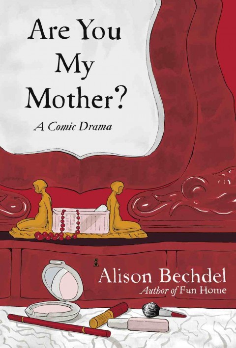
This Precarious Balancing Act — Maud Newton talks to Alison Bechdel, author of (the astonishingly good) Fun Home, about her new graphic novel Are You My Mother?. Fascinating stuff:

I feel like cartooning for me has been like a way to be a crypto-writer. I couldn’t ever say I wanted to be a writer because my mother was a writer, and even now I’ve had to find this alternative way of expressing myself as a writer. I don’t want to diminish the drawing. I think it’s integral to what I do. But I’m kind of a secret writer… I’m very wordy for a cartoonist. I’m always struggling against that, because the more space your words take up the less room you have for pictures. So it’s always this precarious balancing act.

School Disco — Mark Medley’s latest National Post piece on House of Anansi Press follows the publisher to the London Book Fair:

The London Book Fair, now in its 41st year, is one of the biggest, and most important, in the world — though it is dwarfed by Frankfurt, which takes place in October. This year, the fair hosted more than 1,500 exhibitors from 57 countries and expected more than 25,000 attendees, almost half from overseas. During the festival’s three days, MacLachlan describes it variously as “a meeting of the tribe,” “highly social,” and “like [a] school dance. The cool kids are in one corner, the nerds are somewhere else.”

Confused By the eBook Lawsuit? So Is Everyone else” — Peter Osnos, founder of Public Affairs Books, writing at The Atlantic.

And finally…

With the Bauhaus: Art as Life exhibition opening at the Barbican tomorrow, author Fiona MacCarthy (William Morris: A Life for Our Time)  looks back at the revolutionary design school at The Guardian:

Gropius’s idea for the Bauhaus emerged from his experience of the first world war in which he served as a cavalry officer on the western front for almost the whole four years. His response to the devastating scenes he lived through was a stark determination to “start again from zero”. Only a new outlook on design and architecture could provide the means for a shattered civilisation literally to rebuild itself… Gropius’s vision was for the “unification of the arts under the wings of great architecture”. It was a democratic concept of art for the people, art for social betterment in which everyone would share. The Bauhaus aesthetic replaced bourgeois furbelows with a geometry of clarity, sharp angles and straight lines.

The Guardian’s art critic Adrian Searle reviews the show here.

2 Comments

St. Aubyn Redesigns by Stuart Wilson

A few weeks ago, I mentioned Stuart Wilson’s unsettling redesigns for the Picador (UK) editions of the Patrick Melrose novels by Edward St. Aubyn. Here’s the full the set:

3 Comments

Something for the Weekend

Sturm und Drang — Author Nick Harkaway (Angelmaker and the forthcoming The Blind Giant: Being Human in a Digital World) on Amazon and the publishing industry for The Guardian:

The most thunderous argument in Amazon’s favour is that the market has spoken, and demands cheaper product. This one I find utterly bizarre. We know very well, in this post-crash age, that the market can be an idiot. The market wanted easy credit extended to all, low taxes and plenty of public spending. The end result was a financial catastrophe that has just plunged us into a double-dip recession and shows no sign of being played out. Sometimes, things cost more than we want. That is a truth we were encouraged to forget in the 90s, but it’s one we’re going to have to remember.

See also: Jason Epstein in the NYRB and Dennis Johnson’s on-going commentary on the Department of Justice’s legal shenanigans at MobyLives (archive).

Literature Needs More Than E-booksJames Bridle for Wired Magazine:

What we are coming to realise is that no one thing can pick up where the book left off; instead it is everything, all of our networks, our services, our devices, the internet plus everything else, which will carry literature forward. Literature is unique among art forms in that it is enacted entirely in the minds of author and reader; a psychic dance. Literature is everything, and thus everything must be employed in its support. And publishers, so long accustomed to doing a couple of things well, are adrift in a world that needs them to do everything — or GTFO.

And finally…

No Sympathy for the Creative Class — A fascinating piece by Scott Timberg for Salon:

Creative types, we suspect, are supposed to struggle. Artists themselves often romanticize their fraught early years: Patti Smith’s memoir “Just Kids” and the various versions of the busker’s tale “Once” show how powerful this can be. But these stories often stop before the reality that follows artistic inspiration begins: Smith was ultimately able to commit her life to music because of a network of clubs, music labels and publishers. And however romantic life on the edge seems when viewed from a distance, “Once’s” Guy can’t keep busking forever.

Yes, the Internet makes it possible to connect artists directly to fans and patrons. There are stories of fans funding the next album by a favorite musician — but those musicians, as well, acquired that audience in part through the now-melted creative-class infrastructure that boosted Smith.

(And on that cheery note, have a good weekend).

Comments closed

The Penguin English Library

Award-winning director Woof Wan-Bau has created a wonderfully weird animated short for the launch of the  Penguin English Library:

(via Ace Jet 170)

1 Comment

Something for the Weekend

A busy week for John Gall, Art Director at Anchor/Vintage: he unveiled a beautiful new website, and his design for the paperback boxed set of 1Q84 by Haruki Murakami (pictured above). My Q & A with John is here.

Los Angeles Review of Books also has a swanky new website.

Let’s Not Get Carried Away — Harvard professor Ann Blair, author of Too Much To Know, on the history of information at The Browser:

“Reading” covers a wide range of practices. Medieval scholasticism, for example, favoured a ponderous kind of reading of difficult Latin texts done by a few qualified scholars with pen in hand to comment on them. This kind of reading typically took place in a library or study with access to many other learned books. Novel reading was very different when it developed, especially in the 18th century – novels were viewed as engrossing and escapist entertainment, which was typically enjoyed in a nice comfy chair. Interestingly, this kind of reading, which we try to encourage in our children today, worried people in the 18th century. Wouldn’t girls especially get carried away by flights of fancy? People thought it important to control reading. For instance, it was considered better to have girls read in a circulating library since a public setting imposed limits on how far they could get carried away. So some of the fears parents have today about kids playing video games used to apply to reading.

And finally…

Howard Jacobson on Wisden’s Cricketer’s Almanack for the Independent:

What a wonderful thing is Wisden, that lovely, lozengy, yellow-jacketed, Bible-shaped and Bible-weighted cricketers’ almanack, 1,500 pages deep, in which the averages of batsmen and bowlers and wicketkeepers, English and not-English, male and female, living and dead, are collated with a mystic punctiliousness that proves beyond argument the existence of God. You want to see the Divine Watchmaker at work on the mathematics of life? Then read Wisden.

Comments closed

Midweek Miscellany

Insufficiently Bored — An essay by author Toby Litt on technology and reading (and writing) at Granta:

Proposition: ‘The human race is no longer sufficiently bored with life to be distracted by an art form as boring as the novel.’

Perhaps novels will continue, but instead of the machine it will be the connectivity that stops, or becomes secondary.

What we’re going to see more and more of is the pseudo-contemporary novel – in which characters are, for some reason, cut off from one another, technologically cut off. Already, many contemporary novels avoid the truly contemporary (which is hyperconnectivity).

Rereading All Over Again — Bharat Tandon reviews On Rereading by Patricia Meyer Spacks and Second Reading by Jonathan Yardley for the TLS:

[If] rereading… teaches us anything, it is that the conjunctions between readerly and textual lives will always be unpredictable and promiscuous ones. “What did you make of that book?”, runs the conventional phrase. As we revisit the objects of our reading, like recognizable but weathered landmarks, there can be no full going back, because we are not exactly the same people we were; but the consolation of rereading is the knowledge that we are these different people in part because of what those books have made of us.

Artwork Confidential — An interview with Daniel Clowes about the first retrospective museum exhibition of his work, “Modern Cartoonist: The Art of Daniel Clowes, and the accompanying monograph at Publishers Weekly:

[T]he work wasn’t created to be seen on a wall. The final artwork is the book. But I collect original artwork. It has a meaning to me that goes beyond the printed page. It’s the only [kind of] artwork you can see on a wall that you may already have a personal relationship with. If you read the story that that artwork comes from, you have a connection to it in a way you don’t have with a painting or something that’s only intended to be seen in that context. That made it interesting to me. There’s something about that final piece as an artifact of the printed work that gives it a certain value and magic. My goal with both [the exhibition and the book] is to get people interested in the work and then to read the books. If that is achieved, then both of these will have been a success.

And finally…

Six Degrees of Aggregation — A really fascinating history of the Huffington Post at the CJR:

Huffington Post, they understood, was not an enterprise whose core purpose was the creation of works of journalism—as significant or mundane as that can be. It was in the content business, which created all sorts of possibilities of what it could gather and, with a new headline and assorted tags, send back out, HuffPost’s logo affixed. Content would come to mean original reporting by Sam Stein or Ryan Grim from Washington, as well as Alec Baldwin’s blog, Robert Reich’s rants about the forsaking of the American worker, a “Best Retro Bathing Suits” slide show, “Why Women Gladly Date Ugly Men,” David Wood’s Pulitzer Prize-winning 10-part series on wounded veterans, “Nine Year Old Girl’s Twin Found Inside Her Stomach,” campaign dispatches from the Off The Bus citizen journalists, “Angelina and Brad Wow at Cannes,” and “Multitasking Wilts Your Results and Relationships”—as well as Nico Pitney’s blogging on the violence after the disputed 2009 Iranian presidential elections and the 111,000 comments it generated. Because comment was content, too.

Comments closed

Q & A with Jennifer Heuer

Jennifer Heuer is a book designer based in Brooklyn. Formerly a designer at HarperCollins and Simon & Schuster, she now runs her own studio out of the Pencil Factory. Jen’s striking inkblot design for 1000 Black Umbrellas by Daniel McGinn, published by Californian small press Write Bloody, was one of my favourite covers of last year. As Jen was in a list with many of the usual suspects — several of whom have already been interviewed here — it only seemed appropriate to feature more her excellent work on The Casual Optimist and interview her as well.

Jen and I corresponded by email earlier this year.

When did you become interested in book design? Where did you start your career?

In college I always thought that I wanted to design either album covers or book covers. I didn’t really know how to get into either field after I graduated, but I was fortunate to have Dave Caplan hire me over at HarperCollins. It was a great place to start and Dave was an awesome boss. I was in the children’s department there, and worked on a wide range of covers as well as interiors. It was boot camp in learning how to package an entire manuscript — all the way down to the binding specs and headbands. It was a great way to start thinking beyond the cover and the spine.

I spent about 4 years there learning the ins and outs of book design with a great team. My next goal was to move over to adult book cover design. Simon and Schuster became my new home where I was able to have a blast creating fiction and nonfiction covers for five super talented art directors.
Why did you decide to go freelance?

It’s funny, I’d always dreamed of taking the freelance plunge, but had planned on staying in-house for a few years more before doing so. Thankfully, my husband, Jed, and I shook up our lives a bit and moved to Portland, Oregon for a year. He was joining the experimental team of WK12 at Wieden+Kennedy and I figured I’d be miserable if I sat around Brooklyn without him. So we packed up, and took a few weeks to drive across the country and try something new. The best and scariest decision I’ve made in a long time.

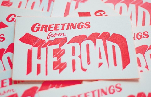
I set up a studio in town and biked to work most days. I worked on building up clients and challenging myself with new projects and classes in and around the area. I even learned how to letterpress! In the end, I’m so glad I took the freelance jump when I did.

Who are some of the publishers you work with?

Just over a year out on my own I’m so thankful to say I’ve worked with HarperCollins, Random House, Little Brown, Grand Central, Penguin, Thomas Nelson, Simon & Schuster, Scribner, Freepress, Ecco, Columbia University Press, Write Bloody, Harvard Business Review Press, and W.W. Norton & Co.

Could you describe you book cover design process?

Each book is different, so the process can vary. But ideally, this is how I hope I’m working:

Naturally, I read the manuscript if there is one. While I’m reading I keep a running list of keywords, signifiers, and themes in my notebook. From there I create some free-association lists of words, trying to decide on a general direction for the look. Then I head to the Pratt library. As an alumni, I have access to the remarkably eclectic collection. The library is where I tend to sketch out ideas. I made these simple worksheets, basically 6 book shaped rectangles on a sheet of paper to knock around some layouts before using the computer. When I’m back in the studio I set up a moodboard on imgspark.com to organize the artwork I’ve created and keep track of art I’ve collected. That’s kinda the whole shebang. I do a lot of prep work before starting the actual design, although you need to be wary of overthinking a project. Sometimes it’s nice to have almost no time at all and just go with my gut. I recently got to do that with the 30 Books in 30 Days project and the Lolita Project.

What are your favorite books to work on? The most challenging?

Well, this may sound super obvious, but I really don’t care what the subject matter is — from brain eating aliens to a medical history, or a memoir on life abroad, to a beautiful love story — as long as it’s a smart, well-written book that I want to pass along to friends and family. Those are the best books to work on. The ones where you don’t feel like you’re doing work while reading the manuscript. The most rewarding projects present a conceptual design challenge, similar to editorial illustration.

Do you see any current trends in book design?

I feel like I’m hearing more and more about making the book an object of desire — something that will be coveted and gift-worthy. And I love seeing smart special effects on covers these days. While this may be the knee-jerk reaction to e-books, I hope it will be something that holds on long enough to make everyone appreciate the object of the book. There also seems to be more attention paid to detail throughout the entire book — from the cover to the end paper to the title page. It’s a great thing to see these days, and solidifies the purpose of the designer.

Where do you look for inspiration and who are some of your design heroes?

Inspiration honestly comes from everywhere. The important part is to pay attention. I try to to get away from my desk and go to the library, museums, read fashion magazines, the newspaper, listen to the radio, watch documentaries and observe closely. I tend to find that when I’m not consciously searching for a design solution, I’m inspired by things happening around me. These things are often times closely related to the project at hand. Perhaps its all synchronicity, but either way, paying attention to what’s around me seems to work well.

As far as heroes go, it’s the people around me that inspire me the most. Friends I’ve known over the years who keep me on my creative toes are an incredible source of inspiration. Of course there are greats throughout the history of art and design, but I feel like I look up to a different person or group of people depending on what I’m working on.

OK, that’s annoyingly vague. Here are some examples: I just watched Senna, and loved the Formula One graphics and footage from the 80’s; the silk screen posters from Slavs and Tatars in the Print/Out show at MoMA were wonderfully fresh and fun to read; found this amazing book of South African block prints while searching for artwork at the library; was settling into the new studio and read an interesting article about brainstorming and the chance creative interactions that were coming out of MIT’s make-shift Building 20.


Who else do you think is doing interesting work right now?

I mentioned earlier that my husband and I spent some time living in Portland last year, and the WK12 group was a big influence. Not necessarily in how I work visually, but in thinking beyond the assignment. While I love spending hours in bookstores oohing and aahhing over the beautiful covers, I’ve been trying to look elsewhere when it comes to interesting work.

It spans from the gorgeous Alexander McQueen textiles, to the beautifully clever industrial design of Joey Roth (I love these speakers!). I’ve been looking at the photography of Todd Hido, and love the eye of Jason Fulford. But I try to pull inspiration from the world outside of design and art. Shows like The Moth, Radiolab, and TED are obvious ones, but incredible resources. The people who are doing the most interesting work are those promoting solid ideas and telling those stories in brand new ways.

What books have you read recently?

Non-work related reading? I’ve been really into Aravind Adiga’s novels. I randomly picked up Between the Assassinations from the free book shelf when I used to work at S&S a couple of years ago and loved it. Right now I’m in the middle of his latest. I’m also in the middle of Chronic City which is a blast to read. I tend to be in the middle of a lot of books when it’s not work related, and always seem to lose track of what I was last reading.

Work related, I enjoyed reading Alexi Zentner’s Touch—lovely story! And a soon-to-be-released collection of short stories by Lucia Perillo was a truly good read (got to use a photo by Todd Hido!).

Do you have a favorite book?

That’s a tough one… It used to be A Farewell to Arms, but it’s been so long since I’ve read that. I did a piece for a gallery show based on Leaves of Grass and found it to be amazingly relaxing to read. And a recent favorite (before any hint of a movie, which I think I’ll skip) is Extremely Loud and Incredibly Close. I loved the combination of visual narrative and traditional narrative to tell a story.

What does the future hold for book cover design?

Oh, I’m sure it’s adorable puppies on every cover. I think my mom would be happy with that! Who wouldn’t?!

Thanks Jen!

You can read more about Jen’s design process in this interview for Faceout Books.
2 Comments