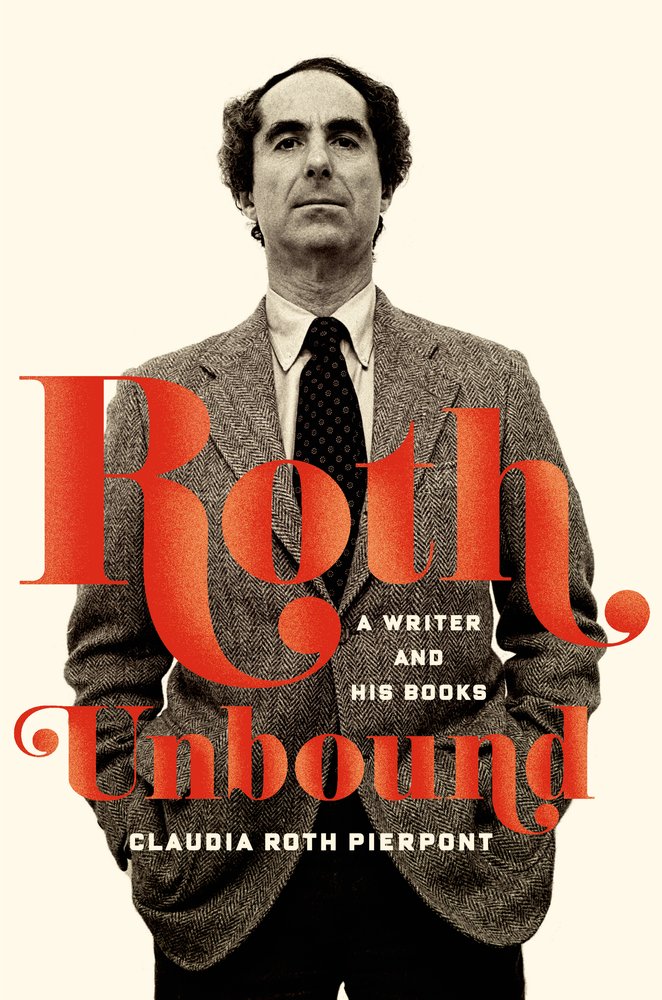
I am very late to this, but Miriam Markowitz’s article for The Nation ‘Here Comes Everybody‘, on women and book publishing in 2013, is well worth reading:
More nuanced fiction that isn’t of an obvious commercial genre—much of which is written by women—often brushes up against the literary. Publishers have various terms for the books that straddle this line. One of the ugliest and yet most useful is “upmarket.” The writers who may be lumped in this category are diverse in their output and their ambitions.
One commercial editor told me that many of her writers once cherished literary aspirations, but that they’re comfortable in the “upmarket” category, in part because it’s more lucrative. “If you cash in on the monetary market, you won’t get prestige. A lot of writers are OK with that.” Few writers have control over their covers, let alone the way their books are marketed, but if an agent or publisher says that this lacy dress or that whispery veil might entice more readers, who are they to object? Readers of literary fiction, especially women, will buy commercial titles as well. But the phenomenal popularity of Fifty Shades of Grey or the Twilight series or Nora Roberts among women who do not specifically identify as “readers” suggests that the reverse is less true. It’s hard to blame women writers for trying their hand at the commercial market when the literary one is so inhospitable.
For writers of work that is unambiguously ambitious, this choice is more difficult in that it may not be an option at all.
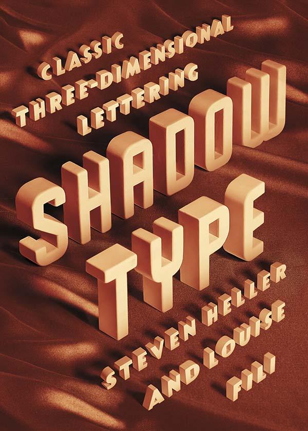
“Dimensional typefaces toy with human perception, challenging the limits of cognition. Whether framed by a subtle tint or a bold silhouette, in color or in black and white, a shadow adds bulk, enabling the words to rise voluminously from otherwise flat and unmonumental surfaces. Shadow faces are typographic trompes l’œil, fascimiles of real three-dimensional letters and inscriptions in sculpture and architecture… This sculptural essence of shadow type adds not only to the letters’ visibility, but also to their continuing allure.”
Just thinking about how much Steven Heller writes makes me a little giddy. The renowned art director, educator, design historian, and critic provides a steady stream of design commentary in newspaper, magazine and journal articles (not to mention his blog for Print magazine, The Daily Heller). He has authored, co-authored, or edited over 100 books on design, illustration and typography, including the recent Shadow Type: Classic Three-Dimensional Lettering, co-authored with his partner Louise Fili.
Shadow letters started to make an appearance on merchants’ signs in the 18th-century, and were introduced as metal typefaces as early as 1815, but they did not become common in printed text until later in the 19th-century. After a surge in popularity among printers and their clients, type foundries began to provide a wide selection of styles and sizes, and by the late 19th-century shadow wood type was also in demand, coming in extra-large sizes so it could be used outdoors. “Whether custom drawn, or as metal or wood type, shadow letters animated newspaper and magazine mastheads, product labels, and, indeed, all kinds of signs and posters.”
Published in September last year by Princeton Architectural Press, and distributed in Canada by Raincoast Books, I had the opportunity to ask Steven about Shadow Type, his interest in design ephemera, and how he finds time to write.
Do you remember when you first became interested in design?
I was interested in pictures at an early age. I wanted to be like Jules Feiffer, a comics artist. Design came later. I was studying the work of some German satirists, who were also designers.
Did you grow up in a creative household? Not especially.
Where did you begin your design career? At 14 I worked for an ad agency doing RussssTogs. Didn’t go well. It took another 3 years before I was hired by an underground paper to do layouts.
When did you first start writing about design history?
When I was at the NY Times as OpEd art director, I did a little bit of writing on those Germans I mentioned. Then it accelerated to writing about publications and other historical themes.
How do you find the time write?
There’s always time.
Do you still get excited when you hold one of your own books in your hands for the first time? Yes, the thrill is still there. But the high lasts shorter. An addict gets used to the fix and needs another and another. These days, I don’t rip the envelope right open. I let it sit for hours, so I have something to look forward to. Weird, I guess.
Why did you and Louise decide to write a book on classic three-dimensional lettering?
We did the first one on Scripts. We’ve done series before, they didn’t start out that way, but evolved. This evolved into Shadow Type. I have long loved the dimensional, colourful, sculptural letters.
When was the heyday of ‘shadow type’? 19th, 20th and 21st centuries. Its never gone out of style. But the golden age was late 1880s to 1940s.
Why did it become popular? Dimensionality on flat surface. Our eyes love to be fooled.
Why do you think there is a renewed interest in ornate typography and lettering? It comes and goes. I see a shift away again. But it has to do with the joy we get from ornament and I think it parallels what goes on in clothing.
Has Louise’s work contributed the revival of decorative type? Possibly. But she’s not decorative per se. Her type choices are elegant. She’s about precision and aesthetic pleasure.
Do all the examples in the book come from your own collection?
For Scripts and Shadow yes. And for the next one too, that’s Stencil Type.
Why does design ephemera hold such a fascination for you? I’ve come up with all sorts of reasons, but the all seem bogus. I feel the stuff somehow represents who I am. But I also love being a repository of history. More than that, I cannot say.
Your son, Nicolas Heller, recently made a film about your den called “The Cave.” What was that experience like? He’s a great talent. I just set him loose. And he made his film. The stuff in that place should be interpreted by others. The juxtapositions of objects and books are at times wonderful.
What’s Nicolas working on now? He’s doing a series of documentaries on eccentric New Yorkers called NO YOUR CITY, he’s also filming designers for documentaries produced by Brian Collins.
Do you have a favourite book? Of my own? I’ve done over 165, but I love Iron Fists. Of other people? There are too many to say.
What books are in your ‘to read’ pile? I just finished Deborah Solomon’s biography of Norman Rockwell – smartly done. And I finished Year Zero by Ian Buruma about the year 1945, makes the blood chill and boil. On the pile is a thick book about the Beatles. Not sure I’ll get to that.
Is there one book you think all designers should read?
I love Ben Shahn’s The Shape of Content. I also love The Hare with Amber Eyes, but for me, nothing is so essential that I’d stand on the mount and scream that they should read the tablets.
The Rizzoli Bookstore is one of the most beautiful bookstores in the world and an icon of New York City architecture. Unfortunately the owners of 31 West 57th Street, the store’s home for 30 years, have recently announced their plan to demolish the six-story, 109-year-old building and replace it with a highrise “ultraluxury” tower. The Landmarks Preservation Commission, whose mission is “to be responsible for protecting New York City’s architecturally, historically, and culturally significant buildings,” has declined to grant landmark status to the building on the grounds that the property “lacks the architectural significance necessary to meet the criteria for designation,” despite its apparent architectural and cultural importance. A campaign to save the store, and a petition to have 31 West 57th Street designated an individual and interior landmark have been started.
You can read more about the plans to demolish the building in The New York Times. While at The New Yorker, Jon Michaud wrote about his time working at the store:
Many of the things that Rizzoli offered its customers (and its staff) are now easily obtainable online: international periodicals, European popular music, and books in foreign languages. But there is nothing online that will replace the ambiance of the place. With its vaulted atrium, marble flooring, and wood-panelled shelving units, Rizzoli looked like the private library of a Medici prince, the sort of place where an Umberto Eco character would hunt down an ancient secret.
I first came across Jessica’s name in 2009. I was trying to convince Peter Cocking, then art director at Douglas & McIntyre, to agree to an interview. Peter, in his way, was having absolutely none of it (and still isn’t, really), but he did suggest that I talk to his senior designer Jessica Sullivan, “the best book designer in the country.” Nothing came of it then, but I did start to pay attention to Jessica’s work — to be honest, it was hard to miss her distinctive style, impeccable typography, and quite how many Alcuin Awards she was winning!
Now, five years after that original conversation with Peter, Jess is now working as a freelance designer and part-time art director for Greystone Books, and still delivering some of the best book covers in the country. In this interview she discusses her work, her career, and offers some advice for designers starting out today.
Jess and I corresponded by email.
When did you first become interested in design?
I took an art class for the very first time in grade ten. My teacher was a graphic designer and one of his clients was A & W. My 15-year-old self thought that was just about the coolest job I could have imagined.
From that day forward any time anyone asked me what I wanted to be when I grew up, I said Graphic Designer. Even though I didn’t really know what that meant.
Did you study design at school?
My determination to be a designer was thwarted by a scholarship to UBC, so after a bit of a detour, I rerouted and attended the Emily Carr Institute of Art + Design and received a BA in Communication Design.
Where did you start your career?
I think I started my career at school. I had this perception that landing a design job on my own was going to be impossible (I’m not sure why). I had it in my head that my first job would materialize through one of my instructors. I treated school like a very long job interview, only not so well-dressed. By fourth year an offer came by way of my typography instructor Peter Cocking, then Art Director at Douglas & McIntyre. A position was created for me and the two of us became the new in-house design department. And a book designer was born.
How long were you at Douglas & McIntyre?
9.5 years. During my tenure I married, had babies, designed hundreds of books and experienced a bankruptcy—theirs, not mine.
Has working freelance been very different from working in-house?
In almost every way. I’ve always enjoyed my job, but now I enjoy so many more aspects of it. There is a lot that’s rewarding outside of the work itself. You’re fairly invisible in an in-house scenario. There’s little you can change about process and there is an historical nucleus to the way things are done. It’s a lot simpler to affect change when it’s just me I’m dealing with. I’m pretty easy to work with.
Are you still designing books and book covers?
Yes, absolutely. I just design more than books now.
What have you worked on recently?
I’ve recently designed a book series for MOA [Museum of Anthropology] at UBC, I’m currently working on a visual identity for an editing and writing services company which I’m having a lot of fun with, and I just wrapped up a project for an exhibition of Japanese woodblock prints from the 1800s. I also continue my work with Greystone Books as their art director. A position which adds balance and bit of chaos to my work flow and ensures I leave the house at least once a week. It also guarantees a few good laughs—it’s a great office to work in.
What are your favourite kinds of projects?
I love it when after your first meeting you’ve not only fallen for the project itself (you have a vision for it, you can’t wait to get started, you can SEE how you’re going to make a difference and bring something to this thing) but you’ve also fallen for the people, the client. Every time this happens, and I’ve been very fortunate over the past 14 months as it’s happened quite frequently, I walk away from those meetings like there are tiny, little clouds under my feet.
What kind of books present the greatest creative challenges?
Fiction covers. I don’t know if I hate them or love them. It’s such a hard market, competitive and over saturated, so the cover becomes of utmost importance. It’s usually the most painful genre when designs are rejected, and I’m generally unfazed by rejections at this point in my career, it’s just part of the job. But I’m fairly opinionated regarding fiction and powerless in terms of persuasion, so it can make for a tortured process. And I might be over exaggerating a bit here.
Can you describe your process for designing a book cover?
If it’s fiction, I read the book, otherwise I read the synopsis and familiarize myself with the content and tone. Then I think. That’s probably the most important stage. Generate as many ideas and concepts from all that thinking. Source imagery or create imagery or have imagery created. Add type. Explore, test, judge, select, refine. Judge, select, refine. Judge, select, refine. Sleep. Wake up and see if I still agree with myself. Submit.
What advice would you give a designer starting their career?
1. Be professional at school. Be on time, hand things in by deadline. Design communities are often small. You will encounter your instructors out in the world. They will remember you if you pissed them off with your laziness. They will not hire you.
2. You only get out of school what you put into it. They can’t teach you to be a good designer; that comes from work and practice. Ensure that every instructor you encounter enriches your education—you are paying for it.
3. Continue to grow. If your job becomes boring—challenge yourself. Give yourself personal goals within your projects. Ensure that everything you create is adding to your own personal archive. When you’ve amassed what you need don’t be scared to leave and move on to the next challenge.
Is there a supportive design community in Vancouver?
I’m not really sure. I do feel I am part of a supportive community—although it’s not actually composed entirely (or much at all) of fellow designers. I’ve been told one exists in Toronto, and I have to admit, I am very curious about it all.
Where do you look for inspiration, and who are some of your design heroes?
I try to be aware of my surroundings, to makes connections of all kinds, not just in design. I like old things and new things and mixing the two together. I’m always looking at stuff. Printed stuff: books, magazines, wallpaper, packaging. Moving stuff: movies, documentaries, TV, birds. Invented stuff: art, architecture, interior design, music, fashion. Stuff that just exists: fish—which have the most amazing colour palettes, snow affirms the beauty of white space.
That’s a hard one. I’ve been so busy lately that I honestly haven’t had time to read anything besides work related matter. I used to read in transit and at night, so I consumed a lot of books on a monthly basis. Now I write proposals and tend to email on the bus rides and research in the evenings and fall asleep before I can finish a page of the book that’s sitting next to my bed, Ingenious Pain. The last book I read that I really devoured was Million Little Pieces which is strange because I almost exclusively read novels.
I don’t really see that much changing, to be honest. Unless we’re no longer allowed to use paper, and we go back to the time where stories are housed in people’s memories. And then I’ll be useless for a number of reasons. I have a terrible memory for that kind of detail.
James Lovegrove reviews Tove Jansson, Life, Art, Words by Boel Westin, the first authorised biography of artist and writer, and Jansson’s own childhood memoir, Sculptor’s Daughter, first published in 1968 and now available in English for the first time, for The Financial Times:
The stories have… exerted an influence on many modern writers, for adults as well as children. Ali Smith, Jeanette Winterson and Maggie O’Farrell are self-professed Moomin fans. Philip Pullman has called Jansson a “genius”, while Frank Cottrell Boyce drew important life lessons from the Moomins at an impressionable age. “Jansson valorised coffee and pancakes and reticence and the mystery of others,” he wrote in a review of Moomin picture book The Dangerous Journey. “But more to the point she showed me how it might be just those small pleasures that keep us together when we start to grow apart.”
The young Boyce, however, was also drawn to the Moomins because he sensed an existential darkness at the heart of the books. Jansson wrote in the dominant mode of 20th-century children’s literature, fantasy, but hers was fantasy shot through with a quiet anguish. Apocalypse through natural disaster – flood, volcano, potentially earth-shattering comet – looms in the background of her stories. Characters are solitary, lonely, sometimes on the brink of despair, and acknowledge the fragility of things with an accommodating liberal shrug.
Kate Kellaway also reviews both books for The Observer:
[T]he greatest revelation, reading the memoir, is that what drove Jansson’s imagination was fear. This is a book of perils. The dark is a faceless monster with “distinct hands”. Snow is like “grey hands with a hundred fingers”. An eiderdown behaves like a fist. Ice breathes. Snakes in the carpet are almost real. The words “safety” and “dangerous” repeat themselves. The external world was always an internal landscape for Jansson. Reading her is like a return to childhood: things happen that are inexplicable when adults are in charge. It’s unwise to pretend to know what is coming next. Life, she indicates, is best approached gingerly, with respectful regard.
Helen Yentus, the art director of Riverhead Books, designed two covers for the recently published On Such a Full Sea by Chang-rae Lee. The regular hardcover — which is beautiful in itself (see below) — has a hand-lettered jacket. The second, for a limited edition of the novel, comes in a white slipcase made on a 3D printer. In this video, Helen talks about the 3D printed slipcase, designed in collaboration with the MakerBot Studio:
This isn’t the first time Helen’s worked with MakerBot. In 2011 she used the 3D printer to create the letters on the cover of The Innovator’s Cookbook by Steven Johnson:
I didn’t exactly know what to call this post, but ‘postscript’ seems appropriate.
Every time I post my annual list of favourite covers I immediately see (or remember) a dozen designs that would have been on the list (or would’ve been close) if I did it all over again. This is an attempt to collect a few of those covers from last year in one place. I guess you could call it a list of ‘honourable mentions,’ but that doesn’t seem quite right. Truthfully, it’s a collection of some of the covers that I saw for the the first time, or was gently reminded of, immediately after I posted my original list. It is, as much as anything else, an excuse to post more fantastic work from 2013.
I have been completely overwhelmed by the incredible response to this year’s covers post, and although I could probably do lists like this for the rest of 2014, I won’t. I will save my energy for next December. Happy New Year!
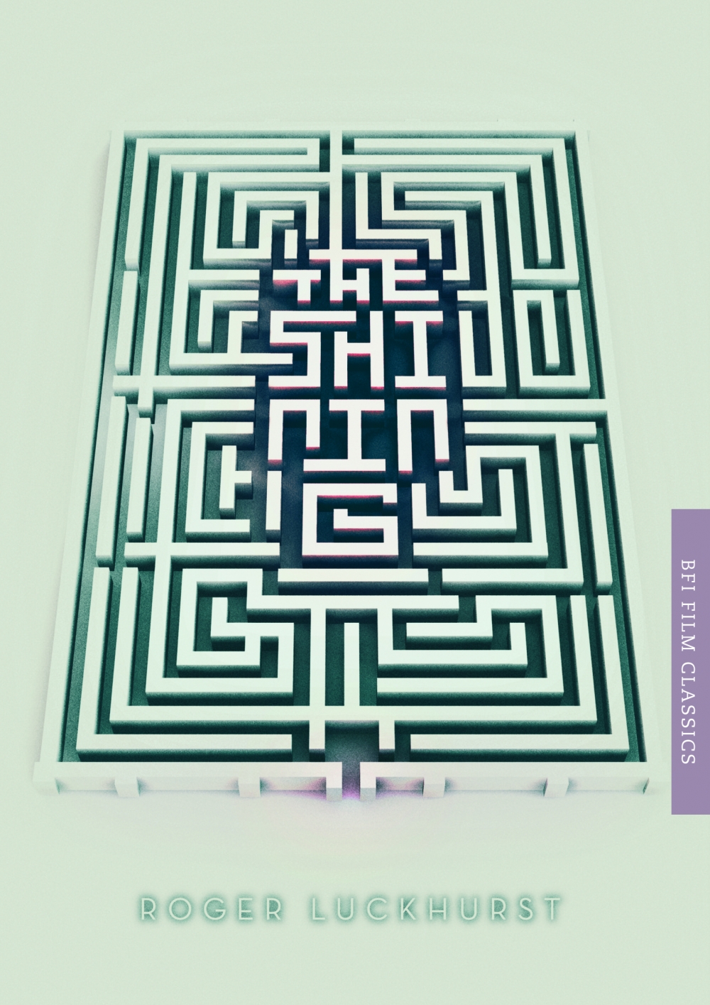
I liked a lot of the BFI covers (obviously!), but Mark’s design for The Shining struck me as particularly clever. You can read about the design process for all the recent BFI Film Classics here.
Ok. I had seen this cover and didn’t forget about it either. It was on my list from the start and it got cut at the last minute. I’ve agonised about it since. Sorry Peter.
J. Hoberman reviews the oversize comics collection Society is Nix: Gleeful Anarchy at the Dawn of the American Comic Strip, 1895–1915, edited by Peter Maresca and published by Sunday Press Books, for the New York Review of Books:
Society is Nix focuses on the depiction of then-contemporary metropolitan life. In addition to Hogan’s Alley and other metropolitan jungles, the comics reveled in the quotidian chaos of the urban scene: the pushcart madness of “Familiar Sights of a Great City—No. 1, The Cop is Coming” is rendered as a mock-classical frieze. Genuine monuments are regarded with derision; several strips in Society is Nix satirize the rapid transit system then under construction in New York. As the twentieth century approached, cartoonists extrapolated a city of the future, replete with snow-capped office buildings, floating real-estate agents, and colliding single-person dirigibles, or ponder “the possibilities of wireless telegraphy” which, save for predicting communication with Mars, seems much like the Internet…
…In his introduction, Maresca refers to these comic strips as “the birth of modern popular culture”—perhaps “mass media” would be a better term. These strips were not only all over the page, they were in big cities all over the country—the most successful supplements reached hundreds of thousands of readers in New York alone. Yet at the same time, they were wildly experimental… [The] first newspaper comic strips were not so much an extension of vaudeville as precursors of the equally déclassé and temperamentally anti-authoritarian motion picture. The early strips thrived on choreographed violence, including runaway horse carts, baroque streetcar collisions, and a panoply of what Hearst might have termed polychromous explosions.
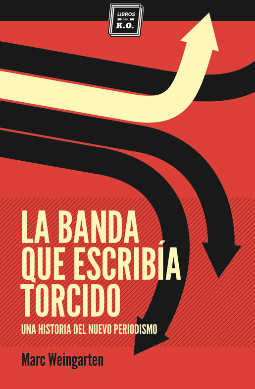
One of the enduring shortcomings of my end of year covers list is its failure to represent designers from the non-English-speaking world. Having interviewed Spanish designer Ferran López Creative Director for Editorial Planeta (and previously a designer at Random House Mondadori) a few years ago, I’m particularly aware of how much amazing work is being done in Spain and how little of it gets featured here. Fortunately at Unpopular Culture, the blog of Madrid-based independent publisher Pop Editions, Óscar Palmer has selected his 12 favourite book covers of the year. It’s a good-looking list!
Pictured above (from top to bottom): DIARIO DE 1926, design by Eduardo Jiwnani; LA BANDA QUE ESCRIBÍA TORCIDO, design by Carlos Úbeda; EL ARTE DE LA COCINA FRANCESA, design by Nora Grosse; ROBINSON, design by Juan Pablo Cambariere; LA SOMBRA FUERA DEL TIEMPO, design by Zuri Negrín.
Book editor Gerald Howard had lovely op-ed in this weekend’s New York Times called ‘Triumph of the English Major’:
Almost any cultural transaction involving a sum of money represents, as Samuel Johnson famously said of second marriages, the triumph of hope over experience. We live in a time when college enrollment in the humanities is declining precipitously, in good part because majoring in such subjects seems unlikely to result in gainful employment in a strapped economy and thus would be a waste of hard-earned (or usuriously borrowed) tuition dollars.
Somehow our culture has persuaded itself that the naked quest for financial gain, often through the devising and trading, on monstrous amounts of (very low interest) borrowed money, of what Warren Buffett has called instruments of mass destruction, is a more urgent and honorable calling than the passionate pursuit of truth and beauty.
I’ve tried to suggest that at least a portion of that pursuit can have gratifying economic results. (Plus it will not plunge us into an endless recession!) But that’s not really the point. The point is truth and beauty, without which our lives will lack grace and meaning and our civilization will be spiritually hollowed out and the historical bottom line will be that future epochs will remember us as a coarse and philistine people who squandered our bottomlessly rich cultural inheritance for short-term and meaningless financial advantage.
Read it. It’s a wonderful thing (and I’m not even an English Major).
Design Observer, in partnership with AIGA and Designers & Books, began hosting the competition in 2011, and you can see the winners from the previous two years here.
Meanwhile, if you are a designer based in the UK, The Academy of British Cover Design (ABCD) has also announced the opening of its new annual cover design competition.
The competition is open to any cover produced for a book published between January 1 and December 31 2013. Entries must be received by January 31st, 2014.


