Skip to content

Category: Books

Aldus Manutius and the Roots of the Paperback

aldus

The New York Times visits ‘Aldus Manutius: A Legacy More Lasting Than Bronze‘, an exhibition of nearly 150 books from the press Aldus founded in Venice in 1494:

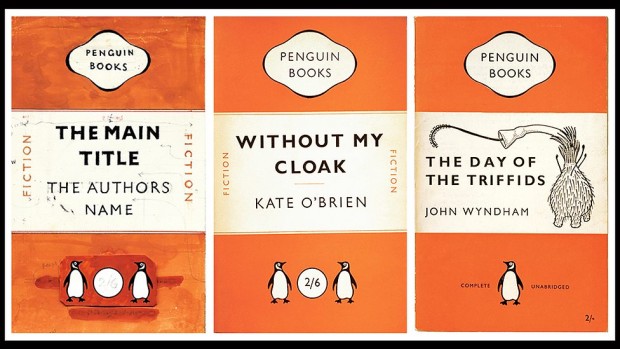
Gutenberg may have invented the movable-type printing press, used to create his monumental Bibles. But anyone who has ever sat in a cafe, or in the bath, with a paperback owes a debt to Aldus and the small, cleanly designed editions of the secular classics he called libelli portatiles, or portable little books.

“It’s become a cliché to call them the forerunners of the Penguin Classics,” G. Scott Clemons, the president of the Grolier Club, said during a recent tour of the installation in progress. “But the concept of personal reading is in some ways directly traceable to the innovations of Aldus’s portable library…”

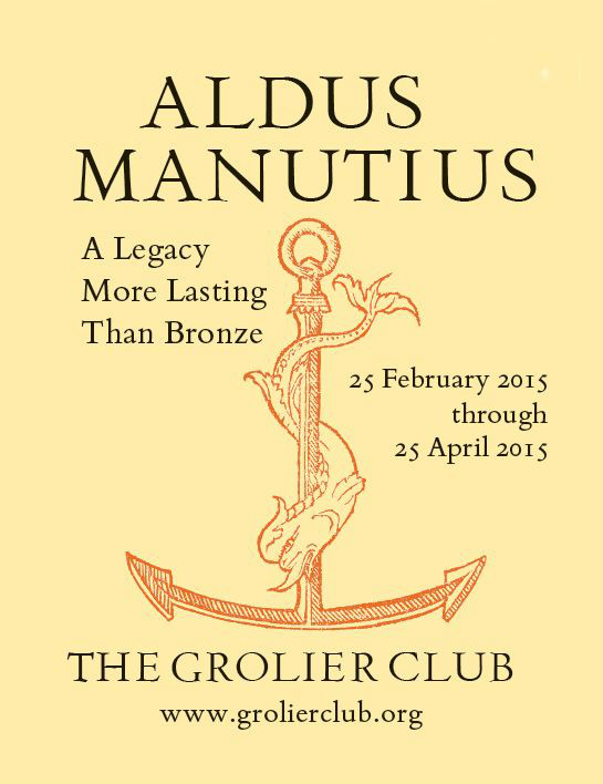
…The Aldine Press, in its start-up phase, emphasized Greek and Latin lexicons and grammar manuals. In 1495, Aldus began publishing the first printed edition of Aristotle. In 1501, he released the first of his small octavo editions of the classics, books “that could be held in the hand and learned by heart (not to speak of being read) by everyone,” as he later wrote. The show includes 20 libelli portatiles, all bearing Aldus’s printer’s mark, a dolphin curled around an anchor. (The colophon is still used today by Doubleday.) Some of the books were treated as treasures, and customized with magnificent decoration that harked back to the tradition of illuminated manuscripts. Others were workaday volumes, filled with marginal scribbles….

…Aldus’s contributions to the art of printing [include the] first italic typeface, which he created with the type cutter Francesco Griffo, a shadowy fellow who broke with Aldus acrimoniously and then slugged a man to death with an iron bar before reputedly meeting his own demise at the end of a hangman’s rope. Italics, which were intended to mimic the humanist handwriting of the day, first appeared in a modest five words in a 1500 edition of the letters of St. Catherine and soon spread to other Aldines, and beyond.

And then there was the roman typeface devised for a 1496 book by the humanist scholar Pietro Bembo — the inspiration for the modern font Bembo, still treasured by book designers for its grace and readability.

“The book itself is almost frivolous,” Mr. Clemons said of the text, which recounts a trip to Mount Etna. “But it launched that very modern typeface.”

The exhibition runs until April 25, 2015.

Comments closed

Book Covers of Note March 2015

Here is March’s selection of new and noteworthy covers. It’s a little bit of the Merto and Mendelsund show I’ll admit, but I assure you there really are some brilliant covers by other designers this month too!

a-z-of-you-and-me
The A-Z of You and Me by James Hannah; design by Leo Nickolls (Doubleday / March 2015)

bookseller
The Bookseller by Cynthia Swanson; design by Kimberly Glyder (Harper / March 2013  killed)

discontent-and-its-civilizations
Discontent and its Civilizations by Mohsin Hamid; design by Rachel Willey (Riverhead / February 2015)

field-notes-from-a-catastrophe
Field Notes from a Catastrophe by Elizabeth Kolbert; design by Patti Ratchford; illustration by Eric Nyquist (Bloomsbury / February 2015)

I also loved Eric’s ‘H is for Hawk’ illustration in the February 22nd edition of The New York Times Book Review.

9780701186982
The Four Books by Yan Lianke; design by Matt Broughton (Chatto & Windus / March 2015)

get-in-trouble
Get in Trouble by Kelly Link; design by Alex Merto (Random House / February 2015)

highway-of-despair
The Highway of Despair by Robyn Marasco; design by Jennifer Heuer (Columbia University Press / March 2015)

9780374172077
Holy Cow by David Duchovny; design by Rodrigo Corral; illustration and lettering by Natalya Balnova (Farrar, Straus & Giroux / February 2015)

i-am-sorry
I Am Sorry to Think I Raised a Timid Son by Kent Russell; design by Peter Mendelsund; hand lettering by Janet Hansen; photography by George Baier IV (Knopf / March 2015)

knife
The Knife by Ross Ritchell; design by Alex Merto (Blue Rider Press / February 2015)

(Camouflage book covers are the New Thing!)

last-word
The Last Word by Hanif Kureishi; design by Jaya Miceli (Scribner / March 2015)

letter-to-a-future-lover
A Letter to a Future Lover by Ander Monson; design by Marian Bantjes (Graywolf / February 2015)

Layout 1
The Librarian by Mikhail Elizarov; design by David Pearson (Pushkin Press / March 2015)

9781627790932
Making Nice by Matt Sumell; design by Gray318 (Henry Holt & Co. / February 2015)

9780691165073
One Day in the Life of the English Language by Frank L. Cioffi; design by Chris Ferrante (Princeton University Press / March 2015)

poser
The Poser by Jacob Rubin; design by Will Staehle (Viking / March 2015)

satin_island
Satin Island by Tom McCarthy; design by Peter Mendelsund (Knopf / February 2015)

so-youve-been-publicly-shamed
So You’ve Been Publicly Shamed by Jon Ronson; design by Matt Dorfman (Riverhead / March 2015)

The-Swan-Book
The Swan Book by Alexis Wright; design by Ceara Elliot (Corsair / March 2015)

unloved
The Unloved by Deborah Levy; design by Katya Mezhibovskaya; photograph by Robert and Shana ParkeHarrison (Bloomsbury / March 2015)

walls-around-us
The Walls Around Us by Nova Ren Suma; design by Connie Gabbert (Algonquin Books / March 2015)

we-all-looked-up
We All Looked Up by Tommy Wallach; Lucy Ruth Cummins; photographer Meredith Jenks (Simon & Schuster / March 2015)

The version of this cover which caught my eye was actually wordless — and I believe that was the designer’s original intention — so I’m a wee bit disappointed that the publisher didn’t quite have the courage to follow through on that.

worst-person-ever
Worst Person Ever by Douglas Coupland; design by Alex Merto (Plume / March 2015)

1 Comment

Reading Posture

Gauld-Cartoon-2-23-690

Tom Gauld for The New Yorker.

Comments closed

Affordable, Unabridged and Pocket-sized: 80 Years of Penguin Books

penguin

At BBC Arts, Brian Morton writes about 80 years of Penguin paperbacks:

The ubiquity of Penguin books in modern British publishing conceals a paradox best expressed by founder Allen Lane’s colleague and biographer Jack Morpurgo, who said that even in Allen Lane’s lifetime, Penguin became “the least typical member of the genus it was said to have created”.

There had been paperbacks before Penguin – all French books were paperback for instance and Woolworth’s, soon to be a key outlet for the new imprint, sold their own cheap editions – but few ranged so eclectically and wide.

And, in a second article, he looks at the legacy of their covers:

No other house had quite Penguin’s confidence in design. Pan Books, which began publication a decade after, in the mid 40s, were defined by a Mervyn Peake colophon of the god playing his pipes, a hint perhaps that here was a house that wasn’t going to trouble you with books on microeconomics or English churches… but with something more sensuous and possibly sensual…

…At the opposite extreme, but no less successful in their way, were the Fontana Modern Masters which began publication under Frank Kermode’s editorship in the 1970s, combining seriousness, a quick-crib approach to major thinkers and a stunning simple visual device, which was that each group of books featured a tessellating cut-up of an abstract painting by Oliver Bevan.

Buy them all, lay them out on your table and you had a bit of modern art. Painterly abstraction and san-serif typeface seemed to go together and seemed to fit as well as Bevan’s angles…

…But it was Penguin which continued to perfect the idea of cheap books as items that might be collected and displayed.

Comments closed

Wear and Tear

Somewhat related to Timothy Young’s list of the 10 good reasons the book is important, Oliver Farry writes on the comfort of well-worn books for the New Statesman:

This is one of the attractions of wear and tear. Objects that feel lived in give us a comforting feeling of having come a long way, of having been through the years (or months, as it might be). There is also the sense of having done some work. Even reading a book can be denoted by the physical mark you leave on it – the cracking of a spine, its progressive warping as you work your way to the end. Occasionally when reading a secondhand paperback, a bookmark or a dog-eared page shows you where the last owner gave up – you feel momentarily like Amundsen discovering Scott’s encampment.

Comments closed

Learning to Love the House Style

In a long and charming essay for The New Yorker, the magazine’s query proofreader Mary Norris muses on her career, and the history and uses of the comma:

Then I was allowed to work on the copydesk. It changed the way I read prose—I was paid to find mistakes, and it was a long time before I could once again read for pleasure. I spontaneously copy-edited everything I laid eyes on. I had a paperback edition of Faulkner’s “The Hamlet” that was so riddled with typos that it almost ruined Flem Snopes for me. But, as I relaxed on the copydesk, I was sometimes even able to enjoy myself. There were writers who weren’t very good and yet were impossible to improve, like figure skaters who hit all the technical marks but have a limited artistic appeal and sport unflattering costumes. There were competent writers on interesting subjects who were just careless enough in their spelling and punctuation to keep a girl occupied. And there were writers whose prose came in so highly polished that I couldn’t believe I was getting paid to read them: John Updike, Pauline Kael, Mark Singer, Ian Frazier! In a way, these were the hardest, because the prose lulled me into complacency. They transcended the office of the copy editor. It was hard to stay alert for opportunities to meddle in an immaculate manuscript, yet if you missed something you couldn’t use that as an excuse.

Norris’s book, Between You & Me: Confessions of a Comma Queen, will be published by W. W. Norton in April.

Comments closed

Labels

left-handed-scandinavians

I’m pretty sure ALL of these are BISAC codes. (It actually relates to this article in The Guardian)

See more of Tom Gauld’s cartoons here (or, better still, buy his book).

Comments closed

Ten Good Reasons the Book is Important

Over at Design Observer, writer Timothy Young gives 10 reasons why the book is still important. Number seven is that it is an object fixed in time:

“A book can tell us about its status in history. If we look through first editions of Moby Dick or Leaves of Grass, we find that they give away information not only about when they were created, but also about the worlds in which they were created, by way of advertisements, bindings, the quality of their paper, and watermarks on that paper. Such components are often not captured by scanning or are flattened out to make them of negligible use. In Nicholson Baker’s Double Fold—his saga about how libraries microfilmed runs of newspapers in the 1950s and 1960s and then discarded them—one of his chief complaints was that the filmers skipped advertising supplements and cartoons: things that had been deemed unimportant.”

Here’s the full list:

  1. It is a piece of technology that lasts
  2. It needs very little, if any, extra technology to be accessed
  3. The book retains evidence
  4. Books are true to form
  5. Each copy of a book is potentially unique
  6. Printed items are consumable goods
  7. A book is an object fixed in time
  8. A book can be an object of beauty and human craftsmanship
  9. When you are reading a book in a public place, other people can see what you are reading
  10. The Internet will never contain every book
1 Comment

The Snooty Bookshop

snooty-bookshop

We’ve all been there….

(by Tom Gauld, of course)

Comments closed

All Heart

With Valentine’s Day just around the corner, I thought I would share a few book covers that use hearts as part of their design…

all-about-love
All About Love by Lisa Appignanesi; design by Jamie Keenan (W. W. Norton / July 2011)

Alternatives to Sex
Alternatives to Sex by Stephen McCauley; design by David Ter-Avanesyan (Simon & Schuster / March 2006)

9780143122371
American Supernatural Tales edited by S. T. Joshi ; design by Paul Buckley (Penguin / October 2013)

Amy-and-Matthew
Amy and Matthew by Cammie McGovern; design by Sharon King-Chai (Macmillan Children’s Books / March 2014)

9780143120209B
The Campus Trilogy by David Lodge; design by Heads of State (Penguin / October 2011)

9781406325416
Cold Hands, Warm Heart by Jill Wolfson; design by Jack Noel (Walker Books / November 2011 )

coming-clean
Coming Clean by Kimberly Rae Miller; design by Lynn Buckley (New Harvest / July 2013)

committed

Committed by Elizabeth Gilbert; design by Helen Crawford-White; illustration by Illustration Yulia Brodskaya (Bloomsbury / January 2011)

don't-you-forget-about-me
Don’t You Forget About Me by Jancee Dunn; design by Catherine Casalino (Villard Books / July 2008)

eat-my-heart-out
Eat My Heart Out by Zoe Pilger; design by Rose Stallard (Serpents Tail / January 2014)

9781555976712
The Empathy Exams: Essays by Leslie Jamison; design by Kimberly Glyder (Graywolf / April 2014)

Untitled-10
Fraught Intimacies by Nathan Rambukkana; design by David Drummond (UBC Press / May 2015)

9780143119692_GirlsGuide_CV.indd
The Girls’ Guide to Hunting and Fishing by Melissa Bank; cover art by Lina Stigsson (Penguin / July 2011)

978144722397901
Gloss by Marilyn Kaye; design by Rachel Vale (Macmillan Children’s Books / June 2013 )

happy-are-the-happy-suzanne-dean
Happy are the Happy by Yesmina Reza; design by Suzanne Dean (Harvill Secker / July 2014)

The recently released US edition of Happy are the Happy published by Other Press, and designed by Kathleen DiGrado, also features a heart on the cover (if you know who the designer is, please let me know):

Happy-Are-The-Happy-US

Heart of the City_Sabar_HSYee
Heart of the City by Ariel Sabar; design by Henry Sene Yee (Da Capo / January 2011)

heart-of-darkness
Heart of Darkness by Joseph Conrad; design by Paul Buckley; art by Mike Mignola (Penguin / August 2012)

volkswagen
How to Keep Your Volkswagen Alive by Christopher Boucher; design by Christopher Brian King (Melville House / September 2011)

how-to-love
How to Love by Katie Cotugno; design by Alison Klapthor; cover art by Alison Carmichael (Balzer + Bray / October 2013)

hundred-hearts
The Hundred Hearts by William Kowalski; design by Michel Vrana (Thomas Allen / May 2013)

9781940450261
In Case of Emergency by Courtney Moreno; design by Sunra Thompson (McSweeney’s / September 2014)

in-case-we-die
In Case We Die by Danny Bland; design by Jacob Covey (Fantagraphics / September 2013)

9781250052896
Irritable Hearts: A PTSD Love Story by Mac McClelland; design by Keith Hayes (Flatiron Books / February 2014)

9780226018928
Learning to Love Form 1040 by Lawrence Zelenak; design by Isaac Tobin (University of Chicago Press / April 2013 )

lolita-bierut
Lolita by Vladimir Nabokov; design by Michael Bierut (Lolita Book Cover Project / 2013)

love-poems
Love Poems by Bertolt Brecht; translated by David Constantine and Tom Kuhn; design by Jennifer Heuer (W. W. Norton / December 2014)

lovers-dictionary
The Lover’s Dictionary by David Levithan; design by Jennifer Carrow (Farrar, Straus & Giroux / February 2011)

loves-winning-plays
Love’s Winning Plays by Inman Majors; design by Eric White (W. W. Norton / July 2013)

man-who-touched-his-own-heart
The Man Who Touched His Own Heart by Rob Dunn; design by Ploy Siripant (Little, Brown & Co. / February 2015)

marriage-plot
The Marriage Plot by Jeffrey Eugenides; design by Jo Walker (Fourth Estate / April 2012)

zusak
The Messenger by Markus Zusak; design by Sandy Cull / gogoGingko (Pan Macmillan / November 2013)

On-the-Noodle-Road
On the Noodle Road by Jen Lin-Liu; design by Lynn Buckley (Riverhead / July 2013)

ps-i-love-you
P. S. I Love You by Cecelia Ahern; design by Heike Schüssler (HarperCollins / January 2014)

teeth
Teeth by Hannah Moskowitz; design by Angela Goddard (Simon & Schuster / January 2013)

things-we-know
Things We Know by Heart by Jessi Kirby; design by Erin Fitzsimmons (HarperCollins / May 2015)

Doern art
The Wet Engine by Brian Doyle; design by David Drummond (Oregon State University / May 2012)

with-or-without-you
With or Without You by Domencia Ruta; design by Greg Mollica; lettering by Rebecca Siegel  (Spiegel & Grau / February 2013)

4 Comments

Because You Bought H is for Hawk

h-is-for-hawk

Tom Gauld

(H is for Hawk is actually on my reading list. And I would love a book about horology and depression to be honest)

Comments closed

Lettres Libres

Brut_LL

Canadian designer Catherine D’Amours kindly let me know about her work at Nouvelle Administration to redesign the ‘Lettres Libres’ series published by Montreal-based publisher Lux Éditeur, with the help of Jolin Masson, a freelancer for the team. Printed on craft paper, each cover has its own pattern based on the subject of the book.

I am also a big fan of Catherine’s work for Le Quartanier, another Montreal-based publisher. You can read more about her NOVA series here.

1 Comment