Skip to content

Category: Books

Book Covers of Note February 2015

Here is this month’s selection of new book covers that have caught my eye…

angry-youth-comix
Angry Youth Comix by Johnny Ryan; design by Keeli McCarthy (Fantagraphics / February 2015)

Dom Casmurro hi-res
Dom Casmurro by Machado de Assis; design by Nathan Burton (Daunt Books / February 2015)

etta-otto-russell-james
Etta and Otto and Russell and James by Emma Hooper; design by Gray318 (Penguin / January 2015)

fishermen-gray318
The Fishermen by Chigozie Obioma; design by Gray318 (Pushkin Press / February 2015)

Girl In The Dark
Girl in the Dark by Anna Lyndsey; design by Greg Heinimann (Bloomsbury / February 2015)

i-am-radar
I Am Radar by Reif Larsen; design by Will Staehle (Penguin Press / February 2015)

ismael-and-his-sisters
Ismael and His Sisters by Louise Stern; design by Dan Mogford (Granta / February 2015)

italians
The Italians by John Hooper; design by Nicholas Misani (Viking / January 2015)

karate-chop-pearson
Karate Chop by Dorthe Nors; design by David Pearson (Pushkin Press / February 2015)

munich-airport
Munich Airport by Greg Baxter; design by Anne Twomey (Twelve Books / January 2015)

room
The Room by Jonas Karlsson; design by Christopher Brand; photograph by George Baier IV (Hogarth / February 2015)

shooting-stars-burton
Shooting Stars by Stefan Zweig; design by David Pearson (Pushkin Press / February 2015)


Pudd’nhead Wilson and The Prince and the Pauper by Mark Twain; design by Isabel Urbina Peña (Vintage / February 2015)

utopia-of-rules
The Utopia of Rules by David Graeber; design by Christopher Brian King (Melville House / February 2015)

2 Comments

Our Dear, Departed Books…

dear-departed-books

Tom Gauld for the New Yorker.

Comments closed

The Doves Type Revival

DovesBibleTidcombe720x400

I missed this wonderful story about the infamous lost typeface of English Arts and Crafts publisher Doves Press — unceremoniously “bequeathed” to the Thames by one of the co-founders of the press —  in The Economist last month:

Between August 1916 and January 1917 Cobden-Sanderson, a printer and bookbinder, dropped more than a tonne of metal printing type from the west side of the bridge. He made around 170 trips in all from his bindery beside the pub, a distance of about half a mile, and always after dusk. At the start he hurled whole pages of type into the river; later he threw it like bird seed from his pockets. Then he found a small wooden box with a sliding lid, for which he made a handle out of tape—perfect for sprinkling the pieces into the water, and not too suspicious to bystanders.

Those tiny metal slugs belonged to a font of type used exclusively by the Doves Press, a printer of fine books that Cobden-Sanderson had co-founded 16 years earlier. The type was not his to destroy, so he concealed his trips from his friends and family and dropped his packages only when passing traffic would drown out the splash. There were slip-ups, all the same. One evening he nearly struck a boatman, whose vessel shot out unexpectedly from under the bridge. Another night he threw two cases of type short of the water. They landed on the pier below, out of reach but in plain sight. After sleepless nights he determined to retrieve them by boat, but they eventually washed away. After that he was more careful.

Now, almost 100 years after the original metal type was lost, Doves has been revived as a digital typeface:

For three years [Richard Green] has been crafting a digital reproduction of the famous face—the first fully usable Doves font since the original metal pieces were swallowed by the Thames. In search of perfect curves and precise serifs, he reckons he has redrawn it at least 120 times. “I’m not really sure why I started. In the end it took over my life.”

Intrepid fans have occasionally tried to recover pieces of the type from the river, but no one has ever found any, so Mr Green had to beg and borrow Doves books as a reference. That sounds simple—yet the uneven printing that letterpress-lovers cherish made tracing the type impossible. Once ink hits paper, no single letter is reproduced identically. Guessing the shape of the metal that made the marks takes time and patience. Guess wrong, and the error is imperceptible at first; but lined up in text the letter looks awkward, the typeface distracting.

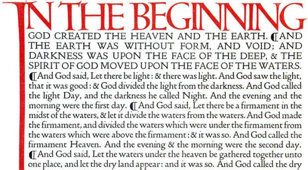
That painstaking process is similar to the technique Cobden-Sanderson and Walker used to create the Doves type, itself a confection of two earlier designs. Doves owes most to the type of Nicholas Jenson, a Venetian printer from the 15th century whose clear and elegant texts shunned the gothic blackletter favoured by print’s early pioneers. A few letters were added, and others redrawn. The arrow-straight descender of its lower case ‘y’ divides critics; purists lament the thick crossbar of the upper case ‘H’. Most people neither notice nor care. “No more graceful Roman letter has ever been cut and cast,” opined A.W. Pollard, a contemporary critic, in the Times. Simon Garfield, a modern writer, celebrates its rickety form, which looks “as if someone had broken into the press after hours and banged into the compositor’s plates.”

You can read more about the history of Doves and the digital revival at Typespec.

And apparently a small amount of the original metal type was recently salvaged from the Thames too. Amazing.

2 Comments

The Wolf Hall Fun Book

wolf-hall-fun-book

Tom Gauld.

Comments closed

Student Editions by Ákos Polgárdi

DK-Jokai-KEF

These rather fabulous typographic covers were designed by Ákos Polgárdi for Európa Könyvkiadó‘s Student Editions series. Works of classic literature from Hungary and around the world, each cover features text from the book as a background pattern.

student-editions-1 student-editions-2student-editions-4 student-editions-3

You can see more of Ákos’ book covers on his website.

Comments closed

Ladybird by Design

ladybird-by-design-4

The Guardian‘s Kathryn Hughes visits Ladybird By Design, an exhibition of over 200 original illustrations from the golden age of Ladybird Books:

To enter Ladybird’s world again is to relearn a universe that is both strange yet uncannily familiar. Inevitably the books express the values of their times. In the Peter and Jane series (aka Key Words Reading Scheme), Peter tends to hang out with Daddy in the garage, while Jane helps Mummy get the tea. Fair-haired and blue-eyed, every one in the children’s world looks exactly like them, apart from Pat the dog.

Still, if Ladybird books were conservative on gender and race, they were positively brisk on class. The world of Peter and Jane – and all the other children who appear in the Ladybird universe doing magic tricks, going to the shops, taking batteries apart or learning to swim – is both modern and modest. As illustrated by Berry, Wingfield and Martin Aitchison, the children appear to live in one of the postwar new towns. Their home is probably privately owned but it could conceivably be a newly built council house. Their adventures involve going on a train or to the beach with Mummy and Daddy. There are no prep-school japes here, no solving of improbable mysteries or clifftop rescues.

Perhaps this achievable utopia was a compensatory fantasy for the illustrators who, born around 1920, had mostly known childhoods far harder than this. Busy providing a safe, stable environment for their own little Peters and Janes, men such as Berry and Wingfield showed a world where things were, on the whole, getting better. Modernity increasingly presses into the frame: Jane and Peter eat off a table that looks like knock-off Habitat, Mummy wears slacks and Daddy even starts to help with the washing-up. More disruptive changes, though, are kept at a safe distance. Carnaby Street, with all its troubling freedoms, has no place in the Ladybird world, nor does the cold war or Vietnam.

For those of you who didn’t grow up in the UK, Ladybird Books were slim illustrated hardcover books for children. They were educational, or at least ‘improving’, and so creepy that I think they’ve actually scarred the national psyche. If you are of certain age, the books trigger a shiver of queasy nostalgia — without Ladybird Books the horrifying weird of The League of Gentleman or Scarfolk is just inconceivable — and yet I still think of them fondly. Sort of.
9780723293927
The exhibition, which opens later this week, takes its title from a forthcoming Penguin book called Ladybird by Design. Written by Lawrence Zeegen, Professor of Illustration and Dean of the School of Design at the London College of Communication, the book celebrates 100 years of Ladybird, and examines the social and design history of the publisher. It is sure to be smashing.

1 Comment

50 Years Since the Great Poet’s Death

50-years

Tom Gauld‘s weekly strip is back in The Guardian.

Comments closed

The Four Undramatic Plot Structures by Tom Gauld

gauld-four-undramatic-plot-structures-1200

Tom Gauld for The New Yorker.

Comments closed

Noam Chomsky Series Design by David Pearson

Layout 1

Designer David Pearson has created some rather nice typographic covers for the UK editions of Noam Chomsky available from UK publisher Pluto Press.

Layout 1

In addition to the talented Mr. Pearson, Pluto Press’s design manager Melanie Patrick kindly let me know that the publisher is currently working with designers such as David Drummond, David Gee, Jamie Keenan, Dan Mogford, and Jarrod Taylor. You can see some of the results on their new Tumblr Pluto Press Covers, including this slick (ba-dum ching!) cover for the forthcoming Artwash by Mel Evans, designed by Mr. Keenan:

artwashrgbhighres

Comments closed

Books Covers of Note January 2015

January’s selections include some of this month’s new releases plus a few stragglers from 2014 that were undeservedly overlooked last year:

against-the-country
Against the Country by Ben Metcalf; design and illustration by Leanne Shapton (Random House / January 2015)

bad-character-novel
A Bad Character by Deepti Kapoor; design by Janet Hansen (Knopf / January 2015)

Brave New World
Brave New World by Aldous Huxley; design by Scot Bendall & Richard Carey / La Boca (Vintage / November 2014)

fifty-mice
Fifty Mice by Daniel Pyne; design by Alex Merto (Blue Rider Press / December 2014)

first-bad-man
The First Bad Man by Miranda July; design by Mike Mills (Scribner / January 2015)

91bGUNqrbPL._SL1500_
GB84 by David Peace; design by Christopher King (Melville House / November 2014)

hall-of-small-mammals
Hall of Small Mammals by Thomas Pierce; design by Grace Han; cover art by Kate Bergin (Riverhead / January 2015)

9781250052216
The Heart Does Not Grow Back by Fred Venturini; design by Henry Sene Yee (Picador / November 2014)

I-THINK-YOURE-TOTALLY-WRONG
I Think You’re Totally Wrong: A Quarrel by David Shields and Caleb Powell; design by Chip Kidd (Knopf / January 2015)

mermaids-in-paradise

Mermaids in Paradise by Lydia Millet; design by Chris Welch Design (W. W. Norton / November 2014)

9780241004968
Trouble in Paradise By Slavoj Žižek; design by Richard Green (Allen Lane / November 2014)

unbecoming
Unbecoming by Rebecca Scherm; design by Paul Buckley (Viking / January 2015)

schafferzf
The Veiled Sun by Paul Schaffer; design by David Drummond (Véhicule Press / January 2015)

weathering
Weathering by Lucy Wood; design by Greg Heinimann (Bloomsbury / January 2015)

X
X by Ilyasah Shabazz with Kekla Magoon; design by Matt Roeser (Candlewick Press / January 2015)

Comments closed

2015 Design Awards

Happy New Year!

Now that all the amateur ‘best of 2014’ lists are out of the way, it’s time for the professionals submit their covers to the actual design competitions. Last week 50 Books / 50 Covers opened for entries. Meanwhile the closing dates for this year’s Australian Book Design Awards and ABCD15 in the UK are fast approaching…

50 Books / 50 Covers

Design Observer announced the opening of the 50 Books/50 Covers competition for books published in 2014. The competition will accept online entries from January 7, 2015 to March 18, 2015. See the guidelines for more details.


View the 2013 50 Books and 50 Covers 

ABCD 15

If you live in the United Kingdom, the Academy of British Cover Design (ABCD) has announced the opening of its second annual cover design competition. Books published between January 1 and December 31 2014 by any designer based in the UK are eligible. All entries must be received by the 31st January 2015.

View the winners of ABCD14

Australian Book Design Awards

The Australian Book Designers Association (ABDA) has also announced the 63rd Australian Book Design Awards. The awards are open to any book designed and published for the first time in Australia between 1 January 2014 and 31 December 2014. Entries close on Friday 23 January 2015.

View the winners of the 2014 ABDA Book Design Awards

Comments closed

Front Row: The Art of Book Cover Design


BBC Radio 4’s Front Row talks to Suzanne Dean, creative director at Random House UK, about the art of book cover design. Dean, who was very publicly thanked by Julian Barnes for her work on his book The Sense of an Ending, has been responsible for more Booker-winning covers than any other designer apparently.

Host John Wilson also chats with designer Matthew Young about the relaunched Pelican Books, while authors Ian McEwan, Tom McCarthy and Audrey Niffenegger, and Telegraph books editor Gaby Wood, share their thoughts on what makes a good book cover.

BBC Radio 4 Front Row: The Art of Book Cover Design mp3

Comments closed