Congratulations to all the 2015 Australian Book Design Awards Winners!
You can find all the winning designs on the Australian Book Designers Association website.
Comments closedBooks, Design and Culture
Congratulations to all the 2015 Australian Book Design Awards Winners!
You can find all the winning designs on the Australian Book Designers Association website.
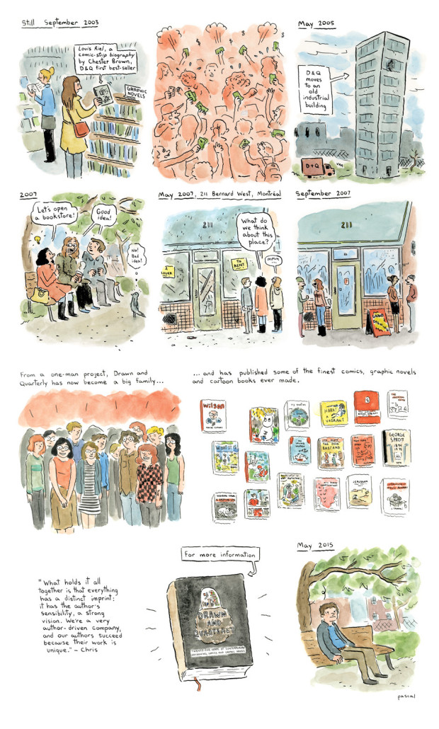
Comments closedThis past weekend at the Toronto Comic Arts Festival, Montreal publisher Drawn and Quarterly celebrated their 25th anniversary. D+Q cartoonist Pascal Girard (Petty Theft, Reunion, Bigfoot) drew a history of the publisher for the National Post:
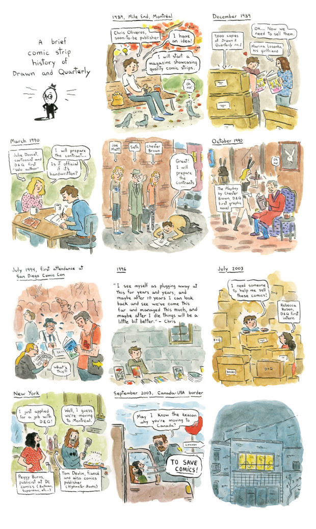
While in a lengthy profile of the publisher by Mark Medley, the Globe and Mail revealed that founder Chris Oliveros is handing the company over to long-time collaborators Tom Devlin and Peggy Burns:
If Drawn and Quarterly is “like a big family,” as Chester Brown described the company to me earlier this week, then, in a sense, the family is losing its father.
A little more than a year ago, Oliveros pulled aside Burns and Devlin, his longest-serving co-workers, and told them he was thinking of stepping down, and that he wanted them to take over the company.
“It was a complete surprise,” says Devlin. “We kind of assumed he’d just do it forever.”
Burns says she burst into tears upon hearing the news.
“I’ve personally taken it as far as I can take it,” says Oliveros. “It would have been fine if I continued. It’s not like they were telling me to go or anything. I could have been around for the 30th anniversary, for the 35th, and the 40th, if I’m still alive, but I just feel, you know what, I don’t think I can accomplish – me, personally – I don’t think I can accomplish more.”
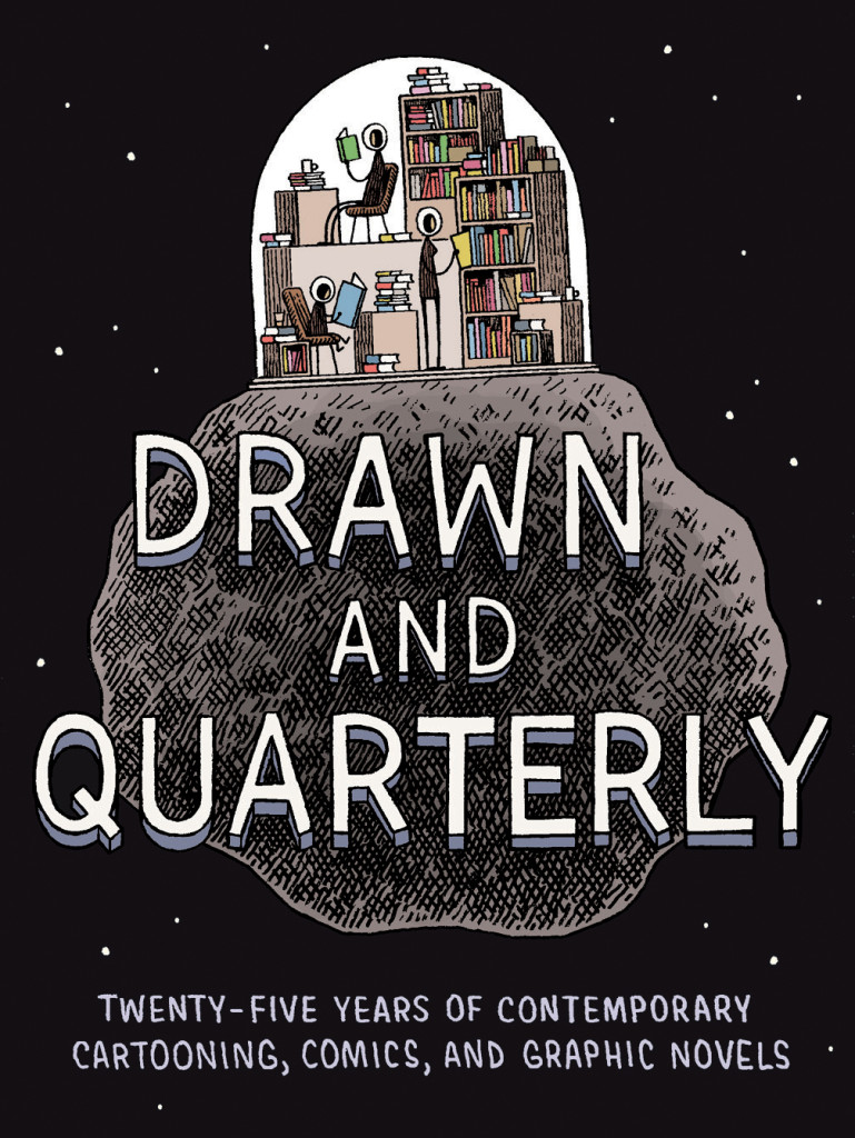
A new book celebrating the publisher, Drawn and Quarterly: Twenty-Five Years of Contemporary Cartooning, Comics, and Graphic Novels, will be published later this month.
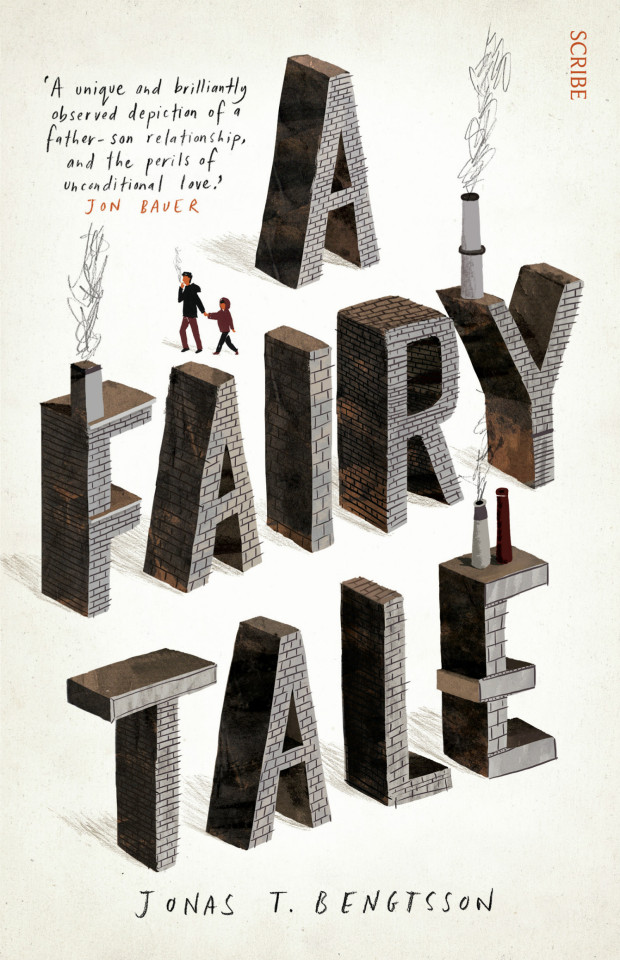
This month’s post is very heavy on illustrated and hand-lettered covers for some reason, but it’s all the prettier for it…
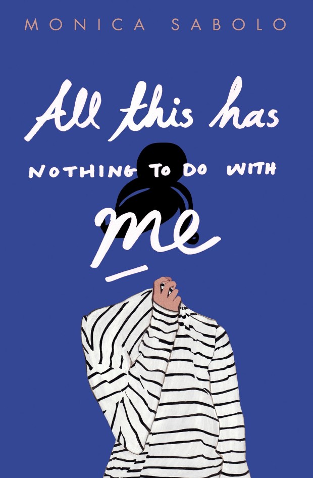
All This Has Nothing To Do With Me by Monica Sabolo; design by Justine Anweiler; illustration by Daphne van den Heuvel (Picador / April 2015)
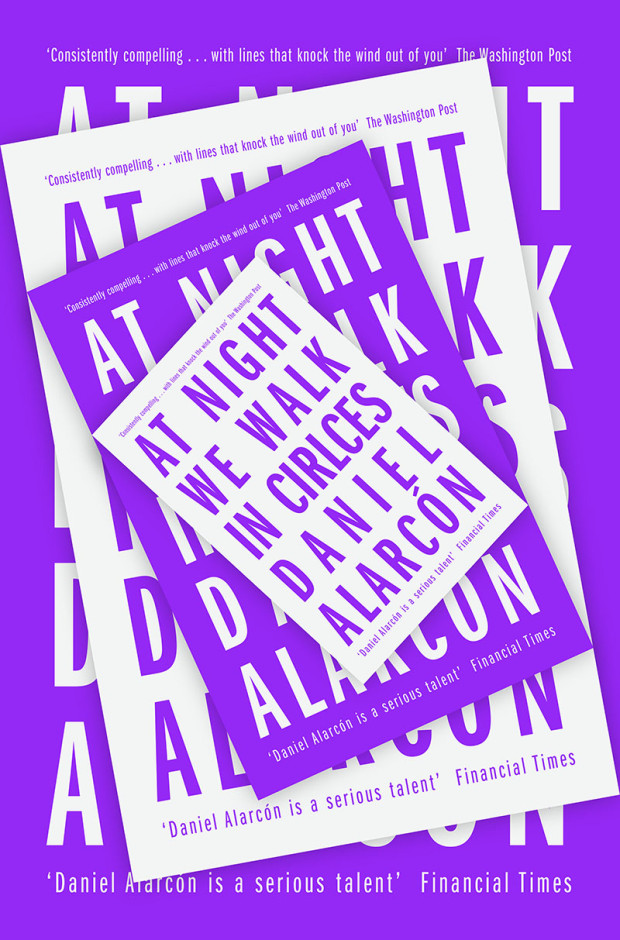
At Night We Walk in Circles by Daniel Alarcón; design by Jonathan Pelham (Fourth Estate / May 2015)
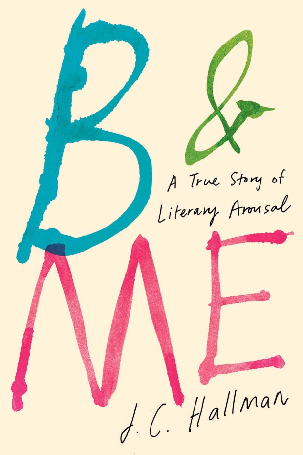
B & Me by J. C. Hallman; design by Christopher Lin (Simon & Schuster / March 2015)

The Bees by Laline Paull; design by Sara Wood (Ecco / May 2015)
The jacket for the US hardcover of The Bees, designed by Steve Attardo, was a book cover of note in May 2014.
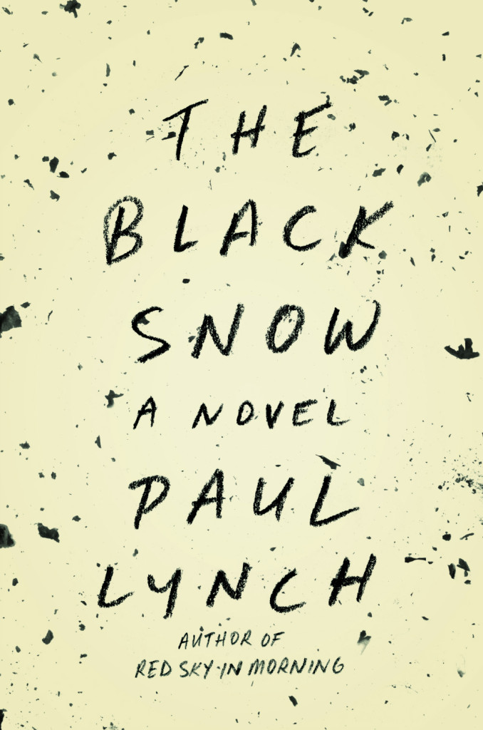
Black Snow by Paul Lynch; design by Keith Hayes (Little, Brown & Co. / May 2015)

Boo by Neil Smith; design by Isabel Urbina Peña (Vintage / May 2015)
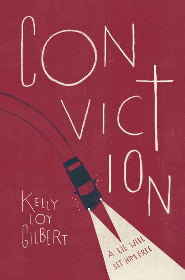
Conviction by Kelly Loy Gilbert design by Maria Elias; illustration by Christopher Silas Neal (Disney-Hyperion / May 2015)
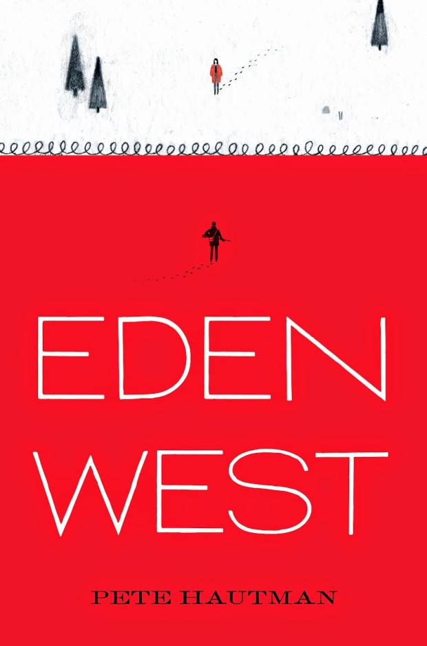
Eden West by Pete Hautman; design by Matt Roeser (Candlewick / April 2015)
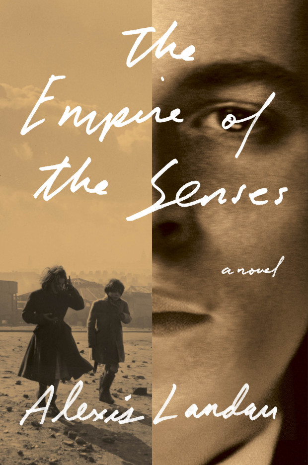
Empire of the Senses by Alexis Landau; design by Janet Hansen (Pantheon / March 2015)

Herzog by Saul Bellow; design by Lynn Buckley (Penguin / May 2015)
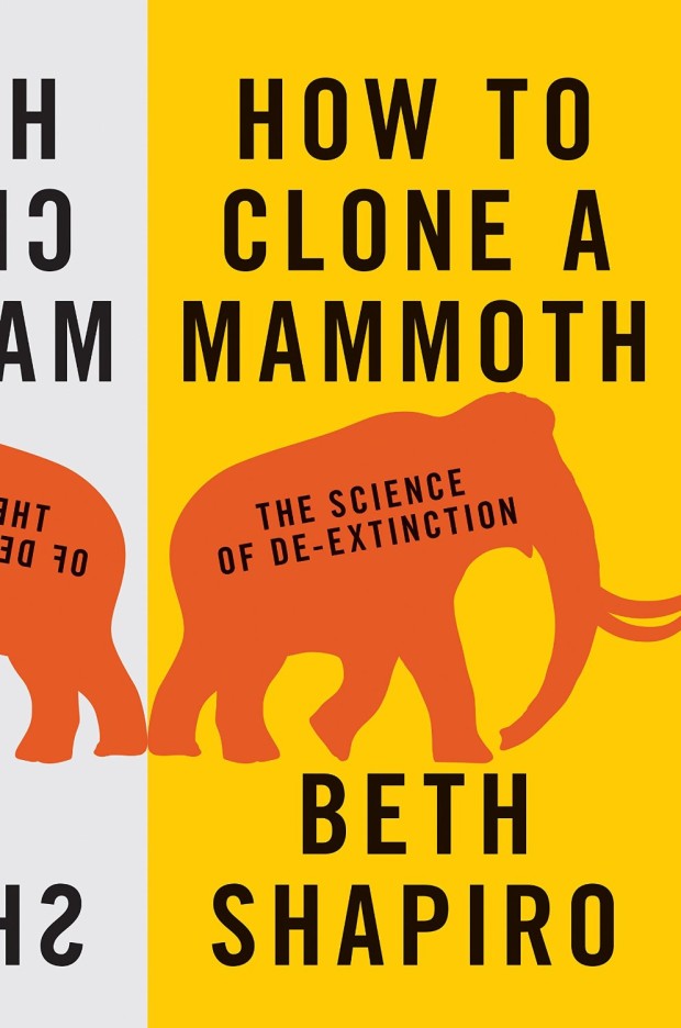
How to Clone a Mammoth by Beth Shapiro; design by Jason Alejandro (Princeton University Press / April 2015)
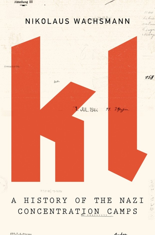
KL by Nikolaus Wachsmann; design by Alex Merto (Farrar, Straus & Giroux / April 2015)
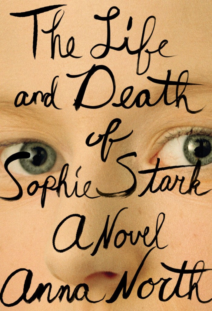
Life and Death of Sophie Stark by Anna North; design by Spencer Kimble (Blue Rider Press / May 2015)
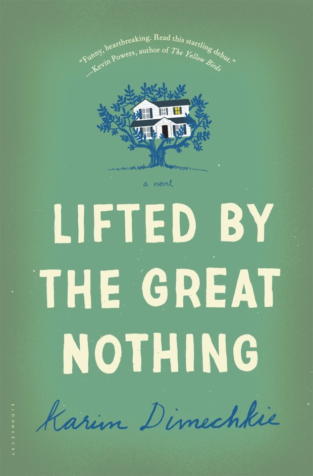
Lifted by the Great Nothing by Karim Dimechkie; design by Katya Mezhibovskaya; illustration by Christopher Silas Neal (Bloomsbury / May 2015)
Further proof, were it needed, that Christopher would do a great covers for Harper Lee.
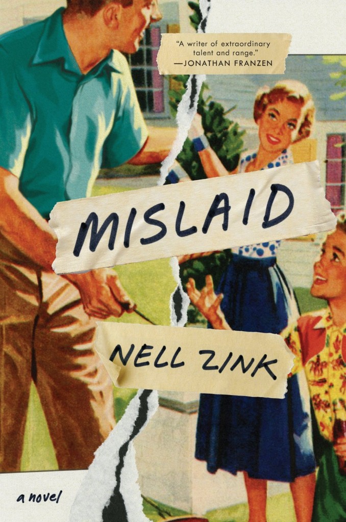
Mislaid by Nell Zink; design by Allison Saltzman (Ecco / May 2015)
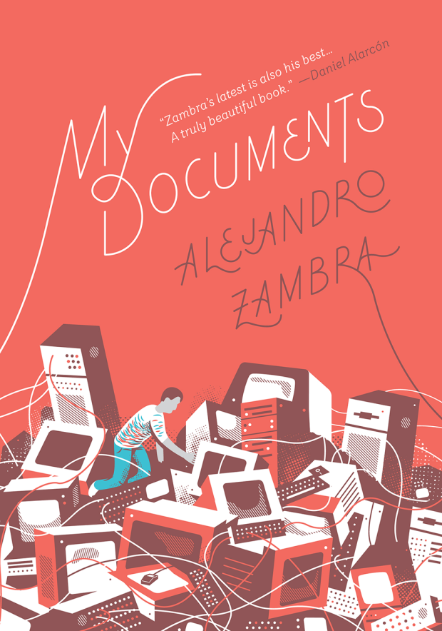
My Documents by Alejandro Zambra; design & illustration Sunra Thompson (McSweeney’s / April 2015)
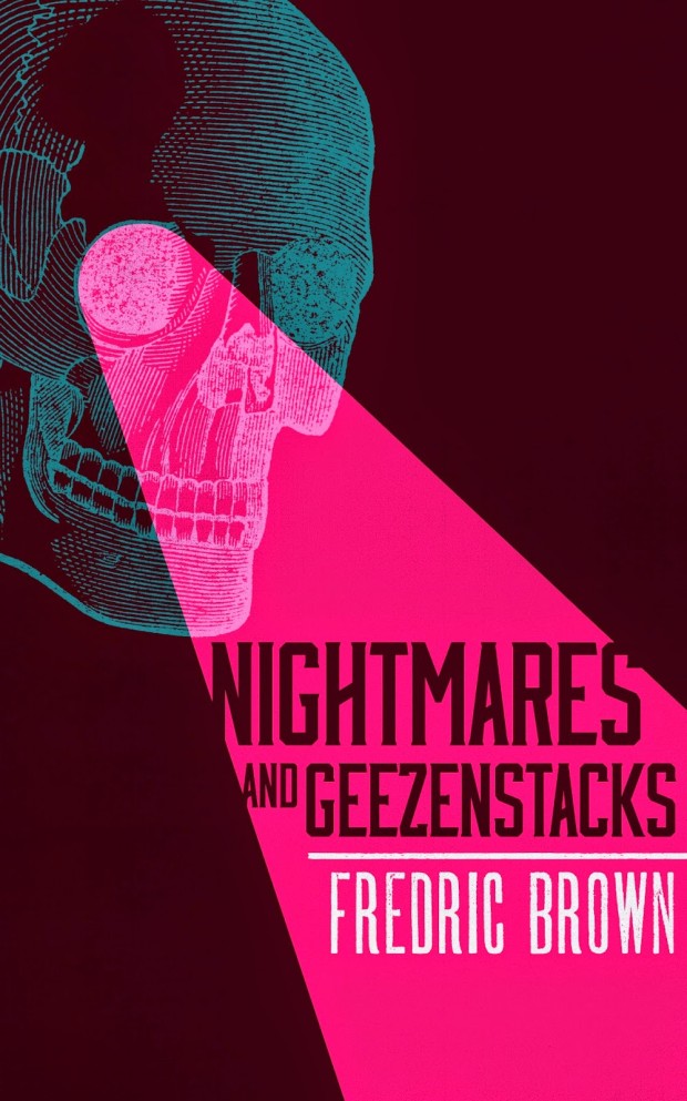
Nightmares and Geezenstacks by Fredric Brown; design by M. S. Corley (Valancourt Books / April 2015)
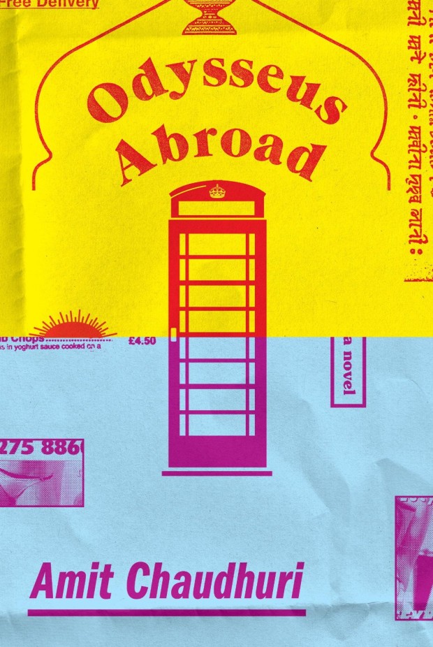
Odysseus Abroad by Amit Chaudhuri; design by Oliver Munday (Knopf / April 2015)
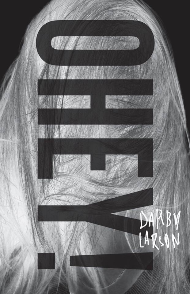
Ohey! by Darby Larson; design by Alban Fischer (CCM / May 2015)
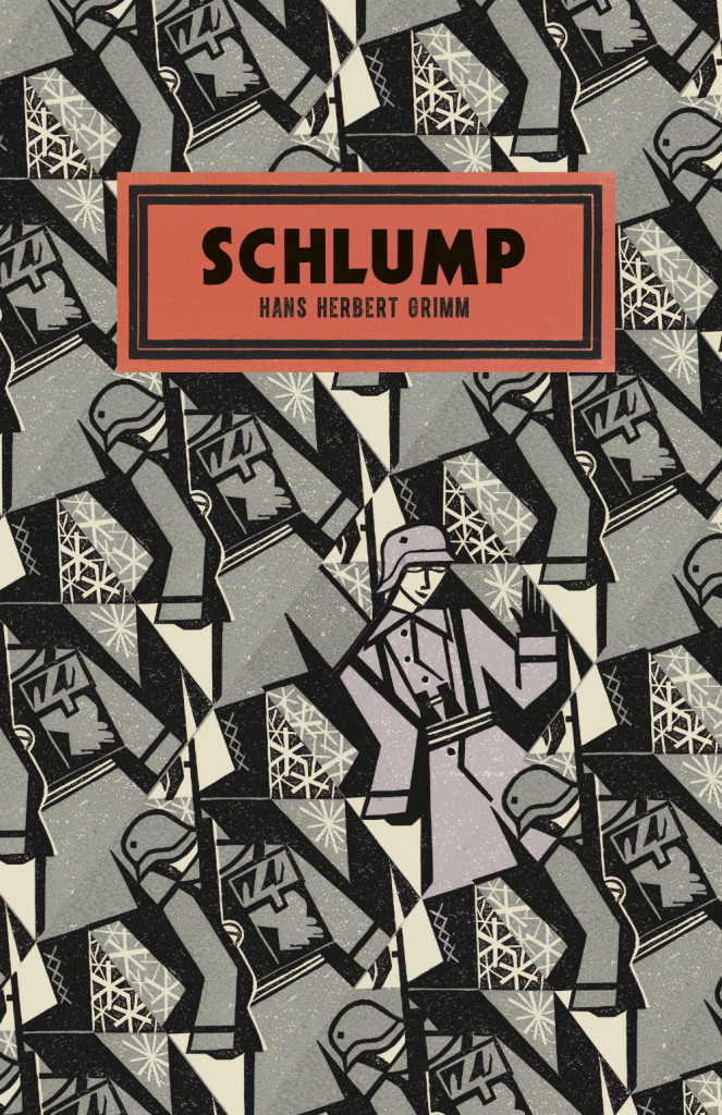
Schlump by Hans Herbert Grim; design by Suzanne Dean; illustration by Clare Curtis (Vintage / May 2015)
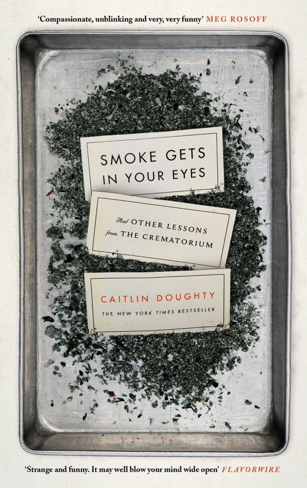
Smoke Gets in Your Eyes by Caitlin Doughty; design by Peter Adlington (Canongate / April 2015)
The US edition, designed by David High, was a book cover of note in September 2014.
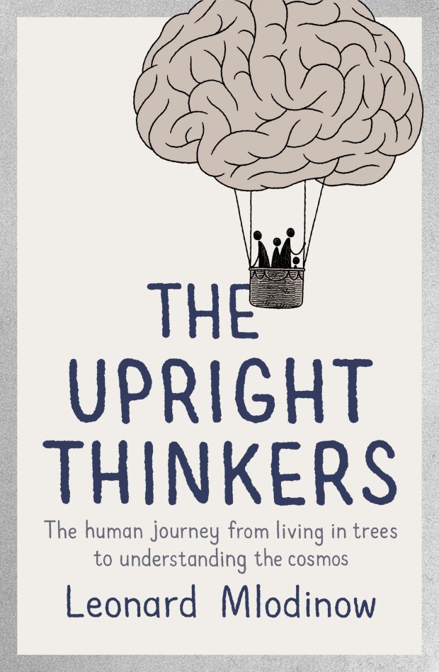
The Upright Thinkers by Leonard Mlodinow; cover art by Tom Gauld (Allen Lane / May 2015)

Visiting Hours by Amy Butcher; design by Spencer Kimble (Blue Rider Press / April 2015)
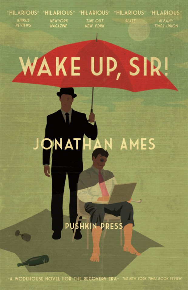
Wake Up, Sir! by Jonathan Ames; design by Jamie Keenan (Pushkin Press / May 2015)
At the NYRB Blog, Tim Parks wonders if there are just too many books:
1 CommentIs there a relationship between the quantity of books available to us, the ease with which they can be written and published, and our reading experience?
At present, for example, it’s hard not to feel that we are in an era of massive overproduction. Just when we were already overwhelmed with paper books, often setting them aside after only a few pages in anxious search of something more satisfying, along came the Internet and the e-book so that, wonderfully, we now have access to hundreds of thousands of contemporary novels and poems from this very space into which I am writing.
Inevitably, this tends to diminish the seriousness with which I approach any particular book. Certainly the notion that these works could ever be arranged in any satisfactory order, or that any credible canon will ever emerge, is gone forever.
I don’t post too many crowd-funded publishing projects here on the Casual Optimist — there are so many of them, and so few seem really significant — but I’m more than happy to support the Designers and Books‘
campaign to create a facsimile reprint of Visual Design in Action by modernist graphic designer Ladislav Sutnar. First published in 1961, and out of print for decades, it looks very worthy of a revival:
You can read more about the book and the campaign here.


I particularly like that they have an award for Young Designer of the Year. The designers shortlisted this year are Alissa Dinallo, Hazel Lam, and Imogen Stubbs:


The full list can be downloaded as a PDF from the ABDA blog. The winners will be announced Friday, May 22nd in Sydney.
Comments closed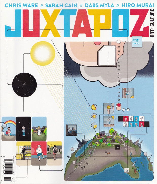
Juxtapoz contributing editor Kristin Farr talks to Chris Ware, the magazine’s May 2015 cover artist, for their Beyond the Cover site:
Comments closedBeyond setting a very specific mood, tone or feeling of a time of day or era, color in my stuff sometimes acts as a separate, countervailing story, connecting elements and images in ways that I sometimes hadn’t even predicted when I was simply drawing the page, reflecting more the way we see the world than how we define it. At the same time, the page compositions are also an attempt to get a glimpse at the way we edit, remember, and clean up our own experiences into “stories”…
…Comics best approximate how I remember and think about the world and how I also think many other people do; I believe even Nabokov at some point expressed frustration at not being able to induce a non-verbal image-based sort of page-memory (but he still did it better than anyone, except Joyce). I find myself thinking about my stories at odd times during the day, almost as if they’re an alternate reality; I can’t liken the experience to anything other than the psychosis of false or self-induced memories. Then again, any memories are always going to have some falseness, all of which add up to a fairly unreliable sense of one’s life and experience.
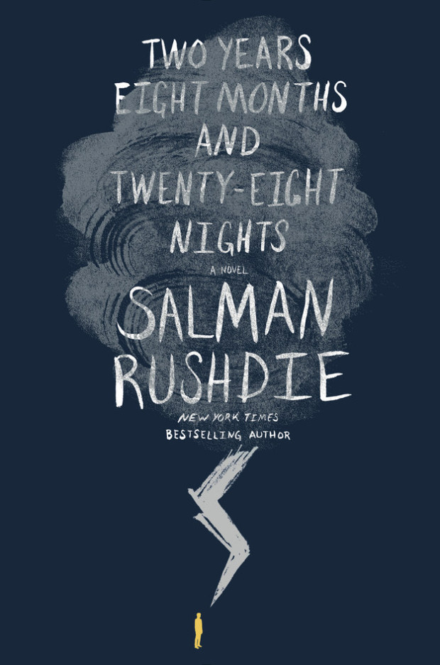
The cover of the US edition of Salman Rushdie’s first adult novel in seven years. Two Years Eight Months and Twenty-Eight Nights (Random House, September 2015), was revealed on Buzzfeed last week.1 While the cover itself is perfectly fine, the most remarkable thing about it is how much it looks like a novel for young adults.
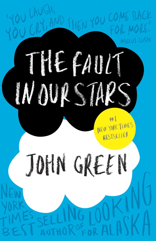
I was immediately reminded of the cover of The Fault in Our Stars by John Green, designed by Rodrigo Corral (Penguin 2012)…
…and the lovely hand-lettered YA covers of Australian designer and illustrator Allison Colpoys:


After some further thought, however, I realised that it is even more reminiscent of the cover for the novel Waiting for Doggo by Mark B. Mills, designed by Yeti Lambregts (Headline, November 2014), which made me wonder if, perhaps, we are starting to see more adult covers that look like YA?


Since the success of Harry Potter, publishers have known that adults read ‘children’s books’ for pleasure, and they will often try to appeal these to older readers with more mature covers. On Twitter last week, American YA cover designer Erin Fitzsimmons (interviewed on the blog here), identified this as ‘crossover appeal.’ But crossover appeal can go both ways, and it seems that adult covers are being designed to reach the widest possible audience too.
This trend is more pronounced in the UK where bright and whimsical illustrated covers are common for commercial fiction. The vibrant cover of the UK edition of Two Years Eight Months and Twenty-Eight Nights (and the accompanying backlist) — beautifully illustrated by Sroop Sunar and unveiled today — is a perfect example:
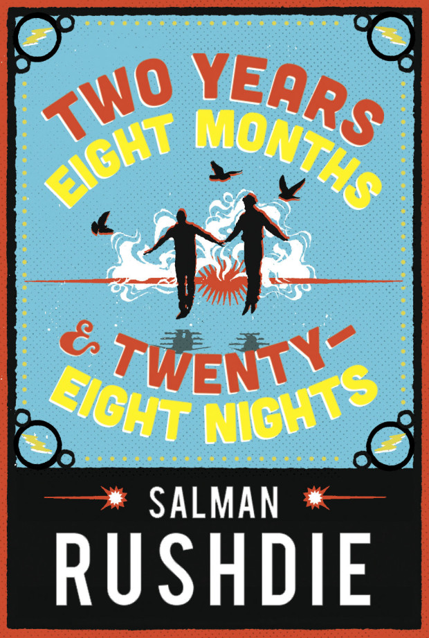
According to CMYK, the Vintage Books design blog, Sunar was inspired by printed ephemera found in India around the time of Independence, and the brightly coloured covers would work equally well for YA as for adult fiction:

US publishers have (I think) been slower to market adult fiction to younger readers in this way. Although hand-lettering has become very common on US covers for a while now, photographic images still dominate commercial fiction covers. Compare, for example, the UK cover of Station Eleven by Emily St. John Mandel, illustrated by Nathan Burton (left), with US edition designed by Abby Weintraub (on the right):


From my own experience, I can also think of at least one quirky illustrated cover — for an upcoming literary novel that the publisher has very high hopes for — that was killed at the last minute in favour of a more traditional photographic one. The original design could easily have been for a gothic Young Adult fantasy. The new cover, much less ambiguous, is clearly intended for adult book clubs.


Even so, Two Years Eight Months and Twenty-Eight Nights and a few other recent covers suggest that US publishers are willing to experiment, and as audiences for YA and adult fiction become harder to differentiate, we will only see more covers that blur those lines.
Comments closed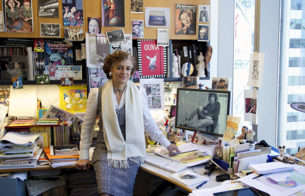
Grace Bello interviews the always interesting Françoise Mouly, art director of The New Yorker and founder of Toon Books, for Guernica:
Comments closedI know what I respond to is a voice. A voice is not just a stylistic thing, but it means someone who really has something to say. I think a lot of what I get from books—whether they be books of comics or books of literature—is a window into somebody’s mind and their way of thinking. I love it when it’s so specific. It’s a new way to look at the world. It’s as if I could get in and see it through their eyes. It also reaches a level of universality because, somehow, I can recognize some of my feelings in seeing somebody who is actually expressing their own inner reality. Even though Flaubert has not been in Madame Bovary’s skin, you do get a sense of what it’s like to be that person. It’s a kind of empathic response when you’re reading it.
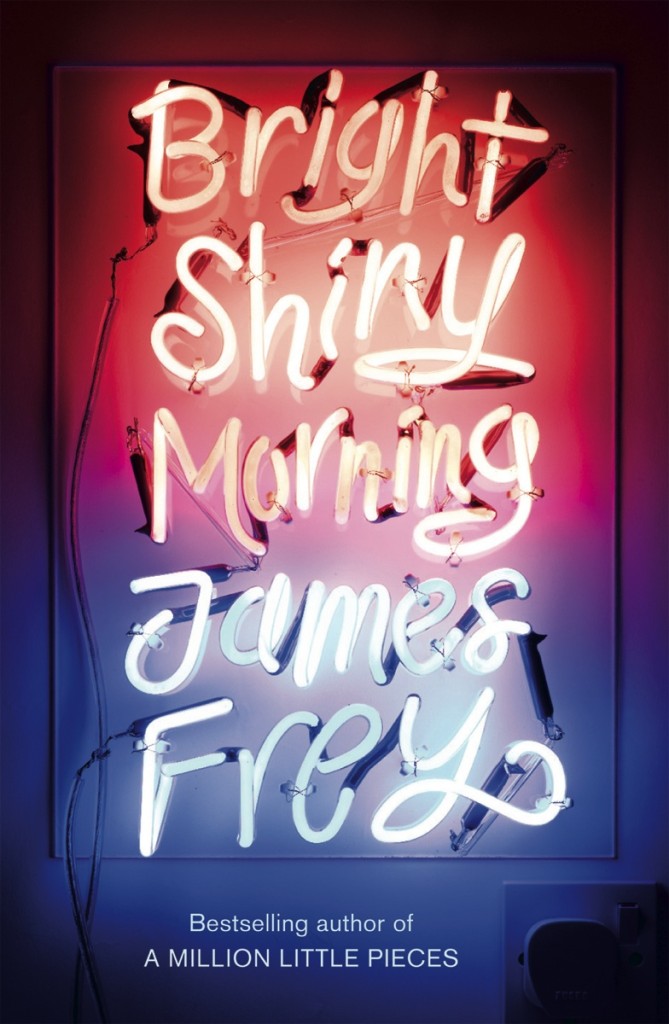
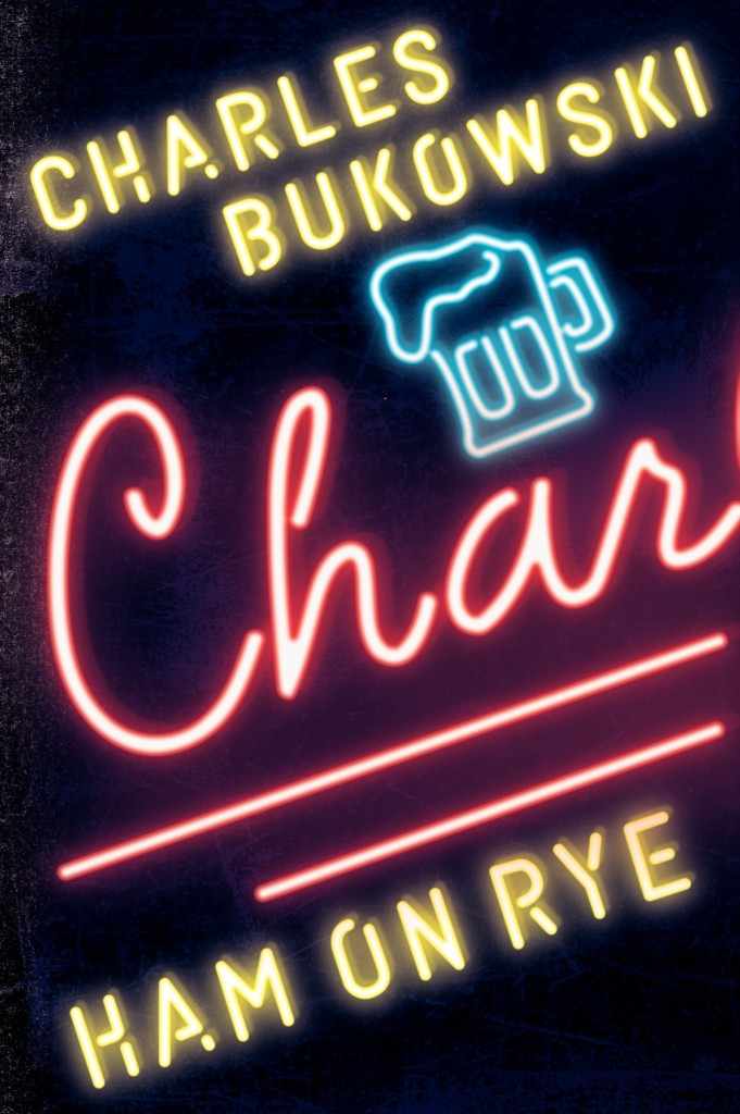
Inspired by the recent Blur album cover designed by Tony Hung (read more about it here) amongst other things, here are a selection of (relatively) recent books cover designs using lettering inspired by neon signs (pictured above: Bright Shiny Morning by James Frey, designed by the one and only Gray318 in 2008):

Brothers by Yu Hua; design by Jonathan Sainsbury (Random House / January 2009)


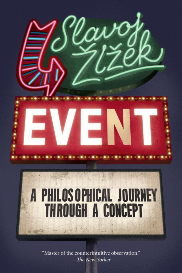
Event by Slavoj Žižek; design by Christopher King (Melville House / August 2014)
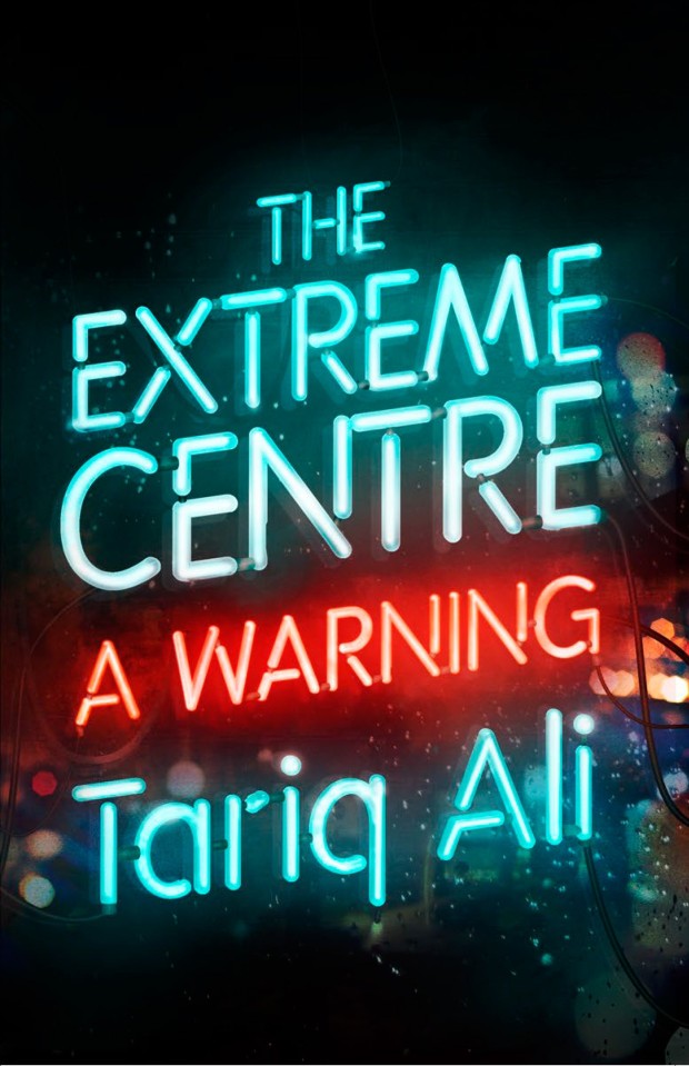
The Extreme Centre by Tariq Ali; design by Dan Mogford (Verso / March 2015)
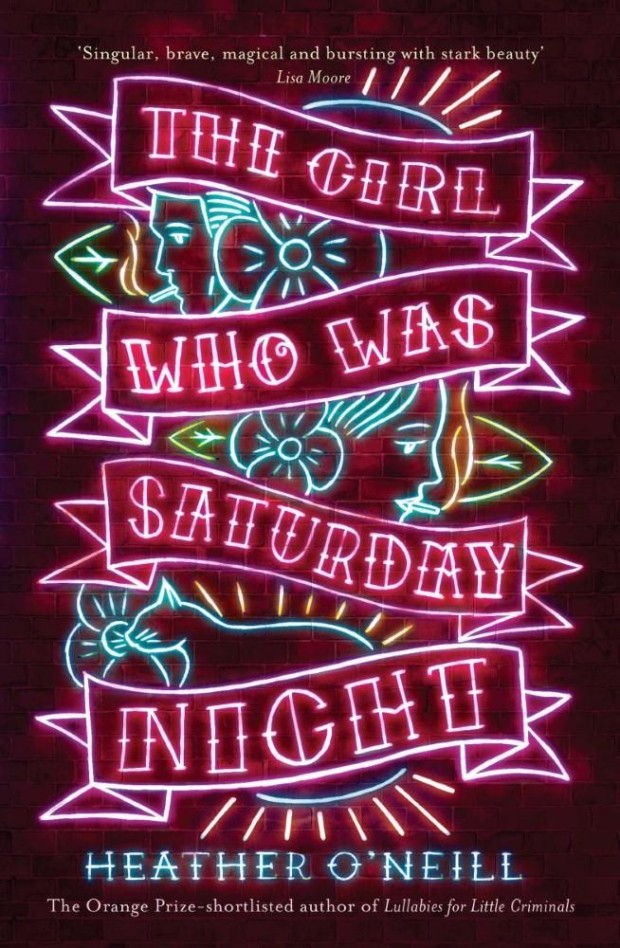
The Girl Who Was Saturday Night by Heather O’Neill; design by Leo Nickolls (Quercus / March 2015)
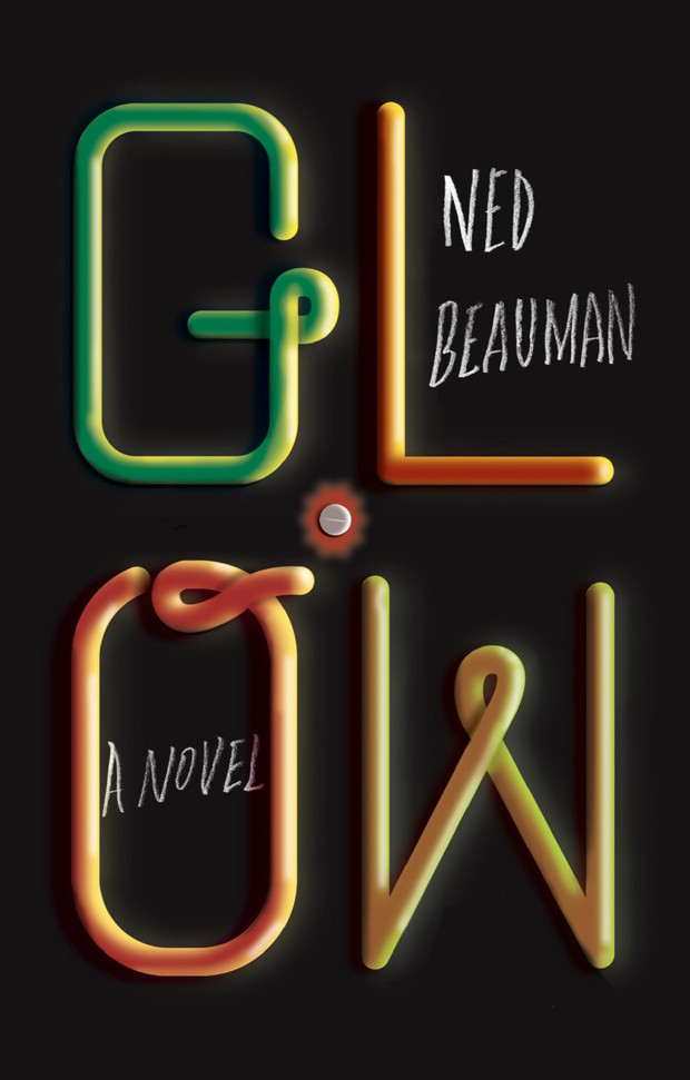
Glow by Ned Beauman; design by Oliver Munday (Knopf / January 2015)

The Hotel Life by Javier Montes; design by Simon Pates (Hispabooks / October 2013)
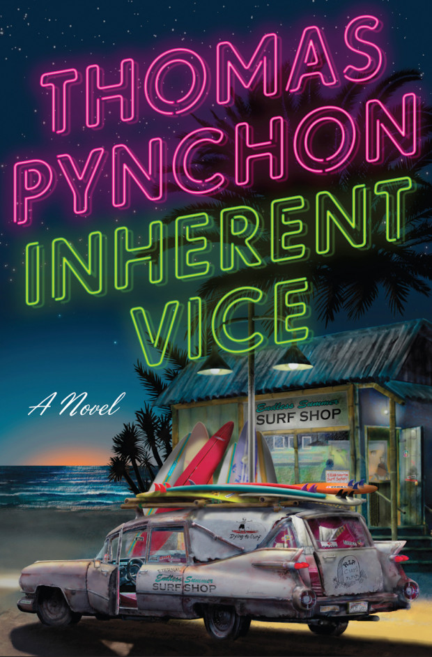
Inherent Vice by Thomas Pynchon; design by Darren Haggar and Tal Goretsky; illustration by Darshan Zenith / Cruiser Art (Penguin / August 2009)
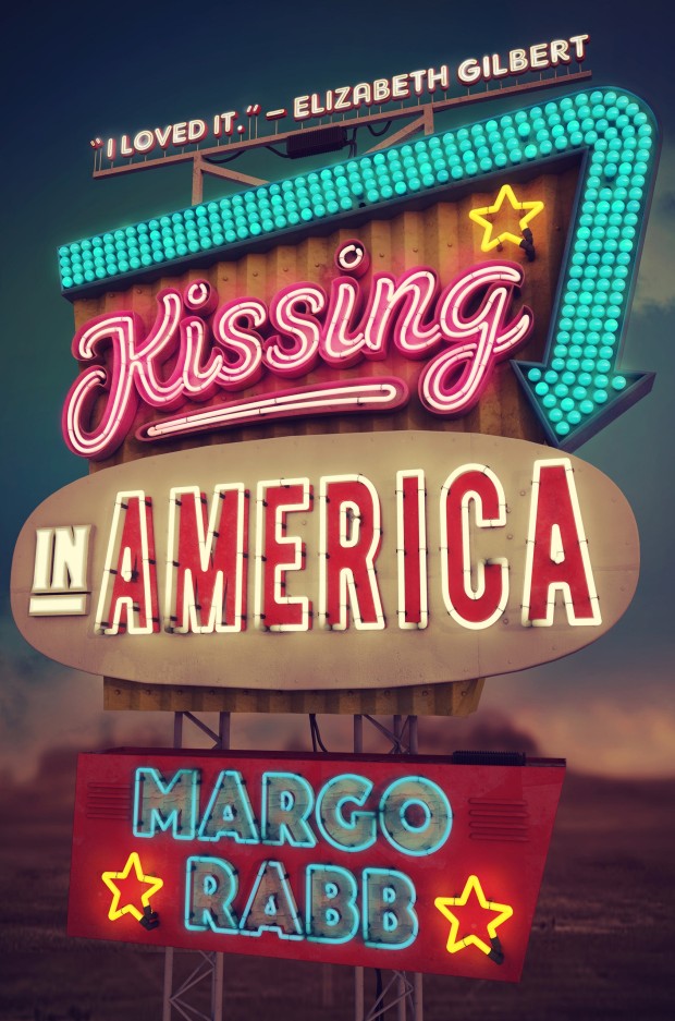
Kissing in America by Margo Rabb; design by Erin Fitzsimmons; art by Thomas Burden (HarperCollins / May 2015 )
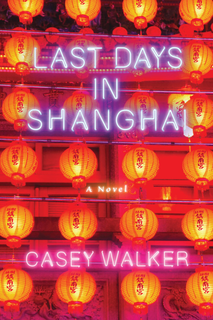
Last Days in Shanghai by Casey Walker; design by Jason Snyder (Counterpoint / December 2014)
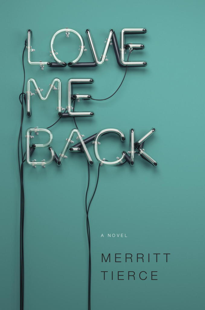
Love Me Back by Merritt Tierce; design by Emily Mahon; illustration by Rizon Parein (Doubleday / September 2014)
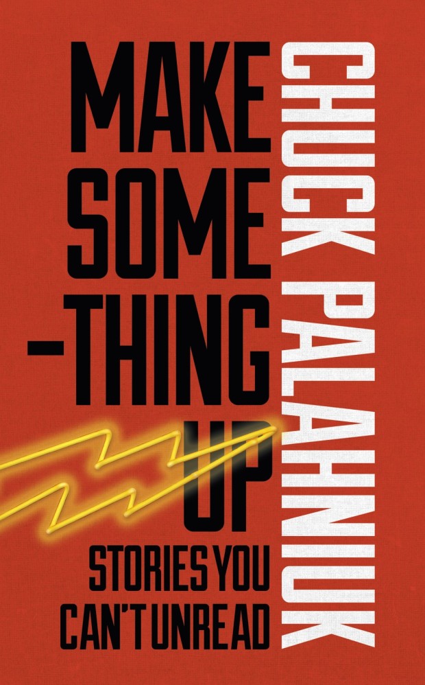
Make Something Up by Chuck Palahniuk; design by James Paul Jones (Jonathan Cape / May 2015)
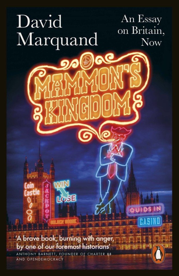
Mammon’s Kingdom by David Marquand; cover art by Mr Whaite (Allen Lane / May 2014)

Milk Bar Life by Christina Tosi; design by Walter Green (Clarkson Potter / April 2015)
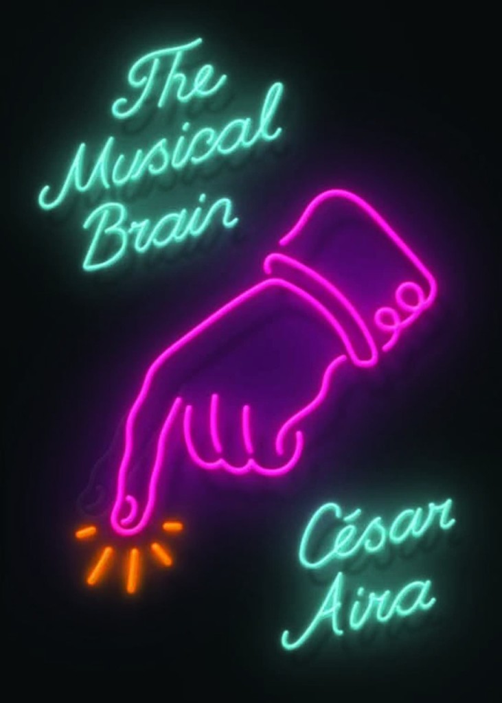
The Musical Brain by César Aira; design by Rodrigo Corral (New Directions / March 2015)
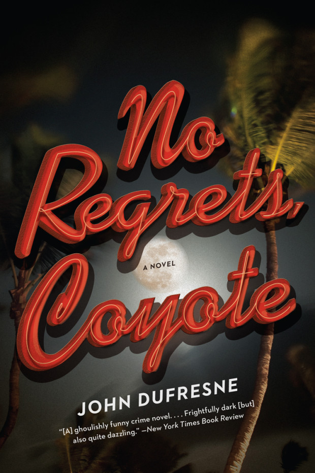
No Regrets Coyote; design by John Dufresne; design by Jennifer Heuer (W. W. Norton / July 2014)
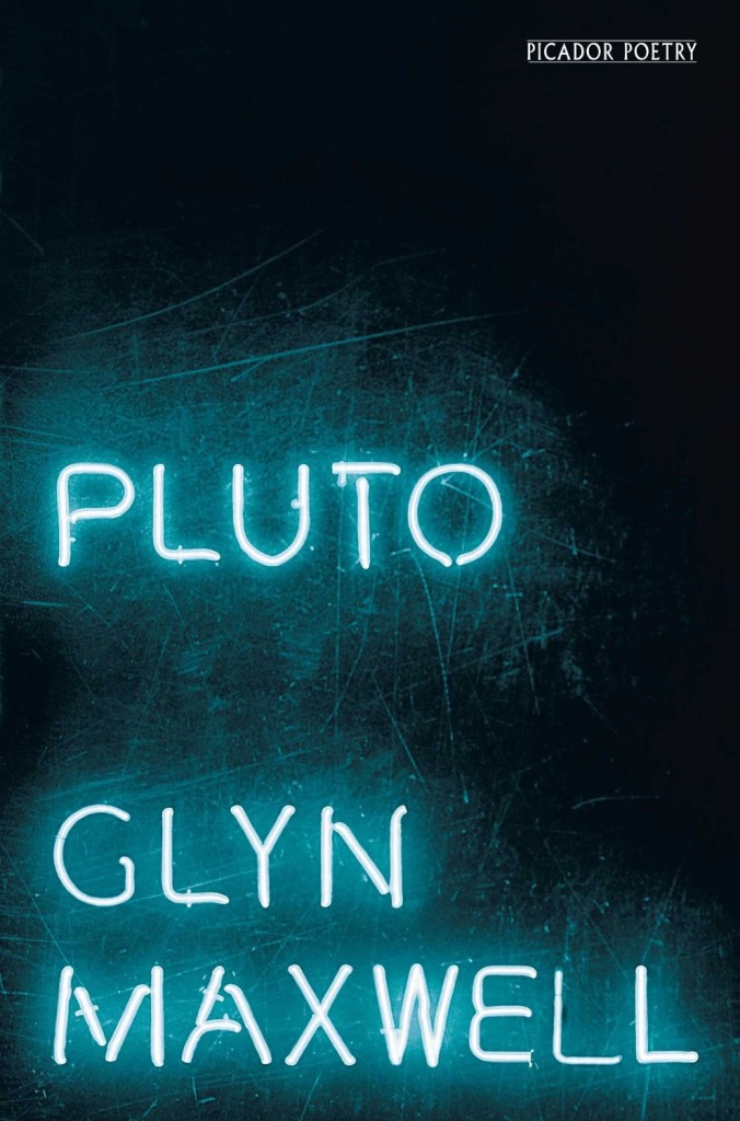
Pluto by Glyn Maxwell; design by Jonathan Pelham (Picador / April 2013)
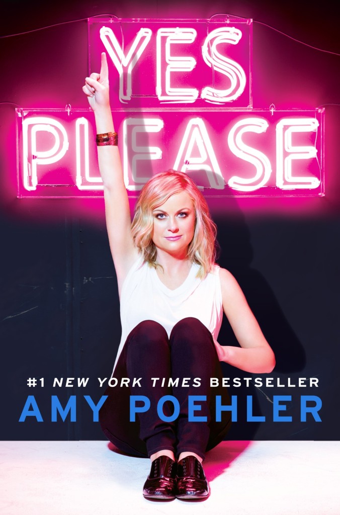
Yes Please by Amy Poehler; design by Mary Schuck (Dey Street Books / October 2014)