Skip to content

Category: Books

Rise of the Robots

jobs.1x1600

Writing at the MIT Technology Review, David Rotman looks at the impact of automation and digital technology on jobs with reference to a number of recent books related to the subject including Rise of the Robots: Technology and the Threat of a Jobless Future by Martin Ford, The Great Divide by Joseph Stiglitz, and The Second Machine Age by Erik Brynjolfsson and Andrew McAfee. But if you find that all too depressing to contemplate — and who doesn’t? — you can at least enjoy the wonderful Joost Swarte illustrations that accompany article …

jobs.6x519

Comments closed

When a Bookstore Closes, an Argument Ends

Writing at the New Yorker, Adam Gopnik considers the closing of La Hune in Paris, and what is lost when a bookstore closes:

The forces that brought La Hune down are, sadly and predictably, the same forces that destroyed Rizzoli, on 57th Street, or the old Books & Co., on Madison Avenue: the ruthless depredations of the Internet (Amazon is regarded warily in France, and pays a bookstore-protection tax, but it is there), alongside the transformation upward (or is it downward?) of the inner cores of big cities into tar pits for a mono-culture of luxury. Where La Hune last stood, Dior now stands.

These laments can all be dismissed as mere nostalgia—though, since nostalgia starts the very moment our experience becomes past, it can never be so easily dismissed. And the case for minimal regret about such transformations, or easy acceptance of them, is plain enough and not hard to make. Bookstores open and they close, following the path of bright young people as migratory birds follow the sun. In Paris, good bookstores have opened in, or migrated to, the popular quartiers of the 15th and 19th arrondissements, just as a few independent bookstores in [New York] have migrated to the sunnier climes of Brooklyn. Anyway (the more impatient counter argument goes on), a bookstore is only a platform for the purchase of literature, and platforms move and change with every new age, gathering and then shedding the moss of our memories as they roll on. Someday, someone will be writing a nostalgic account of one-click shopping on Amazon. Indeed, if videocassettes had lingered longer, we’d have sad feelings about the passing of Blockbuster. Some members of Generation X probably do now.

Yet the emotions that such losses stir can’t be dismissed quite so blithely—talking to Parisian friends, I found they shared my sense of something that it would be indecent to call grief but inadequate to call sadness.

I’m actually OK with it all being nostalgia. I just like bookstores, and it makes me sad when good ones close.  That said, Luc Sante’s reality-check did make me laugh:

Comments closed

Henrietta’s Reading Adventures

Henrietta-Reading-01-690

The New Yorker has posted a lovely series of cartoons about reading by Argentinian cartoonist Liniers. Henrietta — along with her cat Fellini and teddy bear Mandlebaum — is a regular character from Liniers newspaper comic strip Macanudo.

Henrietta-Reading-5-2-690 Henrietta-Reading-09-690  Henrietta-Reading-17-690

Two collections of Liniers’ Macanudo strip are available in English from Enchanted Lion Books, with third one available this fall. There is also a new book featuring Henrietta coming from TOON Books in September.

(via Pickle Me This)

Comments closed

The Expensive Notebook Company

I know it’s the second Tom Gauld cartoon I’ve posted today, but this one for The New Yorker is magnificent:

Gauld-Expensive-Notebook-Company-1200

1 Comment

All Characters Wait Here

characters wait here tom gauld

Mr. Tom Gauld

Comments closed

Book Covers of Note June 2015

I don’t know where last month went, but somehow it’s June already and it’s time for another selection of recent book covers:

General Theory of Oblivion design by Julia Connolly
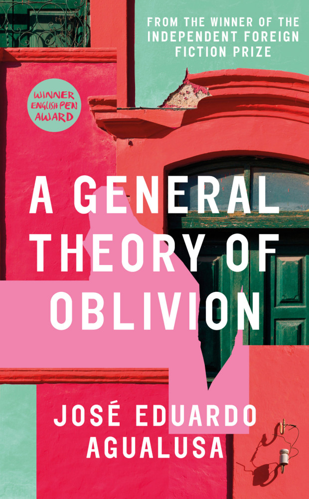
A General Theory of Oblivion by José Eduardo Agualusa; design by Julia Connolly (Harvill Secker / June 2015)

the-hourglass-factory-design-melissa-four
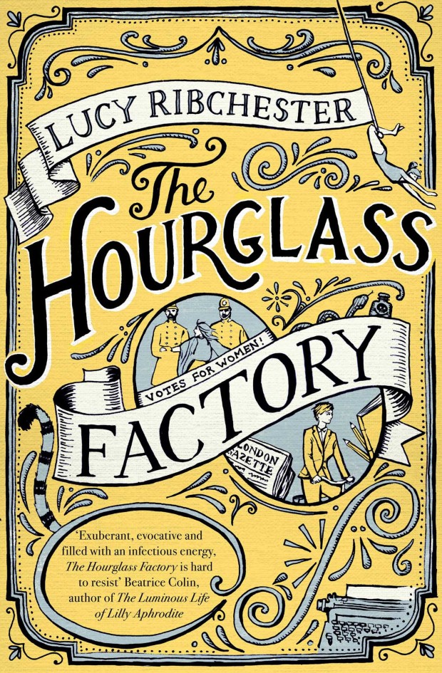
The Hourglass Factory by Lucy Ribchester; design by Melissa Four (Simon & Schuster / January 2015)

how music got free design James Paul Jones
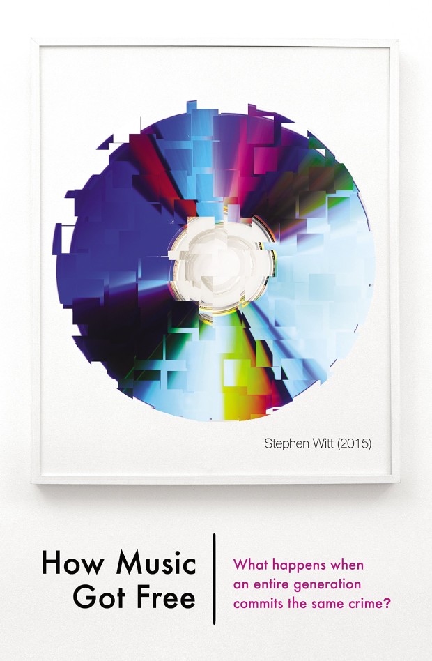
How Music Got Free by Stephen Witt; design by James Paul Jones (The Bodley Head / June 2015)

in the beginning illustration Robert Frank Hunter
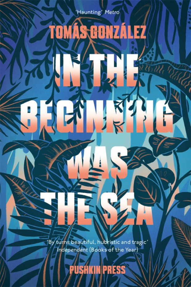
In the Beginning was the Sea by Tomás González; cover illustration by Robert Frank Hunter (Pushkin / May 2015)

intimacy idiot design spencer kimble
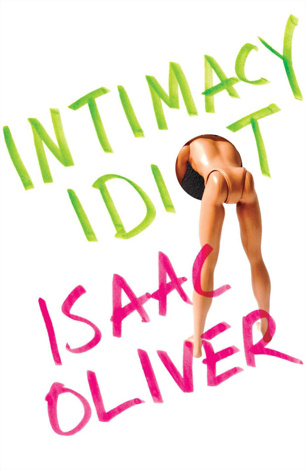
Intimacy Idiot by Isaac Oliver; design by Spencer Kimble (Scribner / June 2015)

lesser beasts design by Nicole Caputo
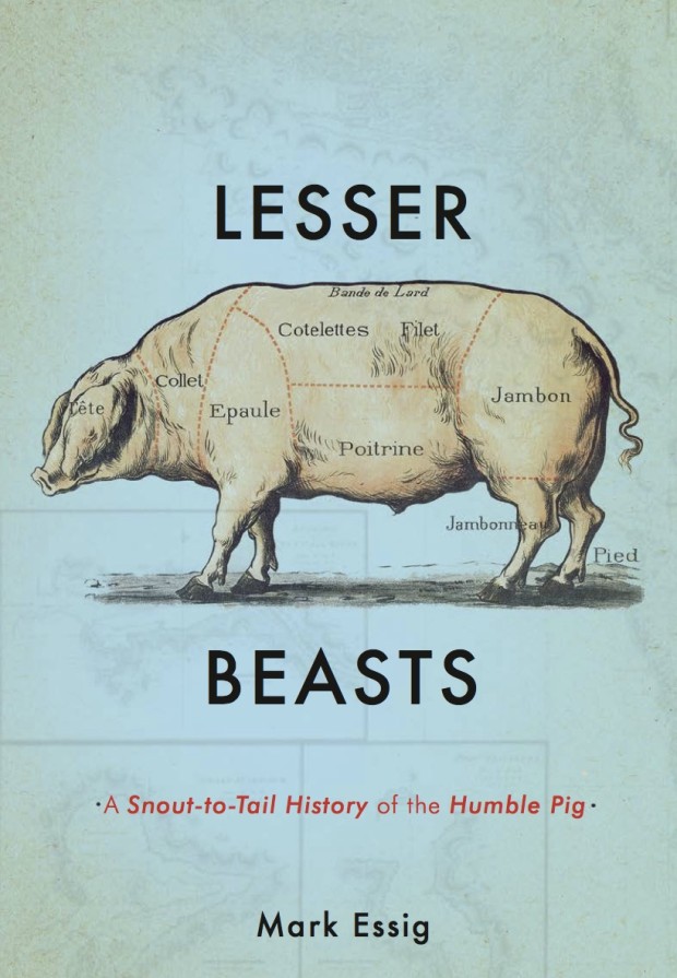
Lesser Beasts by Mark Essig; design by Nicole Caputo (Basic Books / May 2015)

LivingInTheSound
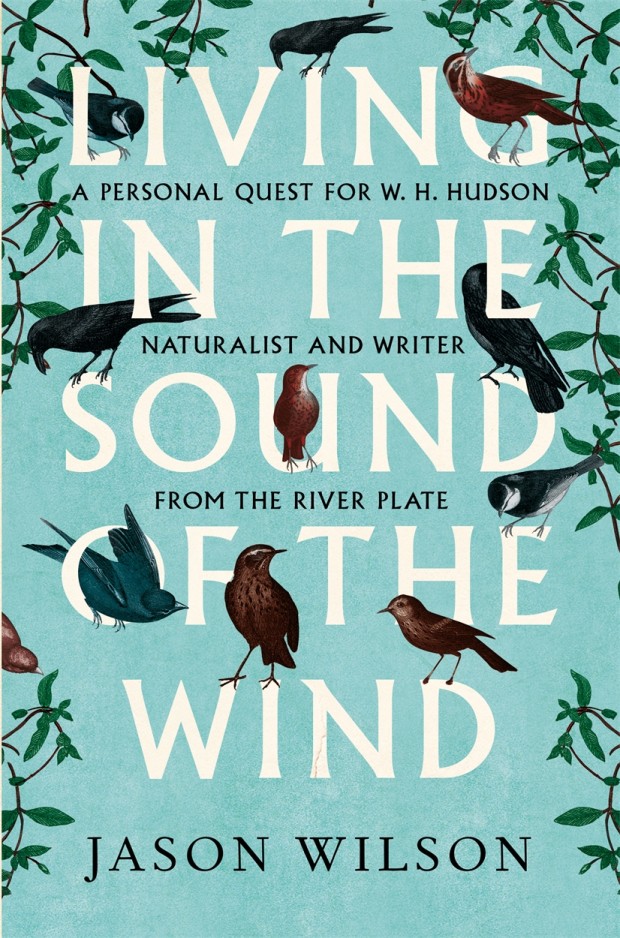
Living in the Sound of the Wind by Jason Wilson; design by Leo Nickolls (Constable / June 2015)

London Overground design by Richard Bravery
London Overground by Iain Sinclair; design by Richard Bravery (Hamish Hamilton / June 2015)

lucky alan design ben wiseman
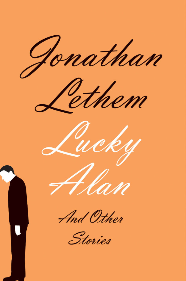
Lucky Alan and Other Stories by Jonathan Lethem; design by Ben Wiseman (Doubleday / February 2015)

manhattan mayhem design by Timothy ODonnell
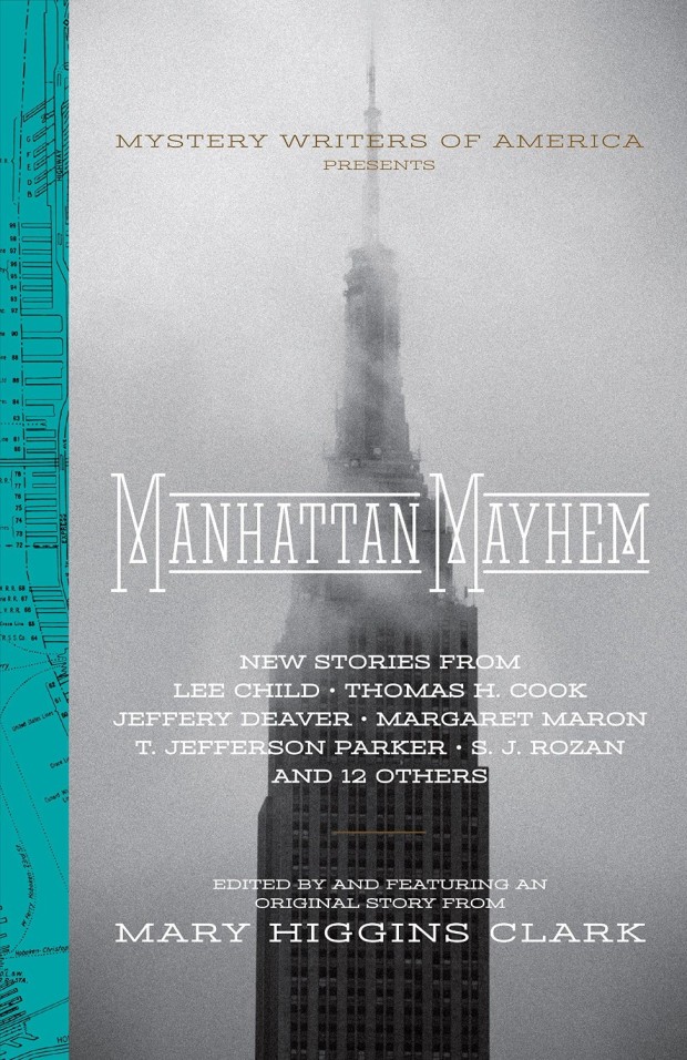
Manhattan Mayhem edited by Mary Higgins Clark; design by Timothy O’Donnell (Quirk Books / June 2015)

motorcycles ive loved design by rachel willey
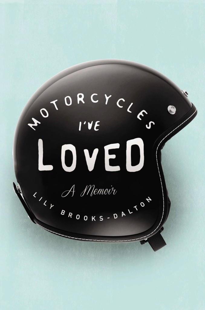
Motorcycles I’ve Loved by Lily Brooks-Dalton; design by Rachel Willey (Riverhead / April 2015)

muse design by gabriele wilson
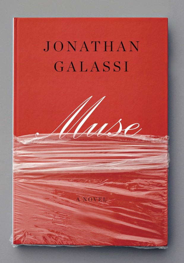
Muse by Jonathan Galassi; design by Gabriele Wilson (Knopf / June 2015)

professor in the cage design by matt dorfman
The Professor in the Cage by Jonathan Gottschall; design by Matt Dorfman (Penguin / April 2015)

ResistanceIsFutile_R.indd
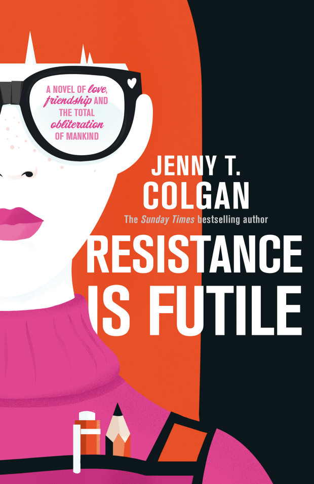
Resistance is Futile by Jenny Colgan; design by Hannah Wood; illustration by Pietari Posti (Orbit / May 2015)

rise design by greg heinimann
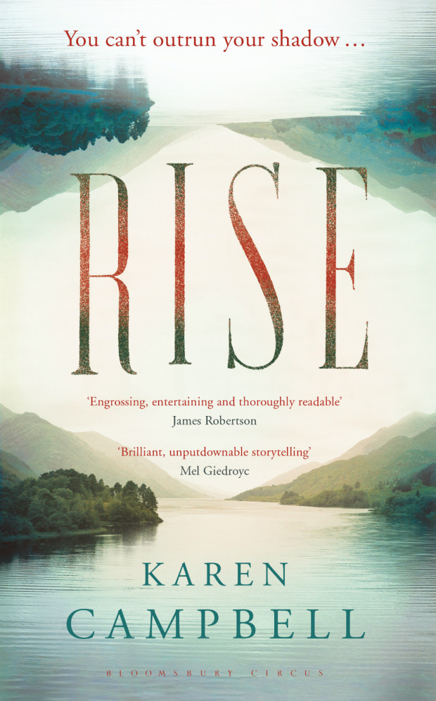
Rise by Karen Campbell; design by Greg Heinimann (Bloomsbury / March 2015)

thank you goodnight design Kimberly Glyder
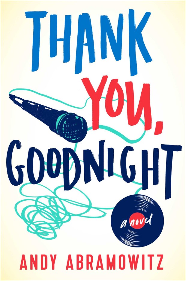
Thank You, Goodnight by Andy Abramowitz; design by Kimberly Glyder (Simon & Schuster / June 2015)

tongues of men or angels design by Jamie Keenan
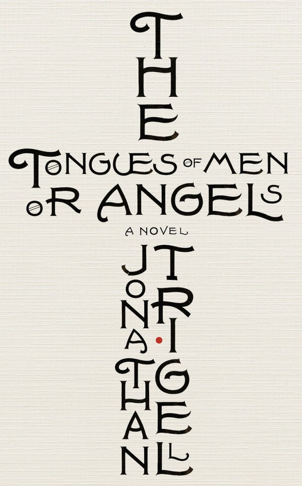
The Tongues of Men or Angels by Jonathan Trigel; design by Jamie Keenan (Little Brown / May 2015)

9780385352871
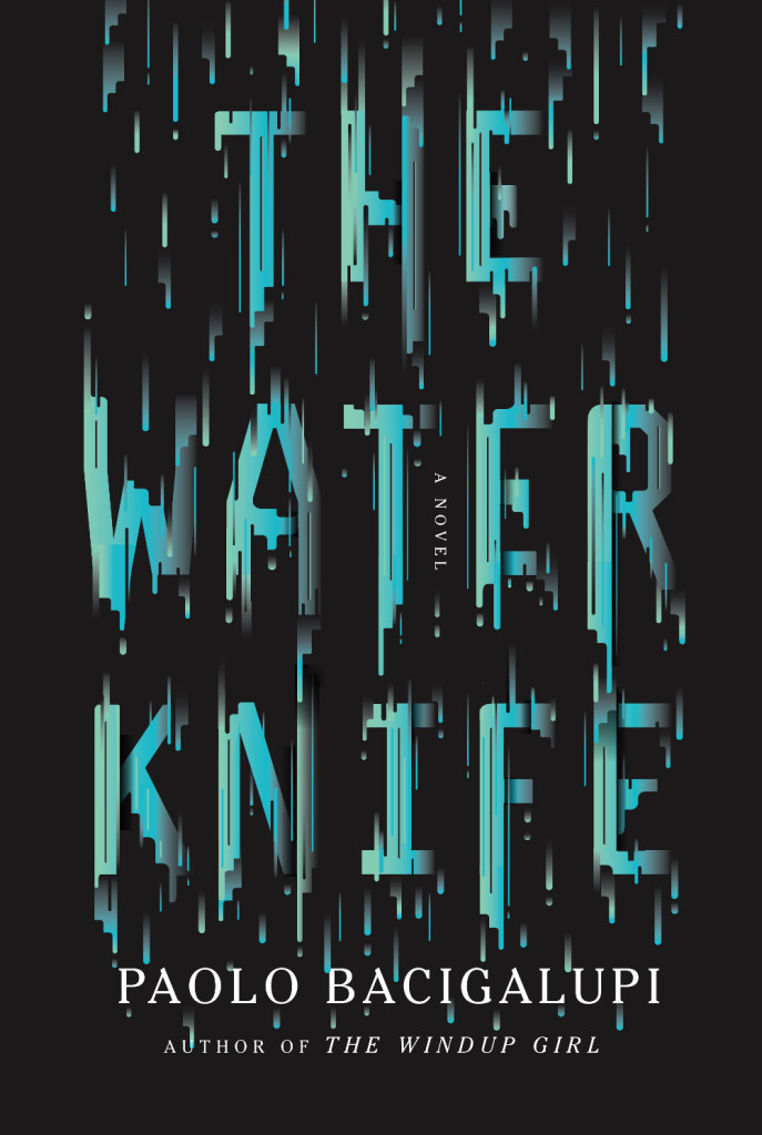
The Water Knife by Paolo Bacigalupi; design by Oliver Munday (Knopf / May 2015)

9780385350174
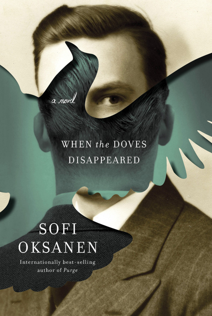
When the Doves Disappeared by Sofi Oksanen; design by Kelly Blair (Knopf / February 2015)

world does not exist design david gee
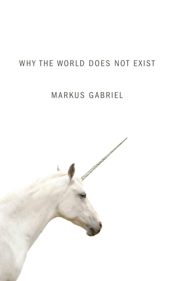
Why the World Does Not Exist by Markus Gabriel; design by David Gee (Polity / June 2015)

The White Company design James Paul Jones
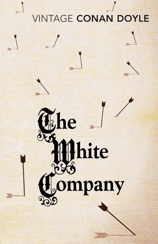
The White Company by Arthur Conan Doyle; design by James Paul Jones (Vintage / June 2015)

wonder garden art and design thomas doyle
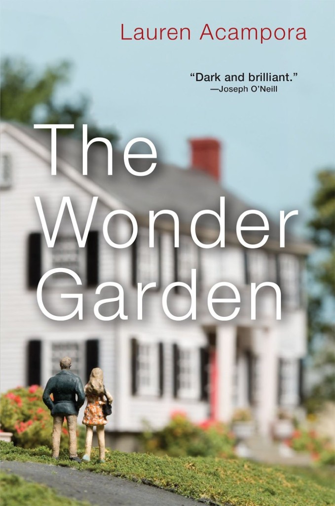
The Wonder Garden by Lauren Acampora; art and design by Thomas Doyle (Grove Press /May 2015)

why-information-grows-design-richard-green
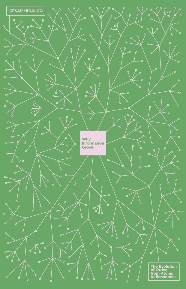
Why Information Grows by Cesar Hidalgo; design by Richard Green (Allen Lane / June 2015)

Comments closed

Virago Modern Classics Daphne du Maurier

JamaicaInn_YA

This summer UK publisher Virago is publishing two sets of Daphne du Maurier’s most famous titles with new and beautifully illustrated covers.

According to editorial director Donna Coonan, du Maurier’s reputation has flourished in recent years. She is also an author with cross-generational appeal. “The heroines of her best-known novels are young women at a turning point in their lives,” says Coonan. “These are beautifully written books that are exciting, suspenseful and brilliantly atmospheric. There is passion, danger, romance . . . and pirates!”

For over a decade Virago published du Maurier’s backlist with a uniform style. “They sat nicely together in a set, but were starting to look a little dated and lacked individuality,” says art director Nico Taylor. “I had never read du Maurier before, but once I got stuck in I realised just how diverse her writing is which led me to the idea that presenting each novel with a distinctive, individual look would be the best way to ensure du Maurier’s work continues to look fresh.”

Rebecca

For the first three titles in series (there are a staggering 17 or so more to come!), Taylor worked with illustrators Neil Gower (Jamaica Inn, Frenchman’s Creek) and Jordan Metcalf (Rebecca). “It became clear that it would be hard to avoid some of the obvious reference points from each title, but I was keen that they were used in an integrated or suggestive way… all credit has to go to the illustrators for imagining their respective covers in such distinctive ways.”

Rebecca_YA


Alongside this refreshed backlist, Virago is also planning to introduce these same three classics — French Man’s Creek, Jamaica Inn, and Rebecca, — to young adults with new covers by Iacopo Bruno. “This was a great opportunity to show that du Maurier is a big contribution to the gothic novels popular with this age group of readers,” says art director Sophie Burdess. “I wanted to create a set of covers primarily composed of evocative gothic typography that gave du Maurier the authority and appeal she deserves as well as giving a feel for the individual themes of each novel,” she continues. “[Iacopo] is a rare and exceptionally beautiful illustrator and hand lettering artist who knows just how to pitch the work for a younger audience… the task of creating a set of beautiful compositions of elegant hand lettering and vignette illustrations was very safe in his hands.”

Comments closed

Who Writes Novels?

Gauld-Who-Writes-Novels-526-1200

Tom Gauld for The New Yorker.

Comments closed

Today in Micro-Trends: Rotate 90°

downtown owl design paul sahre
design by Paul Sahre (2008)

Turning the picture sideways is not exactly new (the brilliant John Gall and Paul Sahre (thanks for the reminder, Jacob!) were experimenting with it years ago), but there has been a spate of commercial covers making use of images rotated through ninety degrees in the past couple of years. It seems like a such peculiar thing to have caught on, and yet here we are:

california

California by Edan Lepucki; design Julianna Lee (Little Brown & Co. July 2014)

empty-chair-kulickThe Empty Chair by Bruce Wagner; design by Gregg Kulick (Blue Rider Press / December 2013)

girl in the moonlight design by mumtaz mustafa painting horacio g garcia
The Girl in the Moonlight by Charles Dubow; design by Mumtaz Mustafa; painting by Horacio G. Garcia (William Morrow / May 2015)

green on blue

Green on Blue by Elliot Ackerman; design by Oliver Munday & Jaya Miceli (Scribner / February 2015)

i-saw-a-man

I Saw a Man by Owen Sheers; design by Emily Mahon; photograph by Mike Lambert (Nan A. Talese / June 2015)

Sugar design by M S Corley

Sugar by Deirdre Riordan Hall; design by M. S. Corley (Skyscape / June 2015)

waiting for the apocalypse design kimberly glyder

Waiting for the Apocalypse by Veronica Chater; design by Kimberly Glyder (W. W. Norton / February 2009)

we-are-not-ourselves-design-christopher-lin

We Are Not Ourselves by Matthew Thomas; design by Christopher Lin (Simon & Schuster / August 2014)

Comments closed

Errors Commonly Made by Inexperienced Murder-Mystery Novelists

errors-commonly-made

Tom Gauld.

Comments closed

Gray318 TYPO Talk Berlin

everything is illuminated gray318

“I’m not a designer, not an illustrator, and certainly not a type designer – I’m a misfit…Publishing – that’s where people who don’t quite fit in end up.”

The TYPO Talks blog recaps Jon Gray‘s recent talk at TYPO Berlin:

Gray looked around for inspiration and got interested in old hand written signs often posted at churches. Written by sign writing dilettantes who need to communicate something to their fellow churchgoers, to Gray these signs tell a story, they speak of dedication, personality, of love. The signs reference a specific time and place, an idiosyncratic personality and character. Gray took the loose and spontaneous quality of the handwriting on these signs and used it for the cover of “Everything is Illuminated”.

What he got gave him one of these rare moments where “You make something and you know it works, it’s something new – I made it and it was completely me. I liked it, Penguin loved it, the author was all over it.” Published in 2002, the rough all-over hand-lettering on the cover contrasted strongly with the clean lines and vector graphics that had been dominating graphic design for a while then. It was the avant-garde of what Steven Heller called “The Decade of Dirty” when handmade aesthetics became fashionable again. And it marked the very beginning of the still ongoing revival of hand-lettered typography.

Comments closed

Tim Parks on Where I’m Reading From

Where I'm Reading From (1)

At BOMB Magazine, writer Tim Park discusses his new book Where I’m Reading From, a collection of his essays from the NYRB Blog, with Scott Esposito (co-author of The End of Oulipo):

In a way, this book is an autobiography of someone brought up with a very particular relation to books, in a religious family, in an English literary tradition, who on becoming an adult, for private personal reasons, set himself literary goals that were gradually revealed as spurious. Also, it’s about a person from the literary center—English, London— who has spent more than thirty years in another country, Italy, that is out of the literary mainstream. And a writer who also, by chance, became a translator and went on to teach translation. My life has been a long process of awakening to the reality, the changing reality, of the contemporary book world, which is a million miles from the naïve vision I had when I started writing books at twenty-two. Since it is in the publishers’ interests, and indeed the University’s, to sustain a false picture of what the book world is like and what the contemporary experience of books amounts to, my articles were a response to this, and an attempt to get my own head straight about what I’m really doing and the environment I move in. One is seeking at last to be unblinkered about it all.

And, if you missed it, Park reviewed What We See When Read by designer Peter Mendelsund on the NYRB Blog earlier this month:

One of the pleasures of his book is his honesty and perplexity at the discovery that every account he offers of the process of visualization very quickly falls apart under pressure. We do not really “see” characters such as Anna Karenina or Captain Ahab, he concludes, or indeed the places described in novels, and insofar as we do perhaps see or glimpse them, what we are seeing is something we have imagined, not what the author saw. Even when there are illustrations, as in many nineteenth-century novels, they only impose their view of the characters very briefly. A couple of pages later they have become as fluid and vague as so much of visual memory. At one point Mendelsund posits the idea that perhaps we read in order not to be oppressed by the visual, in order not to see.

(Pictured above is the cover of the UK edition, published by Harvill Secker in December last year, of Where I’m Reading From designed by James Paul Jones. The US edition, which has a more utilitarian cover, was just published by New York Review of Books)

Comments closed