Skip to content

Category: Books

50 Books / 50 Covers 2014 Winners

Young God design by Rodrigo Corral

Design Observer has announced the winners of their 2014 50 Books | 50 Covers competition, organized in association with AIGA and Designers & Books.

The fifty winning covers can be seen here

Brave New World design by La Boca

…and the fifty winning books, here.

A Maze and A Muse design Jenny Volvovski

My 2014 cover selections are here.

On Such a Full Sea design by Helen Yentus
1 Comment

The Antiquarian Bookshops of Old London

L1000142

At the lovely Spitalfields Life blog, the Gentle Author reminisces about buying and selling used books in London, and shares some wondeful black and white photographs of the city’s secondhand bookshops taken in 1971 by Richard Brown:

Frustrated by my pitiful lack of income, it was not long before I began carrying boxes of my textbooks to bookshops in the Charing Cross Rd and swapping them for a few banknotes that would give me a night at the theatre or some other treat. I recall the wrench of guilt when I first sold books off my shelves but I found I was more than compensated by the joy of the experiences that were granted to me in exchange.

Inevitably, I soon began acquiring more books that I discovered in these shops and, on occasion, making deals that gave me a little cash and a single volume from the shelves in return for a box of my own books. In this way, I obtained some early Hogarth Press titles and a first edition of To The Lighthouse with a sticker in the back revealing that it had been bought new at Shakespeare & Co in Paris. How I would like to have been there in 1927 to make that purchase myself.

L1000109 L1000152 L1000167 L1000136 L1000132


Comments closed

Bibliophilia: Books in the Films of Wes Anderson

gbh-book-1002x547

Not exactly a supercut, Bibiliophilia is a video-essay by Luís Azevedo about books in the films in Wes Anderson:

You can read more about the project at the A-Z Review.

Comments closed

Book Covers of Note July 2015

It’s finally summer, and because July is traditionally something of a quiet month in publishing, I’m taking the opportunity to catch up on a few covers that I missed earlier in the year…

Act of God design Janet Hansen

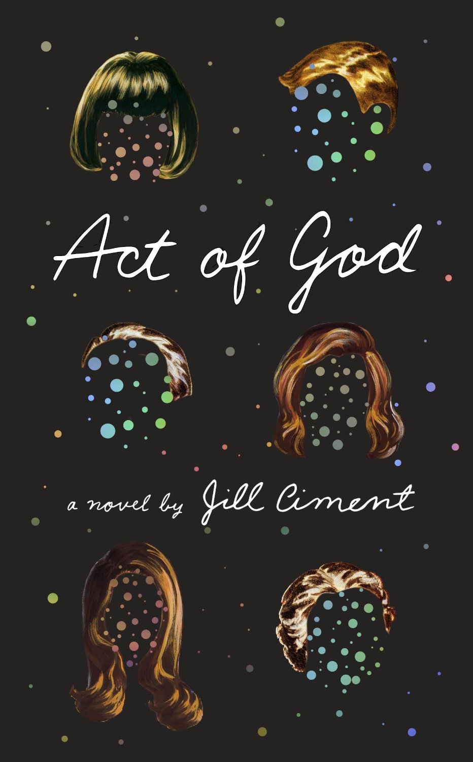
Act of God by Jill Ciment; design by Janet Hansen (Pantheon / March 2015 )

All My Puny Sorrows design Sunra Thompson

All My Puny Sorrows by Miriam Toews; design and illustration by Sunra Thompson (McSweeney’s / June 2015)

Print
Armada by Ernest Cline; design by Will Staehle (Crown / July 2015)

Asylum design Spencer Kimble
The Asylum by Simon Doonan; design by Spencer Kimble (Blue Rider Press / February 2015 )

Book of Numbers design Suzanne Dean cover illustration Carnovsky

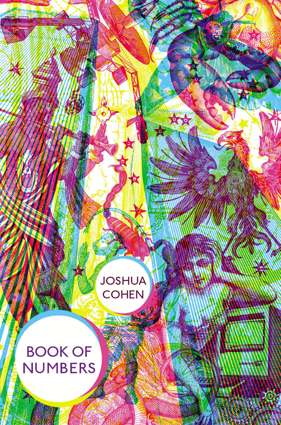
Book of Numbers by Joshua Cohen; design by design Suzanne Dean; illustration Carnovsky (Harvill Secker / June 2015)

Book of Numbers design Oliver Munday

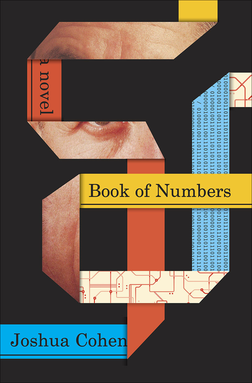
Book of Numbers by Joshua Cohen; design by Oliver Munday (Random House / June 2015)

Chasing Rumer illustration by Andrew Holder

Chasing Rumor by Cameron Chambers; design by Haruna Madono; illustration by Andrew Holder (Patagonia / June 2015)

Earth design by Alex Merto
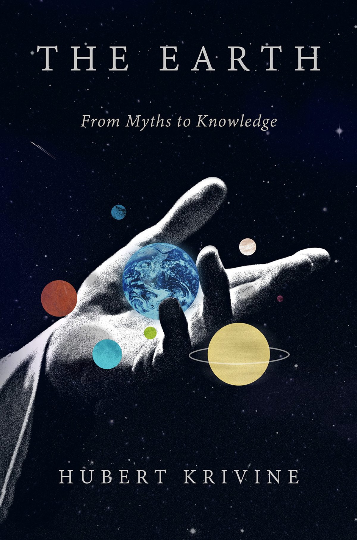
Earth by Hubert Krivine; design by Alex Merto (Verso Books / April 2015)

Economics After Capitalism design David Gee

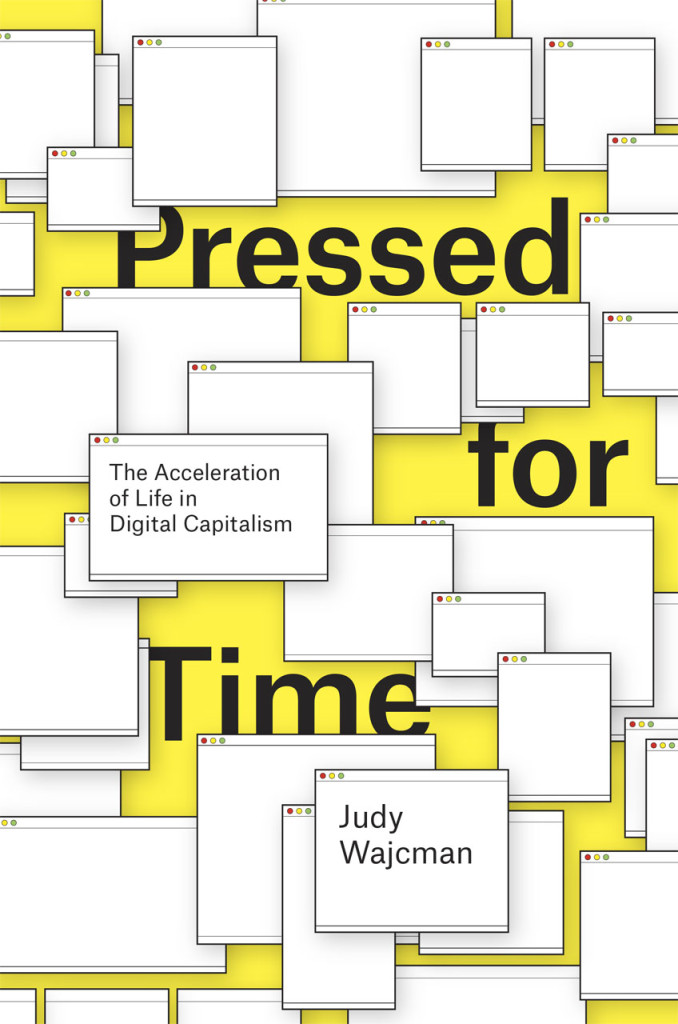
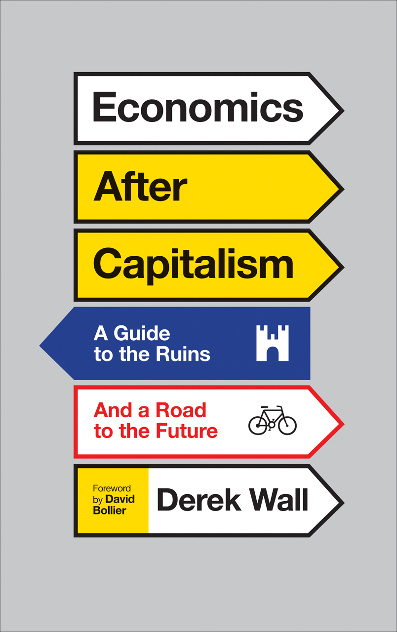
Economics After Capitalism by Derek Wall; design by David A. Gee (Pluto Press / July 2015)

egg design by Clare Skeats

Egg by Blanche Vaughan; design by Clare Skeats (Wiedenfeld & Nicolson / March 2015)

Here You Are design by Alban Fischer

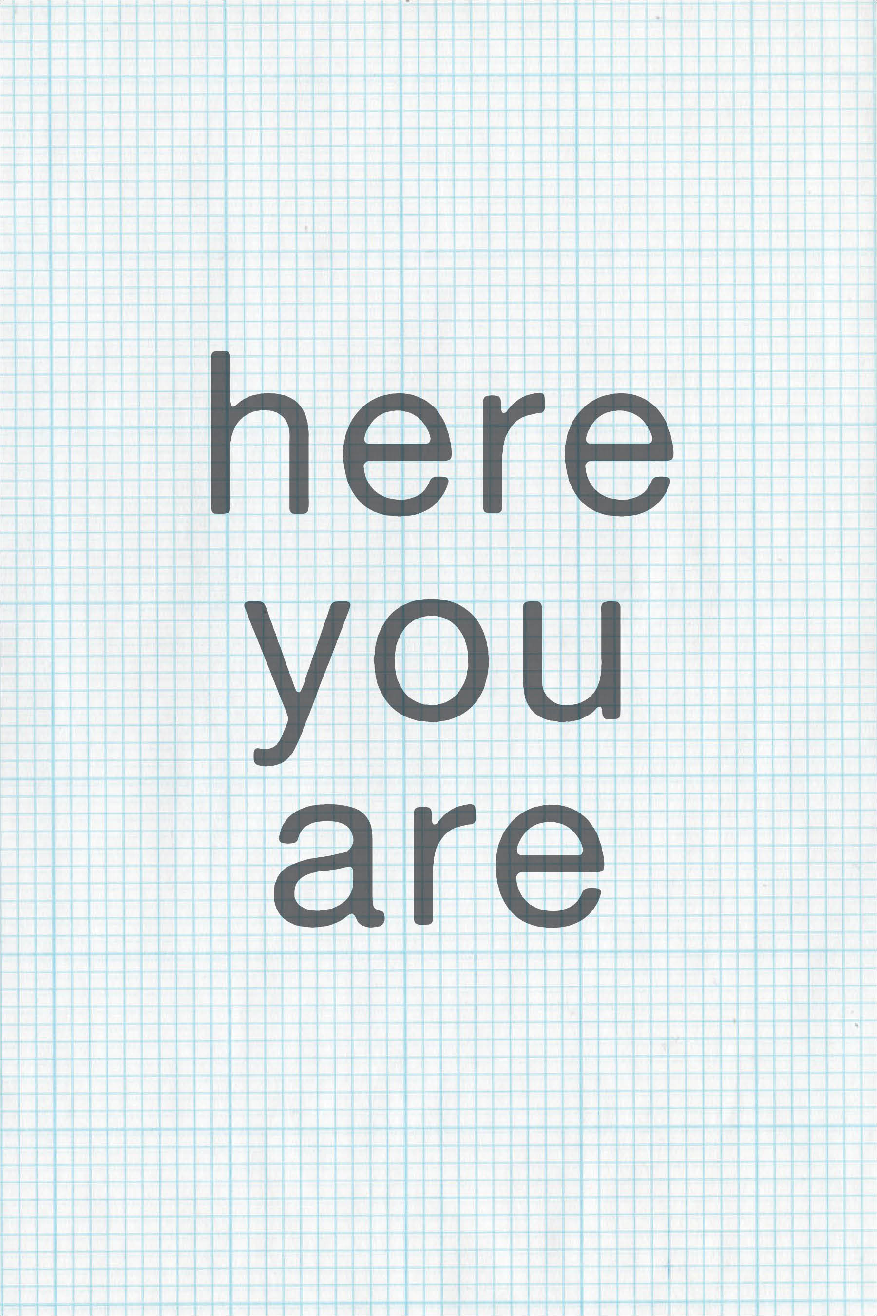
Here You Are by Jared Joseph & Sara Peck; design by Alban Fischer (Horse Less Press / March 2015)

Krautrock design by Adly Elewa

Future Days by David Stubbs; design by Adly Elewa (Melville House / July 2015)

Lord Fear design by Kelly Blair

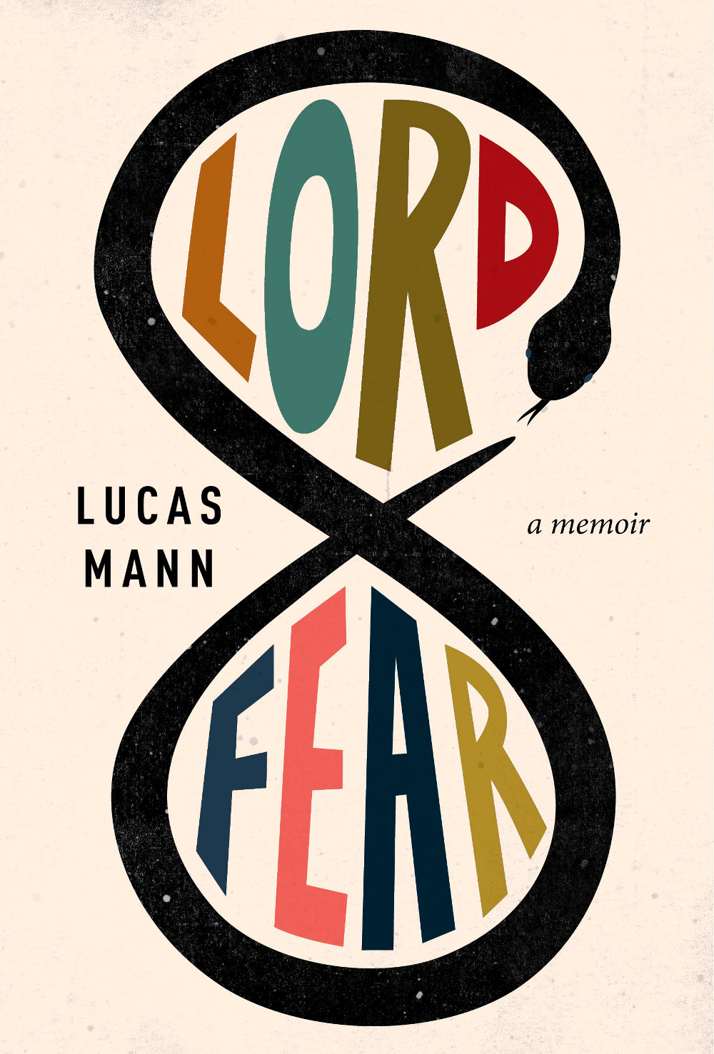
Lord Fear by Lucas Mann; design by Kelly Blair (Pantheon / May 2015)

Modern Romance design by Jay Shaw photograph by ruvan wijesooriya
Modern Romance by Aziz Ansari; design by Jay Shaw; photograph by Ruvan Wijesooriya (Penguin / June 2015)

Pretty Is design by Lucy Kim

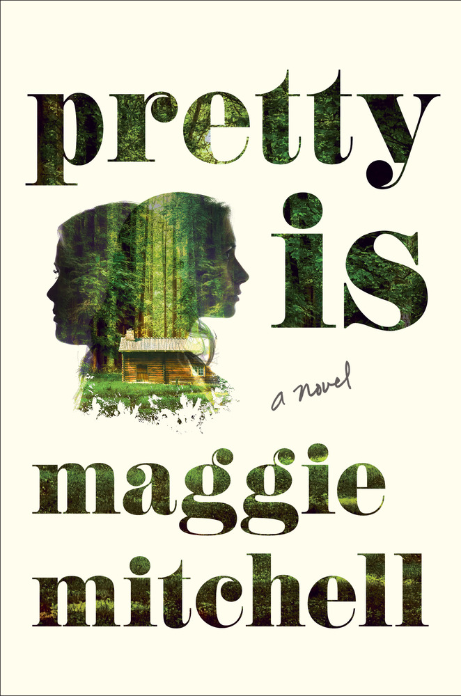
Pretty Is by Maggie Mitchell; design by Lucy Kim (Henry Holt / July 2015)

Seed Collectors design by Gray318

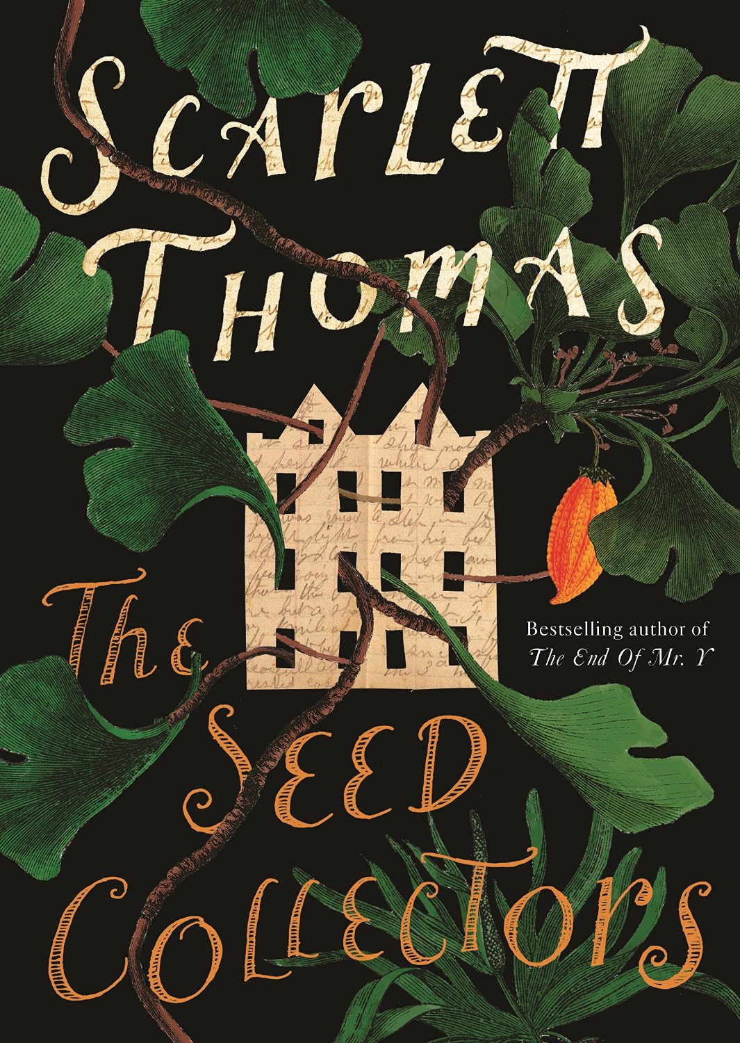
The Seed Collectors by Scarlett Thomas; design by Gray318 (Canongate / July 2015)

Stammered Songbook design Clare Skeats

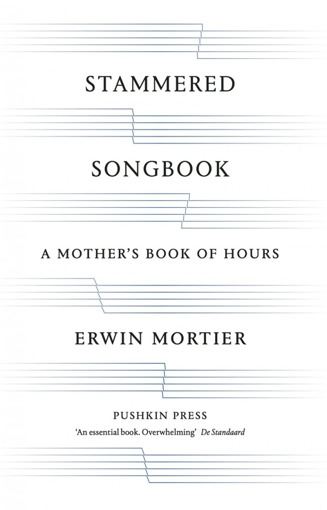
Stammered Songbook by Erwin Mortier; design by Clare Skeats (Pushkin Press / March 2015)

thrown design gray318

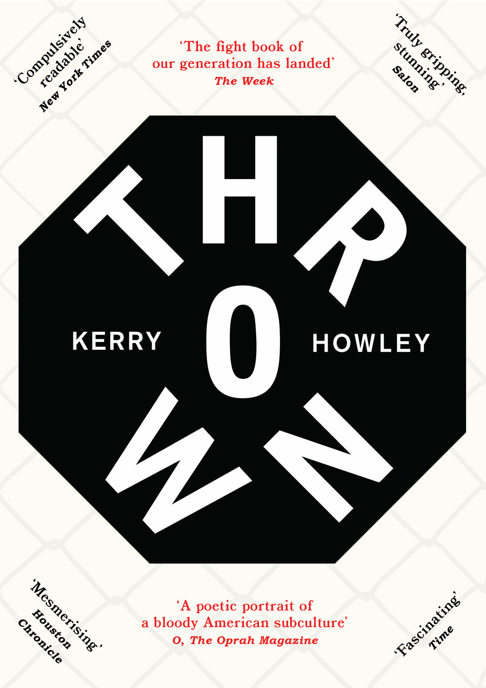
Thrown by Kerry Howley; design by Gray318 (Hamish Hamilton / May 2015)

Trust Me design Jamie Keenan
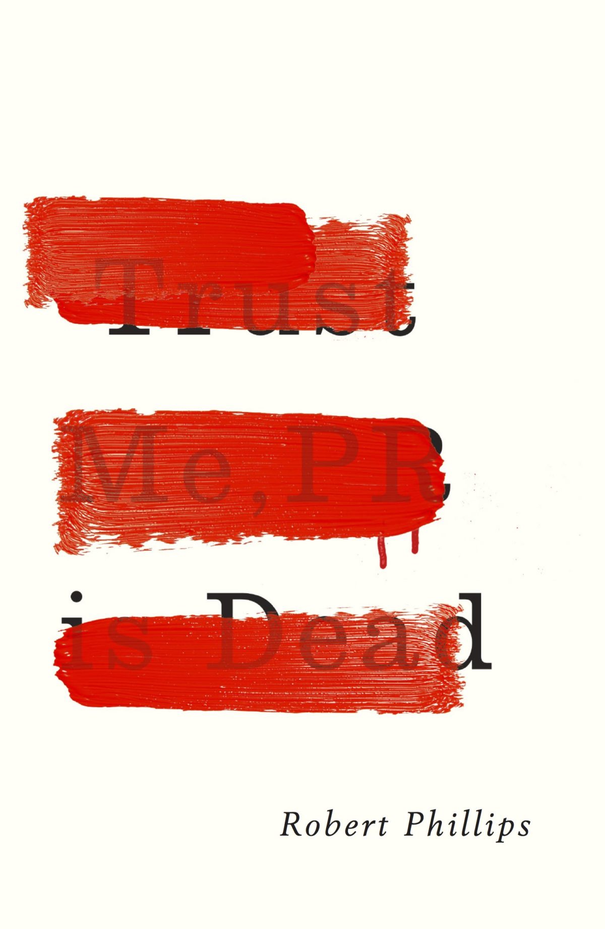
Trust Me, PR is Dead by Robert Phillips; design by Jamie Keenan (Unbound / June 2015)

Unibrow design Zoe Norvell

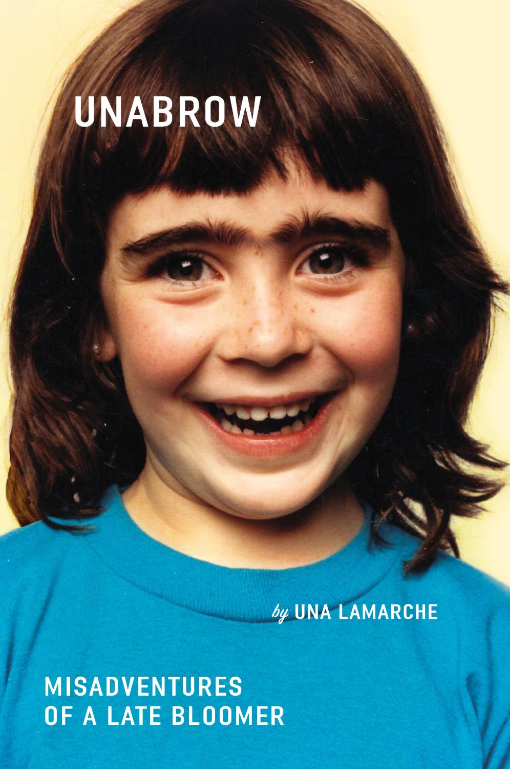
Unabrow by Una Lamarche; design by Zoe Norvell (Plume / March 2015)

9780241972762
Whisky Tango Foxtrot by David Shafer; design by Richard Bravery (Penguin / June 2015)

World on a Plate design Nick Misani

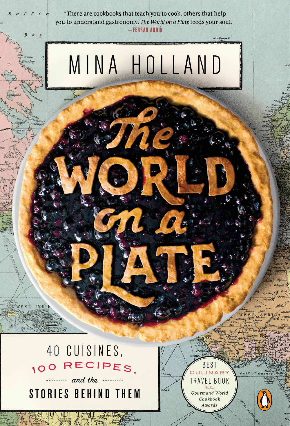
World on a Plate by Mina Holland; design by Nick Misani (Penguin / May 2015)

Comments closed

This Year’s Hot New Genres

hot new genres tom gauld

Tom Gauld.

Comments closed

Books Covered by Stuart Bache

reunion of ghosts design by jo walker

Designer Stuart Bache, art director of Oneworld Publications, has started a new vlog about book cover design. In his latest video, Stuart looks at the cover for A Reunion of Ghosts by Judith Claire Mitchell, designed by Jo Walker:


And if that wasn’t enough, Stuart is also writing a column on book design for UK trade magazine The Bookseller. The most recent post is on new covers for classic crime novels.

Comments closed

Robert Frank: The Man Who Saw America

05mag-05index-t_CA0-jumbo
Katy Grannan for The New York Times

This weekend’s New York Times Magazine has a remarkable profile of photographer and filmmaker Robert Frank by writer Nicholas Dawidoff:

Frank absorbed artistic influences all over New York. Edward Hopper’s moody office-scapes, restaurant interiors and gas pumps were not in fashion when Frank discovered the painter: ‘‘So clear and so decisive. The human form in it. You look twice — what’s this guy waiting for? What’s he looking at? The simplicity of two facing each other. A man in a chair.’’ Frank’s creative day to day was informed by the Abstract Expressionist painters he lived among. Through his window, Frank studied Willem de Kooning pacing his studio in his underwear, pausing at his easel and then walking the floor some more. ‘‘I was a very silent unobserved watcher of this man at work. It meant a lot to me. It encouraged me to pace up and down and struggle.’’ He also saw the downside of an artist’s life: ‘‘I used to watch de Kooning work, and then I’d walk down the street and see him drinking and lying in the gutter. Somebody’s bringing him upstairs. You drink because you have doubts. Things seem to crumble around you.’’

Online, the Times also revisits The Americans, Frank’s best known work and “one of the most influential photography books of all time.”

“Parade — Hoboken, New Jersey,” 1955. Robert Frank

Comments closed

Russian Plays in Translation Designed by John Gall

The brilliant John Gall has designed a wonderful set of minimal book covers for Theater Communications Group’s Russian drama series:

Month-in-the-country-mech_670
A Month in the Country by Ivan Turgenev (Theatre Group Communications / February 2015)

The-Inspector-Mech-ID5_670
The Inspector by Nikolai Gogol (Theatre Group Communications / June 2015)

Cherry-Orchard-front.6.16_670
The Cherry Orchard by Anton Chekhov (Theatre Group Communications / August 2015)

1 Comment

The Scientist’s Dilemma

In his latest cartoon for New Scientist magazine, Tom Gauld illustrates the temptations of science fiction:
science fiction tom gauld

In related news, Drawn & Quarterly are going to publish Tom’s new book Mooncop next year. It looks amazing:

mooncop

Comments closed

Today in Micro-Trends: Post-it Notes

Heaven-cover

Sticking post-it notes to the front of books is a very real thing in the book industry — at least in the corners I’ve occupied — so perhaps it’s no surprise that they’ve made into cover designs too.

The first cover I can think of to incorporate a post-it was the hardcover of Heaven in Small by Emily Schultz, designed by Ingrid Paulson (House of Anansi in 2009).1 Interestingly, while the paperback, also designed by Ingrid (see below), kept the post-it, it no longer tricks the eye in quite the same way.

The last couple of years has seen a small flurry of post-it note book covers. I particularly like Nathan Burton‘s designs for rising literary star Valeria Luiselli, but post-it notes seem particularly in vogue for young adult covers, so we might well be seeing a few more in the coming months…

9780141357034
All the Bright Places by Jennifer Niven; design by Lucy Kim and Alison Impey; hand-lettering by Sarah Watts (Knopf / January 2015)


Faces in the Crowd and Sidewalks by Valeria Luiselli; design by Nathan Burton (Coffee House Press & Granta / May 2013 & May 2014)

9780887849565
Heaven is Small by Emily Schultz (paperback); design by Ingrid Paulson (Anansi / April 2010)

9780374535308

Lions and Shadows by Christopher Isherwood design by Charlotte Strick; illustration by Dan Funderburgh (Farrar, Strauss & Giroux / November 2015)

Christopher Isherwood series; design by Charlotte Strick; illustrations by Dan Funderburgh (Farrar, Strauss & Giroux / 2013-2015)

Last Time We Say Goodbye design Erin Schell
The Last Time We Say Goodbye by Cynthia Hand; design by Erin Schell (HarperTeen / February 2015)

queen-of-bright-shiny-things-design-anna-booth
The Queen of Bright and Shiny Things by Ann Aguirre; design by Anna Booth; photography by Jon Barkat and Gary Spector (Feiwel & Friends / April 2015)

then we came to an end design Jamie Keenan
Then We Came to the End by Joshua Ferriss; design by Jamie Keenan (Little, Brown & Co. / March 2007)2

4 Comments

Available Only in Bookshops

To mark Independent Bookshop Week in the UK, author Helen Dunmore celebrates browsing the shelves:

Readers go their own way, and this is what frustrates governments and tantalises publishers. You can drag the reader to the water with the most brilliant advertising and marketing campaigns, but you cannot make him or her drink deep of shallow words.

No one can define the quality in a book that makes it command passionate loyalty from readers, and while some bestsellers are predictable, others have leapfrogged every idea about what readers should love. This is where physical bookshops and libraries are so important to readers, in spite of the convenience and ease of making an online purchase. We need to be able to see all the books that we don’t know about yet. Bookshops encourage browsing, dawdling and discovery. They open byways that become high roads to new fields of understanding. They don’t nag; they suggest. To be a reader in search of a book is more than to be a shopper who already knows what he or she wants to buy. Bookshops and libraries are places where books and readers come out of the private world, and make their claim on the public space. They say, visibly, how important books are to us.

Comments closed

Simenon’s Island of Bad Dreams

mahe circle

At the NYRB Blog, John Banville reviews Georges Simenon’s novel The Mahé Circle, translated into English for the first time and now available from Penguin Classics:

Simenon was a driven creature, who in his lifetime wrote more than four hundred books, drank and womanized incessantly, and, in his younger days, roamed the world in frantic search of he knew not what. His mother despised him; his long-suffering wife wrote a roman à clef in which she portrayed him as a rampaging egotist—“His voice rang through the house from morning to night, and when he was out it was as though the silence was awaiting his return.” Most calamitous of all, his daughter Marie-Jo, who adored and idolized him—as a child she asked him one day to buy her a gold wedding ring—killed herself at the age of twenty-five. He was, all his life, a spirit in flight from others and from himself, and he is present, often lightly disguised, in every one of his books.

Penguin are reissuing Simenon at an astonishing clip. Along side his ‘romans durs’ like The Mahé Circle, they are publishing new translations of all 75 Maigret novels with covers featuring specially commissioned photographs by Magnum photographer Harry Gruyaert:

shadow-puppet

Earlier this year, Scott Bradfield also wrote about the Belgian author for the New York Times:

In many ways, the Maigrets were a sort of comfort food — the books that Simenon wrote to recover from the physical and psychological stress of writing his better, and far less comforting, novels. In these non-Maigret “thrillers,” often referred to as the romans durs (but to most aficionados known simply as the “Simenons”), the central, usually male character is lured from the stultifying cocoon of himself — and his suburban, oppressively Francophile (and often mother-dominated) life — into a wider, vertiginous world of sexual and philosophical peril, where violence, whether it occurs or only threatens to occur, feels like too much freedom coming at a guy far more quickly than he can handle.

Comments closed