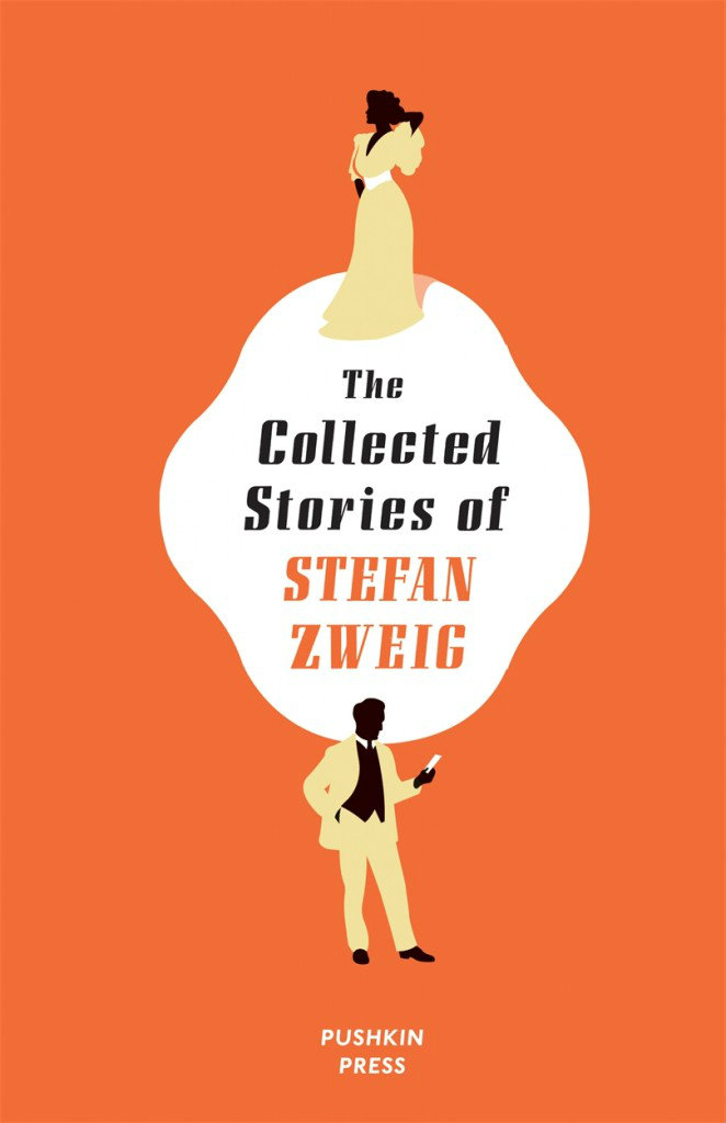
Zweig’s world is the world of the exile: the world of those displaced — by war, imprisonment, or by life, for whom hotels on Lake Geneva or the French Riviera are the only safe, if liminal, spaces. His characters are bereft of any sense of belonging; in the absence of a network, a sense of home, their emotions are heightened and their actions become ever more erratic. Thus in “Amok,” a doctor working in India finds himself blackmailing a patient for sex, painfully aware of how his self-imposed exile is disconnecting him from his own personal morality. In “Incident on Lake Geneva,” a Russian prisoner of war attempting to return home is stymied by a series of redrawn borders he does not understand; he tries to swim across, only to drown.
Such stories, of course, are colored by their political context: Zweig’s world is a world cut loose from itself. People’s bonds to their sense of self, of home, of country, of allegiance, have all been severed. But even consciously temporal stories like “Mendel the Bibliophile” — about a Viennese book collector sent to a concentration camp, and “The Invisible Collection,” about a blind art collector unaware of the fact that his family has sold his beloved prints to cope with rising German inflation — transcend their political context. They are, at their core, about the human need to connect, to ascribe meaning to what is not there, to look too fondly on an easier and imagined past as a means of coping with the at times impossible demands of real life.
Meanwhile, in the new issue of the London Review of Books, Michael Wood reviews the Zweig-inspired The Grand Budapest Hotel:
Zweig was born in an actual Europe and left, in the 1930s, to die in an actual Brazil… Best known during his lifetime for his vast and immensely readable biographies (of Dickens, Dostoevsky, Marie Antoinette, Mary Queen of Scots), he has recently been resurrected (in English, that is, since in French and German he hadn’t died) as the author of brilliant and bitter, if slightly too well-made fictions. It is from Joan Acocella’s fine introduction to one of them (Beware of Pity) that I take the fact that Zweig wrote a book called The World of Yesterday and the notion that he ‘saw himself as a citizen not of any one country, but of Europe as a whole.’ Of course Zweig was more serious about that world than the movie is or wants to be. He thought he had lived there. The movie thinks no one did.
At BBC News, Mark Bosworth looks at the life of artist and writer Tove Jansson:
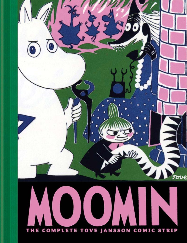
Tove Jansson grew up in an artistic household in Helsinki. Her father, a Swedish-speaking Finn, was a sculptor, her Swedish mother an illustrator.
While her mother worked, Tove would sit by her side drawing her own pictures. She soon added words to the images. Her first book—Sara and Pelle and the Octopuses of the Water Sprite—was published when she was just 13.
She later said that she had drawn the first Moomin after arguing with one of her brothers about the philosopher Immanuel Kant. She sketched “the ugliest creature imaginable” on the toilet wall and wrote under it “Kant”. It was this ugly animal, or a plumper and friendlier version of it, that later brought her worldwide fame.
Jansson studied art in Stockholm and Helsinki, then in Paris and Rome, returning to Helsinki just before the start of World War Two.
“The war had a great effect on Tove and her family. One of her brothers, Per Olov, was in the war. They didn’t know where he was, if he was safe, and if he was coming back,” says Boel Westin, a friend of Jansson’s for 20 years and a Professor of Literature at Stockholm University.
Jansson’s first Moomin book—The Moomins and the Great Flood—was published in 1945, at the end of this difficult and nerve-wracking period, with Comet in Moominland following soon afterwards.
“Tove’s anxiety and grief are embedded in the first two books. She was depressed during the war and this is mirrored in those books because they are about catastrophes,” says Westin.
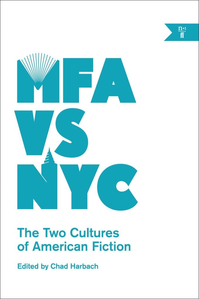
I finally just got around to reading Emily Gould‘s spiralling essay on writing and debt ‘How much my novel cost me‘ over the weekend. It’s an excerpt from the new n+1 book MFA vs NYC edited by Chad Harbach (author of The Art of Fielding), which seems like it could be essential reading for idealistic folks wishing to pursue writing as a career:
IT’S HARD TO WRITE ABOUT BEING BROKE because brokeness is so relative; “broke” people run the gamut from the trust-funded jerk whose drinks you buy because she’s “so broke right now” to the people who sleep outside the bar where she’s whining. But by summer 2012 I was broke, and in debt, and it was no one’s fault but mine. Besides a couple of freelance writing assignments, my only source of income for more than a year had come from teaching yoga, for which I got paid $40 a class. In 2011 I made $7,000.
During that $7,000 year I also routinely read from my work in front of crowds of people, spoke on panels and at colleges, and got hit up for advice by young people who were interested in emulating my career path, whose coffee I usually ended up buying after they made a halfhearted feint toward their tote bag–purses. I felt some weird obligation to them and to anyone else who might be paying attention to pretend that I wasn’t poor. Keeping up appearances, of course, only made me poorer. I’m not sure what the point of admitting all this might be, because I know that anyone who experiences a career peak in his mid-twenties will likely make the same mistakes I did, and it’s not even clear to me that they were all mistakes, unless writing a book is always a mistake, which in some sense it must be.
Interestingly, Robert McCrum touches on the financial difficulties of older authors in an article for this weekend’s The Observer
To writers of my generation, who grew up in the age of Penguin books, vinyl records and the BBC, it’s as if a cultural ecology has been wiped out. For as long as most of us can remember, every would-be writer knew the landscape of the printed word. This Georgian square was home to publishing grandees (now retired). On that high street were the booksellers (now out of business). In those twisting back streets, you could expect to find literary agents working the margins with the injured innocence of pickpockets at a synod. It was a mutually dependent ecosystem.
Publishers were toffs, booksellers trade and printers the artisan champions of liberty. Like the class system, we thought, nothing would change. The most urgent deadline was lunch. How wrong we were. The years 2007-2010 are pivotal: first… came the credit crunch. And it occurred at the very moment that the IT revolution was wrecking the livelihoods of those creative classes – film-makers, musicians and writers of all sorts – who had previously lived on their copyrights.
Gould is self-recriminating. McCrum — a former editor-in-chief at Faber and Faber — is nostalgic for a time I don’t remember (things were always better in the ‘old days’ in publishing circles). For Gould the internet is a double-edged sword — a platform and a distraction — for McCrum it has brought nothing but woe. Both seem to agree, however, that nobody is making any money, “marketing types” are awful (aren’t they though?), and being a writer is not all it’s cracked up to be…
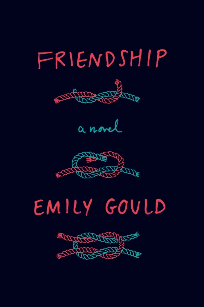
Coincidently, Emily Gould’s new novel Friendship will be published in the US and Canada by Farrar, Straus & Giroux on July 1 (and a couple of days later in the UK by Virago). I’m not sure who designed the cover, but it is rather nice.
(NB: FSG, and n+1 / Faber & Faber are distributed in Canada by my employer Raincoast Books)
Writers throughout these essays face the shame of privilege and the specter of poverty: They join magazine mastheads to keep from going broke, or they teach to keep from going broke, or else they actually do go broke—they’re broke in Brooklyn and broke in Los Angeles. Eli Evans evokes his years living in a “warehouse on Pico and Fourth” in one perfect image, one of the most remarkable moments in the entire collection: “I once found a baby rattlesnake strangled with electrical wire and tied to a signpost.” This baby rattlesnake, apparently, is what dreams become…
Author Rachel Kushner discusses her novel The Flamethrowers(now out in paperback), and the importance of images to her work, with The Quietus:
I’m inspired by visual art and film… Whether or not I’m writing about those mediums directly, as I sometimes do in Flamethrowers, I’m always thinking about images… I always wanted to have images in a book, and with [The Flamethrowers], after I got to have my choice of the image on the North American cover, I got a little bold, and asked about putting images inside. My editor said yes, so I quickly put together a short list of ideal visual passages. I didn’t want anything that would illustrate the narrative. I wanted, instead, images as kind of pauses, or counterpoints, but that would complicate, function in a relation, but not an obvious one. There’s a Richard Prince image, and he’s a shadow presence over the course of the book (one of the characters is also the name of Prince’s alter-ego, John Dogg). There’s a photograph by Aldo Bonasia, of a riot and police tear-gassing the rioters, in Italy. There’s a still from the movie Wanda, which figures in the book…
Funnily enough, I have feeling that Scribner have actually stuck closer to the hardcover for the front of the US paperback edition and slapped needless award stickers all over it, but I prefer the restraint of the version above left. The cover on the right is the UK paperback — a vast improvement on that mystifying hardcover).
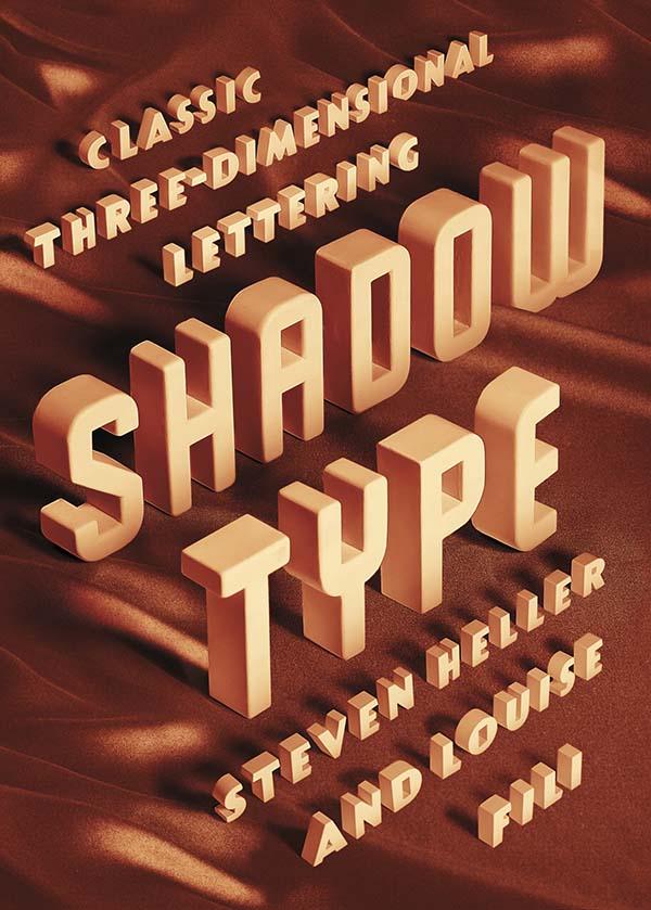
“Dimensional typefaces toy with human perception, challenging the limits of cognition. Whether framed by a subtle tint or a bold silhouette, in color or in black and white, a shadow adds bulk, enabling the words to rise voluminously from otherwise flat and unmonumental surfaces. Shadow faces are typographic trompes l’œil, fascimiles of real three-dimensional letters and inscriptions in sculpture and architecture… This sculptural essence of shadow type adds not only to the letters’ visibility, but also to their continuing allure.”
Just thinking about how much Steven Heller writes makes me a little giddy. The renowned art director, educator, design historian, and critic provides a steady stream of design commentary in newspaper, magazine and journal articles (not to mention his blog for Print magazine, The Daily Heller). He has authored, co-authored, or edited over 100 books on design, illustration and typography, including the recent Shadow Type: Classic Three-Dimensional Lettering, co-authored with his partner Louise Fili.
Shadow letters started to make an appearance on merchants’ signs in the 18th-century, and were introduced as metal typefaces as early as 1815, but they did not become common in printed text until later in the 19th-century. After a surge in popularity among printers and their clients, type foundries began to provide a wide selection of styles and sizes, and by the late 19th-century shadow wood type was also in demand, coming in extra-large sizes so it could be used outdoors. “Whether custom drawn, or as metal or wood type, shadow letters animated newspaper and magazine mastheads, product labels, and, indeed, all kinds of signs and posters.”
Published in September last year by Princeton Architectural Press, and distributed in Canada by Raincoast Books, I had the opportunity to ask Steven about Shadow Type, his interest in design ephemera, and how he finds time to write.
Do you remember when you first became interested in design?
I was interested in pictures at an early age. I wanted to be like Jules Feiffer, a comics artist. Design came later. I was studying the work of some German satirists, who were also designers.
Did you grow up in a creative household? Not especially.
Where did you begin your design career? At 14 I worked for an ad agency doing RussssTogs. Didn’t go well. It took another 3 years before I was hired by an underground paper to do layouts.
When did you first start writing about design history?
When I was at the NY Times as OpEd art director, I did a little bit of writing on those Germans I mentioned. Then it accelerated to writing about publications and other historical themes.
How do you find the time write?
There’s always time.
Do you still get excited when you hold one of your own books in your hands for the first time? Yes, the thrill is still there. But the high lasts shorter. An addict gets used to the fix and needs another and another. These days, I don’t rip the envelope right open. I let it sit for hours, so I have something to look forward to. Weird, I guess.
Why did you and Louise decide to write a book on classic three-dimensional lettering?
We did the first one on Scripts. We’ve done series before, they didn’t start out that way, but evolved. This evolved into Shadow Type. I have long loved the dimensional, colourful, sculptural letters.
When was the heyday of ‘shadow type’? 19th, 20th and 21st centuries. Its never gone out of style. But the golden age was late 1880s to 1940s.
Why did it become popular? Dimensionality on flat surface. Our eyes love to be fooled.
Why do you think there is a renewed interest in ornate typography and lettering? It comes and goes. I see a shift away again. But it has to do with the joy we get from ornament and I think it parallels what goes on in clothing.
Has Louise’s work contributed the revival of decorative type? Possibly. But she’s not decorative per se. Her type choices are elegant. She’s about precision and aesthetic pleasure.
Do all the examples in the book come from your own collection?
For Scripts and Shadow yes. And for the next one too, that’s Stencil Type.
Why does design ephemera hold such a fascination for you? I’ve come up with all sorts of reasons, but the all seem bogus. I feel the stuff somehow represents who I am. But I also love being a repository of history. More than that, I cannot say.
Your son, Nicolas Heller, recently made a film about your den called “The Cave.” What was that experience like? He’s a great talent. I just set him loose. And he made his film. The stuff in that place should be interpreted by others. The juxtapositions of objects and books are at times wonderful.
What’s Nicolas working on now? He’s doing a series of documentaries on eccentric New Yorkers called NO YOUR CITY, he’s also filming designers for documentaries produced by Brian Collins.
Do you have a favourite book? Of my own? I’ve done over 165, but I love Iron Fists. Of other people? There are too many to say.
What books are in your ‘to read’ pile? I just finished Deborah Solomon’s biography of Norman Rockwell – smartly done. And I finished Year Zero by Ian Buruma about the year 1945, makes the blood chill and boil. On the pile is a thick book about the Beatles. Not sure I’ll get to that.
Is there one book you think all designers should read?
I love Ben Shahn’s The Shape of Content. I also love The Hare with Amber Eyes, but for me, nothing is so essential that I’d stand on the mount and scream that they should read the tablets.
James Lovegrove reviews Tove Jansson, Life, Art, Words by Boel Westin, the first authorised biography of artist and writer, and Jansson’s own childhood memoir, Sculptor’s Daughter, first published in 1968 and now available in English for the first time, for The Financial Times:
The stories have… exerted an influence on many modern writers, for adults as well as children. Ali Smith, Jeanette Winterson and Maggie O’Farrell are self-professed Moomin fans. Philip Pullman has called Jansson a “genius”, while Frank Cottrell Boyce drew important life lessons from the Moomins at an impressionable age. “Jansson valorised coffee and pancakes and reticence and the mystery of others,” he wrote in a review of Moomin picture book The Dangerous Journey. “But more to the point she showed me how it might be just those small pleasures that keep us together when we start to grow apart.”
The young Boyce, however, was also drawn to the Moomins because he sensed an existential darkness at the heart of the books. Jansson wrote in the dominant mode of 20th-century children’s literature, fantasy, but hers was fantasy shot through with a quiet anguish. Apocalypse through natural disaster – flood, volcano, potentially earth-shattering comet – looms in the background of her stories. Characters are solitary, lonely, sometimes on the brink of despair, and acknowledge the fragility of things with an accommodating liberal shrug.
Kate Kellaway also reviews both books for The Observer:
[T]he greatest revelation, reading the memoir, is that what drove Jansson’s imagination was fear. This is a book of perils. The dark is a faceless monster with “distinct hands”. Snow is like “grey hands with a hundred fingers”. An eiderdown behaves like a fist. Ice breathes. Snakes in the carpet are almost real. The words “safety” and “dangerous” repeat themselves. The external world was always an internal landscape for Jansson. Reading her is like a return to childhood: things happen that are inexplicable when adults are in charge. It’s unwise to pretend to know what is coming next. Life, she indicates, is best approached gingerly, with respectful regard.
It’s tempting to ask just how transgressive a novel, especially a best-selling novel, can be—and whether taking a stand against mainstream values makes you subversive or just modern. In other words: Is Kushner the flamethrower for real?
The answer is, basically, yes, in both senses of the phrase: She knows what she writes about, and she’s dead serious about her ideals. There’s plenty of room in The Flamethrowers for the dark side of that idealism—murdered businessmen, casually discarded girlfriends, movements warped by violence. In many ways it’s the subject of the book. But if something ardent and glamorizing blazes through, like the flashy World War I brigade of the title, that’s because Kushner herself is a believer, a genuine and unself-conscious exponent of what she might call the radical gesture—even if those gestures are more common now among academics and art stars than any genuine underclass. In a forthcoming interview with Tin House, she calls her shimmering mosaic of a second novel a “paean, maybe, to things that have long interested me. Nothing is in the book that I had to learn about. Instead, it is filled with things I already knew … drawn from my taste, my life, my sensibility.”
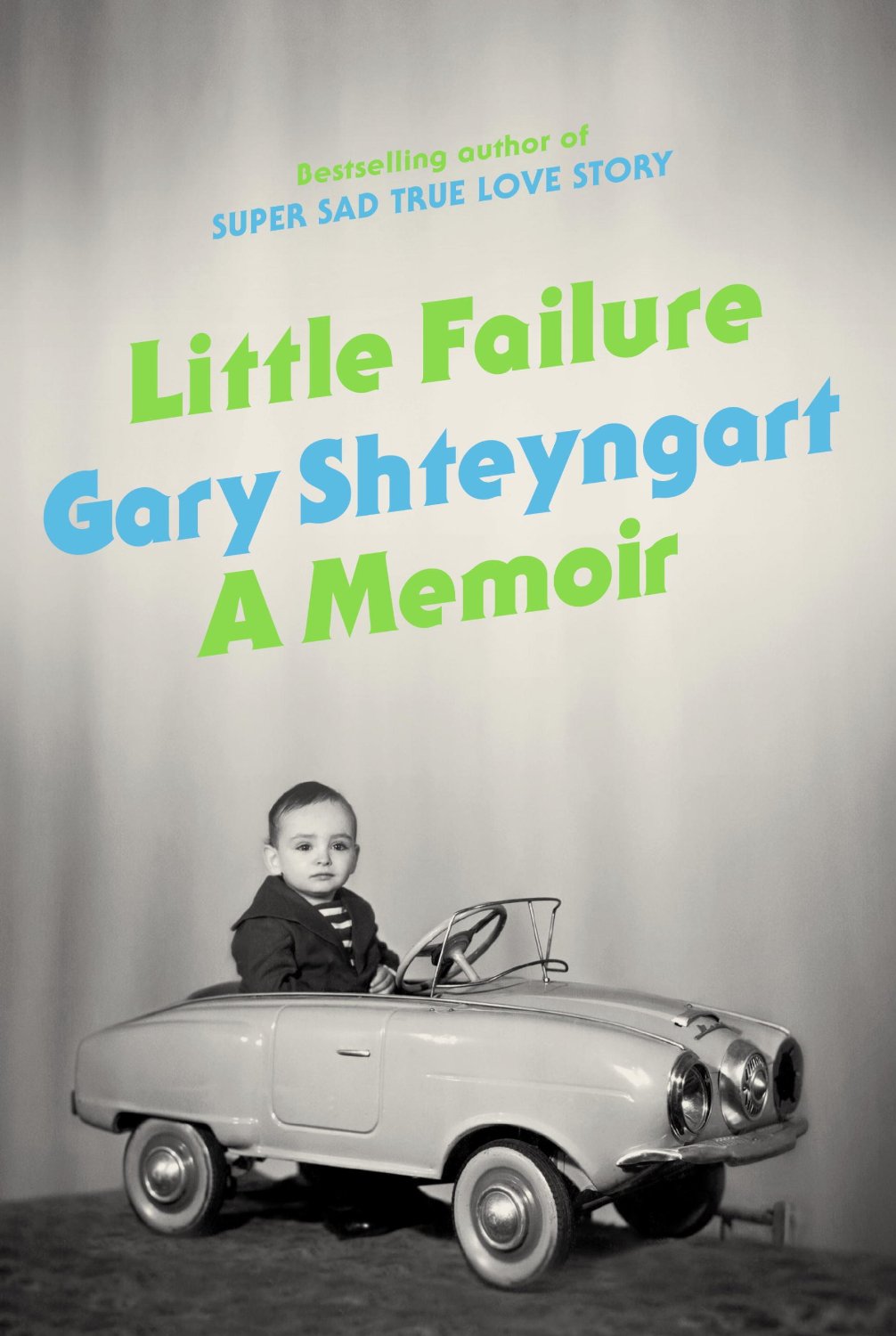
Surely just about everyone has seen this already, but in case you missed it, the new video for Gary Shteyngart’s forthcoming memoir Little Failure, which features James Franco as his husband and Jonathan Franzen as his therapist, is pretty great:
The video also stars David Ebershoff, Rashida Jones, Sloane Crosley, and Alex Karpovsky.
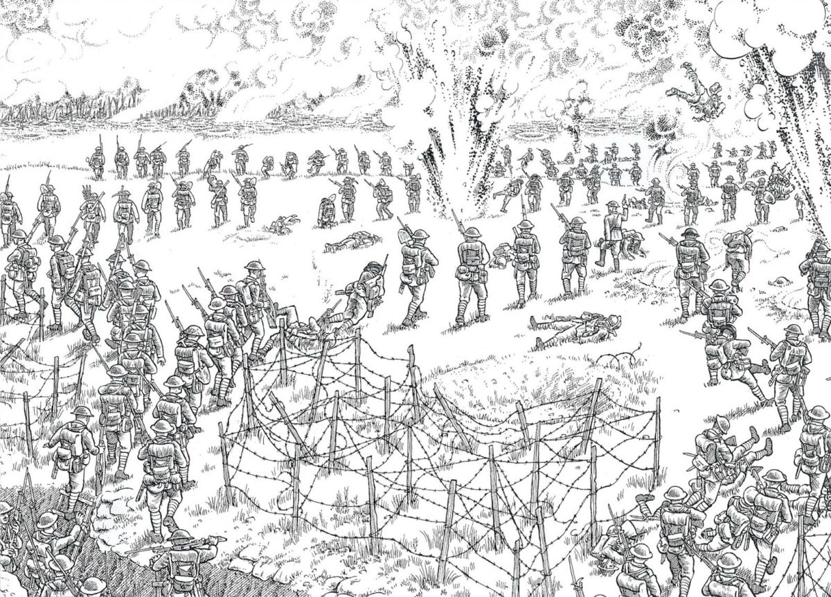
Cartoonist Joe Sacco discusses his new illustration/book The Great War in an interview at Salon:
I think every medium has its strengths. But I think illustrated work puts the reader directly into a picture. You open up, let’s say, a comic book, and I’ve drawn a Palestinian refugee camp — you’re inside it, and with the multiple images, you’ll hopefully get an idea of the atmosphere. As a cartoonist, you’re concentrating on giving visual information — especially in the background — that can be conveyed by multiple images. And things follow the reader around. You know, the architecture will follow the reader from one panel to another, so it becomes part of the atmosphere that the reader is imbibing. With the written word, you can describe the architecture, but you’re not going to keep mentioning it as a figure is walking down the street, you’re not going to keep mentioning what the background is. With comics you can do that.