Skip to content

Category: Authors

Tim Parks on Where I’m Reading From

Where I'm Reading From (1)

At BOMB Magazine, writer Tim Park discusses his new book Where I’m Reading From, a collection of his essays from the NYRB Blog, with Scott Esposito (co-author of The End of Oulipo):

In a way, this book is an autobiography of someone brought up with a very particular relation to books, in a religious family, in an English literary tradition, who on becoming an adult, for private personal reasons, set himself literary goals that were gradually revealed as spurious. Also, it’s about a person from the literary center—English, London— who has spent more than thirty years in another country, Italy, that is out of the literary mainstream. And a writer who also, by chance, became a translator and went on to teach translation. My life has been a long process of awakening to the reality, the changing reality, of the contemporary book world, which is a million miles from the naïve vision I had when I started writing books at twenty-two. Since it is in the publishers’ interests, and indeed the University’s, to sustain a false picture of what the book world is like and what the contemporary experience of books amounts to, my articles were a response to this, and an attempt to get my own head straight about what I’m really doing and the environment I move in. One is seeking at last to be unblinkered about it all.

And, if you missed it, Park reviewed What We See When Read by designer Peter Mendelsund on the NYRB Blog earlier this month:

One of the pleasures of his book is his honesty and perplexity at the discovery that every account he offers of the process of visualization very quickly falls apart under pressure. We do not really “see” characters such as Anna Karenina or Captain Ahab, he concludes, or indeed the places described in novels, and insofar as we do perhaps see or glimpse them, what we are seeing is something we have imagined, not what the author saw. Even when there are illustrations, as in many nineteenth-century novels, they only impose their view of the characters very briefly. A couple of pages later they have become as fluid and vague as so much of visual memory. At one point Mendelsund posits the idea that perhaps we read in order not to be oppressed by the visual, in order not to see.

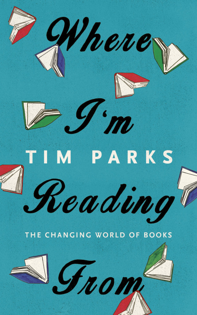
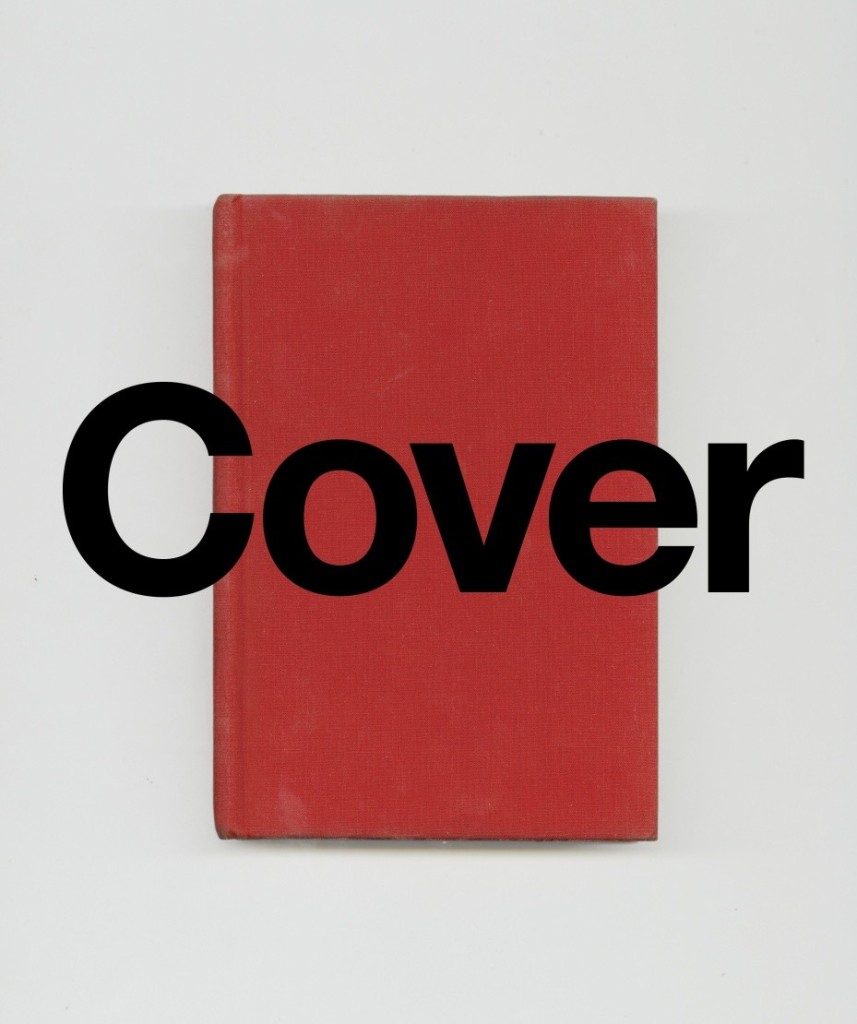
(Pictured above is the cover of the UK edition, published by Harvill Secker in December last year, of Where I’m Reading From designed by James Paul Jones. The US edition, which has a more utilitarian cover, was just published by New York Review of Books)

Comments closed

The Eeriness of the English Countryside

A-Field-in-England-009
A Field In England

Robert Macfarlane, whose new book Landmarks was published in the UK last month, has a fascinating essay in The Guardian on the writer M. R. James, and the eerie horror of the English countryside:

We do not seem able to leave MR James (1862–1936) behind. His stories, like the restless dead that haunt them, keep returning to us: re-adapted, reread, freshly frightening for each new era. One reason for this is his mastery of the eerie: that form of fear that is felt first as unease, then as dread, and which is incited by glimpses and tremors rather than outright attack. Horror specialises in confrontation and aggression; the eerie in intimation and aggregation. Its physical consequences tend to be gradual and compound: swarming in the stomach’s pit, the tell-tale prickle of the skin… James stays with us is his understanding of landscape – and especially the English landscape – as constituted by uncanny forces, part-buried sufferings and contested ownerships. Landscape, in James, is never a smooth surface or simple stage-set, there to offer picturesque consolations. Rather it is a realm that snags, bites and troubles. He repeatedly invokes the pastoral – that green dream of natural tranquillity and social order – only to traumatise it.

James’s influence, or his example, has rarely been more strongly with us than now. For there is presently apparent, across what might broadly be called landscape culture, a fascination with these Jamesian ideas of unsettlement and displacement. In music, literature, art, film and photography, as well as in new and hybrid forms and media, the English eerie is on the rise. A loose but substantial body of work is emerging that explores the English landscape in terms of its anomalies rather than its continuities, that is sceptical of comfortable notions of “dwelling” and “belonging”, and of the packagings of the past as “heritage”, and that locates itself within a spectred rather than a sceptred isle.

I think the eerie is also a theme that runs through English comics, although Macfarlane doesn’t mention it, and I’m hard pressed to think of specific examples. Gothic psychogeography is very much Alan Moore territory, and it feels like it should be in Warren Ellis’s wheelhouse too, but have either of them written anything explicitly about the horror of the English countryside?

(via Theo Inglis)

3 Comments

Olivia Laing on the Future of Loneliness

Gail-Albert-Halaban

Olivia Laing whose new book The Lonely City is out in 2016, has a personal essay on loneliness and technology in The Guardian that, like her books To the River and The Trip to Echo Spring, weaves a lot of surprisingly disparate threads together into fascinating meditation on art, literature and place:

At the end of last winter, a gigantic billboard advertising Android, Google’s operating system, appeared over Times Square in New York. In a lower-case sans serif font – corporate code for friendly – it declared: “be together. not the same.” This erratically punctuated mantra sums up the web’s most magical proposition – its existence as a space in which no one need ever suffer the pang of loneliness, in which friendship, sex and love are never more than a click away, and difference is a source of glamour, not of shame.

As with the city itself, the promise of the internet is contact. It seems to offer an antidote to loneliness, trumping even the most utopian urban environment by enabling strangers to develop relationships along shared lines of interest, no matter how shy or isolated they might be in their own physical lives.

But proximity, as city dwellers know, does not necessarily mean intimacy. Access to other people is not by itself enough to dispel the gloom of internal isolation. Loneliness can be most acute in a crowd.

Coincidentally, Laing’s piece is illustrated with photographs from Gail Albert Halaban‘s series Out My Window — one of which was used on the cover of My Salinger Year by Joanna Rackoff, designed by Peter Mendelsund and Oliver Munday.

Comments closed

William Gibson on Authenticity

gibsonlabel

I’d be the first to admit that I didn’t really get on with William Gibson’s latest novel The Peripheral, but I really enjoyed his ‘Blue Ant’ trilogy — Pattern Recognition, Spook Country, and Zero History.

Interestingly, the (fictional) Buzz Rickson MA-1 flight jacket worn by Cayce Pollard, the protagonist in Pattern Recognition, led to the Japanese clothing company working with Gibson to manufacture a line of clothes (including the aforementioned black MA-1) inspired by the author. In this fascinating interview with Rawr Denim, the author discusses Buzz Rickson, Japanese pop culture, workwear, authenticity and more:

“Authenticity” doesn’t mean much to me. I just want “good”, in the sense of well-designed, well-constructed, long-lasting garments. My interest in military clothing stems from that. It’s not about macho, playing soldiers, anything militaristic. It’s the functionality, the design-solutions, the durability. Likewise workwear.

Military clothing is built to strict contract, but with the manufacturer cutting ever corner they can without violating the specifications. The finishing on a Rickson reproduction is exponentially superior to the finishing on most of the originals, and I’d much rather have a brand-new exact copy that’s more carefully assembled…

…[In] 1947 a lot of American workingmen wore shirts that were better made than most people’s shirts are today. Union-made, in the United States. Better fabric, better stitching. There were work shirts that retailed for fifty cents that were closer to today’s Prada than to today’s J.Crew. Fifty cents was an actual amount of money, though. We live in an age of seriously crap mass clothing. They’ve made a science of it.

Comments closed

Labels

left-handed-scandinavians

I’m pretty sure ALL of these are BISAC codes. (It actually relates to this article in The Guardian)

See more of Tom Gauld’s cartoons here (or, better still, buy his book).

Comments closed

Hilary Mantel: Speaking with the Dead

I’m finally, finally reading Wolf Hall (I know, I know…). It is excellent of course, and I’m looking forward to reading Hilary Mantel’s new collection of stories The Assassination of Margaret Thatcher just as soon as I’ve finished it (and Bring Up the Bodies). Mantel was recently profiled by Olivia Laing, author of A Trip to Echo Spring (one of my favourite books of the year), for the November issue of Elle magazine:

there’s an unmistakably eerie element to what Mantel does: a summoning of and speaking with the dead. Although she insists that she has “a very constrained imagination” and is happiest working within a scaffolding of fact, she is nonetheless adept at the act of mediumship that fiction requires. More than any other historical novelist I can think of, she also has a knack for conveying the slipperiness of time, the way it sloshes backward and forward, changing even as you watch. “History and memory is the theme,” she agrees, “how experience is transmuted into history, and how memory goes to work and works it over. It’s the impurity, the flawed nature of history, its transience—that’s really what fascinates me.”

Comments closed

Peter Mendelsund on Fresh Air

cover

I think there are two primary jobs that a jacket has to do: It has to represent a text and it has to sell it. In a way, a book jacket … is sort of like a title that an author comes up with. It’s one thing that has to speak to a big aggregate thing, which is the book itself. And it has to be compelling in some way such that you’re interested enough to pick it up — and perhaps buy it. … It’s like a billboard or an advertisement or a movie trailer or a teaser. …

I think of a book jacket as being sort of like a visual reminder of the book, but … it’s also a souvenir of the reading experience. Reading takes place in this nebulous kind of realm, and in a way, the jacket is part of the thing that you bring back from that experience. It’s the thing that you hold on to.

Peter Mendelsund, book designer and author of What We See When We Read, interviewed on NPR’s Fresh Air:

NPR Fresh Air Interview: Author and Designer Peter Mendelsund mp3

2 Comments

Previously Unknown Chapters of Charlie and the Chocolate Factory

charlie-tom-gauld

Tom Gauld

Comments closed

It Kills Everything It Touches

sheer-rage

At the LA Review of Books, Daniel Mark Janes discusses last month’s curious conference at Birkbeck College (University of London) about the author Geoff Dyer:

Anyone who has written about Geoff Dyer will have been tempted to emulate his style, particularly his tendency to digress: “I planned to write about Geoff Dyer but instead I got distracted/stoned/fell asleep.” (Of those who resist this urge, most feel obliged to describe this temptation.) However, the point of works like ‘Out of Sheer Rage’ and ‘Zona’ is not just that Dyer chronicles his experiences; it is that, for all of the tangents, we still at the end find ourselves closer to Lawrence, closer to Tarkovsky. Personal reminiscence alone did not necessarily make us closer to Dyer — but it was still welcome in shaping the tone. Amid the ’ism’s and ’otic’s of traditional academic papers, humanity can often be lacking — yet Dyer’s work is all flesh and bone, united by a persona that is profoundly, playfully human.

And on a related note, Philip Maughan also spoke to Dyer about the conference for the New Statesman:

“I’m one of the people who seem to have licensed the ‘I’m meant to write about this book but I’m just going to write how I got stoned instead’ essay – but it only works for certain subjects. It has to lead you into a deeper appreciation of the subject than could have been attained in a more direct way. It’s like those legal highs,” he said. “Some of them can get you pretty messed up. Really they ought to be proscribed.”

Comments closed

Authors’ Cocktails

hard-day

I didn’t see this weekend’s Guardian, but I assume Tom‘s cartoon is in reference to Olivia Laing’s article about 20th century female writers who drank, a follow-up to her excellent book The Trip to Echo Spring, which examines the link between creativity and alcohol through the lives F. Scott Fitzgerald, Ernest Hemingway, Tennessee Williams, John Berryman, John Cheever, and Raymond Carver:

Female writers haven’t been immune to the lure of the bottle, nor to getting into the kinds of trouble – the fights and arrests, the humiliating escapades, the slow poisoning of friendships and familial relations – that have dogged their male colleagues. Jean Rhys was briefly in Holloway prison for assault; Elizabeth Bishop more than once drank eau de cologne, having exhausted the possibilities of the liquor cabinet. But are their reasons for drinking different? And how about society’s responses, particularly in the lubricated, tipsy 20th century; the golden age, if one can call it that, of alcohol and the writer?

Comments closed

Easily Influenced

easily-influencedI’ve posted Tom Gauld‘s cartoons for The Guardian pretty regularly here for the past few years (and you can read my 2011 Q & A with him here), but he’s really been on great form of late. If you still haven’t checked out his collection of cartoons, You’re All Just Jealous of My Jetpack, I highly recommend you do.

Comments closed

Nicholson Baker: “Wrapping Sentences Around Things”

Way-The-World-Works
This made a couple of people in my Twitter feed very, very happy today — author Nicholson Baker talking about writing, design and the influence of his parents, who both studied at Parsons School of Design in New York, at Lingua Franca: The 2014 D-Crit Conference at the School of Visual Arts last week:

As Michael Bierut noted on Twitter, Nicholson Baker’s father was a graphic designer who worked for the great Erik Nitsche! Who knew?

(via @acejet170)

Comments closed