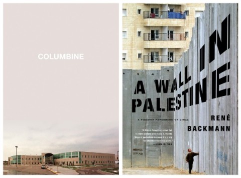
Columbine and A Wall in Palestine: cover designs by Henry Sene Yee
Henry Sene Yee is a designer and art director at Picador USA. The very of his best work (and all of it is good) — his cover designs for Columbine by Dave Cullen and A Wall in Palestine by René Backmann to pick two recent examples — combine judiciously selected and smartly cropped photographs with bold typographic choices.
Given the poignancy of the images he chooses and the respect he gives to them within his compositions — the room he gives them to breath — it isn’t surprising that Henry is a photographer himself, regularly capturing scenes of daily life in his beloved New York through a lens.
Photo by Henry Sene Yee
The author Richard Price, who has also written for the HBO series The Wire, was born in and raised in the Bronx. Several of his novels, including Clockers and Freedomland (both adapted to movies), are set in the in fictional town of Dempsy, New Jersey.
Photo by Henry Sene Yee
Over the last couple of years Henry, who also happened to grow up in New Jersey, has designed covers for Picador’s recent reissues of Price’s novels.
Bringing his understanding of photography and type to the designs Henry has, like Price himself, avoided the expected crime fiction clichés.
As fan of Price’s work as well as Henry’s, I thought I would take to the opportunity to ask the designer how he approached the covers.
Here is his reply:
Lush Life: cover design by Aaron Artessa
It started when Picador published the paperback edition of Richard Price’s bestseller Lush Life. Because of its success, the FSG cover was reproduced in ads and displayed prominently in bookstores. Repackaging the cover for paperback would not take advantage of the public familiarity with it so it was decided to keep the original jacket design [by Aaron Artessa].
Clockers final cover by Henry Sene Yee
Clockers: unused designs by Henry Sene Yee
Clockers, probably Price’s most well known backlist was also acquired by us and was reprinted to coincide. It was designed as a stand alone. I couldn’t see how I would or need to relate it to Lush Life.
Bloodbrothers final cover by Henry Sene Yee
It was followed by his next backlist title Bloodbrothers, which was also designed as a stand alone. That book’s themes reminded me of photographer Bruce Davidson’s beautiful 1970s NYC Subway photos. I found this great Davidson photograph from his gang series and kept the colors simple.
The Breaks final cover by Henry Sene Yee
We later acquired The Breaks and Ladies’ Man and I had no intention to follow any previous Price’s look since there was none. Photo research found some great images similar in look to the Davidsons. My two favorite photos happen to both be horizontal and the initial layouts looked similar to Bloodbrothers. I tried to distinguish them by using different colors in the background, type. But in the end, it was just distracting from the great photos. So I decided to have them match Bloodbrothers, keeping the type and same palette of black, warm gray duotones, cream and warm red.
Ladies man final cover by Henry Sene Yee
The Breaks and Ladies Man: unused designs by Henry Sene Yee
Thanks Henry!
Disclosure: As of Fall 2011, book published by Picador will be distributed to independent bookstores and libraries in Canada by my employer Raincoast Books as part of a new distribution arrangement with Macmillan US. For the record, Henry and I discussed featuring his work on The Casual Optimist several times well before details of this deal was known to either of us.


Wow–these are just wonderful. Thanks for the interview!