Futurism wasn’t all bravado; it did have an aesthetic (or anti-aesthetic) of its own, which was to modernise the arts through a mimicry of the effects of new media, such as the adaptation of chronophotography and cinema to painting, photography and sculpture, or the application of the phonograph to musical performance. More ambitiously, the futurists sought to refashion the human sensorium along the lines of these new techniques of perception, and to this end they updated the ideas of synaesthesia, or the fusion of the senses, and kinaesthesia, or the mixing of bodies in motion and at rest. At the same time (and this is just one of many contradictions), the futurists were conservative stylistically; for all their nationalist pride, they relied on French sources, especially the divisionist brushstroke of neo-impressionist painting, which they adapted to themes of the modern city. Thus in Street Light (1909) Giacomo Balla offers the streetlamp as an improvement on the moon: both kinds of illumination are represented as waves of energy, but the artificial light dominates the natural one. So too in The City Rises (1910-11) Boccioni shows us the metropolis as a firestorm of colour greater than any in nature, where construction is difficult to distinguish from destruction; here the futurists thrill to modernity as catastrophe.
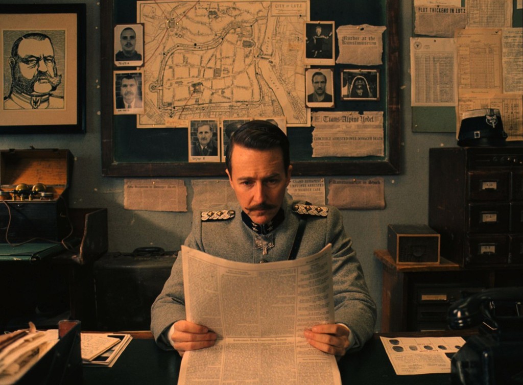
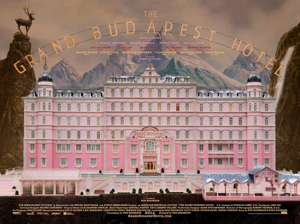
Just to quickly follow up my post about Wes Anderson and The Grand Budapest Hotelearlier this week, there is an interesting interview with art director Adam Stockhausen about working with on the film at The Dissolve:
[The references] come from all over the place. They’re very specific, but they can come from any place. They can come from a story, they can come from a painting, they can come from a movie. In this movie, there’s a Bergman film called The Silence, with the boy wandering around the hallways, we modeled our hallways on that. If you look at the hotel doors in that film, ours are a carbon copy. There’s a sequence in a Hitchcock movie called Torn Curtain where he comes out of his hotel and he gets on the bus and he goes to the museum; we have a bit of an homage to that sequence when Deputy Kovacs goes from his office to the art museum and he’s being chased by Willem Dafoe’s character. For the palm court we looked at Rousseau paintings. For the command tent in Moonrise Kingdom, we looked at Churchill’s war room. The references can be very wide, but they’re all pretty different.
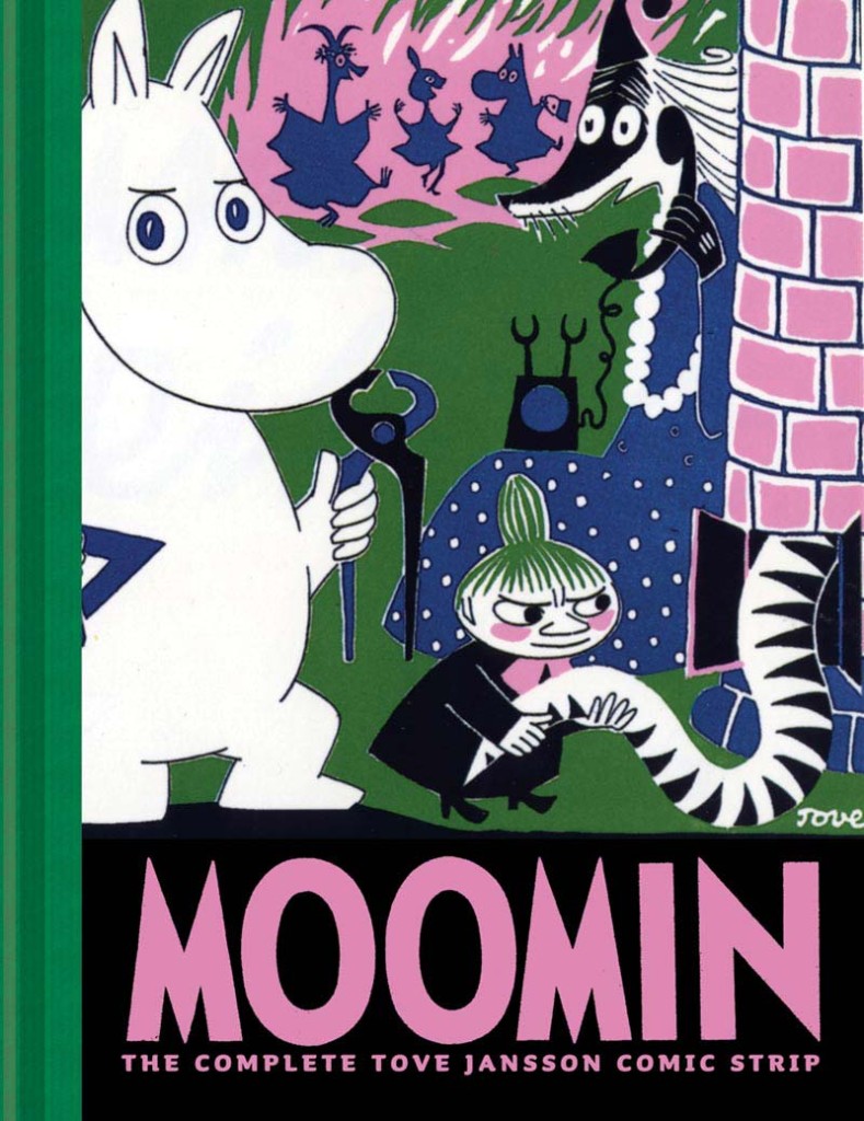
At BBC News, Mark Bosworth looks at the life of artist and writer Tove Jansson:
Tove Jansson grew up in an artistic household in Helsinki. Her father, a Swedish-speaking Finn, was a sculptor, her Swedish mother an illustrator.
While her mother worked, Tove would sit by her side drawing her own pictures. She soon added words to the images. Her first book—Sara and Pelle and the Octopuses of the Water Sprite—was published when she was just 13.
She later said that she had drawn the first Moomin after arguing with one of her brothers about the philosopher Immanuel Kant. She sketched “the ugliest creature imaginable” on the toilet wall and wrote under it “Kant”. It was this ugly animal, or a plumper and friendlier version of it, that later brought her worldwide fame.
Jansson studied art in Stockholm and Helsinki, then in Paris and Rome, returning to Helsinki just before the start of World War Two.
“The war had a great effect on Tove and her family. One of her brothers, Per Olov, was in the war. They didn’t know where he was, if he was safe, and if he was coming back,” says Boel Westin, a friend of Jansson’s for 20 years and a Professor of Literature at Stockholm University.
Jansson’s first Moomin book—The Moomins and the Great Flood—was published in 1945, at the end of this difficult and nerve-wracking period, with Comet in Moominland following soon afterwards.
“Tove’s anxiety and grief are embedded in the first two books. She was depressed during the war and this is mirrored in those books because they are about catastrophes,” says Westin.
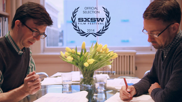
Dress Code‘s documentary short about typographers Jonathan Hoefler and Tobias Frere-Jones, Font Men, “gives a peek behind the curtain into the world of Jonathan and Tobias. Tracking the history of their personal trajectories, sharing the forces that brought them together and giving an exclusive look at the successful empire they built together.” The film is a SXSW 2014 Official Selection:
The Bookseller has posted an edited transcript of a recent speech by Stephen Page, chief executive of Faber & Faber, at the IPG and Publishing Scotland conferences:
One joy of digital is that it promotes thinking about all incarnations of reading, from the insubstantial to the disposable to the luxurious. We’re back to a place where we must imagine all the means we have of expressing value for a text. Where a reader will buy a £100 edition, let’s make that, and a 99p e-book where that’s appropriate… In the future we’ll spend a lot more time talking and listening to consumers. Whether they’ll listen will depend on our skills and the degree of fandom for the writer. If we’re successful, we’ll get a conversation going among consumers, and if we’re really skilful they’ll come back to talk some more. Having the systems and skills to do this will be the core to a publisher’s commercial opportunity, alongside taste.
There’s a wonderful photochrom of the hotel that I always thought of as sort of the model for our hotel, which is the Hotel Pupp in Karlovy Vary, which was in Carlsbad. The thing we learned when we visited all sorts of places that we found on this collection of pictures was that none of them were enough like what they once were to work for us. But the photochrom images seemed to tap into a truth about Zweig’s vision of the world that I was able to draw on in developing a visual aura for the film.
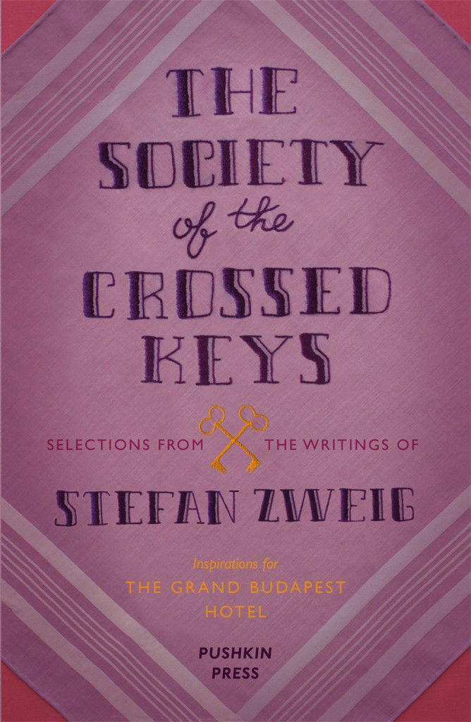
In The Post Office Girl, Zweig’s description of the grand hotel in Switzerland is so evocative. The protagonist is a girl who works in the post office. She’s invited to stay in this hotel as a gift from her rich aunt, and when she arrives in this place, the management thinks she’s there to make a delivery. Her suitcase is a basket. Finally they realise she’s actually going to be a guest in the hotel, which is unlike anywhere she’s ever been. Her point of view about this treatment she receives, and her experience of walking in and realising, “This is where I’m going to sleep”, is so powerful. But also that by the time her holiday abruptly ends, she is already addicted to this other way of life, and her existence is so dramatically changed, and a sort of desperation comes over her — and then a connection she makes with someone who is in his own desperate state. The idea of that work being something that had been out of print for that long is sort of surreal.
At a recent event at the New York Public Library, Anderson similarly discussed Zweig’s work with Paul Holdengräber:
The movie itself was reviewed all over place the last week, but I quite enjoyed Richard Brody’s review for The New Yorker:
Perhaps more than ever, Anderson takes a joyful yet aching delight in recreating the styles of bygone days. The hotel is like a majestically confected cake on the outside and a jewel box on the inside, adorned with staff and guests whose uniforms and fashions are nuanced to the buttons, and whose behavior is self-controlled to the glance. Yet also, more than in any of his other films, that very recreation is his subject. “The Grand Budapest Hotel” is about the spiritual heritage and the political force of those long-vanished styles—about the substance of style, not just the style of his Old World characters but also, crucially, Anderson’s own. This isn’t Anderson’s most personal film, in the strict sense, but it is, alongside “The Life Aquatic with Steve Zissou,” his most reflexive one—even more so because the new film exposes the inner workings not just of his practice of filmmaking but of his sensibility.
UPDATE:Creative Review talks to the film’s lead graphic designer Annie Atkins about her work:
We actually used comparatively few typefaces in the movie, as most lettering was created by hand. Wes and Adam had been on location recces all around Eastern Europe and had references of all kinds of hand-made signage from the last 100 years or so. The beautiful thing about period filmmaking is that you’re creating graphic design for a time before graphic designers existed, per sé. It was really the craftsmen who were the designers: the blacksmith designed the lettering in the cast iron gates; the glazier sculpted the lettering in the stained glass; the sign-painter drew the lettering for the shopfronts; the printer chose the type blocks for the stationery…
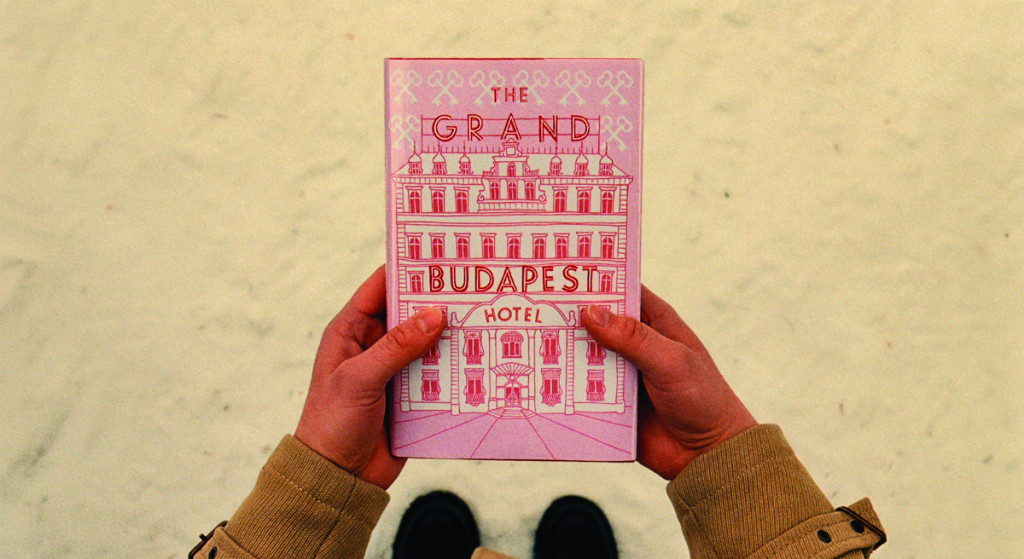
… My absolute favourite piece is the book itself that opens the story. It’s a modern pink hardback with a drawing of the hotel on the front, and the name of the movie as the hotel sign. It’s a relatively simple piece, but it’s really special having a prop that you made with the movie’s name on it like that. I remember Wes had sent me a quick sketch showing his idea for the book, and I really loved being able to help make that work for him. I treasure that piece, actually – we made three for the shoot, in case one got dropped in the snow, and so I brought one home with me.
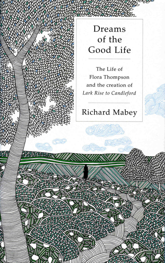
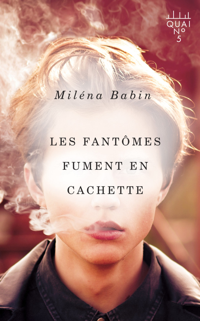
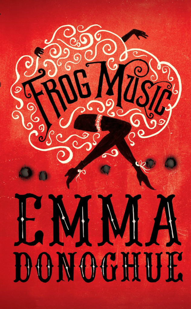
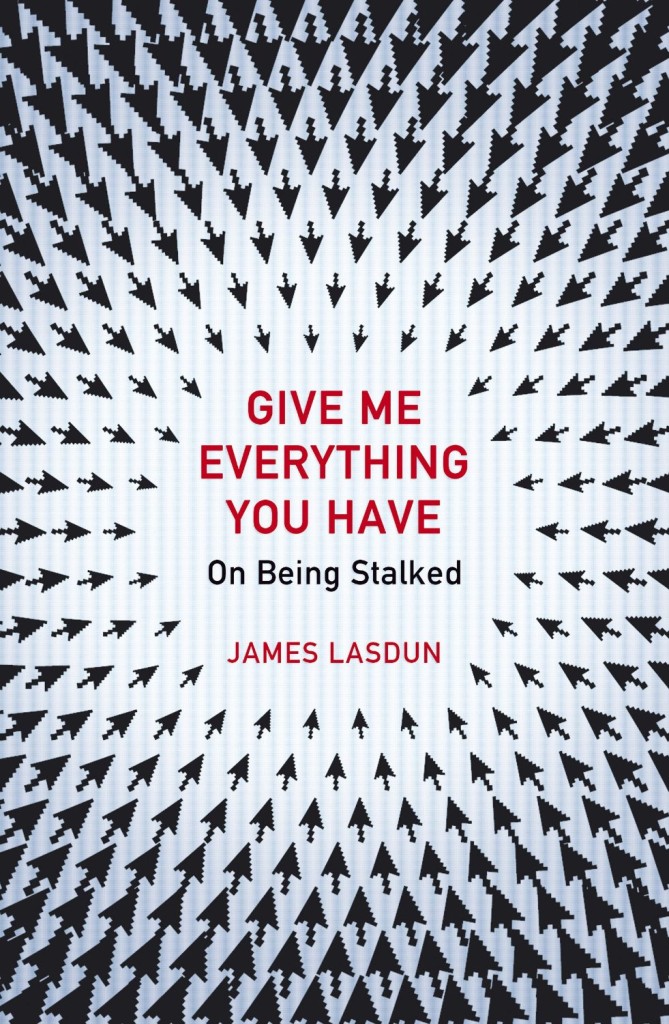
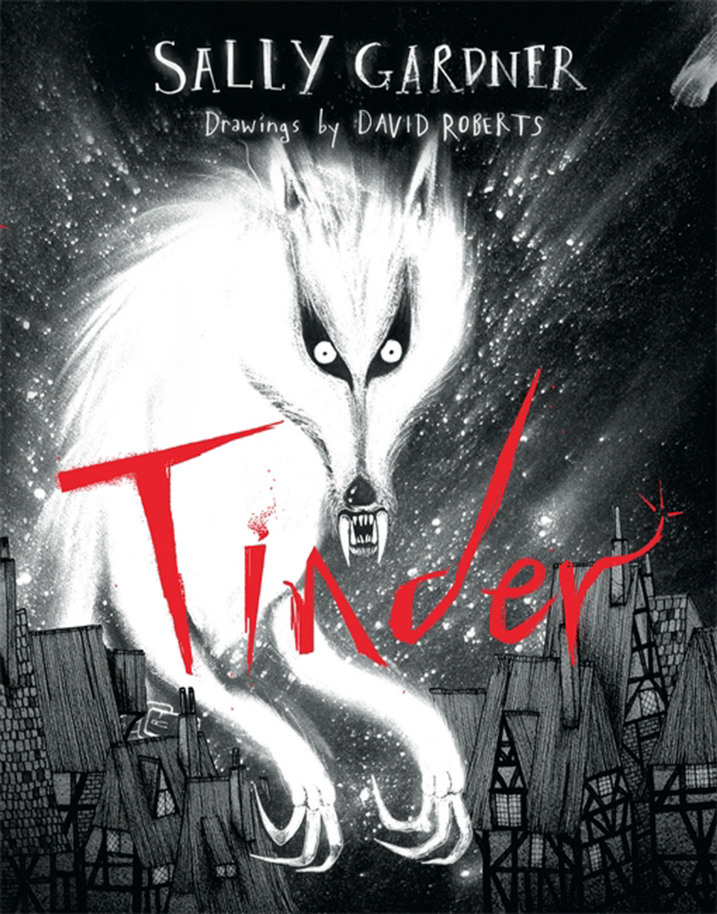
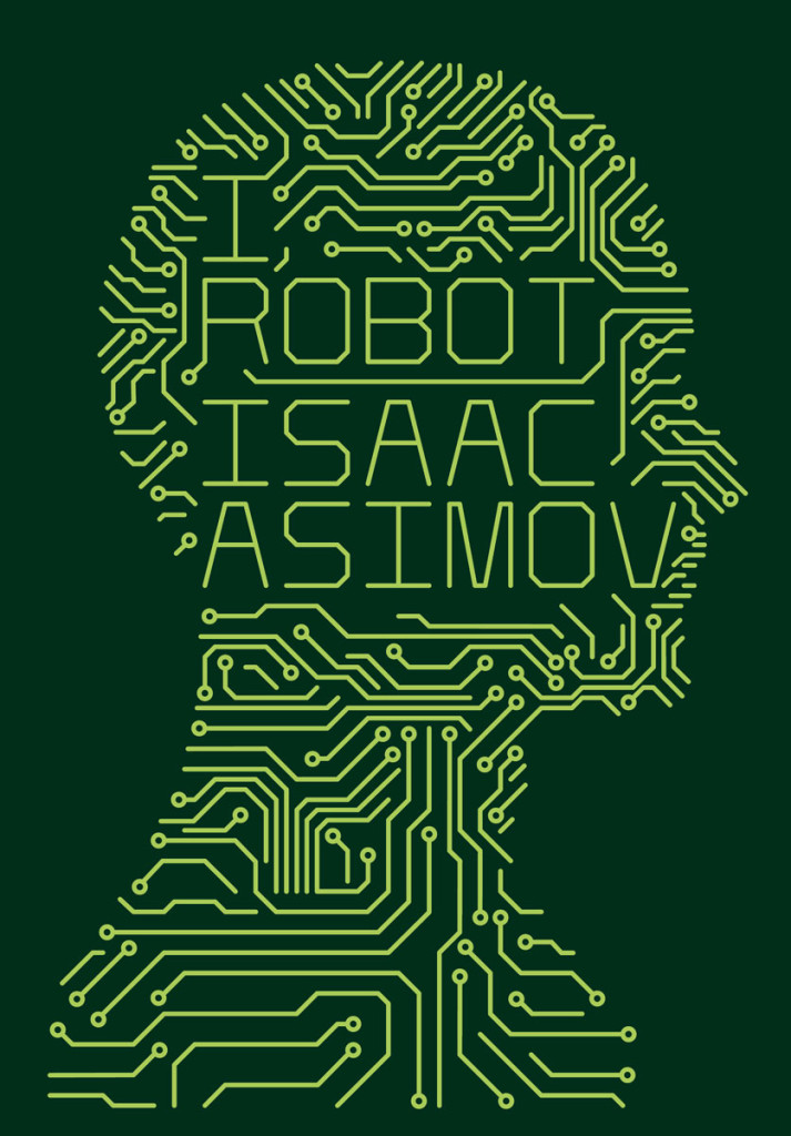
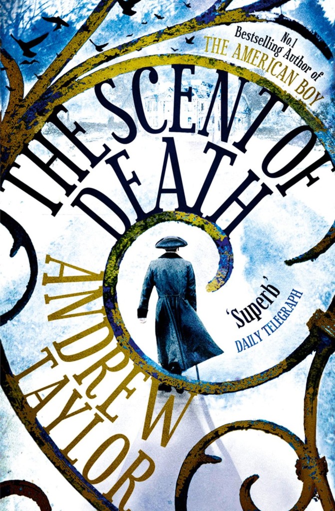
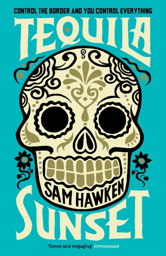
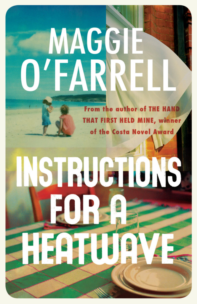
The Academy of British Cover Design held its inaugural awards ceremony last night. The competition was open to any cover produced for a book published between January 1 and December 31 2013 by a designers based in the UK. Here are the winning cover designs in each of the 10 categories:
How is that I’ve not seen Herzog and the Monsters before now? Lesley Barnes‘ lovely 2006 short animated film, made at the Glasgow School of Arts, has just about all you could wish for: “a small boy who steals words, a forest full of monsters and lots of vintage penguin books.”