Skip to content

The Casual Optimist Posts

Lead the Autobiographical Novelist to the Literary Prize

autobiographical novelist Tom Gauld

Tom Gauld on Karl Ove Knausgaard for The Guardian.

Comments closed

Brooklyn’s Most Cluttered Bookstore

The New Yorker visits the Community Bookstore in Brooklyn as owner John Scioli begins to clean out his “cavern of books” in preparation of the store’s closing in May:

Comments closed

David Pearson Found on the Shelves

on_corpulence-design_david_pearson_illus_joe_mclaren

At The Bookseller, designer David Pearson talks about his new cover designs for Pushkin Press’s ‘Found on the Shelves’ series celebrating 175 years of the London Library:

At the heart of successful series design is motif – be it colour, type, grid, imagery, or other visual touchpoints – yet Pearson’s latest covers for Pushkin are perhaps less obviously groupable. “The series identifier is a subtle one,” he says, “but it is present in the use of decorative borders. I had begun to explore this idea of active border-making with some of Pushkin’s Collection Covers; the idea being that a decorative border can provide a layer of meaning or a tension point within the cover, and not simply act as a framing device.

“For The London Library series, this takes the form of overlapping tyre treads in ‘Cycling: The Craze of the Hour’; snaking, northbound steam in ‘The Lure of the North. It’s a small thing to hang your ideas on – and it matters little if no one notices it – but it ensured that I didn’t flounder at the beginning of the design process, as I had something to kick against, an inbuilt challenge to wrestle with.”

Pearson attributes much of the covers’ liveliness to the illustration, which he is quick to credit: “I intend to broaden the illustrative scope [further titles are scheduled for November] but for this first selection I’m relying on tried, trusted and incredibly talented hands. Joe McLaren produced the illustrations for ‘On Corpulence’ and ‘Life in a Bustle’ – and as with all of Joe’s work, the result is joyous.” The additional images were sourced from illustrations within the texts themselves, giving some of the covers a distinctly vintage appearance.

Each of the covers will print using a spot colour – one outside the gamut of four-colour CMYK printing, as it cannot be created using a combination of cyan, magenta, yellow and black (“key”); as a consequence of this it is bolder, more vibrant and less ubiquitous (and therefore more striking) – and will feature black foil-blocking on uncoated paper stock.


On Reading design David Pearson

life_in_a_bustle_design_david_pearson_illus_joe_mclaren Cycling David Pearson

Save

Comments closed

Inside High-Rise

French-book-new2

I’m a bit late to this, but the Creative Review talked to graphic artists Michael Eaton and Felicity Hickson about their fantastic looking work on Ben Wheatley’s film adaptation of J.G. Ballard’s High-Rise, which included designing book covers, record sleeves, cigarette packets, supermarket products and apartment plans…

ME: It was a really fun one – from a design point of view, everything just looked so cool from that time. One of the first things I did was the Learn French book… I looked at old 70s school textbooks. And quite early on with Felicity, we worked out what the main fonts of the film would be.

We had fonts on the office wall that Ben and Mark Tildesley, the production designer, liked – certain things would have their own font; the high rise itself, the supermarket and everything had a sort of ‘brand’ within the building. So from the start, you were aware of how you could stick to a certain aesthetic. Then you’d be given your task by the set decorator [Paki Smith] from the script.

FH: We had a few references, but [for the supermarket] Paki had the wonderful idea of using colour as the main graphic; so you’d have these blocks of colour. We did blocks of products, so as you went down the aisle, rather than seeing individual products you saw bold, graphic shapes. It wasn’t a line of ten different brands on the shelf, you had all these own-label ‘Market’ brands. It was a ‘stylised’ view of dressing.

ME: We realised when we saw the shelves just how much it would take to fill the space. We looked at references for that – Andreas Gursky’s shots of supermarkets with loads of repeats of the same packaging, that was the starting point. We also looked at old images of phone books, any kind of instructional manual, toy kits.

We looked at covers of things, such as Penguin books and magazines. Also, the buyers on the film would be out buying props and every so often they’d come in with, say, a box of comics, or TV guides from the 70s. So we had all this great stuff lying around the office we could look through.

Final-Freud-1024x756

Record-covers

WashingPowder2

Comments closed

The Custodian of Forgotten Books

In a lovely piece for The New YorkerDaniel A. Gross talks to blogger Brad Bigelow, the man behind the Neglected Books, about rediscovering forgotten literature:

Most novels are forgotten. Glance at the names of writers who were famous in the nineteenth century, or who won the Nobel Prize at the beginning of the twentieth, or who were on best-seller lists just a few decades ago, and chances are that most of them won’t even ring a bell. When “The Moonflower Vine” resurfaced and ricocheted around the publishing world, it became an unlikely exception.

What’s strange about the journey of that book—and about our moment in the history of publishing—is that its rediscovery was made possible by an independent blogger, named Brad Bigelow. Bigelow, fifty-eight, is not a professional publisher, author, or critic. He’s a self-appointed custodian of obscurity. For much of his career, he worked as an I.T. adviser for the United States Air Force. At his home, in Brussels, Belgium, he spends nights and weekends scouring old books and magazines for writers worthy of resurrection.

“It can just be a series of almost random things that can make the difference between something being remembered or something being forgotten,” Bigelow told me recently. On his blog, Neglected Books, he has written posts about roughly seven hundred books—impressive numbers for a hobbyist, though they’re modest next to the thousands of books we forget each year. “It’s one little step against entropy,” he said. “Against the breakdown of everything into chaos.”

Comments closed

Making It Up: The Bookseller Interviews Mr Keenan and Gray318

Mr Keenan and Gray318

I love this Bookseller interview with designers Jamie Keenan and Jon Gray, co-founders of the Academy of British Cover Design (among other things):

ABCD tends to recognise and reward brave, striking and fresh approaches, rather than more “conventional” cover aesthetics. I ask the pair whether they feel designers have more freedom these days; whether, as books become imbibed with more longevity and are seen as less disposable, publishers are more amenable to the idea of cover art as art, rather than as a marketing tool. They are reticent; Keenan responds: “It’s strange, because when you do see a weirdo cover – for a reason, not just for the sake of it – quite often they are really successful. If you think of a book as an actual package and compare that to other forms of packaging, its really old-fashioned in a lot of ways.

“Imagine a poster for, say, the next iPhone, and it has a quote on it like you’d see on a book cover – ‘this is the best phone I have ever had!’ – you just think, this is so old-fashioned, that kind of endorsement idea. On a book cover it’s the norm. A lot of advertising you see, you aren’t really sure what it’s for but it draws you in, whereas a lot of book covers are really overt – they tell you exactly what the book is about. We’re supposedly becoming more and more visually literate, but book covers are still, in some ways, quite naïve.”

Gray concurs: “It feels like a real nervous habit, the quote on the front. Is that really helping a book to be sold? Can [shoppers] not just read that on the back and get the same idea…on the front, is it really making someone think: ‘aha!’?”

“The greatest and the worst thing about book cover design is that no one really knows if it’s incredibly powerful or a complete waste of time,” Keenan says. “Quite often when you get a brief, you’ll be sent other covers that the [client] likes and some of them will look absolutely terrible…but it was a bestselling book! So that automatically becomes, in their eyes, a sort of ‘good cover’.”

“There’s no science to it,” Gray agrees.

You can almost hear them sipping their pints.

Comments closed

Lustig Elements Font Revival on Kickstarter

Lustig Elements

Working with the legendary Elaine Lustig Cohen, designer Craig Welsh has launched Kickstarter campaign to revive a font originally designed by Alvin Lustig in the 1930s that they’re calling ‘Lustig Elements’. The project is about halfway to its funding goal, but there are only a couple more weeks to back it, so maybe give them a boost if you are fan of the Lustig’s work (and I know you are!):

Comments closed

Book Covers of Note March 2016

Much later than usual, here are this month’s book cover selections…

Cambodia Noir design Alex Merto
Cambodia Noir by Nick Seeley; design by Alex Merto (Simon & Schuster / March 2016)

Heads design by Alex Camlin
Heads by Jesse Jarnow; design by Alex Camlin (Da Capo / March 2016)

House Full of Daughters design Cressida Bell
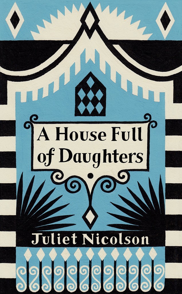
A House Full of Daughters by Juliet Nicolson; design by Cressida Bell (Chatto & Windus / March 2016)

How To Slowly Kill Yourself design Greg Heinimann
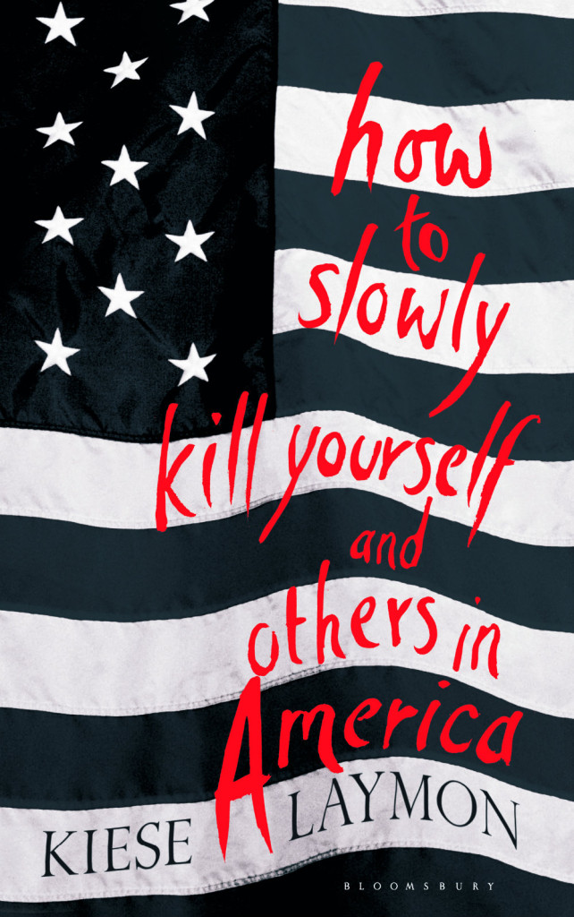
How to Slowly Kill Yourself and Others in America by Kiese Laymon; design by Greg Heinimann (Bloomsbury / March 2016)

Insignifica design Alban Fischer
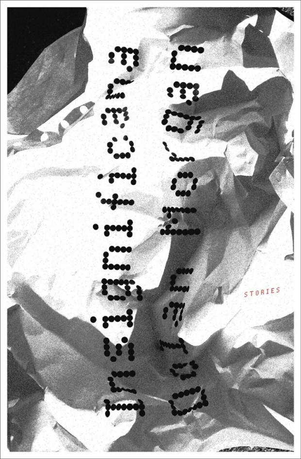
Insignificana by Dolan Morgan; design by Alban Fischer (CCM / March 2016)

Knockout design by Matt Dorfman
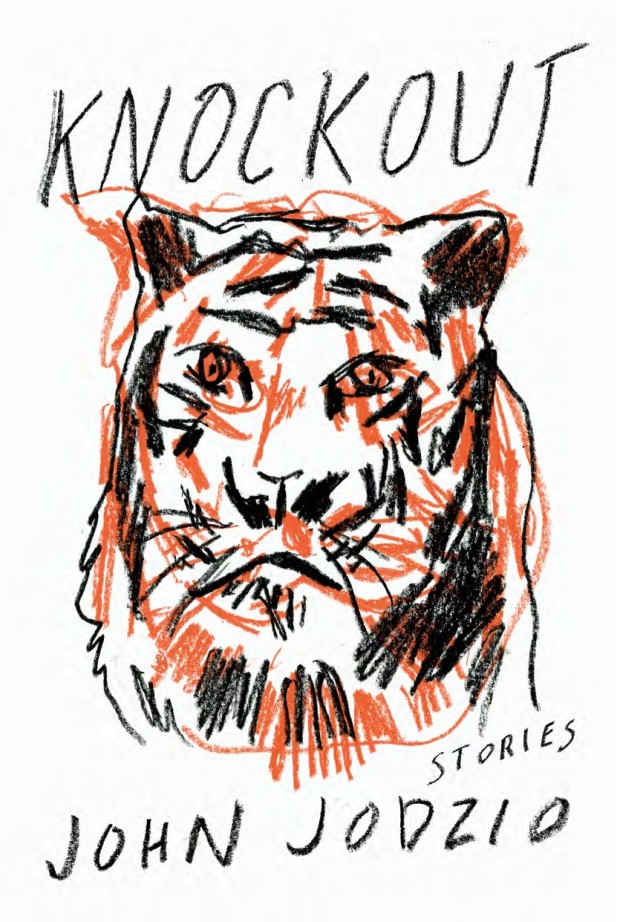
Knockout by John Jodzio; design by Matt Dorfman (Soft Skull / March 2016)

Latecomer design Doublenaut
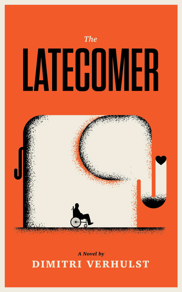
The Latecomer by Dimitri Verhulst; design Ross Proulx / Doublenaut (Portobello Books / March 2016)

Lonely City
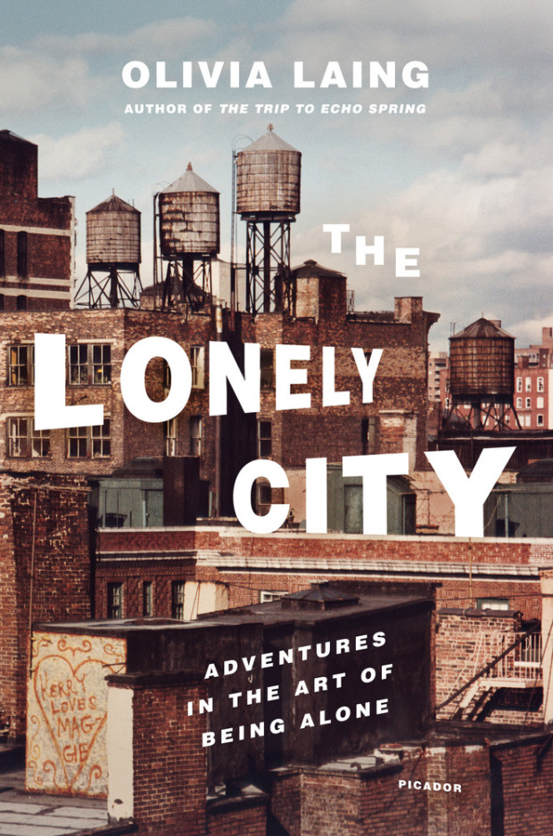
The Lonely City by Olivia Laing; design Henry Sene Yee; photograph by Jerome Liebling (Picador USA / March 2016)

Love Like Salt design Nico Taylor image Sarah Gillespie
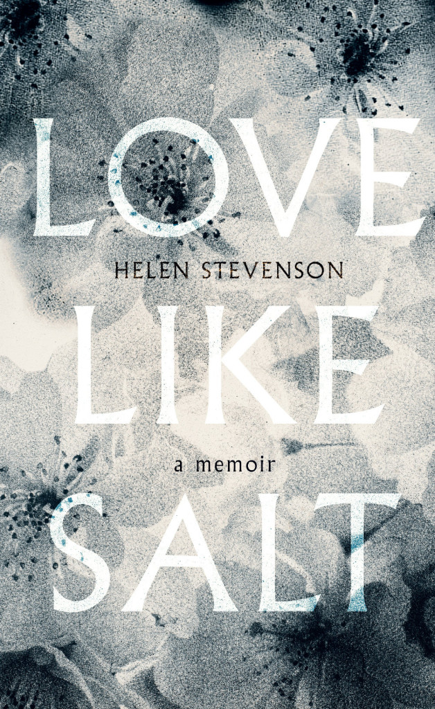
Love Like Salt by Helen Stevenson; design by Nico Talyor; image by Sarah Gillespie (Virago / March 2016)

lover design Neil Lang
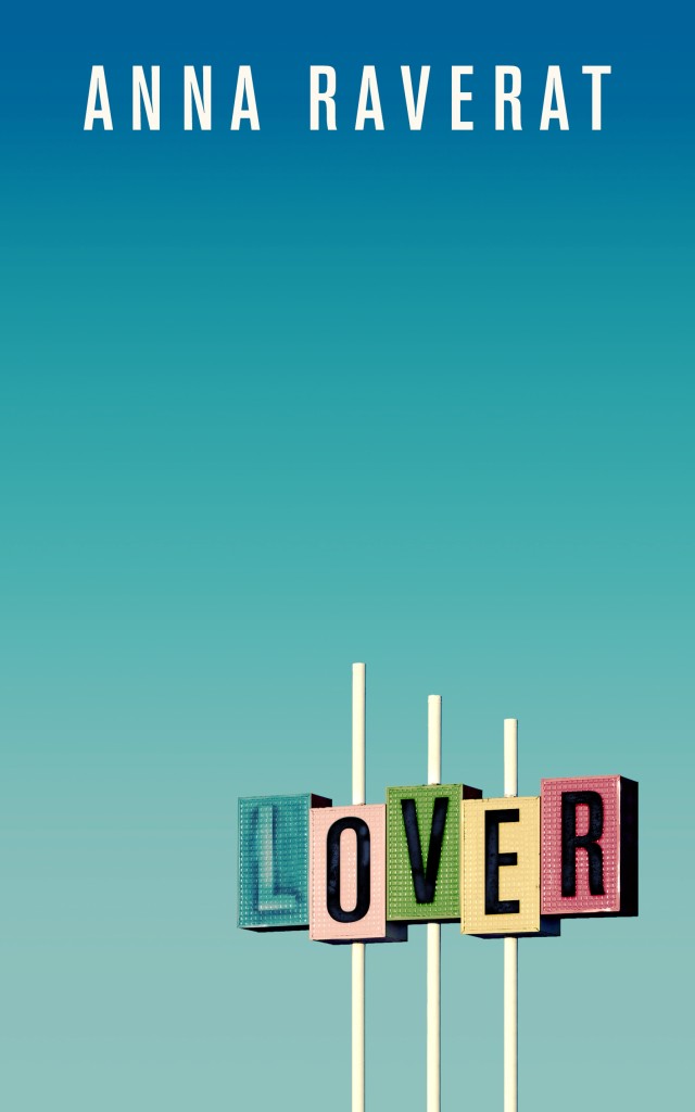
Lover by Anna Raverat; design by Neil Lang (Picador / March 2016)

Lust and Wonder cover design Olga Grlic
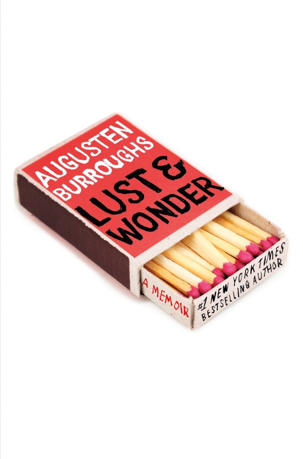
Lust & Wonder by Augusten Burroughs; design by Olga Grlic (St. Martin’s Press / March 2016)

Paper Tigers design Alban Fischer
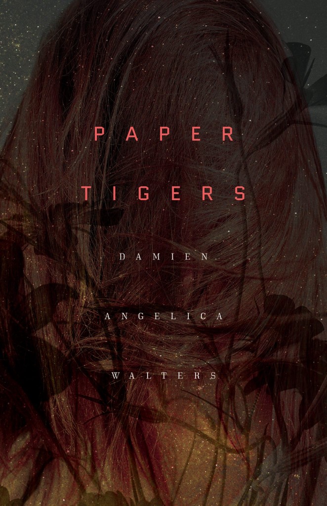
Paper Tigers by Damien Angelica Walters; design by Alban Fischer (Dark House Press / February 2016)

Mademoiselle S design Gabriele Wilson
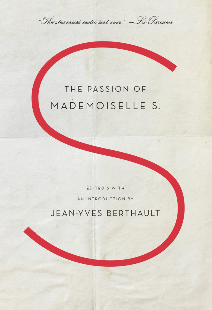
The Passion of Mademoiselle S. edited by Jean-Yves Berthault; design Gabriele Wilson (Spiegel & Grau / February 2016)

Seeing Red design by Anna Zylicz
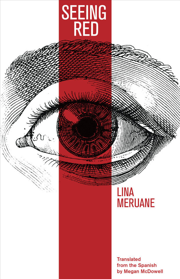
Seeing Red by Lina Meruane; design by Anna Zylicz (Deep Vellum / March 2016)

Socialist Optimism design Emma J Hardy
Socialist Optimism by Paul Auerbach; design by Emma J. Hardy (Palgrave / March 2016)

Sudden Death design Rachel Willey
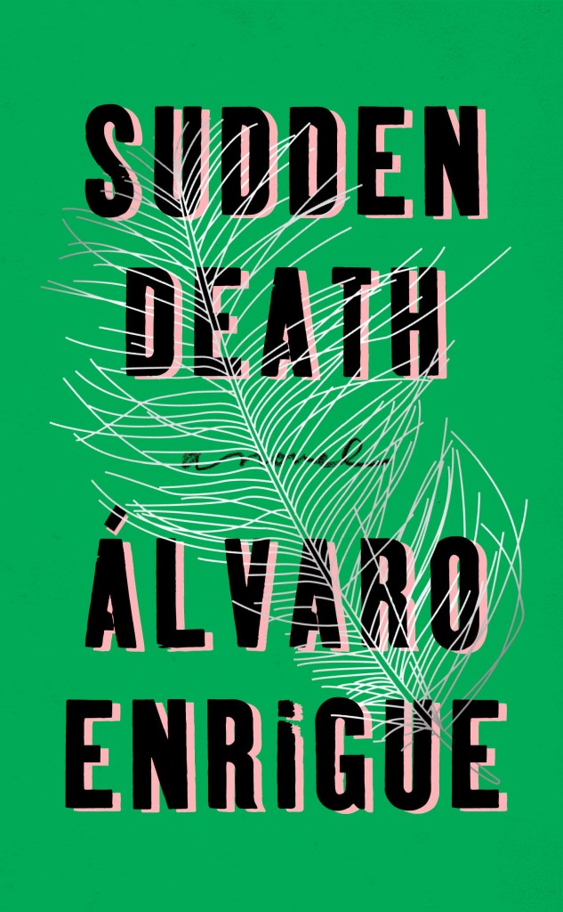
Sudden Death by Álvaro Enrigue; design by Rachel Willey (Riverhead / March 2016)

Trees design David Mann
The Trees by Ali Shaw; design by David Mann (Bloomsbury / March 2016)

Two Family House design Sara Wood
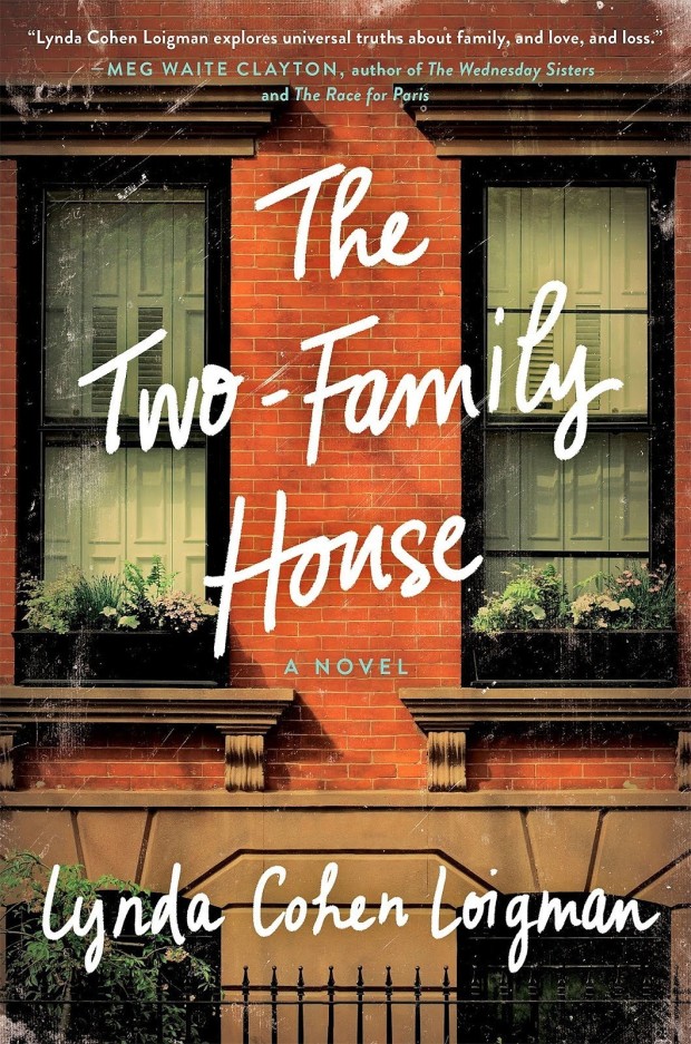
The Two-Family House by Lynda Cohen Loigman; design by Sara Wood (St. Martin’s Press / March 2016)

Weve Already Gone this Far design Lucy Kim
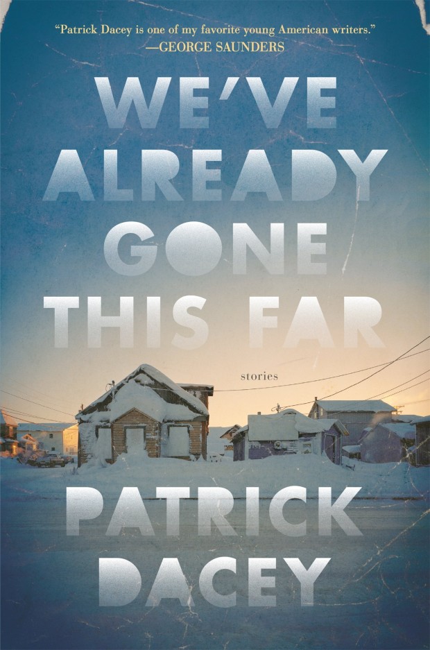
We’ve Already Gone This Far by Patrick Dacey; design by Lucy Kim (Henry Holt / March 2016)

What is Yours design Helen Yentus
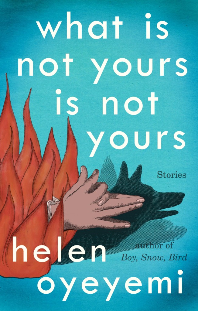
What Is Not Your Is Not Yours by Helen Oyeyemi; design by Helen Yentus (Riverhead / March 2016)

When Everything Feels Like the Movies design Ceara Elliot lettering Martina Flor
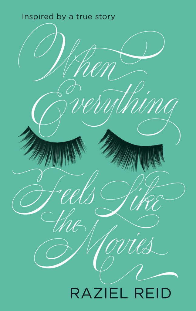
When Everything Feels Like the Movies by Raziel Reid; design Ceara Elliot; lettering and illustration Martina Flor (Atom / February 2016)

XX design Sara Wood
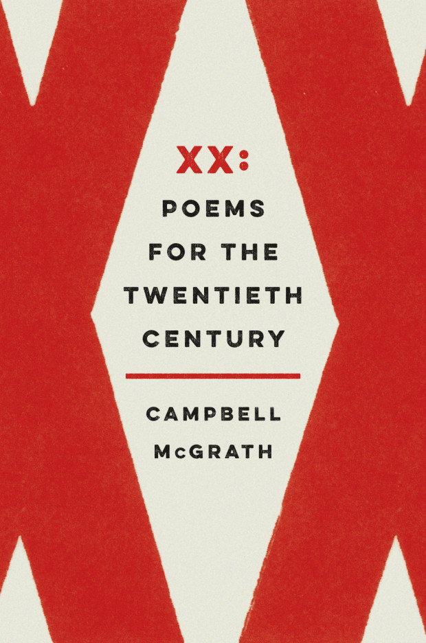
XX: Poems for the Twentieth Century by Campbell McGrath; design Sara Wood (Ecco / March 2016)

2 Comments

Design Matters with Tobias Frere-Jones

39139-mallory-bikes-1256

On the subject of typography, I missed type designer Tobias Frere-Jones on Design Matters with Debbie Millman at the end of last year:

Comments closed

Edward Johnston: Modest Typographic Purist

Edward Johnston

At The Guardian, Oliver Wainwright considers the work of Edward Johnson, and visits a new exhibition marking the centenary of his famous typeface for London Underground:

Although sans-serif typefaces (letters without the little flicks at the end of their strokes) date back to the 18th century, Johnston’s Underground typeface can be credited with popularising the style. Indeed, it was so influential that it became the typeface from which every 20th-century sans-serif typeface would be measured. As Gill later wrote in admiration, Johnston “redeemed the whole business of sans-serif from its 19th-century corruption”.

His former student was perhaps driven by the guilt of seeing the success of his own typeface, Gill Sans, which he admitted had been heavily based on Johnston’s work. Promoted and licensed by Monotype, and preloaded into computers, it has become much more widespread than Johnston, which is owned by Transport for London.

“I hope you realise that I take every opportunity of proclaiming the fact that what the Monotype people call Gill Sans owes all its goodness to your Underground letter,” Gill wrote in a letter to Johnston later in life. “It is not altogether my fault that the exaggerated publicity value of my name makes the advertising world keen to call it by the name of Gill.”

Little did it bother Johnston, accidental creator of one of the world’s longest-lasting corporate identities, who was never one for the limelight. When asked to submit a biography for Who’s Who, he was characteristically to the point, listing only three achievements: “Studied pen shapes of letters in early MSS, British Museum, 1898-99. Teacher of the first classes in formal penmanship and lettering, LCC Central School, 1899-1912. Designed block letters based on classical Roman capital proportions (for London Electric Railways), 1916.” But what influential letters they would turn out to be.

The exhibition Underground: 100 Years of Edward Johnston’s Lettering for London opens at Ditchling Museum of Art and Craft in Sussex March 12 and runs until September 11.

johnston roundels


Comments closed

52 Women Book Cover Designers

If you follow the Casual Optimist on Twitter, you will know that a couple of weeks ago design studio Aishima asked people to tweet about inspiring women graphic designers using the hashtag #celebratewomen. As today is International Women’s Day, I thought I would follow up my #celebratewomen tweets with a visual list of 52 inspiring women book cover designers (one for every week of the year!) — from influential veterans whose work I’ve admired for years to junior designers that have just appeared on my radar.

The names of all 52 designers can be found at the end of the post. With a few more hours in a day the list could easily have been many times longer, so apologies to anyone I have overlooked. Please let me know who you would’ve included in the comments or on Twitter.

Don't Let's Go To the Dogs Tonight by Alexandra Fuller; design by Justine Anweiler (Picador / January 2015)

Justine Anweiler


Jane Eyre Clothbound design Coralie Bickford Smith

Coralie Bickford-Smith


Aftermath design Kelly Blair

Kelly Blair


The Wall design Gabrielle Bordwin photograph John Gay

Gabrielle Bordwin


forever design Lizzy Bromley

Lizzy Bromley


On-the-Noodle-Road

Lynn Buckley


Curious design Nicole Caputo

Nicole Caputo


friendship_gould

Jennifer Carrow


m train design carol devine carson

Carol Devine Carson


Girl-Who-Was-Saturday-Night

Catherine Casalino


Cat and Fiddle design Allison Colpoys

Allison Colpoys


Stoner (hardback)

Julia Connolly


Holloway

Eleanor Crow


100-sideways-miles-9781442444959_hr

Lucy Ruth Cummins


First Novel design Suzanne Dean photograph Stephen Banks

Suzanne Dean


Milk

Barbara deWilde


tender-is-the-night

Sinem Erkas


Madness So Discreet design Erin Fitzsimmons

Erin Fitzsimmons


Dust to Dust design Alison Forner

Alison Forner


Seating Arrangements design Elena Giavaldi

Elena Giavaldi


barefoot queen design Kimberly Glyder

Kimberly Glyder


Lopsided design by Carin Goldberg

Carin Goldberg


luminaries

Jenny Grigg


Voices in the Night by Steven Millhauser; design by Janet Hansen (Knopf / April 2015)

Janet Hansen


What the Family Needed

Jennifer Heuer


follow me design Karen Horton

Karen Horton


book-of-heaven

Linda Huang


specter-of-capital

Anne Jordan


This Will Be Difficult to Explain design Chin Yee Lai

Chin-Yee Lai


Silvered Heart TBK.indd

Yeti Lambregts


978-0-385-53807-7

Emily Mahon


first husband

Jaya Miceli


Sixty design by Terri Nimmo

Terri Nimmo


Unabrow by Una Lamarche; design by Zoe Norvell (Plume / March 2015)

Zoe Norvell


Welcome to the Circus design Natalie Olsen

Natalie Olsen


Untitled-1

Lauren Panepinto


A Good Book design Ingrid Paulson

Ingrid Paulson


all-our-names

Isabel Urbina Peña


Redeployment design Rafi Romaya

Rafi Romaya


Canada design by Allison Saltzman

Allison Saltzman


Year I Met You design Heike Schussler

Heike Schüssler


silence

Clare Skeats


A Year of Marvellous Ways design by Amy Smithson

Ami Smithson / Cabin


flamethrowers design Charlotte Strick

Charlotte Strick


Toronto Cooks design Jess Sullivan

Jess Sullivan


Longitude design Jo Walker

Jo Walker


Americanah

Abby Weintraub


Living on Paper design by Amanda Weiss

Amanda Weiss


Barbara the Slut by Lauren Holmes; design by Rachel Willey (Riverhead / August 2015)

Rachel Willey


middle-c_

Gabriele Wilson


Design Megan Wilson, photograph Saul Leiter

Megan Wilson


All the Birds design by Joan Wong

Joan Wong


Summerlong design Sara Wood

Sara Wood


MythOfSis

Helen Yentus


  1. Justine Anweiler
  2. Coralie Bickford-Smith
  3. Kelly Blair
  4. Gabrielle Bordwin
  5. Lizzy Bromley
  6. Lynn Buckley
  7. Nicole Caputo
  8. Jennifer Carrow
  9. Carol Devine Carson
  10. Catherine Casalino
  11. Allison Colpoys
  12. Eleanor Crow
  13. Lucy Ruth Cummins
  14. Suzanne Dean
  15. Barbara deWilde
  16. Sinem Erkas
  17. Erin Fitzsimmons
  18. Alison Forner
  19. Elena Giavaldi
  20. Kimberly Glyder
  21. Carin Goldberg
  22. Jenny Grigg
  23. Janet Hansen
  24. Jennifer Heuer
  25. Karen Horton
  26. Linda Huang
  27. Anne Jordan
  28. Chin-Yee Lai
  29. Yeti Lambregts
  30. Emily Mahon
  31. Jaya Miceli
  32. Terri Nimmo
  33. Zoe Norvell
  34. Natalie Olsen
  35. Lauren Panepinto
  36. Ingrid Paulson
  37. Isabel Urbina Peña
  38. Rafi Romaya
  39. Allison Saltzman
  40. Heike Schüssler
  41. Clare Skeats
  42. Ami Smithson
  43. Charlotte Strick
  44. Jess Sullivan
  45. Jo Walker
  46. Abby Weintraub
  47. Rachel Willey
  48. Gabriele Wilson
  49. Megan Wilson
  50. Joan Wong
  51. Sara Wood
  52. Helen Yentus
22 Comments

Cold Comfort Books

160307_a19821-600

Roz Chast for The New Yorker.

1 Comment