Skip to content

The Casual Optimist Posts

It Can Happen Here

With shadows of authoritarianism rising around the world, Cass R. Sunstein reviews three books on life in Nazi Germany for the New York Review of Books.

The books, They Thought They Were Free by Milton Mayer, Defying Hitler by Sebastian Haffner, and Broken Lives by Konrad Jarausch, do not focus on the well-known historic figures, but explore how ordinary people navigated such a terrible time. The contemporary parallels are chilling:

With evident fatigue, the baker reported, “One had no time to think. There was so much going on.” His account was similar to that of one of Mayer’s colleagues, a German philologist in the country at the time, who emphasized the devastatingly incremental nature of the descent into tyranny and said that “we had no time to think about these dreadful things that were growing, little by little, all around us.” The philologist pointed to a regime bent on diverting its people through endless dramas (often involving real or imagined enemies), and “the gradual habituation of the people, little by little, to being governed by surprise.” In his account, “each step was so small, so inconsequential, so well explained or, on occasion, ‘regretted,’” that people could no more see it “developing from day to day than a farmer in his field sees the corn growing. One day it is over his head.”

(via Kottke)

Comments closed

Book Covers of Note June 2018

Thanks to a combination of disk storage issues, the AUPresses Book, Jacket, and Journal Show, breaking my wrist, general anxiety, and utter despair at the latest round of horror, corruption and lies to the south, this month’s covers post is…well, late. Fuck it. Donate to a good cause. 1  


Aroused by Randi Hutter Epstein; design Zoe Norvell (W.W. Norton / June 2018)

One for the neon signs list.


Beyond Vision by Allan Jones; design David Drummond (McGill-Queen’s University Press / June 2018)


Calypso by David Sedaris; design by Peter Mendelsund (Little, Brown & Co. / May 2018)


Crudo by Olivia Laing; design Justine Anweiler; photograph Wolfgang Tillmans (Picador / June 2108)

There have been a number of covers making use of work by famous photographers in recent months. I think the risk of this approach is that the image overwhelms the text. If the photograph is so important, perhaps it is better to just to get out of the way and let it speak for itself? (If, ahem, the ‘interested parties’ will let you, of course!)  


He Is Mine and I Have No Other by Rebecca O’Connor; design Rafi Romaya; lettering by Oriol Miró Genovart (Canongate / June 2018)

Watch a video of Oriol Miró Genovart gilding one of the letters:


Here Kitty Kitty by Jardine Libaire; design Catherine Casalino (Hogarth / June 2018)


The Hospital by Ahmed Bouanani; design by Oliver Munday (New Directions / June 2018)


Long Players by Peter Coviello; design Catherine Casalino (Penguin / June 2018)

A nice addition to this list.


My German Brother by Chico Buarque; design by Michael Morris (Farrar, Straus & Giroux / June 2018)


The Outsider by Stephen King; design by Will Staehle (Scribner / May 2018)

This has such a great B-movie feel. 


A Stitch in Time by Daphne Kalmar; cover art by Karl James Mountford (St Martin’s Press / June 2018)


Ten Arguments For Deleting Your Social Media Accounts Right Now by Jaron Lanier; design Dan Mogford (The Bodley Head / June 2018)

The cover for the US edition, published by Henry Holt, was designed by Nicolette Seeback. For me, it’s made by the cat wrapping around the spine onto the back cover. Listing the ten arguments on the back is also a really nice touch.


We Begin Our Ascent by Joe Mungo Reed; design by Zak Tebbal (Simon & Schuster / June 2018)

(This really reminds me of something else, but I cannot think of what. It’s bugging me, so let me know if you have any suggestions)


Whistle in the Dark by Emma Healy; design Helen Crawford-White (Viking / May 2018)

The Canadian edition, published by Knopf Canada and designed by Leah Springate, takes a photographic approach. I think it’s a good example of how the Canadian market can be quite different from the UK (and the US)…

4 Comments

Signs with Soul

A short film about London sign makers Goodwin & Goodwin:

Comments closed

Book Covers of Note May 2018


America is Not the Heart by Elaine Castillo; design by Gray318 (Atlantic Books / May 2018)

A great new entry in the books on book covers genre! 


Awayland by Ramona Ausubel; design by Alex Merto (Riverhead / March 2018)


Be More Pirate by Sam Conniff Allende; design by Chris Bentham (Penguin Books / May 2018)

Related: I have a board of skull covers on Pinterest if that is your thing.


The Comedown by Rebekah Frumkin; design by Rachel Willey (Henry Holt / April 2018)


Exactly by Simon Winchester; design by Julian Humphries (William Collins / May 2018)

For some reason this reminded me of a Peter Mendelsund’s 2009(!) cover design for Vintage’s Foucault list. In reality, they don’t actually look that a like at all:


The Gloaming by Kirsty Logan; design Julia Connolly (Harvill Secker / April 2018)


The Honey Farm by Harriet Alida Lye; design by Zoe Norvell (Liveright / May 2018)

This fits both the ‘centred big white type‘ trend and the ‘type and flora‘ trend, but I still like it. 


Invasion by Peadar O’Guilin; cover art by Jeffrey Alan Love (David Fickling Books / March 2018)

Jeffrey also did a cover for The Call, the first book in this series,


It Needs To Look Like We Tried by Todd Robert Petersen; design by Nicole Caputo (Counterpoint / May 2019)


The Life and Rhymes of Benjamin Zephaniah; design by Jack Smyth (Simon & Schuster / May 2018) 


A Lucky Man by Jamel Brinkley; design by Kyle G. Hunter (Graywolf / May 2018)

I have to confess that I’m including this partly because I recently had a conversation with a publisher about a street scene on a book cover. The publisher said the author insisted on using a specific photo, which always makes things difficult, but all the same, I felt the photo could be used more effectively. The cover for A Lucky Man isn’t fancy, but it does the job really well — while there is a sense of place and atmosphere (it may even be recognizable if you know the street?), there is also ambiguity that leaves it open to interpretation. The blue of the authors name echoes the blue of a sign in the photo, but it doesn’t over do it — it’s nicely understated. 


The Mars Room by Rachel Kushner; design by Peter Mendelsund; photograph by Nan Goldin (Scribner / May 2018)

Using a Nan Goldin photo feels like a bold choice — especially for one of the most anticipated books of the year. I don’t know… perhaps Goldin’s photos aren’t as controversial as they once were? It seems appropriate to me, but then I Goldin’s photography. I guess the cover of A Little Life by Hanya Yanagihana used a photo by Peter Hujar…?

In any case, it’s quite different look from The Flamethrowers cover (designed by Charlotte Strick), and yet the compositions seem to echo each other (the horizontal bands of title — rectangular photo — author) when you place them side by side:

Monday’s Not Coming by Tiffany D Jackson; design by Erin Fitzsimmons (Katherine Tegen Books / May 2018)


The National Debt by Martin Slater; design by Steve Leard (Hurst / May 2018)


On Gravity by A. Zee; design by Jason Alejandro (Princeton University Press / May 2018)


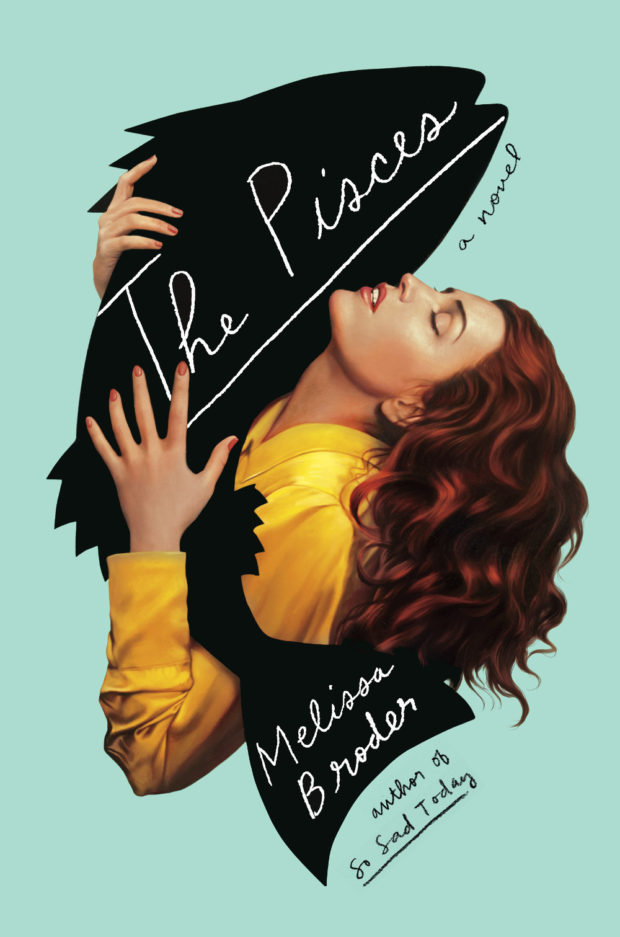
The Pisces by Melissa Broder; design by Rachel Willey (Bloomsbury / May 2018)


See What Can be Done by Lorrie Moore; design by Jonny Pelham (Faber & Faber / May 2019)

You can read about the process behind this cover on the Faber blog.


Sharp by Michelle Dean; design by Bekki Guyatt  (Little, Brown & Co. / April 2018)

The cover of the US edition published by Grove was designed by Gretchen Mergenthaler and Daniel Rembert, and features an illustration by Kathryn Rathke:


Tomb of the Unknown Racist by Blanche McCrary Boyd; design by Nicole Caputo (Counterpoint / May 2019)

Nicole’s recent covers for Counterpoint all work quite well together. It’s interesting that snaking curves — a worm, a road, an actual snake! — appears in the background of these three:


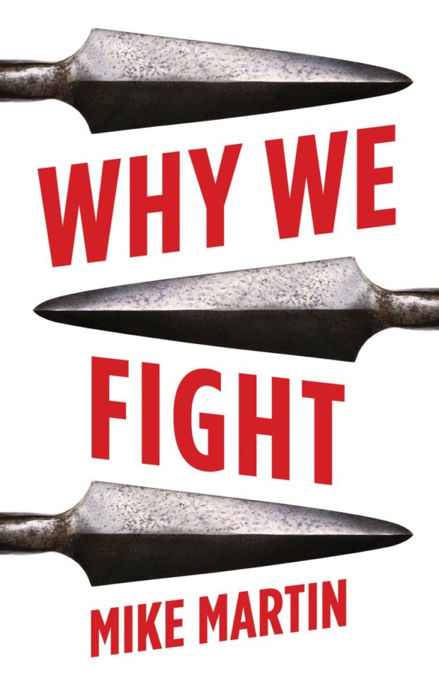
Why We Fight by Mike Martin; design by Steve Leard (Hurst / May 2018)

Clearly I have a thing for black, white and red covers this month! 

Comments closed

The Nine Rs

Grant Snider for the New York Times. (Oh, and Grant has a book out too)

Comments closed

The Collection

The Collection is a short documentary about two friends and their discovery of a unique collection of movie memorabilia, comprised of over 40,000 printer blocks and 20,000 printer plates used to create the original newspaper advertisements for movies released in the US from the silent era through to the 1980s:

(via Coudal)

Comments closed

Living with a Genius

Tom Gauld for The Guardian.

Comments closed

Geoff Dyer on Photographs and Essays

Geoff Dyer, whose new book The Street Philosophy of Gary Winogrand features personal essays inspired by Winogrand photographs, considers other books that combine images and essays in The New York Times:

John Szarkowski was for many years the head of photography at the Museum of Modern Art in New York. In 2000, in the twilight of a provocative, highly influential career, he published “Atget,” a selection of 100 images by the French photographer Eugène Atget, each reproduced on the recto page with an accompanying caption-essay on the facing verso page. With Szarkowski as the best kind of guide — one whose itinerary allows interludes of undisturbed contemplation — we wind our way through the haunts of old Paris, emerging from time-shuttered streets into the open skies of the surrounding countryside. Szarkowski had always been a distinctive stylist, but this format enabled him to give free rein to his talents as a writer, which were usually securely tethered by curatorial obligation. He also drew confidence, I think, from an earlier assay at the same form, “Looking at Photographs” (1973), in which he used a single picture by each of the most important photographers in the museum’s holdings to compile a radically synecdochic survey of the medium’s history. The obligation to cover so much ground, to balance what he had to say about so many major figures on such slender plinths, rather limited Szarkowski’s range of literary and thematic movement. With Atget — whose photographs, appropriately enough, were originally offered as “Documents for Artists” — the combination of abundance of subject matter and limited space encouraged a kind of tight flourishing or contained extravagance. Szarkowski’s knowledge of Atget’s work was so extensive that he had scarcely even to think about what he knew. And so the photographs serve as starting-off points for reflections on all sorts of things, including how photography has changed our view of the world: “I do not think that empty chairs meant the same thing before photography as they mean to us now.”

You can find reviews of Dyer’s Winogrand book in the New York Times and The Guardian.

Comments closed

Women and Critics: Roxane Gay and Michelle Dean

Michelle Dean talks about her new book, Sharp:The Women Who Made an Art of Having an Opinion, and the nature of criticism with Roxane Gay for The Cut

I tend to judge a piece of criticism by how smart I find the argument… I don’t mean, how much I agree with it, exactly, but more: how much does this open up the subject at hand? Does it show me things about it I didn’t already know? I like debate and argument, so I’m usually all right with disagreement, and I’m even all right if the critic doesn’t come to a clear thumbs up or thumbs down. But I need the disagreement to have some kind of line I can follow on the map. I like following an interesting mind along it.

Bad criticism recites rote arguments. The shame of rote arguments isn’t just that they’re clichés, though they are, but that they tend to hide from us why a critic is actually thinking what they’re thinking. In which case there’s no point in reading the review at all. I don’t care about the bare fact that anyone liked or didn’t like a book or movie; they can only interest me in that bare fact by writing an intelligent review.

Comments closed

Find Your Place in the Market

Tom Gauld for The Guardian.

Comments closed

Design Canada

Design Canada, is a new documentary celebrating the ‘golden era’ of Canadian graphic design: 

The film is screening in Canada in the summer 2018, and releasing digitally in the fall. 

(via Coudal)

Comments closed

The Making of 2001: A Space Odyssey

Dan Chiasson takes a look at the making (and meaning) of Stanley Kubrick’s ‘2001: A Space Odyssey’ for The New Yorker:

Kubrick brought to his vision of the future the studiousness you would expect from a history film. “2001” is, in part, a fastidious period piece about a period that had yet to happen. Kubrick had seen exhibits at the 1964 World’s Fair, and pored over a magazine article titled “Home of the Future.” The lead production designer on the film, Tony Masters, noticed that the world of “2001” eventually became a distinct time and place, with the kind of coherent aesthetic that would merit a sweeping historical label, like “Georgian” or “Victorian.” “We designed a way to live,” he recalled, “down to the last knife and fork.” (The Arne Jacobsen flatware, designed in 1957, was made famous by its use in the film, and is still in production.) By rendering a not-too-distant future, Kubrick set himself up for a test: thirty-three years later, his audiences would still be around to grade his predictions. Part of his genius was that he understood how to rig the results. Many elements from his set designs were contributions from major brands—Whirlpool, Macy’s, DuPont, Parker Pens, Nikon—which quickly cashed in on their big-screen exposure. If 2001 the year looked like “2001” the movie, it was partly because the film’s imaginary design trends were made real.

Much of the film’s luxe vision of space travel was overambitious. In 1998, ahead of the launch of the International Space Station, the Times reported that the habitation module was “far cruder than the most pessimistic prognosticator could have imagined in 1968.” But the film’s look was a big hit on Earth. Olivier Mourgue’s red upholstered Djinn chairs, used on the “2001” set, became a design icon, and the high-end lofts and hotel lobbies of the year 2001 bent distinctly toward the aesthetic of Kubrick’s imagined space station.

I have to confess that I’m with Renata Adler — I’ve always found 2001 to be simultaneously “hypnotic and immensely boring.” I think I just like reading about Kubrick’s films far more than I actually like watching them. 

Chiasson’s essay reminded me Keith Phipps great series on science fiction films ‘The Laser Age’ for late and lamented film website The Dissolve, which started with 2001. Someone really should collect those essays together into a book if they haven’t already, 

The cover of Michael Benson’s book on the making of 2001, Space Odyssey,  was designed by Rodrigo Corral and was featured in this month’s book covers post.  


Comments closed