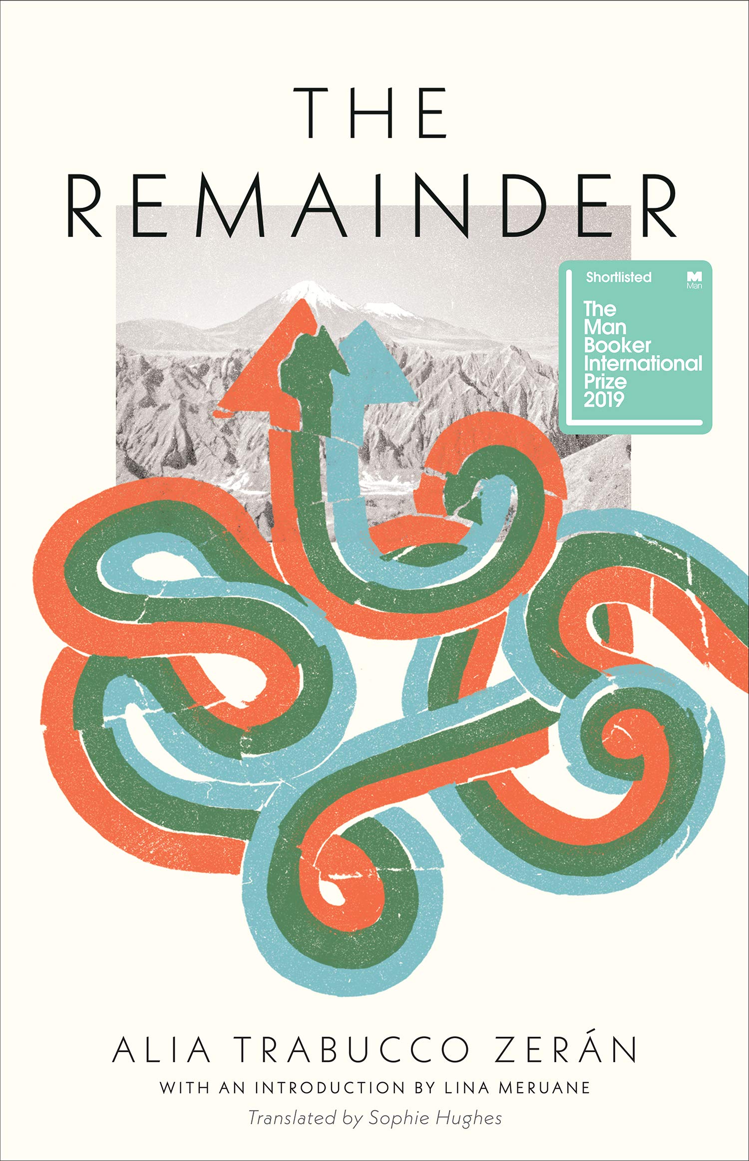
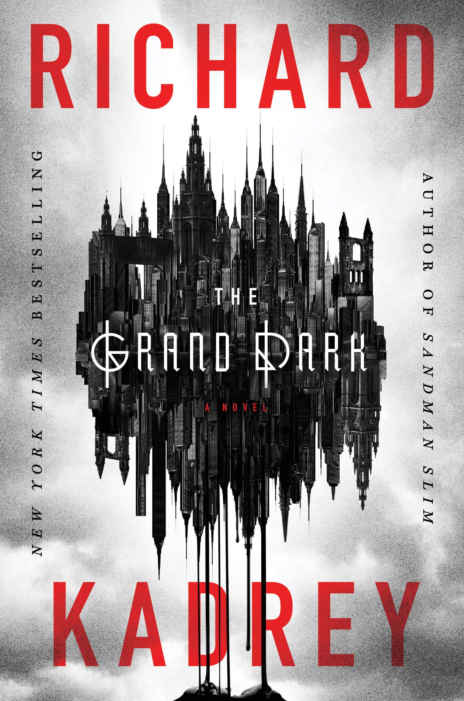
Here are your August book covers of note. Another good month, I think?
The Bell Jar by Sylvia Plath; design by Gray318 (Faber & Faber / July2019)
This is apparently available now (according to Faber’s Instagram at least!), but I haven’t been able to find it online. If anyone cares to share the ISBN, I will try to add a link.
The new design is inspired by the 1966 cover designed by Shirley Tucker.
This is an interesting change in direction from the cover of The Infatuations by Javier Marías designed by Isabel Urbina Peña and published by Knopf in 2013.
(The UK covers for Javier Marías’ novels published by Hamish Hamilton are photographic. If anyone can supply me with the design/photo credits, I’d be happy to add them in here for reference!).
Thank you to the good folks on Twitter who helped me identify the designer and then the typeface. It turns out the type is “Lydia” from Colophon Foundry — a revival of the Bold Condensed styles of (you guessed it!) Lydian.
Tree also designed the cover of the UK edition published by And Other Stories last year. She wrote about the process of designing both covers for Spine not so long ago (they really are doing a better a job of this than me, aren’t they?).
Michel has also dusted off his comics publishing endeavour Black Eye Books if you’d like to support him. There is a new book by Jay Stephens planned for next month.
Swishy retro fonts are definitely a ‘thing’ now. In this instance I believe the font is Cabernet JF — an unofficial revival of Benguiat Caslon — which has been mentioned here before. The sans is Futura of course. I rather rashly went on record not so long ago saying Futura is a little overused on university press covers (much to the chagrin of Robert Bringhurst!), but I think it works here.
(There is probably a post to be had of covers that feature ‘guns’ made of other things. Although I’m struggling to think of any other examples off the top of my head, so maybe I’m thinking of artworks and/or magazine covers? Or just imagining it?)
I would have have a hard time telling you which country these covers came from if I didn’t already know. Using the US spelling “Travelers” on the UK cover confuses the issue, but I don’t think either cover looks particularly American, which is kind of interesting. Michael Morris recently discussed his version with Spine.
The cover of the UK edition of Turbulence, published at the end of last year by Jonathan Cape, reminded me of Anne Twomey’s 2015 cover for Munich Airport by Greg Baxter…
Interestingly, the barcode on the front of the UK edition actually works. You can read an interview from earlier this year with designer Rosie Palmer about the UK cover over at Spine.
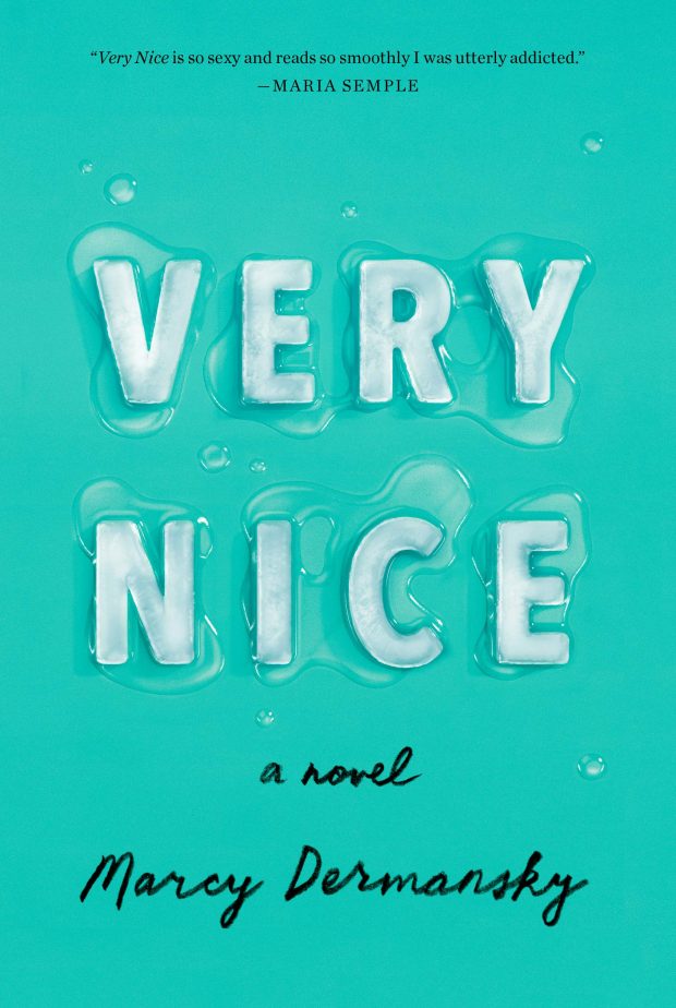
Very Nice by Marcy Dermansky; design by Janet Hansen; ice rendered by Justin Metz (Knopf / July 2019)
Apparently it is June already. I’m pretty sure it’s a terrible mistake.
Here are your book covers of note.
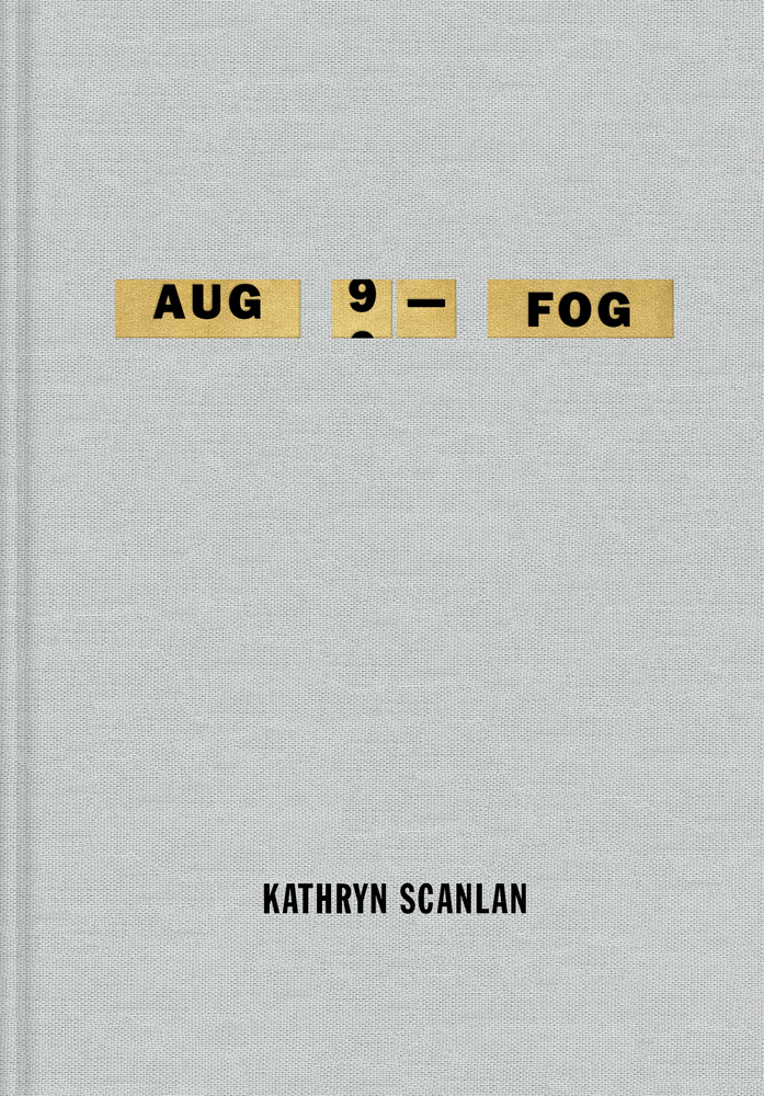
Aug 9 — Fog by Kathryn Scanlan; design by Na Kim (Farrar Straus & Giroux MCD / June 2019)
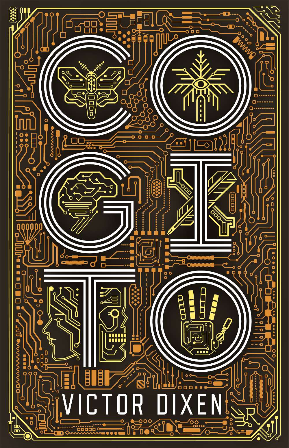
Cogito by Victor Dixen; design by Jim Tierney (Collection R / May 2019)
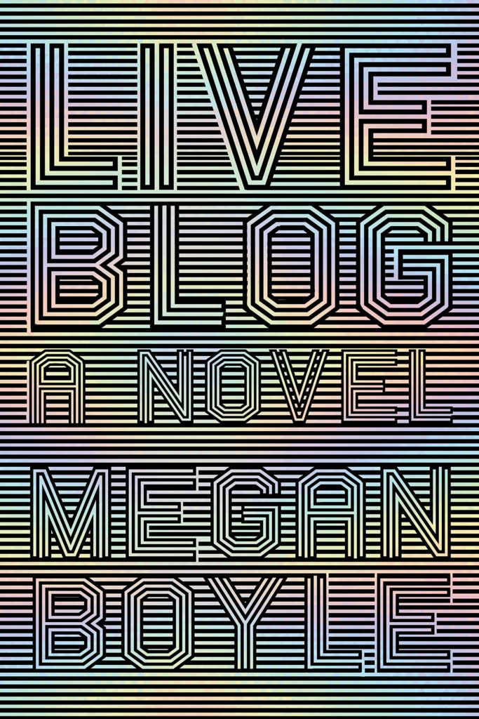
This reminded me of something. I’m not sure exactly what. The best I could up with was Nicole Caputo‘s stripey op-art cover for Liveblog by Megan Boyle, but that’s not it at all…
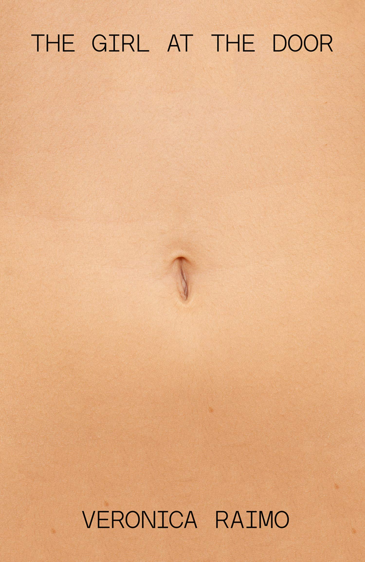
The Girl at the Door by Veronica Raimo; design by Julian Humphries (Fourth Estate / June 2019)
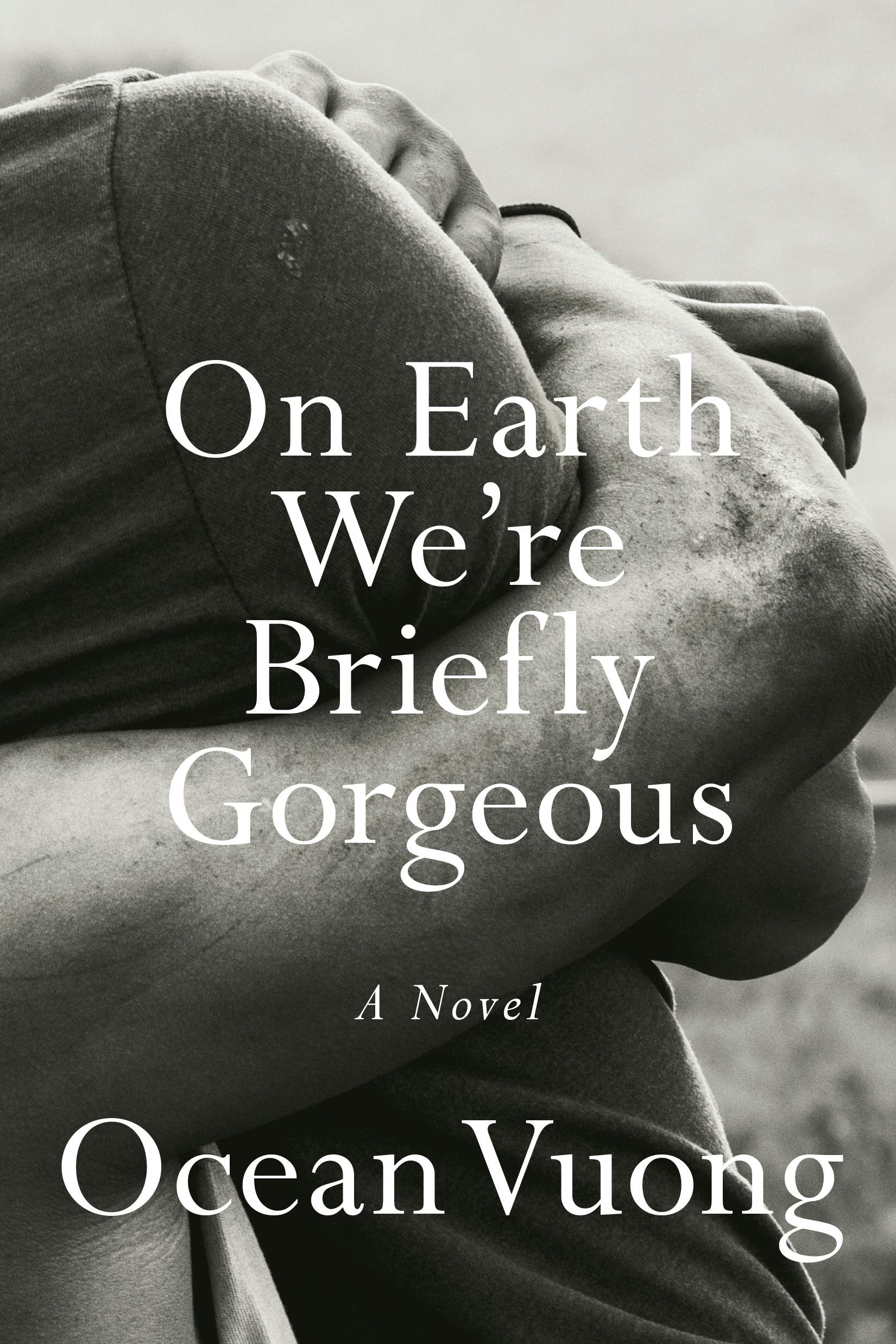
Are we seeing a trend for close cropped photographs of… arms? (Don’t get me wrong, these are both beautiful photographs / covers.)
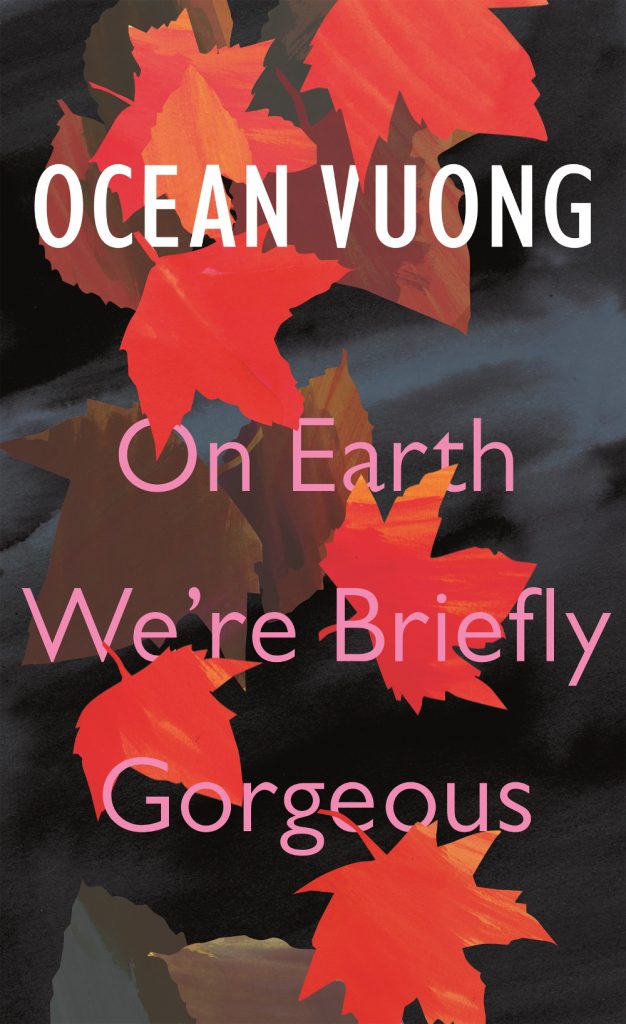
Also of note in a compare-and-contrast sort of way, the cover of the UK edition of On Earth We’re Briefly Gorgeous published by Jonathan Cape was designed by Suzanne Dean:
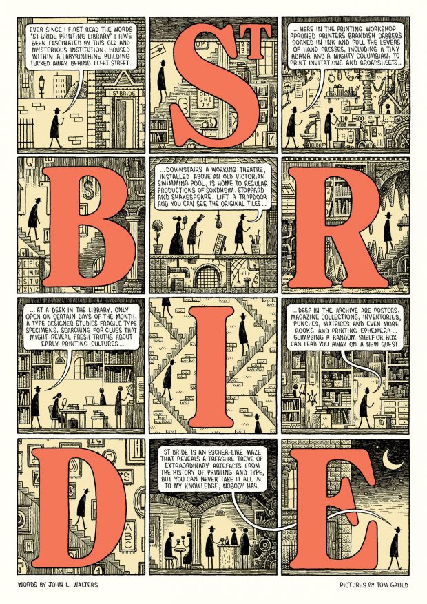
Tom Gauld has collaborated with John L Walters, editor of Eye magazine, to make this lovely poster celebrating the St. Bride Library in London — the largest print and publishing library in the world.
Produced in a limited edition of 80, you can get one from the library store for £15.
(I feel like this is a variation on a gag that has been going around independent bookstores for a while now, but it gets more accurate by the day. I guess we have to laugh or we will cry, right?)
Swing Time by Zadie Smith; design by Gray318 (Hamish Hamilton / November 2016)
It’s Nice That talks to Jon Gray, AKA Gray318, about his design process and working on covers for high-profile authors like Zadie Smith:
Jon’s covers are not simply aesthetically pleasing; they’re also suitably thoughtful. He always asks for the most text possible from his clients, in order to kickstart his creative process. “I struggle designing without knowing the mood of the book, it’s character,” he says. “I’m not good at fishing in the dark for concepts and I think my best work comes about when it’s rooted in the text.”
But sometimes, he has to make do with very little. Which is why working with gifted authors like Zadie Smith and wonderful editors like Simon Prosser (Zadie’s editor) is such a blessing: “They will send me a great brief that outlines the plot and sets the mood. There will be visual references and often a strong sense of the area that the book should sit, but with plenty of room to experiment.”
He adds that working with high-profile clients is easier than one might think. “People often imagine that designing covers for big authors is going to be harder somehow. It’s true that marketing and sales departments have a big say in the final cover, but generally, if you can make an author and their editor happy, the rest will follow.”
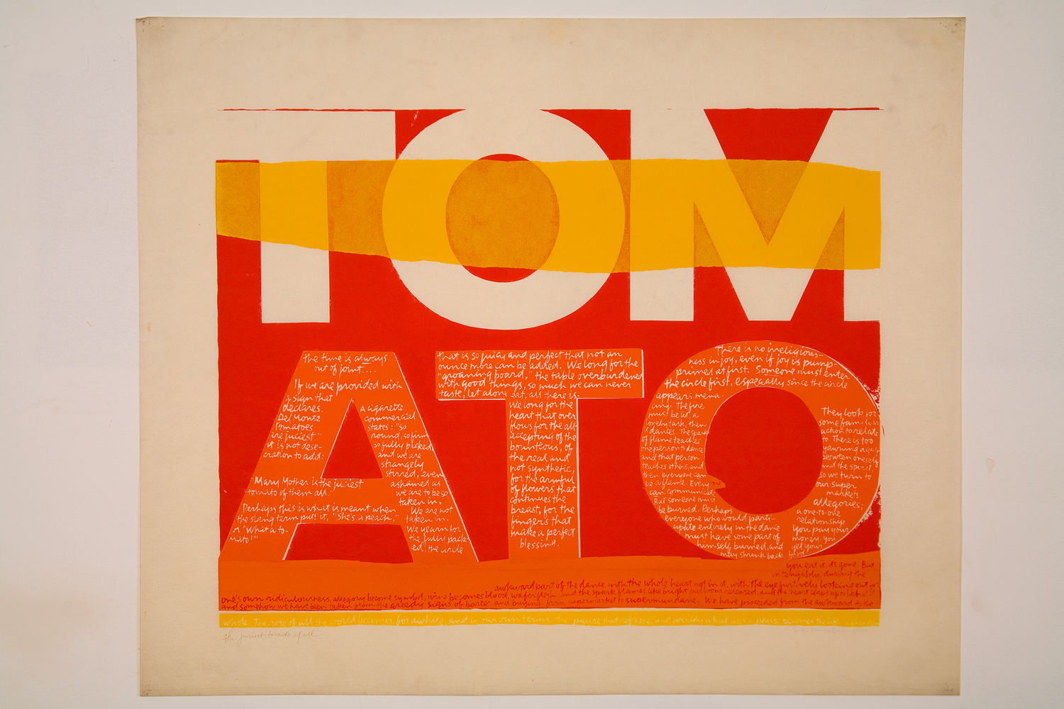
In 1962, Kent saw work by Andy Warhol for the first time, and her aesthetic changed markedly, becoming bolder, flatter, more abstract and brighter, often with saturated, almost fluorescent, colors. Her new style was so successful that it became became known as “nun art,” and was often imitated. Her adherence to the Pop Art aesthetic was well suited to her joyous aims: Kent said she wanted her art to “give people a lift” and help them get “more fun out of life.”
Pop Art’s celebration of the urban everyday also empowered Kent to introduce more quotidian sources into her text works. During the ’60s, she began to incorporate lyrics from pop songs, advertising slogans, and snippets of text seen on signs and packaging into her work, often pairing them with religious text. It was a move that elevated the ordinary to the spiritual, and became a frequent theme in Kent’s art and teaching. She found delight in the commonplace, and believed that the divine could be seen anywhere, even amidst the chaos of the modern city. Kent often took her students on urban expeditions—even day-long trips to gas stations and car lots—armed with cameras and viewfinders.
The largest ever exhibition of Corita Kent’s work in the UK, Corita Kent: Power Up, is currently on display at House of Illustration in King’s Cross until May 12.
The winners of the 2019 Academy of British Cover Design (ABCD) Awards were announced earlier this month and, as in previous years, the winners are an eclectic mix of styles. It is always interesting to see the covers that the designers themselves vote for. Only a couple of the winning designs have been featured here before.
Young Adult
Run, Riot by Nikesh Shukla; design by Michelle Brackenborough (Hodder Children’s Books / June 2018)
Sci-fi/Fantasy
Folk by Zoe Gilbert; design by David Mann (Bloomsbury / July 2018)
Non-fiction
Money by Laura Whateley; design by Jack Smyth (Fourth Estate / October 2018)
Series Design
Miriam Toews; design Jonathan Pelham (Faber & Faber / September 2018)
Classics/Reissue
Rebecca by Daphne Du Maurier; design by Hannah Wood; embroidery by Hand & Lock (Virago / February 2018)
Children’s 0-5
Helping Hen by Claudia Ripol and Yeonju Yang; design and illustration by Claudia Ripol and Yeonju Yang (Owl and Dog Books / November 2018)