Skip to content

The Casual Optimist Posts

Chris Ware’s Cover for Granta 108

Chris Ware’s cover design for Granta 108: Chicago:

Comments closed

Midweek Miscellany, September 2nd, 2009

Watching Gideon — A nice new cover design with some great typography from Nate Salciccioli. Read my Q & A with Nate here.

A Manifesto for Slow Communication — An excerpt from The Tyranny of E-Mail by John Freeman, AKA acting editor of Granta, in the Wall Street Journal:

Slow communication will preserve these threads and our ability to sensibly choose to use faster modes when necessary. It will also preserve our sanity, our families, our relationships and our ability to find happiness in a world where, in spite of the Internet, saying what we mean is as hard as it ever was. It starts with a simple instruction: Don’t send.

And on the topic of slow communication…

On Feeding — an older, but lovely, post from A Working Library on the difference between unread books and an unread RSS reader (via booktwo.org):

those two sights—the stack of books and the unread count in my feed reader—evoke dramatically different responses. To the books, I feel excitement, eagerness… The act of reading is always unfinished…

Yet my feed reader—also always unfinished—evokes within me a dread… I grow weary as the unread count increases, as it fills up with new articles before I can skim the old ones. In it’s timeliness—most blog posts have short half-lives and so must be read now—and the mathematical precision with which the reader measures its contents, I am stripped of my eagerness to read and filled, instead, with despair. Instead of a thing to enjoy, it makes reading a thing to get done with… It’s reading made efficient.

The minimal design of the A Working Library site is really nice too by the way.

Book Cover Design in India 1964-1984 at A Journey Round My Skull.

Prix Fixe — Arnaud Nourry, chief executive of French publishing group Hachette Livre, makes some interesting comments on e-book pricing in the Financial Times, notably that publishers are “very hostile” to Amazon’s pricing strategy:

“On the one hand, you have millions of books for free where there is no longer an author to pay and, on the other hand, there are very recent books, bestsellers at $9.99, which means that all the rest will have to be sold at between zero and $9.99,” Mr Nourry said…

There was a “muscular” debate in the industry in the US, he added. Retailers were paying publishers more than $9.99 for each e-book, so were selling them at a loss: “That cannot last . . . Amazon is not in the business of losing money. So, one day, they are going to come to the publishers and say: ‘by the way, we are cutting the price we pay’. If that happens, after paying the authors, there will be nothing left for the publishers.”

Mike Shatzkin has written an interesting follow-up piece about pricing.

Noury also makes more interesting observations about consolidation in the industry in a separate article in the FT, which seem very prescient in light of Disney’s acquisition of Marvel this week.

And finally…

46 Essential Rock Reads — A list to argue over on the LA Times‘ Jacket Copy blog.

2 Comments

Q & A with Michel Vrana, Black Eye Design

Michel Vrana, AKA Black Eye Design, has been on my radar since we first crossed paths on Twitter in the run up to Book Camp Toronto earlier this year.

I had hoped to run into the Montreal-based designer in person at Book Camp, but unfortunately, in the dehydrating hustle of the day, I didn’t get chance to introduce myself.

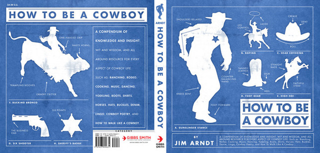
Nevertheless, a few weeks after the event, I came across a series of reissued cowboy books from publisher Gibbs Smith in a Raincoast sales meeting. The witty retro cover designs — with their pop culture references and knowing wink to the distinctive letterpress work of the Hatch Show Print studio — stood out among the more traditional covers in the catalogue.

It turned out that they were designed by Michel.

Small world, I thought.

A little later I found out that Michel also designed covers for Casual Optimist favourite Drawn & Quarterly (also distributed by Raincoast for the record).

And then it seemed Michel’s work was everywhere. Or perhaps it just seemed that way. My love of letterpress, comics, vintage magazines, typography, ephemera and stuff certainly make me notice his work, which often seems to draw on these elements.

Although we still haven’t met in person, we’ve stayed in touch through the electronic wonder of Twitter and email over the past couple of months, and despite some major changes at Black Eye Design during that time, Michel seemed a natural fit for this series of interviews.

You can see more Michel’s work at his design:related portfolio and, of course, follow him on Twitter @michelvrana.

 Briefly, could you outline the history of Black Eye?

In 1993, I started Black Eye Productions as a comic book publishing company. Inspired by Drawn and Quarterly, I sought to do justice to all the hard work that the cartoonists put into the books I published by making sure they were well packaged and designed. Over the years, I did more and more graphic design, and less publishing, in order to pay the bills, and eventually decided to dedicate myself design full time in 1998.

From 1998 onward, Black Eye Design became a boutique design studio specializing in publication design. I spent much of my time running the studio and art directing and not as much time as I wanted doing what I enjoyed most: the hands-on design. Starting in 2006, I rolled up my sleeves and started doing book design again, though I was really splitting my time between running the company and doing hands on work. In 2009, I decided to shutter the studio and concentrate on book design full-time. It’s really what I’ve enjoyed the most over the years, from those first days as a comics publisher onward.


Do have a ‘house’ style? How would you describe it?

I’m sure anyone looking at my work would see a style more than I can. I’m sure the word ‘retro’ applies. Someone once described the work I do as ‘prop design’, where the design emulates something else but that is not always the case. My business card, for example, is set up like a vintage boxing ticket. Two of my most recent fiction covers have the titles incorporated into a matchbox and a postage stamp. So that’s probably a trend in my work.

I try to incorporate, whenever I can, a subtle ‘punchline’ into my covers. For example, the book that has the match box is called The Last Shot; it’s a collection of short stories where many of the characters are stuck at a dead end in their lives, and are looking for that one ‘last shot’ to change things. The cover has a few spent matches, and a matchbox with one last match sitting in it. I like to think a reader is going to look at the title, look at the visual and then it will click and they’ll get that little ‘Aha!’ in their head, and feel like they’re in on the joke.

 The (English-speaking) Canadian book industry is largely focused in Toronto. What are the pros and cons of being a book designer based in Montreal?

It’s a pat answer, but in this day and age, you can be anywhere in the world and succeed as a graphic designer. As long as you get the word out there to the right people, you’ll find contracts. I’ve worked very hard in promoting my studio, and now myself. Not having lived/worked in Toronto, maybe it would be easier to find new projects if I lived there, but it’s hard to say for sure.

Could you describe your design process?

I front-load my process with questions, thinking and pencil sketching, rather than sitting down straightaway at the computer.

When I’m not sure I have enough info from my design brief, I’ll usually ask many questions of my publisher, editor, or art director for the project. I find that that really helps clarify things.

When possible, I also try to get a sample, or the whole manuscript to read. I use Stanza on my iPhone to read manuscripts and annotate them with ideas, as I read. When I don’t have a manuscript, I just start by writing out ideas and brainstorming.

I usually delay sitting down at the computer as long as I can. I sketch out rough thumbnails for myself, and sometimes even show these (very) rough sketches to the art director, editor or publisher I’m working with, to get the discussion going. I find that keeping everything loose and unpolished at the beginning frees me from getting too attached to any one idea, from it becoming too precious, and that keeps creativity flowing. It’s a valuable lesson I learned from designer Jan Wilker at the SVW 2008 workshop.

 What are your favourite projects to work on?

I’m going to be a cliché and say that I love working on all book covers. To me, the fun in visual problem solving remains the same whether it’s a kids’ humour book about Gross Stuff, or a collection of short stories by a budding young talent. That being said, my absolute favourite ones are the ones that require me to push myself out of my comfort zone and try something new. Scary, but fun.

What are the most challenging?

The ones with a short design brief. I’ve come to realize that these seemingly ‘easy’ projects are deceptively so, and the covers often require the most revisions. Now when I get a quick design brief, I try to dig deeper with my art director, editor or publisher to find out more about their goals with the cover.

What are some of the common frustrations working with publishers?

My number one frustration would be that sometimes publishers underestimate their audience. As a culture, we’re a lot more savvy about visual communication than many people assume. We’re all continually exposed to clever ad campaigns, posters, book covers; so let’s not underestimate the intelligence and experience of the audience. For books this seems especially important, since you’re talking about a segment of the population that’s especially literate.

 What do you think makes a good cover design?

Marketer Seth Godin hit the nail on the head for me, when he described the role of a cover as ‘to tee up the reader so the book has maximum impact’. The goal of a book cover is to engage the reader, and get them to pick it up, to interact with it (look at the back cover copy, maybe read a quick passage). That’s the stuff that sells the book. The cover is the invitation, and that invitation needs to be enticing.

Do you see any current trends in cover design?

Illustration and hand-drawn type are definitely a trend these days. And I think that Peter Mendelsund‘s design for Stieg Larsson’s The Girl with the Dragon Tattoo opened up the idea of type layered with the image. In fact, dimensional type, or maybe even ‘environmental type’ seems to be a meme in graphic design these days.

Where do look for inspiration?

I’m a big fan of ephemera: retro packaging, book design, comics. I love that stuff. I also try more and more to keep up to date with what other ‘big’ designers are doing, hopefully without finding myself overly influenced by their work. There are so many talented designers, photographers and illustrators online that it’s hard not to be inspired! Of course, if I ever get ‘stuck’ on a design, I find that tuning out for a while is the best way to go for me, knowing that somewhere in the back of my head, the ideas are still percolating.

 Who are some of your design heroes?

The first designer I was ever aware of was Art Spiegelman. The work he did on Raw magazine, and on Maus has always been influential (right down to my love of the font Metro, which Spiegelman often uses). David Mazzucchelli would also be another cartoonist/designer that’s always impressed me: from his work on Batman Year One to his self-published Rubber Blanket, to his newest Asterios Polyp.

In 1992 I picked up a copy of Jeanette Winterson’s The Passion in London, and it was part of an edition of tiny hardcovers published as Bloomsbury Classics. The design of that first book, and the series, has always stuck with me [see pictures pf the Bloomsbury Classics here and here]. Jeffrey Fisher is the amazingly talented illustrator who worked on the series.

I’m also a big fan of Paul Sahre: I bought Rick Moody’s Demonology completely based on the elegant Paul’s cover: a photo of the multi-coloured ‘Rocket’ candy. I thought the design was brilliant at conveying the idea of the book being a collection of short stories.

Amy King is great, her work shows such variety, but it’s all so well executed. John Gall‘s paperback covers for Haruki Murakami are lovely. Of course, Henry Yee‘s work always blows me away – his cover for The Adventures of Kavalier and Klay is a favourite. And let me not forget fellow Canadian designers Peter Cocking and David Drummond. Not to mention the work of my colleagues on twitter Ingrid Paulson, Christopher Tobias, David Gee.

 What do you think e-books mean for book designers?

It’s going to be interesting to see how new e-book readers shape the reading experience. I’m keeping my fingers crossed that fine typography and graphic design will continue to be important. What I can see in the future is the incorporation of more rich media into book design – childrens’ books with motion graphics, novels with musical cues, or even embedded video. Who knows, maybe we’ll even see book covers with motion graphics on the e-book front? Ultimately, I think it means that books are going to evolve. Down which path I’m not sure, but book designers will have to evolve along with them. Whether we end up with books that act like the publications in the Harry Potter world, or if they’re something completely different.

Thanks Michel!

Next Week: Alex Camlin, Creative Director at Da Capo Press.

Comments closed

Something for the Weekend, August 28th, 2009

Now, About That Cover — Ted Striphas, an assistant professor in the Department of Communication and Culture at Indiana University, discusses the cover of his new book The Late Age of Print, which uses a dramatic photograph by artist Cara Barer:

The Late Age of Print is a book about the past, present, and future of book publishing, and so I knew early on that I wanted some type of cover image that would represent the themes of permanence and change.  Much later, as I looked at the books about books appearing on my bookshelf at home, I decided that I wanted a more abstract type of design, since many titles in my opinion overly-literalized their subject matter.

Another other Cara Barer’s images can also be seen on the cover Michael Greenberg’s  Beg, Borrow, Steal: A Writer’s Life released in September.

You can download a PDF of Striphas’ book under a Creative Commons license from his site, cunningly called The Late Age of Print.

Why Are Artists Poor? — Author and professional  contrarian Andrew Keen (The Cult of the Amateur),  looks at how the creative class make a living in the “new digital economy” for The Telegraph.

Keen is as provocative as ever, but his conclusions — that self-promotion is a requirement for all artists and that being paid for content can be replaced by getting paid to perform in person — are a little underwhelming.  Ernesto Priego offers more thoughts on Keen’s article in his blog post “Portrait of the Artist as a Digital Native”.

And finally…

Having mentioned the  Richie Fahey illustrations that adorn the covers of  Megan Abbott‘s crime novels earlier this week, it would be remiss of me not mention the remarkable R.A. Maguire Cover Art site, which includes an amazing collection of the artist’s book covers, paintings, and source photos from the 1950’s and 60’s:


(And if you can’t get enough of pulp covers and vintage paperbacks, you probably should check out the slightly potty-mouthed Pop Sensation.)

Self promotion and making money in the new digital economy

2 Comments

Midweek Miscellany, August 26th, 2009

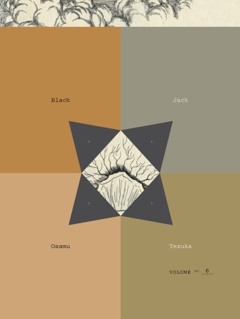
Black Jackets — The mighty Peter Mendelsund is giving away all of Osamu Tezuka’s Black Jack manga series in return for some assistance designing the next cover.

Take That! And That! And That! — Sony, having recently announced a pocket-sized reader and their switch to the ePub format, have now unveiled a new wireless electronic book reader with a 7-inch touch screen.

And on a related note, E-Reads tries to unpack some of the complex issues around Sony, ePub, and DRM.

Typedia — much linked to elsewhere (causing a severe strain on their servers earlier this week), Typedia is “a community website to classify typefaces and educate people about them.” I have no idea what I might use it for, but it looks pretty neat. You can also follow them on Twitter.

On the subject of typography, check out The Alphabetography Project, a photography blog cataloging found letters of the alphabet.

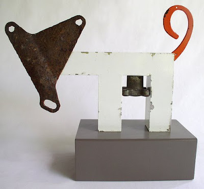
And hell, why not take a look June Corley’s charming typographic sculptures while you’re at it (via The Daily Heller and pictured below)…

Board — Also much linked to elsewhere, the New York Observer‘s Leon Neyfakh looks at three new hardcover books designed without dust jackets. It’s not exactly “the new thing” — more a case of the mainstream catching up with indies perhaps (and a light news day) — but there are still some interesting comments about book design:

Most of the publishers experimenting with jacketless hardcovers, including Viking, FSG, and Graywolf, are consciously taking their cues from the folks at McSweeney’s, who have been putting out beautiful books designed in this style for years. For Eli Horowitz, the managing editor at McSweeney’s, the method is a means of restoring some of the permanence and singularity to the book as object.

From the Design Desk — Designer Suzanne LaGasa talks about the cover design process at Chronicle Books.  (Full disclosure: Chronicle are distributed in Canada by Raincoast Books, my employer).

Big Comics — reviewsnthings asks notable comic artists, writers, publishers, editors and the like “what’s your opinion of the term ‘Graphic Novel’?” stirring up some interesting reactions. Here’s Leigh Walton, comics editor, and Top Shelf’s marketing coordinator, for example:

I find it intensely frustrating, in the sense that I can’t fully support it and I can’t fully dismiss it. Great minds have worked for ages to invent a better term, and they’ve failed. Its shortcomings are obvious — it’s based on a term, ‘novel,’ which has specific requirements of length and content, and it can never replace ‘comics’ as a general term for the medium… Yet ‘comic book’ was reserved ages ago for a format that isn’t really very booklike at all.

Mixtape — Robin McConnell is compiling cartoonists’ playlists for Inkstuds (the radio show about comic books), including Love and Rockets legend Jaime Hernandez.

And lastly, something for the fanboys to argue over: The Top 70 Most Iconic Marvel Comic Panels. (via LinkMachineGo)

1 Comment

Megan Abbott Noir Covers

For all my love of clean lines and Swiss modernism, I’m also a total sucker for trashy pulp paperback covers and film-noir movie posters, so when I stumbled across these covers illustrated by Richie Fahey for Megan Abbott‘s crime novels, I thought I should post the series:

Meg Abbott interviewed in 3:AM Magazine.

7 Comments

Something for the Weekend, August 21st, 2009

Picador Paperback have posted their fall catalogue to Facebook. Apparently they also did this with their spring list too . Needless to say, I think this is  a great idea. Is any one else doing it? (via Arthur’s Design)

Control — An interview with Alan Rapp, former senior editor of art, design, and photography at Chronicle Books and the new Associate Director of Hey, Hot Shot!:

for all the possible flaws in the trade publishing model, one thing I always liked about it is the collaborative process. It defies the auteur model; the author is almost never the sole creator. I suppose that this could sound like the ex-editor making a case for the value of his role in an industry that is really undergoing massive and fundamental changes, but I stand by the principle: all content benefits from editing. The author, whether a verbal or visual one, is almost always too involved with the material to see how it can be best adapted to another form. And the design and production processes are also critical to making the best book possible; one thing [that] I think is in danger of getting lost in self-publishing is the production potential. The physical aspects of books make important, and often subliminal, effects on the reader, but we are getting a much more homogenized offering through the current self-publishing models.

Final Crisis — A short Q & A with Chip Kidd about designing comic book covers at the NY TImes‘ ‘The Moment’ blog.

And finally, thinking of comics, Will Kane (The World of Kane) recently posted some mind-blowing pop-art pages from French comic “La Vie Privée de Dyane” drawn by Michel Quarez, published in 1968 (pictured below). Also check out Will’s post on Quarez’s 1967 Mod Love.

Comments closed

Midweek Miscellany, August 19th, 2009

‘The 100 Best Comic Book Covers’ Part 1, Part 2, Part 3, and Part 4 at Kelly Thompson’s 1979 Semi-Finalist blog. I am not a comics nerd (believe that if you will), but there’s some great stuff (new and old) in this epic list…

Open to QuestionThe New York Times reports on Sony’s decision adopt the “open standard” ePub format for all their digital books. This means that “books bought from Sony’s online store will be readable not just on its own device but on the growing constellation of other readers that support ePub”. Progress of sorts I would say, but before you break out the bunting, David Rothman questions how “open” this format actually is at TeleRead.

Book Design on Twitter — Ben at the Book Cover Archive has posted a list of book designers who Tweet.

Ben’s list was also a nice reminder to mention  Jennifer Tribe‘s amazing directory of book industry people on Twitter.

Book Worship —  Shawn Hazen’s blog cataloging “graphically interesting, but otherwise uncollectible, books that entered and exited bookstores quietly in the 50s, 60s, and 70s.” Lovely (via Book Cover Archive blog).

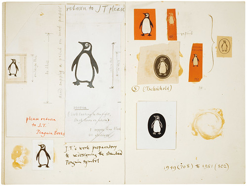
Penguin Symbols — I know I just mentioned designer David Pearson’s Flickr the other day, but how fantastic is this? “An investigation by Production Manager Hans Schmoller into the origins and usage of Penguin devices”

And speaking of Penguin…

Covers And That — Jim Stoddart, Art Director of Penguin Press, discusses their book cover process and looks at some of the new covers for book released this month:

Each cover may face a wide range of hurdles and conflicting opinions, this is the very nature of book covers. Good designers tend to be very focussed and resiliant, and the value of a good sense of humour cannot be underestimated. As with most design jobs there is a balance of concept, craftsmanship and time dexterity required. Any number of changes to the brief may occur even once the design is finished. But in Penguin Press it is widely appreciated that the more a cover is ‘tweaked’ by a committee the less chance there is of retaining that original spark that we all know helps a book stand out in a world where thousands of books are vying for attention.

Comments closed

David Pearson’s Flickr

Print designer David Pearson‘s Flickr stream has all the new additions to Penguin’s Great Ideas series, but also his abstract covers for Éditions Zulma, including this one for Pierre Albert-Birot’s Mon Ami Kronos (via the BCA).

Comments closed

Midweek Miscellany, August 12th, 2009

Typographic book covers by Ed Cornish for the 2009 D&AD student award brief for typography (via We Made This).

Tools of the TradeThe Montreal Gazette talks to Hugh McGuire about Book Oven and the new self-publishing landscape:

Call it Self-publishing 2.0. And it’s one of the fastest-growing sectors of the book world, which is itself enjoying a nice growth period despite the recession and the glut of competing media choices.

“Like in any other media, when you the make tools of publishing easy, people will take advantage of it,” said Hugh McGuire, founder of Montreal self-publishing start-up Book Oven. “It’s just now coming into public consciousness.”

It is troubling however that the photograph accompanying the article suggests that Hugh only rents the top-half of his office space!

Richard Green’s redesigns for ten of Penguin’s classic romance thrillers seen at Noisy Decent Graphics.

Dirty Stories — Eric Reynolds, Marketing Director for the Seattle-based art comics publisher Fantagraphics, interviewed in PW:

The book industry has been in a state of flux for at least a year or two years. I think that’s going to continue as everyone adapts to the larger challenges that print media is facing, and that’s going to affect anybody that publishes in print. It comes down to electronic delivery and the shrinking book market in general and just how you navigate these sorts of things… Without making it sounds like we’re totally awesome, we face the same problems that any understaffed, under-funded company does, but we’re streamlined, and there’s not a lot of fat to be cut.

Ornament — Doug Clouse and Angela Voulangas, authors of The Handy Book of Artistic Printing (published by Princeton Architectural Press), have created a nice website and blog for their book about letterpress type.

(I do love this book, but for the sake of full disclosure I should stress that PAPress are distributed in Canada by my employer Raincoast Books).

1 Comment

Q & A with Ingrid Paulson, Ingrid Paulson Design

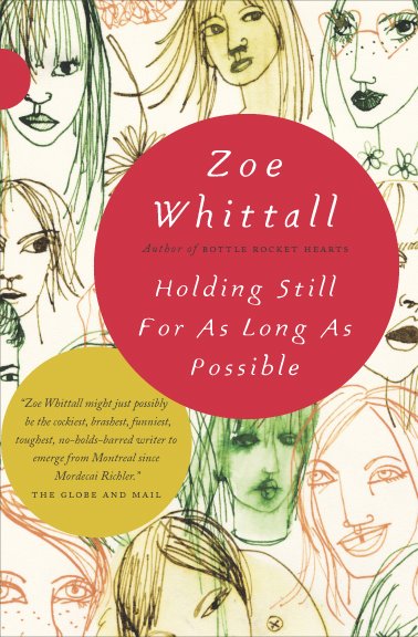
Holding Still cover

Before setting up her own design studio in Toronto, award-winning Canadian designer Ingrid Paulson was senior designer at McClelland & Stewart, and art director for Key Porter and Raincoast Books.

Although Ingrid worked at Raincoast, we didn’t actually meet until BookCamp Toronto earlier this year. We only had a brief a conversation, but it was just about long enough for me to blurt out that I wanted to interview her, and for the apparently unflappable Ingrid to say “OK” (and sound like she might mean it).

And so I do want to say a big thank you to Ingrid for coming through with such grace and patience, and for providing such wonderful answers to my not-so-wonderful questions.

Could you describe your design process for book covers?

In terms of workflow? The publisher gives me a title information sheet and/or a creative brief, plus (fingers crossed) either a few chapters or the entire manuscript for the book. I always ask to read the fiction, but for non-fiction I can manage well with a concise book description and perhaps the introduction. I submit a minimum of three cover concepts to my contact at the publishing house, and wait for feedback. Then I either redesign and resubmit, or, if I was ‘on to something,’ I tweak one of the concepts until we get it right.

In terms of creative process? Um. Well.

Some cover concepts appear in my head, fully formed, by the end of my first conversation with my publishing contact. Other get dragged out of me kicking and screaming, begging to stay in the dark void of my head. Sometimes I sketch out the covers — wee thumbnails in my moleskine — whereas other times I play a Google Images lotto search using various vague terms that would describe a feeling I want to associate with the book. Sometimes the font is the first thing chosen, or I envision the type at certain sizes and placed in specific places. Other times, the image is driving the cover and the type just has to play catch-up. I’ll envision a book as predominantly red, or dark, or punchy — and that all comes from what the author has written. I’ll respond to textured sentences with textured visuals (perhaps collage?) and bleak will meet bleak. (But not so bleak as to discourage someone picking it up. The bookbuyer is in my thoughts as well, as I try to envision them and their habits, quirks, and book needs.) Needless to say, my brain gets crowded.

And then there are the days when I just stare at a wall and hope against hope I’ll figure out something clever. I haunt a lot of bookstores.
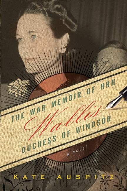
wallis

What are your favourite projects to work on?

The ones I get right on the first try.

I love working on fiction, but it takes the most concentration and, because fiction is so subjective, so evocative of the human condition (both funny and sad), designing a fiction cover can drive me nuts. There is never one absolute visual solution for fiction. Nonfiction, on the other hand, can get formulaic, but I love the simplicity of thought — punchline design, in many ways. So, for sanity’s sake, I prefer to keep a balance of fiction and nonfiction going. Cookbooks can be a blast to design, but I (sheepishly) think that comes from the photo shoot where we all end up eating most of the props (the ones that have flavour, or haven’t been sprayed with any shellac). And then there are the special projects where I’m asked to work on the cover and interior, and I am part of the planning and layout process, where I get to research the images, discuss things with the editors on a page-by-page basis. Those projects are rare, but they keep me happy for a few years at a time.

What do you think makes a good cover design?

Being able to lure someone into picking up the book and reading the back, which takes about 1.5 seconds of their time. Job done. How to do that? If we in publishing knew, we’d also be able to predict bestsellers. The best I’ve figured out is to keep it a simple visual package — don’t let the type look out of place with the image, don’t use the same colours as everyone else is using that season, stay away from looking too much like any of the other books, but make it look like a book. I dunno. The cover should evoke an emotional pull from the bookbuyer, that moment of ‘yes, that’s interesting and looks like what I want to read.’ That solution changes from book to book.

What are some of the common mistakes publishers and designers make with covers?

For publishers, they’ll try to make their book look similar to someone else’s (bestselling) book, as if to catch the wave. This is not clever, it just means the publisher is out of ideas or is feeling the year-end coming and needs to hook on to a sales-winner. It’s the publisher that took a design chance on a different look — and came out the winner in terms of sales — that is the ultimate winner. The rest end up on the remainder table eventually. Daunting. They don’t call it a ‘gentleman’s profession’ for nothing. (Or ‘gentlewoman’s’. I’m just citing the old, old adage.)

For designers, it is not being able to pitch their cover effectively. If a designer can articulate the reasons for their choices of colour, type, and image, then they have a fighting chance of getting that design through. Otherwise they are leaving it to speculation. I’ve worked both sides of the table — inhouse art director, freelance designer — and I know that it is ten times harder for a freelancer to get that voice heard in the meetings. But inhouse staff can get asked to revise designs far more often than the freelancer, as the perceived economies behind a salaried staff versus a per-project contractor sometimes give the publisher too much leeway on revisions. I’ve been inhouse with a book cover that I simply didn’t ‘get,’ but there was no way to contract out the job, as, due to costs, the publisher refused. It was a painful, long design process for all involved (not just me), and they ended up with something inferior to what they would have gotten with a designer who understood the book. As an Art Director, I could’ve just handed it to a specialist designer and, with a few good notes, gotten something much more suitable for the book.

I guess that leads to a codicil: know when to walk away. Yes, we all want to try new book categories. Just know when to draw the line, so to speak.

British and American book design styles are often seen as quite distinct (with critics and proponents of both!). Is there a Canadian style of book design?

What there is known of Canadian book design is an amalgam of quiet, well-crafted literary press style — usually hand in hand with DIY letterpress style — smashed against a desperate need for full-bleed sepia landscapes (or sleeping sepia people) and egregiously large title type. We err on the side of poetic, which can look like a wash in the stores (or worse — too literary, which could alienate those poor readers still recovering from their English high school reading list). We avoid edgy.

There is some astonishing design coming out of the cracks across the nation — David Drummond comes to mind, as does the brain trust under Peter Cocking at Douglas & McIntyre — and I hope that will win out. Clear, slightly subversive, more in tune with our world-famous sense of humour. Intelligent is the word that comes to mind.
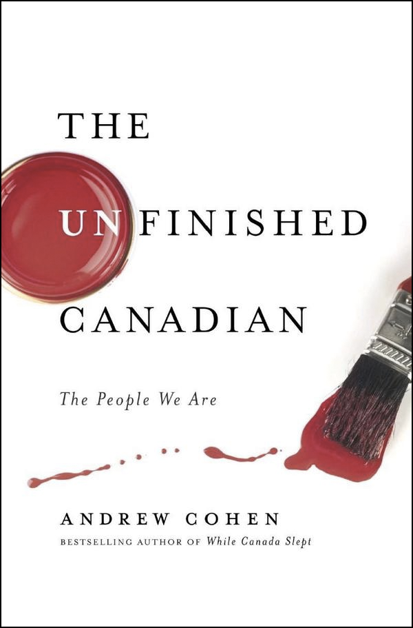
Do Canadian book designers have unique opportunities? Are they accompanied by particular challenges?

Figuring out new and exciting ways to design both hockey and ‘whither Canada’ books, which are a yearly staple on publishers’ lists. We are handy and imaginative with maple leaf imagery and the colour red.

You’re an artist as well as a book designer. Is there a tension between your artistic sensibility and the commercial design process?

Every day, and the design wins. I’ve tried to avoid overlaps, but words are images to me, so lately I’ve been working on art based around words. I try to keep it as three dimensional as possible (since my day work is two-dimensional), but then font choices become a factor and I run screaming. It helps to know that both Jenny Holzer and Barbara Kruger worked in designer/typesetter jobs early in their artistic careers.

The challenge lies in accepting and separating out design and art from their ultimate goals: design is created to communicate a product; art is created to communicate the world, in whatever form, or whatever scope, the artist chooses. There is no client in art.

How is designing book interiors different from designing their covers?

Interiors are, in many ways, a much more detailed exercise in communication. For a text-only book, I have to make sure that the reader never really sees the design, else it distract from their involvement with the text. For a picture book, the pictures stand tall, so the design should just assist the pictures. But a cover is a marketing tool, and the cover must try, in no uncertain terms, to woo the reader. It must stand out.
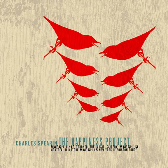
poster

Where do you look for inspiration?

Currently? Other designers (book and non-book), as well as music poster design. There is a great revival (when did it go away?) of one-off poster designs for gigs. They are all silkscreened or letterpressed limited-edition beauties. I used to look at rave fliers all the time (when raves were the thing). I look online. I remember stuff my mom — who was an antiquer in the 1970s — used to show me, old ads and magazines. I read a lot (beyond manuscripts), so I end up with this polymathic knowledge of, say, alchemical symbols and Greek demigods. We used to be such a visual culture, pre-literacy, and I think in many ways we’re heading back there. My job is to connect the shorthand symbols of the culture, both old and new. It can fascinate me for hours, why LOLCats is the thing (and then not the thing, but what did the visual say of us?), or looking at, say, a Dutch design student’s incredibly cool/obscure website.

Who else is doing interesting work right now?

I love designers with latitute — ones that aren’t just one-trick (or one-look). Who comes to mind? Coralie Bickford-Smith, Jason Gabbert, Terri Nimmo, David Gee, Gabriele Wilson, Peter Mendulsund… They all have style that can bend to the project. I could go on, but that’s today’s list. It will change and expand tomorrow.

You’re very active with your website, blog, and Twitter etc. Is it important for a designer to engage with people online?

You know, every time I blog (or answer nice questions like yours), I sit back afterward and fear that my opinion is going to lose me a client. There is this balance one must keep when designing, as the client is always right (or deserves the design they get, depending on the outcome), yet what designers put out there does contribute to our visual worldscape. So, I try to contribute.

But I work from home (or, in Toronto parlance, I have a ‘live/work situation’). Blogging keeps me from talking to the wall too much, or thinking that the cat cares when I’m sweating to find the right sans-serif. It has been fascinating to watch how many book designers have joined Twitter lately — we all seem to find each other, this odd subgenre of designers, and I think in the future, that will result in some mind-blowing design (or a great convention in Bend, Oregon). My purpose online is to build community, to share ideas, to groan when needed, and if other non-designers join the conversation, well, then it just becomes this great party.

With the growing popularity of e-books, what is next for book cover design?

Ack! I don’t know. I really don’t. We’ll see what happens. What I do know is that there will always be a role for design, but what that role takes is anyone’s guess.

Thanks Ingrid!

Comments closed

Something For The Weekend, August 7th, 2009

Winnie and Wolf — cover design by Alex Camlin (the chap behind that rather wonderful Harvard Review overhaul). I’m hoping to speak to Alex for the designer Q & A series later this month.

And just while were on the subject, Caustic Cover Critic looks at the new designs for the Penguin World War II Collection.

In Search of Lost Time — David L. Ulin, Book Editor of the LA Times, on the lost art of reading:

Today, it seems it is not contemplation we seek but an odd sort of distraction masquerading as being in the know. Why? Because of the illusion that illumination is based on speed, that it is more important to react than to think, that we live in a culture in which something is attached to every bit of time.

Here we have my reading problem in a nutshell, for books insist we take the opposite position, that we immerse, slow down… Yet there is time, if we want it. Contemplation is not only possible but necessary, especially in light of all the overload.

But, if you sympathize with this perspective be warned: you are weak and you just don’t love books enough (and you’re probably a calcified narcissist).

Talking Books — I don’t agree with everything here (OK I actually disagree with a lot of it and, I’m sorry, describing the Globe & Mail as “daring” is just  delusional), but Ian Brown, writer, arts journalist and broadcaster has some interesting things to say about Canadian literature and culture in a sprawling interview over at Conversations in the Book Trade:

[T]he novel is no longer the prime example of literature. Nor does it need to be. Too much attention can ossify a genre. If anything is in trouble, it’s literary fiction–but again, only because there are so many alternative ways to consume good writing these days. The book itself is a fantastic technology, but literary fiction has some serious competition for my attention.

And as this has been something of slow week, and because I was chatting about it with book designer Jason Gabbert on Twitter (who is responsible for the lovely C.S. Lewis redesigns above), I’m just going to take this opportunity to (re)plug my image library on Image Spark and (while I’m at it) my slightly stream-of-consciousness inspiration blog The Accidental Optimist.

4 Comments