Skip to content

The Casual Optimist Posts

Reasons to be Cheerful


They’re here and I’m back — officially one year older, and a father of two. Mum and the twins, born a week before my birthday, are doing well.

The new Raincoast website is close to being on schedule (thanks to Monique at Boxcar, Al, Tony, Jamie and Siobhan at Raincoast HQ) and daily coffee consumption — while still exceptionally high — is back to a more sustainable level. I still have that grid for Amazon to do though…

But back to the Optimist business: I missed a lot of great stuff while I was away, so expect posts every day this week (starting Monday) as I try to catch up. The interviews with book designers will hopefully return in November.

Thanks to Mark for the pep talk a couple of weeks ago, and thanks to the people who emailed and left comments while I was away.

It’s nice to be back.

11 Comments

Something for the Weekend, September 25th, 2009

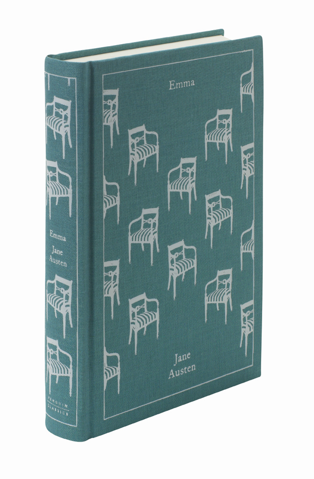
Great Ideas — Art director and designer David Pearson discusses his publishing venture White’s Books with Peter Terzian in Print Magazine (above: cover for Emma, published by White’s Books; illustrated by Amy Gibson):

Due to the arrival of eBooks, many prophesied the death of the printed word, but we see it as an opportunity to turn the spotlight back on the traditional methods of book production and to luxuriate in the craft and tactility of the physical book and the printed page. It’s lovely to be designing with longevity in mind as we aim to create objects that will be retained and cherished by their readers.

David Pearson also discusses his work for Éditions Zulma and Penguin. I’m hoping to post a Q & A with David on The Casual Optimist later this fall.

Questions Should Be Answered — Dutch type designer Jos Buivenga, whose quality free typefaces (including personal favourite Fontin Sans) are available from his one-man font foundry exljbris, interviewed in the MyFonts newsletter. Jos’ new typeface Calluna (shown above) looks rather lovely.

The Future of Publishing? — Patrick at the Vroman’s Bookstore blog looks at what publishers do and how they might do it (or something different) in the future. While there is nothing especially new here, it’s an interesting post in part because it’s written from the perspective of a bookstore. The comments are worth reading too, if only for Ann Kingman‘s contributions and hilarity of a certain self-styled “agent of change” having the audacity to accuse someone else of oversimplifying (pot introducing kettle). All of which is a good, solid reminder that I have a related post in my drafts folder than needs dusting off… *Sigh*

And on a related note…

Reimagining the Book — Mark of index//mb is looking for people to help organise a conference on authorship in Toronto.

And just FYI: There is a good chance that this will be the last post for a couple of weeks. Work stuff + Life Stuff + Internet Fatigue means that I need a break from even the gentle rigours of irregularly posting here. Hopefully normal service will resume in October (for what it’s worth…).

Out.

2 Comments

Sunnyside

I just picked up  copy of Glen David Gold’s most recent novel Sunnyside.

Book Covers Anonymous gave the British cover — with a whimsical illustration by Adam Simpson — some love back in July, but I think I prefer this lovely elegant, and understated cover by Megan Wilson for the US edition published by Knopf:

You can see more of Megan Wilson’s work at her website, including these rather lovely covers for Vintage’s Richard Yates reissues:

Young Hearts Crying: Photograph by Richard Rutledge

A Special Providence: Photograph by John Rawlings

Comments closed

Midweek Miscellany, September 23rd 2009

It’s funny how topics of conversation sometimes repeat themselves for no apparent reason. This week Romek Marber and his designs for Penguin have come up with sufficient frequency for me to take it as a sign I should post some links about about him:

Eye Magazine has a great article about his classic design of Penguin Crime Series:

Marber’s grid allows for different placements of title and author’s name depending on the length of the title and the needs of the design as a whole. There are small inconsistencies in some of the vertical measurements on a few of the books, probably due to printer’s error, but the basic design is sufficiently robust that it does not matter… With the typographic structure in place, Marber could concentrate on producing images that reflected the atmosphere of the books, which he read with relish from cover to cover. He was a graphic image-maker of great versatility, able to sum up the stories with motifs and ciphers that contrived to be both playful and threatening. Many of these whodunnits were decades old, but his interpretations gave them a contemporary allure.

The Ministry of Type shows you how to construct the famous Marber grid.

Apt Studio have a Marber WordPress theme (demo). Are any literary blogs using this I wonder?

And there’s this great Flickr set of Romek Marber Crime Covers.

Please let me know if you have any other good Marber links…

In other news…

The Electro-Plasmic Hydrocephalic Genre-Fiction Generator 2000 by David Malki (via INDEX // mb).

The Awesomeness Manifesto — I’m a little skeptical about these kinds of manifestos simply because they’re not terribly useful, but Umair Haque’s list is as interesting for its criticism about the chimera that is ‘innovation’ as for what is says about the warm and fuzzy  ‘awesomeness’.

1 Comment

Designer Q & A’s Round One

Monday’s interview with Paul Buckley wrapped up the first round of my Q & A’s with book designers. I’ve been overwhelmed by the generosity of the designers who have participated in the series and I’ve had some great correspondence from designers and non-designers alike who have read the posts. I owe a lot of people a lot of thanks. Thank you. But now the fall book season is well and truly under way now and there’s going to be a (hopefully) short hiatus before the second round of Q & A’s start.

As with round one, I’m hoping to talk to designers who are in different stages of their careers and whose work is interesting and distinctive. I’m very excited about the designers who have already agreed to answer my questions, and I have some ideas about other designers who I’d love to be involved.

Suffice to say it should be good (fingers crossed) — it’s just going to take a little time — so I hope you can be patient while I try and set things up (and juggle life and the day job).

In the meantime, here’s a recap of the great designers I spoke to this summer:

Nate Salciccioli, designer, The DesignWorks Group

Ingsu Liu, VP Art Director, W.W. Norton and Co.

Ingrid Paulson, designer,  Ingrid Paulson Design

Michel Vrana, designer, Black Eye Design

Alex Camlin, Creative Director, Da Capo Press

Coralie Bickford Smith, Senior Designer, Penguin Press

Paul Buckley, VP Executive Creative Director,  Penguin US

And these two older interviews might also be of interest if you missed them:

Ben Pieratt and Eric Jacobsen, dudes, The Book Cover Archive

Ellen Lupton, designer, writer, editor, educator, Design Writing Research

Thanks.

3 Comments

Q & A with Paul Buckley, Penguin US

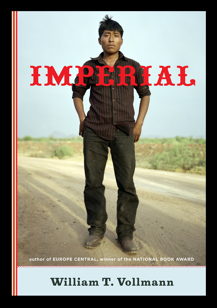
Photo by Erika Larsen. Design by Paul Buckley

It is not every day that I get an email from the Vice President Executive Creative Director of Penguin US, so it was something of a surprise when Paul Buckley sent me a note a few weeks ago about a book cover design mentioned in my interview with his wife Ingsu Liu.

I had been conspicuously unable to locate the image online and Paul was able to help. But it seemed like too good an opportunity to miss, so I asked the Brooklyn-based designer if he would be willing to do a Q & A about his work as well. Again, much to my surprise, not only did Paul say yes, he managed get his answers back to me in record time (with annotations and links included!)…

Of Mice and Men

How did you come to book design?

I went to SVA on an illustration scholarship, and was very intent on becoming an illustrator. While other parents were giving their kids children’s books, my father was giving me illustration annuals. But I supported myself during my college years working for various NYC design studios as a designer, learning through those around me… and at the same time pursuing freelance illustration assignments as well – basically learning both crafts simultaneously through different venues. Right after graduation I took a 3 month road trip spending my savings, and thus came home to Greenpoint needing an income. A studio manager at one of the studios I worked in during my early college years suggested me to her sister who was working at NAL/Plume/Dutton, as they needed a Junior Designer… I landed the position with a portfolio that was equal parts design and illustration. Though in the beginning I was very hardcore about becoming the best painter I could be, I quickly fell in love with designing book covers and never looked back… within two years we merged with Penguin. Though I’ve become far too busy (and lazy!) to pull out the oils and actually paint something, I did manage to get a few simple ink drawings in the Society of Illustrators this year. I realize these will pale in comparison to 99% of everything else done by the true working pros in the annual, but it was still a kick and an honor to have my work chosen for inclusion.

The World According to Garp

Can you describe your role at Penguin?

I act as a Creative Director overseeing a sizeable staff and many many projects. My Penguin publishing team is very open to me and my guys pitching ideas and we nicely act as an overall creative team, in a way that editorial and art together collaborate to create nice projects — most recently I’m directing a cover design book where we have the authors commenting on their covers, and a new series named Penguin Ink, where the world’s leading tattoo artist’s do covers for me. Recently in the stores is the gorgeous collaboration of Roseanne Serra with Ruben Toledo… this was all Roseanne’s brilliant art direction, and I had nothing to do with it — but it is gorgeous Penguin project that is very much worth checking out.

Art by Duke Riley
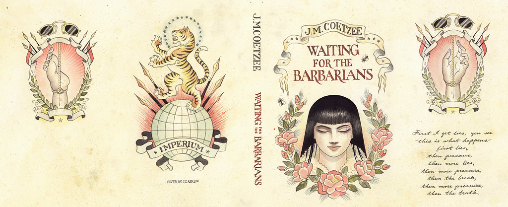
Waiting for the BarbariansArt by Chris Conn

How many imprints do you oversee?

Six

Does each imprint have a particular design style?

Yes, each imprint is very unique unto itself, as each Publisher/Editorial team brings their own style, as does each Art Director. In my group, Roseanne Serra and I collaborate on Penguin paperbacks, and to a lesser degree, with the Viking imprint as well. Roseanne art directs Pam Dorman books. Joe Perez smartly art directs Portfolio and Sentinel, which are brilliant business and political imprints. Darren Haggar art directs Penguin Press overseeing the packaging for literary giants like Thomas Pynchon and Zadie Smith… and while not it’s own imprint per se, Maggie Payette Art Directs our gorgeous poetry series.

The Jan Tschichold Penguin paperbacks are design icons in the UK. Is there a sense of that legacy within Penguin Group USA?

Very much so. We all have quite a few Tschichold books on our shelves. The UK Penguin art department, under the Art Direction of Jim Stoddart and John Hamilton, does an incredibly beautiful job of keeping that legacy alive.

How is American book cover design different from the UK?

I don’t know that it is all that different. In fact, Art Directors over here, and Art Directors over there, are hiring the same art and design talents on each side of the Atlantic.

Do you discern any current trends in American book cover design? Yes… very nicely a resurgence of designers and illustrators who do both the design and illustration; the whole package. Jaya Miceli, Chris Brand, Jon Gray, Gregg Kulick, Jamie Keenan, Rodrigo Corral, Ben Wiseman, Jennifer Wang, Tal Goretsky, etc – these are the folks creating the personally unique covers of today that will be the design icons of tomorrow.

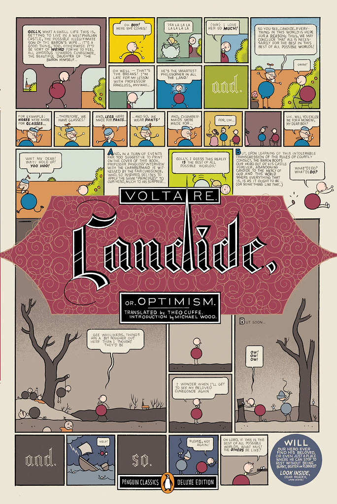
Art by Chris Ware

How did the Penguin Graphic Classics come about?

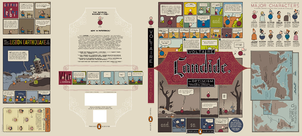
We do a handful of what we call Penguin Graphic Classics Deluxe packages every list, and when it was time do one for Voltaire’s Candide, I handed it off to Helen Yentus who was in my group at the time. Helen wanted to work with Chris Ware on it, and off it went with us all happy that he accepted the assignment. When Chris’s sketch came in, it just sort of blew everyone away… Up to that point we’d never had anyone grab editorial control of a cover that way… Chris had gone hog wild and wrote all his own copy and illustrated and designed the living hell out of every square inch of this cover from flap to flap. It took forever to make its way around the packaging meeting table with everyone grabbing hold of it, reading it and laughing out loud. A short time later, our Penguin Publisher Kathryn Court declared that we needed to do more of these. Kathryn really nurtures good art and design and is one of the reasons I’ve been here so long.

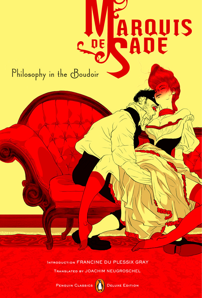
Cover by Tomer Hanuka with design by Paul Buckley and Tomer Hanuka


Art by Anders Nilsen
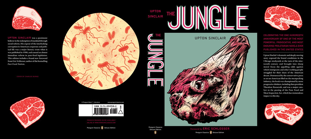
Art by Charles Burns
Art by Roz Chast

How did you match the artists with the titles?

The titles were given to us by the Penguin Classics editorial team, and Helen and I would sit in my office surrounded by comic books and simply have fun matching this artist with that title.

Art by Michael Cho. Design by Paul Buckley

Are their plans to expand the series? What new covers can we look forward to in the future?

We do about 6 a year and I think we are all comfortable with that number at the moment. I just finished White Noise with Michael ChoMoby Dick by Tony Millionaire just came out, as did Huck Finn by Lilli Carré, and Ethan Frome by Jeffrey Brown. In the near future, I’d really love to do something with Jim Rugg, Jeff Lemire, Mike Mignola, David Small, and I still hold out hope that one day Crumb will actually say to me “damnit you pesky bastard… ok, ok, I’ll do it”.

Art by Tony Millionaire


Art by Lilli Carre. Design by Paul Buckley

Do you still design yourself?

All the time… mostly in the evenings after everyone has gone home and I can focus without the constant distractions of the work day. My greatest hits are posted on my website.

 
Art by David Byrne. Design by Paul Buckley. 
Pigmented foil stamped on linen cloth
Art by Will Eisner. Design by Paul Buckley. 
Art direction by Ingsu Liu & Albert Tang
 Photo by Fredrik Broden. Design by Paul Buckley

Could you describe your design process?

I start each project with the hope that I’m going to do something unusual; and then I try my best to do just that — read the material and find a visually unique way to interpret it. I tend to go either very loud, or very subdued and moody. I do a ton of comps for every cover I work on — sometimes, 20 or more to explore what I’m thinking and all the tangents that come along during the process — I get nuts when freelancers send me two or three comps. I’ll show 3-5 of what I think are the best and receive comments and direction on those from editorial… when discussing why a designer did this or that, I think what people commenting on book covers seem to gloss over is that the publishers and editors have far more at stake than the cover designer — they have committed sums of money and must answer to the house and the author to make this book a success — so they are very strong about what they think the cover should be and nothing is being printed without their full consent.

Here are a few rejects from the pile… I’m not saying these covers are better for the individual book, than what got printed… maybe the books would have tanked with these covers… but they do illustrate how in-house visions do not always sync:

Upper left: art by Paul Buckley. Upper right: various stock.
Lower Left: art by Amy Bennett with descending placards by Paul Buckley.
Lower Right: painting by Keniche Hoshine with added stock image.
(see final cover here)
Various antique endpapers combined with altered ebay images
and antique portrait of feral child.
(see final cover here)

Do you approach fiction and non-fiction differently?

Often, yes. Fiction needs a more peripheral approach where I’m looking to capture a mood to reflect the book’s tone, whereas non-fiction often needs you to stare it directly face on and state precisely what the topic is.

What are your favourite books to work on?

Any title where the Editor and Publisher are open.

What are the most challenging?

Any title where the Editor and Publisher are nervous.

Where do you look for inspiration?

Everywhere. My staff blows me away daily. My wife shows me beautiful work constantly. Editors show me stuff. Blogs like yours so nicely showcase how much great work is out there. Friends deluge my inbox with artist links. Illustrators. Photographers. Fine Artists. Music. Furniture. All talent is inspiring. Cruising Flickr and the web in general has me bookmarking new people daily, and I can spend hours google imaging the most absurd things that always tangent me to the greatest places. I found and purchased an image for a difficult book cover project recently just because I decided to google “leucistic squirrel” after I noticed a few in Prospect Park. I have no idea how we all existed before the internet.

What do you look for in a designer’s portfolio?

A unique talent. Distinction.

Front cover art by Frank Miller. Design by Paul Buckley

What does the future hold for book cover design?

There will be a market that just wants/needs to download the material for reading purposes, and there will be a market that is looking for an object. What Penguin does with the Graphic Classics is a great example– some student will download Gravity’s Rainbow cheaply, while an older Thomas Pynchon or Frank Miller fan with a little more cash in their pocket will want the beautiful book/object. So I believe the cover design market will shrink in that way. Textbooks and travel guides will go digital first as there is no real reason to carry all that in your backpack or pay for all that book production. For digital readers, big budget fiction and non fiction titles will have moving covers, more like mini movie trailers. If Grisham were still with us, his future digital reader cover would be something akin to us looking at a murky black screen… the reader would hear running footsteps and ragged breathing… then a loud shot rings out, and a big red splotch hits your screen and drips to form the title type. Then one blurb after another flies across the screen and after a moment Grisham himself pops up in the corner thanking you for purchasing his new book and asking if you’d like to peruse his backlist titles… and click this link if you’d like to pay an extra dollar to help our troops in North Korea, Iran, Afghanistan or Iraq. Interior-wise, there will be tons of product placement… not necessarily for gratuitous reasons; but because people, places and things are mentioned on every page in every book be it fiction or non fiction; and if folks desire a more interactive read that really helps them get into the book in a different way, then it’s possible there will be quick jump links to everything – for instance… if in this book, the character is having lunch in Balthazar and then running off to the Standard Hotel for an ongoing affair… then why not have Balthazar and The Standard pay a small fee to the publisher to provide these links; this seemingly free advertising? Big money to had there. I reserve judgement as to whether any of this is a good thing or a bad thing… but as publishing goes more digital, I think it’s naive to think these things wont happen to books just as they happen everywhere else.

Thank you very much!

You bet.

9 Comments

Something for the Weekend, September 18th, 2009


Bring the Noise — Toronto illustrator Michael Cho (known locally for his much-loved signage for the now defunct Pages Books & Magazines on Queen Street) discusses his jacket art for the Penguin Graphic Classics edition of Don Delillo’s White Noise.

I ‘m very happy to hear that D+Q are publishing a ‘petit livre’, Backalley Drawings, by Michael next year.

And watch this space for an awesome Q & A with Paul Buckley, the art director of the Penguin Graphic Classics series (coming soon!)…

But Is It Type? — Design educator Ellen Lupton on the difference between lettering and typography for Print Magazine:

I subscribe to the rather rigid theory that typography is about readymade, reproducible families of letterforms. Vernacular hot-dog signs, handwritten wedding invitations, and space-age logos aren’t typography…

Perhaps my quibble is an old one: you just can’t view real typography online. Beautifully printed books and magazines are still the best resource for designers who want to know what’s happening in their field. Yet the design discourse is unfolding in real time on the web, and this is where students and young designers go to participate and be inspired.

And while were on the subject of typography, I thought — as a bungling amateur — that Brian Hoff’s post 10 Common Typography Mistakes was useful. Although I like to think I was surprising good at Cheese or Font (for what it’s worth).

Publish Local — An interesting list from The Task Newsletter (via REFERENCE LIBRARY). Would this work for book publishing?:

  1. Find what’s missing
  2. Work in the gaps
  3. Figure it out together
  4. Make it visible
  5. Make it viable
  6. Research and plan
  7. Expand existing systems
  8. Plan transparently
  9. Start small
  10. Commit to it
  11. Learn about your local flora
  12. Don’t get permission
  13. Print what you’ve got
  14. Make positive spaces.
  15. Find funding

And lastly, I just had to post this…

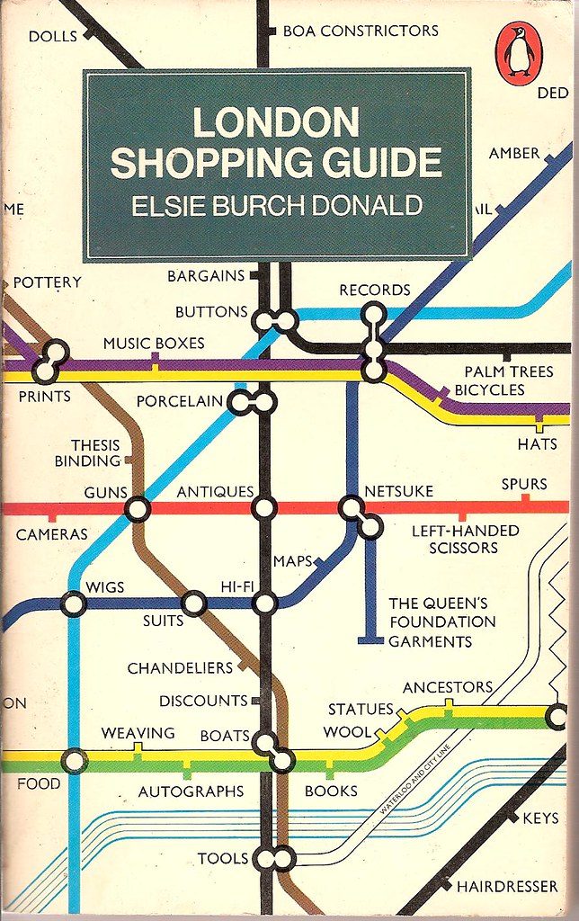
London Shopping Guide — Revised second edition from 1977, cover design by John Carrod, seen at Covers etc on Flickr.

Two design classics in one: Penguin paperbacks and Harry Beck’s tube map. What more could you ask for?

Comments closed

Midweek Miscellany September 16th, 2009

Rejected Covers by Klas Ernflo — Typography to make you weep (with either joy or envy). (via ISO50)

Poet of Desolate Landscapes — Author Jonathan Lethem on J.G. Ballard in the New York Times:

[V]ery few writers I’ve encountered, even those I’ve devoted myself to, have burrowed so deeply in my outlook, and in my work, where I find myself recapitulating Ballardian patterns not for their beauty (though they are beautiful) but for their tremendous aptness in attempting to confront the dying world before me, and inside me.

Ira Glass on the Internet and Public Radio — The host of NPR’s This American Life talks to Jesse Brown for a TVO Search Engine podcast (is it just me, or is there something gently life affirming about the fact Ira Glass doesn’t know who Chris Anderson is?)

“Well, it’s still more fun than a lot of other jobs” — Over at The Barnes & Noble Review, Daniel Menaker, author and former Executive Editor-in-Chief of Random House and fiction editor of The New Yorker, discusses — with bracing candour I might add — publishing and the role of book editors (don’t read if you are even slightly depressed):

[T]he tectonically opposing demands on publishing — that it simultaneously make money and serve the tradition of literature — and its highly unpredictable outcomes and its prominence in the attention of the media have made it a kind of poster adult for capitalism and the arts in crisis.

All awfully close to bone, and yet somehow Menaker also misses something vital about publishing and the opportunities that are arising…

Slovakian Book Covers — More amazing stuff from the genius A Journey Round My Skull (above: Binding illustration for Moji přátelé milionáři by Bernt Engelmann, 1968)

No-Man’s Land — A little late to the party, but over at  The Atlantic, technology journalist Kevin Maney looks at why the future might not be so bright for the Kindle (and he doesn’t even mention the iPhone):

Life, it turns out, is a series of tradeoffs between great experience and high convenience... Most successful products and services aim for one or the other, but not both. Products and services that offer neither tend to fail.

That’s why, despite all the great press it’s gotten, Amazon.com’s Kindle may be in trouble: in aiming to provide both a great experience and supreme convenience, it has achieved neither.

And lastly…

Words on Film — Designer Ed Cornish discusses his fantastic, but unused, cover designs for the 2009 D&AD student award brief for typography (sponsored by Faber and Faber) at FaceOut Books (because I haven’t linked to FaceOut for about 5 minutes right?).

1968, binding illustration for Moji přátelé milionáři by Bernt Engelmann
Comments closed

Q & A with Coralie Bickford-Smith, Penguin Press

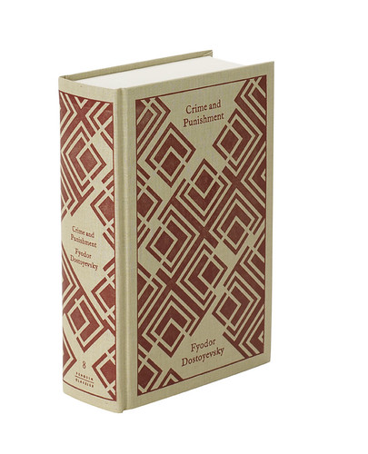
Coralie Bickford-Smith was one of the first book designers I mentioned on The Casual Optimist and her distinctive cover designs have featured regularly ever since.

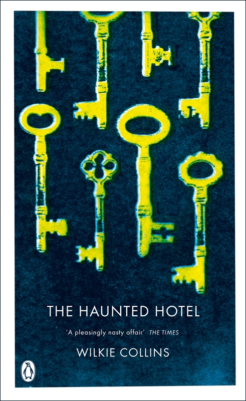
While Coralie’s work for Penguin clearly draws inspiration from the Arts & Crafts Movement and British inter-war illustration and design, it never seems trite or conventional. There is always an asymmetry, angle, pattern, or colour combination that gives it an unexpected twist that lifts it out of the ordinary. Her covers for Penguin’s ‘Gothic Reds’, for example, are amongst the most brilliantly stark, original, off-kilter and unsettling covers of recent memory.

It almost goes without saying that I am thrilled that Coralie agreed to an interview, and I’m using it as a shameless excuse to post a lot of images of her work.

When did you decide to become  a designer?

I don’t remember when I heard the term designer for what I wanted to do and it all became clear, but I spent my childhood collecting stamps, letraset, calligraphy nibs, books and making my own edition of the dictionary. All that made a lot of sense once I started studying design at university.

What is your role at Penguin,  and where did you work previously?

I’m a senior cover designer for Penguin Press, which publishes Penguin’s classic fiction list as well as non-fiction titles in science, philosophy, history, etc. Before I started at Penguin I worked in various jobs designing whole books, magazines and instore promotions for supermarkets. It was not until a started at Penguin that I settled down and really started to feel creatively fulfilled.

Do you work on particular  imprints?

At Penguin Press we have a number of imprints: Allen Lane, Particular Books, Penguin Classics, Modern Classics, Red Classics and Penguin Paperbacks. Our art department shares the titles around so we get to work on different projects and designers are not tied to one imprint.

Penguin is synonymous with British book design. Is there a sense of that legacy within Penguin  itself?

Absolutely, it’s great to work for a publisher with such a rich design heritage. The responsibility to live up to that can be quite daunting at times, but you just have to get on with what you do and enjoy it, otherwise it would get paralysing. The reputation means that design is valued within the company, which gives the designers a stronger voice. Not that we get carte blanche — sales and marketing obviously have their say — but there isn’t always the decision to play it safe, we’re given a bit more rope to take some risks and hopefully push things further. So we get to have a lot of fun with design and feel listened to and respected.

Could you describe your  design process for book covers?

The first stage of every new cover is nerves and self-doubt: can I do something interesting, visually smart and get across the fundamental nature of the book and help it sell? Nightmare. So I get reading and then try to throw away all my concerns and fears and start getting stuff down on the page, sketching on paper and working things out on the computer. Usually that means trying out a lot of rubbish and having to trust that eventually something will emerge from the process that works. When that happens I can breathe a short sigh of relief and then get on with developing and refining until the cover is finished.

Your work often incorporates  traditional Arts and Craft elements like ornamentation, illustration,  and hand-drawn type. Is this something you strive for or is it dictated  by the nature of the projects?

I suppose those elements are close to being obsessions of mine — I was heavily into William Blake and William Morris as a child. Some projects have quite open briefs so I can pursue a particular vision — the first of my hardback classics grew out of a fascination with Victorian book bindings, which inspired me to experiment with foil-stamped cloth bindings. Other times there will be an element in the brief — illustration for the Boys’ Adventure series for example — that I latch on to and try to get the most out of, with lots of period research and careful commissioning. A lot of the hand-drawn type on my books is commissioned — Stephen Raw is great at period type — but I’d like to develop my own skills in that area as well. John Gray is a constant source of inspiration, the energy in his hand-drawn type is incredible.

What are your favourite  books to work on?

I would say the cloth classics right now. I really enjoy the process of getting the best colour combinations and the feel of the end result in my hands. Representing classic literature through patterns is fun there is so much to go on within the text. Life only doing these would be dull though, so I like that I get to work on a variety of titles. I like that there’s always another area in which to push myself as a designer. I think its coming up with concepts I like best. The rush of the moment where you show it to someone and they get it. When you feel that you know you have got it right.

What are the most challenging?

They’re all challenging at the start, when I think I might make a hash of this one. Conceptual covers for non-fiction can be quite a challenge — especially when there’s a late change to the title or subtitle that makes a great design suddenly redundant. It can be hard scrapping a cover I’ve become attached to and has been approved. I just have take a deep breath and remind myself that the cover is there to serve the book and not the other way around…

How is designing for a series  different for designing an individual cover?

As you would expect, it’s a more intense process. I always have to have rules that will work across the series, from colour usage to typography. There are often period-specific elements that have to researched and backed up. It there’s a grid it has to work across the whole series and not get tired and boring. It’s a longer process, and the energy and attention to detail has to be maintained to the end. With individual covers its a bit more organic as you won’t have to pay down the line for decisions that might create difficulties if spun out into a series. If it works it works and once you’ve got it you move on.

Do have a favourite set  from your recent designs?

Again it has to be the cloth classics as they sit so satisfyingly on the shelf as a set. I tend to pick my work apart after each series is finished and make notes about what I would do next time and how I can improve on the way I approach the typography and the images, well all of it really. I think designers are harsh critics of their own work; there’s a dissatisfaction that motivates us to keep producing new stuff, new approaches.

Where do look for inspiration  and who are some of your design heroes?

The internet is a huge and readily accessible resource. I can spend ages going from site to site just soaking up inspiration. I like to collect objects that I see in junk shops/ebay/charity shops. Bookshops too of course – I really enjoy the Oxfam book shops, so many gems to be found. As for design heroes, there are many. The Williams I mentioned earlier — Blake and Morris. Then there’s so much inspiration in the Penguin back catalogue, form people like Romek Marber and Alan Aldridge. In current book design, John Gray and David Pearson often come up with things that make me think wow, look what you’ve done, that’s amazing. There are also many outside of the book world I admire, such as Orla Kiely. I love her use of colours, and also the 70’s vibe. I have a thing for 70’s orange plastic, and her stuff reminds me of that, its really comforting.

What does the future hold  for book cover design?

Covers are still a lot of the time the only piece of marketing material to attract the customer so I don’t think that is going anywhere fast. We might go through a wave of utter tripe as everyone gets all excited about 3D or animated covers, and the novelty of technology takes precedence over good design. Electronic books are inevitably going to impact physical publishing, but the printed book is a very successful technology in its own right and I don’t think it will be entirely displaced. For all the advantages of ebooks — portability, interactivity, production and distribution savings — there’s something potent about the physical object that will always have a strong appeal. I like to think that as the volume of physical books declines, the average quality of the design will increase, because books will have to work harder to justify their physical presence.

Thanks Coralie!

7 Comments

Midweek Miscellany, September 9th, 2009

Getting Paid by the Joke — Roy Hattersley on Keith Waterhouse, author of Billy Liar, who died last week aged 80:

One of the great lines, spoken in the subsequent film version by Wilfred Pickles playing Billy’s father, combined fury and bewilderment. Why, he demanded to know, had his son told the neighbours that he had only one leg. Billy worked in a dismal office – an ironic tribute to Waterhouse’s first job as clerk to an undertaker. It seemed a step up for the son of a door-to-door vegetable salesmen and a cleaner who had left Osmondthorpe Council School at 15 with an interest in books but no qualifications and few prospects.

When’s That Book Coming Out? — A nice breakdown of the production process by Shelby Peak which explains why it seems to take a long time for books to be released after an author has turned in their final manuscript. Every time I read something like this, I wonder why we don’t hear from publishing professionals more often. It would be great to see publishers explain this kind of thing on their own blogs. (via blog.rightreading)

Spine Out — John Gall has started a blog. Holy fuck.

And — on a related note — there is a nice conversation on Vintage’s The Sun & Anchor blog between designer Peter Buchanan-Smith and photographer Todd Hido about the new Raymond Carver covers (commissioned by John Gall).

Doing the Work — A fascinating interview with Australian book designer Tony Palmer at Caustic Cover Critic:

Sometimes you hear the bigger book publishers described as being like factories – where the work is churned out in a mechanical and unthinking way. It’s never been like that for me at Penguin. The editors, production staff and designers all love their work. But love can be wild and unpredictable. So I’ve dreamt of being a plumber. I like the way water moves on surfaces. I like the fact that there are only four different ways to plumb a house. But book design? Gawd, maybe there’s about 120 right ways to do a good book cover, and there are probably millions of ways to make a bad one.

And finally…

A Master of ReinventionBrad Mackay, director and co-founder of the Doug Wright Awards, reviews David Mazzucchelli’s remarkable Asterios Polyp for The Globe & Mail. The Comics Reporter has a critical reading guide.

6 Comments

Q & A with Alex Camlin, Da Capo Press

Even though I first noticed the chunky Eisner-esque cover design for Douglas Wolk’s Reading Comics at The Book Design Review, it wasn’t until much, much later — when Ben Pieratt posted about the elegant redesign of The Harvard Review at  The Book Cover Archive blog back in June — that I registered that it was the work of designer Alex Camlin.

Both Reading Comics and The Harvard Review demonstrate Alex’s incredible attention to typography, his range of his influences, and the amazing diversity of his portfolio. Currently Creative Director for Da Capo Press, I caught with Alex via email earlier this month.
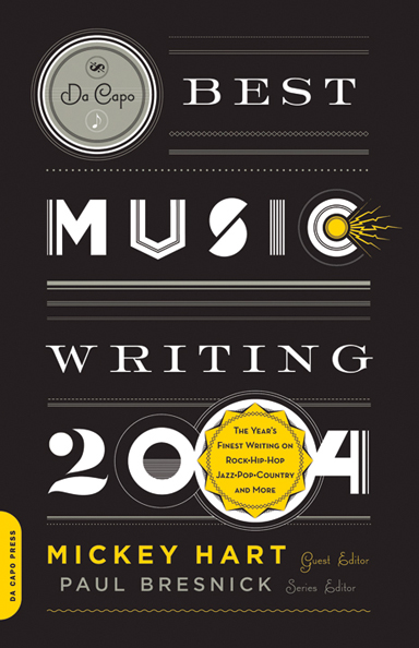
Briefly, could you tell me about Da Capo Press?

By most accounts, Da Capo started as a New York based trade paperback reprint house in 1975. At the time, many mid-to-large-sized publishers licensed paperback rights to reprint operations, rather than publishing their own paperbacks. In the beginning, Da Capo focused on licensing nonfiction, concentrating on music (jazz and blues/roots mostly), military history, and biographies. This continued through the late 90s, until Da Capo was purchased by the Perseus Books Group, who added the imprint to a growing portfolio that included Basic Books, Public Affairs and Running Press, among others. Da Capo was relocated to Cambridge, Massachusetts in 1999 to set up shop alongside another member of the Perseus group, the former trade division of Addison Wesley, renamed Perseus Publishing. Since then, Da Capo has evolved to publish its front list in hardcover and paperback originals, in many more categories. In the process, we managed to spin off a sister imprint—Lifelong Books—with a list focused on self help, childbirth, parenting, cooking, nutrition, and relationships. My first day on the job was also Da Capo’s first day in Cambridge, and we’ve been hacking away ever since on a shadowy fringe of the MIT campus. It will be 10 years in September!

How would you describe the role of Creative Director?

I’m basically just a glorified art director. My ‘staff’ has taken different forms over the years. Currently, it’s myself and one in-house art director who handle the entire list by either collaborating with freelance designers/photographers/illustrators, or engaging in some good old-fashioned DIY.

Approximately how many titles do you work on a season?

50-60 titles per season has been the norm for a while now. We publish two lists per year, Spring and Fall. Due to the changing market and current economic climate (stop me if you’ve heard this one before) our list is down-sizing a bit, and we will be closer to 90 titles per year by next Fall.

What are your favourites to work on?

I really enjoy working on books that are a bit off-beat or quirky. Recently, I’ve worked covers for a Karaoke memoir, a history of jetpacks, and a fake autobiography of Steve Jobs. I find that the books with moderate-to-low sales expectations (usually due to their niche subject matter) are the best to work on. Very few people bother to deconstruct what I’ve done, and the off-beat content usually leads to some interesting visuals.

What are the most challenging?

Believe it or not, it’s the parenting, pregnancy, and self-help books. Visually, these categories are so narrowly defined that it’s a real struggle to develop a unique look for a cover. Plus, the editors and authors who are publishing in these categories tend to favour literal interpretations, which can be quite limiting. So you will rarely ever see any of these in my portfolio, because the goal is usually to make them look the same as—but different than—all of the other books on the same subject. One up-side is that I’m intimately familiar with the range of pregnant-lady stock art that’s currently available, so if anyone out there needs some, just let me know!

How are final covers decided upon at Da Capo?

Initial comps are shown to and discussed by a ‘committee’ comprised of the publisher, marketing director, the book’s editor, and myself. We meet as needed, with greater frequency as the catalogue deadline approaches. I try to address all major concerns and present as many revisions as possible before the catalogue is printed. Covers are finalized somewhere between their appearance in the catalogue and their press date, after we field the reactions of the authors, our sales force and—in some cases—booksellers. Our overall process is probably a bit less formalized compared to other publishers.

Could you describe the design process for the Winnie and Wolf cover for Picador?

A.N. Wilson’s Winnie and Wolf is a historical fiction based on a relationship between Adolf Hitler and Winifred Wagner, the heiress of composer Richard Wagner. Their real-life friendship is well-documented, but the book builds on this to imagine a complicated love affair with Hitler’s rise to power and eventual demise as a backdrop. The themes of Wagner’s operas—primarily Parsifal—are referenced, and echo throughout the book. Picador wanted a new cover for their paperback edition, and I was hired by (the eminent and talented) Henry Yee to work on it. I knew immediately that the novel’s quirky-but-dark premise plus historical setting would offer a good range of possible imagery. I submitted four comps:

COMP 1: The first was my take on an interwar-era German poster, using a photograph of Winifred Wagner as the basis for the illustration. My only reasoning for this direction was that it sort of placed “Winnie” on a pedestal, which the narrator seems to do throughout the entire book. Mostly, it was just fun to create.

A series of propaganda photographs, by Adolf Hitler’s personal photographer, of the German dictator meeting ordinary Germans in 1932 and 1933 – around the time he came to power. (Photo by Heinrich Hoffmann/Hulton Archive/Getty Images)

COMP 2: I was ambivalent about this direction, mostly because I really wanted to avoid using Hitler’s image on the cover. The beautiful ornamental border comes from the cover to a playbill for a performance of Wagner’s Parsifal. The photograph is a piece of Nazi propaganda which is somewhere between symbolic and metaphoric representation of the love affair (the normally fierce and confident Winnie is observed as being girlish and entranced in the presence of Hitler). It also doubles as a literal representation of a scene near the end of the book. Ultimately, this direction was chosen for the final cover. I made a few adjustments and re-drew the title type for the final version. The photo was a black-and-white image which I tinted using some hand-tinted photos from an old Nazi book as a color guide.

COMP 3: I loved this one, mostly because of the way the illustration (a detail from an interwar-era festival poster) worked with the title. Also, in the book, Hitler is known to the Wagner children as “Uncle Wolf”, and spends a lot of time telling fairy tales and staging puppet shows for them. With the design, I was shooting for the look of a German children’s book from the 30s. Both direction and comp #1 were influenced by posters and other design featured in a great exhibition I saw several years ago at the RISD museum: Graphic Design In Germany 1890-1945, curated by Jeremy Aynsley.

COMP 4: The art depicts a scene in Wagner’s The Twilight of the Gods from a group of fantastic children’s book illustrations by Arthur Rackham. I thought that several themes from the book could be interpreted in this.

In the end, I was happy with comp #2 being selected. I guess it has the best of both worlds: fanciful Wagnerian themes—that are true to the story, coupled with Nazis—that sell books.

How did you become involved in the redesign of the Harvard Review?

The Review’s editor, Christina Thompson, asked me to speak to a class she was teaching at Harvard back in 2000 or 2001. She had recently been appointed editor of the Review and was planning on repackaging it, and agreed to let me submit some ideas for the cover. I started designing the covers at that time, and we finally had the opportunity to reconsider the entire package (cover and text) last year, for issue #35. It was great timing, because #35 featured the work of Kara Walker and Chuck Close (in addition to the usual selection of great writers)—not bad company.

Do you see any recent trends in book design?

Blogs by book cover designers like David Drummond, Kimberly Glyder, Henry Yee and The Design Works Group offer insight into the thought processes and mechanics involved in cover design, and I think this sort of journal-keeping is really validating for the profession. As for visual trends, I’m really enjoying the resurgence of hand-lettering on covers that has been happening for a while now. There’s something very pure, expressive and organic in handmade letterforms that can somehow be infused with style and attitude, but also timeless.

Who else do you think is doing interesting work right now?

Peter Mendelsund, Julia Hasting, Paul Buckley. Gray318 always does great work. Charlotte Strick’s design for FSG’s paperback edition of 2666 raises a bar (if not the bar)—other publishers should take note. One of the most inspiring covers I have seen lately is Carol Carson’s design for My Father’s Tears by John Updike. Peter Mendelsund discusses it here. It is deceptively simple, beautiful and timeless. Carson seems to have made a point of designing all-type jackets recently, which I totally admire. There is a purist inside of me that believes ALL covers should be all-type.

Where do look for inspiration and who are some of your design heroes?

I read eye and baseline magazines regularly. The Book Cover Archive is also a great resource, it’s been fun watching it grow as a sort of visual database. As for design heroes: W. A. Dwiggins, Jan Tschichold, Alvin Lustig, Massin, Sister Corita Kent, Alexey Brodovitch, Virginia Lee Burton, Wim Crouwel, Buckminster Fuller, Karl Gerstner, Josef Albers, my mom…the list goes on, but that’s a good cross-section.

What does the future hold for book cover design?

I don’t know. For the most part, people have stopped asking me to “make sure the title can be read in that thumbnail image on Amazon”—probably because someone told them that a 3-D, 3G full-color latte-brewing Kindle is going to be the next big thing. Sadly, too many trade publishers—under pressure from mega-store retailers—are focused on ‘packaging’, and are largely concerned with making covers that fit a certain category, rather than those that offer true insight or interpretation of what’s between the covers. On the other hand, the industry is saturated with brilliant designers who flocked to publishing because of people like Chip Kidd, Louise Fili, John Gall, Paul Bacon, etc. This keeps the practice of cover design highly competitive, and we are all better because of the current standard. When you look at some of the amazing stuff that actually makes it to press in spite of the modern publishing process, it’s encouraging and quite inspirational and hints at a future full of possibilities.

Thanks Alex!

Next week: Coralie Bickford-Smith, Penguin Press

9 Comments

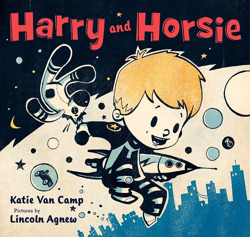
Q & A with Lincoln Agnew, Harry and Horsie

Children’s picture book Harry and Horsie by Katie Van Camp has mostly been in the news because the eponymous Harry happens to be the very real son of TV host and comedian David Letterman (who also provides the foreword to the book).

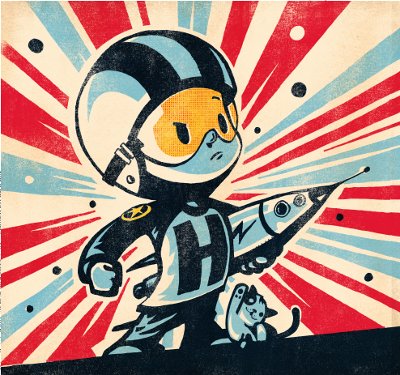
But what caught my eye were the illustrations by Calgary artist Lincoln Agnew. The illustrations, which bring to mind 1950’s advertising, cereal boxes, comics, vintage toys, pop art, and Bill Watterson’s Calvin & Hobbes, give the book a distinctive retro look.

I managed to catch up with Lincoln by email and ask him a few questions about his work.

Briefly, could you tell me a little about yourself?

No.

Hahahahaha…. I kid….. apparently I think I’m funny.

I’m just an artist trying to find my way with as little compromise as possible.  I go to sleep when I am tired, get up when I’m awake and work on any project i deem “fun” during the hours in between.  I’ve gone into debt trying to maintain my “artistic integrity” and on the days that I become too hungry to care i give in to my belly and use a steel scrub brush to bathe off the guilt…. after i finish my steak dinner.

Is Harry and Horsie the first children’s book you’ve illustrated?

Yes, the first of many i hope…. i really enjoyed the process.  I had no idea what i was doing but was inspired by the challenge.

How did you become involved in the book?

A great friend of mine, Alan Rosales introduced me to Katie at a New Years party in Montreal long before she decided to write a book.  We spoke for about ten minutes before she grew tired of my jibber jabber and moved on.  Years later he heard that she was looking for an  illustrator and recommended me for the job.  Katie and I then started tossing ideas around over email for the next few years but we didn’t reunite face to face until we both arrived in New York to celebrate with our publishers.  She was taller than I remembered.

How did you create the images? Could you describe your process?

My process is clumsy at best, I fumble around with rough outlines, scanners, photocopiers, pencil crayons, ink pens, sandpaper and computers. It’s a struggle, nothing really comes easy and there’s only a small window of time before the love turns to hate.

The illustrations have a wonderful retro feel. Where did you look for inspiration?

It all started with the toys, while I was doing up some rough sketches for the story I figured the rocket ship should look like a vintage tin toy from the 50’s.  That initial research inspired the look of everything to follow.

Where else can we see your work?

It’s around. I do freelance design, illustration and photography for magazines, studios, bands and clothing companies.  I vary my medium and style to fit the project…. so very little of it looks like the book.


Can we expect more children’s book illustrations from you in future?

Absolutely! Katie and I learned a lot during the initial process so we are eager to apply our new found knowledge to create something bigger and better than the first!  We are currently working on a second Harry and Horsie adventure with the lovely people over at Balzer and Bray/Harper Collins.

Thanks Lincoln!
And special thanks to Melissa Zilberberg, Marketing and Publicity Coordinator at HarperCollins Canada, for helping arrange the interview.

All illustrations copyright (c) 2009 by Lincoln Agnew

3 Comments